1970s Graphic Design: It’s Not Just Brown and Orange
When most people think of 1970s graphic design, their minds conjure a particular image.
It involves shag-pile carpets, avocado green kitchens, and typography so bubbly and rounded it’s barely legible.
It’s the “retro” filter on your phone. It’s an easy cliché.
And it’s mostly wrong. Or at least, it’s a tiny, misunderstood corner of a much larger, more chaotic, and frankly, more interesting story.
The 70s were a decade of violent contradiction. For every earthy, back-to-nature folk album cover, there was a brutally minimalist corporate logo for a national airline. For every glamorous disco poster, there was an angry, photocopied punk flyer.
If you’re a business owner looking to borrow from this era, understanding this tension is everything.
Slapping a groovy font on your logo is easy. Understanding the competing spirits of rebellion and order that defined the decade is where you’ll find something that works.
- The 1970s encompassed diverse, often-contradictory design styles—not just brown and orange clichés.
- Phototypesetting revolutionised typography, enabling tight kerning, overlapping letters, and expressive type design.
- Four dominant flavours: earthy handmade, glamorous disco, clean corporate modernism, and raw punk DIY.
- Key figures—Milton Glaser, Herb Lubalin, Saul Bass—shaped humanist, typographic, and corporate directions.
- Using 70s aesthetics for brands requires choosing a single “feeling” and applying colour and typography intentionally.
The Cultural Blender: What Was Actually Happening?
You can’t understand the design without a snapshot of the decade. It wasn’t a peaceful time. It was a ten-year hangover from the sixties, complete with economic turmoil and a deep-seated cynicism towards authority.
The Hangover from the ’60s
The idealism of the 1960s counterculture didn’t just vanish on January 1, 1970. It curdled. The psychedelic visuals, the call for authenticity, and the anti-corporate sentiment bled into the mainstream, influencing everything from advertising to book covers.
Economic Gloom and Social Change
The oil crisis of 1973, soaring inflation, and political scandals like Watergate created a backdrop of anxiety. This gloom fueled two opposite reactions in design. On one hand, you had the glitter-drenched escapism of disco. On the other hand, the raw, nihilistic anger of punk.
The Technology That Changed Everything: Phototypesetting
This is the boring part, which is the most crucial part. Before the 70s, type was set in metal. It was rigid, expensive, and slow. Phototypesetting changed the game completely.
Designers could now set type on film, allowing them to overlap characters, stretch letterforms, and—most crucially—kern them with microscopic precision. This technological leap is the secret ingredient behind the decade’s iconic typography. It was the start of designers taking total control of type.
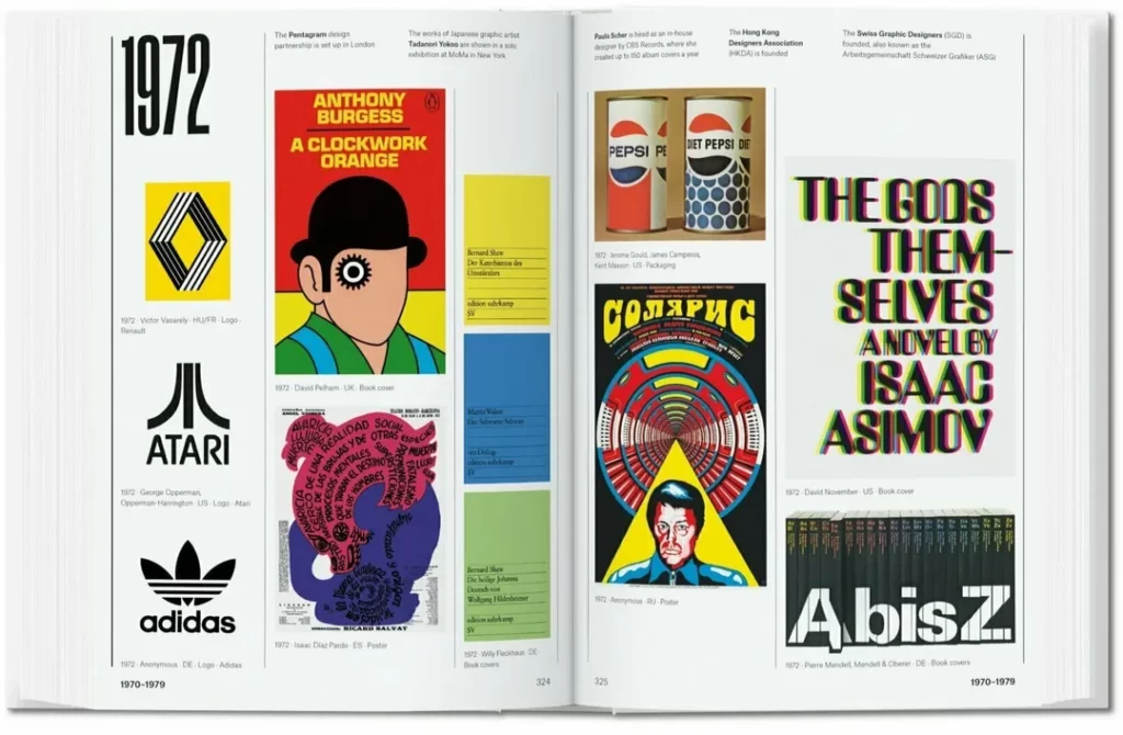
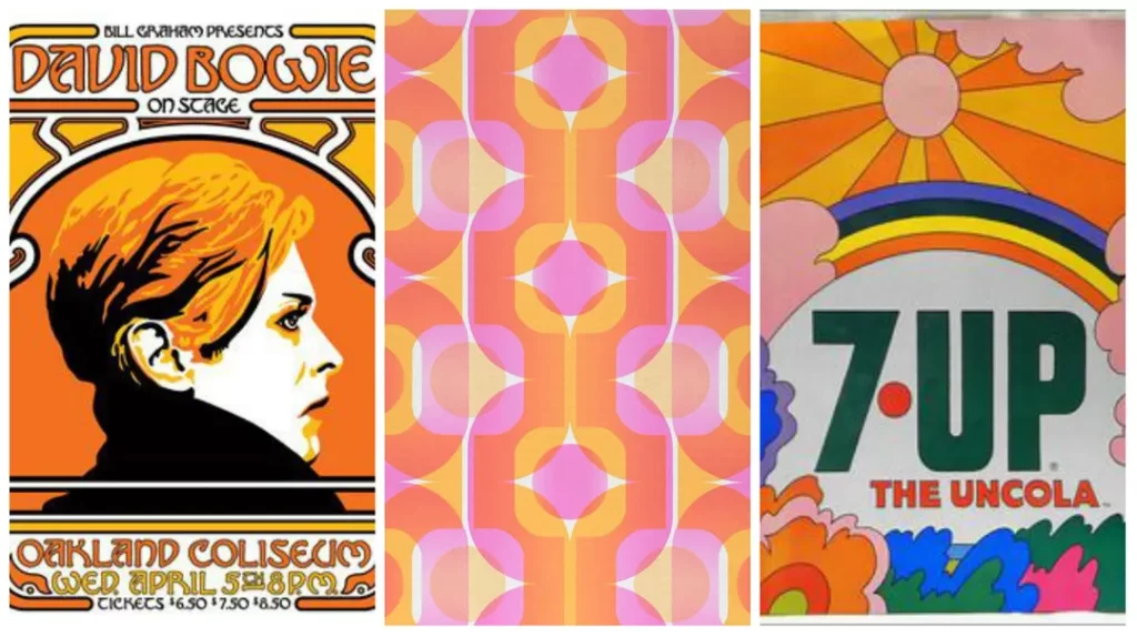
The Four Flavours of 1970s Design (Because It Wasn’t Just One)
Anyone who tells you the 70s had one “look” is trying to sell you a bad vintage sofa. The decade was a battleground of competing styles. You could walk down a single street and see all four living side-by-side.
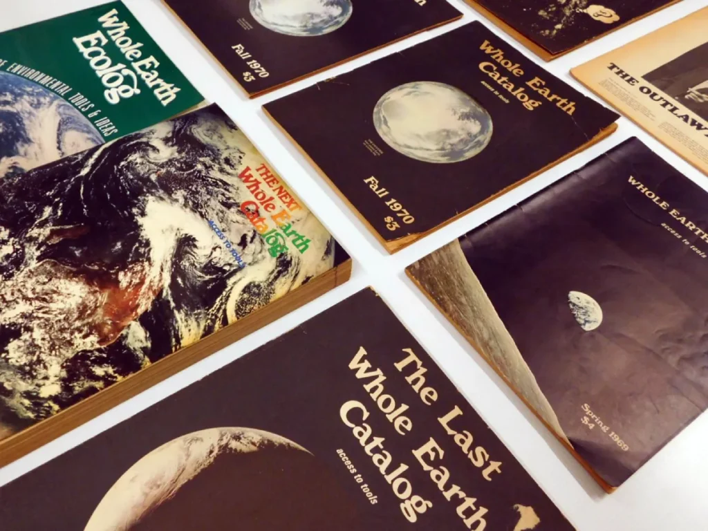
1. The Earthy, Organic, and Handmade
This is the style most people think of first. It’s the visual equivalent of listening to Joni Mitchell on vinyl. It was a direct reaction against the cold, hard modernism of the previous decade.
- Characteristics: Warm earth tones were the rule. Think avocado green, harvest gold, burnt orange, and lots of brown. Shapes were rounded and soft. Illustrations were often thick-lined, friendly, and looked hand-drawn. The overall feeling was authentic, natural, and human.
- Where you saw it: Folk and rock album art, book covers (especially for paperbacks), health food packaging, and publications like the Whole Earth Catalog.
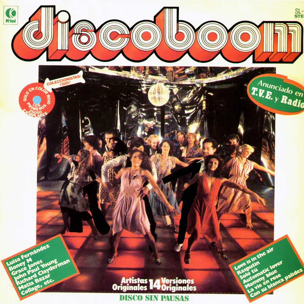
2. The Slick, Sexy Funk and Disco Vibe
If the organic look was about staying in, the disco vibe was about going out. This was pure escapism. It was glamorous, confident, and unapologetically commercial.
- Characteristics: High-contrast visuals were key. Photography was slick and stylised. Colours were vibrant and saturated—think hot pinks, electric blues, and deep purples. Chrome effects, starbursts, and lens flares were everywhere. Typography was bold, often with a metallic sheen.
- Where you saw it: Disco album covers are the quintessential example (think Chic, Earth, Wind & Fire, Donna Summer). You also saw it in movie posters, nightclub branding, and cosmetic advertising.
3. The Clean, Confident Corporate Machine
While all this expressive chaos was happening, big business quietly refined the principles of mid-century modernism. This was the design of function, clarity, and global ambition. It was the polar opposite of the handmade look.
- Characteristics: This style was built on grid systems and clean sans-serif fonts like Helvetica. Logos were reduced to their most minimalist, geometric forms. White space was used strategically to convey stability and confidence.
- Real-world examples: The most famous is the 1975 NASA “Worm” logo by Richard Danne and Bruce Blackburn. Others include Saul Bass’s iconic logos for AT&T and United Airlines and the comprehensive identity for the 1976 Montreal Olympics.
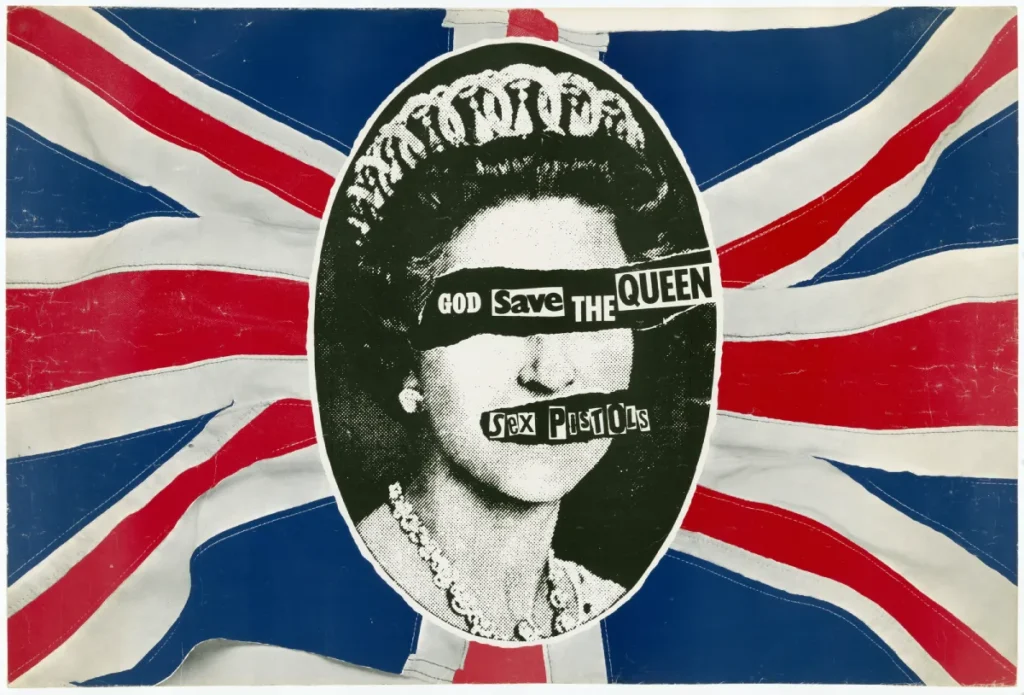
4. The Raw, Angry Rip-It-Up of Punk
Towards the end of the decade, a new movement spat in the face of both slick corporate design and groovy organic vibes. Punk was anti-design. It was a deliberate rejection of technique, polish, and legibility.
- Characteristics: The aesthetic was pure DIY. Think ransom-note lettering cut from newspapers, high-contrast and grainy photocopies, collage, and a stark colour palette of black, white, and occasionally a violent splash of neon pink or yellow.
- Real-world examples: The definitive work was done by Jamie Reid for the Sex Pistols. His cover for the “God Save The Queen” single, with the Queen’s eyes and mouth covered by text, is one of history’s most recognisable graphic design pieces.
Typography: The Decade’s Real Superpower
Right, let’s talk about my biggest pet peeve—the typography. You’re missing the entire point if you think 70s type is just fat, bubbly letters. The decade saw a typographic explosion driven by the freedom of phototypesetting.
The Liberation of Phototypesetting
I mentioned it before, but it’s worth repeating. This technology allowed for tight kerning. Extremely tight. Designers like Herb Lubalin built careers on pushing letters so close together they practically kissed. This ability to control the negative space between characters created a dense, graphic, and powerful new look.
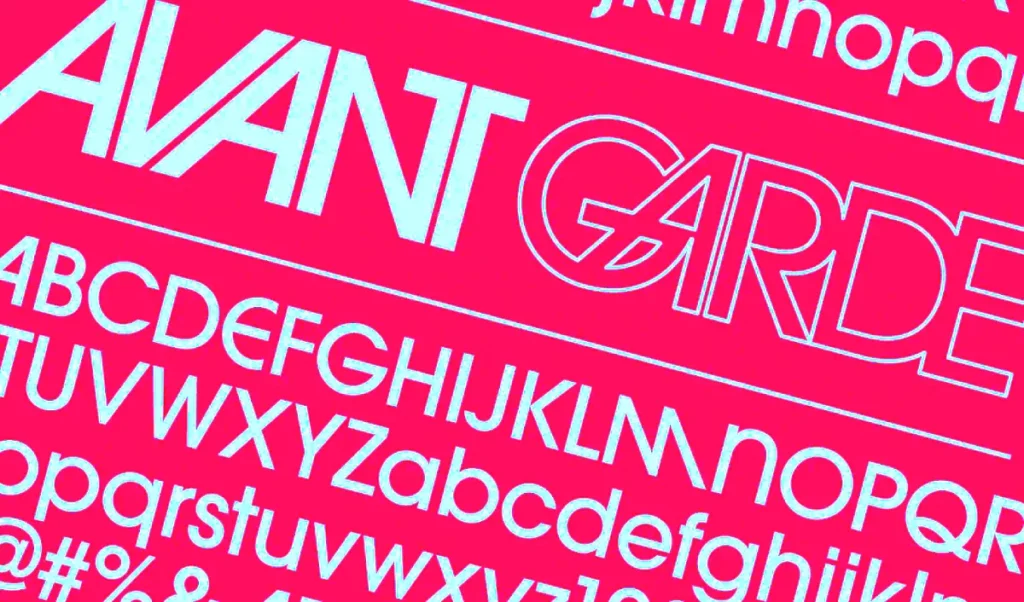
The prime example is ITC Avant Garde Gothic, designed by Lubalin himself. Its geometric forms and extreme ligatures (special characters that combine letters like ‘AV’ or ‘CO’) became the era’s signature. It was clean but had a huge personality.
Serifs Got Soulful
The 70s also saw a massive comeback for serif fonts, but not the stiff, academic ones. The decade embraced typefaces that were soft, rounded, and friendly.
Cooper Black, a font actually designed in the 1920s, was suddenly everywhere, used on album covers (The Beach Boys’ Pet Sounds) and TV shows. ITC Souvenir was another favourite with its rounded serifs and warm feel. These fonts were chosen because they felt human and approachable—a direct counterpoint to the cold sans-serifs that dominated the 60s.

And Yes, The Bubbly and Psychedelic Stuff
Of course, the expressive, over-the-top display fonts existed. Fonts like ITC Busorama or those with huge, swirly ascenders and descenders were popular.
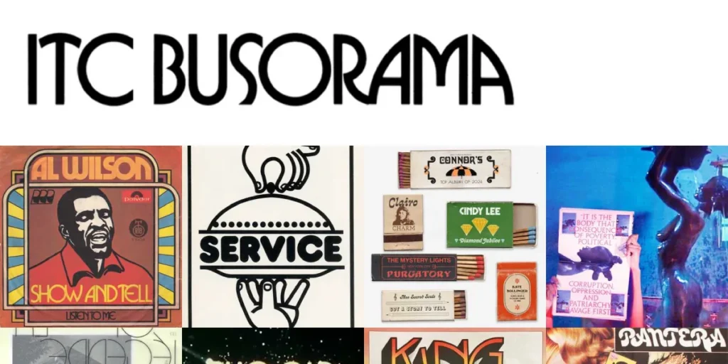
But they were a specific tool for a particular job. They were used on party invitations, film titles, and album covers to scream “fun” and “freedom.” They were just one small part of a much bigger, more sophisticated typographic landscape.
The Mount Rushmore of ’70s Design (The People You Should Know)
A few key figures defined the look and feel of the decade. They weren’t just designers but thinkers who shaped how we see the world.
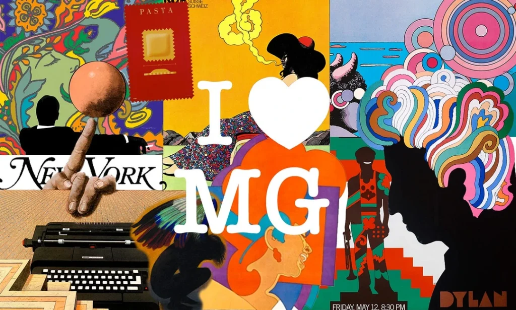
Milton Glaser: The Master of Humanism
Glaser was a co-founder of the hugely influential Push Pin Studios. He rejected rigid modernism and brought illustration, wit, and a handmade feel back into American graphic design.
- Key work: His 1967 Bob Dylan poster is iconic, but his most enduring creation is the “I ❤ NY” logo from 1977. Sketched in the back of a taxi, it became a global symbol of resilience and affection, proving that simple, emotional ideas could be compelling.
- His impact: Glaser showed that design could be witty, charming, and deeply human.
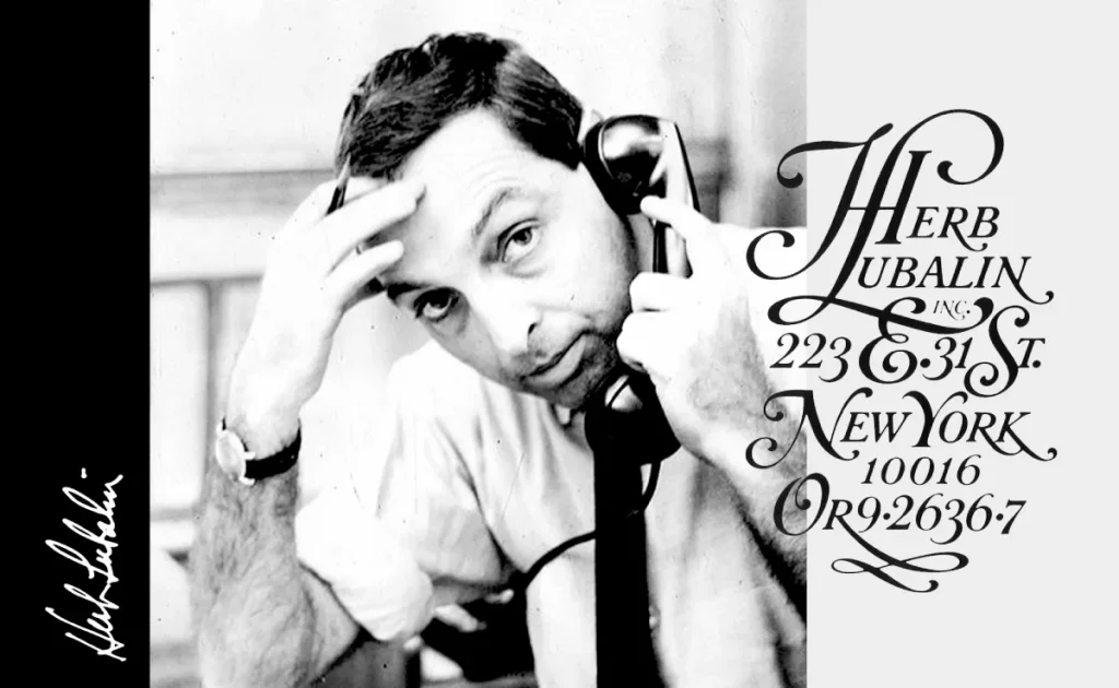
Herb Lubalin: The Typographic Genius
If the 70s were a golden age for typography, Lubalin was its king. He used type not just to convey information, but to create an entire visual concept. His mantra was “typographics”—the fusion of typography and graphics.
- Key work: As mentioned, he designed ITC Avant Garde. He also art directed the brilliant U&lc (Upper & lower case) magazine, a publication that became the bible for designers wanting to see the expressive potential of type.
- His impact: Lubalin proved that letterforms alone could be witty, sexy, and powerful. He made kerning cool.
Saul Bass: The Corporate Storyteller
While others were experimenting with expressive forms, Saul Bass continued to prove that modernism was the most effective language for big business. He created identities that were simple, memorable, and built to last.
- Key work: He designed some of the most enduring logos of the 20th century, many of them in the 70s, including Bell System (which became AT&T), United Airlines, and Warner Communications.
- His impact: Bass demonstrated that corporate design didn’t have to be soulless. It could tell a story and create a powerful, lasting emotional connection.
So, You Want to Use 70s Style for Your Business? Read This First.
Borrowing from a past era can be powerful, but it’s a minefield of clichés. If you’re thinking about a 70s-inspired brand, here’s how to do it without looking like a dated theme restaurant.
Don’t Just Copy, Understand the Feeling
What part of the 70s are you trying to channel? You can’t be all four flavours at once.
- Are you going for the handmade style’s warm, authentic, community-focused feeling?
- Do you want the bold, confident, glamorous energy of the Disco vibe?
- Are you channelling the raw, anti-establishment attitude of Punk?
- Or do you want the stability and clarity of Corporate modernism?
Pick a lane. Your choice should be rooted in your brand’s personality, not just a fleeting aesthetic preference.
Use Colour With Intention
Colour is an emotional shortcut. That classic brown, orange, and avocado palette instantly communicates warmth and nostalgia. Is that what your brand is about? The stark black, white, and neon pink of punk feels aggressive and urgent. Is that your brand?
Use this simple table as a starting point:
| Desired Feeling | 70s Colour Palette Examples |
| Warm, Authentic, Natural | Avocado Green, Harvest Gold, Burnt Orange, Brown |
| Glamorous, Bold, Escapist | Saturated Pinks, Purples, Electric Blue, Silver/Chrome |
| Urgent, Raw, Rebellious | Black, White, with accents of Neon Pink or Yellow |
| Stable, Clear, Confident | Primary Red, Blue, and Yellow with ample white space |
Typography Is Your Loudest Signal
Your font choice says more about you than you think. A bubbly, rounded font shouts “fun, casual, and maybe naive.” A tightly-kerned sans-serif like Avant Garde feels “slick, fashionable, and sophisticated.” A ransom-note font screams, “We don’t care what you think.”
This is the single easiest place to get it wrong. Choosing the right typeface requires a deep understanding of its history and connotations. This is often where getting professional help makes a difference; a poor font choice can undermine your entire message. If you struggle to find the right typographic voice, our graphic design services can help clarify that direction.
The Legacy: Why We Still Can’t Quit the ’70s
The influence of the 1970s is everywhere today, from Instagram filters to the branding of tech startups. Why?
Partly because it was the last great decade of analogue design, everything was made by hand—cut, pasted, airbrushed, and photographed. This gives the work a tactile, human quality we still crave in our digital world.
But more importantly, the 70s taught us that there is no one right way to do things. It was a decade where pristine corporate modernism, shaggy handmade illustration, high-gloss disco, and raw punk anger all screamed for attention simultaneously. It proved that design could be messy, contradictory, and deeply personal.
And that’s a lesson that never goes out of style.
Need a Design That’s More Timeless Than Trend?
Chasing trends can be exhausting. Building a solid brand identity is about finding what’s right for you, whether it’s inspired by the rebellious spirit of the 70s or something else entirely. The goal is to create something authentic that connects with your audience and stands the test of time.
If you’re ready to build a brand that lasts longer than a fad, look at our graphic design services. Or if you have a project in mind, request a quote, and we can discuss specifics.
Frequently Asked Questions About 1970s Graphic Design.
What defines 1970s graphic design?
1970s graphic design is not one single style, but a collection of competing aesthetics. It is primarily characterised by bold, experimental typography (especially tightly-kerned fonts), earthy colour palettes (avocado green, orange, brown), high-contrast photography, and a split between organic, handmade styles and clean, corporate modernism.
What were the main design movements of the 1970s?
The four prominent undercurrents were: the earthy, back-to-nature organic style; the slick, glamorous funk and disco style; the clean, minimalist corporate modernist style (a continuation from the 60s); and the raw, DIY anti-design of the punk movement.
Who were the most famous graphic designers of the 1970s?
Key figures include Milton Glaser (creator of the “I ❤ NY” logo), Herb Lubalin (a master of typography known for ITC Avant Garde), and Saul Bass (who designed iconic corporate logos for companies like AT&T and United Airlines).
What fonts were popular in the 1970s?
Popular fonts included the tightly-kerned sans-serif ITC Avant Garde Gothic, the chunky and friendly Cooper Black, the soft serif ITC Souvenir, and numerous bubbly or psychedelic display typefaces.
How did technology influence 1970s design?
The widespread adoption of phototypesetting was the most significant technological influence. It liberated designers from the rigidity of metal type, allowing for precise control over letter spacing (kerning), overlapping characters, and stretching type, which heavily defined the era’s typography.
What are the classic 1970s colour palettes?
The most famous is the earth-tone palette: avocado green, harvest gold, burnt orange, and various shades of brown. However, the disco era also popularised vibrant, saturated colours like hot pink and electric blue, while punk used a stark black-and-white with neon accents.
What is the difference between 1960s and 1970s graphic design?
While 60s design was often defined by rigid Swiss-style modernism or swirling psychedelia, the 70s became more eclectic. It incorporated more photography, embraced warmer and earthier colour palettes, and its typography became more expressive and tightly packed due to new technology.
What is the NASA “Worm” logo?
The NASA “Worm” is a minimalist logotype designed in 1975 by Richard Danne and Bruce Blackburn. It spelt out the agency’s name in a simple, geometric red font and became a prime example of the prevalent clean, modernist corporate design during the decade.
How did punk rock influence 70s design?
Punk was an “anti-design” movement. It rejected professional polish in favour of a raw, DIY aesthetic using collage, ransom-note lettering from cut-up newspapers, grainy photocopies, and a deliberately jarring look. Jamie Reid’s work for the Sex Pistols is the most famous example.
Is the 70s design still relevant for brands today?
Yes, but it must be used with intention. The era’s emphasis on authenticity, bold typography, and distinct colour palettes can be very effective. The key is to borrow the spirit (e.g., warmth, rebellion, glamour) of a 70s style rather than just copying its surface-level clichés.
What are “supergraphics”?
Supergraphics were a popular 70s trend involving large-scale, bold geometric shapes and stripes painted directly onto walls and buildings. They defined spaces, created energy, and integrated graphic design with architecture.
Why is 70s album art so iconic?
The 12-inch vinyl record provided a large canvas for designers. In the 70s, this format became a key part of an album’s identity, with record labels investing in high-concept photography, illustration, and typography to create memorable covers that defined musical genres from funk to punk.

