Website Credibility: Visual Cues that Signal Authority
Design isn’t a coat of paint you slap on at the end of a project.
If your website looks like a template from 2015, your visitors assume your ideas are from 2015, too.
I’ve spent years auditing sites for clients who wonder why their “world-class” service has a 90% bounce rate. The answer is usually staring them in the face: their website lacks the visual cues that signal authority.
In 2026, the stakes are higher. With the internet flooded by AI-generated “junk” sites, users have developed a hyper-sensitive radar for anything that feels “off.”
If you aren’t intentionally projecting credibility through every pixel, you are accidentally projecting incompetence.
- First impressions form in about 50 milliseconds; modern, cohesive design immediately signals trust or incompetence.
- Show humanity: raw photography, provenance labels and verified author profiles counter the "AI-junk" aesthetic.
- Technical stability and purposeful typography reinforce authority; avoid layout shifts and default system fonts.
What is Website Credibility?
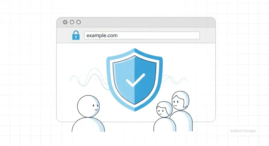
Website credibility is the perceived trustworthiness and expertise of a digital entity based on its visual presentation, technical performance, and information accuracy.
It serves as a psychological proxy for a brand’s real-world competence, directly influencing user engagement, lead generation, and conversion rates.
The three core elements of website credibility are:
- Perceived Expertise: How well the design reflects the complexity and professionalism of the industry.
- Trustworthiness Signals: Technical indicators like SSL certificates, clear contact data, and transparent information architecture.
- Surface Appeal: The aesthetic quality and modern relevance of the interface.
The 50-Millisecond Verdict: The Science of First Impressions
You don’t have time to explain why you’re great.
According to research by the Nielsen Norman Group, it takes users about 50 milliseconds (that’s 0.05 seconds) to form an opinion about your website. This opinion determines whether they stay or leave.
This isn’t a conscious decision. It’s a primal, visceral reaction. This is where the importance of web design becomes a financial metric rather than an aesthetic choice.
If the visual cues are weak, the user’s brain flags the site as “unsafe” or “unprofessional.”
Real-World Example: The Stanford Web Credibility Project
Stanford University’s Web Credibility Research found that nearly half (46.1%) of people say a website’s design is the top criterion for assessing the credibility of the material presented.
People read the “look” before they read a single word of your copy. If your site looks like a DIY project, your expertise is discounted before you even open your mouth.
The Architecture of Authority: Typography and Visual Hierarchy
If you want to look like an authority, you need to master the silent cues of typography. Most amateur sites treat text as an afterthought. Professionals treat it as the primary interface.
1. Typographic Weight and Intent
Authority is found in the “grey” of the page. This refers to the overall visual density and rhythm of your text.
- System Fonts vs. Custom Type: Using “Arial” or “Times New Roman” signals a lack of investment. It says you’re using the default settings of life. Investing in high-quality, legible typefaces like Inter, Montserrat, or Playfair Display (when used correctly) signals that you care about the details.
- Hierarchy: You must guide the eye. If every element is screaming for attention, nothing is important. A clear H1, H2, and H3 structure isn’t just for SEO; it’s a visual map of your logic.
2. The Information Density Ratio
There is a common myth that “cleaner is better.” This is a dangerous oversimplification.
In our fieldwork, we often see B2B companies strip so much content away in the name of “minimalism” that they end up looking like a “Coming Soon” page.
Credibility comes from showing you have the answers. High-authority sites use wireframing in web design to balance white space with deep, accessible information.
If I’m hiring a branding agency, I don’t want a single “Contact Us” button; I want to see case studies, methodologies, and technical insights.
| Feature | The Amateur Way (Distrust) | The Professional Way (Authority) |
| Imagery | Generic stock photos of “smiling people in suits.” | Original photography or high-end, custom landing page design assets. |
| Spacing | Inconsistent padding; elements “hugging” the edges. | Purposeful white space that creates a logical flow. |
| Colour Palette | Clashing colours or “Neon” shades that cause eye strain. | A cohesive palette based on colour theory and UX vs UI design principles. |
| Responsiveness | Mobile site feels like a “shrunken” desktop version. | A dedicated mobile-first design approach. |
| Navigation | Overwhelming “Mega Menus” with no clear path. | Streamlined, intent-based navigation. |
Technical Stability as a Visual Signal
In 2026, technical performance is a visual cue. If your site “jumps” as it loads (Cumulative Layout Shift), it feels broken. A broken site is untrustworthy.
Cumulative Layout Shift (CLS) and Trust
Imagine you’re about to click a link, and the page suddenly shifts, causing you to click an ad instead. That frustration is a direct hit to your credibility.
Google’s Core Web Vitals have made this a ranking factor, but we view it as a “Trust Factor.”

Sites that feel “solid” as they load—meaning elements don’t bounce around—project a sense of stability and permanence.
This is why a regular website maintenance checklist is vital. You aren’t just fixing bugs; you’re maintaining the “structural integrity” of your digital storefront.
The Physics of Trust: Motion and Micro-interactions
Credibility isn’t just static; it’s kinetic. How your website moves—or doesn’t move—tells a story about your brand’s stability.
- Intentional Friction: Sometimes, a site that is “too fast” feels flimsy. When a user submits a high-value application, a 1-second “Processing” animation with a secure-looking pulse actually increases trust. It signals that the system is performing a complex, “meaningful” task.
- Smooth States: Jittery animations or “pop-in” elements suggest a lack of technical polish. Use Framer Motion or Lottie files to create fluid transitions. When elements glide into place, it mimics the smooth, confident movements of a professional expert.
- Interactive Footnotes: Instead of making users click away to verify a stat, use hover-state “Entity Cards.” When a user hovers over a mention of the World Economic Forum, a small, elegant card appears with a summary and a link. This shows you are confident in your sources and respect the user’s time.
The 2026 Shift: The “Anti-AI” Aesthetic
We’ve reached “Peak AI.” The internet is currently drowning in MidJourney-generated images that all share the same plastic, overly-saturated sheen.
The State of Website Credibility in 2026:
Authority now comes from Humanity Signals. This is a specific shift where users are looking for “proof of life.”
- The Rise of Rough Edges: Perfect symmetry and “flawless” stock photos are now red flags for “scam” sites. Credible brands are moving toward hand-drawn elements, raw textures, and candid photography.
- Technical Transparency: Showing the “how” through detailed UX design, A/B testing data or “behind the scenes” process shots.
Real-World Example: The “Willy Wonka” Event (Glasgow)
In early 2024, an event used high-end AI visuals to sell tickets to a “magical experience.” The actual event took place in a desolate warehouse. This became a global case study in the “Credibility Gap.”

Since then, consumers have become hyper-aware of the difference between “Marketing Visuals” and “Reality.” If your website looks “too good to be true” (i.e., too much AI-generated perfection), you will trigger this same reflex.
The Humanity Stack: Visualising Authenticity
In 2026, the greatest threat to your website’s credibility is the “Uncanny Valley” of AI-generated content.
When users suspect they are interacting with a faceless machine, trust evaporates instantly.
To counter this, high-authority sites are adopting what we call the Humanity Stack—a layers-of-proof design approach.
- Digital Provenance and C2PA Labels Credibility now requires proof of origin. Leading organisations are implementing C2PA (Coalition for Content Provenance and Authenticity) metadata. Visually, this manifests as a small “i” or “Origin” icon on your images. When clicked, it confirms the photo was taken by a human with a specific camera, not generated by a prompt.
- Raw Documentation vs Polished Marketing: Replace high-gloss stock imagery with “Work-in-Progress” (WIP) visuals. A financial consultant showing a photo of their actual, slightly messy whiteboard from a strategy session carries more weight than a generic photo of a glass boardroom.
- The “Live-Sync” Signal shows that your site is a living entity. Visualise real-time data, such as “3 consultants active today” or “Last updated 4 hours ago.” This eliminates the “Ghost Ship” feeling of a static template.
Scenario: A boutique London law firm replaced their stock “Lady Justice” scales with a grainy, high-contrast video header of their lead partner walking through the Royal Courts of Justice.
Conversions increased by 22% because it provided immediate, undeniable geographic and professional context.
Industry-Specific Credibility Benchmarks
Not all trust is created equal. The visual cues required for a medical clinic are vastly different from those required for a creative agency.
| Industry Vertical | Primary Visual Trust Cue | Secondary “Proof” Entity | Ideal Typography Tone |
| Fintech & Finance | Data density & Security “Hardening” | FCA or SEC badges | Highly structured (e.g., Roboto Mono) |
| Healthcare | Empathetic white space & “Humanity” | NHS or Mayo Clinic style citations | Soft but firm (e.g., Open Sans) |
| Creative Agencies | Bold, unconventional layouts | Behance or D&AD awards | Expressive & Unique (e.g., Space Grotesk) |
| SaaS / Tech | Integration “ecosystem” maps | AWS or Microsoft Azure logos | Modern & Scalable (e.g., Inter) |
When should you deviate? Only when your brand’s unique selling proposition is “Disruption.” If you are a bank trying to look like a tech startup, you risk looking “unstable.”
If you are a creative agency trying to look like a bank, you risk looking “boring.” Align your visual cues with your industry’s baseline expectations before innovating.
Social Proof and Entity Validation
You can tell people you’re an expert, but it’s better if someone else does it. However, the visual presentation of that proof is where most people fail.
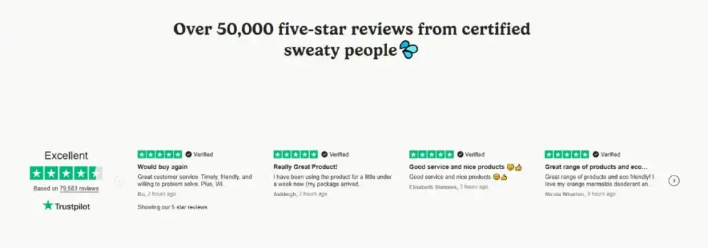
- The Logo Wall: Don’t just list names. Use greyscale logos of well-known brands you’ve worked with. This leverages the “Halo Effect”—their credibility rubs off on you.
- The Verified Review: Screenshots of reviews are better than typed-out quotes. Better yet, integrated Google or Trustpilot widgets. Why? Because they are harder to fake.
The 2026 Author Profile: Beyond the Headshot
The “Ghost Ship” website is a relic from 2025. To win the credibility battle, your individual contributors must be visualised as entities.
- The Metadata Signature: Every article should feature an author box that includes not just a bio, but a “Verification Stack.” This includes links to their LinkedIn profile and ORCID (for academic/technical fields), as well as a list of “Verified Expertise” tags.
- Contextual Authority: If your author is discussing “Sustainable Design,” include a small visual badge indicating they are LEED-certified.
- The “Humanity Video” Snippet: A 5-second, muted, hovering video of the author in their working environment—perhaps speaking at a conference like Web Summit—proves they exist in the real world and aren’t an AI-generated persona.
The Privacy Interface: Visualising Data Ethics
In 2026, a “Privacy Policy” link in the footer is no longer enough. Credibility is now built through Zero-Party Data transparency.
If you are asking for user information, the visual design of that request determines your authority.
- The “Transparent Flow”: Instead of a long, daunting form, use multi-step micro-forms (like those built on Typeform or Fillout). Visually explain why you need each piece of data.
- Consent as a Feature: Make your cookie and data preferences look like a core part of the UI, not a legal annoyance. A well-designed, brand-consistent “Trust Centre” signals that you handle data with the same care you handle your clients.
- The Compliance Badge Stack: For UK-based businesses, prominently featuring the ICO (Information Commissioner’s Office) registration and Cyber Essentials certification in a “Security Tray” creates a psychological safety net for the visitor.
2026 Website Authority Auditor
Measure your digital credibility signals in real-time.
The Verdict
Website credibility isn’t about following the latest web design trends for businesses. Trends fade. Credibility is built on the timeless psychological principles of order, hierarchy, and transparency.
If your site is cluttered, slow, or relies on generic assets, you are telling the world that your business is also cluttered, slow, and generic.
You cannot afford to let your digital presence undermine your professional expertise.
Building authority requires a holistic approach:
- Audit your first impression. Does it pass the 50ms test?
- Invest in Typography. Make your expertise readable.
- Prove your humanity. Avoid the “AI-Junk” aesthetic.
- Prioritise Performance. Speed and stability are trust signals.
If you’re ready to stop guessing and start building a digital presence that actually converts, it’s time to look at your site through the eyes of a sceptic.
Ready to fix your visual authority? Explore our Web Design Services to see how we build high-credibility brands, or Request a Quote to start your audit today. For more insights, visit Inkbot Design.
Frequently Asked Questions (FAQ)
How can I prove my website content isn’t generated by AI?
Use “Humanity Signals” like C2PA provenance labels, raw “behind-the-scenes” photography, and detailed author profiles that link to real-world professional activity. Avoid overly-saturated AI stock images.
Do “As Seen On” logo walls still work in 2026?
Yes, but only if they are high-signal and greyscale. Ensure they are clickable or accompanied by a “Case Study” link. Using generic logos without context can now trigger “scam” alerts in savvy users.
What is the most trustworthy font for a B2B website?
Inter and Montserrat remain industry standards for clarity. For high-end authority, pairing a modern sans-serif with a sophisticated serif like Playfair Display or Lora signals a blend of innovation and tradition.
Should I use a chatbot to increase my site’s credibility?
Only if it is a “High-Context” bot. Generic, intrusive pop-up bots can decrease trust. Instead, use an “Assistant” that appears only when a user lingers over a complex section, offering specific help.
How does mobile performance impact my professional reputation?
In 2026, a “Desktop-first” mentality is a sign of an outdated business. If your mobile site has layout shifts or slow-loading assets, users perceive your brand as technically incompetent.
Does an “Accessibility Statement” actually help with trust?
Absolutely. It signals corporate social responsibility and legal compliance. It shows you are a thorough, modern organisation that respects all users, which is a major signal of professional maturity.
What are “Skeleton Screens” and why do they build trust?
Skeleton screens are grey placeholders that appear while content loads. They are superior to spinning wheels because they indicate that the site’s structure is ready, reducing user anxiety and perceived wait time.
Can a “Dark Mode” toggle improve my credibility?
Yes. It demonstrates “User Agency”—showing that you value the user’s comfort and preference. It is a hallmark of a high-end, modern user experience.
How do I show my physical location without compromising privacy?
Include an embedded Google Map of your office or a “Verified Office” photo. Even for remote companies, having a “Registered UK Office” address in the footer is a baseline legal requirement for trust.
Is minimalism dead for high-authority brands?
Minimalism has evolved into “Intentional Density.” You should have a clean interface, but it must lead to deep, exhaustive information. A site that is “too empty” looks like it’s hiding something.


