Wayfinding Design: Navigating Through Signage
Have you ever got lost in a hospital, panicking and trying to find the right department? Or circle in some car-parking garage searching for your car as if it had entered the witness protection program?
Welcome to the world with no wayfinding design.
It’s the invisible art guiding us, the silent conductor orchestrating our movements through space. And when it’s done right, you hardly even notice.
When it’s done wrong? That’s when the cursing at inanimate objects starts.
Wayfinding design isn’t slapping some arrows up and calling it a day; instead, it is how our brains process space, make decisions and interact with the immediate environment. It is psychology meeting architecture and graphic design; all put together in one package that is supposed to make our lives easier.
But the fact is, good wayfinding design is more crucial now than ever. It’s not just A-to-B. It’s about comfort and access, and the fewer times we want to pull our hair out. Let’s go on a journey through the world of wayfinding design. No GPS is needed; follow the signs.
- Wayfinding design is crucial for guiding people through spaces, combining psychology, architecture, and graphic design to enhance user experience.
- It reduces stress and improves accessibility by making environments clear and intuitive, such as in healthcare or urban settings.
- Effective wayfinding incorporates signage, colour coding, and architectural elements to facilitate navigation without overwhelming users.
- Technology, like digital signage and mobile apps, has transformed wayfinding, providing dynamic information and enhancing user interactions.
- Inclusive design is essential, ensuring wayfinding is accessible for all users, including those with disabilities and different cultural backgrounds.
The Essence of Wayfinding Design
Wayfinding design is like a silent conductor, orchestrating our movements through space. It is the thorough distribution of signs, symbols, and environmental cues to help us get from point A to B without pulling our hair out. But it is not just putting up a few arrows and naming it a day.
Good wayfinding design combines psychology, architecture, and graphic design, incorporating a deep understanding of how people think, move, and make environmental choices. The difference between confidently striding through a new city and feeling like a lost puppy in a sea of confusing streets.
Why Should You Care?
You may think, “Well, I have GPS on my phone, so what? Why does it matter?” But that’s just the thing: Wayfinding design is more than getting from A to B. It’s about creating experiences, reducing stress, and making spaces much more accessible to everyone.
Think of a hospital where visitors and patients rarely need to stop and inquire at every turn. Or, think of that museum whose design speaks volumes to guide one through exhibits in a very logical and engaging manner. That’s the power of good wayfinding design – it doesn’t just direct; it enhances the user experience.
The Legal Framework: Standards, Statutes, and Safety
Wayfinding is not merely a design choice; in many jurisdictions, it is a legal imperative.
Whether you are operating in the UK under the Equality Act 2010 (formerly the DDA) or in the US under the Americans with Disabilities Act (ADA), failing to provide legible, accessible navigation can result in significant legal liability and financial penalties.
A professional wayfinding strategy must align with ISO 7010, the international standard for graphical hazard symbols. This ensures that a fire exit or a first aid station is recognisable to anyone, regardless of their native language.
Key Regulatory Requirements
To ensure compliance, designers must adhere to specific technical benchmarks:
- Mounting Heights: For tactile signs (Braille), the ADA requires the baseline of the lowest character to be a minimum of 1200mm and the highest character at a maximum of 1500mm above the floor.
- Visual Contrast: You must maintain a high Light Reflectance Value (LRV) difference between the text and the background. A minimum contrast of 70% is generally recommended to ensure legibility for users with visual impairments.
- Tactile and Braille: In public buildings, directional signs leading to permanent rooms (toilets, exits, offices) must include Grade 2 Braille and raised characters.
The Wayfinding Masterplan: A Strategic Roadmap
Developing a cohesive system requires more than just buying signs; it requires a Wayfinding Masterplan. This document serves as the blueprint for how a user interacts with a brand or environment from the “first mile” to the “last inch.”
Phase 1: Analysis and Auditing
Before a single pixel is drawn, a Wayfinding Audit must be conducted. This involves “ghosting” the user journey—walking in the footsteps of a first-time visitor to identify “decision points” where confusion arises. During this phase, designers use Spatial Data to map out high-traffic nodes and “blind spots” where existing signage fails.
Phase 2: Strategy and Logic
This is where the Information Hierarchy is defined. You must decide which information is “Primary” (e.g., Hospital Entrance), “Secondary” (e.g., Radiology Wing), and “Tertiary” (e.g., Room 402). A common mistake is “Over-signing,” which leads to Cognitive Overload. In 2026, the best strategies follow the “Progressive Disclosure” principle: only show the information a user needs at that specific moment.
Phase 3: Design and Fabrication
Only after the logic is set do we choose typography and materials. In this stage, designers select Substrates—such as powder-coated aluminium for durability or reclaimed timber for sustainable, biophilic environments.
Phase 4: Implementation and Post-Occupancy Evaluation
The final step is the Post-Occupancy Evaluation (POE). Three to six months after installation, the system is tested against real-world user behaviour. Are people still stopping staff to ask for directions? If so, the strategy needs refinement.
The Building Blocks of Wayfinding Design
Signs and Symbols: The Language of Navigation
The most prominent element of wayfinding design is signage. But not just any signage; we’re talking about a carefully crafted visual communication system.
Effective signage is:
- Clear and concise
- Consistent in style
- Visible from the proper distance
- Placed at decision points
But it’s not just words. The starring acting role goes to symbols. Think universal restroom, exit, or information desk symbols. These little pictograms transcend language, allowing people to navigate spaces.
Colour Coding: More Than Pretty Hues
Colour in wayfinding design is not about making the sign more pleasing to the eye. It is one of the critical cognitive ways of making intuitive wayfinding systems. Think of a hospital where the different departments’ codes are blue for radiology, green for surgery, and yellow for paediatrics. Suddenly, finding your way is as straightforward as following the right colour.
Here lies the catch: The colours can’t be any colour. They must be:
- Distinct and easily distinguishable
- Consistent throughout the space
- Accessible to those with colour vision deficiencies
Architectural Elements: The Silent Guides
Sometimes, the best wayfinding design is the one you don’t even notice. It’s baked into the space’s structure. Think about how a well-designed airport naturally funnels you from check-in to security to your gate. Or how the layout of a museum gently guides you through exhibits in a logical sequence.
These architectural elements might include:
- Sightlines that make important destinations visible
- Lighting that subtly reveals direction
- Flooring patterns indicating direction
- Memorable landmarks providing reference
Typography: The Unspoken Voice of Direction
Right, let’s talk about fonts. It sounds boring, but it’s massive.
The typeface you choose is basically the voice of your directions. Get it wrong, and it’s like getting directions from someone who mumbles.
You want something clean, clear, and easy to read from a distance. That’s why you see sans-serif fonts like Helvetica or Frutiger everywhere.
They don’t have those little flicky bits on the end of the letters, so your brain processes them faster.
And it’s not just the font itself. It’s the spacing between letters and the height of lowercase letters compared to the capitals.
All this stuff matters, especially for people with visual impairments or when you’re glancing at a sign in a hurry.
A brilliant example of this is a typeface called Clearview. It was designed specifically for American highway signs.
They found it improved legibility, particularly for older drivers at night. That’s the level of detail we’re talking about.
It’s not just about looking pretty; it’s about pure, simple function.
The Psychology of Space: Nudge Theory and Anxiety
Navigating an unfamiliar environment is not just a physical task; it is an emotional one.
Spatial Anxiety is a documented psychological response to feeling lost, which triggers a “fight or flight” state.
When a user is stressed, their peripheral vision narrows, and their ability to process complex text drops by up to 50%.
Applying Nudge Theory
To combat this, designers use Nudge Theory—subtle environmental cues that guide behaviour without the user being aware of it. For example:
- Lighting Cues: Humans are naturally drawn to light. By increasing the lux level at the end of a long corridor, you “nudge” the user to move toward that destination.
- Flooring Transitions: A change in floor texture or colour (e.g., moving from carpet to wood) can signal a transition from a public “Path” to a private “Node” or office area.
- Scent and Sound: In high-end retail, “Olfactory Wayfinding” uses specific scents to define different departments, creating a multi-sensory mental map.
Designing for Neurodivergence
Inclusive wayfinding in 2026 must account for Neurodiversity. For individuals with autism or sensory processing disorders, standard “high-contrast” signage can be overstimulating.
Professional designers now create “Calm Paths”—routes with lower sensory input and simplified iconography—to ensure the environment is accessible to everyone.
Comparison Table: Materiality & Durability
| Material Substrate | Ideal Use Case | Longevity | Sustainability Score | Pros/Cons |
| Powder-Coated Aluminium | External Directional | 15+ Years | High (Recyclable) | Highly durable; can be expensive. |
| Acrylic / Perspex | Internal Identification | 5-10 Years | Medium | Sleek finish; prone to scratching. |
| Reclaimed Timber | Biophilic / Corporate | 7-12 Years | Excellent | Warm aesthetic; requires maintenance. |
| Digital E-Ink | Dynamic Meeting Rooms | 5 Years | Medium | Low power; limited colour range. |
| Enamel Signage | High-Traffic Urban | 20+ Years | High | Virtually indestructible; classic look. |
Wayfinding Design in Different Contexts
Urban Settings: The Concrete Jungle to Get Through
Cities are beasts and may be challenging to navigate. Urban wayfinding design attempts to make our cities more legible, allowing residents and visitors to move quickly.
Critical elements of urban wayfinding include:
- Street signs and building numbers
- Public transport maps and signage
- Pedestrian directional signs
- Digital kiosks and interactive maps
One brilliant example is the Legible London system. Uniform signage, mapping, and digital guides throughout the city; a coherent, improved wayfinding scheme is thus provided. It is meant to help people better perceive distances and support navigation on foot.
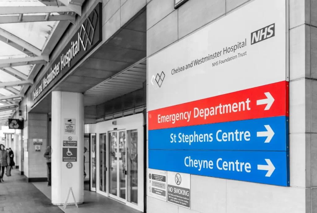
Healthcare Facilities: Guiding in High-Stress Environments
Hospitals and other healthcare facilities have their own set of peculiar wayfinding challenges. Visitors are often under stress and in a hurry, and they may be unfamiliar with most of the medical terminology being thrown at them. Good wayfinding design can be a lifesaver in a hospital environment.
Principles of good healthcare wayfinding:
- Clear, plain language
- Colour-coding for various departments
- Frequent reassurance and confirmation
- Designed to meet the needs of patients with diverse disabilities
Ohio’s Cleveland Clinic is known for its world-class wayfinding system. They incorporate colour coding, simple icons, and clear language to help patients and visitors navigate their sprawling campus easily.
Retail Spaces: The Balance Between Navigation and Exploration
Wayfinding performs two functions in retail spaces. It is supposed to allow customers to find the desired product or department and make them meander for exploration and discovery.
Standard retail good practices of wayfinding include:
- Clear signage for departments
- Aisle markers and product category signs
- Directory maps at critical locations
- Digital wayfinding kiosks
IKEA stores epitomise retail wayfinding. That famous arrow path takes consumers through the whole store, along with various shortcuts and good signage, so people can go directly to places.
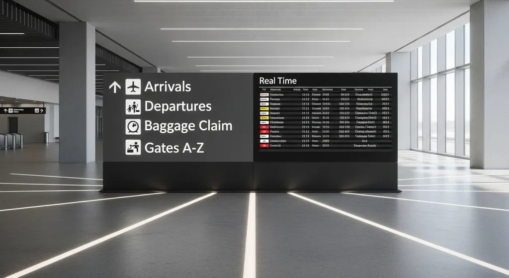
Transportation Hubs: Keep Them Moving
Airports, rail terminals, and other transportation centres are the über wayfinding challenges. They must move large volumes of people, most of them in a hurry, through complex processes and spaces.
Some principles of effective transportation hub wayfinding:
- Use universal symbols along with multiple languages.
- Give clear directional information at decision points.
- Integrate real-time information, such as flight status or platform changes.
- Consider the entire journey from arrival to departure.
Amsterdam’s Schiphol Airport often serves as a benchmark for airport wayfinding. Its clear iconography, consistent design, and innovative digital solutions lead travellers smoothly through the airport.
Educational Campuses: Navigating Learning Environments
University campuses are a special kind of nightmare to navigate. Let’s be honest.
You’ve got thousands of new students every single year, all wandering about like lost sheep.
You’ve got buildings that all look the same, built in the 60s from the same grey concrete.
And you’ve got a mix of people, from stressed-out 18-year-olds to visiting professors who are probably late for a lecture.
So, how do the good ones sort it out? They get smart with the basics.
They might zone the campus, so all the science buildings are in the ‘blue zone’, and the humanities are in the ‘red zone’.
They use massive, clear signs on buildings, so you can actually read the name from the other side of the quad.
They also make sure there are proper landmarks, like the main library or the student union bar, that everyone knows and can point to.
And, of course, they lean into tech. Interactive maps on their websites, mobile apps with walking directions to lecture halls.
The lot. It’s all about taking that initial chaos and giving people the tools to make sense of it quickly.
Digital Wayfinding: Beyond the Screen
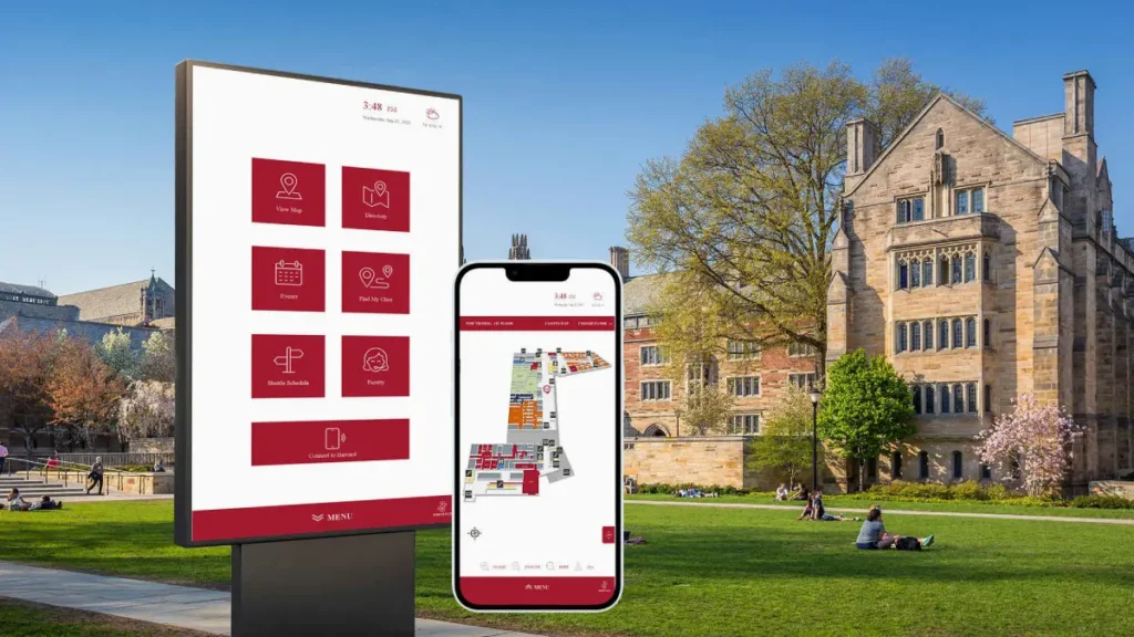
In 2026, the boundary between physical and digital navigation has vanished.
We are moving away from static “You Are Here” boards and toward Context-Aware Systems that respond to the individual user.
Indoor Positioning Systems (IPS)
GPS fails once you step inside a concrete and steel structure. To solve this, modern facilities use Indoor Positioning Systems (IPS).
By deploying a network of Bluetooth Low Energy (BLE) beacons or Ultra-Wideband (UWB) anchors, a building can communicate directly with a visitor’s smartphone.
This enables Blue Dot Navigation—the same experience you have on Google Maps, but inside a complex multi-floor hospital or airport. For the user, this means turn-by-turn directions that adjust in real-time if an escalator is out of service or a corridor is blocked for maintenance.
Spatial Computing and AR
With the rise of hardware like Apple Vision Pro and advanced ARCore mobile integrations, Augmented Reality (AR) wayfinding is now a standard expectation for major hubs.
Instead of looking at a 2D map, users see digital arrows projected onto the floor through their phone screen or wearable glasses.
Generative Wayfinding and AI
The latest trend is Generative Wayfinding. Using AI, buildings can now change their digital signage dynamically based on “Crowd Logic.”
If a particular gate in an airport is overcrowded, the AI can automatically update directional signs to route new arrivals through a less congested path, balancing the “Spatial Load” of the building.
Inclusive Wayfinding Design
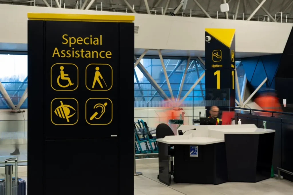
Accessible Design: Accessibility in Designing
Wayfinding design is intuitive and efficient, but should be designed primarily for all, regardless of disability. Inclusive wayfinding considers the various types of disabilities so that all users can access the environment.
- Tactile elements for visually impaired users
- Clear, high-contrast visuals for partially sighted users
- Audio cue descriptions for blind users
- Breaking down journeys into smaller, manageable steps to avoid information overload.
- Use literal language and avoid confusing metaphors or jargon. Straightforward is always better.
- Pairing text with clear, universal symbols to reinforce the message for everyone.
- Being relentlessly consistent with terms and icons, so the system is predictable and easy to learn.
- Consideration of reach ranges and sightlines for wheelchair users
Cultural Considerations in Wayfinding
Wayfinding systems will often need to support users from different cultural backgrounds. This extends beyond the translation of text into multiple languages.
Cultural considerations in wayfinding design:
- Colour associations are likely to be very different across cultures
- Reading directions-left-to-right vs. right-to-left
- Numerical systems and date formatting
- Taboos or sensitivities
- Symbols and icons with which people are more familiar
The Future of Wayfinding Design
Artificial Intelligence and Machine Learning
AI and machine learning will create some critical shifts in wayfinding design. These technologies can analyse vast amounts of data on users’ movement within spaces, making wayfinding more intuitive and adaptive.
Possible uses include:
- Predictive wayfinding that knows what users want
- Systems learn over time
- Personalised navigation based on each user’s behaviour
- Incorporating real-time crowd management into busy spaces
Augmented Reality: The Next Frontier
AR will bring wayfinding to a new plane. AR can provide intuitive, context-aware navigation by superimposing digital information in the real world.
Some other exciting possibilities of AR in wayfinding include:
- Turn-by-turn navigation overlaid onto the real world
- Virtual information points that would appear if needed
- Interactive 3D maps of complex spaces
- Gamification elements to entertain the user while navigating
Eco-Friendly Wayfinding: Guiding Towards Green Territory
With sustainability taking centre stage each day, wayfinding designs are changing to facilitate more environmentally friendly behaviours.
Sustainable wayfinding may include the following strategies:
- routing people to public transport facilities,
- demarcating cycling/walking routes,
- making physical signs out of eco-friendly materials,
- and integrating with innovative city initiatives for reduced energy consumption.
Measuring the Success of Wayfinding Design
Key Performance Indicators
How is a wayfinding system working? It is not always easy to measure, but here are some key indicators we can look at:
- Reduced staff time spent giving directions
- Decreased congestion in critical areas
- Improved user satisfaction scores
- Reduced journey times for common routes
- Increased exploration of the optional regions – retail or cultural spaces
User Testing and Feedback
There is no substitute for on-air testing with real users in wayfinding design. Testing methods may be through:
- Observation of how users get around in a space
- Surveys and interviews with users
- Eye-tracking studies determine what they are looking at
- A/B testing of wayfinding elements
Continuous Improvement
The wayfinding design is not a “set it and forget it” proposition. The best systems evolve through user feedback and emerging needs.
Ways to do continuous improvement:
- Regular auditing of the wayfinding system
- Gathering and analysing feedback from the users
- Staying updated with the latest technologies and methodologies
- Changing use patterns or space configurations
Implementing Effective Wayfinding Design: A Step-by-Step Guide
1. Understand Your Space and Users
Before even contemplating design, a deep understanding of your space and the users who would use it is needed. This encompasses:
- Mapping of the physical layout
- Identifying key destinations and decision points
- Analysis of the demographics and needs of users
- Particular challenges or constraints within the space
2. Develop a Wayfinding Strategy
Knowing your space and users inside and out, you can formulate a high-level wayfinding strategy that will present the following: aims and objectives of the wayfinding system, fundamental principles driving the design, an overview of different wayfinding elements which one is going to use in the space, such as signs, digital tools, architectural elements; a plan for how those elements will work together.
3. Develop a Strong Visual Identity
Consistency is the key to wayfinding design. If you develop a visual language to be used throughout your space, consider the following: a colour scheme, typography choices, iconography, and layout templates for different types of signs.
4. Design the Individual Elements
With your strategy and visual language in place, you are ready to design the individual elements of your wayfinding system. This may include the following: directional signs, identification signs, maps and directories, digital interfaces, and environmental graphics
5. Test and Refine
Testing the wayfinding design before full implementation may involve creating prototypes or mock-ups. User testing: actual or simulated environment. Gathering feedback from various user groups. Refine the design by making changes based on test results.
6. Implement and Train
After getting your final design, this is the implementation time. During this stage, Physical elements manufacturing and installation, Digital components deployment, Training of staff on the new system, Creation of user guides or instructions that may be needed
7. Monitor and Evolve
One buildout does not mean the work is over. Continuously assess and be prepared to make adjustments to your wayfinding system. It’s an ongoing process that will help one be sure that the wayfinding design will remain effective as space – and user needs – continue to change.
Conclusion: The Art and Science of Guiding People
Wayfinding design is a fascinating blend that balances art and science, psychology, and technology. It is not just about getting people from A to B but about creating experiences, reducing stress, and making our built environment more accessible and enjoyable.
As discussed, good wayfinding design requires a deep understanding of human behaviour and cautious planning – keeping the heart and mind open to adaptation and evolution. The principles applicable while designing for the smallest office remain the same for an entire city: clarity, consistency, and user-centricity.
The role of good wayfinding design becomes increasingly important in the increasingly complex world we live in. It’s an exciting field in constant flux, driven by new technologies and insights. But at its heart, it keeps one simple, vital goal: helping people find their way.
So, the next time you are smoothly navigating your way with ease through the complications of space, take a moment to applaud the invisible efforts of a hardworking wayfinding designer. Unsung heroes make our journeys relatively easy, one sign after another.
Frequently Asked Questions
How do I calculate the correct text size for a wayfinding sign?
The industry standard is the 1:100 rule. For every 10 metres of viewing distance, your capital letter height should be at least 25mm. However, for older populations or in high-stress environments such as hospitals, increasing this by 20% is recommended to ensure legibility.
What is the best font for wayfinding in 2026?
How does wayfinding impact business ROI?
In retail, efficient wayfinding increases “dwell time” in high-margin departments. In healthcare, it reduces “Missed Appointment Rates”—a study by Emory University found that poor wayfinding costs their hospital over $200,000 per year in lost staff productivity.
What is a ‘decision point’ in navigation?
A decision point is any location where a user must choose between two or more paths. These are the most critical spots for signage. If a sign is placed 5 metres after a junction, it is functionally useless.
What is Light Reflectance Value (LRV) and why does it matter?
LRV measures the percentage of light a surface reflects. To comply with accessibility laws, there must be a significant difference (usually 30 points or 70% contrast) between the sign’s background and the text to ensure it can be read by people with visual impairments.
How would you balance aesthetics with functionality in wayfinding design?
This is where the wayfinding designer walks a tightrope. You want your system to be beautiful, but not at the cost of clarity. It’s like creating a work of art that is also incredibly useful. The trick is to let the function lead, then wrap it in an aesthetic that complements the environment without overwhelming the information.
What are the salient factors in an inclusive wayfinding design?
Inclusive wayfinding ensures everyone can find their way to the space, regardless of their abilities. That means considering tactile elements for visually impaired users, clear visual contrast for partially sighted users, and simple language for users with cognitive diversity. It’s about creating a navigable world for everyone, not just the average user.
How do cultural differences impact wayfinding design?
Like flavours in cooking, cultural differences in wayfinding design can significantly affect results. For example, various cultures vary in colours, symbols, and even direction conventions. A functionally significant wayfinding system in New York might be confusing or even offensive in Tokyo. Local research and cultural sensitivity are essential in global wayfinding projects.


