User Experience Testing: Guide to Methods and Tools
Ignoring User Experience Testing is the fastest way to subsidise your competitor’s growth.
When a user hits a friction point—a broken form, a confusing navigation menu, or a slow-loading asset—they don’t “persist.” They leave.
In 2026, the cost of customer acquisition is too high to let “gut feeling” dictate your customer experience strategy.
- Test with real users (even five) to find 85% of usability issues quickly and cheaply, prioritising task success and error rates.
- Fix technical UX: optimise INP, LCP, CLS and mobile thumb-zones to reduce abandonment and improve SEO and conversions.
- Make accessibility non negotiable (WCAG 2.2, EAA): manual screen reader and keyboard testing drives legal compliance, inclusivity and growth.
What is User Experience Testing?
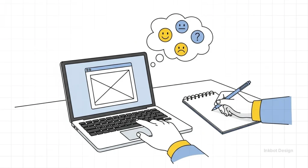
User Experience Testing is the technical process of evaluating a product or website by testing it with real users to identify friction points, usability flaws, and conversion bottlenecks.
It moves beyond aesthetic preference to provide empirical data on how easily a user can complete a specific goal.
The three core elements include:
- Task Success Rate: Can the user actually do what they came for?
- Error Rate: How many times does the interface trip them up?
- Subjective Satisfaction: Does the process feel intuitive or like a chore?
The 2026 Testing Hierarchy: Beyond Heatmaps
If you think a basic heatmap from Hotjar is “testing,” you are a decade behind. In the current market, we categorise testing into three distinct layers:
1. The Non-Negotiables
These are the basics. If these aren’t right, your brand experience is dead on arrival.
- Accessibility (WCAG 2.2): This isn’t just about being a good person; it’s about legal compliance and SEO. If a screen reader cannot parse your checkout, you are excluding a significant portion of the market.
- Mobile Thumb-Zones: With 70%+ of traffic on mobile, testing the “reachability” of your CTA buttons is vital. If your “Buy Now” button is in the top-left corner, you are failing Fitts’ Law.
2. Technical Precision
This is where professional consultants earn their keep.
- Interaction to Next Paint (INP): Google’s Core Web Vitals now heavily weigh INP. This measures the delay between a user’s action (like a click) and the visual feedback. A high INP feels “janky” and leads to immediate abandonment.
- Cognitive Load Testing: We use tools to measure the amount of “brain power” a page requires. If your pricing page looks like a tax return, the cognitive load is too high, and the user will bounce.
3. The Psychological Edge
- Micro-Frustration Analysis: We look for “Rage Clicks”—when a user clicks a button 10 times in 2 seconds because nothing is happening.
- B2B Trust Signals: In a high-stakes pitch, a broken link in your portfolio isn’t just a bug; it’s a signal that your agency is sloppy.
Debunking the “Statistically Significant” Myth

One of the most harmful pieces of advice circulating in the “fluff” design world is that you need hundreds of participants for your testing to be valid. This is nonsense.
Data from the Nielsen Norman Group has consistently proven that testing with just 5 users uncovers 85% of usability issues.
Small-scale, qualitative testing is far more valuable to SMBs than large-scale quantitative data.
Why? Because “Big Data” tells you that 40% of people left the cart. “Small Data” (watching 5 people) tells you they left because the “Postcode” field was wonky on Android phones.
Stop waiting for a “large enough sample size” to fix obvious mistakes.
The Science of Satisfaction: Standardised Scoring
While qualitative “Small Data” finds the bugs, quantitative frameworks allow you to benchmark your performance against the industry.
In 2026, the System Usability Scale (SUS) remains the gold standard for a quick, reliable health check of your digital product.
The SUS is a 10-item questionnaire that provides a “Global Score” out of 100.
- A Score of 68: The average. Anything below this means you are actively losing customers to frustration.
- A Score of 80.3 or higher: You are in the top 10% of “Easy to Use” websites. This is the “Apple” level of experience.
For complex B2B software or SaaS platforms, we often use the Post-Study System Usability Questionnaire (PSSUQ).
This breaks down the score into three sub-scales: System Usefulness, Information Quality, and Interface Quality. If your users love the layout but hate the data accuracy, the PSSUQ will highlight exactly where the friction lies.
Example Scenario: A London-based fintech app found its SUS score was a mediocre 55. While the design was beautiful, the “Information Quality” sub-score was abysmal. Users didn’t trust the way interest rates were displayed. By rewriting the micro-copy—not changing the design—their score jumped to 78, and retention increased by 14%.
Accessibility as a Growth Engine (WCAG 2.2 & EAA)
In 2026, accessibility testing is no longer a “check-box” exercise for your dev team; it is a legal and commercial necessity.
The European Accessibility Act (EAA), which came into full force recently, requires almost any business trading in the EU—including UK exporters—to meet strict accessibility standards for digital products.
Testing with Axe DevTools or WAVE is the first step, but the real work happens through manual testing with assistive technologies.
- Screen Reader Testing: Navigating your site using NVDA (Windows) or VoiceOver (iOS) to ensure the “Focus Order” is logical.
- Keyboard-Only Navigation: Can a user complete a purchase without a mouse? If they get stuck in a “Keyboard Trap” (like a pop-up they can’t close), your conversion rate for motor-impaired users is zero.
- Cognitive Accessibility: Testing for neurodivergent users (ADHD, Dyslexia). We look for “distraction-free” paths and clear, sans-serif typography that doesn’t “swim” for the reader.
Mini Case: A major UK utility provider redesigned its bill-pay flow to meet WCAG 2.2 Level AA standards. By simplifying the colour contrast and increasing touch-target sizes for those with limited dexterity, they saw a 9% increase in on-time payments from the over-65 demographic.
Professional User Experience Testing Methods
Moderated vs. Unmoderated Testing
In Moderated Testing, a researcher (like me) sits with the user (virtually or in person). We don’t help them. We watch them struggle.
This is the most brutal and effective way to see where your user experience design fails.
Unmoderated Testing uses platforms like UserTesting or Maze. It’s faster and cheaper, but you miss the nuances—the sigh of frustration, the squinting at the screen, the hesitant cursor movement.
Tree Testing and Card Sorting
Before you build a single page, you must test your navigation.
- Card Sorting: Ask users to group your services into categories. If they put “Logo Design” under “Marketing” but you put it under “Identity,” your navigation is broken.
- Tree Testing: Give them a text-only version of your menu and ask them to find a specific page. If they can’t find it in 3 clicks, your information architecture is a failure.
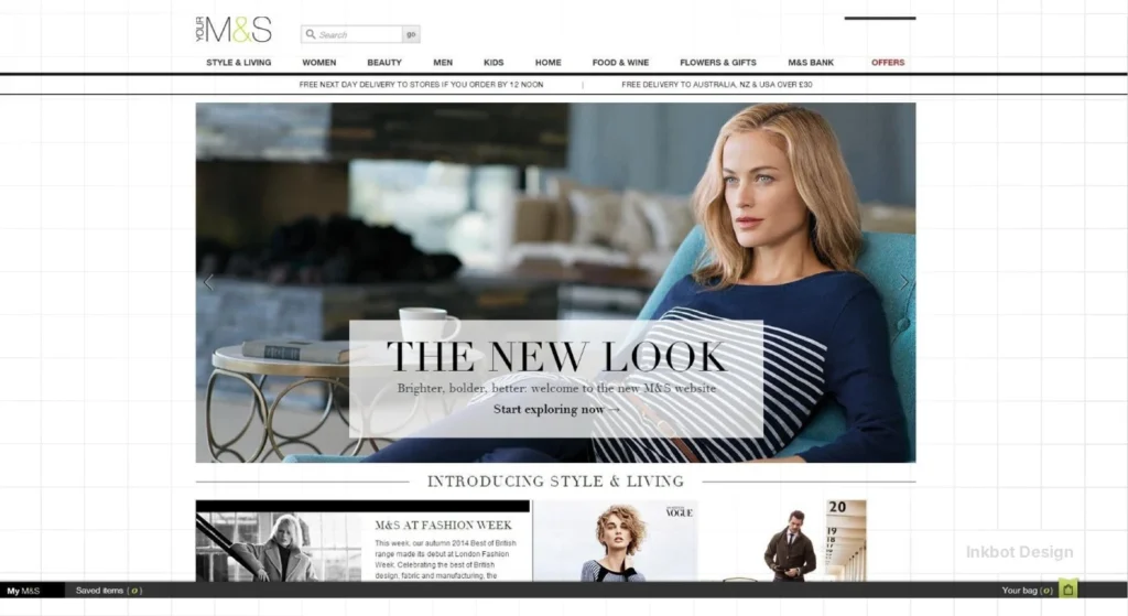
Real-World Evidence: Marks & Spencer
In 2014, Marks & Spencer spent £150 million and two years on a new website. It was beautiful. It was also a usability nightmare.
They failed to adequately test the “tablet” experience, leading to an 8.1% slump in online sales. They prioritised “brand look” over “user flow.” Don’t be M&S.
Information Architecture: Can They Actually Find It?
If a user can’t find the product, they can’t buy the product. We use two specific “lean” methods to test your site’s skeleton before we worry about the skin.
1. First-Click Testing
Research by Bob Bailey and Cari Wolfson found that if a user’s first click is on the right path, they have an 87% chance of completing the task. If they click the wrong place first, that success rate drops to 46%.
We use tools like Chalkmark or Optimal Workshop to show users a screenshot and ask: “Where would you click to manage your subscription?”
If they click ‘Profile’ but you put it under ‘Settings’, you have a navigation crisis.
2. Tree Testing (The “No-Frills” Navigation Test)
Tree testing strips away all design, colours, and images. It presents your menu as a simple text tree. We ask users to find a specific item (e.g., “Find the return policy for international orders”).
If they have to “pogo-stick” up and down the menu levels, your labels are confusing.
| Method | Best For… | Key Metric |
| Card Sorting | Planning a new menu | Category Agreement % |
| Tree Testing | Validating an existing menu | Direct Success Rate |
| First-Click | Testing specific page layouts | Time to First Click |
The 2026 Professional Stack: From Startup to Enterprise
The tool you choose depends on the “maturity” of your organisation. In 2026, we categorise the stack into three tiers:
Tier 1: The “Lean Startup” (Budget: <£200/mo)
- Microsoft Clarity: Essential. It provides session replays and heatmaps for free. Use it to find “Rage Clicks” and “Dead Clicks.”
- Maze: Excellent for unmoderated testing of Figma prototypes. It gives you quantitative “Misclick Rates” instantly.
- Lyssna: Great for “Five-Second Tests” to see if your value proposition is actually clear to a stranger.
Tier 2: The “Scale-Up” (Budget: £500–£2,000/mo)
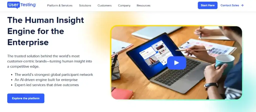
- UserTesting (Human Insight Platform): The industry leader for recruiting high-quality participants quickly by using AI recruiting software.
- Lookback: Our preferred tool for moderated remote interviews. It records the user’s face, screen, and touches with high fidelity.
- Optimal Workshop: The “Swiss Army Knife” for Information Architecture (Card sorting and Tree testing).
Tier 3: The “Enterprise” (Custom Pricing)
- Contentsquare: Uses AI to predict “Revenue Opportunity” based on UX friction points. It tells you exactly how much money a specific bug is costing you.
- Glassbox: Essential for highly regulated industries (Fintech/Healthcare), offering complete data masking and compliance-ready session replays.
- Tobii Sticky: Webcam-based eye-tracking that shows exactly where users are looking (and what they are ignoring) without requiring expensive hardware.
| Tool Category | Amateur Choice | Professional Standard (2026) | Why? |
| Heatmapping | Basic Hotjar | Microsoft Clarity | Clarity provides free, deep session replays and specific “Rage Click” metrics without the heavy script lag. |
| User Recruitment | Friends & Family | User Interviews / Prolific | You need strangers who aren’t afraid to tell you your site is rubbish. |
| Prototyping | Static PDFs | Figma (Advanced Variables) | High-fidelity prototypes allow for “logic-based” testing before a single line of code is written. |
| Accessibility | Chrome Lighthouse | AXE DevTools / WAVE | Lighthouse is a starting point; AXE finds the technical ARIA failures that actually block screen readers. |
The State of User Experience Testing in 2026
The biggest shift in the last 18 months has been the rise of AI-Augmented Synthetic Users.
We can now run “first-pass” tests using LLM-driven agents that simulate specific personas (e.g., “Sceptical 55-year-old CEO”).
While these don’t replace humans, they allow us to strip out 90% of the “obvious” errors before a human ever sees the site. This reduces the “Cost of Retrieval” for insights.
Also, with the 2026 update to Google’s search algorithms, the “Helpful Content” signal is now inextricably linked to UX.
If users bounce quickly because of a layout shift (CLS), your rankings will tank, regardless of how many keywords you’ve stuffed into the footer.
Technical On-Page UX Check (A SEO Perspective)
Your first impressions are dictated by technical performance.
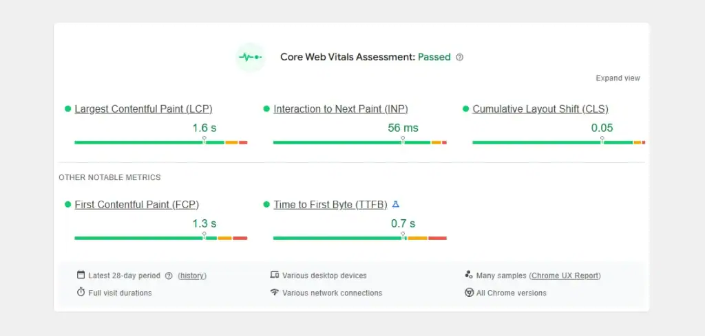
- LCP (Largest Contentful Paint): Must be under 2.5 seconds.
- CLS (Cumulative Layout Shift): Must be under 0.1. Nothing is more frustrating than a button moving just as a user tries to click it.
- FID/INP: An immediate response to user input is the hallmark of a brand identity that respects the user’s time.
If you are running an omnichannel experience, your testing must span all touchpoints. A seamless desktop experience is worthless if your mobile checkout is a dumpster fire.
Calculating the ROI of Friction Removal
“It looks better” doesn’t win budget. “This will save us £50,000 in support calls” does. When building a business case for testing, we focus on three conversion metrics:
- The Support Deflection Value: If 10% of your support tickets are “How do I reset my password?”, and a usability test helps you fix that flow, you save the cost of those manual interactions. In the UK, the average cost of a support call is roughly £6.20. Fix 1,000 calls a month, and you’ve saved £74,400 a year.
- The “Found Money” Formula: * Current Conversion Rate (CR) x Average Order Value (AOV) x Traffic.
- If testing identifies a checkout bug and moves your CR from 2.0% to 2.2%, that 0.2% lift—on £1m of traffic—is £100,000 in annual revenue.
- The “Developer Waste” Reduction: 50% of a developer’s time is spent on “rework” (fixing things that were built wrong). Testing a prototype in Figma costs £1,000. Re-coding a live site costs £10,000. The ROI is 10x just in engineering efficiency.
The Verdict
User Experience Testing is not an “add-on.” It is the foundation of digital profitability.
In 2026, users have zero patience for friction. They expect your site to be as fast and intuitive as the apps they use every day.
Stop guessing. Stop asking your spouse what they think of the “colour palette.” Start watching real people try to give you money and failing because your interface is in the way.
If you want a site that actually works—one that builds brand loyalty through ease of use—you need a professional audit.
Ready to stop losing customers to bad design?
Request a Quote today, and let’s fix your UX before your competitors do. Or, visit our homepage to see how we build high-performance brands from the ground up.
Frequently Asked Questions (FAQ)
Why is User Experience Testing important for SEO in 2026?
Google’s 2026 ranking factors prioritise “User Signals.” High bounce rates, low dwell time, and poor Interaction to Next Paint (INP) scores signal to search engines that your site isn’t helpful. Testing ensures your UX keeps users engaged, thereby boosting your visibility.
How many users do I need for a valid UX test?
For qualitative usability testing, 5 users are usually enough to find the vast majority of your site’s problems. If you are doing A/B testing or quantitative research, you may need hundreds, but for fixing friction, 5 is the magic number.
What is the difference between UI and UX testing?
UI (User Interface) testing focuses on the visuals—colours, fonts, and button styles. UX (User Experience) testing focuses on the “flow”—how easy it is to navigate, the logic of the steps, and the overall feel of the journey.
How much does a UX audit cost in the UK in 2026?
For a small business, a “light” audit using unmoderated tools and expert review typically starts at £1,500–£2,500. For an enterprise-level, multi-device study with moderated interviews, you should budget between £8,000 and £15,000 per research sprint.
Is AI-generated user testing (Synthetic Users) reliable yet?
In 2026, AI agents are excellent at finding “mechanical” errors, such as broken links or layout shifts. However, they lack the emotional nuance and “irrational” behaviour of humans. Use AI for your first pass to save money, but always validate with 5 real humans before a major launch.
What is a “Rage Click” in UX testing?
A rage click occurs when a user repeatedly clicks a specific element rapidly. This usually indicates that the element is broken, slow to respond, or appears to be a link but isn’t. It is a primary indicator of user frustration.
How often should I test my website?
Testing should be an ongoing process. At a minimum, you should run usability tests during a redesign, before launching a new product, or whenever you notice a significant drop in conversion rates.
What is the “Think Aloud” protocol?
This is a technique where participants are asked to verbalise their thoughts, feelings, and frustrations while performing a task. It is the most powerful way to understand why a user is confused, rather than just seeing where they click.
Is remote UX testing as effective as in-person?
Yes. Modern remote testing tools allow for high-quality video and audio recording of the user’s screen and face. In many cases, it’s better because the user is in their “natural environment” using their own device.
What is WCAG 2.2, and why does it matter?
WCAG 2.2 is the latest set of web accessibility guidelines. Following these ensures your site is usable by people with disabilities (visual, auditory, motor). In 2026, failing these standards can lead to legal liabilities and poor search performance.
How do I test UX for neurodivergent users?
Focus on “Cognitive Load.” Test your site with tools that simulate visual impairments and use participants who identify as neurodivergent. Key areas to check include the predictability of navigation and the ability to pause or hide moving elements (like auto-playing videos).
What is “First-Click Testing” and why does it matter?
It measures where a user clicks first when given a task. Statistics show that if the first click is correct, the user is twice as likely to succeed. It is the fastest way to see if your “Call to Action” buttons are intuitive.
Can I do UX testing on a “Guerrilla” budget?
Yes. Take your prototype to a coffee shop (or use a remote equivalent like Prolific), find 5 people who fit your persona, and offer them a £10 voucher for 10 minutes of their time. The insights will still be 80% as good as a formal lab study.


