Typography in Advertising: The ROI of Legibility & Hierarchy
You might have the most persuasive copy since the days of David Ogilvy.
Your product might be revolutionary. Your targeting parameters might be surgically precise. But if your audience cannot read your message instantly—without conscious effort—you have already lost them.
During my time auditing brand identities, I have seen six-figure ad budgets wasted not because the offer was bad, but because the typography was subpar.
A headline set in a cramped, lightweight sans-serif on a busy background does not say “sophisticated.” It says “amateur.”
Typography in advertising is not about making things look pretty. It is about Cognitive Fluency: the ease with which the brain processes information.
When processing is easy, the emotion is positive. When processing is hard (due to poor leading, bad kerning, or illegible font choices), the emotion is negative, and that negativity is transferred to your product.
This is not an art class. This guide offers a step-by-step approach to overcoming self-sabotage that can hinder your marketing revenue.
- Legibility drives conversions: make characters distinguishable for instant comprehension and positive cognitive response.
- Hierarchy guides the eye: clear size, weight, and colour differences prioritise the message and reduce abandonment.
- Technical details matter: kerning, tracking, and leading must be tuned for professional, trustworthy presentation.
- Use appropriate typefaces: choose serif or sans based on brand context, screen quality, and semantic fit.
- Optimise for digital: variable fonts, file size, accessibility and licensing prevent wasted impressions and legal risk.
What is Typography in Advertising?
Typography in advertising refers to the strategic arrangement of type to make written language legible, readable, and visually appealing when displayed. It involves the engineering of letterforms to control the speed and order in which a viewer consumes information.
Key Components:
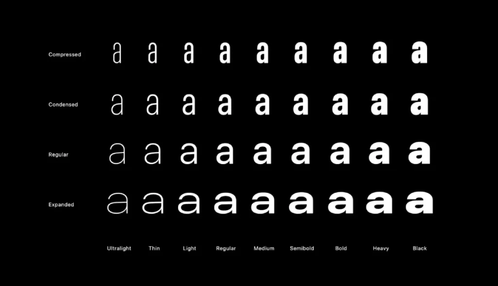
- Typeface Selection: The visual “voice” (e.g., Serif, Sans-Serif, Script).
- Hierarchy: Using size, weight, and colour to tell the eye where to look first.
- Typesetting: The technical adjustments of spacing (Kerning, Tracking, Leading) to maximise reading speed.
The Psychology of Type: Why the Brain Judges Your Font
We judge books by their covers and brands by their fonts. It happens in milliseconds.
The Gestalt Principles of perception dictate that our brains look for order in chaos. Good brand typography creates that order. It signals safety, competence, and authority.
The Semantic Memory Connection
A study by Monotype Imaging and the MIT AgeLab found that “bad” typography (poor legibility) physically affects the reader’s mood. It induces a “frown” response—a literal muscle contraction associated with cognitive strain.
If your ad makes a user frown just to read the price, you have created a subconscious barrier to purchase before they even understand the offer.
Consultant’s Note: I once reviewed a legal firm’s billboard campaign. They used a whimsical script font called Lobster because they wanted to appear “friendly.” The result? They looked incompetent. Typography carries semantic baggage. A bank cannot look like a bakery. Context is king.

The Core Mechanics: Legibility vs. Readability
People often use these terms interchangeably. They are not the same. In advertising, confusing them is a fatal error.
1. Legibility (The Micro)
Legibility refers to how distinguishable individual characters are from one another. Can you tell an ‘I’ from an ‘l’?
- The X-Height Factor: The height of the lowercase letters relative to the uppercase letters. In mobile advertising, a generous x-height is critical. If your letters are too short, they turn into mush on a smartphone screen.
- Counter Space: The open space inside letters (like the hole in ‘o’ or ‘e’). If the stroke is too thick (bold), the counters close up, and legibility drops.
2. Readability (The Macro)
Readability refers to the ease of reading blocks of text. This is determined by how you arrange the type.
- Leading (Line Spacing): In advertising, space is expensive, so the temptation is to cram text. Don’t. Tight leading forces the eye to skip lines.
- Line Length (Measure): The ideal line length is 45–75 characters. Go wider, and the eye loses its place. Go shorter, and the rhythm breaks.
The “Stroop Effect” in Advertising
You can trigger cognitive dissonance if your typography conflicts with the word’s meaning. This is known as the Stroop Effect (originally related to colours, but applies to type).
- Example: Writing the word “Power” in a delicate, thin script font creates hesitation.
- Example: Writing “Relaxation” in a jagged, aggressive heavy metal font creates tension.
Your typography must reinforce the semantic meaning of the word, not fight it.
The Technical Deep Dive: Kerning, Tracking, and Hierarchy
If you are building ads yourself or managing a junior designer, these are the technical levers you must pull to increase conversion rates.

1. Hierarchy: Controlling the Eye
You cannot scream everything at once. If your headline, subhead, and call-to-action (CTA) are all the same size and weight, the viewer’s eye bounces randomly. You need a clear path.
The Golden Ratio of Advertising Hierarchy:
- The Hook (Headline): Largest, boldest. Contains the primary benefit.
- The Context (Subhead): 50-60% of the headline size. Explains the ‘how’.
- The Action (CTA): Distinct colour or button shape. Isolated by whitespace.
If you fail to establish hierarchy, you increase the “Cost of Retrieval.” The user has to work to understand what you are selling. In the attention economy, work equals abandonment.
2. Kerning: The Mark of a Professional
Kerning is the spacing between individual pairs of letters. Most software handles this automatically (Metric Kerning), but for headlines, it is often wrong.
- The “AV” Problem: Letters with diagonal strokes (A, V, W, Y) often have huge gaps between them.
- The “To” Problem: The capital T often leaves a massive gap before a lowercase ‘o’.
Bad kerning makes a brand look cheap. It implies you did not care enough to check the details. Why should I trust you with my money?
3. Tracking: Giving Words Breath
Tracking refers to the spacing applied to a whole word or block of text.
- Pro Tip: If you use all-caps, you must increase the tracking. Uppercase letters are blocky; they need breathing room to be legible.
- The Mistake: Do not track out lowercase letters. It disrupts the flow of the word shape and causes reading to stutter.
Serif vs Sans Serif: The Eternal Debate
For decades, the rule was simple: Serif for print, Sans-Serif for digital. That rule is dead.
High-density Retina and 4K displays render serifs beautifully. The choice now depends on the brand’s personality and the context.
The Sans-Serif Advantage (The Modern Standard)
Sans-serif fonts (such as Helvetica, Roboto, and Inter) are characterised by low contrast and uniformity.
- Pros: Highly scalable. They survive being shrunk down to a 320px mobile banner ad. They feel modern, clean, and efficient.
- Cons: Can feel generic or cold if not paired well.
- Use Case: Tech startups, app interfaces, digital display ads.
The Serif Resurgence (The Authority Play)
Serif fonts (such as Garamond and Playfair Display) have “feet” that guide the eye along the line.
- Pros: They convey heritage, trust, and luxury. They are easier to read in long-form copy (like advertorials).
- Cons: Fine serifs can disappear (pixelate) on low-quality screens or poor billboard prints.
- Use Case: Law firms, luxury fashion, and editorial content.
Historical Evidence: When Type Made the Brand
You cannot discuss advertising typography without analysing the campaigns that changed the industry.
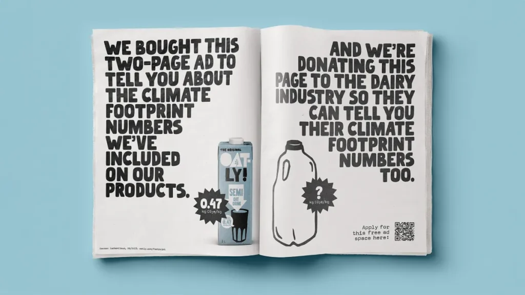
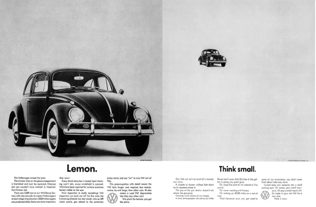
1. Volkswagen “Think Small” (1959)
This campaign by Doyle Dane Bernbach didn’t just sell cars; it sold an attitude.
- The Type: Futura. A geometric sans-serif.
- The Strategy: In an era of cluttered, shouting car ads, VW used massive white space and a small, stark headline. The typography was the voice: honest, unpretentious, direct.
- The Lesson: Typography can define the brand’s volume. Sometimes, whispering is louder than shouting.
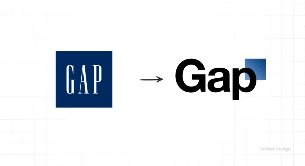
2. The GAP Logo Fiasco (2010)
In 2010, GAP tried to rebrand, abandoning its classic condensed serif for a generic Helvetica bold with a gradient square.
- The Reaction: The internet revolted. It was seen as “cheap,” “generic,” and “lazy.”
- The Cost: GAP scrapped the rebrand after just six days, incurring an estimated $100 million in lost rollout costs and damage to brand equity.
- The Lesson: Consumers form emotional attachments to typography. Changing it without cause is dangerous.
Digital Advertising: The Technical Constraints
This is where entrepreneurs fail. A font that looks great on a PDF proof might negatively impact your online campaign performance.
1. Web Fonts and Load Latency
Advertising is often programmatic. Speed is everything. If you use a custom font file that is 500KB, and the user is on a 4G connection:
- The ad container loads.
- The text is invisible (FOIT – Flash of Invisible Text) while the font downloads.
- The user scrolls past.
- The impression is wasted.
The Fix: Use “Variable Fonts.” These are single font files that contain all weights and styles, drastically reducing file size and the number of HTTP requests. This improves Core Web Vitals and ensures your ad renders instantly.
2. Licensing Liabilities
I see this constantly. A business buys a font license for “Desktop” use (creating images in Photoshop) but not for “Web” or “App” use.
- The Risk: Font foundries use crawlers to find unlicensed usage in digital ads.
- The Fine: It can range from thousands to tens of thousands of pounds.
- Always review the End-User License Agreement (EULA) before embedding a font in a dynamic HTML5 ad.
The Reality Check
“Can’t we just use Arial? It’s free.”
I hear this often. And honestly? Sometimes, yes. If the alternative is a poorly chosen, illegible custom font that crashes the browser, use Arial.
However, default system fonts signal “default effort.”
We once audited a B2B SaaS client who was struggling to book demos. Their site and ads used a mishmash of Open Sans (Google’s Default Font) and Times New Roman (the System’s Default Font). It looked like a template.
We switched them to a robust, geometric sans-serif pair (branding consistency) and tightened the leading. We didn’t change the copy. Conversion rates on the landing page increased by 14% over a three-week period.
Why? Because the design finally matched the price point. You cannot sell a £5,000/month software solution using typography that looks like a high school essay.
For a comprehensive breakdown of how we handle this, please refer to our digital marketing services. If your brand looks disjointed, you are leaking revenue.
The Amateur vs. The Pro
Here is a breakdown of the specific typographic choices that separate high-performing ads from money pits.
| Feature | The Amateur Approach | The Professional Approach |
| Font Count | Uses 3-4 different fonts to make it “pop”. | Uses 1-2 fonts (one for display, one for body). |
| Contrast | Places grey text on a white background (low contrast). | Ensures WCAG AA standard contrast ratios. |
| Leading | Default auto-leading (often too tight). | manually adjusted (120-145% of point size). |
| Kerning | Ignores it. Leaves gaps in headlines (e.g., ‘T o’). | Manually kerns headlines for optical balance. |
| Alignment | Centre-aligns large blocks of body text. | Left-aligns body text for easier eye tracking. |
| Emphasis | Bolds, underlines, and italics all at once. | Uses weight or colour sparingly to guide attention. |
The State of Typography in 2026: Kinetic & Variable
The static image ad is dying. The future is motion.
Kinetic Typography
With the dominance of TikTok and Instagram Reels, typography is no longer stationary. It moves.
- The Trend: Text that animates in sync with audio (captions).
- The Benefit: It holds attention. Viewers read along, increasing retention rates.
- The Standard: By 2026, static text overlays will be seen as “legacy” media. If your typography isn’t responsive and kinetic, you are invisible to Gen Z.
Accessibility as a Ranking Factor
Google and Facebook are putting increasing pressure on accessibility.
- The Shift: Ads with poor contrast or illegible text are being penalised in auction algorithms (higher Cost Per Click).
- The Requirement: Variable fonts allow for “optical sizing”—the font automatically gets thicker and more legible as it gets smaller. This is no longer a luxury; it is a technical requirement for performance.
Best Practices for Ad Typography
If you are about to launch a campaign, run it through this checklist.
- The Squint Test: Squint at your ad. Can you still see the hierarchy? If the headline disappears into the background, fix the contrast.
- The Glance Test: Show the ad to someone for 3 seconds. Hide it. Ask them what the primary benefit was. If they don’t know, your typography failed to prioritise the message.
- Check Your Licences: Do you have the rights to use that font in a paid social campaign?
- Pair Wisely: If you are unsure, use the “Concord” method (one font family, different weights) or the “Contrast” method (One Serif Headline, one Sans-Serif Body). Read more on font pairing.
The Verdict
Typography in advertising is the interface between your business and your customer’s brain. It is the delivery mechanism for your value proposition.
You can view it as an aesthetic choice, in which case you will likely choose what “looks cool” and wonder why your click-through rates are average. Or, you can view it as we do at Inkbot Design: as a function of engineering, psychology, and economics.
Clean, legible, hierarchical typography respects the user’s time. And in advertising, respect earns revenue.
Do not let bad design kill good ideas.
If you are ready to stop guessing and start treating your brand visuals as a strategic asset, request a quote today. Let’s fix your hierarchy before you spend another pound on ads.
Frequently Asked Questions (FAQ)
What is the best font for Facebook ads?
There is no single “best” font, but sans-serif fonts like Roboto, Open Sans, or Helvetica are generally safest. They render clearly on mobile screens and withstand the compression algorithms of social media platforms better than intricate serif fonts.
How many fonts should I use in an advertisement?
Stick to a maximum of two. Use one bold, distinctive typeface for the headline (to grab attention) and a highly legible, simple typeface for the body copy/subhead. Using three or more creates visual clutter and reduces comprehension speed.
Why is kerning important in advertising?
Kerning adjusts the space between individual letters. In large headlines, default spacing often creates awkward gaps (especially between letters like A, V, and W) that make the design look unprofessional. “Cheap” looking design erodes trust in the product.
Can I use free Google Fonts for commercial ads?
Yes, most Google Fonts are released under the Open Font License (OFL), which permits commercial use in print and digital advertisements. However, always verify the specific license file included with the font to be certain.
What is the difference between legibility and readability?
Legibility refers to how easy it is to distinguish one letter from another (micro-level). Readability refers to how easy it is to read a whole block of text (macro-level). You can have a legible font that is unreadable because the lines are too close together.
Does typography affect conversion rates?
Yes. Studies show that “cognitive fluency” (the ease with which information is processed) correlates with truth perception and purchase intent. If an offer is difficult to read, users subconsciously perceive it as “risky” or “difficult,” which lowers conversion rates.
What size should text be on mobile ads?
For mobile feeds, body text should be at least 16px in size. Headlines need to be significantly larger to stop the scroll. Ensure your text contrasts strongly with the background, as users often view screens in bright sunlight/glare.
What is a Variable Font?
A Variable Font is a single font file that acts like multiple fonts. It allows you to adjust weight, width, and slant on a sliding scale. This reduces file size (faster ad loading) and allows for more precise design control without loading multiple files.
Should I use Serif or Sans-Serif for luxury brands?
Traditionally, Serif fonts (like Bodoni or Didot) are associated with luxury, heritage, and elegance. However, many modern luxury brands are moving to Sans-Serif to appear more accessible and digital-first. Context matters more than categories.
How do I fix “widows” in ad copy?
A “widow” is a single word left on a line by itself at the end of a paragraph. It creates an awkward visual gap. Adjust it manually by adjusting the line breaks, slightly tweaking the tracking, or rewriting the copy to balance the text block.


