The 20 Best Print Ads of All Time: A Masterclass in Creative Strategy
Print isn’t dead; it’s an exclusive club. We analyse the 20 best print ads in history to understand the psychology, layout, and copywriting secrets that defined generations.
 By Stuart Crawford
 Reviewed by Tabitha Ayers
Updated 20 min read
On this page20 min left
- What Defines the Best Print Ads?
- 1. Volkswagen – “Think Small” (1959)
- 2. Avis – “We Try Harder” (1962)
- 3. Apple – “Think Different” (1997)
- 4. KFC – “FCK” (2018)
- 5. The Economist – “I never read The Economist” (1988)
- 6. Absolut Vodka – The Bottle Campaign (1981-2000s)
- 7. De Beers – “A Diamond is Forever” (1947)
- 8. Nike – “Just Do It” (1988)
- 9. LEGO – “Imagine” (2006)
- 10. Porsche – “Nobody’s Perfect” (1983)
- 11. FedEx – “Neighbours” (Unknown Date)
- 12. Marmite – “Love it or Hate it” (1990s-Present)
- 13. World Wildlife Fund (WWF) – “Horrifying/More Horrifying” (2008)
- 14. Heinz – “No One Grows Ketchup Like Heinz” (2007)
- 15. Got Milk? – “Aaron Burr” (1993)
- 16. IKEA – “Pee on this Ad” (2018)
- 17. Coca-Cola – “Share a Coke” (2011)
- 18. Guinness – “Good things come to those who wait” (1990s)
- 19. Rolling Stone – “Perception vs. Reality” (1985)
- 20. Tabasco – “Exploding Corn” (Unknown Date)
- Why Most SMB Ads Fail
- The State of Print in 2026: The “Tactile” Rebellion
- The Verdict
- Frequently Asked Questions (FAQ)
You have likely been told that digital marketing is the only game in town.
You’ve been told that print is a relic, a dusty medium for dinosaurs and waiting rooms.
This is nonsense.
While digital banners suffer from “banner blindness” and average click-through rates that would make a statistician weep (often below 0.1%), print advertising retains a tactile, psychological weight that pixels cannot replicate.
The best print ads do not just convey information; they interrupt patterns. They force the brain to stop scanning and start thinking.
In my years as a Creative Director, I have seen clients' obsession with Facebook pixels while neglecting the fundamental laws of persuasion that print demands. On a screen, you can click away. With a magazine or a billboard, the image occupies physical space in your reality. It commands attention.
To truly understand branding, look to print. This article is not just a gallery of pretty pictures. It is a forensic analysis of the 20 best print ads of all time, breaking down exactly why they were effective and how their principles can be applied to your business today.
What Defines the Best Print Ads?
Before we dissect the examples, we must define our criteria. A “good” ad looks nice. A “best” ad changes behaviour.
At Inkbot Design, we evaluate creative work based on three non-negotiable pillars:
- The Stop Factor: Does it arrest the eye? In a magazine, this means stopping the page turn. On a billboard, it means registering in a driver's peripheral vision.
- The Single-Minded Proposition (SMP): Does the ad say one thing clearly? The demise of small-business advertising stems from the desire to convey five things at once (price, location, history, offer, website). The best ads strip away everything until only the core truth remains.
- The “Aha” Moment: Does the viewer have to do a tiny bit of mental work to “get” the joke or the connection? This cognitive engagement triggers the release of dopamine, which aids in memory retention.
Quick definitions: The Unique Selling Proposition was popularised by Rosser Reeves at Ted Bates in the 1960s, and states the specific benefit only your product can claim. The Single-Minded Proposition is the one message you choose to communicate now. A clear SMP improves recall in print.
Let's look at the masters who perfected this art.
1. Volkswagen – “Think Small” (1959)
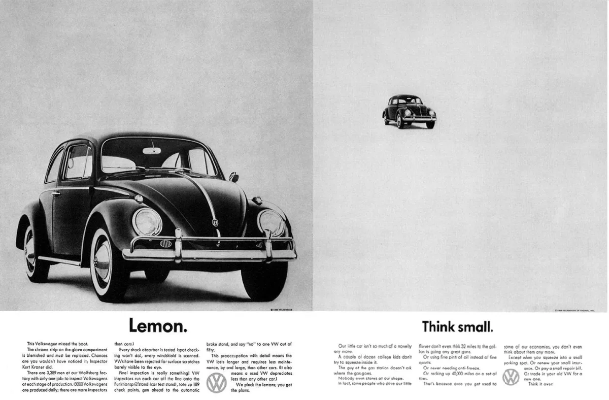
Agency: Doyle Dane Bernbach (DDB)
Credits: Art direction by Helmut Krone. Copy by Julian Koenig. The platform also produced the companion ad Lemon.
Ad Age named the Volkswagen work the top advertising campaign of the 20th century in 1999, cementing its status as the model for modern print.
We cannot start anywhere else. This is the Genesis of modern advertising. In the late 1950s, America was obsessed with muscle cars, tailfins, and excess. You bought a car to show you had “made it.”
Then came Volkswagen with a Nazi-associated, noisy, small, and unattractive Beetle.
The Strategy: Instead of hiding the car's small size, DDB leaned into it. They used a massive amount of “negative space” (white space), placing the tiny car in the top left corner. This was radical. It forced the reader to look for the product in the emptiness.
Why It Worked: It was the ultimate counter-culture statement. The copy, written by Julian Koenig, addressed the reader as an intelligent adult, rather than a consumer. It admitted the car was slow and small, but framed those as virtues (economy, reliability). It created a tribe of “smart” buyers who didn't need to overcompensate with a Cadillac.
The Takeaway: Turn your weakness into your Unique Selling Proposition (USP). If you are small, you are agile. If you are expensive, you are reassuringly quality-focused.
2. Avis – “We Try Harder” (1962)
Agency: Doyle Dane Bernbach (DDB)
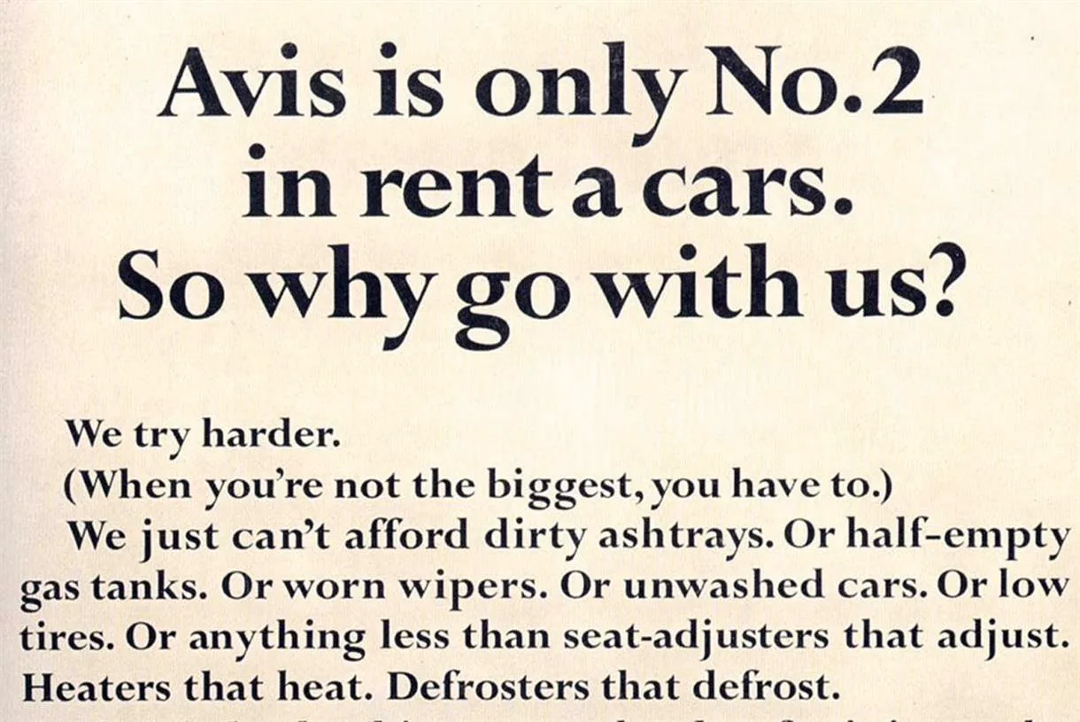
Hertz was the undisputed number one car rental company. Avis was losing money. In a boardroom, admitting you are second best is usually suicide. Avis made it their slogan.
The Strategy: The headline: “Avis is only No.2 in rental cars. So why go with us?” The answer: “We try harder.”
They argued that because they weren't the market leader, they couldn't afford dirty ashtrays, half-empty gas tanks, or rude staff. They had to be perfect just to survive.
Why It Worked: It turned the market leader’s size against them. Suddenly, Hertz looked complacent and bloated. Avis went from losing $3.2 million to making a profit of $1.2 million in a single year. It is a masterclass in positioning.
Case histories and Ad Age reporting show Avis’s market share grew from roughly 11 per cent in 1962 to about 35 per cent within four years. Profit returned.
The company formally retired “We Try Harder” in 2012, after five decades of consistent positioning.
3. Apple – “Think Different” (1997)
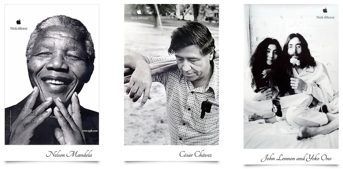
Agency: TBWAChiatDay
Steve Jobs had just returned to Apple. The company was bleeding cash and had no new products ready to launch. They didn't have a device to sell; they had to sell a philosophy.
The Strategy: The print ads featured simple black-and-white portraits of historical rebels, including Einstein, Gandhi, Lennon, and Picasso. No computers were shown. Just the Apple logo and the words “Think Different.
Why It Worked: It was a pure case of brand association. By placing the Apple logo next to Einstein, Apple wasn't saying “our computers have faster processors.” They were saying, “If you are a creative genius, you use our machines.” It flattered the customer. It told the user that buying an Apple was an act of rebellion.
The platform spanned TV, print, and outdoor. The “Crazy Ones” film won the 1998 Emmy for Outstanding Commercial, as recorded by the Television Academy.
The print work carried the same spare system, logo, and two-word line across portraits, creating strong brand linkage without product shots.
4. KFC – “FCK” (2018)
Agency: Mother London
Let’s jump to a modern classic. In 2018, KFC UK changed logistics partners and ran out of chicken. Literally. The chicken shop had no chicken. The public was furious; the police actually had to tweet asking people to stop calling them about it.
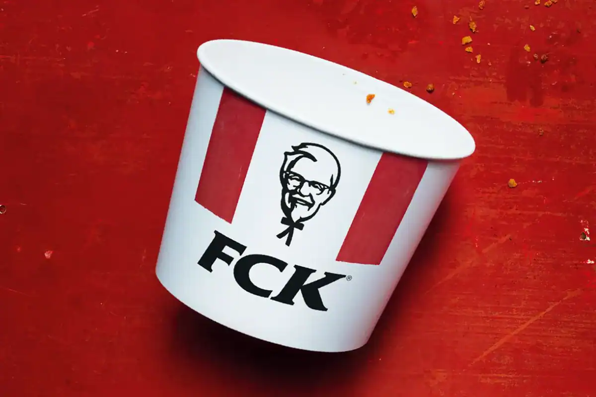
The Strategy: KFC took out a full-page ad in The Sun and Metro. It showed an empty bucket, but the letters KFC were rearranged to read “FCK”.
The shortage followed a February 2018 logistics switch to DHL in the UK, which disrupted deliveries and forced widespread temporary closures. BBC News reported police appeals to stop non-emergency calls.
The apology appeared as a full-page print in The Sun and Metro, reaching a broad audience fast.
Why It Worked: It was humble, human, and hilarious. A corporate apology typically sounds as if it were written by a lawyer (“We regret the inconvenience…”). This ad showed that the brand understood the absurdity of the situation. It diffused tension with humour.
The Takeaway: When you make a mistake, own up to it immediately and maintain your brand voice. Authenticity beats PR spin every time.
5. The Economist – “I never read The Economist” (1988)
Agency: Abbott Mead Vickers BBDO
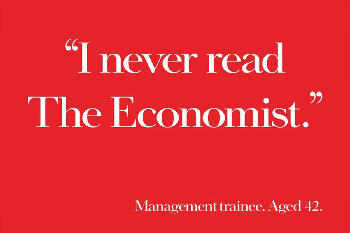
David Abbott led the copy-led campaign, using a consistent red ground and white type system. Each headline worked as a self-contained argument for ambition.
The system made the ads instantly recognisable across years of executions, a lesson in brand codes.
The Economist is a dense, intellectual weekly newspaper. Their challenge was to attract aspiring management professionals who wanted to advance up the corporate ladder.
The Strategy: The ad is a solid block of red. At the bottom, a quote: “I never read The Economist.” The attribution: “Management trainee. Aged 42.”
Why It Worked: Fear. It played on the deep-seated fear of career stagnation. It implied that if you don't read the product, you will fail in life. It achieved this without showing the product or listing a single feature. It sold the result of not buying.
6. Absolut Vodka – The Bottle Campaign (1981-2000s)
Agency: TBWA
Absolut Vodka has a distinctive bottle shape, but vodka itself is a tasteless, odourless liquid. How do you market it?
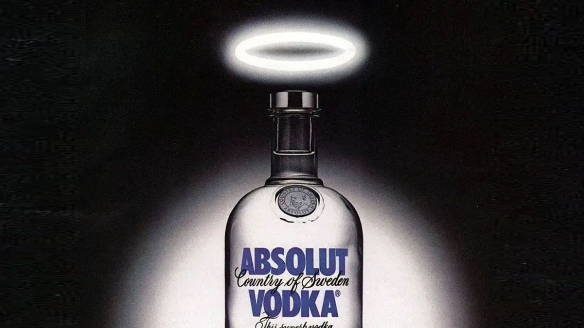
The Strategy: They ran the longest-running print campaign in history (over 25 years). Every ad featured the silhouette of the bottle as part of a visual pun. Absolut L.A. showed the bottle as a swimming pool. Absolut Brooklyn showed the bottle under the bridge.
The first line, Absolut Perfection, ran in 1981. Absolut archives record more than 1,500 variations across decades, a rare continuity in print.
Artist collaborations, including Andy Warhol in the mid-1980s, pushed the bottle into art culture rather than just advertising.
Why It Worked: It turned advertising into a game. Readers would look for the Absolut ad in magazines just to see the next iteration. It made the bottle an icon of pop culture. By the time the campaign ended, Absolut held 50% of the imported vodka market in the US.
7. De Beers – “A Diamond is Forever” (1947)
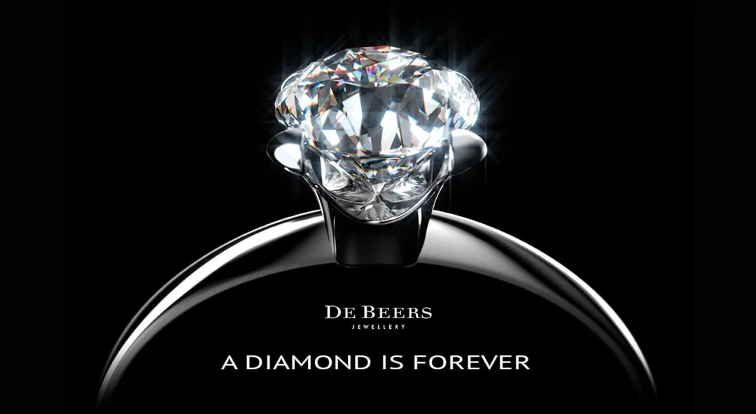
Agency: N.W. Ayer & Son
Copywriter Frances Gerety originated the line in 1947. It framed diamonds as emotional permanence rather than mineral hardness.
Ad Age named “A Diamond is Forever” the “Slogan of the Century” in 1999, reflecting its unmatched longevity.
This is arguably the most successful marketing scam (or triumph) in history. Before 1938, diamond engagement rings were not a standard tradition.
The Strategy: De Beers controlled the diamond supply, but demand was low. The ads didn't sell a specific ring; they sold the idea that the size of the diamond equated to the measure of a man's love. They even invented the “two months' salary” rule in their copy.
Why It Worked: They attached a physical product to an eternal emotion. A diamond is durable; therefore, your marriage will be durable. They engineered a social norm that persists to this day.
8. Nike – “Just Do It” (1988)
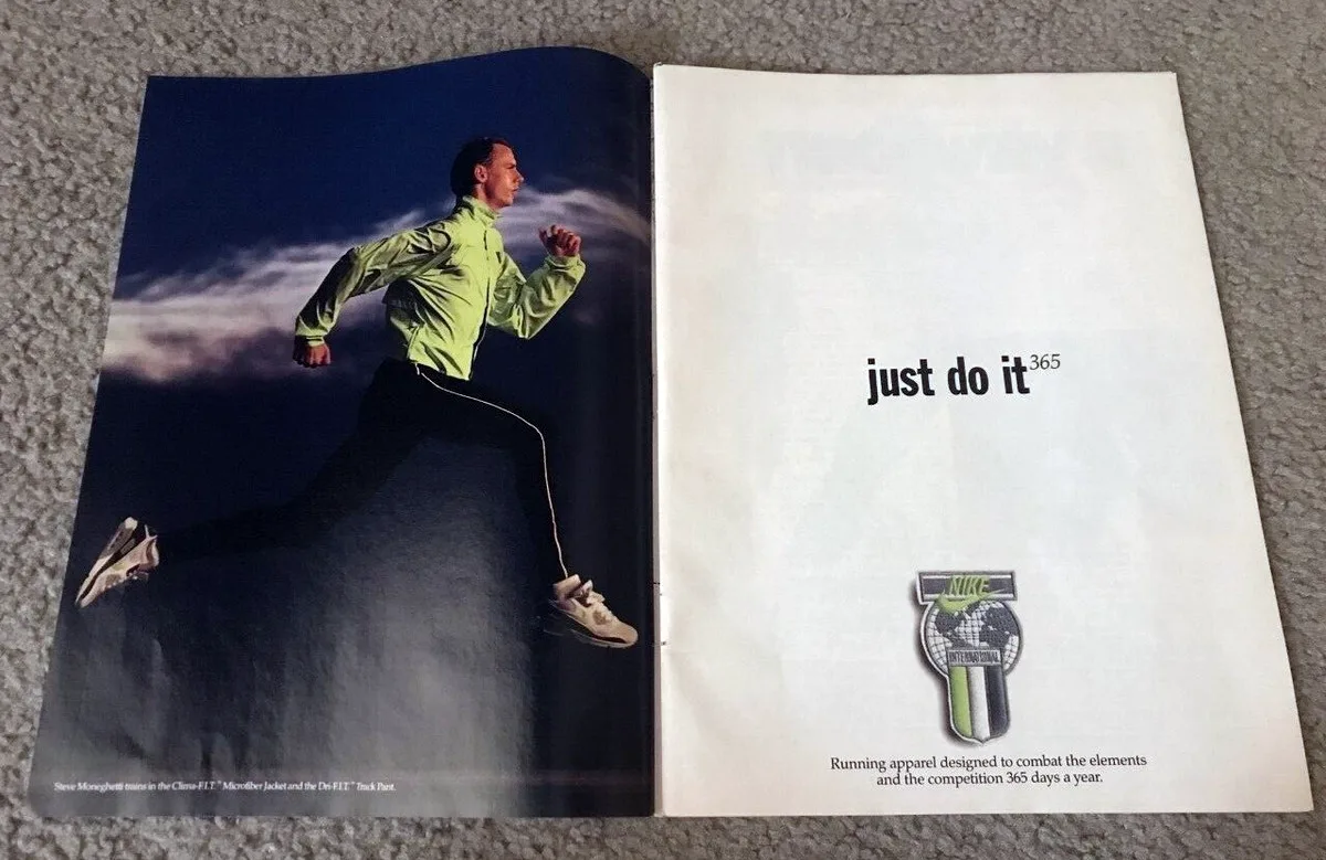
Agency: Wieden+Kennedy
We know the slogan, but the first print execution was crucial. Nike was losing to Reebok in the aerobics craze. They needed to recapture the grit of real sports.
The Strategy: The first “Just Do It” ad featured Walt Stack, an 80-year-old runner who ran 17 miles every morning. The copy explained he kept his teeth from chattering by leaving them in his locker.
Why It Worked: It wasn't about elite athletes (at first). It was about anyone, of any age, overcoming resistance. It democratised fitness. The slogan itself is a command, not a suggestion. It eliminates the internal debate about whether to work out.
Industry reporting through the late 1990s, including Ad Age coverage, placed Nike’s U.S. athletic-shoe share climbing from about 18 per cent in 1988 to over 40 per cent by decade’s end.
The line became a company-wide platform, not a seasonal ad slogan.
9. LEGO – “Imagine” (2006)
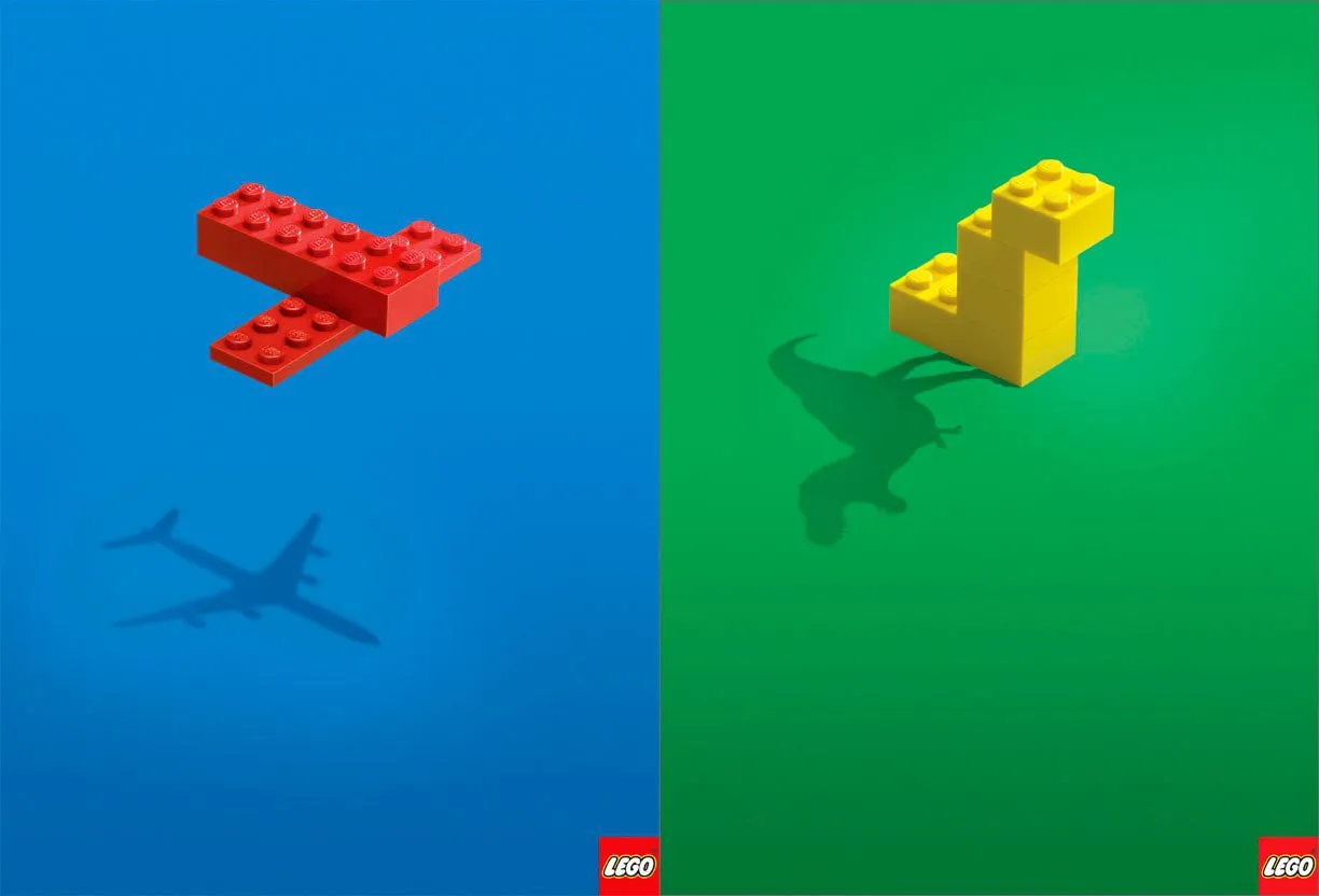
Agency: Blattner Brunner
LEGO has a unique problem: its product is just plastic bricks. The value is entirely in the child's mind.
The Strategy: The ad is minimalist. It shows a simple construction of blue and white LEGO bricks. But the shadow cast by the bricks forms the silhouette of a fighter jet.
Why It Worked: It perfectly visualised the brand promise. To the naked eye, it’s a brick. To a child (and the imagination), it’s a jet. It respected the audience's intelligence by requiring them to connect the object to the shadow.
10. Porsche – “Nobody’s Perfect” (1983)
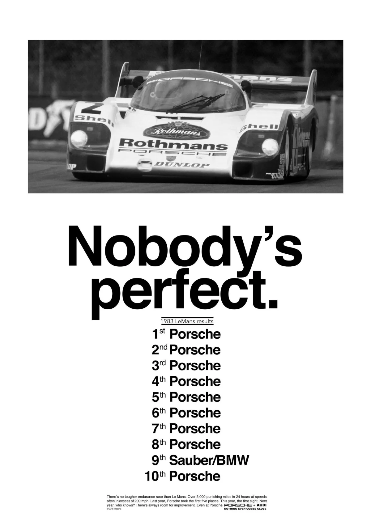
Agency: Fallon McElligott
Porsche had dominated the 24 Hours of Le Mans for years. How do you brag without being annoying?
The Strategy: The ad shows the race results.
- Porsche
- Porsche
- Porsche
- Porsche
- Porsche
- Porsche
- Porsche
- Porsche
- Sauber/BMW
- Porsche
The ad references the 1983 24 Hours of Le Mans classification. Porsche 956 entries finished 1 through 8, Sauber BMW took 9th, and Porsche returned in 10th.
The Automobile Club de l’Ouest records support the result, which makes the gag land.
The headline: “Nobody's Perfect.”
Why It Worked: It’s arrogant, yes, but it’s backed by undeniable data. The humour comes from the fact that they took 9 out of the top 10 spots, and are “apologising” for missing one. It’s the ultimate flex.
11. FedEx – “Neighbours” (Unknown Date)

Agency: DDB Brazil
The print series ran in 2009. Executions juxtaposed peeling paint to place distant countries side by side, including Brazil and Australia, and the USA and Canada.
The set dramatised proximity without copy, a pure visual route for speed and reach.
FedEx needs to communicate speed. Saying “we are fast” is boring.
The Strategy: A visual map of the world (or a continent). But the map is painted on a wall where the paint is peeling. Through the peeling paint of Brazil, you can see the layer underneath is Australia. The two countries are visually touching.
Why It Worked: It visualised the concept that FedEx makes the world smaller. It makes passing a package from one continent to another as easy as passing it through a window to a neighbour. No copy needed.
12. Marmite – “Love it or Hate it” (1990s-Present)
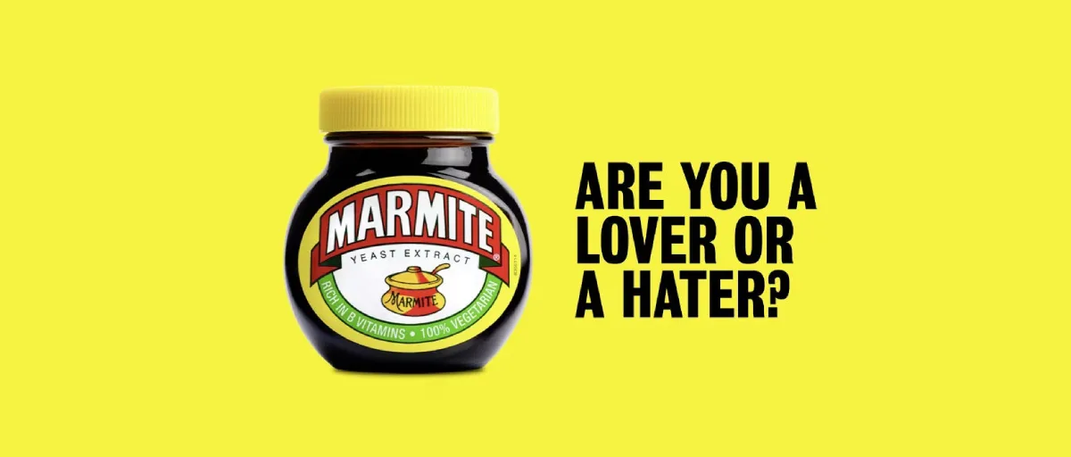
Agency: Adam & Eve/DDB
Marmite is a yeast extract with a very strong, salty taste. Many people despise it.
The Strategy: Instead of trying to convince haters to try it, they validated the hate. They launched “Marmite Neglect” campaigns and ads acknowledging the divisiveness.
“Love it or hate it” launched in the UK in 1996 and has run across TV, print, and outdoor since.
The line is now a cultural shorthand, a brand asset with understanding beyond category.
Why It Worked: It strengthened the bond with the lovers. If you love Marmite, you are part of a special club. By alienating 50% of the population, they secured the loyalty of the other 50% for life. This is a brave strategy that most brand identity services would be too scared to suggest, but it works.
13. World Wildlife Fund (WWF) – “Horrifying/More Horrifying” (2008)
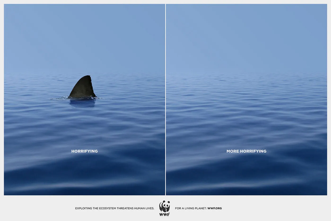
Agency: DDB Turkey
Charity ads often use guilt. WWF used perspective.
The Strategy: Left side: An image of a shark fin circling a swimmer. Caption: “Horrifying.” Right side: An image of just the ocean, no shark. Caption: “More Horrifying.”
Why It Worked: It flips the script. We are biologically wired to fear predators. The ad uses that fear, then intellectually trumps it with the existential fear of ecosystem collapse. It makes the shark's extinction scarier than the shark itself.
14. Heinz – “No One Grows Ketchup Like Heinz” (2007)
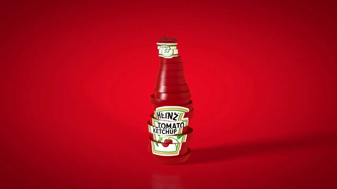
Agency: Leo Burnett
In an era where processed food was becoming the enemy, Heinz needed to prove that its products were natural.
The Strategy: A bottle of Heinz ketchup, but instead of glass, the bottle is formed by sliced tomatoes stacked on top of each other.
Why It Worked: Visual metaphor. It communicates “we are just tomatoes” without a paragraph of text explaining their sourcing policy. It’s fresh, clean, and instantly understandable.
15. Got Milk? – “Aaron Burr” (1993)
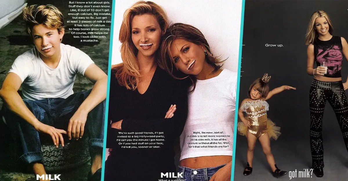
Agency: Goodby, Silverstein & Partners
This campaign started with TV, but the print execution was vital. Milk consumption was dropping. People took it for granted.
The Strategy: The “Deprivation Strategy.” They didn't show people enjoying milk. They showed people suffering without it, eating a peanut butter sandwich or a dry cookie and having nothing to wash it down.
Why It Worked: It targeted the moment of need. You don't think about milk until you run out. The campaign boosted milk sales in California for the first time in a decade.
The California Milk Processor Board created the line in 1993. MilkPEP licensed “Got Milk?” nationally from 1995, taking the idea into nationwide print and promotions.
State-born thinking scaled into a U.S. platform.
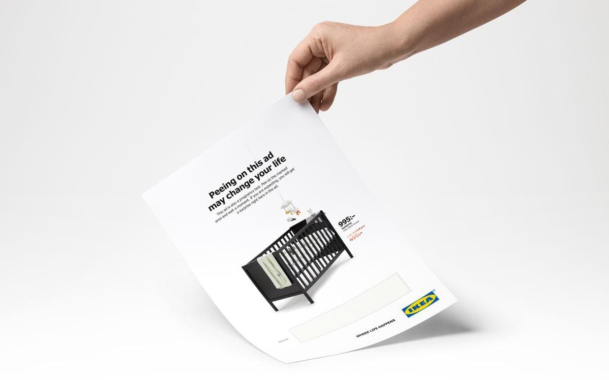
16. IKEA – “Pee on this Ad” (2018)
Agency: Åkestam Holst
This is the most interactive print ad on the list.
The Strategy: IKEA ran an ad for a crib in a women's magazine. The paper contained pregnancy test technology. If the reader peed on the marked area and was pregnant, the ad revealed a discount code (in red) for the crib.
The ad appeared in the Swedish women’s magazine Amelia in January 2018. The printed area used hCG detection chemistry, the same basis as a pregnancy test.
A positive result revealed a discount for expecting parents. Print became a trigger, not a poster.
Why It Worked: It was weird, gross, and technically brilliant. It generated millions in free PR. It proved that print can be a technological medium, not just a static image.
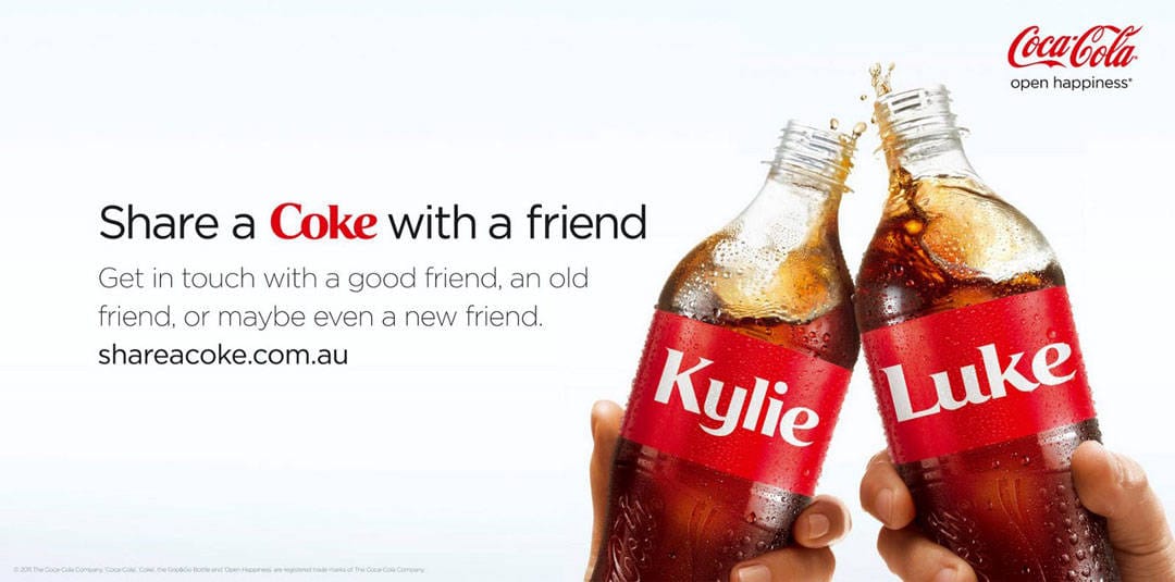
17. Coca-Cola – “Share a Coke” (2011)
Agency: Ogilvy (Australia origin)
Coke is a giant, faceless corporation. They needed to get personal.
The Strategy: They removed their own logo from the bottles and replaced it with the names of the 150 most popular people in the country. The print ads simply featured the bottles, labelled with names like “Mate,” “Dad,” or “Sarah.”
The project started in Australia in 2011 with 150 local names and has since scaled worldwide.
The U.S. rollout arrived in 2014. Markets localised names like “Mate” and “Mum” to match the vernacular.
Why It Worked: Narcissism. People love seeing their own name. It turned a mass-produced product into a personalised gift. It encouraged User-Generated Content (UGC) before it was even a buzzword.
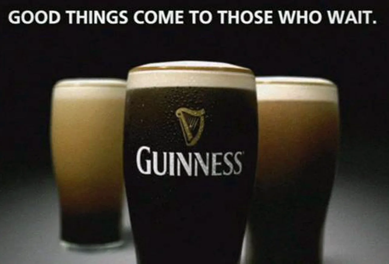
18. Guinness – “Good things come to those who wait” (1990s)
Agency: AMV BBDO
Pouring a Guinness takes 119.5 seconds. In a fast-paced world, this was a product defect.
The Strategy: They framed the wait as a virtue. The print ads featured surreal imagery (such as the Toucan in earlier decades or surfers waiting for the perfect wave), reinforcing the idea of patience.
AMV BBDO launched the platform in the UK and Ireland in 1998. The flagship “Surfer” film anchored the thought.
Print executions carried the same patience motif, strengthening the ritual of the pour.
Why It Worked: It gave the consumer permission to slow down. The “defect” became a ritual. It positioned Guinness as a drink for the mature, thoughtful person, distinct from the lager louts downing pints in seconds.
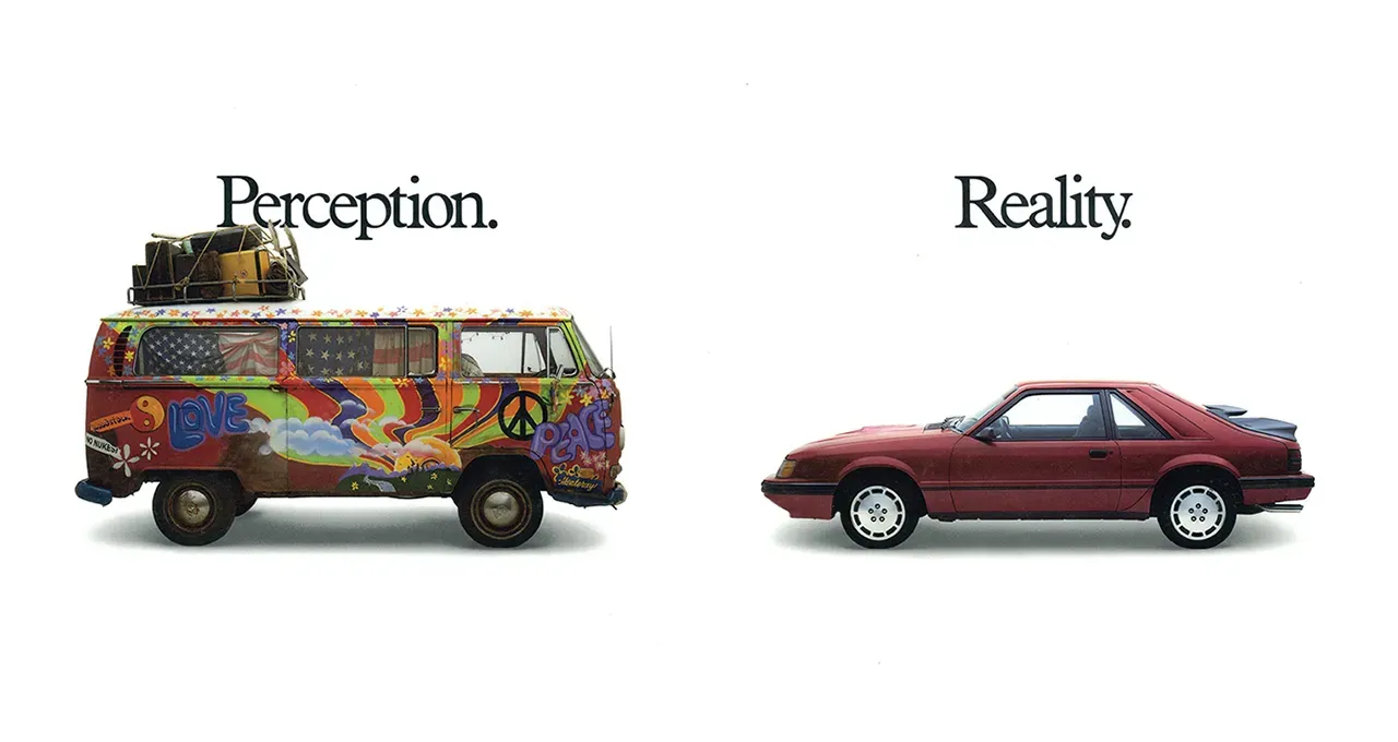
19. Rolling Stone – “Perception vs. Reality” (1985)
Agency: Fallon McElligott
Advertisers thought Rolling Stone readers were broke, hippie types. The magazine needed to prove that its readers had grown up and had money (i.e., yuppies).
The Strategy: Left page (Perception): A visual of a hippie, or a VW bus. Right page (Reality): A visual of a yuppie, or a sports car.
This was a B2B effort aimed at media buyers and planners. The ads ran in trade and business contexts to correct audience myths.
It was not aimed at readers; it was aimed at budgets.
Why It Worked: It directly addressed the media buyers' prejudices. It used data visualisation cleverly to change the B2B narrative. Ad pages skyrocketed after this campaign.
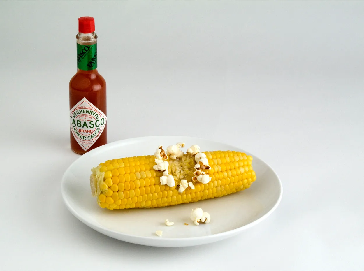
20. Tabasco – “Exploding Corn” (Unknown Date)
Agency: Duval Guillaume
How do you show heat in a static image?
The Strategy: A cob of corn. One single kernel has a drop of Tabasco on it. That specific kernel has popped into a kernel of popcorn.
Why It Worked: Hyperbole done right. It visualises the product's potency. You don't need to consult a Scoville chart to know this sauce is hot.
Why Most SMB Ads Fail
I have audited hundreds of businesses, and when they show me their print ads, I usually see the same three mistakes.
1. The “Make the Logo Bigger” Syndrome. Business owners love their logo. Nobody else does. Your logo is not the hook; it is the signature. In the VW ad, the logo is tiny. In the “Got Milk?” ads, the logo is often just text. Prioritise the message, not the vanity.
2. Fear of White Space There is a temptation to fill every inch of the paper because you “paid for it.” This is a false economy. White space is not empty space; it is an active design element that guides the eye. If you cram your ad with text, the eye doesn't know where to land, and the brain skips it entirely.
3. Weak Calls to Action (CTA) “Visit our website” is weak. “Call for a Quote” is generic. The best ads give a specific reason to act now. Even brand ads like De Beers created a specific action (“Buy a ring”).
4. No unique tracking. If you cannot attribute, you cannot improve. Use campaign-specific phone numbers, vanity URLs with UTM parameters, and QR codes that resolve to dedicated landing pages.
Wrong way | Right way |
|---|---|
One phone number for all ads | Unique call tracking number per placement |
Generic homepage URL | Vanity URL with UTM tags to a matched page |
QR code to homepage | QR code to offer a page with a timed incentive |
I once audited a local service brand that “knew” print did nothing. Unique numbers proved that 27 per cent of monthly leads were from one free community title. Spend was reallocated the same week.
If you are struggling to distil your message, you likely need a fresh pair of eyes on your strategy. You can request a quote for a brand audit, and we can determine if your visuals are working for you or against you.
The State of Print in 2026: The “Tactile” Rebellion
Is print dead? No. It has just become premium.
As AI generates millions of blog posts and images daily, the internet is becoming a repository of low-quality content. In this environment, a high-quality, physical print piece—whether a direct mailer on heavy cardstock or a full-page magazine ad—signals legitimacy.
We are seeing a trend toward programmatic print. This is where digital data triggers the physical mailing of documents. If a customer abandons a digital cart, 48 hours later, a high-quality postcard arrives at their house with a picture of the item and a QR code.
Direct answer: Programmatic print is the automated sending of personalised physical mail, triggered by digital behaviours like basket abandonment or churn risk. It uses APIs to pass data to print partners, who produce and mail within defined windows, often 24 to 72 hours.
- Triggers include abandoned baskets, lapsed subscriptions, or high-intent browsing.
- Personalisation covers imagery, copy, offer value, and QR code destinations.
- Attribution uses vanity URLs, QR codes, and call tracking that map to the trigger.
A standard flow looks like this. A customer abandons a cart, an event fires in your CDP or analytics, a workflow calls a print API, and a postcard with the SKU image, price, and a time-bound code is dispatched.
Vendors support SLA windows for print and delivery. That keeps the message fresh enough to act while the intent is warm.
“Print cannot be measured” is outdated. JICMAIL and postal operators provide mail interaction data, and your own QR and call tracking close the loop. In our fieldwork, brands that added QR codes with timed offers saw scan rates jump compared with static URLs in like-for-like formats.
For GDPR compliance, pass only the minimum data needed to produce the piece. Suppression lists must be maintained, just as with email. The same rigour you use for CRM should govern address hygiene and opt-outs.
According to data from Lockhart, physical ads trigger more emotional processing in the brain than digital ads, leading to improved memory recall. In 2026, print is not for mass awareness; it is for high-value conversion and retention.
The Verdict
The common thread across these 20 examples is bravery.
Volkswagen was brave enough to call its car ugly. Avis was brave enough to admit they were second. Dove was brave enough to show real bodies.
Safe advertising is invisible advertising. If you want your brand to be remembered, you have to risk being noticed. You don't need a Super Bowl budget to apply these principles. You need clarity, a single-minded proposition, and respect for your customers' intelligence.
Do not shout. Do not clutter. Just say one true thing, beautifully.
Would you like me to audit your current advertising assets to see which of these 20 principles you are missing?
Frequently Asked Questions (FAQ)
Why are print ads still effective in the digital age?
Print ads offer a tactile experience that engages memory centres in the brain more effectively than digital screens. They also suffer less from banner blindness and signal a brand's legitimacy and financial stability, building trust with high-value consumers.
What is the most important element of a print ad?
The Single-Minded Proposition (SMP). The most successful ads convey a single, clear message or benefit. Trying to say too much dilutes the impact. Visual hierarchy and a strong stop factor (such as a headline or image) are secondary but essential to delivering that message.
How much white space should a print ad have?
There is no fixed percentage, but luxury and high-end brands typically use more white space (negative space). White space guides the eye to the key message and prevents cognitive overload. Crowded ads are associated with discount or low-budget offerings.
What is the Z-Pattern layout in advertising?
The Z-Pattern describes how a reader's eye naturally scans a page, starting at the top-left (Headline), moving across to the top-right, cutting diagonally down to the bottom-left, and finishing at the bottom-right (Call to Action or Logo). Effective layouts follow this natural path.
How can small businesses emulate big brand print ads?
Small businesses should focus on positioning rather than budget. Like Avis, find your weakness and frame it as a strength. Like the local plumber, use a simple visual metaphor to focus on clarity and wit rather than expensive photography or celebrity endorsements.
Are QR codes in print ads effective?
Yes, if used correctly. Modern QR codes bridge the gap between the offline and online worlds. However, there must be a compelling reason to scan (e.g., an exclusive discount or a utility), not just a link to a homepage.
What is the difference between copy-led and visual-led ads?
Visual-led ads (like those from Absolut) use imagery to create a metaphor or evoke a mood. Copy-led ads (such as those from The Economist or VW) use text to engage the reader's intellect. The choice depends on whether your product's benefits are better explained or demonstrated.
How do I measure the ROI of a print ad?
Use trackable assets. Unique URLs (also known as vanity URLs), specific QR codes, or dedicated phone numbers enable you to track exactly how many leads originated from a specific print placement, much like digital tracking pixels.
What creates the Stop Factor in advertising?
The Stop Factor is created by breaking patterns. This can be achieved through high-contrast colours, shocking imagery, minimalist layouts in a cluttered magazine, or a headline that poses a provocative question or challenge to the reader.