25 Famous TV Show Logos and the Secrets to Their Success
We will dissect 25 famous TV show logos to expose the raw, strategic thinking behind them.
We’ll look at the good, the bad, and the ones that are only famous because they were attached to a cultural juggernaut.
The villain here is lazy design—the kind that’s chosen because it “looks nice.” The hero is strategic intent. A good logo isn’t a decoration; it’s a hard-working employee who should be communicating with you 24/7.
- The purpose of TV show logos: They must convey a show's essence visually within seconds to captivate viewers.
- Three core pillars of successful logos: Effective TV logos rely on typography, symbolism, and context to resonate with audiences.
- Typography defines brand tone: The right font imbues logos with personality, setting expectations about the show's nature.
- Symbols enhance storytelling: Clever symbols encapsulate core ideas, making logos memorable without overwhelming details.
- Design for your audience: Logos must align with genre expectations while offering a unique twist to stand out.
The One Thing Most People Miss About TV Show Logos
A TV show logo has a brutal, unforgiving job. It has about three seconds in a title sequence or a thumbnail on Netflix to sell you an entire story.
It has to scream “gritty crime drama,” “quirky sitcom,” or “epic fantasy” before a single line of dialogue is spoken.
It’s the ultimate test of communicative design.
These logos succeed or fail based on three core pillars:
- Typography as Voice: The font choice instantly sets the tone.
- Symbolism as Shortcut: A single clever image conveys a complex idea.
- Context as Genre: The design fits its specific audience and category.
Let’s break down the real lessons.
Lesson 1: Your Typography Is Your Tone of Voice (Don’t Just Pick a Font)
People say, “It’s just a font.” That’s like saying a Savile Row suit is “just thread.”
Typography is 90% of a logo’s personality. It’s the tone of voice, the accent, the volume. It’s not about finding a pretty font but choosing the right voice.
Friends (1994): The Power of Simple & Quirky
The Friends wordmark is deceptively simple. It’s a clean, legible, hand-drawn-style font called “Gabriel Weiss’ Friends.”
The real genius is the six coloured dots between the letters. They represent the six main characters, the community, and the playful energy of the show. It feels like a conversation in a coffee shop.
Your logo doesn’t need to be complex to have personality. A simple wordmark with one unique twist can be incredibly effective.
Stranger Things (2016): Weaponised Nostalgia
Using the ITC Benguiat typeface, the Stranger Things logo is a masterclass in emotional targeting. The designers knew their audience grew up on 1980s Stephen King paperbacks.
This font choice isn’t a coincidence; it’s a direct, calculated trigger for a specific kind of nostalgia. The glowing red lines instantly transport you to a particular time, place, and feeling.
Understand the cultural signifiers that resonate with your audience. A well-chosen typeface can tap into a deep well of pre-existing emotion and trust.
Succession (2018): Cold, Corporate, and Uncaring
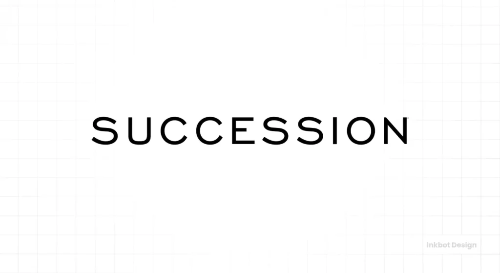
Look at this logo. The custom sans-serif typeface is tightly kerned, overly condensed, and imposing. The letters are crammed together, fighting for space.
It feels like a row of Manhattan skyscrapers squeezing out the sky—uncomfortable, mighty, and inhuman. It perfectly reflects the show’s theme of cut-throat family and corporate dynamics.
Your font should reflect your brand’s core personality, even if that personality is deliberately cold or uninviting. Honesty trumps friendliness every time.
Seinfeld (1989): Perfectly Awkward
The custom, angular typography with that slanted red ‘E’ is as off-kilter as the show’s humour. It breaks the rules of conventional design.
It’s slightly jarring and uneven, just like a conversation with Kramer. It refuses to be a standard, well-behaved logo.
Don’t be afraid to be unconventional if it authentically reflects your brand’s unique voice. A little bit of planned awkwardness can be very memorable.
Cheers (1982): Warm and Inviting
The Cheers logo, set in a custom script font reminiscent of vintage beer labels, epitomises warmth. It looks like the sign of a neighbourhood pub you’ve been going to for 20 years.
It feels familiar, comfortable, and welcoming. It’s a place where everybody knows your name.
Match your typography to the feeling you want to evoke in your customers. If you sell comfort, your logo should look comfortable.
Lesson 2: A Smart Symbol Is a Narrative Shortcut
Too many founders try to stuff their entire business plan into their logo. It’s a terrible idea. The best logos don’t tell the whole story; they hint at the most interesting part. A single, clever symbol communicates a core concept faster and more effectively than a paragraph of text.
Breaking Bad (2008): A Lesson in Chemistry
This is pure genius. The logo isolates two letters from the title, ‘Br’ and ‘Ba’, and presents them as elements from the periodic table—Bromine and Barium. It’s not a gimmick. It is a direct, intelligent link to the show’s central premise of chemistry. It’s a logo for people who are in on the secret.
Can you embed a core piece of your industry’s DNA directly into your logo? Find a symbol that your customers will instantly understand.
The Sopranos (1999): The Hidden Threat
At first glance, it’s just the family name. But the ‘r’ is replaced with a gun. This one small, symbolic act transforms the entire meaning. It speaks to the violence lurking just beneath the surface of a seemingly normal suburban family. It’s a constant, subtle threat.
A small, symbolic replacement within a wordmark can completely reframe its meaning and add powerful layers of depth.
Ozark (2017): The Omen Within
The ‘O’ in the Ozark logo is a container for four symbols that foreshadow the key plot points of each season. It’s a brilliant device that rewards dedicated fans who look closer.
The Z is also sectioned into four parts. The logo is a puzzle box, reflecting the show’s intricate plotting.
For brands with a sophisticated, detail-oriented audience, embedding “Easter eggs” or hidden meanings can create a powerful sense of community and engagement.
Mad Men (2007): The Falling Man
The silhouette of a man in a suit, falling. It’s evocative, perfectly period-appropriate, and tells a story of identity crisis, moral descent, and the hollow core of the advertising world. It’s so strong it works perfectly even without the show’s title.
A strong, simple silhouette can be one of the most memorable branding assets you can own. It’s instantly recognisable and transcends language.
The X-Files (1993): Owning the Unknown
The cracked, oversized ‘X’ in the logo is everything. ‘X’ marks the spot. ‘X’ represents the unknown variable. The ‘X-Files’ are the cases nobody else wants.
The logo takes the most crucial letter in the title and makes it the visual anchor for the entire brand. The faint ‘THE’ and ‘FILES’ are secondary.
Is there one letter or concept you can visually “own” in your business name? Turn it into your anchor.
Lesson 3: Context is King – Design for Your Genre
A logo doesn’t exist in a vacuum. An excellent logo for a children’s toy company would be a catastrophic failure for a hedge fund.
Famous logos are often renowned because they master the visual language of their genre, meeting audience expectations while offering a unique twist.
Star Trek (1966): The Sci-Fi Insignia
The Starfleet delta is more than a TV show logo; it’s an in-universe insignia. It’s clean, geometric, and felt futuristic in the 1960s—and it still does.
It has become a globally recognised icon for optimism and the future of science fiction itself.
Design a logo that could exist within the world of your product or service. This creates a powerful sense of authenticity.
Game of Thrones (2011): Epic and Ornate
The custom typography is metallic, sharp, and gothic. The extended crossbar on the ‘T’ evokes a sword, while the ‘O’ contains the three-headed dragon of the Targaryens.
The whole thing feels heavy, ancient, and important. It screams epic fantasy and war.
Simplicity is not the only rule. Don’t fear detail and texture if your brand concerns craftsmanship, luxury, or epic scale.
The Twilight Zone (1959): Disorienting and Unsettling
The various openings’ warped, fragmented, and spiralling text was designed to be psychologically unsettling. It created a sense of unease, disorientation, and the feeling that reality was breaking apart—the exact themes of the show.
Use visual distortion—stretching, breaking, or warping elements—to create specific psychological effects that align with your brand’s message.
The Crown (2016): Regal and Elegant
This is a textbook example of designing for a luxury context. The typeface is a refined, classic serif. It’s spaced beautifully. The clever element is the crown symbol literally breaking through the letters, signifying the immense, disruptive weight of the monarchy. It looks official and expensive.
Lean into the established visual language of your industry (e.g., finance, law, luxury) to build instant credibility and trust.
Westworld (2016): Minimalist and Mechanical
The logo features a hybrid of Leonardo da Vinci’s Vitruvian Man and a robotic host. It is a perfect visual metaphor for the show’s core conflict: the organic versus the artificial. Paired with a clean, minimalist, sans-serif font, it feels clinical, futuristic, and intelligent.
A logo representing duality—blending two opposing concepts into one symbol—can be compelling for hybrid businesses or brands at an intersection.
The “Great Show, Meh Logo” Principle (And Why It Matters)
Now for some brutal honesty. Some logos are famous simply because they were bolted onto a cultural phenomenon. Their success is a product of massive exposure, not brilliant design.
The Simpsons (1989): The handwritten scrawl is iconic, yes. But is it good design? It reflects the show’s chaotic energy, but by any traditional metric, it’s messy. Its fame is 100% tied to the show’s 30+ year dominance.
Lost (2004): The blurry, out-of-focus text flying toward the screen was intriguing for a mystery box show. But as a static logo, it’s weak, dated, and lacks substance. The concept carried it, not the execution.
The Office (US) (2005): This logo is intentionally mundane. It’s supposed to look like the boring letterhead of a mid-level paper company. So, it’s a success. Visually? It’s forgettable.
A revolutionary product or a billion-dollar marketing budget can make a mediocre logo famous. But you don’t have that luxury.
As a small business, your logo must work harder than your product. It has to be exceptional because it doesn’t have a hit show to back it up.
If your business is just starting, a well-designed logo is crucial. Our team specialises in creating visual identities that work. Check out our logo design services.
The Hall of Fame: Logos That Fire on All Cylinders
These are the ones that get it all right—great concept, perfect execution, and a timeless quality.
Doctor Who (Various): A masterclass in brand evolution. The logo has changed dozens of times, but almost always incorporates a sense of movement, time travel (like the TARDIS-shaped 2010 logo), or sci-fi iconography.
Ted Lasso (2020): Simple, optimistic, and uses a collegiate sports-style font. It feels like a genuine team crest—perfect execution for the show’s tone.
Twin Peaks (1990): The jagged green shape isn’t just a design flourish; it’s the mountain range from the show’s setting. It instantly evokes a sense of place, nature, and mystery—pure atmosphere.
Sherlock (2010): The modern, gritty wordmark with the “SHER” locked together is a clever visual pun on the name. It’s bright, contemporary, and confident.
The Mandalorian (2019): The typeface feels like a Spaghetti Western font that’s been put through a Star Wars filter. It perfectly communicates the show’s genre fusion in a single glance.
The Last of Us (2023): The show’s title is consumed by the fungal cordyceps infection. It’s not a symbol next to the text; it’s an idea happening to the text—brilliant visual storytelling.
What’s the Real Takeaway for Your Business?
Watching TV is entertainment. But analysing these logos is a business education. The patterns are clear and directly applicable to entrepreneurs or small business owners.
- Stop “picking fonts” and start choosing a voice. Ask what you want your brand to sound like, and find the typography to match.
- Find one clever idea, not ten. A great logo is built on a single, strong, simple concept executed perfectly.
- Design for your customer’s world. Your logo should feel at home in your industry and speak directly to the audience you want to attract.
- A great logo is a tool, not a decoration. It should be working to communicate your value, establish your personality, and build recognition daily.
Thinking this critically about logos separates a forgettable brand from a memorable one. These billion-dollar shows have massive cultural momentum on their side. Your business doesn’t.
Your visual identity must be more intelligent, focused, and work harder.
If your current logo isn’t working this hard for you, it might be time for a reassessment. Explore the principles we use for our clients in our logo design portfolio or request a quote to start a conversation with us at Inkbot Design.
Frequently Asked Questions (FAQs)
What makes a TV show logo iconic?
An iconic TV show logo effectively communicates the show’s genre, tone, and core concept in a simple, memorable, and unique visual. The show’s popularity amplifies its success, but the foundation is always a strong design strategy.
How does typography affect a logo’s message?
Typography acts as the brand’s tone of voice. A sharp, gothic font like Game of Thrones conveys seriousness and history, while a quirky, rounded font like Friends suggests lightheartedness and community. The choice of typeface is one of the most critical decisions in logo design.
Why is simplicity essential in logo design?
Simplicity makes a logo easy to recognise, remember, and reproduce across various sizes and media. Simple logos like the Mad Men silhouette or The X-Files‘ X are instantly identifiable even at a small scale on a streaming app.
Can a logo be successful if it’s complicated?
While simplicity is usually preferred, a more complex logo can work if the target audience appreciates detail and the brand is about craftsmanship or intricacy. The Ozark logo is a good example; its complexity rewards fans who look closer.
What is the difference between a wordmark and a symbol?
A wordmark (or logotype) is a logo that consists only of the company or show’s name set in a specific typeface (e.g., Friends, Stranger Things). A symbol (or logomark) is an image or icon without any text (e.g., the Starfleet insignia from Star Trek).
How much should a small business invest in a logo?
A logo is a core strategic asset, not just an expense. The investment should reflect its importance in establishing your brand identity. For a small business, a professional logo is critical to your long-term recognition and credibility.
Should my logo tell a story?
Your logo shouldn’t try to tell your entire story, but should hint at the most crucial part. The Breaking Bad logo hints at chemistry, and The Sopranos logo hints at hidden violence. It’s a narrative shortcut, not the whole book.
What was the primary design trend in the Stranger Things logo?
The Stranger Things logo is a prime example of weaponised nostalgia. It uses the ITC Benguiat font, popular in the 1980s and heavily associated with Stephen King book covers, to instantly evoke the feeling of that era.
What is a “conceptual” logo?
A conceptual logo is built around a clever idea or visual metaphor rather than being purely decorative. The Breaking Bad logo, which uses periodic table elements, is a perfect example of a conceptual logo.
How often should a brand update its logo?
A logo should only be updated when there’s a strategic reason, such as a significant shift in business direction, a need to modernise, or the current logo no longer represents the brand effectively. A timeless design, however, can last for decades with minimal changes.
Why is the Mad Men logo considered so adequate?
The Mad Men logo is effective because its simple silhouette of a falling man perfectly encapsulates the show’s central themes of identity crisis, moral ambiguity, and the superficiality of the advertising world. It’s evocative, stylish, and tells a story.
Does a successful show automatically have a good logo?
No. As seen with shows like The Simpsons or Lost, a show’s massive popularity and marketing budget can make a mediocre logo famous. However, this doesn’t make it a well-designed logo strategically.

