Triangle Symbolism in Logo Design: Tips and Examples
Ever wondered why so many brands reach for the triangle? The easy answer is that it looks ‘dynamic’ or ‘strong’.
That’s what most people say. And it’s a lazy, incomplete answer.
The truth is, a triangle is one of the most misused shapes in the logo design playbook.
Using one without understanding its raw, double-edged psychology is like handing a toddler a scalpel. You might get a precise cut, but you’re far more likely to make a bloody mess.
Let’s cut through the hype.
- Triangles symbolize duality: they can represent stability when upright and danger when inverted, influencing brand messaging significantly.
- Overused upward triangles in logos can lead to generic, unoriginal branding; meaningful design should stem from brand identity.
- Understanding triangle psychology is crucial; sharp points attract attention but can evoke contrasting feelings of energy and risk.
So, You Think a Triangle Just Means ‘Strength’? Think Again.

Let’s get one thing straight before we talk about pyramids and arrows. Your brain is wired for survival. It’s a primitive machine that makes snap judgments.
The Brain’s Reaction: It’s Simpler Than You Think
Why do triangles grab our attention? It’s not magic. It’s because they have sharp points.
Sharp points can be dangerous—a tooth, a thorn, a shard of glass. Your subconscious brain registers a point as something to be aware of.
It’s a primal signal to pay attention. That’s it. That’s the foundation of all triangle symbolism. It puts the viewer on a low level of alert.
Triangles feel more energetic and aggressive than a calming, safe circle or a stable, passive square. They demand a flicker of extra mental processing.
The Duality: Stability vs. Danger
Here’s the rub: that attention-grabbing point can mean two opposite things.
- Stability: A triangle is the most stable shape when resting on a flat base. Think of a pyramid. You can’t knock it over easily. It represents grounded strength.
- Danger: When balanced on a point, it’s the most unstable. It creates tension. It feels risky, precarious, and ready to fall or move.
Your job as a business owner isn’t to pick ‘triangle’. It’s to decide which of these feelings—or something in between—you want to evoke. And most people don’t even consider the second one.
The Upward-Pointing Triangle: The Obvious (and Overused) Choice
This is the default setting. The triangle is at its most basic. It sits on its flat base, pointing to the sky. It’s the go-to for anyone wanting to look powerful.
The Mountain & The Pyramid: Stability and Power
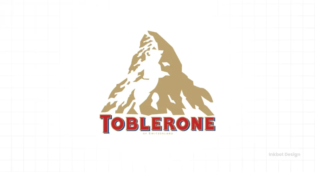
This orientation screams stability. It’s a mountain. It’s a pyramid. It’s an ancient symbol of hierarchy, strength, and permanence. This shape has communicated a clear message for thousands of years: “We are solid. We are powerful. We are at the top.”
This makes it an obvious fit for construction, law, and high finance industries. It conveys a sense of immovable authority.
The Arrow: Growth and Ambition
Flip the psychology slightly, and the upward triangle becomes an arrow. It points up. Towards goals. Towards growth. Towards heaven.
This is the interpretation that tech startups, crypto bros, and life coaches have latched onto with the tenacity of a bulldog. They want to show progress, ascension, and achievement. The upward arrow is the simplest visual shorthand for that.
Why Your ‘Growth’ Triangle is Probably Boring
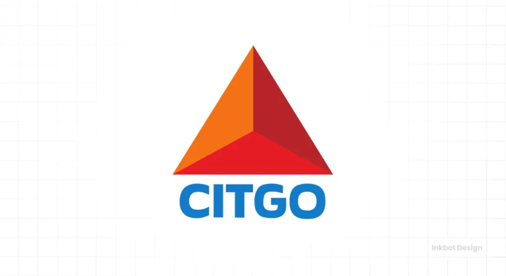
Here’s my first pet peeve. The upward-pointing ‘growth’ triangle has become a monstrous cliché. It’s the design equivalent of using a lightbulb icon for ‘ideas’.
I once sat with a fintech founder who proudly showed me his new logo—a sharp, minimalist triangle pointing upwards. I told him it looked identical to a dozen other fintech logos and a stock icon you could buy for a fiver. He wasn’t happy, but it was the truth.
Unless your execution is exceptionally clever or you have a rock-solid conceptual reason, a simple upward triangle for your ‘growth’ company just makes you look unoriginal. It shows you followed a trend, you didn’t forge an identity.
The Inverted Triangle: Risk, Focus, and That ‘Feminine’ Cliché
Now we flip it. Point down. This is where things get interesting, and where most of the pseudo-intellectual waffle comes in.

Let’s Get This Out of the Way: The Feminine Angle
Yes, the inverted triangle is often associated with the ‘feminine’. It symbolises a vessel, a chalice, or the womb. In many spiritual and historical contexts, this holds. It represents receptivity, water, and grace.
Frankly, leaning on this interpretation is often a weak and outdated strategy unless you’re running a yoga studio or a feminine wellness brand.
It’s a vast oversimplification. The inverted triangle has far more potent and practical meanings in a modern business.
The Real Power: Instability, Risk, and Tension
Remember the brain science? A triangle balanced on its apex is unstable. It’s precarious. It could tip over any second.
This isn’t a bad thing.
This visual tension can communicate risk, disruption, and edginess. Brands that want to be seen as daring, rule-breaking, or on the bleeding edge can use an inverted triangle to create a deliberate sense of unease and excitement. It’s a power move, suggesting a brand comfortable with instability.
The Funnel: A Symbol of Focus and Action
Forget the feminine clichés and look at the inverted triangle practically. What does it look like?
A funnel. Or a target.
It directs the eye downwards to a single point. This makes it a powerful symbol for brands about conversion, focus, filtering, or drilling down to a specific result.
Think of a marketing agency that funnels leads, a data company that pinpoints insights, or any process that takes a wide set of inputs and delivers a singular, focused output.
With its sideways triangle, the Google Play logo subtly hints at this ‘action’ point, but the principle is the same. The shape guides the eye and implies a result.
Sideways & Asymmetrical: Triangles That Break the Mould
Of course, a triangle doesn’t have to point straight up or down. The moment you turn it, you change the story.
The ‘Play Button’ Effect: Progression and Momentum
A triangle pointing to the right is universally understood as ‘Play’. It means ‘Go’. It means ‘Start’. It implies forward motion, progression, and initiative.
This is perfect for media companies, logistics firms, or any brand that wants to move forward. Delta Air Lines is a masterclass in this.

Their logo isn’t just a triangle; it represents a delta wing, pointing forward. It’s a symbol of both their name and their purpose: forward movement. It’s brilliant because it’s not trying to be abstractly clever; it’s directly relevant.
Off-Kilter & Scalene: Engineering a Feeling of Disruption
Then you have the wildcards. Scalene triangles (all sides of different lengths) and asymmetrical compositions. These are inherently unbalanced and chaotic.
They create visual friction. They feel jarring and unpredictable. For a mainstream bank, this would be a disaster.
But this engineered chaos is the whole point for a streetwear brand like Palace Skateboards, a punk rock band, or a disruptive tech firm aiming to shatter the status quo. It signals that you don’t play by the established rules.

Real-World Examples: When Triangles Work
Theory is cheap. Let’s look at who gets it right.
The Masters of Meaning: Adidas & Delta
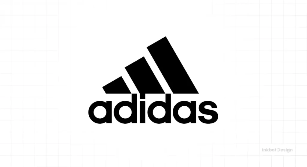
Adidas is the king. The three stripes are iconic, but they aren’t just a shape when arranged as a triangle. They form a mountain.
It’s a visual metaphor for the challenges athletes overcome. The logo tells a story of performance and achievement. It’s not a triangle for the sake of it; the triangle is the message.
As mentioned, Delta does the same. The triangle is a wing. It points forward. It’s their name and their mission in one clean shape. The context is perfect.
The Pragmatists: Caterpillar (CAT) & Mitsubishi
These brands use triangles with brutal, industrial simplicity. The yellow triangle in the CAT logo is simple, bold, and feels like construction equipment. It’s a symbol of strength, but not in an abstract ‘growth’ way—in a “we build heavy machinery” way.
Mitsubishi’s three diamonds (a composition of triangles) have a story rooted in family crests. The result is a mark that feels incredibly stable, engineered, and reliable. Perfect for a company making everything from cars to air conditioners.
The Deceptively Simple: Google Drive
The Google Drive logo is a fantastic modern example.
It’s a triangle made of three interlocking strips of colour. It’s not just one triangle; it’s three distinct parts (Docs, Sheets, Slides) coming together to form a cohesive, stable whole.
The shape directly communicates the product’s function: interconnected storage and collaboration. The symbolism serves the idea, not the other way around.
The Single Biggest Mistake You’re Making with Triangle Logos
After seeing hundreds of brand pitches, the mistake is always the same. It boils down to one thing.
Context is King
Brands fail when they pick the shape first, then try to build meaning onto it later. “We want to look dynamic, so let’s use a triangle.” That’s backwards. It leads to generic, soulless marks.
The triangle must emerge from your brand’s core idea.
- Is your brand about overcoming a challenge? The Adidas mountain makes sense.
- Is your brand about forward movement? The Delta wing makes sense.
- Is your brand about interlocking parts? The Google Drive shape makes sense.
You’re just decorating if you can’t draw a direct, simple line from the triangle back to your core business proposition.
A Shape is Not an Idea
Your logo’s job is to be a vessel for your brand’s reputation. A simple shape can do that, but only if a clear idea backs it.
Without that idea, the Adidas logo is just three bars. Without it, the CAT logo would have just been in a yellow shape.
Don’t start with the shape. Start with the story. What is the most critical thing you need to communicate?
If the answer naturally leads to a pyramid, an arrow, or a funnel, then you have your direction. If not, forcing a triangle into your logo will make it weaker, not stronger.
So, Should Your Logo Be a Triangle? (A Quick Gut Check)
Ask yourself these questions before you brief a designer or fall in love with a pointy shape. Be brutally honest.
- Is it Relevant? Does the meaning of a triangle (stability, risk, direction) have a direct, non-cheesy connection to what you do?
- Is it Overused in My Industry? If you’re in finance or tech, will an upward triangle make you blend in? Be honest. Look at your competitors.
- What Am I Trying to Say? Write down the one-sentence message for your logo. Does a triangle genuinely help tell that story, or does it feel tacked on?
- Is It Just a Decoration? Are you choosing it because it “looks cool” or “feels modern”? That’s the fastest path to a meaningless logo.
If you can’t answer these confidently, step away from the triangle. It’s not the right tool for the job.
The triangle is a powerful symbol. It’s primal, direct, and packed with meaning. But it’s not a shortcut to a great brand identity.
It’s a high-impact tool that, in the wrong hands, creates more noise than signal. Use it with purpose, or don’t use it at all.
Let’s Be Clear
The real work is sorting through these symbols to build a coherent brand identity. It’s about strategy, not just aesthetics.
You might find our other blog posts helpful if you’re tired of generic advice and want to see how this thinking applies in the real world.
You know what to do if you want this level of direct thinking applied to your brand. Our logo design services are built on this no-nonsense approach. Get in touch for a quote when you’re ready to make a logo with a backbone.
Triangle Symbolism in Logo Design (FAQs)
What is the primary meaning of a triangle in a logo?
There’s no single meaning. An upward-pointing triangle typically symbolises stability, power, and growth. An inverted (upside-down) triangle often represents risk, tension, or focus (like a funnel). A sideways triangle usually implies forward movement or action, like a “play” button.
Is a triangle a good choice for my business logo?
It can be, but only if its symbolism directly relates to your brand’s core message and isn’t a cliché in your industry. For example, a construction company (stability) triangle makes sense, but a generic upward-pointing triangle for a “growth” startup can look unoriginal.
What does an upside-down triangle symbolise?
While traditionally linked to feminine energy, it more powerfully conveys risk, edginess, and instability in modern design. It can also represent a funnel, symbolising filtering, focusing, or conversion processes.
Why do so many tech and finance companies use triangles?
They often use the upward-pointing triangle as a simple visual shorthand for “growth,” “upward mobility,” and “peak performance.” While effective, this has become so common that it risks making a brand look generic rather than innovative.
What is the psychology behind triangle logos?
The human brain is wired to pay attention to sharp points as potential threats. This gives triangles an inherent energy and dynamism that circles or squares lack. They command attention and can create feelings of strength, tension, or direction depending on their orientation.
What’s the difference between an equilateral and a scalene triangle in a logo?
An equilateral triangle (all sides equal) looks balanced, stable, and harmonious. A scalene triangle (all sides different) looks dynamic, chaotic, and unbalanced. Brands use scalene triangles to appear disruptive or unconventional.
Can a triangle logo look friendly?
It’s difficult, as sharp angles are inherently more aggressive than soft curves. To make a triangle logo look friendlier, designers often round the corners, use bright and welcoming colours, or combine it with friendlier typography.
Do triangles always represent masculinity?
No. The upward-pointing triangle is often seen as a masculine symbol (strength, power), while the inverted one is traditionally feminine. However, these are archetypes, not rules. In modern branding, the context and strategic intent behind the shape are far more critical than these traditional gender associations.
What is a famous logo that uses a triangle well?
The Adidas logo is a prime example. Its three stripes form a triangle that looks like a mountain, perfectly symbolising the challenges and achievements of athletes. The shape tells a story directly related to the brand’s purpose.
What is the biggest mistake to avoid with a triangle logo?
The biggest mistake is choosing the shape because it “looks cool” without a strong, strategic reason. A shape is not an idea. Your logo must be rooted in your brand’s core message. If the triangle doesn’t support that message, it’s a meaningless decoration.
How does colour affect the meaning of a triangle logo?
Colour dramatically impacts any logo’s meaning. A red triangle might feel like a warning sign or convey passion and energy. A blue triangle could feel more stable, corporate, and trustworthy. A green one might suggest growth or environmental focus. The colour works in tandem with the shape to create the overall impression.
Can I combine a triangle with other shapes in my logo?
Absolutely. Many great logos combine shapes. For instance, placing a triangle inside a circle can soften its aggressive feel, suggesting “contained dynamism” or “secure innovation.” The interaction between shapes creates a more nuanced meaning.
