Tango’s New Look: Why Carlsberg Britvic is Betting on Chaos
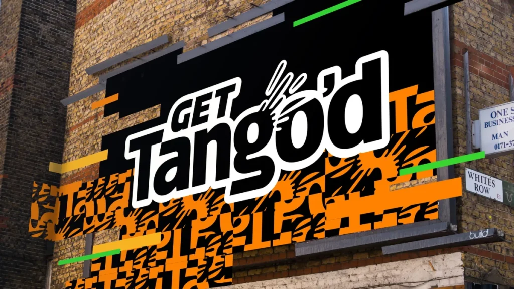
Tango has ditched the ‘rehearsed’ look for a high-saturation, glitch-inspired identity.
In a post-merger landscape, Bloom’s redesign proves that if you want to win Gen Z, you stop shouting and start vibrating.

- Tango adopts a high-saturation, glitch-inspired identity to authentically target Gen Z and Gen Alpha visual culture.
- Bloom applied the 70/30 rule: 70% controlled chaos; 30% disciplined hierarchy for legibility and shelf clarity.
- Post-merger, Carlsberg Britvic uses Tango as a spearhead to dominate the UK market and scale distribution globally.
- Design details—hidden pips, sliced letterforms, black upper canvas—create discovery, shelf standout, and a gritty heritage comeback.
- Business impact: rebrand drove volume growth, boosts activation in short-form media, and prioritises younger heavy users over older audiences.
Why This Matters
We’ve all seen it. A legacy brand gets a ‘youth’ makeover, and it smells like a midlife crisis. It’s too polished. Too desperate.
But Tango is different. It has a history of being the weird kid in the soft drinks aisle—the one who’d slap you across the face for a laugh.
Right now, the stakes are higher than a simple pack refresh. On 17 January 2025, the Carlsberg Group officially completed its £3.3bn acquisition of Britvic plc, forming the new powerhouse: Carlsberg Britvic.
This isn’t just a corporate marriage; it makes the UK Carlsberg’s biggest market globally by revenue. Tango is the spearhead for this new era.
If you’re a business owner, this rebrand is the blueprint for how a legacy brand survives a merger without losing its soul. If you’re a designer, it’s a lesson in trusting your audience’s eyes more than your client’s fear of ‘white space’.

The 70/30 Rule of Controlled Chaos
The London-based agency Bloom didn’t just tweak the logo. They built a visual system that mimics the ‘phygital’ world Gen Z and Gen Alpha live in.
Stuart Witter, the associate creative director at Bloom, hit the nail on the head: the old brand looked ‘rehearsed’.
Think about that. In a world of TikTok filters and deep-fakes, anything that looks too planned feels fake.
Does your brand look too ‘perfect’ to be trusted?
Bloom’s solution was the 70/30 principle.
- 70% Energy and Chaos: Glitch patterns, fractured crops, and high-saturation clashing.
- 30% Breathing Room: Disciplined hierarchy that ensures you can actually tell the difference between Orange and Apple when you’re sprinting through a Tesco Express.
This is the ‘Tangle’—a 10-degree tilt in the layout that creates a sense of volatility. It feels like the can is literally vibrating on the shelf.
Funny enough, most FMCG brands are terrified of this. They want symmetry. They want the logo in the middle. They want it safe.
Tango’s new identity rejects that. It trusts that the audience can read a ‘hack pattern’ (letterforms sliced and reordered) and still recognise it as Tango. It’s an admission that Gen Z reads visual systems the way my generation reads copy.
What’s with the hidden details?
Look closer at the new ‘a’. There’s a hidden pip in the counter. The ‘g’ has a burst that mimics the ‘tssst’ of opening a cold can.
Are these essential? No. Do they matter? Absolutely.
These are the ‘Easter eggs’ of branding. They create a sense of discovery. When a teenager notices that pip, they feel like they’re ‘in’ on the design. It’s a subtle nod of respect to a generation that has been bombarded by ads since they were in nappies.
The Creative Verdict
To be honest, I was worried about this one. When a massive merger like Carlsberg-Britvic happens, the first thing to die is usually the creative edge.
Corporate integration usually leads to ‘lowest common denominator’ design—something that won’t offend the board members in Copenhagen or the logistics managers in Leeds.
Instead, Bloom doubled down on the grit.
They’ve used a black-dominant upper canvas for the packaging. This is a masterstroke for shelf contrast. In a sea of Fanta orange and Sprite green, the black upper half of the Tango can create a heavy ‘datum line’ on the shelf. It’s brutal. It’s simple. It works.
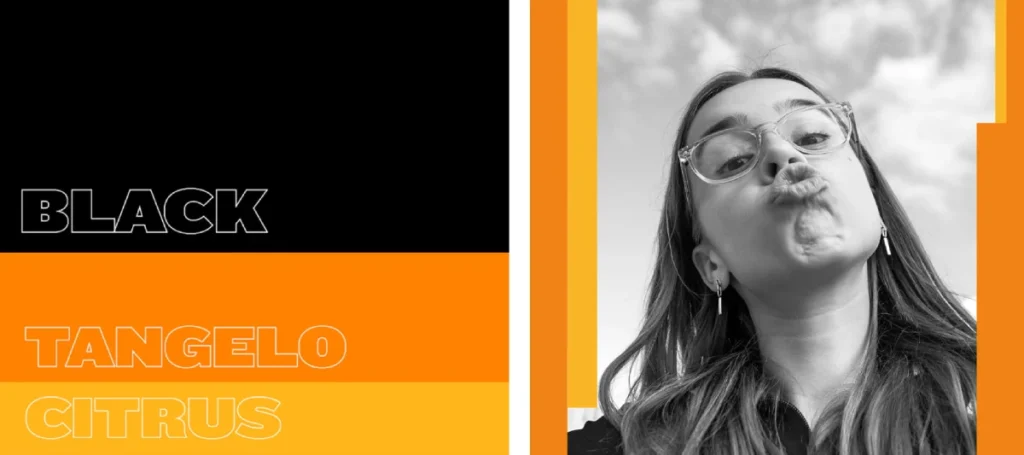
The photography is another win. It’s not the usual ‘sweating bottle on a fake beach’ stuff. It’s lifestyle shots that feel like they were grabbed from a frantic Instagram Story. It’s messy. It’s real.
The way I see it, Tango has finally caught up to its own heritage.
In the 90s, the ‘Orange Man’ advert was banned because kids were slapping each other into deafness. That was the brand’s peak. Since then, it’s been a bit lost—trying on ‘purpose’ and ‘emotional connection’ like a suit that didn’t fit.
Now, it’s back to being ‘Dangerously Potent’. It’s about the hit. The tang. The chaos.
Why this works for business owners
If you’re running a company, you probably think ‘disruptive’ is just a buzzword your marketing agency uses to justify their fee.
In this case, it’s a literal business strategy. Tango added £5.6m in volume growth last year alone. They are currently the third-largest fruit-flavoured carbonate in the UK and the fastest-growing.
The rebrand isn’t just for awards; it’s to ‘unlock consumption moments’. Translated from marketing-speak: it’s to make a Gen Z gamer pick a Tango over a Monster or a Pepsi Max because it feels like it belongs in their world.
Strategic Takeaways
- Graphic Designers: Stop over-explaining your layouts. Trust the audience’s visual literacy to join the dots between fractured elements.
- Business Owners: Don’t let a corporate merger sanitise your brand’s personality—lean into the friction that made you famous in the first place.
FAQs
Is the new logo actually better?
Yes. It’s more versatile. The old one was starting to look like a relic from the early 2010s ‘web 2.0’ era. The new mark is activation-ready and performs just as well in a 15-second TikTok ad as it does on a billboard.
Why is everyone obsessed with Gen Z all of a sudden?
Because they have the spending power and the attention span of a goldfish on espresso. If you don’t catch them in the first 1.5 seconds, you’re dead. This design is built for that 1.5-second window.
Does ‘chaos’ in design make it harder to sell?
Actually, the opposite. In a crowded aisle, symmetry is invisible. Chaos creates a ‘pattern interrupt’. It forces the eye to stop and figure out what it’s looking at. That’s the moment the sale happens.
What is the ‘phygital’ world?
It’s the blurring of physical products and digital culture. Tango’s ‘glitch’ patterns look like a loading screen error. For a generation that lives on their phones, that’s a familiar, almost comforting aesthetic.
Will this rebrand alienate older customers?
Who cares? To be blunt, 45-year-olds aren’t the primary drivers of the fruit-flavoured fizzy drink market. You design for the heavy users, and the rest will follow for the nostalgia.
Is black on a soda can a bad idea?
No, it’s a brilliant one for shelf standout. Most brands are scared of black because they think it looks ‘unhealthy’ or ‘heavy’. Tango uses it to make their bright oranges and purples look like they’re neon signs.
What should I do if my brand feels ‘rehearsed’?
Tilt something 10 degrees. No, seriously. Break the grid. Crop your logo until it’s barely recognisable. If your brand can’t survive being sliced up, it probably wasn’t a very strong brand to begin with.
How does the Carlsberg merger affect the design?
It gives it more muscle. Carlsberg Britvic now has a massive distribution network. The design needs to be scalable and iconic enough to work across thousands of touchpoints, from pub fridges to supermarket aisles.
Did they keep the ‘You’ve been Tango’d’ vibe?
Spiritually, yes. They’ve moved away from the literal slap and toward a visual one. It’s irreverent, cheeky, and doesn’t take itself too seriously.
What’s the biggest risk here?
The biggest risk is that they don’t go far enough with the activations. If the TV ads and social campaigns are boring, the ‘chaotic’ pack will just look like a costume. The energy has to be consistent across the whole brand ecosystem.

