Stefan Sagmeister: Business Logic of Radical Design
Boring design is a tax on your business. It is the silent killer of conversion rates and brand recall.
If your brand looks like every other SaaS startup or local consultancy, you are paying for your customers’ indifference.
Stefan Sagmeister understood this before “personal branding” was a buzzword.
He didn’t carve the details of an AIGA lecture into his skin because he was a masochist; he did it because, in a world of visual noise, only the visceral survives.
If you are a business owner seeking to stand out among famous graphic designers, you need to stop asking for “clean” design and start asking for design that evokes a physical reaction.
- Beauty is functional: high-quality, tactile aesthetics improve user engagement, trust and business performance rather than being mere decoration.
- Sabbaticals drive innovation: regular, planned breaks for non-commercial research yield breakthrough ideas and long-term commercial rewards.
- Typography as physical persuasion: using real materials and the human body makes messages visceral, memorable and distinct from generic design.
Who is Stefan Sagmeister?
Stefan Sagmeister is an Austrian-born, New York-based graphic designer and typographer known for his provocative, tactile, and deeply humanistic approach to visual communication.
He co-founded Sagmeister & Walsh and has won two Grammys for his work in the music industry.

The Three Core Elements of Sagmeister’s Philosophy:
- Tactile Typography: The use of physical materials (coins, fruit, body parts) to create letterforms that demand attention.
- The Sabbatical Cycle: A strict business model of closing the studio every seven years to pursue non-commercial research.
- Functional Beauty: The conviction that aesthetics are not a luxury but a fundamental human need that improves the performance of a product.
Why Resting is a Growth Strategy
In the UK, we have an unhealthy obsession with “the grind.”
Entrepreneurs brag about 80-hour weeks. Sagmeister does the opposite. Every seven years, he shuts his New York studio for a full 12 months. No clients. No deadlines.
This isn’t a holiday; it’s an investment in research and development.
According to a McKinsey & Company report on the business value of design, companies that foster a culture of continuous innovation and “design thinking” outperform the S&P 500 by 219%.
Sagmeister’s sabbaticals resulted in “The Happy Show,” a global exhibition that generated millions in ticket sales and brand equity.
Engineering Physicality: The Music Era (1993–2000s)
To understand Sagmeister, you must look past the “art” and see the obsession with physical engineering and cognitive friction.
He doesn’t just design covers; he builds mechanisms. His work is a rejection of the flat, weightless world of digital screens.
H.P. Zinker: ‘Mountains of Madness’ (1994)

This was his first major breakthrough. The album featured a close-up of a man’s face. In its calm state, the man looks bored or depressed.
However, the CD jewel case was made of transparent red plastic. When you slid the cover out from behind the red filter, the green and red ink interacted to reveal the man screaming in agony.
This wasn’t just a gimmick; it was a physical manifestation of the album’s title. It required the user to perform an action to see the full truth.
In a business context, this is a masterclass in User Engagement. He didn’t just give the answer; he made the customer work for it, which cemented the brand in their memory.
Lou Reed: ‘Set the Twilight Reeling’ (1996)

For Lou Reed, Sagmeister took a more visceral approach. He didn’t use a font. He hand-wrote the lyrics of the songs directly onto Reed’s face in the photograph.
This turned the artist’s physical body into the medium for the message. This approach to typography basics—treating letterforms as organic extensions of the subject—is what makes his work feel human rather than corporate.
The Rolling Stones: ‘Bridges to Babylon’ (1997)

When working with “CEO” Mick Jagger, Sagmeister went to the British Museum for research. He landed on the image of an Assyrian lion.
But the real “Sagmeister touch” was the packaging. He insisted on a specially manufactured, gold-filigreed slipcase.
It was difficult to produce and expensive, but it transformed a standard CD into a collector’s item. This is the ultimate example of using brand identity to justify a premium price point in a declining market.
Typography as Flesh and Bone
Sagmeister’s most controversial work often involves the human body. He treats the skin as a canvas, not for shock value, but for authenticity.

- The AIGA Detroit Poster (1999): To promote a lecture, he had an intern carve the event details into his skin with a razor. The resulting photograph became the poster. It was a literal representation of the “pain” of the creative process.
- Les Arts Décoratifs Poster: Sagmeister and his team (including Jessica Walsh) shaved their heads and used their own hair to create the typography for a poster in Paris.
- The SVA Posters: He has consistently used his own body or the bodies of his team to illustrate life lessons, such as “Trying to look good limits my life.”
This isn’t just “edgy” design; it’s a demonstration of Skin in the Game. In an era of AI and stock imagery, showing the actual human cost of creation is a powerful creative thinking strategy for standing out.
“Having guts always works out for me.”
The Myth of Subjective Beauty
Business owners often say, “Beauty is in the eye of the beholder,” as an excuse to choose the cheapest, safest design option. This is a fallacy. Human biology is hardwired to respond to specific proportions, symmetries, and textures.
Case Study: The “Beauty” Project

Working with Jessica Walsh, Sagmeister launched a crusade against the “ugliness” of modernism. He argued that the Bauhaus obsession with “form follows function” had led to a world of sterile, soul-crushing architecture.
He proved through tests that humans have a universal preference for certain shapes. He argued that Beauty = Function.
A beautiful hospital helps patients heal faster. A beautiful bridge is better maintained by the public.
For an entrepreneur, this means that the aesthetics of your website or product are a direct contributor to its utility.
The Nielsen Norman Group has extensively documented the “Aesthetic-Usability Effect,” proving that users are more patient with errors if the interface is visually appealing.
| Feature | Amateur Approach (The “Safe” Way) | Sagmeister/Pro Approach (The “Beauty” Way) |
| Typography | Standard sans-serif for “readability.” | Typography basics used to create emotional weight. |
| Imagery | Generic stock photos of “happy people.” | Original, often provocative imagery that halts the scroll. |
| Messaging | Literal and descriptive. | Meta-narratives and creative thinking reward the viewer. |
| Strategy | Follows current trends to “fit in.” | Uses brand strategy to disrupt the category. |
Environmental Installations: Scaling the Message
Sagmeister often takes his work into the streets, using massive scale to break urban monotony and force a confrontation with the viewer.
| Project | Material Used | Message/Outcome |
| Everyman Monkeys | Six 10-metre inflatable monkeys | Placed in six different cities to spell out a sentence about the “everyman.” |
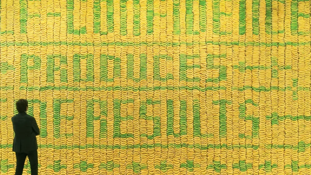
| Banana Wall | 10,000 real bananas | Created for Deitch Projects, the bananas ripened and changed colour over time, spelling out “Self-confidence produces fine results.” |
| Public Bike Poster | 4,209 bike chain links | A poster where the typography was entirely constructed from actual chains, highlighting mechanical beauty. |
Evolution: Now is Better (2024-2025)
His most recent work, “Now is Better,” focuses on long-term positive data. He takes historical statistics—like the rise in global literacy or the decline in extreme poverty—and visualises them using 19th-century oil paintings or contemporary sculptures.
He is fighting the “short-termism” of the 24-hour news cycle. This shift from “shocking” the viewer to “calming” them shows the evolution of a designer who understands that the most valuable currency in 2026 is Hope backed by Data.
“It is very important to embrace failure and to do a lot of stuff – as much stuff as possible – with as little fear as possible. It’s much, much better to wind up with a lot of crap having tried it than to overthink in the beginning and not do it.”
Now is Better
You’re being held hostage by a 24-hour news cycle designed to trigger your amygdala and keep you in a state of constant anxiety. This is the fix. Now is Better by Stefan Sagmeister is a visual protest against short-term pessimism, using cold, hard data to prove that—despite the headlines—humanity is on a massive upward trajectory.
As an Amazon Partner, when you buy through our links, we may earn a commission.
The Verdict
Stefan Sagmeister is not just an artist; he is a specialist in human attention. His work proves that beauty is a functional requirement, sabbaticals are a business necessity, and typography is a visceral tool of persuasion. For the entrepreneur, the lesson is clear: differentiate or die.
If you’re tired of being invisible and want to build a brand that actually commands attention, you need to stop playing it safe. Explore our brand strategy workshops or request a quote to see how we can apply these high-level principles to your business.
Frequently Asked Questions (FAQ)
Who is Stefan Sagmeister?
Stefan Sagmeister is a world-renowned graphic designer based in New York. He is renowned for his collaborations with musicians such as The Rolling Stones and Lou Reed, as well as his in-depth explorations into the science of beauty and happiness.
Why did Stefan Sagmeister carve a poster into his skin?
In 1999, for an AIGA Detroit poster, Sagmeister had the event details cut into his torso with a razor. He did this to illustrate the physical and emotional “pain” associated with the creative process, instantly making it one of the most famous pieces of graphic design in history.
What is the “Sabbatical” model Sagmeister uses?
Every seven years, Sagmeister closes his design studio for one year. During this time, he does not take on any client work. Instead, he focuses on personal experiments and research, which often lead to his most commercially successful ideas later on.
Does Sagmeister still work with Jessica Walsh?
No. After years of partnership as Sagmeister & Walsh, Jessica Walsh formed her own agency, &Walsh, in 2019. Sagmeister transitioned to focus more on non-commercial work and his “Beauty” project.
What is the “Beauty” project?
It is a multi-platform project (book, documentary, exhibition) where Sagmeister argues that beauty is not just a surface-level concern. He uses data to show that beautiful environments and products make humans feel better.
How can a small business use Sagmeister’s principles?
Small businesses can adopt a “tactile” design approach—utilising real textures and distinctive typography instead of relying on stock templates. They can also ensure their brand isn’t just “usable” but genuinely pleasant to look at.
Is Sagmeister’s style too “risky” for B2B companies?
Actually, B2B is where his principles are most needed. Most B2B branding is painfully boring. Using bold colour psychology and unconventional layouts can give a B2B firm a massive competitive advantage.
What awards has Stefan Sagmeister won?
He has won two Grammy Awards: one for his work on the Talking Heads’ “Once in a Lifetime” box set and another for the Brian Eno & David Byrne album “Everything That Happens Will Happen Today.”
Where can I see Sagmeister’s work?
His work is in the permanent collections of the MoMA in New York and the Victoria and Albert Museum in London.
Why is typography so important in his work?
Sagmeister views typography as a physical object. By creating text from real-world items, he compels the viewer to engage with the message on a deeper, more emotional level.
What is the “Aesthetic-Usability Effect”?
It is a phenomenon where users perceive more attractive products as being more effective and easier to use. Sagmeister uses this scientific principle to justify his focus on high-end aesthetics.
How do I contact a design agency that understands these principles?
If you want to move beyond generic design and create something with the impact of a Sagmeister project, consider contacting Inkbot Design for a consultation.

