Sign Design That Sells: A Practical Guide to Getting Noticed
Your sign is not a work of art. It’s a tool. And right now, that tool is probably broken.
Let’s be honest. The vast majority of business signs are a spectacular waste of money.
They are cluttered, illegible, confusing monuments to missed opportunities. They don’t attract customers; they create visual noise that people have trained themselves to ignore.
A great sign is brutally efficient. It has one job: to communicate a critical message in a fraction of a second.
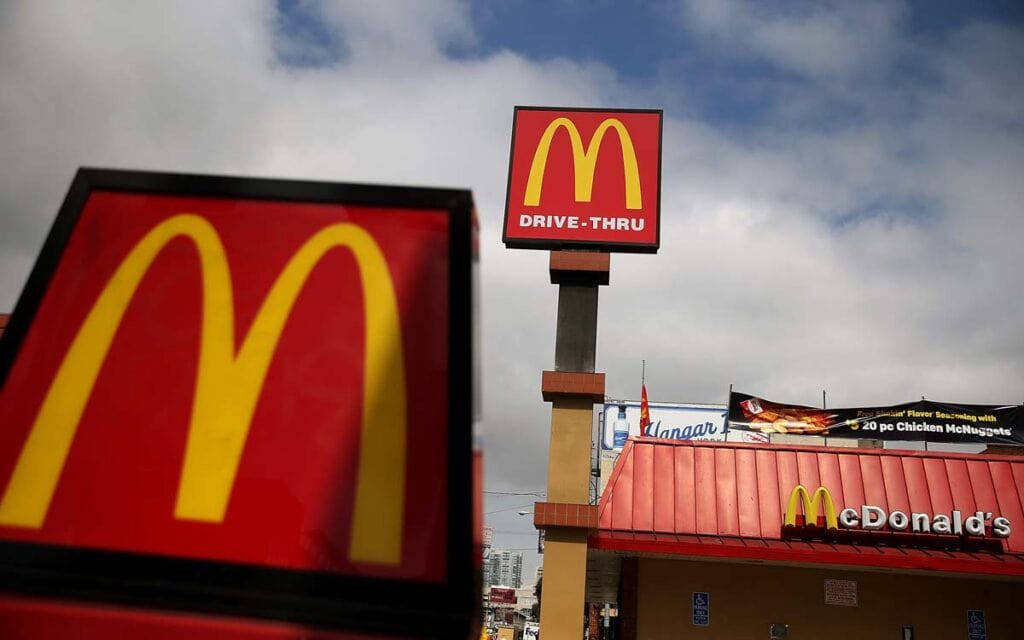
Think of the McDonald’s Golden Arches. You can see them from a kilometre away, at 100 kph, and you know exactly what they mean: cheap, fast, consistent food is available right there.
No words needed.
That is the power you’re aiming for. Your sign doesn’t need to be globally iconic but must obey the same principle of ruthless efficiency.
This guide will show you how to get that. It’s not about abstract theory. It’s about the practical, no-nonsense rules that separate a sign that makes you money from one that just costs you money.
- Signs must communicate clearly in under five seconds, focusing on a core message of five words or fewer.
- Use legible, bold fonts sized appropriately for viewing distance to ensure visibility from afar.
- High-contrast colour combinations enhance legibility against various lighting conditions; avoid subtle colour pairs.
- Visual hierarchy directs attention; the most crucial information should be the largest and most prominent.
- Consider sign context; designs must cater specifically to the viewing perspective of drivers or pedestrians.
The Villain of Sign Design: The Overstuffed “Brochure Sign”
The biggest mistake in sign design comes from a good place: the business owner’s passion. You want to tell everyone about all the great things you do.
This impulse creates the villain of our story: The “Brochure Sign.”
You’ve seen it a thousand times. Imagine “Bob’s IT Solutions.” The sign has its logo, the business name, a tagline, a bulleted list of services (“PC Repair, Virus Removal, Network Setup, Data Recovery”), a phone number, a website, and maybe even a “Find us on Facebook” icon.
Bob has just spent a few thousand pounds on a completely useless sign.
From a moving car, all a potential customer sees is a colourful blur. A pedestrian might notice the name, but they won’t absorb the list. The phone number and website are utterly pointless—nobody will pull over and write them down.
Bob has tried to cram a brochure onto a 4×8 panel, which has guaranteed his message will fail. The cost isn’t just the price of the vinyl and aluminium. The real cost is every customer who drove past, confused and uninterested.
The Unbreakable Rules of Signs That Actually Work
You don’t need a bigger budget or flashier design to defeat the Brochure Sign. You need discipline. You need to follow the rules that govern human perception.
Rule 1: The 3-Second, 5-Word Mandate
You have three seconds. Maybe five if you’re lucky.
That’s the average amount of time a person has to see your sign, read it, comprehend it, and decide if it matters to them. You’ve lost if your message takes over three seconds to process.
This means your sign’s core message should be five words or fewer. For 99% of businesses, that message boils down to three essential things:
- Who you are (Your Logo/Business Name)
- What you do (Your Category, e.g., “Bakery,” “Solicitors,” “Garage”)
- Where you are (Implicit by its location in your building)
That’s it. Anything else is a distraction. Your sign is a headline, not the full article.
Rule 2: Typography Isn’t About “Pretty,” It’s About Distance
This is my biggest pet peeve. People choose fonts for their signs based on what looks nice on a 27-inch screen from two feet away. This is a recipe for disaster.
A lovely, delicate script font might look fantastic on a wedding invitation, but it becomes an illegible smudge from 30 feet on a storefront.
The only thing that matters with typography on a sign is legibility at a distance.
Use this simple formula as a starting point: at least 1 inch of letter height for every 10 feet of viewing distance. If you want your sign to be readable from a road 100 feet away, your letters need to be at least 10 inches tall. Period.
To achieve this, use simple, bold, sans-serif fonts. Think Helvetica, Futura, Franklin Gothic, or Open Sans. They are clean, clear, and designed for maximum readability. Avoid thin, lightweight fonts as they will disappear in bright daylight.
And give your letters room to breathe. Tightly packed letters (poor kerning) merge into a single, unreadable block from afar.
Rule 3: Colour and the Glare of Reality
Another classic mistake is choosing colours that lack contrast.
A subtle light grey on an off-white background might look minimalist and chic in your brand guidelines, but the sun’s glare will make it vanish entirely in the real world.
A sign is not a website. It has to fight against sunlight, rain, shade, and nighttime darkness. The only weapon you have is high contrast.
The best combinations are the classics for a reason:
- Black on Yellow
- Black on White
- Yellow on Black
- White on Blue
- Green on White
- Blue on Yellow
These combinations provide the highest level of legibility. Notice a pattern? It’s a light colour paired with a dark colour.
Avoid pairing two light colours or two dark colours. And never, ever use gradients. They look like mud from a distance.
Rule 4: Hierarchy Tells the Eye Where to Look
Visual hierarchy is a simple concept: the most crucial element should be visually dominant.
Your sign should have a clear path for the eye to follow. If your business name is the most important thing, make it the biggest. If your service (“MOT Centre”) draws people in, give that top billing.
Look at the FedEx logo. The word “Fed” is in a different colour than “Ex.” It’s a simple choice that helps you read the name. It also has a brilliantly simple arrow hidden in the negative space, conveying speed and direction without a single extra word. That’s masterful hierarchy.
Use size, colour, and placement to your advantage. Don’t make every element on the sign compete for attention. Decide on the number one piece of information a customer needs, making it impossible to miss.
Context is King: A Sign Doesn’t Live in a Vacuum
You could follow all the rules above and still end up with a failing sign if you ignore its environment. Designing a sign in the sterile confines of Adobe Illustrator is not sign design.
The View From the Road vs. The View From the Pavement
A sign designed to be seen by drivers travelling at 45 mph is an entirely different beast from a sign for pedestrians.
- For Cars: The message must be massive, concise, and almost primal. Think “PETROL” or “HOTEL.” A simple logo and one or two words.
- For Pedestrians: You have more leeway. A person walking past has more time. You can include your hours on the door or a menu in the window. The sign can be more detailed, but the primary storefront sign should still obey the simplicity rules.
Before you design, stand where your customers will be. What can you see? Are there trees, lamp posts, or other signs in the way? Your sign must be visible from the main lines of approach.
Standing Out from the Noise
Take a walk down your street and look at the other business signs. What do you see? A sea of rectangular, red signs?
Consider a round or custom-shaped sign if everyone else has a rectangular sign. If the street is full of busy, colourful signs, perhaps a minimalist black and white design will stand out more. You don’t have to be the loudest sign on the block to be the most effective. Often, the opposite is true.
Material and Shape Speak Volumes
The materials you choose are part of the message.
- A sandblasted wooden sign for a rustic cafe conveys warmth and craftsmanship.
- Sleek, backlit channel letters for a law firm suggest professionalism and modernity.
- A quirky neon sign for a bar communicates energy and fun.
The medium is part of the message. Don’t just stick a vinyl banner on your building if your brand is concerned with high-end quality. The sign’s physical form must align with the brand it represents.
A Practical Look at Common Business Sign Types

Not all signs are created equal. The design approach must adapt to the sign’s specific job.
There are several types of signs for businesses, but here are the most common:
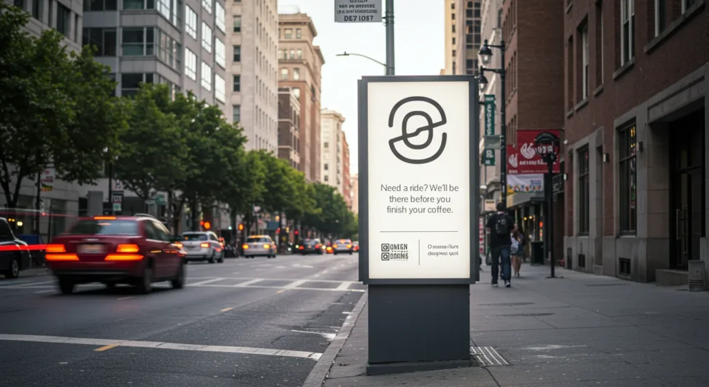
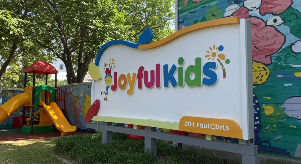
- Storefront Signs (Channel Letters, Lightboxes): This is your primary brand identifier. It’s meant to be permanent and high-quality. The design should focus on your logo and business name. Clarity and durability are key.
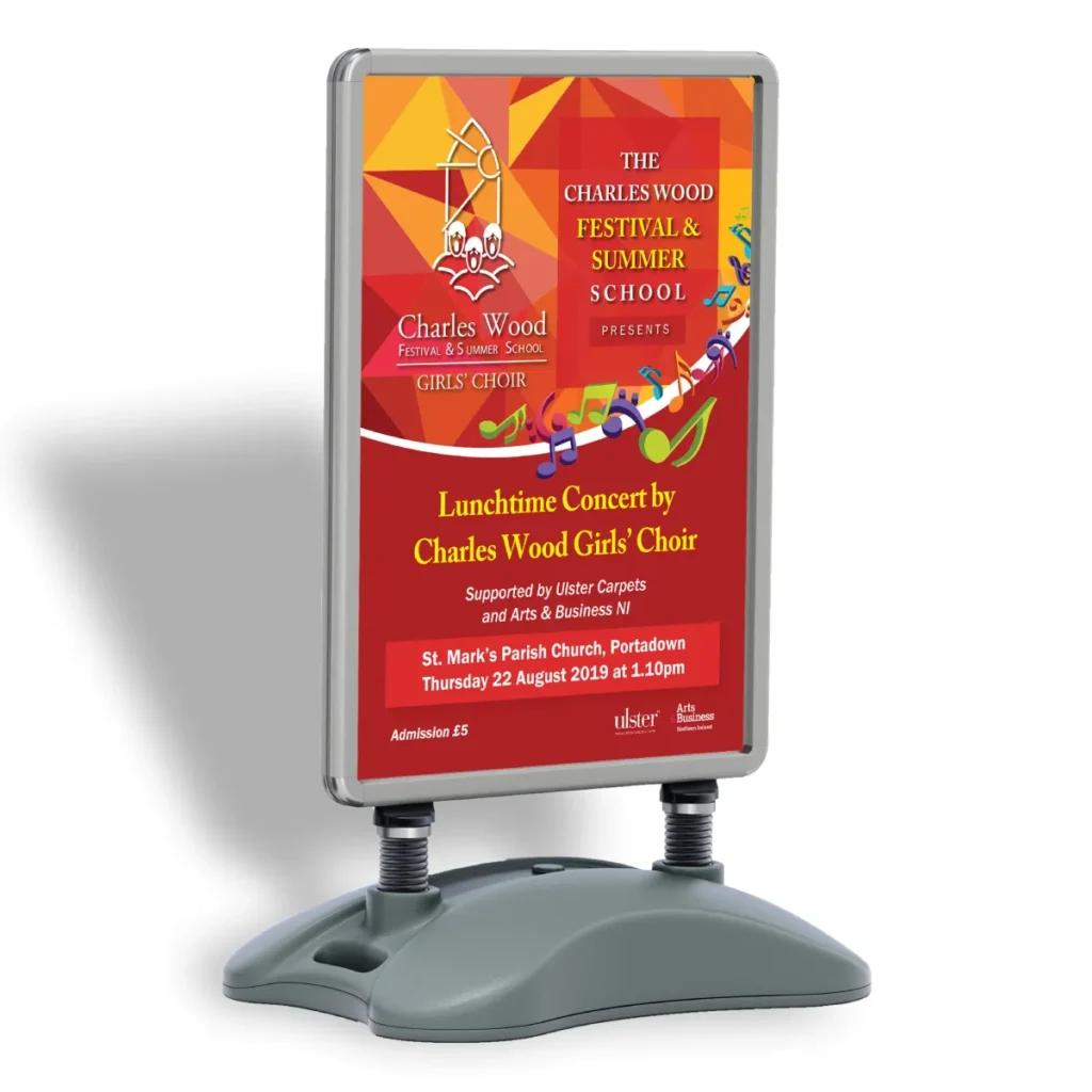
- A-Frames and Pavement Signs: These are tactical workhorses. Their job is to grab immediate attention with a timely offer: “Coffee & Cake £5,” “20% Off Today,” “We’re Open.” The message must be dead simple, huge, and easy to change.
- Banners: These are for temporary announcements: “Grand Opening,” “Sale Now On,” “Under New Management.” They are low-cost and designed for short-term impact. Go for massive letters and extreme contrast.
- Vehicle Wraps: This mobile billboard is where simplicity matters most. You have about two seconds to make an impression on other drivers. Your logo, your business name, and a website. That’s it. Don’t even consider putting a phone number or a list of services on it.
The Process: How to Get Your Sign Designed Without the Headaches
- The Brief is Everything. Don’t just email a designer and say, “I need a sign.” Write a proper brief. Define the most critical message. State the exact address and provide photos of the location from multiple angles and distances. Define who you are trying to attract.
- Work with a Professional. This is not the place to cut corners. A good designer understands the technical and environmental constraints of sign design. They know about letter visibility charts and material limitations. This initial investment will save you from making a multi-thousand-pound mistake. When done correctly, a professional signage design is a revenue-generating asset.
- Insist on a Mock-up—a critical step. Ask the designer to superimpose the proposed sign design onto a photograph of your storefront. This is the only way to get a true sense of scale, colour, and impact in the real world.
- Talk to the Fabricator Early. The company that designs the sign often does not build it. Ensure your designer communicates with the sign manufacturer to ensure the design is feasible within your budget and with the chosen materials.
Your Sign Is an Investment, Not an Expense
Stop thinking of your sign as a decorative necessity. It is one of the hardest-working marketing tools you own. It’s your 24/7 salesperson.
A cheap, poorly designed sign tells the world that you cut corners. A cluttered, confusing sign suggests a muddled, unprofessional business.
But a clear, confident, and professional sign does the opposite. It builds trust before the customer even steps inside. It’s an investment that pays for itself through every customer it brings through your door. Invest wisely.
Frequently Asked Questions About Sign Design
What is the most essential rule of sign design?
The most crucial rule is clarity through simplicity. A sign must be read and understood in under 5 seconds. If it’s cluttered with too much information, it has failed.
How tall should the letters on my sign be?
A good rule of thumb is to have 1 inch of letter height for every 10 feet of intended viewing distance. For a sign meant to be seen from 100 feet away, letters should be at least 10 inches tall.
What are the best fonts to use for a business sign?
What are the best colour combinations for a sign?
High-contrast colour combinations are essential. The most effective pairs are black on yellow, black on white, white on blue, yellow on black, and green on white. Avoid low-contrast pairs like beige on white.
How much information should I put on my sign?
As little as possible. Ideally, a sign should only contain your business name/logo and your general service category (e.g., “Bookshop,” “Mechanic,” “Cafe”). A website or phone number is almost always useless.
What’s the difference between a sign for cars and pedestrians?
A sign for vehicles must be much larger and simpler, as the viewing time is only a couple of seconds. A sign for pedestrians can contain more detail (like opening hours on a door) because the viewer is moving slowly.
Why is negative space important in sign design?
Negative space (the space around letters and logos) is critical for legibility. It prevents elements from crowding each other, making the entire sign easier to read from a distance.
Should my sign be illuminated?
An illuminated sign is a wise investment if your business operates at night or you want to stand out at dusk and dawn. Options like backlit channel letters or a lightbox can dramatically increase visibility.
What is a “pylon” sign?
A pylon sign (or pole sign) is a freestanding sign that is typically very tall, designed to be seen from a long distance, often along a major road or motorway.
How do I get a realistic mock-up of my sign?
Ask your designer to use a high-quality photograph of your building and digitally superimpose the sign design onto it. This will show you how it will look in its actual environment, to scale.
Is a vehicle wrap a good investment?
For businesses with service vehicles, a vehicle wrap can be a highly effective form of advertising. A well-designed wrap can generate thousands of impressions per day. The key is extreme simplicity: logo, name, and website only.
Where can I get professional help with my sign design?
Graphic design agencies specialising in branding and print design are your best resource. They understand the principles of visual communication required for adequate signage.
Getting your sign right isn’t about having a flair for design; it’s about disciplined communication. The difference between a sign that customers ignore and one that draws them in is a clear understanding of these fundamental rules.
If you’re ready to stop guessing and invest in a sign that works, the first step is a professional conversation. Take a look at the signage design services we offer at Inkbot Design. When you’re ready to get serious, request a quote and let’s build something that makes you money.

