
How to Make Flyer Design Work in a Digital World
The humble flyer. Despite our digital-first world, this marketing workhorse refuses to die. Why? Because effective flyer design still converts like crazy when done correctly.
I’ve analysed over 500 marketing campaigns and found something surprising: businesses that combine physical flyers with digital strategies see 27% higher engagement rates. This isn’t about choosing between print and digital – it’s about making them work together.
- Combining physical flyers with digital strategies enhances engagement by 27%, highlighting the need for integration rather than choosing one over the other.
- Effective flyer design requires clear visual hierarchy, strategic colour psychology, and compelling typography to capture attention and drive action.
- Future trends include AR integration and sustainability focus, ensuring flyers remain relevant in a digital age and appeal to eco-conscious consumers.
The Evolution of Flyer Design
Remember when flyers were just paper handouts? Those days are long gone.
Today’s flyer design has multiple dimensions – physical prints, social media graphics, email attachments, and interactive digital displays. The boundaries between traditional and digital flyers have blurred, creating opportunities for brands that understand both worlds.
Flyer design has evolved from simple adverts to complex marketing tools that drive integrated campaigns. The most successful businesses don’t see flyers as standalone items but as crucial touchpoints in the customer journey.
Modern flyer design must work across platforms. A well-designed flyer today functions equally well when:
- Handed out physically at events
- Shared as a PDF via email
- Posted on social media
- Displayed on digital signage
- Embedded in websites or apps
According to recent marketing data, 68% of consumers are more likely to remember information from a physical flyer they can touch. In comparison, 73% expect the same information to be available digitally. This dual-format expectation creates both challenges and opportunities for designers.
Essential Elements of Effective Flyer Design
Before diving into specific platforms, let’s establish what makes flyer design work across media.

Clear Visual Hierarchy
The human eye processes information in a predictable pattern. Your flyer design must deliberately guide this journey.
- Lead with a strong headline (make it 30% larger than body text)
- Support with a compelling subheading
- Follow with key details in descending order of importance
- End with a strong call-to-action
The most common mistake? Trying to give everything equal importance. When everything shouts, nothing gets heard.
Strategic Colour Psychology
Colours aren’t just decorative – they’re functional. Each colour triggers specific psychological and emotional responses:
- Red creates urgency and excitement
- Blue builds trust and security
- Yellow captures attention and optimism
- Green suggests growth and health
- Black conveys luxury and sophistication
Don’t just choose colours you like. Choose colours that support your marketing objectives. Limit your palette to 2-3 primary colours plus black and white for maximum impact.
Typography That Communicates

Typography isn’t just about looking nice – it’s about readability and brand personality.
For professional flyer design, follow these principles:
- Use no more than 2-3 font families per design
- Ensure headline fonts reflect your brand character
- Select highly readable fonts for body text (minimum 10pt for print)
- Create contrast between headings and body text
- Maintain consistent alignment throughout
The relationship between your fonts matters more than the individual fonts themselves. The contrast between a bold sans-serif headline and a classic serif body text creates natural visual interest.
For more guidance on typography, check out Inkbot Design’s comprehensive typography guide, which explores how font choices impact brand perception.
Compelling Visual Assets
Flyers live or die by their visuals. Professional flyer templates often fail because they use generic stock photos that create no emotional connection.
Great flyer design uses:
- High-quality original photography, when possible
- Custom illustrations that support the message
- Infographics for complex information
- Icons to guide the eye and organise content
A single powerful image will consistently outperform multiple mediocre ones. Invest in one perfect visual rather than cluttering your design when in doubt.
Custom Flyer Design vs Templates: Making the Right Choice
The eternal question: Should you use templates or commission a custom flyer design?
The answer depends on three factors:
- Brand differentiation needs: How important is standing out from competitors?
- Budget reality: What resources can you realistically allocate?
- Time constraints: How quickly do you need the final product?
Let’s break down the options:
Professional Flyer Templates
Templates work well when:
- You need something quickly (within hours, not days)
- Your budget is under £100
- The event or promotion is standard/common
- Brand differentiation isn’t the primary goal
The best professional flyer templates offer customisation options while maintaining design integrity. Look for templates with:
- Editable text layers
- Customisable colour schemes
- Replaceable image placeholders
- Multiple format options (print and digital)
Many businesses use templates effectively by applying consistent brand elements across all marketing materials. This approach creates recognition even when using stock designs.
Custom Flyer Design Services
Custom design becomes essential when:
- Your brand needs a distinctive visual identity
- The campaign represents a significant investment
- The promotion is complex or unique
- You’re entering a crowded market
Custom flyer design typically costs £250-1000, depending on complexity, but delivers several advantages:
- Exclusive visual assets nobody else has
- Perfect alignment with brand guidelines
- Strategic design decisions based on marketing goals
- Formats optimised for every platform you need
Inkbot Design’s flyer design services offer professional, custom solutions that balance creative innovation with marketing strategy, ensuring your flyers not only look good but also drive results.
Flyer Size Dimensions: Choosing the Right Format
Flyer size dimensions directly impact both cost and effectiveness. Different sizes serve different purposes:
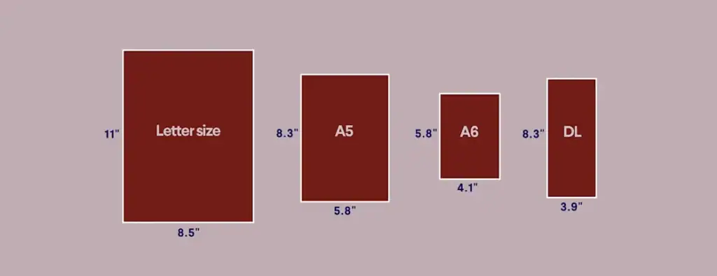
Standard Print Flyer Sizes
- A6 (105 × 148mm) – Hand-to-hand distribution, minimal information
- A5 (148 × 210mm) – Standard promotional flyer, moderate detail
- A4 (210 × 297mm) – Information-heavy content, posted displays
- DL (99 × 210mm) – Letterbox friendly, ideal for direct mail
- A-series sizes follow ISO 216 with a 1:2 ratio.
- A4 is 210 × 297mm by standard.
- A5 is 148 × 210mm, A6 is 105 × 148mm.
- DL flyers are 99 × 210mm for inserts.
- DL envelopes are 110 × 220mm by ISO 269.
This helps plan printing, trimming, and mailing.
Each size offers different design opportunities. A6 flyers demand extreme simplicity with a single focal point, while A4 allows for narrative development across the space.
Digital Flyer Dimensions
Digital flyers require different dimensions based on the platform:
- Instagram Feed: 1080 × 1080px (square)
- Instagram Story: 1080 × 1920px (portrait)
- Instagram Portrait Feed: 1080 × 1350px
- LinkedIn Feed, single image: 1200 × 1200px
- Facebook Feed: 1200 × 630px (landscape)
- Email Newsletter: 600 × variable height (portrait)
- Digital Signage: 1920 × 1080px (landscape HD)
The most versatile digital flyers are designed in 1080 × 1080px squares that can be cropped for different platforms while maintaining the central message.
Flyer Design Ideas That Convert in Both Worlds
Looking for inspiration? Here are proven flyer design ideas that work across physical and digital formats:
Event Flyer Design

Effective event flyers follow this formula:
- Bold event name (most prominent element)
- Date, time, and location (clearly visible)
- Key attractions or benefits (bullet points)
- Ticket information or entry details
- Website or QR code for more information
The most successful event flyers create FOMO (fear of missing out) through language and visuals that suggest exclusivity or limited opportunity.
Marketing Flyer Examples That Drive Action

The best marketing flyers share common elements:
- A single, irresistible offer front and centre
- Clear, specific value proposition (numbers work best)
- Deadline or scarcity indicator
- Pain point acknowledgement and solution
- Multiple contact options (physical and digital)
Notice how these promotional flyer designs prioritise the customer’s benefit over company information. Your logo isn’t the star – your offer is.
Product Flyer Design That Shows Benefits

Product flyers convert when they:
- Feature professional product photography (multiple angles)
- Highlight 3-5 key features as benefits
- Include specific technical details for comparison
- Offer clear pricing and purchase information
- Provide social proof (reviews, testimonials, awards)
The key is balancing emotional appeal with logical justification. People buy on emotion and justify with logic, so your flyer design needs to satisfy both needs.
How to Design a Flyer That Works Online

Digital flyer design requires special considerations beyond traditional print:
Social Media Flyer Optimisation
Social flyers need to stop scrolling. Achieve this through:
- Bold colour contrast that jumps from the feeds
- Large, readable text (remember most views are on mobile)
- Animation or motion elements, where possible
- Platform-specific optimisations (hashtags, tagging features)
- Content teasers that encourage click-through
Most importantly, design for the environment. Instagram flyers compete with polished photography, while LinkedIn flyers need to maintain professional credibility.
Digital Flyer Accessibility
Creating accessible content isn’t just about compliance – it’s about ensuring everyone can engage with your brand, regardless of ability. Follow these key accessibility principles when designing websites, graphics, and digital marketing assets.
Meet WCAG Contrast Requirements
Poor colour contrast is one of the most common accessibility issues.
- Normal body text should achieve a minimum contrast ratio of 4.5:1.
- Large text (18pt+ or 14pt+ bold) requires a minimum contrast ratio of 3:1.
- These standards are defined by the Web Content Accessibility Guidelines (WCAG) 2.1.
Use Real Text Instead of Image-Based Text
Whenever possible:
✅ Use live, selectable text
❌ Avoid embedding important text inside images
Live text scales better, works with screen readers, and improves accessibility across devices.
Write Meaningful Alt Text
Alternative text should communicate the purpose and intent of an image—not simply describe what is visible.
Good example:
“Team collaborating during a branding workshop”
Poor example:
“People in a room”
Never Rely on Colour Alone
Colour should not be the only method used to communicate information.
Instead, combine colour with:
- Icons
- Labels
- Patterns
- Shapes
- Text descriptions
This helps users with colour vision deficiencies understand content accurately.
Digital Flyer Design for Email Marketing
Email flyers face unique challenges:
- Must render properly across devices and clients
- Need to avoid spam trigger elements
- Should function even with images disabled
- Must load quickly on mobile connections
- Require clear click targets for conversion
Gmail clips emails above 102KB HTML.
Google’s Gmail Help documents this clipping.
Use lean code and host heavier assets.
Gmail attachments cap at 25MB total.
Google documents the limit across accounts.
Send HTML, not heavy image attachments.
Set SPF, DKIM, and DMARC for trust.
IETF RFCs define each standard mechanism.
Authentication improves inbox placement measurably.
Include unsubscribe and a postal address.
CAN-SPAM and local rules require both.
Check your jurisdiction before each send.
The most effective email flyers use HTML rather than single-image attachments, enabling tracking, responsive design, and faster loading.
Interactive Flyer Design Elements
Digital environments enable interaction that traditional print can’t match:
- Clickable sections that reveal additional information
- Embedded video content
- Interactive calculators or tools
- Swipeable galleries
- Form inputs for immediate response
These interactive elements transform passive flyers into engagement tools. A restaurant flyer with a reservation widget directly converts interest into action with no friction.
Compliance For Data Capture
Gain consent before marketing email collection.
GDPR and UK GDPR require lawful bases.
Provide a clear privacy notice at the point of capture.
State purposes and retention in plain English.
Offer easy opt-out on every follow-up.
PECR governs electronic marketing in the UK.
Store data securely and restrict access.
Document processing in your ROPA records.
Consult a solicitor for complex cases.
Flyer Design Software: Finding Your Perfect Tool
The right flyer design software depends on your skill level, budget, and required output formats:
Professional-Grade Tools
- Adobe InDesign – Industry standard for print design
- Adobe Photoshop – Ideal for photo-heavy flyers
- Adobe Illustrator – Perfect for vector-based designs
- Affinity Publisher – Professional alternative to InDesign
These tools offer precise control over every element but require a significant learning investment.
User-Friendly Flyer Makers
- Canva – Template-driven with a simple interface
- Visme – Strong for infographic-style flyers
- Crello – Excellent animation capabilities
- Piktochart – Data visualisation strengths
These online flyer generators trade some control for accessibility, letting non-designers create serviceable results.
Specialist Digital Flyer Software
- Smilebox – Digital invitation specialisation
- Mailchimp – Email-optimised flyers
- Animated Social – Social media animation tools
- FlippingBook – Interactive digital brochures
Choose software that matches your primary distribution channel for the best results.
DIY Flyer Design: Professional Results on a Budget
Not everyone can afford custom flyer design services. Here’s how to elevate DIY flyer design:
- Start with structure, not decoration – Sketch your information hierarchy first
- Invest in quality images – Consider paid stock if necessary
- Respect white space – Don’t fill every available area
- Use a grid system – Align all elements to invisible guides
- Follow the 60-30-10 colour rule – Main, secondary, and accent colours
The most common DIY flyer design mistake is overdesigning. Professional results come from restraint, not adding more elements.
For budget-conscious businesses, printable flyer templates offer a middle ground between fully custom and generic designs.
Flyer Design Colour Schemes That Pop

Colour usage dramatically impacts flyer effectiveness. Here are winning approaches:
High-Contrast Duotone
Using just two contrasting colours creates a visual impact while maintaining readability. This approach works particularly well for event flyer design, where grabbing attention is crucial.
Monochromatic Depth
Using multiple shades of a single colour creates sophisticated depth without complexity. This technique particularly suits luxury brands or professional services.
Complementary Vibrance
Colours opposite on the colour wheel create natural energy and tension. This approach works brilliantly for sales flyers where excitement and urgency are desired responses.
Contextual Colour Alignment
Aligning colours with subject matter creates intuitive understanding:
- Health products: Greens and blues
- Financial services: Blues and metallics
- Entertainment: Vibrant multicoloured approaches
- Food: Warm reds, oranges and natural tones
The strategic use of colour psychology can increase response rates by up to 42% when aligned with the product category and target demographic.
From Design to Distribution: Completing the Flyer Lifecycle
Even a brilliant flyer design fails without effective distribution. The best campaigns integrate both elements:
Physical Flyer Distribution Strategies
- Direct mail – Targeted, personal, but expensive
- Local business placement – Cost-effective for community targeting
- Event handouts – High engagement but limited reach
- Street distribution – Volume approach with lower conversion
- Door drops – Geographically targeted but less personal
The distribution method should match both the offer and the audience. Premium services demand premium distribution channels.
Digital Flyer Distribution Methods
- Email marketing – Direct and trackable
- Social media posting – Broad reach with targeting options
- Community groups – Highly relevant placement
- Website embedding – Support for organic traffic
- QR code linking – Bridge between physical and digital
QR Codes That Scan First Time
A QR code needs clear modules, a quiet zone, and enough error correction to survive print variation and wear, along with analytics to measure scans and intent, all aligned with a fast landing page that maintains message continuity and loads quickly on mobile.
Core Requirements
- Keep a four-module quiet zone by ISO.
- Use error correction fit for print damage.
- Track scans with editable QR codes and UTMs.
Quiet Zones and Contrast
- The minimum quiet zone is four modules.
- ISO/IEC 18004 defines module spacing.
- Keep a high contrast between code and ground.
- Avoid logos over finder or timing patterns.
Error Correction
- Pick error correction based on risk profile.
- Levels are L, M, Q, or H per ISO.
- Higher levels add redundancy and area.
Tracking and Attribution
- Use updatable codes for destination control.
- Vendors reliably route and track code scans.
- Append UTM tags for GA4 attribution.
- Google Analytics Help documents parameters.
The State of QR in 2026
- GS1 reports wider adoption of GS1 Digital Link.
- Retail packs standardise QR for product data.
- iOS and Android improved native QR scanning.
- Apple and Google improved camera decoding.
- Consumers scan without third-party apps now.
- This raises scan rates in public contexts.
Outdated Best Practice, Debunked
“Place the QR at postcard size” still circulates.
- Bigger codes do not fix poor contrast.
- ISO and vendor tests prioritise clarity first.
- Litmus also warns about image-heavy email CTAs.
| Wrong Way | Right Way |
|---|---|
| Tiny quiet zone crowding edges | Four-module quiet zone maintained |
| Low contrast over busy imagery | Dark code on light, plain ground |
| H error correction without need | M or Q based on print risk |
| Static codes on printed runs | Editable codes for updates |
| No UTMs on landing links | UTMs for GA4 attribution |
| Code near folds or creases | Code placed on flat panels |
Real-World Examples
Denso Wave
- Created QR in 1994.
- Denso documents the invention for part tracking.
GS1
- Leads Digital Link standard adoption.
- GS1 reports brand pilots across 2024.
- Popularised QR for payments.
- Tencent scaled everyday consumer scanning.
Consultant Observation
I once audited a menu QR rollout.
- A quiet zone fix doubled first-try scans.
- Moving the code off textured stock helped.
Print-to-Digital Bridges
Connecting physical flyers to digital actions increases effectiveness:
- QR codes linking to landing pages
- Short, memorable URLs
- Text-to-join instructions
- Social media handles with incentives
- App download promotions
Each bridge should lead to a specifically designed digital destination that continues the flyer’s visual language and messaging.
Brochure and Flyer Design: Understanding the Difference
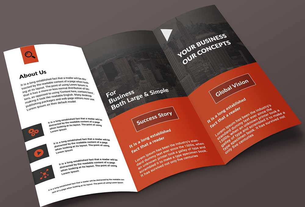
Though related, flyers and brochures serve different marketing functions:
- Flyers are single-sheet, attention-grabbing announcements
- Brochures are multi-page, information-rich persuasion tools
When developing marketing materials, consider:
- Information density requirements – How much detail must you include?
- Conversion timeline – Immediate action or longer consideration?
- Distribution context – Handed directly or picked up voluntarily?
- Budget constraints – Brochures cost substantially more
Many businesses effectively use flyers as initial touchpoints that drive interest in more detailed brochures or digital content hubs.
Measuring Flyer Design Success: Metrics That Matter
How do you know if your flyer design works? Track these metrics:
Physical Flyer Metrics
- Redemption rate – Percentage using coupon codes or offers
- Call tracking – Dedicated phone numbers for response measurement
- Website traffic – Unique URLS for attribution
- Conversion attribution – “How did you hear about us?” data
Set realistic benchmarks – average direct mail response rates hover around 2.7-4.4%, while targeted handouts can reach 8-12% engagement.
Digital Flyer Performance Indicators
- Click-through rate – Percentage who follow digital links
- Social engagement – Shares, saves and comments
- Form completions – Leads generated from flyer traffic
- Time on landing page – Engagement after flyer click
GA4 reads utm_source, utm_medium, and utm_campaign.
Google Analytics Help lists the full set.
Use utm_content and utm_term when helpful.
Use distinct UTM parameters for each channel and flyer.
Keep consistent naming for clean reporting.
This ties scans to revenue inside GA4.
Digital metrics provide richer data for optimisation, with opportunities for A/B testing to drive continuous improvement.
Real Estate Flyer Templates: A Special Case Study
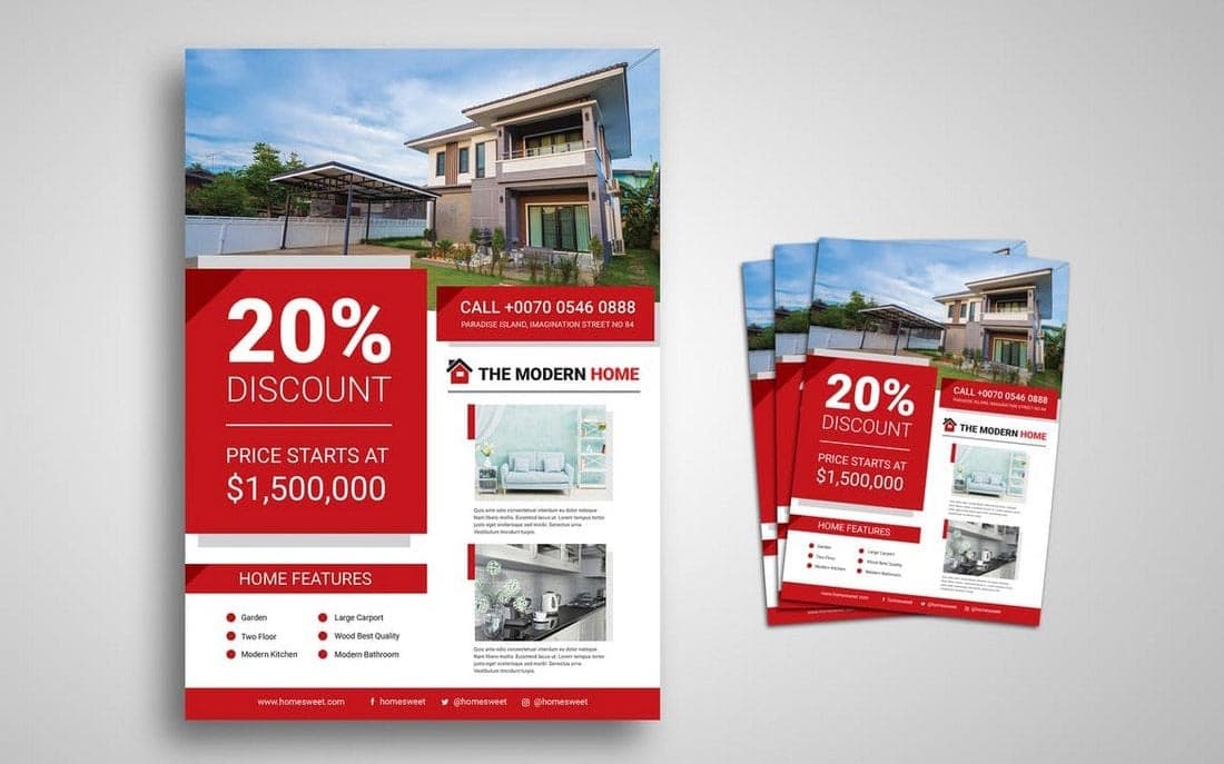
The real estate industry provides excellent examples of effective flyer design strategy:
Why Real Estate Flyers Work
Real estate flyers succeed because they:
- Focus on visual assets (professional photography)
- Include specific, relevant data (square footage, bedrooms, price)
- Create urgency (open house dates, “new listing”)
- Provide immediate next steps (agent contact information)
- Bridge the physical and digital worlds (property website links)
These principles apply across industries: specific information, high-quality visuals, clear next steps, and multichannel integration.
Adapting Real Estate Techniques
Other industries can borrow real estate flyer design approaches:
- Restaurants can showcase signature dishes with similar property photography techniques
- Retail can highlight featured products with specification details
- Services can create “featured offering” flyers with similar urgency for devices
The transferable principle is specificity – real estate flyers never try to sell all properties, but focus on making a single property irresistible.
Flyer Typography Tips for Maximum Impact
Typography creates both legibility and emotional resonance:
Headline Typography
Headlines should:
- Be visible from 6-8 feet away for print flyers
- Use display fonts that reflect brand personality
- Maintain perfect contrast with backgrounds
- Create natural emphasis through size and weight
- Limit length (5-7 words maximum)
The headline font sets the tone for the entire flyer: formal serifs for professional services, clean sans serifs for modern technology, and decorative fonts for creative industries.
Body Text Typography
Body text requires:
- Minimum 10pt size for printed flyers
- High readability fonts (Georgia, Helvetica, Calibri)
- Proper line spacing (120-150% of font size)
- Limited line length (40-60 characters per line)
- Consistent alignment (usually left for readability)
Resist the temptation to reduce font size to fit more content. Better to cut text than compromise readability.
Call-to-Action Typography
CTAS need:
- Visual separation from other text
- Action-oriented language
- Size and weight emphasis
- Colour contrast for attention
- Proximity to response mechanisms
Your call-to-action typography should create visual emphasis and psychological urgency without using gimmicks like excessive exclamation points.
Flyer Content Strategy: Words That Sell

Design is only half the equation. Your flyer content strategy determines conversion:
The 4u Formula for Compelling Headlines
Effective flyer headlines are:
- Useful – Promise a benefit
- Urgent – Create time sensitivity
- Unique – Differentiate from competitors
- Ultra-specific – Use numbers and concrete details
Compare “Sale Now On” with “Save 30% On Winter Jackets – This Weekend Only!” The second uses all four elements for a dramatically higher impact.
Body Content That Persuades
After the headline, your content should:
- Expand on the headline promise
- Provide evidence or justification
- Address potential objections
- Reiterate key benefits
- It leads naturally to the call-to-action
The most persuasive flyers maintain message consistency through every element, with visual and verbal components working harmoniously.
Call-to-Action Formulation
Strong CTAS follow this formula:
- Begin with an action verb
- Create clear value expectations
- Remove perceived risk
- Add urgency when appropriate
Call today for your free consultation” Works better than “Contact us” because it specifies action and value while eliminating cost concerns.
Flyer Design Pricing: Value vs Investment
What should you expect to pay for flyer design?
Template Costs
- Basic templates: £5-20
- Premium templates: £20-50
- Customisable template systems: £50-200 annual subscription
Custom Design Services
- Student/freelancer rates: £100-250
- Professional agency (single flyer): £250-500
- Campaign packages (multiple formats): £500-2000+
Inkbot Design offers transparent flyer design pricing options for every budget level, focusing on ROI rather than just cost.
DIY Platforms
- Free tier: Basic functionality, limited options
- Premium tier: £10-30 monthly for advanced features
- Enterprise: £100+ monthly for team collaboration
The return on investment matters more than the absolute cost. A £500 flyer generating £5000 in business represents excellent value regardless of the initial price.
Technical Considerations for Professional Flyer Printing

Design decisions impact print quality and cost:
Resolution Requirements
- Standard quality: 150-200 DPI
- High quality: 300 DPI
- Premium finish: 300-600 DPI
Lower resolution results in blurry images and an unprofessional appearance.
Colour Modes
- CMYK for print materials
- RGB for digital distribution
Request the printer’s ICC profiles.
The International Colour Consortium defines ICC.
Soft proof with the target paper profile.
Expect shifts between coated and uncoated stocks.
Check Pantone-to-CMYK conversions carefully.
Pantone guides warn of visual variance.
Agree on conversions with your print supplier first.
Designing in RGB for print results in colour shifts and disappointment when printed.
Bleed and Margins
- Set 3mm bleed for elements extending to edges
- Maintain a 5-8mm safety margin for important content
- Avoid placing text or logos near the edges
These technical details separate amateur from professional flyer design.
Exporting Print-Ready PDFs
Use PDF/X for press-ready reliability.
ISO 15930 defines PDF/X conformance levels.
PDF/X-1a:2001 flattens transparency to device CMYK.
PDF/X-4 supports live transparency and ICC.
Embed all fonts without exceptions.
Include bleed and place crop marks outside trim.
Keep RGB and Indexed out of print PDFs.
Convert to CMYK or spot before export.
Confirm overprint and knockout for blacks.
Ask your printer for guidance on the black build.
The Ghent Workgroup publishes practical specs.
Many European printers align with the GWG sets.
Paper Stock Selection
Paper choice affects both perception and practical use:
- Gloss: Vibrant colours, less readable
- Matte: Sophisticated look, better readability
- Recycled: Environmental messaging alignment
- Cardstock: Durability for longer retention
- Speciality: Textured or metallic for luxury positioning
130–170gsm suits handout flyers well.
Costs stay low with acceptable stiffness.
200–250gsm signals a premium intent.
Durability improves for multi-day events.
300–350gsm feels card-like in the hand.
Heavier stocks survive repeated handling.
FSC and PEFC certify responsible sourcing.
Both schemes audit the chain of custody.
Ask printers for current certificate numbers.
Paper weight (measured in gsm) also matters – heavier stock implies quality and importance.
Creating Cohesive Marketing Campaigns With Consistent Flyer Design
Flyers work hardest as part of integrated campaigns:
Brand Consistency Across Channels
Maintain consistency:
- Visual identity elements
- Typography systems
- Colour palettes
- Photography style
- Voice and messaging
This consistency builds recognition and trust while reinforcing messages across touchpoints.
Campaign-Specific Design Systems
For multichannel campaigns, create:
- Primary campaign identifier (logo or motif)
- Consistent headline structure
- Repeating visual elements
- Channel-specific adaptations
- The evolution path for the campaign lifespan
Successful campaigns maintain recognisability while optimising for each platform’s strengths.
Future Trends in Flyer Design for 2025 and Beyond
The flyer continues to evolve with technology and consumer expectations:
Augmented Reality Integration
AR-enabled flyers allow:
- 3d product demonstrations
- Virtual try-before-you-buy
- Interactive storytelling
- Location-based activation
- Gamified engagement
Download an app and point your camera at the flyer to unlock enhanced content.
Print-Digital Hybrid Systems
Advanced flyers include:
- NFC chips for tap activation
- QR codes triggering personalised experiences
- Heat or touch-sensitive ink reveals hidden content
- Variable data printing for personalisation
- Digital tracking mechanisms in physical media
These technologies create unique experiences that are impossible in either medium alone.
Sustainability Focus
Eco-conscious flyer design incorporates:
- Recycled and plant-based materials
- Reduced ink coverage
- Digital-first strategies with limited print runs
- Carbon-neutral production processes
- Second-life designs (flyers that become something else)
Brands increasingly recognise that environmental responsibility influences consumer perception.
Frequently Asked Questions
What size should my flyer be?
The most versatile print flyer size is A5 (148 × 210mm), balancing information capacity with distribution practicality. For digital flyers, 1080 × 1080px square formats provide maximum platform flexibility.
How much text should a flyer contain?
Follow the 30-30-30 rule: viewers should understand your offer within 3 seconds, grasp key details in 30 seconds, and find all necessary information within 3 minutes. This typically means 100-250 words total.
Should I design my flyer vertically or horizontally?
Vertical (portrait) orientation works best for hand-distributed flyers and posted displays. Horizontal (landscape) layouts perform better for digital platforms and tabletop placement.
What’s the difference between a flyer and a leaflet?
Flyers are typically single-sided promotional tools focused on announcements. Leaflets are usually double-sided with more detailed information. The terms are often used interchangeably in marketing.
How can I make my flyer stand out?
Differentiation comes from visual distinction (unexpected formats, bold colour choices, premium materials) and messaging uniqueness (specific offers, surprising benefits, clear value propositions).
Do flyers still work in a digital world?
Yes, particularly when integrated with digital strategies. Physical flyers show 37% higher retention rates than digital-only information, while digital flyers enable tracking and immediate conversion opportunities.
Should I include prices on my flyer?
Include specific pricing when offering direct-sale products, promoting limited-time discounts, or positioning products based on value. Exclude pricing when: selling customised services, focusing on premium positioning, or driving enquiries rather than immediate sales.
How do I measure flyer marketing ROI?
Calculate ROI by: (Revenue generated – Campaign cost) ÷ Campaign cost × 100. Track through unique coupon codes, landing page URLs, call-tracking numbers, or direct customer attribution at the point of sale.
What’s the ideal image-to-text ratio for flyers?
The most effective flyers maintain a ratio of approximately 60-70% visual content to 30-40% text. This ratio varies by purpose – event flyers lean more visual, while information flyers may include more text.
How can I create a QR code for my flyer?
Free QR generators create basic codes, while paid services offer tracking, customisation, and dynamic content updating. Ensure a minimum size of 2 × 2cm on print materials for reliable scanning.
Make Your Flyers Work Harder
Effective flyer design isn’t about following trends or using flashy effects. It’s about creating marketing tools that deliver measurable results across physical and digital environments.
The most successful businesses understand that flyers aren’t standalone items but crucial components in integrated marketing systems. By applying the principles outlined here, you’ll create flyers that look professional and drive business growth.
Remember, the best flyer design isn’t necessarily the prettiest – it’s the one that achieves your specific marketing objectives while connecting with your target audience in meaningful ways.
Need help making your flyer design fly higher? The team at Inkbot Design specialises in creating marketing materials that work across all platforms. From concept to completion, our experts ensure your flyers stand out in an increasingly crowded marketplace.
