
Responsive Web Design: Future-Proof Solutions
Imagine this: you're sitting on the bus, browsing the web on your phone. You click on an interesting link and start reading an article. But as you scroll, the text gets smaller and smaller. Buttons become tiny ‘Tap here links'. Photos overlap with text. Frustrated, you pinch and zoom just to read each paragraph.
It's not exactly a great user experience.
This is the problem that responsive web design aims to solve.
See, the web isn't just accessed on desktop computers anymore. Today, more than 50% of web traffic comes from mobile devices. And that percentage grows every year.
Phones, tablets, laptops – screens come in all shapes and sizes. So, if your website only looks good on a desktop monitor, you're missing out on many potential visitors.
Not to mention, Google prioritises mobile-friendly sites in search rankings. So, if your site isn't responsive, you'll take a hit in SEO, too.
Responsive web design is necessary for businesses that want to thrive online.
Responsive web design significantly boosts your site's SEO. Google now uses mobile-first indexing, meaning that websites optimised for mobile devices tend to rank higher in search results. A responsive site ensures faster load times and a smooth user experience, both of which are factors that Google considers when ranking pages. As mobile traffic continues to rise, websites that fail to adapt might see a drop in visibility and organic traffic.
Beyond just visibility, a responsive design enhances user engagement metrics such as time on site and conversion rates, thanks to its adaptability across devices. When users encounter a seamless browsing experience without the need for constant zooming or navigation challenges, they are more likely to linger and explore, which sends positive signals to search engines.
Moreover, a responsive design directly impacts your website's authority. Sites that function well on all devices build user trust and improve the chances of acquiring quality backlinks. These elements contribute to higher domain authority, which search engines favour. As more users share and recommend sites that work well on their devices, their reputational score also increases.
But what exactly does “responsive” mean? And how do you make sure your website is future-ready?
This guide will cover everything you need to know, from responsive web design basics to tips for implementation.
- Responsive web design enhances user experience by adapting to various screen sizes, improving engagement and usability across devices.
- It significantly boosts SEO as Google prioritises mobile-friendly sites, leading to higher search rankings and greater visibility.
- Implementing a mobile-first approach ensures core content is prioritised, streamlining design and accommodating essential user needs.
A Brief History of Web Design

To understand responsive design, it helps to know how we got here in the first place.
The Desktop Era
In the early days of the Internet, websites were designed almost exclusively for desktop monitors.
Screen resolutions were low but broadly consistent. Designers could assume visitors would see the site within a narrow range of screen sizes.
Fixed layouts with absolute positioning were standard since screens were a known quantity. Column widths, font sizes, and image dimensions could all be locked in.
The Rise of Mobile
When the iPhone launched in 2007, it ignited a mobile revolution. Smartphones and tablets brought the internet into our pockets – but these small touch screens presented new challenges for web design.
Suddenly, fixed layouts broke on mobile screens. Websites needed to adapt to ever-changing dimensions.
Mobile traffic was growing fast, too. IBM reported that Christmas Day 2011 was the first-day mobile devices outsold PCs for online shopping.
The desktop-first approach was no longer viable. The web had outgrown the old ways.
Responsive to the Rescue
In 2010, web designer Ethan Marcotte coined the term “responsive web design” in an A List Apart article.
Finally, there was an answer to the device dilemma – a technical strategy to build sites for the fluid internet.
Marcotte called for fluid grid layouts, flexible images and CSS media queries. These solutions allowed websites to respond dynamically as screens grew or shrank.
Over the following years, frameworks like Bootstrap popularised and simplified responsive techniques. RWD was here to stay.
Today, with mobile commanding over half of all web traffic, responsive design is a fundamental requirement for any modern website.
What is Responsive Web Design?

In simple terms, responsive web design (RWD) is an approach to building websites that enables your content to adapt dynamically to different screen sizes and device types. Rather than creating multiple site versions for each platform, RWD allows you to build a flexible system that responds to the user's environment. The layout changes based on factors like viewport width, platform, and orientation. So whether your visitors are on a high-resolution desktop, a tablet in landscape mode, or a smartphone on the go, they'll get an optimal viewing and interaction experience.
Here's a quick look at some of the key features and benefits of responsive design:
- Fluid layouts: Responsive sites use CSS media queries and fluid grids that automatically adjust and resize elements to fit different devices and viewport dimensions.
- Flexible images: Images are designed to shrink and expand to fit containers through CSS properties like max-width.
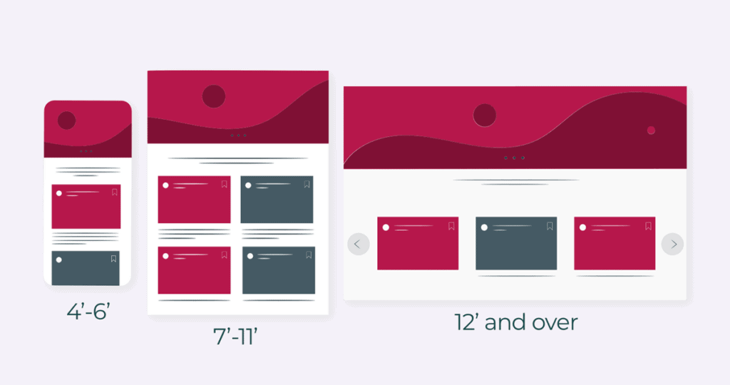
- Media queries: This CSS3 feature enables styling rules based on screen size breakpoints and device capabilities. A site can have customised entirely layouts for mobile, tablet, laptop, and desktop.
- Mobile-friendly: Responsive sites are inherently mobile-optimised. There's no need to build a separate mobile site or app.
- Future-proof: With RWD, your site “just works” on new devices and emerging screen sizes. There's no need for constant updates and redesigns.
- Enhanced UX: By providing an optimal viewing experience across devices, responsive design improves usability and the overall user experience.
- SEO gains: With a single responsive site, you avoid duplicate content issues. And with faster load times, RWD improves SEO rankings on mobile searches.
Simply put, responsive web design creates a seamless, omnichannel experience that allows visitors to engage with your content efficiently on whichever device they use. Rather than “mobile vs desktop,” responsive strategy means thinking inclusively and providing an experience optimised for all screen sizes.
Why Responsive Design Matters More Than Ever Before
Since responsive web design was introduced in 2010, its adoption has steadily grown. Today, over 75% of the top million websites have implemented RWD, and that number continues to rise. With mobile browsing exploding globally, responsiveness is no longer optional for businesses – it's essential.
Here are some key stats that demonstrate the mounting need for responsive sites:
- Massive mobile usage: ~60% of web traffic now comes from smartphones globally. Mobile surpassed desktops back in 2016, and the gap is only widening.
- Mobile commerce: ~70% of ecommerce transactions now happen on mobile devices. Having a desktop-only site cuts you off from a huge revenue stream.
- Slow mobile sites hurt: 40% of people abandon a site that takes over 3 seconds to load on mobile. Responsive sites are optimised for speed across all devices.
- Ranking factor: Google now uses mobile-friendliness as a ranking factor. Responsive sites get an SEO boost.
- Future-proof: There are always new devices, platforms, and screen sizes coming out. Responsive design works on anything, now and in the future.
It all adds up to responsive being essential, not optional anymore. Failing to create a seamless experience across devices will cost you site traffic, new customers, and revenue. By embracing responsive strategies today, you can build a flexible website for long-term success.
Core Components of Responsive Design
Responsive design hinges on three main technical elements working in harmony: flexible layouts, media queries, and flexible images/media. Let's look at each component and how they enable responsive magic.
Flexible Layouts
Fixed pixel widths don't fly in the world of responsive design. The core of RWD is having a flexible grid that dynamically resizes and rearranges itself based on the viewport width. This fluidity is achieved through:
- Flexible grids: Using % widths rather than fixed pixels for layout elements, columns, images, and components. As the page width changes, everything scales proportionally.
- CSS frameworks: Bootstrap, Foundation, or Material Design Lite with responsive-ready CSS components.
- Media queries: We'll get to these more soon. But media queries allow applying CSS styling based on viewport ranges to customise the design.
- Responsive frameworks: Options like Flexbox and CSS Grid that provide advanced responsive capabilities.
With a flexible foundation like this, you can build layouts that adapt their content flow and arrangement to suit the screen space available. You could have a 3-column setup on the desktop that switches to a 2-column view on tablets before stacking everything vertically on mobile. That's the power of fluid grids.
Media Queries
Media queries are one of the most essential ingredients that make responsive design possible. They allow you to alter your site's CSS styling based on parameters like:
- Viewport width: The most commonly used criteria. For example, you can apply one set of CSS for screen widths < 480px and another set for widths >= 480px.
- Device orientation: Change styling based on landscape vs. portrait orientation.
- Resolution: Target specific screen densities and resolutions.
- Hover capability: Detect if hover interactions are possible.
- And many other media features.
By combining fluid layouts with targeted media queries, you can achieve the responsive behaviour you want, like completely rearranging page sections or hiding elements that aren't critical to the mobile experience. The options are endless.
Here is a simple example using just two media queries:
/* Mobile Styles */

@media only screen and (max-width: 480px) {

  .main-nav {

    display: none;

  }

}

/* Tablet & Small Desktop Styles */

@media only screen and (min-width: 481px) and (max-width: 1024px) {

  .sidebar {

    width: 25%;

  }

}
Media queries let you customise your design breakpoints and provide the optimal experience on every screen size.
Flexible Media
Images, videos, and other media types need responsiveness too. Like layout elements, they shouldn't have fixed pixel widths that cause them to overflow or look too tiny on specific devices.
Solutions for flexible media include:
- Max-width: Set a max-width of 100% on images and videos so they shrink to fit their containers.
- Responsive images: Serve different image files based on media queries. This allows showing higher/lower resolution images as needed.
- Background images: Use background-image instead of <img> tag so the media scales responsively.
- Object-fit: Crops or squishes an image to fit its container vs. overflowing it.
- Picture element: Provides sources for different versions of an image to show based on media queries.
With a mix of these techniques, you can make all media types play nicely in a responsive environment.
Mobile-First – The Optimal Responsive Approach
When beginning a new responsive project, experts recommend using a mobile-first approach. This means designing the mobile version first, then enhancing and building up the design for larger screens.
There are several advantages to mobile-first:
- Most constrained design: Mobile has the smallest screens, the least capabilities, and the toughest UX challenges. By tackling it first, the desktop design will feel easy.
- Focus on core content: Mobile forces you to focus on essential content and the most critical information for users. Surface fluff gets cut.
- Less breakpoints: It's easier to start small and expand up vs. going big and then trying to squish everything down. You end up with more straightforward CSS and HTML.
- Real mobile use insights: Designing mobile first reflects actual user behaviour – most people will experience your site on the phone first before any other device.
- Speed optimisation: Keeping mobile lightweight avoids bloated desktop code that slows things down. Mobile speed equals higher user engagement.
If you embrace the constraints and focus on core user needs, going mobile-first results in a streamlined codebase and simple, inclusive, responsive design. Start small and enhance up.
Common Challenges in Implementing Responsive Design
While responsive design offers many benefits, it also presents some challenges. Ensuring consistent performance across all devices can be tricky, especially with varying network speeds and device capabilities. Cross-browser compatibility is another concern, as older browsers may not support newer CSS features.
Testing on numerous devices to guarantee a smooth experience can be time-consuming. Careful planning and regular updates are necessary to address these issues effectively.
Another challenge is managing content hierarchies. As screen size decreases, determining which elements to prioritise becomes crucial. Elements need clear prioritisation to ensure a consistent narrative across various devices. Designing touch-friendly interfaces can also be problematic. Ensuring buttons and interactive elements are correctly sized for touch interaction without hampering aesthetics requires careful design consideration.
Staying updated with rapid technological changes is another challenge for developers. New devices with varying screen dimensions emerge regularly, requiring ongoing adaptations of the responsive framework. This highlights the importance of continuing education and investment in up-to-date web technologies to ensure flexibility and performance.
Tools and Frameworks for Building Responsive Sites
Now that we've looked at the foundations of responsive design let's discuss some helpful tools and frameworks for bringing RWD to life:
CSS Frameworks
High-level CSS frameworks like Bootstrap, Bulma, Foundation, and Tailwind CSS offer enormous advantages for rapid, responsive development. Benefits include:
- Responsive UI components: Buttons, menus, cards, forms, etc., designed mobile-first and adapted across breakpoints.
- Grid systems: Powerful responsive grid layout options to arrange content.
- Helper classes: Utilities for flexbox, spacing, displaying, hiding content and much more.
- Easy prototyping: Quickly mockup and demo responsive behaviours with pre-made components.
- Customisable: Frameworks can be extended and themed based on branding and custom needs.
Frameworks handle all the heavy responsive lifting so you can focus on your unique design and content.
Responsive Design Tools
Dedicated responsive design tools are also available for creating and testing RWD projects:
- Am I Responsive? – Preview your site on multiple devices at once.
- Responsive Design Checker – Test a URL across 50+ devices at once.
- Responsive Viewer – Quickly test and debug media queries.
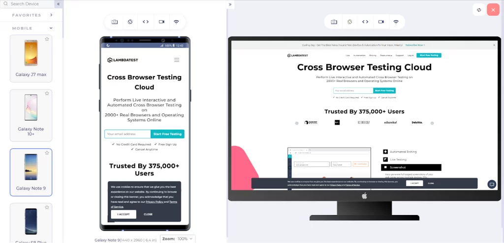
- BrowserStack – Feature-packed tool for responsive testing on real mobile devices.
These tools help streamline testing across viewports and devices to perfect responsive behaviour.
Responsive Images
As discussed earlier, making images responsive requires CSS tricks or serving different file versions conditionally with <picture> or srcset. Thankfully, there are RWD-specific tools here too:
- Picturefill – Polyfill for supporting <picture> elements in old browsers.
- Imager.js – Responsive image lazy loading and optimisation.
- Responsive Breakpoints – Easily generate image assets and code for responsive images.
Mobile Emulation & Inspection
Built-in developer tools in browsers offer ways to test responsive designs:
- Mobile emulation: Emulate device sizes, touch events, geolocation and more.
- Responsive inspecting: Inspect CSS and DOM at any viewport width.
- Throttle network speeds: Simulate slower connections like 3G.
Emulating mobile in the browser is handy for quick testing and QA during development.
RWD-Friendly Site Builders
For those who prefer using dedicated CMS platforms over pure HTML/CSS design, the most popular options like WordPress and Squarespace offer robust, responsive design features:
- Responsive themes and templates: With built-in mobile-friendly UI out of the box.
- Image handling: Automated responsive image capabilities.
- Mobile previews: View edits on mobile instantly.
- Responsive SEO: Tools that optimise mobile SEO.
Site builders and CMS platforms make designs mobile-ready so you can focus on content.
UX Design Considerations for Responsive Sites

Responsive web design involves more than just flexible layouts and breakpoints. To maximise usability on all devices, UX principles and human behaviour need to guide the experience:
Simplify Navigation
Menus and navigation schemes on desktops often fail on small mobile screens. Simplify navigation by:
- Prioritising primary nav links: Focus on top tasks only.
- Using responsive menus, Such as off-canvas or “hamburger” menus that toggle open and closed.
- Adding shortcuts and search: Enable easy access to key pages.
Minimal, focused mobile navigation helps users find what they need quickly.
Streamline Processes
Multi-step processes like registration flows or checkouts get tedious on mobile. Streamline by:
- Reducing form fields: Remove non-essential fields.
- Going linear: Use one-column vs. multi-column layouts.
- Optimising inputs: Enhance taps/scrolling and use mobile-friendly inputs.
- Saving progress: Allow returning where users left off.
Frictionless mobile experiences keep users engaged.
Size Content to the Viewport
Mobile screens have less real estate. Craft content for small screens by:
- Summarising: Use summaries and teasers vs. full, lengthy content.
- Chunking: Break content into easily scannable sections.
- Optimising scrolling: Minimise unnecessary vertical scroll on mobiles.
- Being concise: Tighten up copy and avoid repetition.
Carefully designed content provides a consumable mobile experience.
Focus On Mobile User Needs
Understand how people use your site on mobile vs desktop. Meet needs by:
- Enhancing utility: Enable critical tasks like search, account access, and transactions.
- Reducing cognitive load: Simplify choices and remove distractions.
- Highlighting essential info: Emphasise need-to-know details prominently.
- Optimising for thumbs: Account for extra-large touch targets.
Design for mobile-first use cases, not just smaller screens.
Key Metrics for Evaluating Responsive Design Effectiveness
Evaluating the success of a responsive website involves assessing several key metrics. The mobile bounce rate indicates how well your site retains users on mobile devices. Average session duration shows user engagement levels, while conversion rates highlight how many visitors complete desired actions.
Gathering customer feedback provides deeper insights into user satisfaction. These metrics help identify areas for improvement in your responsive design strategy.
It's also important to scrutinise load time performance. A slow-loading page can deter users, especially on mobile networks. Use tools like Google PageSpeed Insights to benchmark performance and pinpoint areas needing improvement. Monitoring user flow through analytics can uncover potential areas where users might drop off, helping refine the user experience continuously.
Responsive Design Best Practices
To recap, here are some critical best practices to follow for responsive web design projects:
- Adopt a mobile-first approach, starting with the smallest screen widths.
- Use a CSS framework like Bootstrap for responsive components and grids.
- Include flexible images through max-width, srcset, and picture.
- Design with multiple breakpoints using media queries to refine the experience.
- Maintain performance through lightweight code, compressed images, and mobile caching.
- Simplify site navigation and menus for mobile.
- Streamline forms and processes by minimising inputs and steps.
- Schedule responsive testing across real devices using emulators and tools.
- Segment analytics by device and screen width to guide optimisation.
- Think flexible. There's no one-size-fits-all formula. Test and iterate!
Tips for Implementing Responsive Web Design
Ready to make your site responsive? Here are some best practices to follow:
Use a Responsive Framework
Starting from total scratch can make responsiveness daunting. Lean on frameworks like Bootstrap or Foundation to simplify RWD.
They provide fluid grid systems, CSS components and built-in media queries to speed development.
With robust, responsive tools, you can focus on design and content instead of coding complex fluid layouts.
Design with Mobile First in Mind
Keep mobile at the forefront of planning. How does the small screen experience need to differ?
Prioritise critical content that concisely communicates your core brand and services.
Structure pages vertically with toggled sections that expand as needed. Hide non-essential content behind menu taps.
Consider gestures, too – how will visitors navigate and interact? Design explicitly for touch.
Use Flexible Media
As discussed, fluid images, videos, maps, etc, are essential for responsive sites.
Always opt for percentage-based dimensions, max-width CSS and scalable vector formats.
Resize large media assets for different screen sizes. Serve smaller files to mobile for performance.
Test Across Devices
Previewing your responsive site across actual devices is a must.
Resize browser windows can approximate responsiveness – but testing mobile, tablet and desktop interaction firsthand is invaluable.
Using emulators and cloud testing services saves time while validating cross-device UX.
Plan For Performance
Responsive sites have heavier bandwidth needs – more screen variables mean more assets.
So, optimising performance is critical, especially for mobile. Minify code, enable compression, resize images responsively, and cache assets.
Do everything possible to keep load times fast, or visitors will quickly bounce from slow, responsive experiences.
Emerging Trends in Responsive Web Design
Recent trends in responsive design point towards greater integration with Progressive Web Apps (PWAs), which combine the best of web and mobile apps. Accessibility features are also gaining attention, ensuring that websites cater to users with a wide range of abilities.
There's a growing focus on ensuring responsive sites are optimised for new technologies like 5G and adapting to devices such as smartwatches. Staying informed about these trends can help businesses keep their websites relevant and competitive.
Voice search optimisation is another ascending trend, necessitating web design to adapt to voice-command functions. Catering to voice searches requires a refined focus on natural language processing within site architecture. Furthermore, the shift towards minimalist and flatter design elements aligns with responsive needs, as lighter designs tend to load faster and adapt more smoothly across varying screen sizes.
These trends reflect a broader push towards an intuitive, user-centric digital world.
There’s also a growing emphasis on gesture-based navigation. As users continue to engage with touch and swipe motions, integrating interactive gestures in web design becomes increasingly significant. This method boosts user engagement by providing a more immersive browsing experience, encouraging longer visits and interaction.
The Future is Fluid
We live in an era of countless screens. Smart TVs, watches, tablets, laptops – Internet-connected devices keep diversifying.
In this fragmented landscape, responsive design brings unity. It binds experiences together across any device imaginable.
And that seamless fluidity isn't just a “nice to have” anymore. It's mandatory for success today.
Any business that wants to thrive in the mobile world needs a website that responds to the modern web. One site for all screens. One beautiful experience everywhere.
That's the promise and purpose of responsive design. It's not a trend, but table stakes for the future we live in.
So, are you ready to get responsive?
Frequently Asked Questions About Responsive Web Design
Responsive web design is essential today, but you probably still have questions. Here are answers to the most common RWD FAQs:


Great article on responsive web design! It’s so important to ensure our websites look and function well on all devices. Responsive design not only improves user experience but also helps with SEO. Thanks for sharing these insights! 🌐📱💻