Michael Bierut: Technical Secrets of a Pentagram Legend
The first time the public saw Michael Bierut’s logo for Hillary Clinton’s 2016 presidential campaign, the internet erupted.
It was called “clunky,” “amateurish,” and compared to a hospital directional sign. Critics mocked the red arrow pointing right—a supposed political gaffe.
They were all wrong.
While the armchair experts were busy looking for “meaning,” Bierut was busy building a technical system. He wasn’t designing a picture; he was designing a language.
The “H” was built on a strict geometric grid, allowing it to be transformed into a window for photos, a pattern for scarves, or a simplified icon for a 16px favicon. It was a masterpiece of typographic hierarchy and scalability.
The problem is that most business owners are obsessed with the “meaning” of their logo. They want it to show they are “innovative,” “friendly,” and “environmentally conscious”, all in a 200px square.
Michael Bierut is the antidote to this cluttered thinking.
He is one of the most famous graphic designers because he understands a truth that most consultants are too afraid to tell you: your logo doesn’t matter nearly as much as you think it does.
- Design is a technical system, not a picture; logos must be scalable, grid-based, and work from 16px to billboards.
- Empty Vessel theory: logos gain meaning from actions and experience, not inherent symbolism.
- Typography and grid discipline are paramount; legibility and longevity beat trendy aesthetics.
- Build identities as systems (dynamic, data-driven), not static illustrations; prioritise usability across digital constraints.
Who is Michael Bierut?
Michael Bierut is a graphic designer, design critic, and educator who has served as a partner in the New York office of Pentagram since 1990. He is the pre-eminent practitioner of “Design as Strategy,” moving the discipline away from mere decoration toward a systemic business tool.

The three core elements of his approach are:
- The Empty Vessel Theory: The belief that a logo has no inherent meaning and only gains value through the associations built by the company’s actions.
- The Vignelli Grid: A disciplined, mathematical approach to layout and brand typography inherited from his mentor, Massimo Vignelli.
- Wit and Accessibility: The use of clever, often self-effacing visual puns to make large, intimidating institutions (like the MIT Media Lab or Yale School of Architecture) feel approachable.
The Vignelli Apprenticeship: Learning the Rules of the Game
Before you can break the rules like Bierut, you have to master them. Bierut spent ten years working for Massimo Vignelli, the man who designed the New York City Subway map and famously only used a handful of typefaces (Bodoni, Helvetica, Times New Roman, Century, and Futura).
Vignelli’s philosophy was “Intellectual Elegance.” He believed that design was a singular discipline—if you could design a spoon, you could design a city. This period instilled in Bierut a “forensic” approach to design. He doesn’t start with a sketch; he starts with an audit.
Case Study: The New York Times Building
When the New York Times moved into its Renzo Piano-designed headquarters, Bierut was tasked with the signage. Instead of fighting the architecture, he integrated the typography basics directly into the building’s facade.
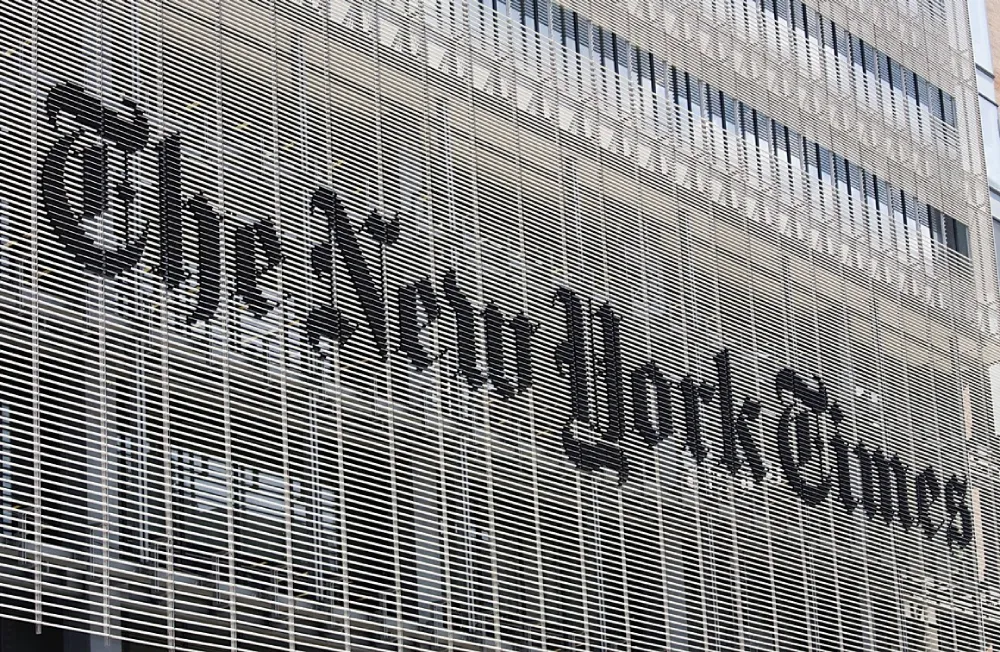
He used the iconic blackletter logo but broke it apart, turning the “T” and “y” into physical objects that interacted with the light.
Data from Nielsen Norman Group (NN/g) suggests that legibility in physical environments is often compromised by “visual noise.” Bierut’s solution was to use the building itself as the grid, ensuring the brand was inseparable from the structure. This isn’t just “designing a sign”; it’s brand identity at a structural level.
The Myth of the “Meaningful Logo”
I regularly audit brand identities for clients who are frustrated that their logo doesn’t “tell their story.” They’ve spent months on Pinterest looking at “creative” logos that use negative space to hide a hammer in a house or a cat in a coffee cup.
This is what I call the “Amateur Trap.”
Michael Bierut’s greatest contribution to the industry is the debunking of this myth. He argues that the world’s most successful logos—the Nike Swoosh, the Apple, the Mastercard circles—are actually quite “boring” in isolation.
“A logo is like a person’s name. It doesn’t mean much until you get to know the person. Once you know them, the name takes on their personality.” — Michael Bierut (Paraphrased).
| Feature | The Amateur Approach (The Wrong Way) | The Bierut Approach (The Pro Way) |
| Concept | Tries to explain the whole business model. | Acts as a distinct, memorable “fingerprint.” |
| Typography | Uses “bespoke” fonts that are hard to read. | Prioritises serif vs sans-serif clarity. |
| Longevity | Follows current Dribbble trends (gradients, thin lines). | Built on geometric foundations that last 30+ years. |
| Scalability | Breaks at small sizes (e.g., social media icons). | Designed for “Favicon-first” visibility. |
| Application | “Slap the logo on everything.” | Develop a comprehensive brand strategy that encompasses the logo as just one component. |
The 2016 Mastercard Rebrand: A Masterclass in Debranding
In 2016, Bierut and his team at Pentagram did the unthinkable: they removed the name “Mastercard” from the logo. They were left with two overlapping circles—one red, one yellow.
Amateurs called it “lazy.”
In reality, it was a data-driven decision. McKinsey’s 2018 report on the Value of Design found that companies with high “Design Indices” outperformed the S&P 500 by 211%. Mastercard knew that its brand recognition was so high that the word “Mastercard” was redundant.
By simplifying the mark, they made it work better on mobile screens and smartwatches. They reduced the “cost of recognition.” This is creative thinking applied to technical constraints. If your logo requires a label for people to understand it, you haven’t built a brand; you’ve built an illustration.
The State of Brand Identity in 2026
As we move into 2026, the “Bierut Method” remains more relevant than ever due to the rise of Generative AI.
Midjourney and DALL-E can generate “beautiful” logos in seconds. They can do the “pretty” part of design better than most junior designers. But AI cannot perform a brand strategy audit. It cannot understand the political nuances of a presidential campaign or the architectural constraints of a skyscraper.
The shift we are seeing in 2025-2026 is a move toward “Liquid Identities.” Brands are no longer static files; they are living systems. Bierut’s work for the MIT Media Lab—where the logo was generated by an algorithm to create a different version for every faculty member—was a decade ahead of its time.
Today, we see brands like Inkbot Design helping SMBs move away from “static” assets toward dynamic systems. If your logo doesn’t work as a 16px icon and a 60-foot billboard simultaneously, it’s a technical failure.
How to use graphic design…
You’re treating graphic design as a series of aesthetic choices, but for Michael Bierut, it is a tool for solving specific human problems. This is the fix. How to Use Graphic Design to Sell Things, Explain Things, Make Things Look Better, Make People Laugh, Make People Cry, and (Every Once in a While) Change the World is a comprehensive manual on the “why” and “how” behind world-class design.
As an Amazon Partner, when you buy through our links, we may earn a commission.
The Reality Check
I once audited a client in the financial technology (fintech) space. They had spent £25,000 on a logo that was a literal “Symphony of Innovation” (their words). It had 14 different colours, three gradients, and a font so “unique” it was illegible below 24pt.
They were losing money because their app icon looked like a smudge on a smartphone screen.
I told them what Michael Bierut would have told them: “You are trying to make the logo do the work of the product.”
A logo cannot make a bad product good. It can only make a good product recognisable. We stripped their identity back to a single, bold character and a high-contrast colour palette. Their user acquisition costs dropped by 18% within three months because people could actually find the app in the App Store.
If you want to look like a world-class organisation, stop looking for “creative” logos and start seeking professional services that understand the fundamentals of typography.
The MIT Media Lab: Complexity Through Simplicity
One of Bierut’s most technically challenging projects was the MIT Media Lab. The Lab is a chaotic hub of diverse research groups. How do you create one identity for a thousand different ideas?
Bierut’s solution was a grid-based system where three shapes could be rearranged into 40,000 different permutations. This gave every student their own unique logo while maintaining a cohesive “parent” brand.
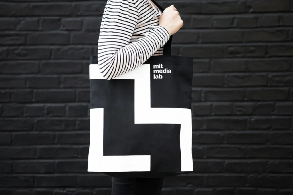
This is “Rare Attribute” territory. Most designers can create a visually appealing logo. Very few can build a mathematical engine that generates ten thousand logos. This is why you hire a consultant who understands brand identity as a data structure, not just an art project.
How to Apply the Bierut Method to Your Small Business
You don’t need a Pentagram budget (£100k+) to think like Michael Bierut. You just need to stop being sentimental about your graphics.
- Kill the “Meaning”: Stop trying to hide a “hidden message” in your logo. Focus on distinctiveness. Does it look like your competitors? If yes, change it.
- Focus on the Font: 90% of your brand communication is text. If your brand typography is weak, your brand is likely to be perceived as weak. Choose a font that is readable at the size of a postage stamp.
- Use a Grid: Even a simple square grid will prevent your designs from looking “off.” Alignment is the difference between an amateur and a pro.
- Embrace the “Empty Vessel”: Spend less time on the logo and more time on the customer experience. The experience “fills” the logo with value.
The Verdict
Michael Bierut is a reminder that design is a job of editing, not adding. He is the forensic consultant of the graphic world, stripping away the fluff until only the essential truth remains.
In an era of AI-generated noise, his focus on wit, humanity, and technical rigour is the only way to build a brand that lasts thirty years instead of three months. If your current brand feels like a “tapestry” of confusing ideas, it’s time to stop decorating and start designing.
Ready to stop over-complicating your brand? Explore Inkbot Design’s branding services or request a quote to start building your “empty vessel” today.
Frequently Asked Questions (FAQ)
What is Michael Bierut’s “Empty Vessel” theory?
Michael Bierut’s “Empty Vessel” theory posits that a logo lacks inherent meaning when it is first created. Instead, it is a container that a company fills with meaning through its actions, service quality, and consistency over time. A logo only becomes iconic because of the brand’s performance, not solely because of the graphic design.
Why was the Hillary Clinton “H” logo controversial?
The logo was criticised for being too simple and for having a red arrow that some interpreted as pointing “to the right” (politically). However, from a technical perspective, the logo was a success because its grid-based design allowed it to be easily adapted, animated, and used as a frame for various campaign messages across digital media.
What is Pentagram?
Pentagram is the world’s largest independently-owned design consultancy. It is unique because it is owned and run by a group of partners who are all practising designers. Michael Bierut has been a partner there since 1990, contributing to its reputation for high-level brand strategy and iconic graphic design.
How did Massimo Vignelli influence Michael Bierut?
Bierut worked for Massimo Vignelli for ten years. Vignelli taught him the importance of geometric grids, a limited but powerful selection of typefaces, and the belief that design should be “intellectually elegant.” This “Modernist” foundation is evident in Bierut’s preference for clarity and structural integrity.
What are the best books by Michael Bierut?
His most famous book is How to Use Graphic Design to Sell Things, Explain Things, Make Things Look Better, Make People Laugh, Make People Cry, and (Every Once in a While) Change the World. He also wrote 79 Short Essays on Design, which is a staple for anyone interested in creative thinking.
Why did Mastercard remove its name from its logo?
Under Bierut’s guidance, Mastercard removed its name because its two-circle brand mark had reached a high level of global recognition. Removing the text made the logo more effective in digital environments, such as mobile payment icons and smartwatches, where space is limited.
What is the difference between a logo and a brand identity?
A logo is a single graphic mark or wordmark. A brand identity is a comprehensive system that includes the logo, typography, colour palette, imagery style, and tone of voice. Michael Bierut focuses on building identities—the entire system—rather than just isolated logos.
How can a small business use the “Bierut Method”?
A small business can apply his method by prioritising simplicity and legibility over “cleverness.” Focus on a distinct colour and a clear brand typography choice. Don’t worry about the logo “telling a story”; let your customer service tell the story, and the logo will eventually represent that.
Is Michael Bierut still active in design?
Yes, Michael Bierut remains a partner at Pentagram and continues to work on major projects. He also teaches at the Yale School of Art and is a co-founder of the Design Observer website, where he continues to influence the next generation of designers.
Why is typography so important in Bierut’s work?
Bierut views typography as the “voice” of a brand. He believes that the choice between serif vs sans-serif fonts can change the entire personality of an organisation. His work often employs classic, highly legible fonts to ensure that the message is never obscured by decoration.
What was unique about the MIT Media Lab identity?
Bierut created an algorithmic logo for the MIT Media Lab. Instead of one static image, he designed a system that could generate thousands of unique variations. This represented the diverse and experimental nature of the lab while maintaining a unified visual identity for everyone.
How do I choose a designer who understands these principles?
Look for a designer who asks about your business goals and technical constraints before presenting you with any sketches. Avoid designers who focus purely on “aesthetics” or trends. You want a consultant who treats brand identity as a strategic tool to solve business problems.


