12 Logo Design Basics from a Professional Designer
I spend a significant portion of my week auditing the mistakes of businesses that thought they could “DIY” their visual identity or, worse, outsourced it to a £5-per-hour marketplace.
The results are usually the same: a visual mess that lacks technical integrity and fails to communicate any sense of authority.
In 2026, a logo is no longer just a “pretty picture” at the top of your website. It is the primary anchor for your brand entity in a digital ecosystem dominated by AI and rapid-fire visual consumption.
If you ignore the logo design basics, you aren’t just hurting your aesthetic; you are actively devaluing your company. According to McKinsey & Company, companies that excel at design grow their revenues and shareholder returns at nearly twice the rate of their industry peers.
- Strategy-first approach: Define the brand's positioning and target audience before designing to ensure appropriateness and semantic clarity.
- Vector sovereignty & scalability: Create logos as vector files (SVG, AI, EPS) so they render crisply from 16px to 16 metres.
- Simplicity and responsiveness: Design memorable, simple marks that work in black and white, at 16px, and across responsive variants (master, secondary, logomark).
What are Logo Design Basics?
Logo design basics are the foundational technical and strategic principles used to create a visual mark that remains legible, scalable, and psychologically effective across all media.
These basics ensure a logo functions as a high-performance business tool rather than a mere decorative element.
- Technical Scalability: The ability to render perfectly from 16px to 16 metres.
- Semantic Clarity: Ensuring the mark communicates the intended brand “vibe” without literal clutter.
- Production Integrity: Constructing the file to survive various printing and digital display technologies.
In a forensic branding context, the most basic function of a logo is to build Mental Availability. This refers to the brand’s ability to be considered in a purchasing situation.
Your logo acts as a “Visual Anchor” for specific Category Entry Points (CEPs).
If your logo design basics are sound, the mark triggers an immediate subconscious link between the user’s problem and your business solution.
Without this “Linkage,” a logo is merely an expensive piece of digital clip-art.
1. The Strategy-First Approach

Before you open Adobe Illustrator or touch a pencil, you must understand the logo design process. Most amateurs start with the “how” (the software) instead of the “why” (the strategy). A logo is the visual summary of a brand’s strategy.
If your strategy is to be the “affordable, friendly local choice,” your logo design basics will differ significantly from those of a “high-end, exclusive consultancy.”
I once audited a client in the legal sector who used a neon-green, script-heavy logo. They couldn’t understand why they weren’t attracting corporate clients. The “basic” they missed? Appropriateness.
The Architecture of Visual Identity
A logo does not exist in a vacuum. To master the basics, you must understand where the mark sits within your Brand Architecture. In 2026, businesses typically fall into one of three structural categories, and your design must reflect this hierarchy to avoid consumer confusion.
- Monolithic (Branded House): A single master logo is used across all products (e.g., FedEx or Virgin). The logo basics here require extreme versatility, as the mark must represent everything from air travel to banking.
- Endorsed Identity: Individual brands have their own logos but are “signed off” by a parent entity (e.g., Courtyard by Marriott).
- Pluralistic (House of Brands): The parent company remains invisible, and each product has a unique, stand-alone logo (e.g., Procter & Gamble).
When designing, you must ask: Is this logo a “hero” or a “supporting actor”? If you are building a Branded House, your logo needs a more robust Design System—a set of rules that dictate how the logo interacts with sub-brands, photography, and UI components.
2. Vector Sovereignty (The Non-Negotiable)
This is the most frequent technical failure I see. A logo must be created as a vector. Unlike raster images (JPEGs or PNGs), which are made of pixels, vectors are made of mathematical paths.
If you don’t understand the difference between vector vs raster images, you have no business designing a logo. A vector logo can be scaled to the size of a skyscraper without losing a single drop of quality.
However, a professional designer in 2026 must go beyond simple .AI files. To ensure your logo is future-proof, it must be delivered in a “Technical Stack” that handles high-density 8K Displays and ultra-fast web loading.
Variable Typography & Kinetic Logic
Modern logos often utilise Variable Fonts. Unlike traditional static fonts, a variable font file allows for infinite adjustments to weight, width, and slant within a single file.
This is a logo design basic for 2026 because it allows the “Wordmark” to subtly shift its weight based on screen size, improving legibility on a Smartwatch versus a desktop monitor.
| Feature | Vector (The Pro Way) | Raster (The Amateur Way) |
| Scalability | Infinite without quality loss | Becomes “blurry” or “pixelated” |
| File Format | .AI, .EPS, .SVG | .JPG, .PNG, .GIF |
| Editability | Easy to change colours/shapes | Nearly impossible to alter |
| Usage | Printing, Web, Merchandise | Web only (and often poorly) |
The Modern File Manifesto
Your “Future-Proof” file pack must now include:
- SVG 2.0: For resolution-independent web graphics that support advanced CSS styling.
- WebP & AVIF: For high-compression raster fallbacks that maintain alpha-channel transparency without the heavy file size of a traditional PNG.
- Lottie (JSON): If your logo has a motion component, Lottie files allow for code-based animation that is lightweight and infinitely scalable.
3. The Power of Simplicity (The “6-Year-Old Rule”)
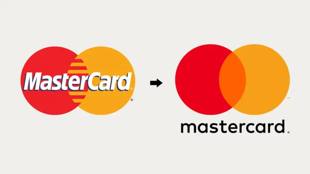
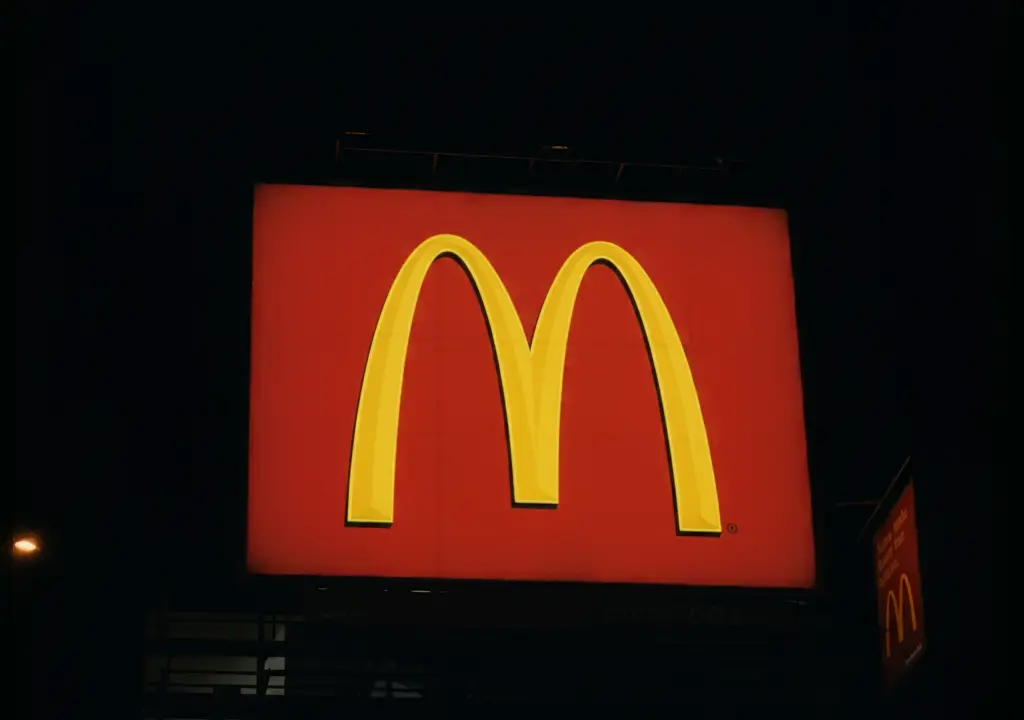
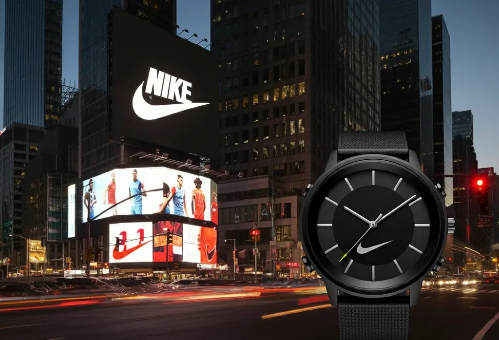
A basic tenet of design is that a logo should be simple enough for a 6-year-old to sketch from memory. Think of the Nike Swoosh, the Apple bite, or the McDonald’s Arches.
Complexity is the enemy of recall. In a world where the average human attention span is shorter than ever, your logo has roughly 0.05 seconds to make an impression.
If your logo has gradients, shadows, and five different fonts, you’ve already lost.
We often direct clients toward different types of logos that favour minimalism to ensure maximum impact.
4. Responsive Logo Architecture
In 2026, a “static” logo is a dead logo. Your logo must be responsive. This means having variations of the mark that adapt to the screen size.
- Master Logo: For desktop and large print.
- Secondary Logo: For medium-sized headers.
- Logomark (Icon): For social media profile pictures and favicons.
A modern “pain point” in 2026 is the failure of Dark Mode.
Many logos look excellent on a white website but vanish when the user’s operating system switches to a dark theme.
The solution is Adaptive Logic, which provides “Inverse” or “Keylined” versions of the logo within your CSS.
This ensures your brand entity remains visible across all UI environments, preventing the “Invisibility Gap” that occurs when a logo’s contrast ratio fails on OLED displays.
Ignoring responsive logo design means your logo will appear as a black smudge when viewed on a smartwatch or mobile device.
5. Colour Psychology and Accessibility
Colour is not a subjective choice; it’s a biological trigger. Research by the Nielsen Norman Group shows that visual appearance is a primary factor in purchasing decisions.
However, a “pro” designer understands logo design psychology and accessibility. In 2026, your logo must meet WCAG (Web Content Accessibility Guidelines) for colour contrast.
If your light grey logo disappears on a white background, you are excluding a portion of your audience and failing a basic design test.
Furthermore, always design in black and white first. If it doesn’t work in one colour, it won’t work in a thousand.
Inclusive Design: Beyond Basic Contrast
By 2026, accessibility will no longer be a “nice-to-have”; it will be a legal and ethical requirement. While many designers still rely on the ageing WCAG 2.1 standards, professionals have moved to the APCA (Advanced Perceptual Contrast Algorithm).
The APCA model more accurately reflects how the human eye perceives contrast on light-emitting screens (OLED and LED). A logo that passes “Old WCAG” might still be unreadable to a user with Protanopia (red-green colour blindness) or low-vision settings.
The Accessibility Stress Test:
- Luminance Contrast: Does the logomark maintain a 4.5:1 ratio (or APCA equivalent) against its primary background?
- Chromatic Redundancy: If you remove all colour, does the logo still convey the same meaning? (e.g., don’t use green for “go” and red for “stop” if the shapes are identical).
- Touch Targets: For mobile UI, ensure the logomark has sufficient “padding” or “safe zone” to serve as an effective home button without accidental taps.
6. Typography as an Entity
The choice of typeface in your logo conveys more than the words themselves. Are you using a Serif (traditional, reliable) or a Sans-Serif (modern, clean)?
Avoid “trendy” fonts. If you follow logo design trends too closely, your brand will look dated within 18 months.
Professional designers often customise the “kerning” (the space between letters) to create a unique rhythm that a standard font can’t provide.
7. The Versatility Stress Test
A logo must work everywhere. I’ve seen beautiful logos that look great on a MacBook screen but become impossible to read when embroidered on a staff shirt or laser-etched onto a pen.
When we provide logo design services, we put the mark through a “stress test.” Does it work on a dark background? Does it work in a single colour?
If the answer is no, it’s back to the drawing board. This is where most logo design mistakes happen—focusing on the digital display while forgetting the physical world.
8. Mathematical vs. Optical Balance
A common pitfall in logo design basics is the obsession with “Perfect Geometry.” If you align a circular logo and a square logo perfectly within a grid, the circle will always appear smaller to the human eye. This is known as Optical Overshoot.
Professional designers use Optical Correction to fix these biological “glitches”:
- The Triangle Bias: The “Visual Centre” of a triangle is lower than its mathematical centre. To make a “Play” button icon look balanced, you must nudge it slightly to the right.
- Curvature Continuity: Instead of using standard geometric circles (which can look “flat” at the joints), pros use G2 Curvature—complex mathematical curves that appear smoother and more “premium” to the eye.
- Horizontal vs. Vertical Thickness: The human eye perceives vertical lines as thicker than horizontal lines of the same width. A balanced logo often has slightly thinner vertical strokes to compensate.
9. Negative Space Mastery
The most sophisticated logo design basics involve utilising negative space. The FedEx arrow is the classic example—a hidden shape that creates a “Eureka!” moment for the viewer.
This increases “stickiness” in the mind. It shows a level of thought and craft that immediately elevates the brand above competitors who are just using “flat” icons.
10. Legibility at Scale (The 16px Challenge)
If you can’t tell what your logo is when it’s 16 pixels wide, it has failed. In 2026, the “Favicon” and the “App Icon” are often the most frequent touchpoints a customer has with your brand.
A professional designer will often create a “shorthand” version of the logo specifically for these tiny spaces. If you’re wondering about logo design cost, you’re often paying for this level of technical foresight.
11. Avoiding Literalism and Cliches
If you are a coffee shop, you don’t need a steaming cup of coffee in your logo. If you are a real estate agent, you don’t need a roofline. These are cliches that make you blend in rather than stand out.
The basic goal of a logo is identification, not description. Use the logo to identify who you are, and let your marketing describe what you do. This is a crucial distinction that separates professional brand builders from amateur illustrators.
From a commercial perspective, adhering to these basics is an act of Risk Mitigation. A logo that is too literal or follows “trends” too closely is significantly harder to protect legally.
By focusing on Semantic Uniqueness, you create an asset that can be successfully registered with the Intellectual Property Office (IPO).
This legal “moat” prevents competitors from diluting your market share and ensures that your “Brand Equity” is a tangible asset on your company’s balance sheet.
12. The “Future-Proof” File Pack
A logo is only as good as the files you receive. A professional handoff includes various logo file formats for every possible use case:
- SVG/WebP: For high-performance web use.
- CMYK EPS: For professional printing.
- High-Res PNG: For internal documents (Word/PowerPoint).
- Brand Guidelines: A PDF explaining exactly how (and how not) to use the logo.
The State of Logo Design in 2026
In the last 12-18 months, we have seen the rise of Liquid Branding. Logos are no longer static “stamps.” They are living entities that can react to user interaction or shift slightly based on the platform.
Furthermore, “AI-Vetting” has become a standard part of the logo design basics.
We now use machine learning models to test how “recognisable” a mark is against a database of millions of other brands, ensuring zero trademark friction and maximum semantic uniqueness.
If your designer isn’t talking about “entity salience,” they are stuck in 2015.
Creating a Legal “Moat” via Design
A logo is a financial asset. From a Trademark Law perspective, the “Basics” require you to create a mark that is “Distinctive” rather than “Descriptive.”
If your logo is too literal (e.g., a lightbulb for an ideas company), you will struggle to secure a Trademark with the IPO (Intellectual Property Office) or USPTO. This is because you cannot “own” a common symbol of an industry.
The Hierarchy of Trademark Strength:
- Fanciful/Arbitrary: High protection (e.g., Apple for computers—no literal connection).
- Suggestive: Moderate protection (e.g., Netflix—suggests “flicks” via the net).
- Descriptive/Generic: Low to zero protection (e.g., “The London Coffee Shop”).
By focusing on Semantic Uniqueness, you aren’t just being “creative”; you are building a Brand Moat that prevents competitors from legally mimicking your aesthetic.
Comparison Table: 2026 Design Workflow
| Feature | DIY / Marketplace (£5) | Professional Strategy (£5,000+) |
| File Type | Flat PNG/JPG | SVG 2.0, WebP, Variable Fonts |
| Grid System | None (Eyeballed) | Geometric Grid + Optical Correction |
| Accessibility | Ignored | WCAG 3.0 / APCA Compliant |
| Trademarking | Likely infringing or generic | Vetted for Semantic Uniqueness |
| Adaptability | Static (one size) | Full Responsive Logic (Liquid) |
| Psychology | “Looks nice” | Anchored in Category Entry Points |
The Verdict
Mastering logo design basics is not about following a set of artistic “vibes.” It is about adhering to a strict set of technical and psychological rules that ensure your brand can compete in a crowded, high-speed market.
A logo is the face of your business. If it’s poorly constructed, unreadable, or cliché, you are telling the world that your business is also poorly constructed and unoriginal. Don’t settle for “good enough.”
Ready to build a brand that actually works?
Request a quote for your logo design project or explore our comprehensive range of branding services to discover how we can help you stand out in your sector.
Frequently Asked Questions (FAQ)
What are the core logo design basics?
The core basics are simplicity, scalability, memorability, and technical versatility. A professional logo must be designed as a Vector file to ensure it functions as a business tool rather than just a decorative graphic.
Why must a logo be a vector file?
Vector files (SVG, AI, EPS) are based on mathematical paths rather than pixels. This means they are infinitely scalable—you can enlarge a vector logo to the size of a billboard without any loss of quality or “pixelation.”
Does my logo need to be symmetrical?
Not necessarily, but it must be Optically Balanced. While symmetry conveys stability, many iconic logos use intentional asymmetry to imply movement and energy. The goal is “Visual Weight” balance, not just a mirrored reflection.
What is a “Responsive Logo” system?
In 2026, you cannot use one single file for everything. A responsive system includes a Master Logo, a simplified Secondary Logo, and a minimal Logomark (icon) for small spaces, such as favicons or app icons.
How many colours should a logo have?
The “Forensic Standard” is 1 to 3 colours. Keeping the palette limited reduces printing costs and ensures the brand remains recognisable at a glance. Always ensure your logo works in pure Black and White before adding colour.
Why is “Negative Space” important?
Negative space mastery allows you to hide “secondary meanings” within a logo (like the FedEx arrow). This creates a “Eureka!” moment for the consumer, which significantly increases Brand Recall and memory “stickiness.”
How do I choose the right font for my logo?
Typography is a psychological trigger. Serif fonts suggest tradition and authority; Sans-serif fonts suggest modernism and efficiency. Avoid “trendy” fonts that will look dated within a year or two.
What is “Kerning” and why does it matter?
Kerning is the adjustment of the space between individual letters. Amateur logos often have “clumpy” or “gappy” text. Custom kerning ensures a rhythmic, professional flow that makes the brand name easier to read at high speeds.
Can I use AI to design my logo?
AI is a great “Brainstorming” tool, but it currently fails at the technical production level. AI often produces raster files with “messy” paths that are impossible to trademark or print professionally. Always have a human expert refine AI concepts.
What is a “Logomark” vs. a “Wordmark”?
A Wordmark is the business name in a specific font. A Logomark is a symbol or icon. Combining them creates a “Combination Mark.” High-authority brands eventually “de-brand” by using only the Logomark once salience is earned.
How do I test if my logo is “Simple” enough?
Apply the 16-Pixel Test. If you cannot distinguish the basic shape of your logo when it is reduced to the size of a tiny browser icon (favicon), it is too complex and will fail in mobile-first environments.
What is “Visual Debt” in logo design?
Visual debt is the cost of using a cheap, poorly designed logo. It leads to low conversion rates and trust friction, eventually requiring a total rebrand that costs 10x more than doing it correctly the first time.
Why should I avoid “literal” logos?
Literal logos (e.g., a tooth for a dentist) are cliches. They make you blend in. A logo’s job is Identification, not description. Let your marketing tell people what you do; let your logo tell them who you are.
What are the best logo file formats to have?
You need SVG (for web), PDF/EPS (for print), and high-resolution PNGs with transparent backgrounds for internal documents. You also need a Brand Guidelines PDF to ensure consistency.
How does a logo affect my SEO?
Indirectly, a high-quality logo enhances user engagement and reduces bounce rates. Directly, using proper Alt Text and Schema Markup for your logo helps Google identify your site as a verified “Brand Entity.”


