Letter Spacing Guide: Mastering Typographic Finesse
The invisible architecture of words is the space between letters.
It’s the breath between sentences, the pause between notes. Most people never notice it, but everyone feels its effect.
To conduct a silent orchestra – this is what mastering letter spacing means; you shape the rhythm and flow of language itself.
In a world drowning in information, well-crafted typography’s subtleties might get your message heard instead of ignored.
Ready to flex this secret superpower?
- Letter spacing (tracking and kerning) balances readability and aesthetics; adjust per typeface, size, and context for optimal Bouma word shapes.
- Accessibility: follow WCAG guidance — e.g. 0.12em tracking and 0.16em word spacing — to aid dyslexic and low-vision readers.
- Practical workflow: start with tracking, refine with kerning, use relative units (em/rem), and test across devices and sizes.
What is Letter Spacing?
Before we begin working on the small details of this topic, let us start with some general knowledge.
Also called tracking, letter spacing is the adjustment of spaces between characters in a text. It is as if you let your letters have air or make them snuggle close together.
Imagine letter spacing as the conductor for your typographic orchestra. The conductor establishes the beat, controls how fast or slow things go and ensures that each instrument plays its part well enough to blend perfectly with others.
If done correctly, your words will sing beautifully; if not… well, let’s just say there might be noise pollution charges involved somewhere along the line.
Why Should I Care About Letter Spacing?
You may ask yourself, ‘Can’t I leave it alone?’ but trust me when I tell you that default settings are anything but exciting!
There is so much more potential waiting to be unleashed by varying these distances slightly – here’s why:
- Readability: Improving legibility should be a top priority – it makes texts easier to read, reducing strain and enhancing understanding.
- Aesthetics: Appealing layouts feature well-designed typefaces with adequate letter spacing, enhancing overall graphic design quality.
- Brand Identity: Uniformity matters most, especially across different communication channels; otherwise, consumers may get confused about what exactly represents their favourite brands.
- Emotional Impact: Play with feelings through various forms of expression, such as altering closeness levels between neighbouring characters within words; try tightening up some places while loosening others elsewhere (but only if appropriate).
Accessibility: This Isn’t Just About Looking Good
Right, let’s have a serious chat for a minute. Getting your letter spacing sorted isn’t just some arty-farty thing to make designers happy.
For some people, it’s the difference between reading your message and just seeing a jumbled mess.
Think about someone with dyslexia. When letters are too cramped, they can appear to swim around or flip over. It’s a genuine nightmare.
Giving them just a little more breathing room can make a world of difference, turning a stressful task into a simple read.
It’s also a massive help for people with visual impairments. Proper spacing makes each letter shape more distinct and easier for the brain to process.
The good news is that there are actual rules for this stuff. The Web Content Accessibility Guidelines, or WCAG, have a specific bit on this.
They say that users should be able to adjust spacing so there’s enough room for letters, words, and lines without the whole layout breaking. It proves that this isn’t just a ‘nice-to-have’, but a fundamental part of good, inclusive design.
So next time you’re tweaking those values, remember you’re not just shuffling pixels. You’re potentially opening up your content to a whole new audience.
Beyond Compliance: Designing for Neurodiversity
In 2026, web standards like WCAG 2.2 have made specific recommendations to support users with visual impairments and neurodivergent conditions such as Dyslexia and ADHD.
- The 0.12 Rule: For optimal accessibility, letter spacing (tracking) should be adjustable to at least 0.12 times the font size.
- Word Spacing: Word spacing should be adjustable to at least 0.16 times the font size.
- Avoid Justification: Fully justified text (where both margins are straight) creates “rivers of white” that are physically painful for some dyslexic readers to navigate. Always prefer left-aligned text for long-form content.
Expert Tip: When designing for the elderly or those with low vision, a slight increase in tracking (around 2–3%) can compensate for the natural blurring of vision, making individual character recognition significantly faster.
The Science Behind Letter Spacing

Let’s wear our lab coats and discover the science behind letter spacing. But don’t worry; I assure you it’s more interesting than your high school physics class!
The Perception Psychology
Our brains are wired to identify patterns and shapes. In reading, we do not process each letter one by one. Instead, we see words as a whole and recognise their overall shape. This is called the Bouma shape theory.
This property of letters depends on space very much. When there is too little space between them, they blend into indistinguishable blurs that our brain fails to tell apart as word shapes.
On the other hand, when there is too much space between letters, they disconnect from each other, making it necessary for our brains to reassemble them over time.
Spacing in the Goldilocks Zone
Just like Goldilocks sought to find “just right” porridge, we should aim at achieving a spacing that is neither too tight nor too loose. This ideal range may change due to various factors, including typeface choice, point size and surrounding text.
However, with practice plus sharp vision, you will feel where things need to be balanced perfectly every time, like magic beans!
Types of Letter Spacing
Default Spacing
This is the space built into a font. Designers spend hours tweaking these settings, so they’re usually an excellent place to start.
Tracking
Tracking adjusts spacing evenly across an entire block of text. Think of it as giving each letter more breathing room—or telling them to cosy up together.
So when do you use it? Look, positive tracking – adding space – is your best mate when you’re working with text in all caps.
ALL-CAPS TEXT LACKS THE UP-AND-DOWN SHAPES of lowercase letters, so it can quickly become a dense, unreadable block. A little extra tracking helps the eye distinguish each letter.
It’s also brilliant for small body copy. When the text is tiny, letters can start to blur together.
Nudging the tracking up a bit keeps everything crisp and legible.
Negative tracking, on the other hand, is for the big stuff. When you’ve got a massive headline or a logo, the default spacing can look comically large.
The gaps between letters can feel like gaping holes. Here, you’ll want to gently tighten things up to create a solid, cohesive visual unit. It’s all about what feels right to the eye at that specific size.
When negative tracking compresses your paragraph too much, it can create an unpleasant, squashed look.
To tackle this while addressing issues like widows or orphans in your typesetting, consider using optical margin alignment. This technique helps adjust outlying elements, such as serifs and apostrophes, by pushing them to the outer edges of your text frames. By doing so, you can create more visual space and improve the overall appearance of your layout.
To implement this, access your design software’s type settings. Look for text adjustment or alignment options, and select optical margin alignment. This subtle tweak can significantly enhance the readability and aesthetic of your text without the drawbacks of negative tracking.
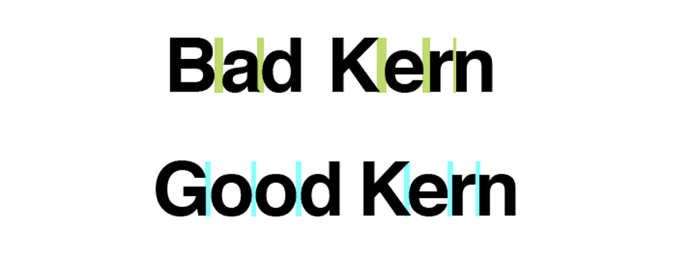
Kerning
Kerning adjusts space between specific pairs of letters. That last-minute fine-tuning makes “AV” look just right instead of “A V.”
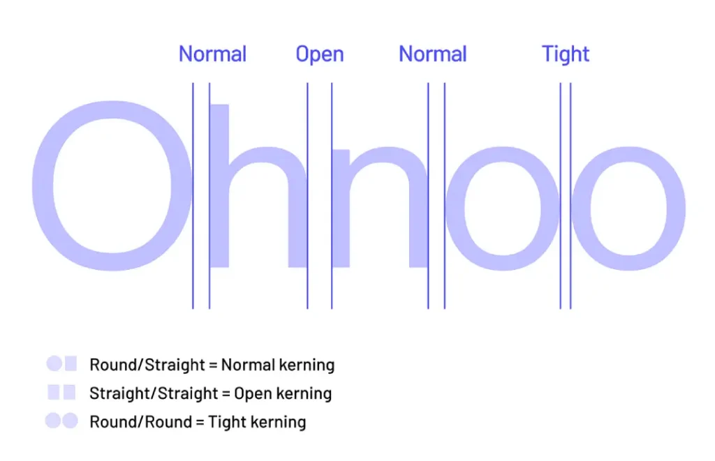
Metric Kerning vs. Optical Kerning
When you get into your design programme, you’ll see two main options for automatic kerning: Metric and Optical.
Don’t just guess which one to use. They do very different jobs.
Metric Kerning
Think of Metric kerning as the ‘designer’s choice’. The person who designed the font spent ages creating hundreds, sometimes thousands, of specific spacing adjustments for letter pairs that look awkward together.
Pairs like ‘To’, ‘Wa’, or ‘P.’.
When you choose Metric, the software simply uses that built-in table of adjustments. It’s honouring the original creator’s intent.
For a well-made, professional font, this is almost always your best starting point. It’s reliable and predictable.
Optical Kerning
Some programs offer optical kerning, which uses algorithms to adjust spacing based on letter shapes automatically. It’s like having a miniature typesetter living inside your computer!
Tools of the Trade
Having gone over the fundamentals, we can now talk about what should be in your letter spacing toolkit:
Letter spacing controls are available in popular design programs such as Adobe InDesign, Illustrator, and Photoshop. This means you can adjust tracking and kerning more precisely.
Implementation for the Modern Web (CSS3 & Beyond)
Translating a designer’s vision into a functional website requires more than just a letter-spacing property. To ensure your typography is responsive and accessible in 2026, you must utilise modern CSS properties.
The letter-spacing Property
In CSS, the letter-spacing property can accept pixels (px), but for truly responsive design, em units are superior. Because em is relative to the current font size, the spacing will scale proportionally if the user increases their text size for accessibility.
/* Recommended for high-readability body text */
p {
  letter-spacing: 0.015em;
  font-kerning: normal; /* Ensures OpenType kerning pairs are active */
}
Advanced Control with Variable Fonts
Variable Fonts have revolutionised how we handle “width” (wdth) axes. Instead of just adding space between letters (tracking), you can actually narrow or widen the letterforms themselves. This is particularly useful for fitting long headlines into narrow mobile screens without sacrificing the “Bouma” word shape.
| Property | Value Example | Best For |
font-variation-settings | 'wdth' 85 | Narrowing titles for mobile |
font-optical-sizing | auto | Automatic stroke/spacing adjustment |
text-wrap | balance | Preventing “widows” in headlines |
Specialised Apps
Specifically, built apps and plugins deal with letter spacing; examples include KernType (a browser-based game that teaches kerning) and RightFont (a font manager with advanced spacing controls).
Mastering the Software: A Professional Workflow
While the theory of spacing is universal, the execution depends on your canvas. In 2026, the industry has shifted toward Figma and Framer for digital interfaces, while Adobe InDesign remains the king of print.
Letter Spacing in Figma
In Figma, letter spacing is typically handled as a percentage of the font size. A common mistake is applying a “one-size-fits-all” percentage to an entire design system.
- Body Text: Aim for 0% to 2%.
- Headlines: Often require -1% to -3% to feel tight and authoritative.
- Caption Spacing: Small labels (10px–12px) often need 3%-5% to remain legible on high-density mobile displays.
The Adobe Creative Suite Logic
For those using Adobe Illustrator or InDesign, you are dealing with “thousandths of an em.”
- Manual Kerning: Place your cursor between two characters and use
Alt + Left/Right Arrow. - Tracking: Highlight the block and use the same shortcut to adjust the overall density.
- The “Optical” Secret: In the Character panel, switch from Metric to Optical kerning when using high-contrast serif fonts at large display sizes. This forces the software to calculate spacing based on the shapes’ visual weight rather than the font’s built-in data.
The Art of Letter Spacing
Okay, now we’re getting somewhere cool. This is where we talk about letter spacing.
Finding the Balance
If there’s one thing you need to know about letter spacing, everything needs balance. You want the text to be neither too tight nor too loose. Here are some tips:
- Squint Test: Squint at your text. If suddenly it looks like a rectangle instead of individual characters, you’re on the right track.
- Flip It: Turn your design upside down. You’ll have to think more about shapes and spaces rather than content.
- Print It Out: Sometimes things look different printed rather than on screen.
Different Fonts Need Different Spacing
When dealing with different fonts, not all rules apply. Here are some general guidelines:
- Serif Fonts: These fonts require less adjustment because they have built-in spacing features.
- Sans-Serif Fonts: Slight increases in tracking can benefit these fonts, especially at smaller sizes.
- Display Fonts: These wildcards often need more pronounced spacing adjustments.
Size Matters
Just as significant as size when talking about letter spacing is the amount of space between each character relative to its surroundings, especially for headlines – trust me! So here’s what happens:
- Large Text: For big letters to stay on top of each other visually, sometimes they need tighter spacing between them.
- Minor Text: Smaller typefaces typically work best with looser space settings, making words easier to read.
- Headlines: When it comes down to titles, I always suggest manual kerning where appropriate so that things look polished up there
Enhancing Typography with Tracking and Kerning
Combining tracking with kerning can elevate your typography from basic to professional. While tracking adjusts the spacing evenly across all characters in a text block, it doesn’t account for the unique space needed between specific letter combinations.
The Role of Tracking
- Uniform Adjustment: Tracking offers a quick way to alter space uniformly across multiple letters, which helps influence the overall readability and aesthetics of a paragraph or headline.
- Scale Adaptability: It’s perfect for resizing text; increasing tracking for larger sizes can make it more legible and visually appealing.
The Importance of Kerning
- Precision Spacing: Kerning allows for fine-tuning the space between individual letter pairs. This is crucial as certain letter combinations naturally require more or less space for optimal visual harmony.
- Enhanced Readability: Proper kerning can improve how a word is perceived, ensuring letters don’t appear crowded or disconnected.
The Synergy of Combining Both
By integrating tracking and kerning, you’ll achieve a nuanced balance. Start with tracking to set a baseline, and then adjust kerning to polish areas where specific letter pairs need attention. This combination ensures your text remains consistent while showcasing precision where it matters most.
Don’t Forget About Word Spacing
Alright, so you’ve got your letters perfectly spaced. Job done? Not quite.
If the gaps between your words are all over the shop, the whole thing can still look a mess.
Word spacing is exactly what it sounds like: the space between individual words. It’s most noticeable when you justify your text, where the computer stretches and squashes the word gaps to make every line the same width.
When this goes wrong, you get what designers call “rivers”. These are nasty-looking white gaps that seem to flow down through the paragraph, completely distracting the reader’s eye.
It makes your text look unprofessional and, frankly, it’s hard to read.
The fix? Take control. In software like Adobe InDesign, don’t just accept the default justification.
Get into the settings, and you can define the minimum, desired, and maximum amount of space allowed between words. Tightening these values up a bit can prevent those ugly rivers and give your paragraphs a much more even, consistent colour.
It’s a small tweak that makes a huge difference.
Common Letter Spacing Mistakes
Sometimes, even experts need help getting the spaces between letters right. Here are some mistakes that are often made and how to avoid them:
Too much space
Over-spacing can make words look messy and complicated to read. Remember, we want to achieve unity, not isolation among letters!
Not enough space
When letters have no space between them, they become cramped and confused, which irritates readers’ eyes, causing headaches. Give these poor characters some air!
Inconsistent spacing
Uneven distribution of letter spacing in one piece creates an oddity that does not look professional or well-thought-out; uniformity should be observed!
Font idiosyncrasies
Fonts differ significantly from one another due to their peculiarities; this is why failing to acknowledge such disparities may result in inelegant combinations of certain characters and an overall bad-looking type setting.
Failure to mind punctuation
Punctuation marks like commas, full stops, etc., also require attention! Particularly when it comes down to headers or significant texts
Letter Spacing in Different Design Contexts

Letter spacing does not have a one-size-fits-all rule. Let’s see how it varies in different design contexts.
Print Design
In print, letter spacing is about precision. You control every aspect of your design, so take the time to get every detail right.
Considerations for Print:
- Paper Type: Glossy paper may require different spacing than matte paper.
- Printing Method: Offset printing may require tighter spacing than digital.
- Viewing Distance: Billboards need different spacing than business cards.
Web Design
Regarding web typography, there are different challenges and opportunities regarding letter spacing.
Web-Specific Tips:
- Use Relative Units: Em or rem units allow for more flexible, responsive spacing.
- Test Across Devices: What looks great on your desktop might be a mess on mobile.
- Consider Load Times: Extensive custom kerning can impact performance.
Logo Design
Letter spacing can make or break your design when it comes to logos. The aim is to create an unforgettable, unified mark.
Logo Spacing Strategies:
- Create Custom Letterforms: Feel free to modify letters for perfect spacing.
- Think About Scalability: Ensure your spacing works in large and small sizes.
- Consider Negative Space: The space between letters can sometimes become part of the logo.
Advanced Letter Spacing Techniques
Ready for the next step in your spacing game? Here are some complex methods:
Optical Alignment
This method adjusts the spacing between the first and last letters in a line to ensure perfect alignment. This is great for headings or other large text.
Contextual Alternates
Some fonts have different letter versions that can help space them together in some instances. Knowing when to use these helps improve your typography.
Mixing Fonts
Letter spacing becomes even more critical when using multiple different fonts. Adjust each font separately so they all look good together.
Spacing for Emphasis
You can strategically space out letters to emphasise certain words or phrases. But remember, a little bit of this technique can go a long way!
Playing with Variable Fonts
Here’s something a bit more advanced, but it’s where the future is heading. Variable fonts are a newer font format that bundles an entire family of styles into a single file.
Think of a font that can smoothly change from thin to bold, or condensed to extended, without needing separate font files.
This gives you incredible control. A variable font can have a ‘Width’ axis (`wdth`) that lets you make the letters themselves wider or narrower, which naturally affects the space they occupy.
It’s a much more organic way to adjust density than just using tracking.
Even better is the ‘Optical Size’ axis (`opsz`). This feature is pure magic. It automatically adjusts things like stroke thickness and spacing to be perfectly optimised for the size at which the font is displayed.
Small text gets a bit more open and sturdy, while large headlines get tighter and more refined, all without you having to lift a finger. It’s like having a master typographer built right into the font itself.
Understanding Optical Margin Alignment and Its Application in Typography
Optical margin alignment is a typography technique that enhances the visual appeal of text. It allows designers to subtly adjust the placement of specific characters, such as serifs or punctuation, beyond the margin of a text block. This adjustment offers a polished, professional look by preventing undesirable gaps.
Why Use Optical Margin Alignment?
- Enhances Visual Flow: Boxed or constrained text can disrupt the reading experience. Optical margin alignment smooths the edges by aligning elements such as quotation marks and serifs, creating a more even visual line.
- Addresses, Widows and Orphans: In typography, “widows” and “orphans” refer to isolated words or short lines stranded at the top or bottom of a text block. Optical margin alignment can help reduce these gaps without compressing text, addressing the imbalance naturally.
How to Implement Optical Margin Alignment
To apply this technique, open the typesetting options in your preferred design software, which are often located under typography settings. Here’s a generalised approach:
- Locate the Feature: Navigate to your application’s typography panel or settings. Look for an option labelled “Optical Margin Alignment” or similar.
- Activate and Adjust: Enable the feature and observe any changes to your text. It may adjust letters, punctuation, or serifs to extend slightly past the text block, enhancing readability and aesthetics.
- Fine-tune as Needed: Test different settings to achieve your desired effect while maintaining the visual balance of your document.
By integrating optical margin alignment in your design process, you ensure that your text looks elegant and maintains its readability and professional appearance.
Letter Spacing in Different Languages
Typography isn’t a one-size-fits-all, particularly when it comes to different languages. Here is an express tour around the world of letter spacing.
Latin-based Languages
While most Western languages are based on the Latin script, that doesn’t mean they follow identical spacing rules.
- English: Largely forgiving, but tricky combinations like “AV” or “To” can trip you up.
- French: Avoid spaces before and after punctuation marks, especially guillemets (« »).
- German: Compound words can get pretty long; additional space between letters might be needed for legibility.
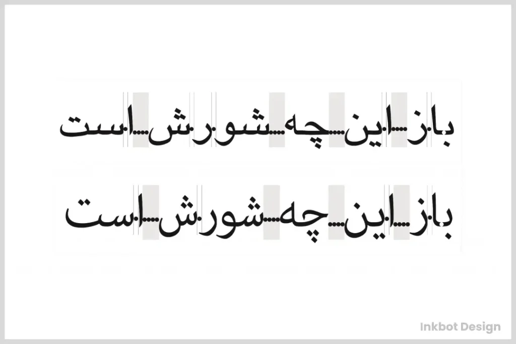
Non-Latin Scripts
Venturing outside the Latin alphabet brings a whole new set of considerations for spacing:
- Arabic: Each letter has connecting and non-connecting forms, which should be handled.
- Chinese and Japanese: Spaces aren’t used between words in these languages, so character spacing becomes even more critical.
- Thai: Readability can improve dramatically by slightly increasing letter spacing with no spaces between words.
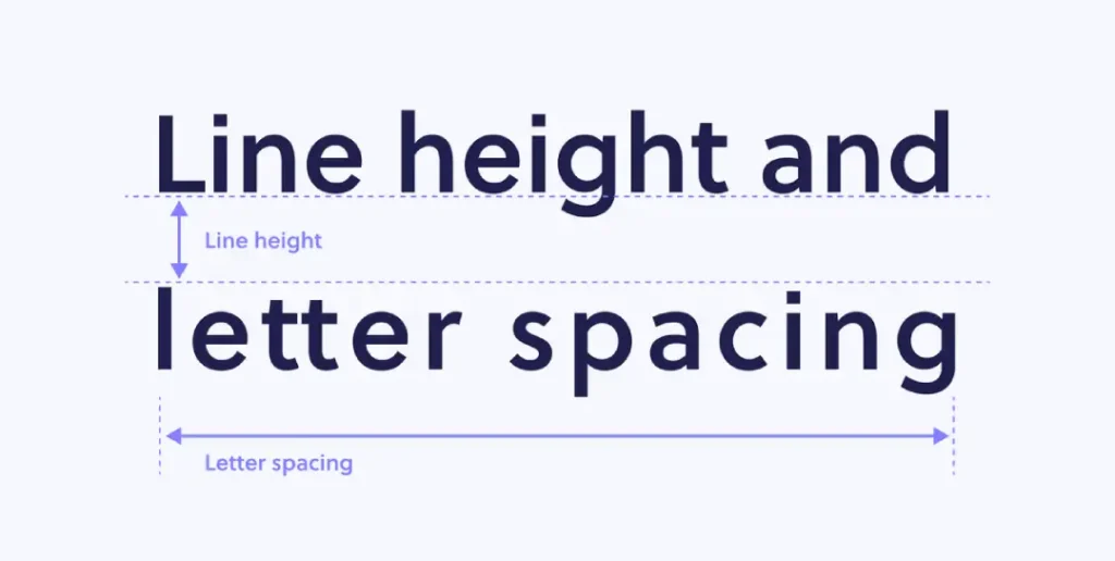
How Tracking Relates to Leading in Typography
In typography, tracking and leading are two crucial elements that shape the readability and aesthetic of text. While they serve different functions, their interaction greatly influences how text is perceived.
Tracking refers to the overall spacing between characters in a block of text. Adjusting tracking affects the density and readability of your text. Tight tracking brings characters closer together, while loose tracking increases the space between them.
Leading, on the other hand, is the vertical space between lines of text. It’s the distance from one line’s baseline to the next. Proper leading enhances readability by ensuring the lines of text don’t overlap or crowd each other.
The Interplay Between Tracking and Leading
When you adjust tracking, you must also consider leading to maintain a balanced and harmonious layout:
- Increased Tracking: When characters are spaced farther apart, lines of text may appear longer. To counteract this visual stretching, you should increase leading. This additional space between lines will prevent the text block from looking squeezed or overly compressed.
- Reduced Tracking: If tracking is tighter, lines may appear denser. Reducing leading can create a more compact, unified appearance without making the text feel cramped.
Why Balance Matters
A proper balance between tracking and leading ensures that text is visually appealing and easily read. If the tracking is generous but leading is inadequate, the text can look horizontally stretched and unbalanced. Conversely, excessive leading can make the text seem disjointed or as if it’s floating on the page.
In summary, effective typography requires careful consideration of both tracking and leading. Their interplay can dramatically impact your text’s readability and visual balance, making them vital tools in any designer’s arsenal.
The Future of Letter Spacing
As technology has changed, so has the way we space letters. Here are some things we think might happen soon:
AI Spacing
Artificial intelligence is already helping make better auto-kerning algorithms. Maybe one day, we’ll have AI that can adjust letter spacing based on what it says, where it is, or even who’s reading.
Fonts That Can Change
These fonts can change lots of things about themselves as you use them. One of those things could be the spacing between letters. This could be useful for typesetting that responds to its environment.
Typography In Augmented Reality
When AR becomes more common, we’ll need to work out how to space letters in 3D. We could have writing that stretches and squashes as you walk around it!
Practical Exercises to Improve Your Spacing Skills
Theory is helpful, but practice improves our skills. Below are some exercises that can help you work on your letter spacing:
- The Magazine Game: Take a magazine and find examples of excellent and lousy letter spacing and suggest how to improve them.
- The Logo Challenge: Pick any well-known logo and try recreating it while highlighting the gaps between letters. Compare yours with the original version.
- The Kern Type Game: Spend time on platforms like Kern Type playing games that require you to kern until proper spacing becomes intuitive.
- The Upside-Down Test: Write out a paragraph, then flip it over. Adjust the spaces until they appear correct, then revert them to the standard view for comparison.
- The Font Pairing Exercise: Choose and combine two fonts with visually compatible letter spacings.
The Business Case: Why Spacing Equals Success
Typography is not just an aesthetic choice; it is a cognitive one. Research on user experience (UX) shows that text density directly affects how long a user stays on a page.
- Reduced Cognitive Load: When letters are correctly spaced, the brain spends less energy “decoding” shapes and more energy “encoding” the message. This leads to higher retention rates.
- Increased Trust: A study on visual hierarchy found that users perceive websites with “breathing room” (generous tracking and leading) as more professional and trustworthy than cramped, data-dense layouts.
- Mobile Conversion Rates: On mobile devices, the “tap target” of a link is influenced by the surrounding space. Tight letter spacing can lead to accidental clicks or “fat finger” errors, frustrating the user journey.
Conclusion
We have covered a lot of ground in our journey through the world of letter spacing. From the basics to advanced techniques, we have learned how those little spaces between letters can make or break your design.
Remember that becoming good at letter spacing is part science, part art. Practice it often, be patient, and pay attention to details. With what you have learnt from this manual, becoming an expert typographer is not far off.
Therefore, I urge you to bravely put spaces between those letters! Trust me; both your designs and readers’ eyes will appreciate it. Also, remember that now you are the conductor for spacing in the great orchestra of typesetting. Let it sing!
Frequently Asked Questions
Does letter spacing affect my website’s ranking?
Directly, no. However, by 2026, search engines will heavily weigh User Engagement Signals. If poor spacing leads to high bounce rates or low “time-on-page,” your rankings will suffer. Accessible typography is a cornerstone of high-performance content.
What is the “ideal” letter spacing for body text?
For most Sans-Serif fonts like Inter or Roboto, a setting of 0 to +0.01em is ideal. For Serif fonts like Merriweather, the default settings are usually sufficient, as the serifs act as natural spacers.
How do I fix “Rivers” in my paragraphs?
“Rivers” are caused by justified text. The best fix is to use Left Alignment. If you must justify, use Adobe InDesign’s “H&J Violations” tool to highlight spacing issues and manually adjust the word spacing to be more consistent.
Is there a difference between letter-spacing and tracking?
In digital design, they are often used interchangeably. However, technically, Tracking is the act of adjusting the space across a range of characters, while letter-spacing is the CSS property used to implement that change on the web.
Can I use letter spacing to fit more text on a page?
Technically, yes, but use extreme caution. Reducing tracking beyond -2% significantly degrades readability. It is better to edit the copy for brevity than to sacrifice the reader’s comfort.
Can letter spacing slow down a website?
Web fonts with many custom kernings might affect load times, but this isn’t much of an issue, thanks to modern web technologies.
Do you have any tools to practice letter spacing?
Absolutely! Try games like “Kern Type” online, or use the options in your favourite design software.
What’s the approach to letter spacing for responsive web design?
Use relative units (em, rem) so that it scales well across devices
Can too much attention on letter spacing become counter-productive?
Yes – over-analysing will only waste time. Find balance; sometimes, good enough is the best solution!
How should I go about letter spacing for logos?
More detailed work is needed for logo typography. Create custom characters if necessary and test at multiple sizes.

