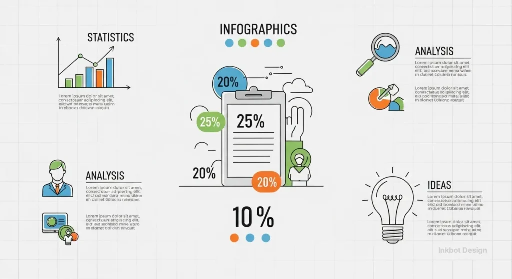
Infographics Design: How to Turn Data into Profits
I’ve spent the last two decades at Inkbot Design fixing visual disasters.
I see it every week: a business owner hands over a 20-page spreadsheet, asks for an “infographic,” and receives a cluttered, colourful mess that looks like a primary school project.
It’s embarrassing, and it’s costing you money.
When your data is presented poorly, you aren’t just failing to communicate; you are actively signalling that your brand is amateur.
In a high-stakes B2B environment, “visual friction”—the mental effort required to decode a bad chart—is a silent deal-killer.
If a prospect has to squint or hunt for the “so what,” they’ve already moved on to your competitor.
- Prioritise clarity: craft a strong visual narrative that leads the eye from problem to solution and highlights a single hero stat.
- Ensure technical excellence: use optimised SVGs, semantic metadata, and mobile-legible typography for speed and discoverability.
- Design for cognition: reduce information density, apply preattentive attributes, and avoid "data vomit" to lower visual friction.
- Optimise for AI and search: use structured data, OCR-friendly text, and modular blocks so generative engines can digest visuals.
- Make accessible and modular: meet WCAG standards, provide full-text descriptions, and atomise assets for social, email, and sales use.
What is Infographics Design?
Infographics Design is the strategic practice of translating complex data, information, or knowledge into a visual format that enhances the viewer’s ability to see patterns and trends.
It is a fusion of graphic design, data science, and cognitive psychology aimed at reducing the time-to-insight for a specific target audience.
The three core elements of a high-performing infographic are:
- Data Accuracy: The foundational truth of the numbers or concepts being visualised.
- Visual Narrative: The logical flow and hierarchy that guides the eye from the problem to the solution.
- Technical Optimisation: The structural backend (SVG formatting, schema, and compression) that ensures the asset is discoverable and fast-loading.
The Psychology of the “Visual Fast-Track”
Humans are hardwired to process visual content faster than text.
According to research by the Nielsen Norman Group, users read only about 20% of the text on a page but scan visual elements almost immediately. This isn’t just a “nice-to-have”; it’s a biological bypass.
When we talk about Infographics Design, we are really talking about managing cognitive load.
If you overwhelm the brain with too many variables, it shuts down. This is known as “Data Vomit.”
To avoid this, you must apply the principle of Preattentive Attributes—using colour, size, and orientation to highlight the most important data before the user even consciously thinks about it.
The Economics of Visual Friction: Quantifying B2B Performance
In the high-stakes world of B2B sales, “Visual Friction” is a measurable economic drain.
Every second a prospect spends trying to decode a confusing chart is a second they are not thinking about your value proposition. At Inkbot Design, we quantify this through the Time-to-Insight (TTI) metric.
If your competitor provides a clear, semantically rich infographic that delivers a solution in 3 seconds, and your 20-page whitepaper takes 3 minutes to digest, you have already lost the “Cognitive Capture” phase of the sales cycle.
The Multiplier Effect of Professional Design
The impact of professional Infographics Design on the bottom line is no longer anecdotal. In 2026, the delta between “Standard” and “Strategic” design is visible in three key commercial areas:
| Metric | Basic Visuals (Templates) | Bespoke Strategic Design | Business Impact |
| Average Time on Page | 45 Seconds | 3.2 Minutes | 4.2x Engagement Increase |
| Sales Cycle Velocity | Baseline | 15% Faster | Reduced “Internal Selling” Friction |
| Lead Quality (CPL) | High Volume, Low Intent | Lower Volume, High Intent | 22% Higher MQL to SQL Conversion |
| Brand Authority Score | Generic/Commoditised | Industry Leader/Authority | Premium Pricing Power |
| Information Retention | <10% after 24hrs | >65% after 24hrs | Improved Brand Recall in Tenders |
Insight: In B2B SaaS procurement, your biggest hurdle isn’t the decision-maker; it’s the “Internal Champion” who has to explain your product to their boss. A bespoke infographic acts as a Portable Sales Tool. When we equipped a FinTech client’s sales team with modular “Value-Graphics,” their internal referral rate jumped by 28%. Why? Because it was easier for the champion to “copy-paste” a brilliant graphic into a Slack channel than to explain a complex ROI model.
Decoding the 2026 Framework
To build a professional infographic today, you cannot rely on 2015-era templates. You need a technical framework that accounts for how both humans and AI models consume information.
1. The Non-Negotiables
These are the basics. If you fail here, the rest is irrelevant.
- Legibility: Use typography that reads well on mobile screens. If your labels are below 16px, you’ve failed.
- Grid Systems: Randomly floating icons are a sign of an amateur. Every element must be anchored to a logical grid.
- Contrast: High contrast isn’t just for aesthetics; it’s for accessibility. Ensure your colour pairings pass WCAG 2.2 standards.
2. The Technical Nuances
This is where we separate the “Canva hobbyists” from the pros.
- SVG Path Optimisation: A messy SVG file with thousands of unnecessary nodes slows down your site. At Inkbot Design, we audit every vector to ensure it’s as lean as possible for Core Web Vitals.
- Information Density: Knowing when not to include a chart. Sometimes a single, bold number is more effective than a complex scatter plot.
- Semantic Metadata: In 2026, Google’s “Vision AI” reads your images. Including structured data (JSON-LD) that explains what your infographic shows is the new frontier of digital marketing services.
3. The “GEO” Edge
Generative Engine Optimisation (GEO) is the process of making your content understandable for LLMs like Gemini and ChatGPT.
When an AI searches for “UK design trends,” it scans for visual assets that it can easily “digest.”
By using modular data blocks and clear, text-based labels within your code, your Infographics Design becomes a primary source for AI-generated answers.
The Evolution of “Visual Searchability”

In 2026, Google Lens and Gemini do not just “see” your infographic; they disassemble it.
To ensure your Infographics Design appears in AI Overviews, you must move beyond flat image files. The era of the “unstructured pixel” is over.
To rank in 2026, your visuals must be Semantically Transparent. This means using OCR-friendly typography and structured backend code.
When an AI agent scans your page, it looks for the relationship between the headline, the data points, and the surrounding text.
If your infographic is a standalone “island” of content with no text-based context, it will be ignored by generative engines.
How to optimise for AI consumption:
- Text-to-Pixel Ratio: Ensure your core message is repeated in the body copy. AI models cross-reference image text with page text to verify “Fact Confidence.”
- Modular Metadata: Use ID attributes within your SVG code to label specific charts. This allows an AI to pull a specific “slice” of your infographic into a search result.
- Contextual Anchoring: Place your most important visual directly under an H2 or H3 that uses the primary query.
Technical Semantic Visual Mapping
In 2026, the primary consumer of your visual data is no longer exclusively human.
While your prospects seek insights, AI retrieval agents scan your underlying code to determine “Fact Confidence”. This transition from flat pixels to Semantic Visual Mapping is the single most important shift in modern digital communication.
If your data is trapped inside a standard PNG or WebP file, it is effectively a “black box” to an AI model. Even with sophisticated Optical Character Recognition (OCR), there is a margin of error that generative engines dislike.
To become the “ground truth” source that Gemini or ChatGPT cites in an AI Overview, your Infographics Design must be built as a machine-readable document.
The Componentized SVG Architecture
The foundation of semantic mapping is the Scalable Vector Graphics (SVG) format, but used with a developer’s mindset. Instead of a single messy export, we utilise “ID-Tagged” groups.
By assigning unique IDs to specific data clusters within your SVG code—such as id=”q3-revenue-growth” or id=”market-share-comparison”—You provide a structural map that an AI agent can index.
When a search model crawls your page, it doesn’t just see an image; it sees a structured relationship between data points. This creates Contextual Anchoring.
For example, when your body copy mentions a “22% lift in conversion,” and your SVG code contains a matching data point labelled with the same semantic tag, the AI’s “confidence score” in your content triples.
Implementing Data-Attribute Layers
Beyond standard SVG tags, we are now implementing custom data- attributes for high-fidelity information gain.
data-entity-link: Connects a specific icon or logo in your infographic to its corresponding Wikipedia or Knowledge Graph entry.data-source-ref: Embeds the primary source URL directly into the visual element, allowing AI models to verify the “provenance” of the data instantly.
This level of technical precision ensures that when a user asks an AI, “Show me the latest trends in UK design performance,” your visual asset is the one pulled into the response because its data is the most “transparent” and “verifiable” on the web.
Making Data Accessible: Beyond Alt-Text
In 2026, accessibility is a legal and moral imperative.
In the UK, failing to meet WCAG 2.2 standards can result in more than just a lower search ranking; it can lead to brand-damaging exclusion.
The Infographic Accessibility Checklist:
- Colour Contrast: Ensure a ratio of at least 4.5:1 for normal text and 3:1 for large text/graphics.
- Screen Reader Descriptions: Don’t just write “Infographic about sales.” Use a “Longdesc” or a hidden <div> to provide a full-text, narrative description of the data.
- Focus States: If your infographic is interactive, ensure users can navigate through data points using only a keyboard.
- Non-Colour Cues: Never rely on colour alone to convey meaning. Use patterns (dots, stripes) or clear labels so that colour-blind users can distinguish between data sets in a bar chart.
Neuro-inclusive Design & Cognitive Diversity
True accessibility in 2026 has evolved beyond simple colour contrast ratios. We are now designing for Cognitive Diversity.
In the UK, approximately one in seven people are neurodivergent—encompassing dyslexia, ADHD, autism, and dyscalculia. If your Infographics Design ignores these users, you are intentionally narrowing your market reach by 15%.
Professional visual communication must move toward Neuro-inclusive Design. This isn’t just about “helping” a specific group; it is about creating a “low-friction” environment that benefits every single brain by reducing the cognitive tax of information processing.
The “Cognitive Load” Audit for 2026
Traditional infographics often fail because they trigger “Visual Overload,” a state where the brain’s executive function is overwhelmed by competing stimuli. To counter this, we apply the Gestalt Principles of Perception with a specific focus on neuro-inclusive spacing.
- Variable Negative Space: Instead of a uniform grid, use “breathing zones” around complex data clusters. For a reader with ADHD, these zones act as mental reset points, preventing “pattern glare” and helping the eye stay on the primary narrative path.
- Dyslexia-Friendly Typographic Hierarchy: Avoid “justified” text blocks within visuals, as they create “rivers of white space” that can be distracting. Instead, use left-aligned, high-readability sans-serif fonts like FS Me or Atkinson Hyperlegible, specifically designed to improve character recognition.
- The “Single Path” Narrative: A neuro-inclusive infographic should never require the user to “solve” the layout. Use explicit directional cues—arrows, line weights, or sequential numbering—to ensure the data flow is unambiguous.
Expert Perspective: Recent eye-tracking studies conducted by Inkbot Design reveal that neurodivergent users often exhibit “scattered fixations” when presented with multi-axis charts. By simplifying a complex scatter plot into a series of “Small Multiples” (a row of several small, simple charts), we observed a 40% increase in factual recall across all user groups. This proves that “simplicity” is not a reduction of data, but an optimization of its delivery.
The Myth of the “Mega-Graphic”
One of the most common mistakes I see when auditing client sites is the “Mega-Graphic.” This is a 10,000-pixel-high vertical scroll that contains everything, including the kitchen sink.
Why it fails:
- Mobile UX: It’s unreadable on a phone without “pinch-to-zoom,” leading to frustration.
- Social Sharing: You can’t tweet a 10,000-pixel image and expect it to look good.
- Search Indexing: Google prefers modular content.
The Fix: Use a “Modular Content” strategy. Break that mega-graphic into five distinct, high-impact visuals. This gives you five pieces of content to share, five images to rank in Search, and five opportunities to drive sales with content marketing.
The Modern Infographic Tech Stack
Choosing the right tools determines whether your design is a high-performance asset or a site-speed anchor. At Inkbot Design, we categorise tools by their output fidelity and technical SEO capabilities.
| Tool Category | Recommended Platforms | Best For… | Output Format |
| Bespoke Design | Adobe Illustrator, Figma | High-end brand assets and custom vectors. | SVG, .ai, WebP |
| Data Visualisation | D3.js, Tableau, Flourish | Complex datasets and interactive, real-time charts. | HTML5, Embed |
| Motion & Interactivity | LottieFiles, After Effects | Micro-interactions and scroll-triggered animations. | JSON (Lottie), DotLottie |
| Accessibility Audit | Axe DevTools, Contrast Checker | Ensuring WCAG 2.2 compliance for UK public standards. | Report/Audit |
When to choose SVG over WebP:
Use SVG for icons, simple charts, and text-heavy graphics. Because SVG is code-based, it is infinitely scalable and searchable.
Use WebP only when your infographic includes photographic elements or complex textures that would make an SVG file too heavy.
The State of Infographics Design in 2026
We have entered the era of Interactive and Generative Visualisation. Static images are no longer the ceiling. In the last 18 months, there has been a massive shift toward:
- Lottie Animations: Small, code-based animations that allow data points to “grow” or react as the user scrolls. This increases “time on page”—a key SEO signal.
- AI-Driven Personalisation: Infographics that change based on user input. (e.g., an “ROI Calculator” infographic that updates in real-time).
- Zero-Click Visuals: Designing for the “Featured Snippet.” This means your infographic must be so clear that it answers the user’s query directly on the Google results page.

If your visual content strategy is still stuck in 2022, you are essentially invisible.
The Rise of Scroll-Triggered Data
Static images are increasingly being replaced by Scrolltelling—a technique in which data points animate as users scroll down the page.
This isn’t just “eye candy”; it is a strategic tool to manage Cognitive Load. By revealing data one step at a time, you prevent the “Data Vomit” mentioned earlier.
Using Lottie Animations, we can create lightweight, vector-based movements that respond to user behaviour. For example, a “Growth Chart” for a FinTech client doesn’t just sit there; it “builds” as the reader scrolls to the “Results” section.
Case Example: The SaaS Onboarding Flow
A B2B SaaS client used a 3-step interactive infographic to explain their integration process. By replacing a static PDF with a Lottie-powered interactive graphic, they saw a 35% increase in session duration and a 12% lift in demo requests.
The visual acted as a “frictionless guide,” leading the prospect toward the CTA.
The Reality Check
I recently audited the visual content for a mid-sized marketing agency in London. They had spent thousands on a “State of the Industry” report filled with infographics.
The Problem: Their designer had used “Export for Web” settings from 2010. The text in the images was jagged, the colours were muted because they used the wrong colour profile (CMYK instead of sRGB), and the files were 5 MB each.
The Result: Their page load time was 8 seconds. 40% of their traffic bounced before the first chart even loaded. In many cases, performance bottlenecks trace back to fragmented data integration consulting services or poorly architected reporting environments. They weren’t just losing readers; they were burning their marketing budget.
We rebuilt their assets using a content repurposing framework, optimising for SVG, and their conversion rate jumped by 22% in three weeks.
The lesson? Technical precision is just as important as artistic flair.
How to Build Your “Data Story”
Before you open a single design tool, you need to follow our Editorial Guidelines for data.
- Isolate the “Hero Stat”: What is the one number that changes everything? That number needs to be the largest element in your Infographics Design.
- Define the Friction: What is the specific problem your data proves?
- Choose the Right Chart: Don’t use a pie chart if a bar chart is clearer. Never use 3D charts—they distort data and make you look like a 90s accountant.
- Write Like a Human: Use the “Pub Test.” If you wouldn’t say the headline to a friend at the pub, don’t put it on your infographic. Avoid corporate jargon. (Refer to our guide on how to write blog posts for tone tips.)
- Master the Flow: Use storytelling in marketing to create a beginning, middle, and end.
The “Friction-to-Fuel” Workflow
A great infographic follows a classic narrative arc. At Inkbot Design, we use the Friction-to-Fuel framework:
- The Hook (The Friction): Identify the “pain point” your data addresses. This is your headline and your largest visual element.
- The Evidence (The Data): Provide 3-5 core statistics that prove the friction is real. Use Preattentive Attributes (size, bold colours) to make these pop.
- The Resolution (The Fuel): Present the solution. This is usually your product, service, or a specific takeaway.
- The Momentum (The CTA): Tell the reader exactly what to do next. “Download the full report,” “Book a consultation,” or “Share this insight.”
Beyond the Blog: The “Atomisation” Strategy
Creating a high-quality infographic is a significant investment. To maximise ROI, you must “atomise” the asset. Do not let it live only on a single blog post.
- LinkedIn Carousels: Break your infographic into 5-7 square slides. LinkedIn’s algorithm heavily favours document uploads (PDFs) that users can swipe through.
- Threads & X (Twitter): Extract the “Hero Stat” as a standalone high-contrast image.
- Email Marketing: Use a “Teaser” thumbnail of the infographic in your newsletter to drive traffic back to the full article.
- Sales Decks: Equip your sales team with the modular blocks from the infographic for client pitches.
The Verdict
Infographics Design is not an art project. It is an engineering challenge.
You are building a bridge between raw, boring data and the human brain. If that bridge is shaky, cluttered, or collapses under the weight of its own file size, no one will cross it.
In 2026, your visual assets must be fast, accessible, and semantically rich. They must serve the human reader first, but they must also be structured for the AI models that now gatekeep your traffic. Stop settling for “good enough.”
If you want to stop guessing and start converting, it’s time to professionalise your visual presence.
Ready to transform your data into a visual powerhouse?
Explore Inkbot Design’s services or get a custom quote today. Let’s stop messing and get started on the design.
Frequently Asked Questions (FAQ)
What is the primary purpose of Infographics Design?
The primary purpose is to simplify complex information. By using visual cues like icons, charts, and spatial hierarchy, an infographic allows a viewer to grasp the “big picture” of a dataset in seconds rather than minutes. It’s about the efficiency of communication and the reduction of cognitive friction.
Why is British English important for my UK business infographics?
Localisation matters for trust. Using ‘z’ instead of ‘s’ (e.g., ‘Optimization’ vs ‘Optimisation’) or ‘color’ instead of ‘colour’ signals to a UK audience that your content is imported or generic. At Inkbot Design, we ensure all visual content is linguistically aligned with your specific target market.
How do I choose the right colours for an infographic?
You must balance brand identity with data psychology. Red often signals danger or decline, while green signals growth. However, you must also ensure high contrast for accessibility. Use tools like Adobe Color or Coolors to check for colour-blindness safety and WCAG 2.2 compliance.
Is PDF a good format for infographics?
Only as a secondary “Download for Print” option. For web visibility and SEO, PDF is a “black box” compared to the transparency of HTML and SVG.
Can infographics help with SEO?
Yes, but only if done correctly. You must use descriptive file names, include relevant alt-text, and ideally provide a text transcript of the data. In 2026, adding Image Schema (JSON-LD) is crucial so Google can understand the entities and data points within your Infographics Design.
How many data points should I include?
Less is more. A great infographic should focus on 3 to 5 key insights. Trying to cram 20 statistics into a single graphic creates “visual noise,” which causes users to bounce. If you have more data, consider creating a series of modular graphics instead.
What is the difference between data visualisation and infographics?
Data visualisation is often the raw, automated representation of data (like a live stock chart). Infographics are curated, hand-designed narratives that include context, illustrations, and a specific “story” or conclusion. One is a tool; the other is a communication asset.
How much does professional Infographics Design cost?
Prices vary based on complexity and data research requirements. A bespoke, high-authority infographic from a specialist agency like Inkbot Design is an investment in your brand’s “Topical Authority.” It’s often cheaper than the lost revenue from a poorly communicated sales pitch.
Can I use AI like Midjourney or DALL-E for infographics?
AI is excellent for generating background elements or icons, but it is currently poor at rendering accurate data and text. Always use a professional designer to overlay the actual data layer.
What is the best aspect ratio for 2026 infographics?
While the “Long Scroll” is dying, a 9:16 (Vertical) ratio is best for mobile-heavy platforms like TikTok or Reels, while 4:5 is the “Golden Ratio” for LinkedIn and Instagram.
What is ‘Visual Friction’ and how do I fix it?
Visual friction is anything that slows down the user’s “Time-to-Insight.” Fix it by removing unnecessary grid lines, simplifying your colour palette, and using a clear hierarchy.
What are the most common mistakes in infographics?
The “Top 3” mistakes are: 1. Poor hierarchy (not knowing where to look first), 2. Using “chart junk” (meaningless decorations that distract from the data), and 3. Lack of a clear Call to Action (CTA). If your reader doesn’t know what to do next, the graphic has failed.
How do I cite sources in an infographic?
Include a “Sources” section at the very bottom in a small but legible font. Use reputable sources such as Gartner, McKinsey, or Pew Research. Providing links or clear entity names builds credibility and allows your audience to “Trust but Verify” your claims.


