The Domino’s Logo: A History in Brand Evolution
Most conversations about logos are dominated by fluffy “brand-speak” and subjective nonsense.
As a design consultant, I’ve seen countless entrepreneurs agonise over a shade of blue while their business model is on fire. We must stop treating logos as art and start seeing them as what they are: ruthlessly efficient business tools.
And if you want a case study in a logo that works, you look at Domino’s.
That simple red and blue domino is more than just a recognisable mark. Its history is a 60-year masterclass for every small business owner on simplicity, strategic change, and the power of consistency. It’s also a perfect example of what happens when you “fix” what isn’t broken.
My biggest annoyances in this industry are:
- Clutter: Designers (and clients) who think “more is more.” Adding a swoosh, a gradient, and a box doesn’t make your logo more “dynamic,” it just makes it a mess.
- Trend-Chasing: Ditching a functional, recognisable logo just to look “modern.” This screams desperation.
- Forgetting Your Core: Losing the one simple idea that made your brand distinct in the first place.
The Domino’s logo history has fallen foul of (and then gloriously recovered from) all three. Its journey is critical for any entrepreneur to understand because a logo is the sharp end of your entire logo design and branding strategy. Get it right, and it does the heavy lifting for you. Get it wrong, and you’re fighting an uphill battle forever.
- Logos are business tools; design for function and recognisability, not art or trends.
- Simplicity and consistency built Domino's global recognition; the 1965 and 2012 marks prove this.
- Rebrands must have clear strategic purpose (digital readiness, product change), not panic-driven tweaks.
- Design stories must be scalable; the three-dot origin worked, adding dots would have failed at scale.
The Humble Beginning (1960-1965): DomiNick’s
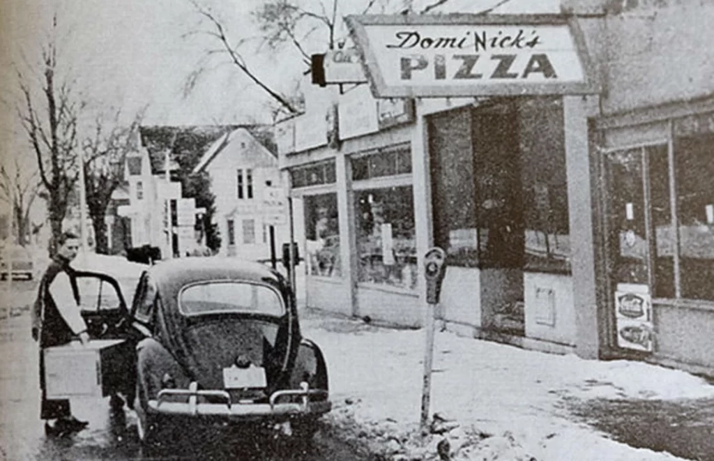
Like most great brands, it didn’t start with a boardroom and a rebrand. It began with a small shop.
In 1960, brothers Tom and James Monaghan bought a small pizza restaurant in Ypsilanti, Michigan, called “DomiNick’s.” Not cut out for the hustle, James traded half of the business to Tom a year later for the Volkswagen Beetle they used for deliveries.
Tom Monaghan was left with a single shop (soon to be three) and a name he couldn’t legally use, as the original DomiNick wanted his name back.
This is the first lesson: branding is often born from necessity. Tom needed a new name, fast.
1965: The Birth of the Icon (and a Terrible Idea)
The new name came from an employee, Jim Kennedy, who suggested “Domino’s.” Tom loved it. It was simple, familiar, and sounded similar enough to the original.
With the name came the first logo. It was rudimentary but had all the core elements: a red and white domino tile.
Crucially, this logo contained the brand’s first story. The domino had three dots. Why? One dot for each of Tom Monaghan’s three stores at the time.
This is brilliant. It’s simple, memorable, and rooted in the company’s origin.
But it also came with an absolutely terrible idea. The original plan was to add a new dot to the logo for every new store they opened.
Let that sink in.
As of 2024, Domino’s has over 20,000 stores. The logo would be a dense, unreadable cluster-mess of dots, looking more like a QR code than a brand.
Lesson for Small Businesses:
Your logo needs a story, but it must be scalable. The “three dots” story is fantastic. The plan to add more was a design-killer. Thank God they abandoned it. When you create your first logo, ask yourself: “If my business grows 100x, will this design still work?” If the answer is no, it’s a bad design.
The “Pizza Inc.” Years (1970s – 1996): Building an Empire
For the next 30-odd years, the logo was standardised and refined. This is the version most of Gen X and Millennials grew up with.
The domino tile (still with three dots) was paired with a clear, stacked wordmark: “Domino’s” in a bold blue font, and “Pizza” underneath, often in a blue rectangle. The colours were set: bright, primary red and blue.
This logo was a workhorse. It was high-contrast, easy to read from a distance, and perfectly suited for its primary jobs:
- On building signs.
- On car-topper delivery signs.
- Printed on millions of cardboard boxes.
It wasn’t “cool.” It wasn’t “edgy.” It was functional. And in that function, it became one of the most recognised brand marks in the world. It built a multi-billion-dollar empire.
Lesson for Small Businesses:
Consistency is more valuable than coolness. For 30 years, Domino’s resisted the urge to “tinker.” They let the logo do its job. That relentless repetition burned the mark into our collective consciousness.
New business owners are often terrified of their brand “getting stale.” Don’t be. Be terrified of it being unrecognisable. Before you worry about being “boring,” worry about being remembered.
The 1996 Rebrand: When Marketing Lost the Plot
And then… the 90s happened.
In 1996, Domino’s launched a major rebrand. And oh dear. It’s a textbook example of “design by committee.”
Let’s break down this misstep:
- The Tilted Box: The clean, simple domino tile was suddenly tilted. Why? To look “dynamic” and “action-oriented,” no doubt. It just looks clumsy.
- The Container: The wordmark “Domino’s Pizza” was now italicised and jammed inside a different tilted blue box with a needless swoosh.
- The Clutter: The core icon (the domino) was now fighting for attention with the container for the wordmark. It was two boxes competing.
- The Emphasis: The word “Pizza” was de-emphasised, signalling their first move to be “more than just pizza.” This was a sound business strategy, but the design execution was a mess.
This logo screamed, “We’ve been to marketing meetings!” It lost the elegant, brutal simplicity of the original. It was cluttered, less legible, and felt like it was trying way too hard. This is my “clutter” pet peeve in action. They added elements instead of reinforcing the one that worked.
Lesson for Small Businesses:
A rebrand should simplify and focus your message, not dilute it with trendy graphics. The 1996 logo was weaker because it was less confident. It added elements to try and explain itself (“we’re dynamic!”).
If your logo needs other graphic “stuff” to prop it up, the logo itself has failed.
The 2012 “Pizza-less” Revolution: A Stroke of Genius
For 16 years, the world tolerated the cluttered 1996 logo. But behind the scenes, two massive things were happening:
- The Product Turnaround (2009-10): Domino’s launched its famous “Our Pizza Sucks” transparency campaign. They admitted their product was bad, reformulated their recipe from scratch, and saw a massive business resurgence. They had rebuilt trust in the product.
- The Digital Takeover: The iPhone was launched in 2007. By 2012, the world was mobile. People were ordering everything from small screens.
The 1996 logo was rubbish for a mobile world. It was an unreadable blue and red smudge as a tiny app icon.
The business had changed. The product had changed. The context (mobile) had changed. The time was right for a real rebrand with a strategic purpose, not just a stylistic one.
In 2012, they unveiled the masterpiece.
What did they do?
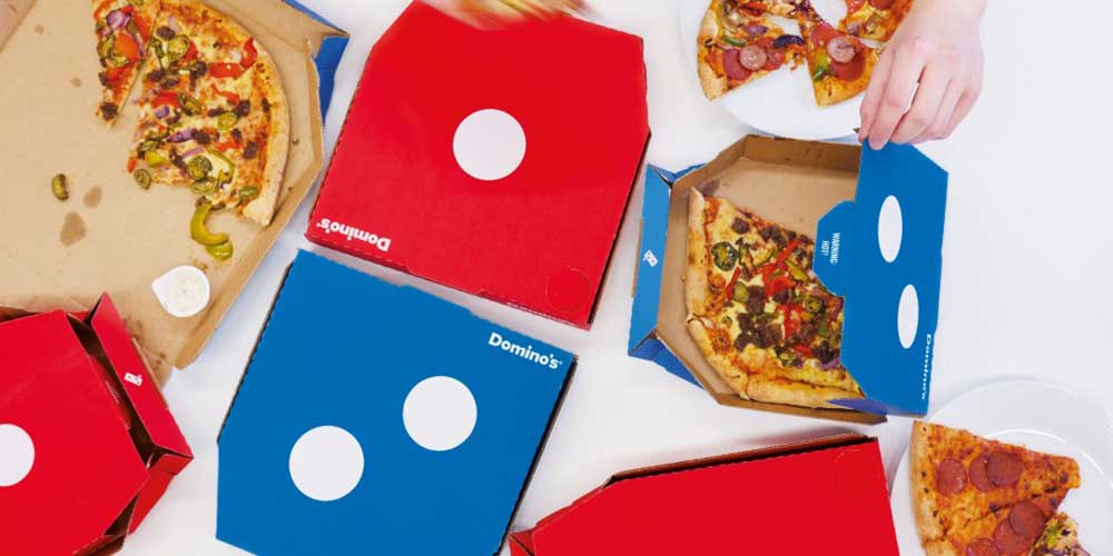
- They deleted the word “Pizza.” The company was now just “Domino’s.”
- They deleted the cluttered blue box and italic wordmark.
- They liberated the domino tile, making it the hero.
They created a flexible “brand system.” The iconic domino tile is the logo. The wordmark “Domino’s” is also the logo. They can be used together or, crucially, apart.
On a pizza box, you’ll see the wordmark and the icon. You might just see the icon on a store sign.
And on a phone? In the App Store? Just the domino.
This was a stroke of genius. It returned to the simple, confident core idea from 1965, but re-engineered for a digital-first world. It’s clean, scalable, and instantly recognisable, whether 100 feet tall on a building or 16 pixels wide on your phone.
Lesson for Small Businesses:
Your logo must pass the App Store Test.
I don’t care if you sell plumbing services or artisan bread. Your brand will live as a tiny square on a screen—as a social media profile pic, a favicon on a browser tab, or in a contacts list.
If your logo is a complicated, wordy, swooshy mess, it will fail this test. The 2012 Domino’s logo is the perfect example of a legacy brand adapting to this new reality. They simplified down to their strongest, most iconic asset.
Summary: A Visual Timeline of Strategy
To make this crystal clear, let’s lay it all out. The “why” is more important than the “when.”
| Year | Visual Description | Key Changes | Strategic Rationale (The “Why”) |
| 1965 | Simple red domino (3 dots) + “Domino’s Pizza” wordmark. | * New name (from DomiNick’s). * 3 dots = 3 original stores. | Establish a new, scalable brand identity with a core story. |
| 1970s | Standardised stacked wordmark and logo. | * Colour consolidation (red/blue). * Fixed layout. | Consistency. Create a recognisable mark for national/global franchising. |
| 1996 | Tilted domino. Italic wordmark in a blue “swoosh” box. | * Tilted. * Added container box. * “Pizza” de-emphasised. | A Misstep. 90s trend-chasing. Attempting to look “dynamic” and signal product expansion resulted in clutter. |
| 2012 | “Pizza” dropped. Logo = just the domino. Wordmark = just “Domino’s.” | * Radical Simplification. * “Pizza” removed. * Container box removed. * Icon & wordmark can be used separately. | Digital-First & Brand Extension. 1. Works perfectly as an app icon. 2. Confirms the brand is “more than just pizza.” |
What Your Small Business MUST Learn from the Domino’s Logo
Okay, let’s get to the brass tacks. What can you, an entrepreneur, take from this 60-year saga?
1. Start Simple. Stay Simple.
The strongest idea was the first one: a domino. The 1996 logo was the weakest because it added clutter. The 2012 logo was a triumphant return to simplicity. When brainstorming your logo design, find your one strong idea. Don’t add a swoosh and a mountain and your initials. Pick one. Make it bold.
2. Your Logo Must Have a Story (But a Scalable One)
The “three dots” story is memorable. It gives the brand a “why.” However, the plan to add more dots was unscalable.
Find your “three dots.” What’s the simple, true story behind your business? Embed that, but ensure the design can grow with you. A complex illustration will not scale. A simple, clever idea will.
3. Your Logo is a Business Tool, Not Art
The job of the Domino logo is to sell. It needs to work on a box, a sign, a car, and an app. The 1996 logo was less functional because it was cluttered. The 2012 logo is hyper-functional.
Judge your logo on its performance, not your personal taste. Can people see it from a car? Does it look good on an invoice? Does it work in a 16×16 pixel square?
4. Rebrand with Purpose, Not Panic
The 1996 rebrand felt like “panic” (we look old!). The 2012 rebrand had a clear business purpose: 1) Adapt to a digital-first world. 2) Reflect the new, expanded product line.
Don’t rebrand just because you’re bored with your logo. That’s the worst possible reason. Rebrand when your business has fundamentally changed or your logo actively hinders your strategy (e.g., it’s unreadable online). A rebrand is an expensive, disruptive process; make it count.
Stop Tinkering and Build Recognition
Today, the Domino logo is an unbeatable asset. It’s a flexible “brand system” where the icon is so strong that it can stand entirely independently. That is the end goal. You want to reach a point where your “badge” (the domino, the Nike swoosh, the Apple) does 100% of the talking.
The biggest lesson from Domino’s 60+ year history is consistency. They had one significant wobble (the 1996-2012 era), but for 30 years before and the 12+ years since, they’ve been remarkably consistent with the core domino idea. That’s how you build a global brand.
So, stop obsessing over the latest design trends. A great logo isn’t built on trends. It’s built on a simple, timeless idea and decades of repetition.
If you’re still stuck trying to design a “little bit of everything” logo, stop. You’re building the 1996 Domino’s logo. You must create the 1965 or the 2012 version: a simple, strong, functional mark that works.
We build those. If you’re tired of “design by committee” and want a professional logo that functions as a sharp business tool, explore our logo design services.
Or, if you’re ready to get serious about building a lasting brand, request a quote from us at Inkbot Design, and let’s talk strategy.
FAQs
What did the original Domino’s logo look like?
The 1965 logo was a simple red and white domino tile with three dots, next to the “Domino’s Pizza” wordmark.
What do the three dots on the Domino’s logo mean?
The three dots represent the three original pizza stores that founder Tom Monaghan owned in 1965.
Why did Domino’s change its logo in 2012?
They rebranded for two strategic reasons: 1) To adapt to a digital-first world (the simple domino works perfectly as an app icon). 2) To reflect their expanded menu by dropping “Pizza” from the name.
Why did Domino’s drop “Pizza” from its name?
They dropped “Pizza” to signal that they had become a much larger food company, selling chicken, pasta, sandwiches, and desserts, not just pizza.
What was wrong with the 1996 Domino’s logo?
From a design perspective, it was cluttered. It tilted the simple icon and trapped the wordmark in a competing, swooshy blue box, weakening the brand’s core simplicity.
Who designed the Domino’s logo?
The original 1965 logo’s designer is not widely publicised. The major 2012 rebrand was executed by the design agency CP+B (Crispin Porter + Bogusky).
What is the key lesson from the Domino’s logo history?
Simplicity and consistency win. The brand’s strongest logos were the simplest (1965 and 2012). The 2012 rebrand was a masterclass in returning to a core idea and making it functional for the modern (digital) world.
How has the Domino’s logo adapted to digital (like app icons)?
The 2012 simplification was designed for digital. Separating the icon (the domino) from the wordmark can be used as a clean, instantly recognisable app icon or social media profile picture.
What are the Domino’s brand colours?
The brand’s core colours are red, white, and blue.
Can a logo stand alone without the company name?
Yes, but only after building significant brand recognition. The 2012 Domino’s rebrand allowed the Domino’s icon to stand alone, a move only possible because they had spent decades making it famous.


