Food Truck Design: Technical Guide to Mobile Branding
The street food industry is a graveyard of good recipes served from bad trucks.
A hopeful entrepreneur spends £40,000 on a vintage Citroën H Van or a step van, installs a Michelin-grade kitchen, and then slaps a Fiverr logo on the side using cheap vinyl.
They park up, open the hatch, and wonder why the queue is forming at the truck next door—the one selling inferior burgers but communicating a superior message.
Design is not decoration. In the mobile catering sector, design is the only salesperson you have.
You do not have a waiter to explain the concept. You do not have a foyer. You have a moving billboard that must communicate what you are, what you cost, and why you matter in under three seconds.
If you are planning to start an online business or a physical mobile franchise, the principles remain the same: clarity beats cleverness. This article is not a gallery of “inspirational” photos. It is a technical, operational, and aesthetic audit of what makes a food truck design successful.
- Prioritise clarity: make the food category instantly legible from 30 metres using bold, high‑contrast typography.
- Use cast vinyl for full wraps to ensure durability, conformity to curves, and 5–10 year longevity.
- Design menu for speed: limit core items to seven, use sans‑serif fonts, and employ anchor pricing.
- Respect vehicle realities: avoid seams, keep the pass clear, and place key messaging above the grime line.
What is Food Truck Design?

Food truck design is the strategic integration of brand identity, physical ergonomics, and vehicular advertising. It is not merely a paint job; it is a functional system that guides a customer from “curiosity” to “transaction.”
A successful design system comprises three non-negotiable components:
- The Distant Signal (30m+): The shape, colour, and primary logo that arrests attention from down the street.
- The Transactional Zone (3m): The menu board legibility and service window framing that facilitates the sale.
- The Technical Substrate: The quality of the vinyl material, lighting, and kitchen layout that dictates longevity and workflow speed.
The “3-Second Rule”: Legibility and Hierarchy
The most expensive mistake in food truck design is treating the vehicle like a brochure. A brochure is read in a waiting room. A truck is viewed while walking, driving, or scrolling past on Instagram. You do not have time for nuance.
The Cognitive Load of Street Food
Humans have limited cognitive bandwidth. When a potential customer scans a row of food trucks at a festival, their brain is looking for shortcuts. If they cannot decipher your offering instantly, they filter you out as “noise.”
The Hierarchy of Information must be:
- Category (What is it?): TACOS. BURGERS. COFFEE. If your logo is abstract and you don’t state the category, you lose.
- Brand (Who are you?): The Name/Logo.
- The Hook (Why you?): “Wood Fired,” “Vegan,” “Authentic Thai.”
I once audited a client who had a beautiful, intricate illustration of a bear eating a fish. It covered the entire side of the van. It was art. But nobody knew they sold sushi rolls until they walked right up to the window. By then, 90% of foot traffic had already walked past.
The Fix: Use the “Squint Test.” Look at your design mock-up and squint until it blurs. If you cannot identify the food category, the design has failed.
The “Drive-By” Visibility Test
A food truck is a moving billboard. Can customers understand what you sell in 3 seconds at 30mph? Test your wrap design plan below.
The Technical Reality of Vinyl Wraps
This is where the amateurs lose money. They design for a flat screen, forgetting they are applying graphics to a three-dimensional object covered in rivets, door handles, vents, and rust.
Material Science: Cast vs. Calendered Vinyl
Not all stickers are created equal. When requesting quotes from a printer or a branding agency, it is essential to understand the difference between Cast and Calendared vinyl.
| Feature | Cast Vinyl (The Pro Choice) | Calendered Vinyl (The Budget Trap) |
| Manufacturing | Created as a liquid, then cured. No internal memory. | Rolled into a sheet (like pizza dough). Has memory. |
| Durability | 7-10 years. Resistant to shrinking. | 3-5 years. Prone to shrinking and cracking. |
| Application | Conforms to rivets, corrugations, and complex curves. | Great for flat surfaces only. Pops out of deep channels. |
| Cost | Premium (£££). | Economy (£). |
| Verdict | Mandatory for full wraps. | Acceptable for flat panel spot graphics only. |
If you wrap a Mercedes Sprinter or a corrugated Citroën with Calendered vinyl, it will lift out of the recesses within six months. Water will seep behind the vinyl, the adhesive will fail, and your brand will appear to have a skin disease.
The “Safe Zone” Protocols
Trucks have functional parts. Wheel arches, fuel caps, and exhaust vents can become hot, dirty, or require replacement.
- Avoid Text on Seams: Never place critical text (such as phone numbers or web addresses) across door handles or sliding rails. When the door opens, your message breaks.
- Heat Management: Do not wrap directly over high-heat exhaust outputs with standard vinyl. It will scorch and peel.
- The Grime Line: The bottom 30cm of your truck will be covered in road tar and mud. Do not put your Instagram handle there. Keep the bottom skirt dark or patterned to hide road wear.
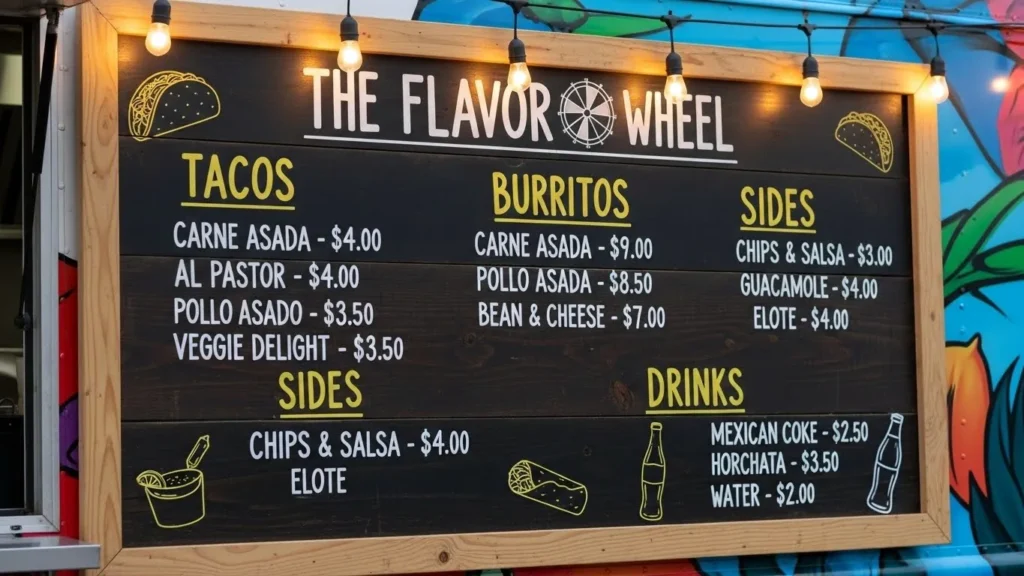
The Menu Board: Engineering Profit
Your menu board is not a list of what you can cook. It is a strategic tool to control the customer’s decision-making process. A poorly designed menu slows down the line, and in the food truck game, throughput = revenue.
The Paradox of Choice
According to psychologist Barry Schwartz, author of The Paradox of Choice, offering too many options causes “choice paralysis.” A customer faced with 20 burrito variations takes longer to order and is often less satisfied with their choice.
The Rule of 7: Never list more than 7 main items. If you have specials, use a separate, smaller board.
- Anchor Pricing: Place a premium item at the top. Even if nobody buys the £18 Lobster Roll, it makes the £12 Burger look like a bargain. This is a classic example of value-based pricing psychology applied to retail.
- Readability: Use a sans-serif font. High contrast (White text on Black, or Dark Blue on White). No cursive scripts. If a customer has to ask, “What does that say?”, you have failed.
Digital vs. Analogue Boards
We are seeing a trend towards digital screens mounted on the side of trucks.
- Pros: You can change prices instantly, sold-out items disappear, and motion graphics attract the eye at night.
- Cons: Glare from the sun can make them invisible. They are fragile. They consume power.
- My Advice: Stick to high-quality magnetic boards or professionally painted signage for the core menu. It is authentic to the street food aesthetic. Use digital solely for dynamic promotions if necessary.
Colour Theory in the Wild
Designing for a backlit computer monitor is different from designing for a gloomy British afternoon or a sodium-lit street at night.

The “Metamerism” Failure
Colours shift depending on the light source. A vibrant lime green might look like vomit under the orange glow of older streetlights.
- Daylight: High saturation works best. Pastels can look washed out on a grey day.
- Night: Reflective vinyls (like those used on emergency vehicles) can be used sparingly to make logos “pop” when hit by car headlights.
The Appetite Spectrum:
There is a reason McDonald’s, Burger King, and KFC use Red and Yellow.
- Red: Triggers stimulation, appetite, and urgency.
- Yellow: Associated with happiness and speed.
- Blue: Generally, an appetite suppressant (few blue foods exist in nature), though acceptable for seafood or ice cream.
- Green: Signals “Health” and “Fresh.” Essential for salad or vegan trucks, but risky for BBQ.
Consultant’s Note: I worked with a BBQ truck that painted their vehicle entirely black with dark grey text to look “premium.” At night, it looked like a hearse. Nobody bought a brisket sandwich. We added orange neon lighting and white vinyl highlights, and sales increased by 40% in the first month.
Operational Design: The Flow
You might wonder why a designer is talking about kitchen layout. Because form follows function. If your service window is placed incorrectly, your queue will block the flow of the event, annoying organisers and customers.
The Service Window Friction
The position of the window dictates where the queue forms.
- Rear Window: Forces the queue behind the truck. Good for narrow spots, bad for visibility.
- Side Window: Standard. Ensure the window is positioned low enough to maintain eye contact. If the truck chassis is high (like a Unimog), you are looking down on your customer. This psychological dominance is detrimental to the hospitality industry. You may need a built-in platform or drop-down stage.
The “Pass” Gap
There must be a clear visual gap where the food is handed over. Avoid cluttering the service shelf with items such as napkin dispensers, tip jars, and sauce bottles. This creates a barrier. Keep the pass clear to initiate the transaction.
The Consultant’s Reality Check
I once audited a client for a “Gourmet Toastie” van. They had spent their budget on a stunning, full-wrap illustration of a wheat field. It was beautiful.
However:
- The text “Gourmet Toasties” was written in a thin script font and wrapped around the wheel arch. It was unreadable.
- The menu was printed on A4 paper and taped to the window.
- The truck looked like a farm supply delivery vehicle, not a food outlet.
We stripped it. We painted the van a solid, deep “Cheese” yellow. We put the word ‘TOASTIES’ in 50cm high, bold, black block letters on the roofline. We installed a backlit menu board.
Result: They no longer had to explain what they sold. The queue started forming before they even opened.
The Lesson: Aesthetics without clarity is just vanity.
Future Trends: The State of Food Truck Design in 2026
As we look towards 2026, the “shabby chic” vintage aesthetic is fading. The market is moving towards Cyber-Minimalism and Eco-Transparency.
- Sustainable Substrates: We are seeing a shift away from PVC vinyls towards PVC-free wrapping films (like 3M Envision series), which are more environmentally friendly. Customers care about this.
- The “Ghost Kitchen” Hybrid: Trucks are being designed with simplified branding to serve as mobile collection points for delivery apps. The design needs to accommodate QR codes for quick scanning by drivers.
- Smart Glass: Windows that turn from opaque (branding/video display) to clear (service mode) at the touch of a button.
Also, be aware of how you present your business case. If you are seeking investment for a fleet, you need to know how to write a project proposal that outlines these design costs as capital assets, not just “marketing expenses.”
The Verdict
Food truck design is a blend of structural engineering, behavioural psychology, and graphic art. It is a high-stakes game where your storefront is moving at 50mph.
Do not overcomplicate it.
- Be legible from 30 metres.
- Be durable by using Cast vinyl.
- Be efficient by engineering your menu for speed.
Your truck is the first bite the customer takes. Make sure it tastes like success.
Frequently Asked Questions (FAQ)
What is the difference between a partial wrap and a full wrap?
A full wrap covers 100% of the vehicle’s paintwork in vinyl, offering a complete colour change and maximum protection. A partial wrap covers 25-75% of the vehicle, using the original paint colour as the background. Partial wraps are significantly cheaper but require the base vehicle paint to be in good condition.
How much does a professional food truck design cost?
Design fees typically range from £500 to £3,000 depending on complexity and agency expertise. The physical printing and installation of the wrap usually costs between £1,500 and £4,000. Beware of quotes under £1,000 for full wraps; they likely use inferior Calendered vinyl.
Why is my vinyl wrap peeling after only a few months?
Premature peeling is usually caused by using Calendared vinyl on curved surfaces (deep channels/recesses) or improper surface preparation (such as inadequate cleaning) before application. It can also occur if the vinyl was over-stretched during installation or not post-heated to set the memory.
What is the best font for a food truck menu?
How do I design a food truck for night events?
Focus on high-contrast colours and external lighting. Standard vinyl disappears in the dark. Utilise LED downlighting, backlit menu boards, or reflective vinyl accents (similar to those found on emergency service vehicles) to ensure your brand remains visible when the sun sets.
Should I put photos of my food on the truck wrap?
Generally, no. High-resolution photos fade quickly in the sun and can look unappealing if the truck gets dirty. Furthermore, food photography is subjective; a stylised illustration or bold typography is often more timeless and creates a stronger brand recognition than a generic photo of a burger.
Can I wrap over rust or dents?
No. Vinyl is like a thin skin; it highlights imperfections rather than hiding them. Rust continues to spread under the vinyl, eventually causing the wrap to bubble and fall off. You must repair, sand, and prime any bodywork damage before wrapping.
How many items should be on a food truck menu?
Limit your main menu to 5–7 core items to prevent “choice paralysis” and speed up service. You can offer customisation options (such as sauces and toppings), but the core distinct choices should be minimal. This improves kitchen throughput and queue speed.
Do I need permission to put a logo or branding on my truck?
In the UK, vehicle advertising generally does not require planning permission, but you must comply with the Highway Code (no reflective materials that mimic police/ambulance patterns) and ensure windows are not obscured in a way that affects driving safety.
How long does a food truck wrap last?
A high-quality Cast vinyl wrap installed professionally should last 5–7 years. Horizontal surfaces (bonnet/roof) degrade faster due to direct UV exposure and may need replacing sooner (3–4 years). Regular cleaning and avoiding harsh chemical washes extend the lifespan.
