Erik Spiekermann: The Business Value of Typography
Erik Spiekermann spent his career fighting mediocrity.
He understood that typography is the “black ice” of branding; you don’t notice it until you’re sliding off the road.
When a customer struggles to read your price list or misses a CTA because the typographic hierarchy is a mess, you aren’t just losing a lead—you are bleeding revenue.
The stakes are quantified by the Nielsen Norman Group, which found that users often leave web pages in 10-20 seconds.
If your typography doesn’t convey value instantly, your business will be invisible. Erik Spiekermann’s methodology isn’t about “making things pretty.” It is about the ruthless efficiency of communication.
If you ignore these principles, you are essentially paying for a megaphone and then whispering into it.
- Typography is a functional business tool: clear typographic hierarchy directly improves user comprehension and conversion.
- Choose legible, context-aware type: high x-height and distinct characters optimise readability on small screens and poor conditions.
- Design must solve problems: typographic systems should guide users efficiently, not decorate, reducing cognitive load and boosting trust.
Who is Erik Spiekermann?
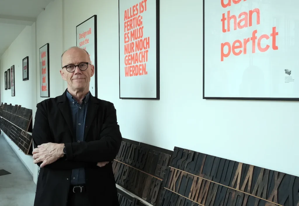
Erik Spiekermann is a German typographer, designer, and author who redefined information design by treating type as a functional interface rather than a stylistic choice. He founded MetaDesign and FontShop, helping to pivot the industry toward digital-first legibility.
The core elements of the Spiekermann methodology include:
- Information Hierarchy: Organising data so the user’s eye is led to the most critical information first.
- Contextual Legibility: Designing typefaces specifically for their environment (e.g., small screens, low-light signage).
- Character over Neutrality: Rejecting “invisible” fonts in favour of type that possesses a distinct, functional personality.
The Architect of the Information Age
To understand why Spiekermann matters to your business today, we must examine the mess he inherited.
Before his influence, many famous graphic designers focused on the “Grand Gesture”—big, bold logos that looked great on billboards but failed when applied to complex transit systems or digital interfaces.
Spiekermann approached design as an engineer. His work for Berlin’s public transportation system, Berliner Verkehrs- und Tarifverbund (BVG), is a prime example of this.
He didn’t just change the colours; he redesigned the way people navigated the city. He understood that a commuter in a rush doesn’t care about “aesthetic flair.” They care about not missing their train.
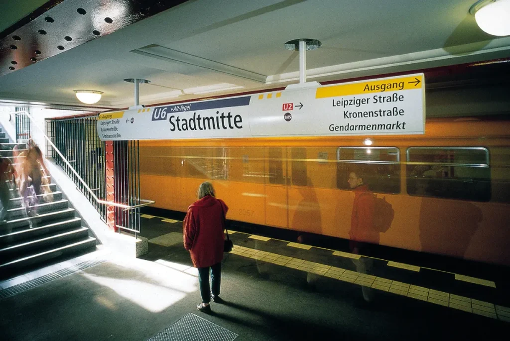
The BVG Case Study: Design as Utility
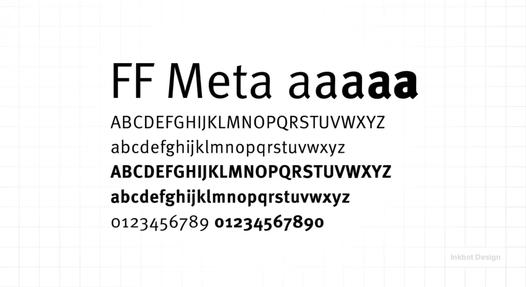
In the early 1990s, the Berlin transit system was a fractured mess of East and West styles. Spiekermann’s firm, MetaDesign, implemented a unified system that utilised FF Meta. This typeface was designed specifically to be legible at small sizes and at odd angles.
The result? A massive reduction in passenger confusion and a streamlined user experience that increased the perceived value of the city’s infrastructure. For a business owner, the lesson is clear: if your brand identity doesn’t help the user complete their goal, it is a barrier, not an asset.

Debunking the “Helvetica is Neutral” Myth
In the world of amateur design, Helvetica is the “safe” choice. It’s the brand equivalent of a beige wall. But Erik Spiekermann famously challenged this, describing Helvetica as “sh*t” for specific functional uses.
Designers like even grayness, which is the worst thing for a reader.
Why Helvetica Fails Your Business
The myth is that Helvetica is neutral and therefore works everywhere. The reality is that Helvetica’s characters are too similar. The capital ‘I’, lowercase ‘l’, and the number ‘1’ often look nearly identical in standard weights. In high-stakes environments, such as financial dashboards or medical apps, this lack of distinction is a liability.
Data from the University of Reading’s Typography Unit suggests that character recognition speed is a primary driver of reading comprehension. Spiekermann’s FF Meta solved this by introducing distinct “apertures” and varied character shapes.
| Feature | The Amateur Way (Default) | The Spiekermann Way (Pro) |
| Font Choice | Picking what “looks cool” on Pinterest. | Choosing based on x-height and legibility at 8px. |
| Hierarchy | Making the logo the biggest thing on the page. | Prioritising the CTA and value proposition. |
| Letter Spacing | Using default tracking for all sizes. | Tightening for headlines, opening for small body text. |
| Colour Contrast | Grey text on a slightly lighter grey background. | Strict adherence to AAA accessibility standards. |
| Consistency | Using five different fonts for “variety.” | A single, robust type system with multiple weights. |
The Economics of FF Meta: The “Helvetica of the 90s”
When Spiekermann released FF Meta through FontShop, he wasn’t just launching a font; he was launching a solution for the post-industrial world. Originally commissioned by the West German Post Office (but initially rejected), FF Meta was designed to be legible on poor-quality paper and at extremely small sizes.
For a modern SMB, this translates directly to brand typography on mobile devices. If your font choice requires a user to pinch and zoom to read your “About Us” page, you have failed.
Small-Screen Authority
As of 2025, mobile traffic accounts for over 60% of web usage. Spiekermann’s obsession with “micro-typography”—the space between letters, the rhythm of the stroke—is what separates a professional site from a DIY template.
Using a font with a high x-height (the height of lowercase letters) ensures that your content remains readable even on a low-end smartphone screen. These are core typography basics that many “consultants” ignore.
The Consultant’s Audit
I recall auditing a B2B SaaS startup that was spending £10,000 per month on Google Ads but achieving a dismal 0.5% conversion rate on their landing page.
The founder was convinced the “copy wasn’t punchy enough.” I took one look at the page and realised the problem wasn’t the words—it was the typographic hierarchy.
They were using a thin, light-grey font on a white background. It looked “elegant” to the founder, but to the 50-year-old procurement officers they were targeting, it was literally invisible.
We applied a Spiekermann-inspired “Information First” approach. We swapped the thin font for a sturdy serif with high contrast, established a clear font pairing strategy, and simplified the layout.
Conversion rates tripled within three weeks without changing a single word of the copy. This is why I am allergic to fluff; design must work before it can be pretty.
The State of Typography in 2026
We are entering an era of “Generative UI,” where interfaces are created on the fly by AI based on user intent. In this environment, the static logo is becoming less important than the brand’s typographic DNA.
Variable Fonts and Fluidity
In 2026, the shift is toward variable fonts that adjust their weight and width in real-time based on the user’s ambient light, device orientation, and even their reading speed. This is the logical conclusion of Spiekermann’s philosophy of “MetaDesign”—a system that is not a fixed image but a set of rules.
Businesses that invest in a brand strategy that includes variable font technology will see lower “Cost of Retrieval” for their users. If you aren’t thinking about how your type behaves in a dynamic environment, you are already behind.
Designing the Un-Designed: The MetaDesign Philosophy
Spiekermann founded MetaDesign on the principle that designers should be “information architects.” This means your website should be as easy to navigate as a well-signposted airport.
The “Stop-Design” Theory
Spiekermann often spoke about “Stop-design.” This is the idea that good design doesn’t shout for attention; it provides the information and then gets out of the way.
For an entrepreneur, this is a difficult pill to swallow. You want your brand to be “loud.” But in a world of constant digital noise, the brand that provides the quickest path to a solution is the one that wins.
This requires creative thinking that prioritises the user’s cognitive load. If your font combinations are causing “visual friction,” you are making your customer work too hard.
Why Serif vs. Sans Serif Still Matters
The old-school debate of serif vs. sans serif is often oversimplified. People say “serif is for print, sans is for web.” Spiekermann proved this is nonsense.
He used serifs for digital projects when the brand needed to convey a sense of history and “long-form” authority (like The Economist redesign).
He used sans serifs for technical, “no-nonsense” communication (like Audi). The choice should never be based on a trend; it should be based on the “Voice” of the brand.
Case Study: The Economist

When Spiekermann worked on the redesign of The Economist, he didn’t just pick a pretty font. He focused on the “density of information.”
The readers of The Economist are time-poor. They need to quickly absorb complex geopolitical data. The typographic system he created enabled high information density without compromising legibility.
If your business involves selling complex services, you should consider how your services are presented. Are you using a font that allows for deep reading, or are you using a “trendy” sans serif that tires the eye after two paragraphs?
Stop Decorating, Start Communicating
Erik Spiekermann’s legacy isn’t a collection of fonts; it’s a rigorous framework for business communication. He taught us that:
- Type is a Technical Spec: It must be tested for legibility, scalability, and accessibility.
- Neutrality is a Lie: Every font choice carries a psychological weight that either builds or erodes trust.
- Design is Information Architecture: Your brand identity is the map your customers use to navigate your value proposition.
If you continue to treat your typography as an afterthought, you are leaving money on the table. A brand that is difficult to read is a brand that is also difficult to buy from.
It is time to audit your visual communication with the same forensic intensity that Spiekermann applied to the Berlin Underground.
Would you like us to audit your current brand typography for legibility and conversion? Explore Inkbot Design’s Services or Request a Quote to fix your design mistakes today.
Frequently Asked Questions (FAQ)
Who is Erik Spiekermann?
Erik Spiekermann is a world-renowned German typographer and designer known for his work in information design and for founding MetaDesign and FontShop. He is the creator of influential typefaces like FF Meta and has redesigned major brands like Audi, Volkswagen, and The Economist.
What is FF Meta, and why is it famous?
FF Meta is a typeface designed by Erik Spiekermann, often referred to as the “Helvetica of the 90s.” It is renowned for its high legibility in challenging conditions, such as small fonts and low-quality print, making it a staple for modern corporate and informational design.
Why did Erik Spiekermann dislike Helvetica?
Spiekermann argued that Helvetica lacks character and is technically flawed for information design. He pointed out that many of its characters (like ‘I’, ‘l’, and ‘1’) look too similar, which can lead to confusion and reduced reading speed in functional contexts.
What is MetaDesign?
MetaDesign is the international design consultancy founded by Spiekermann in 1979. The firm became famous for its systematic approach to branding and information design, focusing on creating cohesive, functional visual identities for large, complex organisations.
How does typography affect business conversion?
Typography impacts how quickly and easily a user can process information. Clear typographic hierarchy and high legibility reduce “cognitive load,” allowing users to find CTAs and value propositions faster, which directly increases conversion rates.
What is the “Stop-Design” philosophy?
“Stop-design” is Spiekermann’s idea that good design should be functional and unobtrusive. It should provide necessary information efficiently and then “stop,” rather than adding unnecessary decorative elements that distract the user from their goal.
Is serif or sans serif better for digital brands?
Neither is inherently better; it depends on the context. Sans serif is often preferred for UI elements due to its simplicity, but serif fonts are excellent for long-form content or brands that want to convey traditional authority and “trustworthiness.”
What are variable fonts?
Variable fonts are a single font file that acts like multiple fonts. They allow designers to adjust weight, width, and other attributes dynamically. Spiekermann’s philosophy of adaptable design is a precursor to this technology, which improves web performance and accessibility.
How do I choose the right font for my SMB?
Choose a font based on your “brand voice” and the environment where it will be read most. Prioritise fonts with a large x-height and distinct character shapes to ensure legibility on mobile devices and across various screen qualities.
What can I learn from Spiekermann’s work for Berlin Transit?
The main lesson is that design should solve problems. Spiekermann’s work for the BVG wasn’t about aesthetics; it was about helping people navigate a complex system. Your website and marketing materials should function as a “map” for your customers.
What is the importance of typographic hierarchy?
Typographic hierarchy uses size, weight, and colour to lead the reader’s eye to the most important information first. Without it, a webpage becomes a “wall of text” that users are likely to abandon within seconds.
Why is FontShop significant in design history?
Founded by Spiekermann in 1989, FontShop was the first independent mail-order distributor for digital fonts. It democratised access to high-quality typography, allowing designers and businesses of all sizes to purchase professional typefaces easily.

