10 Email Design Trends That Drive Results (And 3 to Avoid)
Your inbox is a battleground.
Every day, countless emails fight for a fleeting moment of attention. Most lose. They’re either visual noise, irrelevant fluff, or simply broken.
If you’re an entrepreneur or small business owner, you don’t have time or budget to waste on email design that looks pretty but doesn’t actually work.
This isn’t another list of aesthetic fads. We’re cutting through the noise to focus on what truly matters: performance.
These 10 email design trends are rooted in user psychology, technological advancements, and a no-nonsense approach to conversion.
They’ll help you connect, convert, and keep your audience engaged.
- Performance-driven design prioritises user experience and conversion over aesthetic appeal, ensuring emails load quickly and guide users effectively.
- Adapting to dark mode and utilising clear typography are essential trends that enhance readability and engagement with audiences.
- User-generated content and accessibility are crucial for building trust, expanding reach, and creating a more inclusive email experience.
The One Rule: Performance-Driven Design Over Portfolio-First Design
Forget designing emails to impress other designers. That’s portfolio-first design: visually stunning, often complex, and frequently ineffective.
These emails look gorgeous in a case study, but they’re slow to load, break across various email clients, and fail to guide the user.
They prioritise visual “wow” over clarity and conversion. This approach is a colossal waste of resources.
Instead, we champion performance-driven design. This philosophy puts the reader and your business goals first.
It means creating emails that are fast, accessible, render perfectly on any device, and clearly direct the user to the desired action.
It’s innovative, strategic, and respects your audience’s time and attention. That’s the only design philosophy worth your time.
10 Email Design Trends to Implement Now
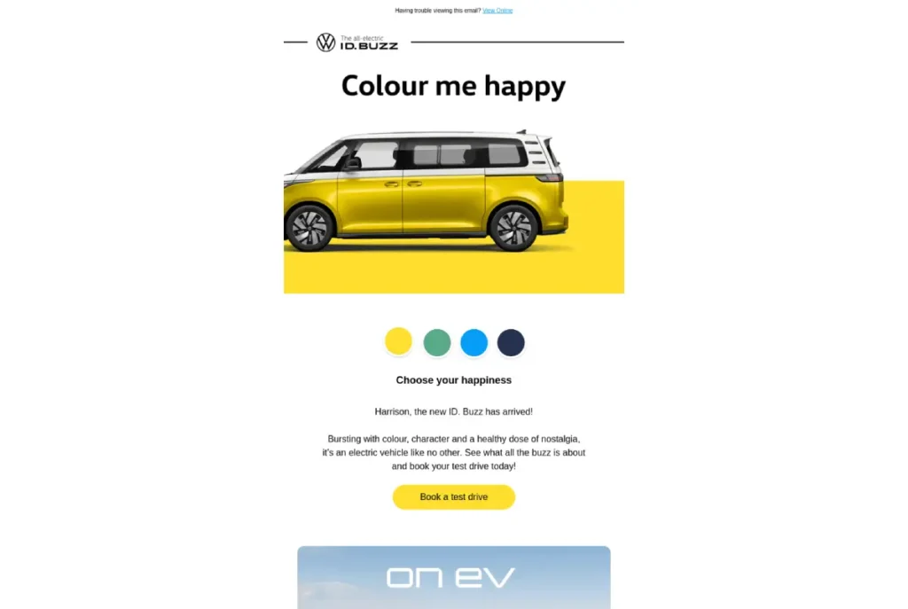
1. Dark Mode is No Longer a Trend, It’s the Standard
What it is: Designing emails that adapt flawlessly, whether a user’s device is set to light or dark mode.
Your emails maintain legibility and brand consistency, regardless of their display settings.
Why it works: A significant portion of your audience prefers dark mode. Designing for it reduces eye strain for users and prevents your emails from appearing amateurish with jarring colour inversions.
Around 82% of users now use dark mode on their devices, making it a critical consideration for engagement.
Best practice: Use transparent PNGs for logos and icons. Define dark-mode-specific CSS within your email’s <head> section. Always test your emails using tools like Litmus or Email on Acid to ensure consistent rendering across various email clients, especially Gmail and Apple Mail.
2. Radical Simplicity: The Rise of the Text-First Email

What it is: Prioritising clear, concise copy and minimal HTML over heavy imagery and intricate layouts. This isn’t just “minimalism”; it’s a deliberate choice to remove distractions.
This is where most brands get it wrong: true minimalism is about essential function, not just space and weak typography. It’s about clarity, not just ‘clean’ aesthetics.
Why it works: Text-first emails boast higher deliverability rates because they avoid common spam triggers associated with image-heavy designs. They load faster, feel more personal, and can bypass many ad-blockers. When there’s less visual clutter, your message stands out.
Best practice: Focus intensely on exceptional copywriting. Use short paragraphs and bold text for hierarchy. Don’t be afraid of white space. Let your words do the heavy lifting.
Example: Newsletters like The Hustle or Morning Brew effectively use this approach, feeling more like a personal note than a marketing blast. Seth Godin’s blog posts are a masterclass in this, often just a few lines of impactful text.
3. Typography as the Primary Visual Element
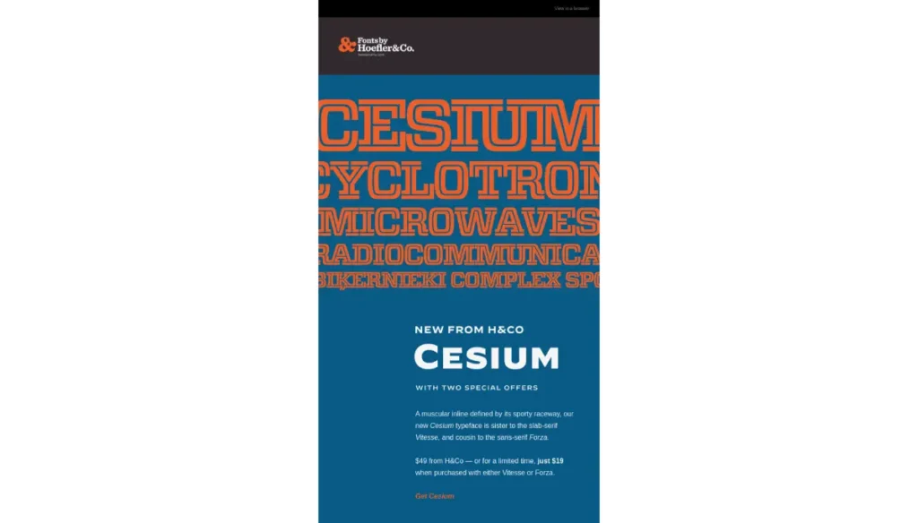
What it is: Using large, bold, and distinct fonts as the main design feature, often replacing the need for complex imagery. This trend capitalises on strong typographic choices to convey brand personality and draw the eye.
Why it works: Bold typography grabs attention instantly and establishes your brand’s voice without relying on heavy image files. It’s a quick, efficient way to communicate mood and message. A strong typeface can increase brand recognition by up to 10%.
Best practice: Select a maximum of two complementary font families. Ensure your chosen fonts have good web font support across major email clients, or provide safe fallback fonts. Use a larger font size for headings (e.g., 24-32px) and a readable body text size (e.g., 14-16px).
Example: Brands like Mailchimp use their distinctive custom fonts for readability and as a core part of their brand identity. Oatly’s playful yet bold typography is another excellent example.
4. Accessibility by Default (WCAG 2.1 AA)
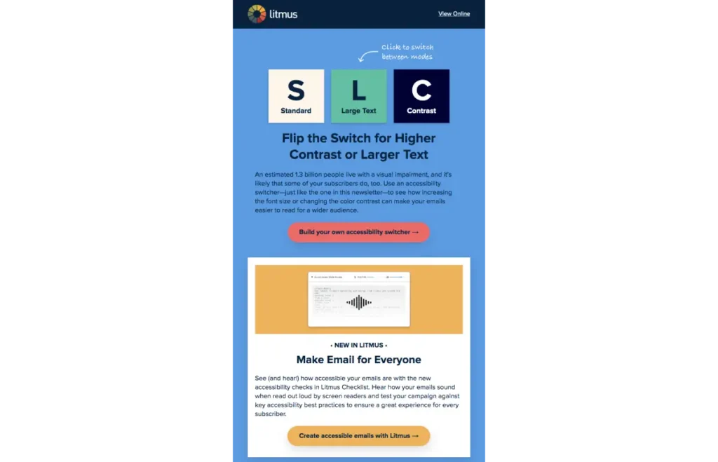
What it is: Building emails usable and understandable by everyone, including people with disabilities. This adheres to Web Content Accessibility Guidelines (WCAG) 2.1 AA standards, which cover aspects like colour contrast, text size, and screen reader compatibility.
Why it works: It’s the right thing to do morally, and it significantly expands your audience reach. An accessible email improves the experience for all users, not just those with disabilities. Over 15% of the global population experiences some form of disability, making accessibility a non-negotiable for broad reach.
Best practice: Ensure high-contrast colour combinations (e.g., black text on a light background). Use semantic HTML tags (<h1>, <p>, <a>) rather than just styling divs. Provide descriptive alt text for all images so screen readers can interpret them.
Example: The UK government’s digital services (GOV.UK) are a global leader in web accessibility, setting a high standard that email design should emulate.
5. Bite-Sized Data Visualisations
What it is: Integrating simple, clear charts, graphs, or infographics directly into your email to make complex data easily digestible. This isn’t about data dumps but visually highlighting one or two key insights.
Why it works: The human brain processes visuals 60,000 times faster than text. Visual data helps users quickly grasp information, making your message more impactful and memorable. Visual data in emails can boost engagement by up to 20%.
Best practice: Focus on a single key statistic or trend per graphic. Use clean, minimalist designs for your charts. Embed them as static images rather than relying on complex, often unsupported, interactive elements.
For example, fitness trackers like Fitbit use weekly progress summaries with simple bar charts to show activity levels. Financial apps like Mint use pie charts to illustrate spending categories effectively.
6. Purposeful Micro-Interactions & Subtle Animation
What it is: Small, subtle animations or interactive elements that provide feedback, guide the eye, or enhance understanding, rather than purely for aesthetic flair. This is not the “GIF Plague” where everything flashes pointlessly.
Why it works: When used strategically, micro-interactions can increase user engagement, highlight a call to action, or reveal information progressively. They add a touch of polish and professionalism without being distracting. Subtle animations can increase click-through rates by up to 15% when used effectively to draw attention to CTAs.
Best practice: Use CSS animations for simple hover effects on buttons or to draw attention to a new product. Keep file sizes small. Avoid large, looping GIFs that serve no real purpose beyond movement.
Example: Headspace uses gentle, calming animations in their app and marketing, subtly applying this principle in emails to reinforce their brand ethos.
7. True Interactivity with AMP for Email
What it is: Allowing users to take direct actions—like RSVPing to an event, browsing a product carousel, or filling out a quick form—inside the email itself, without navigating to a separate landing page.
Why it works: AMP (Accelerated Mobile Pages) for Email significantly reduces friction by removing the need for extra clicks. This streamlines the user journey and can lead to higher conversion rates. Interactive elements can increase engagement by up to 73%.
Best practice: Start with a simple use case, such as a poll or a concise feedback form. Always ensure you have a robust HTML fallback version for email clients that do not support AMP (which is still a majority).
Example: Google uses AMP in Gmail, allowing users to reply to comments on Google Docs or manage calendar invitations directly from their inbox. Booking.com has also experimented with in-email booking options.
8. The Strategic Use of AI-Generated Imagery
What it is: Leveraging AI tools like Midjourney or DALL-E 3 to create unique, abstract, or conceptual hero images and visual assets. This is about generating visuals that stock photography simply cannot provide.
Why it works: AI offers a cost-effective and rapid way to produce bespoke visuals that perfectly match your message and brand. It helps your emails stand out from the sea of generic stock imagery. Custom visuals can improve email memorability by over 50%.
Best practice: Use AI for abstract backgrounds, conceptual art, or unique textures. Avoid generating realistic human faces or precise product shots, as AI still struggles with consistency and often falls into the uncanny valley for these applications.
Example: A tech startup could use an AI-generated abstract image for a new feature announcement, conveying innovation and cutting-edge design.
9. Depth and Layering with Glassmorphism
What it is: A design style that uses blurred, semi-transparent backgrounds to create a sense of depth and layering, mimicking the look of frosted glass. It’s a softer, more elegant evolution of older flat design principles.
Why it works: Glassmorphism creates a modern, clean aesthetic that helps organise information hierarchically. It can make key elements visually pop without being heavy or distracting. When used subtly, it can elevate brand perception.
Best practice: Apply this effect sparingly, on an overlay for a hero image or to subtly highlight a call-to-action block. Ensure the text layered over glassmorphic elements has sufficient contrast to remain perfectly legible against the blurred background.
Example: This style is heavily used in modern user interfaces like Apple’s iOS and Microsoft’s Windows 11, and its principles can be adapted for striking email hero sections.
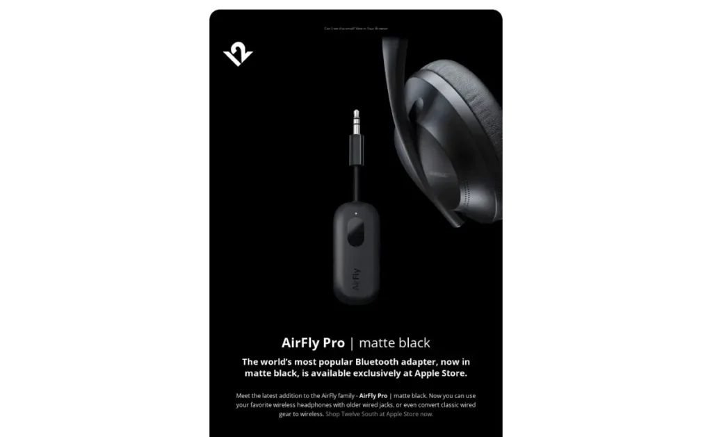
10. Building Trust with Integrated User-Generated Content
What it is: Featuring authentic customer photos, glowing reviews, or heartfelt testimonials directly within your email body. This is about letting your customers tell your story.
Why it works: User-generated content (UGC) provides powerful social proof and authenticity that no amount of branded content can replicate. People trust other people. 90% of consumers say UGC influences purchasing decisions more than promotional emails.
Best practice: Always obtain explicit permission before featuring user content. Credit the user. Present UGC in a clean, modular layout that makes it easy to read and visually appealing. Avoid making it look like an afterthought.
Example: Airbnb frequently includes stunning photos from guest stays in their emails, inspiring wanderlust and showcasing real experiences. Brands like Glossier also excel at featuring customer reviews and photos.
Putting it All Together: From Trends to Strategy.
These trends are tools, not rigid rules. Implementing them effectively requires more than just picking a few. It demands a cohesive, overarching strategy aligning with your business goals and audience needs.
This is where simply following a list breaks down, and a cohesive digital marketing strategy becomes essential.
3 “Trends” to Stop Using Immediately
1. Overly Complex Background Images
Why to stop: They rarely render correctly across all email clients, particularly Outlook, notorious for poor background image support. They distract from your core message and create legibility nightmares for any text placed over them. Simplicity in backgrounds is almost always better.
2. The “Everything is a GIF” Approach
Why to stop: This is my pet peeve. While a single, purposeful animation can work (see trend 6), stuffing an email with multiple, large, auto-playing GIFs bloats email size, triggers spam filters, and often makes your email look cheap and unprofessional. Your message gets lost in the visual chaos. Prioritise clarity over gratuitous movement.
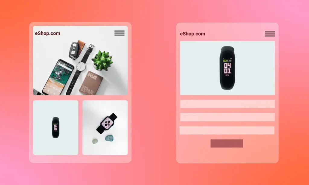
3. Designs That Ignore Mobile Entirely
Why to stop: It’s 2025. This isn’t a “trend” to avoid; it’s a fundamental failure. Up to 80% of your users are likely opening your emails on a mobile device. A non-responsive design that forces users to pinch and zoom will be deleted instantly. Every email you send must be designed mobile-first.
Conclusion
Stop chasing fleeting trends. Start communicating effectively.
Your email design should serve a purpose: to inform, engage, and convert—design for people, not for portfolios.
If your emails aren’t delivering results, it’s time to re-evaluate your approach with these actionable, performance-driven strategies.
Frequently Asked Questions
What is performance-driven email design?
Performance-driven email design prioritises user experience and business goals over pure aesthetics, focusing on load speed, accessibility, clear calls to action, and cross-client compatibility.
How important is dark mode optimisation for emails?
Critically important. With over 80% of users now preferring dark mode, optimising your emails ensures legibility, brand consistency, and a professional appearance, preventing jarring colour inversions.
What are the benefits of text-first email design?
Text-first emails offer higher deliverability, faster load times, a more personal feel, and better bypass ad-blockers, leading to increased engagement by focusing on core messaging.
How can typography improve email design?
Bold and distinct typography can act as the primary visual element, instantly grabbing attention, conveying brand personality, and improving readability without relying on heavy images.
What does WCAG 2.1 AA mean for email design?
WCAG 2.1 AA refers to Web Content Accessibility Guidelines, which provide standards for making emails usable by people with disabilities. This includes guidelines for colour contrast, text size, and semantic HTML.
Can AI-generated imagery be used effectively in emails?
Yes, strategically. AI is excellent for creating unique, abstract, or conceptual visuals that stand out. However, it’s best to avoid realistic human faces or complex product shots due to current AI limitations.
What is AMP for Email?
AMP (Accelerated Mobile Pages) for Email allows users to interact directly with content (like filling forms or RSVPing) within the email, reducing friction and increasing conversion potential by eliminating clicks to external pages.
Why should I avoid complex background images in emails?
Complex background images often fail to render correctly across various email clients, especially Outlook. They can distract from your message and make the text unreadable.
How much animation is too much in an email?
Generally, less is more. Subtle, purposeful micro-interactions (like CSS button hovers) are effective. Avoid multiple large, auto-playing GIFs, as they increase file size, trigger spam filters, and often detract from the message.
What is the most crucial consideration for email design in 2026?
Mobile-first responsiveness. Given that over 80% of emails are opened on mobile devices, ensuring your design is fully responsive and renders perfectly on small screens is non-negotiable for engagement and retention.
How does user-generated content boost email effectiveness?
User-generated content provides powerful social proof and authenticity. Featuring real customer photos or testimonials builds trust, makes your brand more relatable, and significantly influences purchasing decisions.
Ready to transform your email strategy from an afterthought to a powerhouse? An efficient digital marketing approach integrates these design principles seamlessly.
Contact Inkbot Design today for a bespoke digital marketing quote, and let’s build emails that actually deliver.
Alternatively, explore more insightful articles on our blog to refine your strategy further.


