10 Email Design Best Practices for Engaging Campaigns
Here’s an email marketing truth that most “gurus” won’t tell you: The average executive spends just 3 seconds deciding whether to trash your email. And in those precious moments, your perfectly crafted message isn’t competing against other emails – it’s competing against client calls, Slack notifications, and the third cup of coffee they desperately need.
But what if I told you that by implementing just a handful of proven design elements, you could transform your emails from instant-delete fodder into revenue-generating machines that your subscribers look forward to opening?
In the next few minutes, I will break down the 10 email design best practices that have helped my clients generate millions in revenue – practices that work whether you’re sending to a list of 100 or 100,000. And the best part? None of them require you to be a design expert or spend thousands on fancy software.
Let’s turn those 3-second glances into engaged readers and paying customers.
- Strong email design grabs attention quickly, making first impressions crucial for engagement and avoiding spam filters.
- Utilising mobile-first principles and AI allows for personalised experiences that resonate with users, driving higher engagement.
- Emphasising accessibility, minimalism, and compelling CTAs in design enhances user experience and conversion rates.
Importance of Email Design in Campaigns
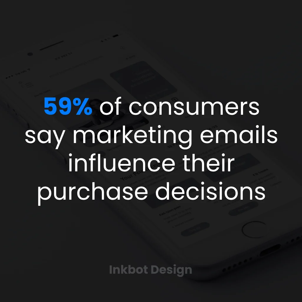
Let’s get real for a moment. You could have the best offer in the world, but if your email looks like it jumped straight out of 2005, chances are it’ll go straight into the black hole of the spam folder.
Nobody’s got time for poorly designed emails!
Here’s why excellent email design matters so much:
- First Impressions Count: You’ve got seconds to grab attention. An eye-catching design acts like a warm handshake, inviting recipients to dig deeper.
- Brand Identity: Consistent, well-thought-out designs reinforce your brand’s identity. Think of famous brands—like Apple or Nike. Their emails are instantly recognisable.
- Enhanced User Experience: A clean layout makes it easy for users to navigate your content. Frictionless experiences lead to higher engagement and, ultimately, sales.
- Driving Engagement: Well-designed emails boast a higher click-through rate.
- Conversion Rates: Ultimately, it’s all about the end goal. A well-crafted email design steers the reader towards your call to action, resulting in conversions.
Let’s take a step back. When I started my business—Inkbot Design—email design was much less sophisticated than it is today. Sending a plain text email was common practice, and people were more forgiving of poor designs.
Fast forward to now, and the bar has been raised. Users expect emails to look polished, professional, and personable. They want content that resonates.
So, what does this evolution look like?
Evolution of Email Design
When email burst onto the scene in the 90s, it was the Wild West.
Users didn’t have high expectations because, let’s face it, they were just thrilled to have an inbox! But then, something changed.
The early 2000s saw the rise of HTML emails, which allowed for greater creativity. However, many brands took this freedom too far, leading to gaudy designs that still haunt us today. Think flashy GIFs and giant buttons screaming, “Click me!”
As tech advanced, email designs matured significantly:
- Responsive Design: Remember the horror of opening an email on a mobile device, and it looked like a toddler’s crayon drawing? Thanks to the rise of smartphones, designers had to re-think layouts. Now, responsive designs ensure that emails look great on any screen size.
- The Minimalism Movement: Brands have shifted towards minimalist designs over the years. Think clean aesthetics with plenty of white space. You need to let your content breathe!
- Incorporation of Data: Today’s email designs aren’t just pretty; they’re smart. We’re using data analytics to inform designs—so your emails are tailored to individual user experiences.
- Interactive Elements: Remember when all we had was a button to click? Interactive elements like carousels or embedded videos are becoming more common, engaging users like never before.
- Personalisation: Personalisation would be your bullseye if email marketing were a game of darts. Brands are implementing features that allow for a tailored experience based on user data, leading to improved engagement rates.
- Accessibility in Design: Nowadays, inclusivity is a hot topic. Brands are taking accessibility into account, ensuring that designs are friendly to all users, including those with disabilities.
Let’s not forget the rising influence of AI. You can now use AI-powered tools to enhance everything, from predicting consumer behaviour to customising content based on previous interactions.
10 Email Design Best Practices for Engaging Campaigns in 2025
Now that we’ve covered the importance of email design and its evolution, it’s time to dive into the 10 email design best practices that will make your campaigns shine in 2025.
Trust me, you’ll want to take notes on these!
1 – Adopt Mobile-First Design Principles
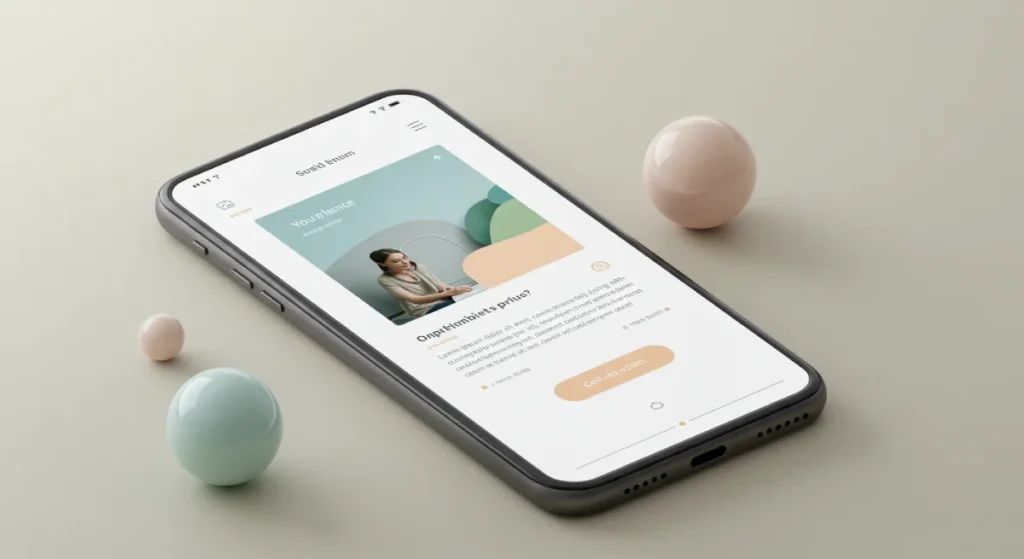
If you’re not designing for mobile first, what are you doing?
With over half of all emails being opened on mobile devices, a mobile-first mindset isn’t just a nice-to-have; it’s a must-have.
Here’s how you can embrace this principle:
- Keep Layout Simple: One-column layouts work wonderfully on mobile. They make scrolling easy and eliminate the need for pinching and zooming.
- Legible Fonts: Use larger font sizes (at least 14px) for optimal readability. If users are squinting, they’re likely to swipe left.
- Thumb-Friendly CTAs: Make your call-to-action buttons larger and easy to tap. Ideally, they should be at least 50 pixels tall.
When I first designed emails for Inkbot Design, I made the mistake of prioritising desktop views. I learned the hard way—watching clients’ engagement plummet when mobile opened up on their dashboards.
Don’t let that happen to you!
2 – Implement AI-Powered Predictive Personalisation
Personalisation isn’t just about inserting a recipient’s name into the subject line. Nope, we’ve come so far since then!
AI is your ally, creating more innovative, intuitive email experiences.
Consider these methods for implementation:
- Behaviour Tracking: Leverage behavioural data to understand your audience’s preferences and tailor your emails accordingly.
- Segmented Lists: Use AI tools to sort your subscribers based on their interactions and buying patterns, ensuring your content is relevant.
- Dynamic Subject Lines: Craft subject lines that adapt based on user data. For instance, refer to previous purchases or browsing history.
Imagine sending a personalised email to someone who just bought a camera, recommending accessories they might be interested in. That’s the kind of predictive personalisation that keeps customers coming back!
3 – Incorporate Interactive Elements
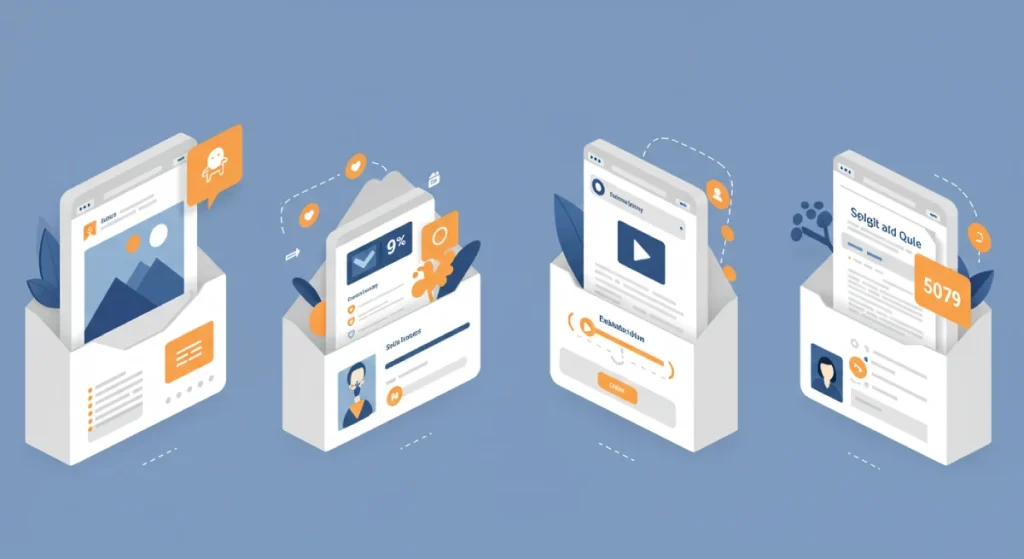
Boring emails are dead!
Interactive elements add a layer of engagement that excites people about your content.
Try these ideas:
- Polls and Surveys: Get feedback directly from your audience. It’s a fun way to learn more and engage your subscribers.
- Galleries and Slideshows: Showcase products or images users can scroll through within the email.
- Countdown Timers: Create urgency for special offers with a ticking clock.
4 – Utilise Dynamic Content to Tailor Email Designs
Gone are the days of a “one size fits all” approach.
Dynamic content allows you to serve different visuals or messages based on user data.
- Geo-Targeting: Tailor your messaging based on the location of the recipient.
- User Preferences: If you know someone loves gardening but loathes cooking, why show them meal prep tips?
- Recent Interactions: Feature products or content based on their past interactions with your brand.
Dynamic content makes your emails feel bespoke, just like a tailored suit!
5 – Embrace Minimalist Design for Faster Load Times
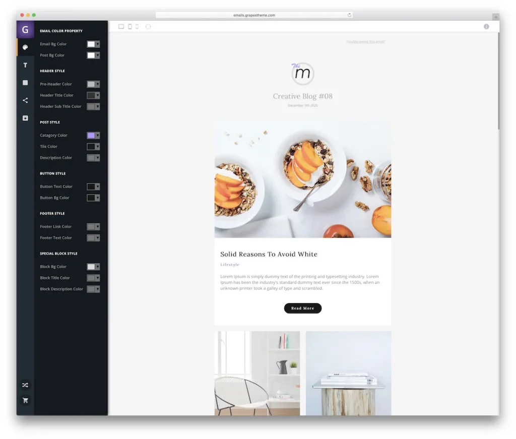
Less indeed can be more!
With attention spans dwindling, fast load times are essential.
- Simplified Design Elements: Stick with fewer images and elements that might slow things down.
- Optimised Images: Use compressed images to reduce load times without sacrificing quality.
- White Space is Your Friend: It gives your content room to breathe and increases focus.
The last thing you want is for customers to close your email because it takes too long to load.
We noticed open rates and engagement soared when Inkbot Design embraced minimalism in our marketing materials.
6 – Ensure Accessibility Across Devices and Email Clients
Accessibility is crucial, not just for inclusivity but also for reaching the broadest audience.
Make sure your designs work across all devices and email clients:
- Alt Text for Images: Always include alt text in your emails. This is invaluable for visually impaired users and cases where images don’t load.
- Colour Contrast: Ensure your text stands out against the background for easy readability.
- Keyboard Navigation: Ensure links are accessible to those navigating via the keyboard.
7 – Feature User-Generated Content like Reviews and Social Media
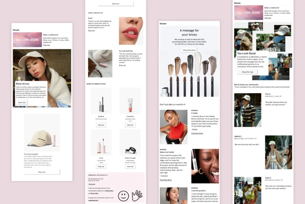
Your audience loves to see what others think!
Featuring user-generated content (UGC) establishes social proof and creates a community around your brand.
- Customer Reviews: Include snippets from satisfied customers to validate your product offerings.
- Social Media Shout-outs: Highlight posts from your followers showcasing your products.
- Contests and Features: Encourage subscribers to share and showcase their experiences in your emails.
Remember, the more authentic the content, the stronger the connection with your audience!
8 – Use Interactive Content Such as Animated Buttons, Rollover Effects, and Quizzes
Breathe life into your emails!
Interactive content keeps users engaged, making them more likely to click through.
- Animated CTAs: Create buttons that change colour or size on mouse-over. It encourages clicks!
- Quizzes: Fun little quizzes can provide insights while entertaining your audience.
- Hover Effects: Use rollover effects to reveal information, such as product descriptions.
9 – Design Intuitive Email Layouts Following Z or F Patterns
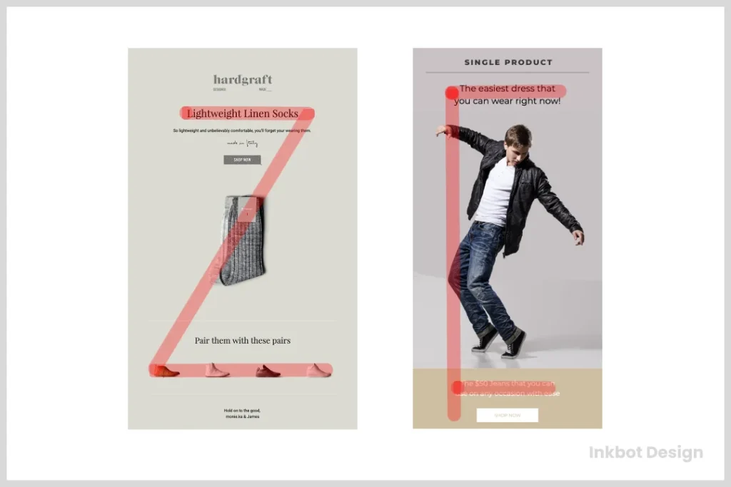
Did you know that humans naturally read in Z or F shapes?
Utilise this knowledge to structure your email layouts for maximum impact:
- Z Pattern: Flows from left to right and top to bottom. Great for straightforward layouts.
- F Pattern: Best for content-rich emails, drawing attention on the left side.
- Hierarchy is Key: Place essential elements along those reading patterns to guide the viewer’s eye and attention.
This psychology isn’t just fascinating; it’s essential for effective design!
10 – Create Prominent, Visually Distinct CTA Buttons
Finally, let’s talk about the crown jewels of your email: the Call-to-Action (CTA) buttons.
If your CTAs don’t stand out, you’re losing potential clicks.
- Use Contrasting Colours: Your CTA should be a pop of colour amidst the rest of the email.
- Compelling Text: Instead of “Click here,” try something more enticing like “Grab your exclusive offer!”
- Strategically Position Your CTAs: Don’t bury them; place them where they’re easily visible.
As we look toward 2025, applying these 10 best practices in email design will enhance engagement and foster stronger connections with your audience.
Are you ready to elevate your email game? Your subscribers are waiting! 📨
Email Design Trends to Know in 2025
As we’ve explored effective email design best practices, it’s only fitting to shift our focus towards upcoming trends.
Staying ahead of the curve can help ensure your campaigns meet current standards and anticipate what audiences will expect next.
Ready to revamp your email game? Let’s dive into the email design trends poised to dominate in 2025!
Immersive Visual Experiences
Content is king, but visuals are the throne on which he sits!
Email design moves beyond static images and simple layouts to provide an immersive experience.
Here’s what to look for:
- Cinemagraphs: These are half-video, half-photograph, featuring subtle movements that draw attention without being overly intrusive.
- Full-Width Backgrounds: Large, bold images that stretch across the entire email can set the mood and grab readers’ attention.
- Video Content: With improved email client support, embedding videos directly into emails will allow for richer storytelling and engagement.
Think of it this way: instead of just showing a product, how about a short clip of someone using it? It invites your audience into a living, breathing narrative.
Data-Driven Design
In 2025, data isn’t just the backbone of your marketing strategy; it will also inform your design choices.
Here’s how to harness the power of data:
- User Behaviour Insights: Leverage analytics to understand how your audience interacts with your emails and modify designs based on their preferences.
- A/B Testing: Don’t shoot in the dark; systematically test different layouts, colours, and styles to determine what resonates best.
- Personalisation at Scale: With growing data capabilities, you can create unique email experiences tailored to individual user segments.
Remember, the more you lean into your data, the sharper your design will become!
Sustainability in Design
With climate change and sustainability becoming focal points in consumer consciousness, brands are beginning to adopt designs that reflect eco-friendly values.
- Earth Tones and Organic Textures: Think greens, browns, and soft neutrals that evoke a sense of nature. These colours can signal your commitment to sustainability.
- Promoting Ethical Practices: Showcase your brand’s sustainability initiatives within your campaigns, whether responsible sourcing or eco-friendly practices.
- Minimalism Meets Sustainability: As discussed earlier, minimalist designs naturally align with sustainability—fewer images mean reduced loads and less data usage.
I remember the moment I realised the impact of sustainable design during a project for a client-focused on eco-friendly products. Adopting sustainability as a core theme enhanced the visuals and resonated with the brand’s mission, boosting its overall image.
Microinteractions
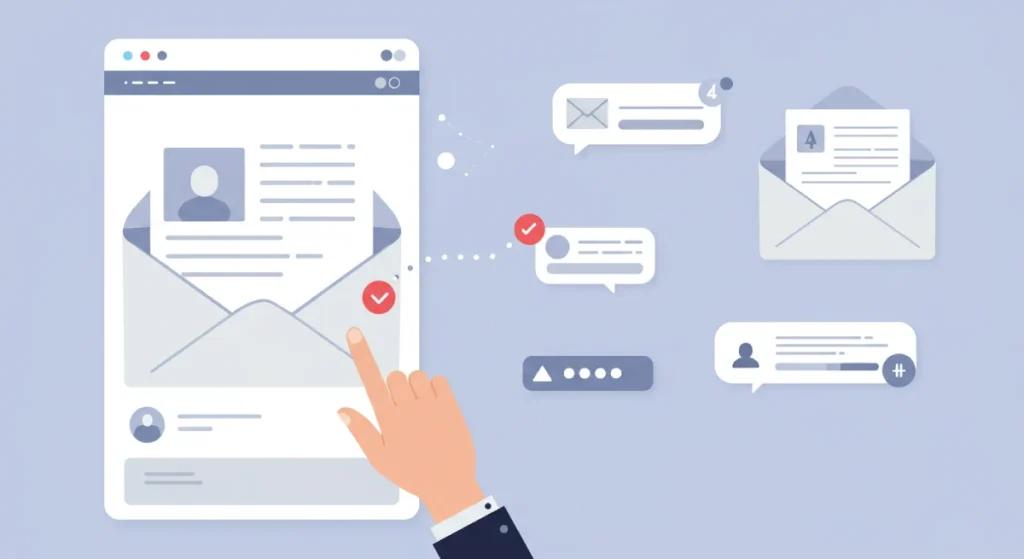
Microinteractions are the delightful little movements and animations that provide feedback to users. They can be as simple as a button that changes colour when clicked or a loading animation that keeps users informed.
- Tangible Feedback: Every action taken within an email should result in a visual change to assure users that their interaction is registered.
- Enhanced UX: Think of closing a modal window or how a button subtly moves when hovered over. It makes emails more dynamic and engaging.
I remember how excited clients were when we designed hover effects for CTAs. It’s like a friendly nudge saying, “Hey, go ahead and click me!”
Investing in microinteractions transforms a flat email into a fulfilling experience.
Augmented Reality (AR) Elements
Augmented reality is moving from the fringes to the forefront of email design.
Imagine users seamlessly integrating digital elements into their real world—all thanks to your email!
- AR Product Previews: Users can view products in their spaces before purchasing. For example, if you sell furniture, allow users to visualise what a chair would look like in their lounge.
- Interactive 3D Models: Users can rotate or interact with 3D product models directly in an email to get a feel for the product.
Though AR might still be nascent in email marketing, brands like IKEA are already leading the charge.
Let’s face it — it’s more than just a gimmick; it’s an opportunity to innovate.
Bold Typography
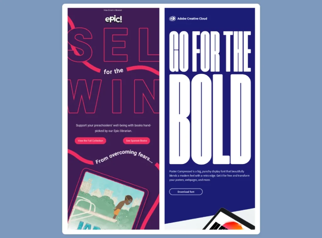
While once a subtle aspect, typography is stepping into the spotlight as a primary design feature.
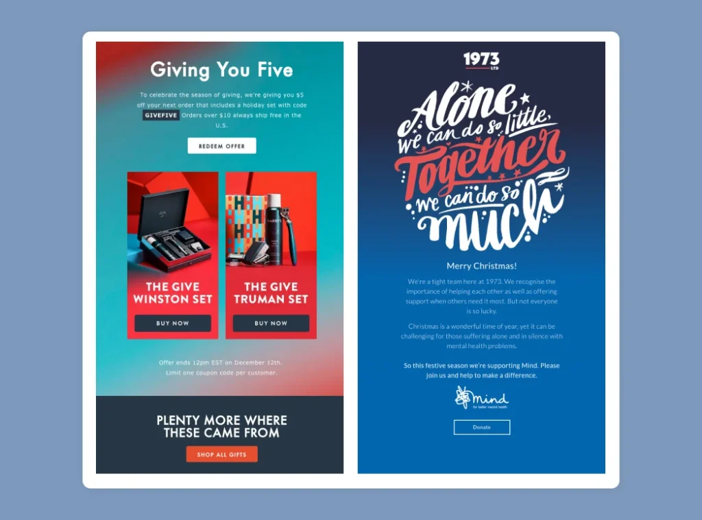
- Statement Fonts: Use bold and oversized fonts that can command attention and enhance your brand identity.
- Layered Text Designs: Playing with overlays and contrasts can create a visually striking effect.
- Playful Typography: Consider using informal and conversational fonts that match your brand’s voice and resonate with modern audiences.
At Inkbot Design, we shifted to bold typography for our headlines, and the response was overwhelmingly positive.
It not only bolstered our branding but also improved readability. Unique typefaces can transform the character of your message, making it unforgettable.
Inclusivity and Diversity in Design
In this quickly evolving world, brands no longer cater to the majority. It’s all about inclusivity!
- Diverse Representation: Ensure your design reflects a variety of cultures, backgrounds, and lifestyles.
- Language Options: Designing with multilingual capabilities can cater to wider audiences, ensuring no one feels left out.
- Visual Accessibility: Adopting diverse visuals helps represent your entire customer base, which can foster a sense of community.
Integration of Social Media Elements
In the age of sharing, integrating social media directly into your emails can be a game-changer.
- Social Feed Widgets: Showcase user posts or brand updates that directly link to your social accounts in your email.
- Shareable Content: Encourage sharing straight from the email with integrated social share buttons.
- Incorporate Hashtags: Create specific campaign hashtags that engage users and encourage them to interact.
During a campaign at Inkbot Design, featuring an Instagram feed in our emails boosted our social media interactions, providing users with a visual connection to our online presence.
Futuristic, Tech-Inspired Designs
Lastly, with the rapid advancement of tools and technology, expect to see more futuristic influences in email design.
- Neon Glows and Gradients: This can evoke a tech-forward feel.
- Digital Aesthetics: Incorporating elements reminiscent of coding, 3D graphics, or even sci-fi themes can make your emails stand out.
2025 is shaping up to be an exciting year for email design.
By embracing these trends, not only will you keep your campaigns fresh and engaging, but you’ll also forge deeper connections with your audience.
Ready to jump in? The future is now! 🌟
Conclusion
As we wrap up our exploration into the evolving world of email design, it’s clear that the landscape is not static.
It’s more dynamic than ever!
From embracing best practices to keeping an eye on the latest trends, many opportunities exist to enhance your email strategies.
In the spirit of summarising everything we’ve discussed, let’s reflect on the key takeaways and embrace the promise of an exciting future.
Embrace Change, Drive Adaptation
The digital world moves at lightning speed. New technologies, design philosophies, and consumer behaviours emerge almost daily.
To stay relevant, it’s vital to remain flexible:
- Accept Feedback: Build a culture where feedback is welcomed. Whether it’s from your audience or your team, insights can unlock new design opportunities.
- Iterate Constantly: Don’t consider your designs set in stone. What worked today may not resonate tomorrow. Experiment frequently!
- Stay Informed: Regularly engage with industry publications, webinars, or design conferences to keep your finger on the pulse of email design.
Today, I encourage my clients to be open to change—after all, new ideas can produce astonishing results!
Prioritise User Engagement
Remember, at its core, email marketing is about connecting with your audience. Your design should facilitate rather than obstruct this process.
Consider these strategies:
- Know Your Audience: Understand their preferences and pain points. Customisation should come from this knowledge.
- Engagement Metrics: Always evaluate your open rates, click-through rates, and conversion metrics. Adjust your designs based on what these numbers tell you.
- Compelling CTAs: Ensure every email contains a clear, appealing call to action. What do you want your readers to do? Make it unmistakable!
Focus on Aesthetics and Accessibility
An aesthetically pleasing email catches the eye; accessible design ensures everyone can appreciate it.
In practice, this means:
- Visual Hierarchy: Use layout, colour, and typography to guide your reader’s journey through the content.
- Testing for Accessibility: Regularly check if your email designs meet accessibility guidelines.
- Responsive Designs: Mobile-friendliness isn’t just a trend; it’s a necessity.
Incorporate Cutting-Edge Technologies
Let’s face it: the future is here.
Incorporating new technologies into your email marketing strategies not only keeps your efforts fresh but also appeals to tech-savvy consumers:
- Artificial Intelligence: Use AI tools for predictive personalisation and to automate routine tasks.
- Augmented Reality: Embracing AR can redefine user interaction even in its infancy within emails.
- Interactive Elements: Implement interactive components that engage users and create memorable experiences.
Sustainability and Ethical Responsibility
We’re witnessing a cultural shift where consumers demand accountability from brands. Embracing sustainability in your email design can also enhance your reputation and maintain customer loyalty.
Here’s how you can embody sustainability:
- Transparent Practices: Share your eco-friendly initiatives with your audience.
- Choose Your Materials Wisely: Make informed decisions about imagery and resources to minimise environmental impact.
- Encourage Sustainable Behaviours: Promote products or actions that align with eco-friendly practices.
Your Email Must Reflect Your Brand Identity
Lastly, every email design should resonate with your brand’s core values and aesthetics.
- Consistency is Key: Ensure your email designs echo your website, social media, and other marketing materials.
- Authentic Voice: Make sure the tone of your emails reflects your brand personality. Whether it’s casual, professional, or quirky, authenticity builds trust.
Looking Forward
As we plunge into 2025, the potential for innovative email design is boundless.
You can ensure your emails are engaging and effective by experimenting, staying informed, and keeping your audience at the forefront of your strategy.
To sum up:
- Stay adaptable. The only constant is change.
- Engage your audience. Make them feel valued and understood.
- Prioritise aesthetics and accessibility. Every subscriber deserves a good experience.
- Leverage technology. Embrace what’s available to enhance engagement.
- Be sustainable. Reflect modern values in your brand.
- Always be authentic. Let your true brand spirit shine!
Are you excited about the endless opportunities that await? So am I!
After all, the world of email design remains ever-expanding. Embrace these shifts and watch your engagement rates soar! Your audience is out there, waiting to be amazed by your creativity.
Let’s revolutionise email design together! 🌟📧

