How to Create a Landing Page That Converts Visitors into Customers
An indispensable component of the sales funnel in our digital world, a landing page will convert casual onlookers into permanent loyal customers.
A great landing page is not just about looks.
It takes detailed planning so a visitor can become a new customer and grow a base.
This guide will guide you through the simple steps to help build a replication of a landing page that will convert.
- Understanding your target audience is crucial for creating relevant content that drives conversions.
- A compelling headline and clear call-to-action are essential for engaging visitors.
- Regularly evaluate and optimise your landing page based on performance metrics to ensure effectiveness.
Grasping the Target Audience
Understanding who the audience is comes before we start our process to create a landing page!
Discover the wants, needs, and pains of all potential customers.
Awareness of this allows us to create more effective visitors and relevant content that makes them more likely to convert.
However, knowledge of user demographics, behaviours, and motivations adds the spice required for a homogenous experience.
Creating A Catchy Headline

An adage says: You never get a second chance to make a first impression.
The headline needs to be good enough to tell them to go ahead and continue reading in the next place.
Keep the headline short, clear, and to the point of the value offered.
Your writing should focus on benefits instead of features, which is more convincing.
For example, rather than a general product description, convey how it addresses a specific pain point.
Create a Layout That Makes Sense
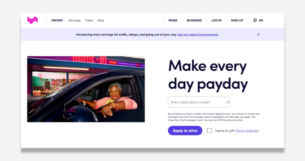
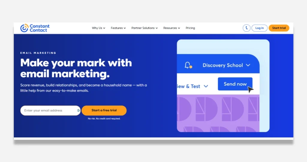
A simpler and straightforward design encourages user engagement.
An intuitive layout guides visitors seamlessly across the page, making the information easy to access.
Critical components, such as the Call-to-Action (CTA) button, must be obvious.
Practical usage of white space, proper spacing of different sections, and a simple design make browsing a beautiful experience and help reduce bounce rate.
Mobile Optimisation
Since mobile browsing is on the rise, mobile-friendliness has become a necessity.
Responsive design is the term used to describe how design takes shape according to the screen sizes of various devices, ensuring an almost uniform experience on all devices.
Pages that load quickly have easy-to-read text and receive online visitors seamlessly, navigating on mobile phones, improving user experience and increasing the likelihood of a conversion.
Providing a landing page optimised for mobile fulfils the needs of users using their mobile devices while out and about.
Using Eye-Catching Images

Visual elements are essential to obtaining attention.
Effective Images, such as High-quality images, videos, or infographics, convey specific messages easily and make complex information more memorable.
Brand-appropriate contextual images build connection and trust.
Include emotive or product-related images to help validate the page.
Writing Persuasive Copy
Compelling copy is a good accompaniment to visuals and reinforces the message.
Show benefits, not features, and improve the user’s life.
Choosing words carefully keeps in line with focused ideas rather than ambiguous statements that switch the focus and make the audience lose interest.
Confront possible objections up front in the copy to remind hesitant visitors.
User Testimonials or Reviews add credibility and stimulate trust.
Developing an Effective Call-to-Action

A good call to action is a final push towards conversion.
Call-to-action words suggest the next step we want the visitor to take: sign up, buy, or download.
Your CTA must shine through, inspire, and cater to the page’s end goal.
Testing variations helps see what works best for the audience.
Establishing Credibility and Trust
Conversion is grounded in trust.
Include trust elements, such as customer reviews, case studies, or trust badges.
Addressing insecurities with guarantees such as security, returns, satisfaction, etc., can foster confidence and prompt conversion.
Having clear contact details provides extra reassurance to visitors that the brand is legitimate.
Evaluating the Performance
An effective landing page regularly undergoes assessment and inspires further modification.
A/B testing helps determine which elements perform better, so guesswork never blurs the decision.
Metrics such as conversion rates, bounce rates, and user engagement help guide optimisation efforts.
Periodic performance checks help keep the page relevant and functional.
Conclusion
Creating a landing page that can turn visitors into customers is an art form.
Success is determined by their understanding of the audience to create compelling content and optimise design.
Focusing on the users’ needs can boost your online brand presence and convert the users into your targeted goals.
An engaging landing page attracts more visitors and turns them into loyal customers, driving business growth.
High-Converting Landing Page FAQS
What’s the single biggest mistake people make with landing pages?
Most landing pages fail because they try to be clever instead of clear. People waste the first 5 seconds with cute headlines instead of addressing the pain point immediately. Your visitor has one question: “Can you solve my problem?” Answer that in the headline, not some cute slogan. I’ve tested thousands of landing pages, and clarity crushes cleverness every single time. The pages that convert at 15%+ all nail this first impression by stating the exact problem and solution upfront.
How many CTAS (Call-to-Actions) should I include on my landing page?
One. Not two, not three—ONE. Every additional option reduces conversion by 15-30%. I’ve seen clients go from 2% to 9% conversion overnight by removing secondary CTAS. The moment you give people options, you create decision fatigue. Your landing page has ONE job: get them to take ONE specific action. Everything on that page should drive to that single CTA. If you want to A/B test, test different CTAS on different pages, not multiple options on the same page.
What’s more important for conversion: design or copy?
Copy, and it’s not even close. I’ve seen ugly pages with excellent copy convert at 3x the rate of beautiful pages with mediocre copy. When we A/B tested with our clients, improving copy lifted conversion by 400% on average, while design improvements typically gave us 20-50% lifts. Design matters for credibility, but copy is what sells. Spend 80% of your time on the words and 20% on making it look decent—the only exception is mobile responsiveness, which is non-negotiable.
Do I need social proof on my landing page, and how much?
Yes, and more than you think. In our tests, pages with 3+ forms of social proof (testimonials, results, logos, stats) convert 250% better than those with just one type. But here’s the key: they need to be specific and relevant. “This was great!” converts at 0.5%. “I made $10,439 in my first 30 days following this system” converts to 5%. The specificity creates believability. Use numbers, time frames, and relevant context in every testimonial.
How long should my landing page be?
As long as it needs to be to overcome all objections—no more, no less. For a $27 product, maybe 1-2 scrolls. For a $2,000 product, you’ll need much more. We’ve seen that longer pages consistently outperform shorter ones for higher-ticket offers. The key isn’t length but engagement. Every section should pass the “so what?” test. Cut it if it doesn’t advance the sale or overcome an objection. I’ve seen 15,000-word landing pages convert at 12% for high-ticket offers because every word served a purpose.
What’s the optimal headline formula for high-converting landing pages?
The highest-converting headline formula we’ve tested follows: [Specific Desirable Outcome] + [Specific Timeframe] + [Address Objection]. Example: “How to Get 100 High-Quality Leads Every Week Without Spending More on Ads.” Notice that it has the outcome (100 leads) and the timeframe (weekly), and it handles the objection (without more ad spend). This formula has consistently beaten all others in our tests, often doubling the conversion rate of “clever” headlines.
Should I include pricing on my landing page?
Suppose you’re selling something under $200, yes. For higher-ticket items, it’s not until you’ve built enough value. Here’s why: in our tests, showing low prices upfront increased conversion by 25%, but showing high prices before establishing value decreased conversion by 70%. The key is a value-to-price ratio. Conversion skyrockets if your landing page establishes $10,000 worth of value before revealing a $2,000 price. But if you show a $2,000 price before establishing value, you’ll lose them instantly.
Video or no video on landing pages?
Include video, but don’t rely exclusively on it. Our tests show that pages with both video and text convert 80% better than video-only or text-only pages. Why? Different people consume information differently. The winning formula: a short 60-90 second video above the fold that hits the main pain points and solutions, followed by text that expands on those points for scrollers. Ensure the video has captions—30-40% of people watch without sound.
What’s the best approach for mobile landing pages?
Mobile isn’t just a smaller screen—it’s an entirely different psychology. Mobile users convert differently. Three critical differences: 1) Keep paragraphs to 1-2 sentences max, 2) Use more subheads (every 2-3 paragraphs), and 3) Make buttons at least 45px tall and full-width. When we implemented these three changes alone for clients, mobile conversion rates jumped from 1.2% to 3.8% on average. Most critical: test your page on actual phones, not just responsive simulators.
How do I handle objections on a landing page?
You must proactively address the top 3-5 objections before they become roadblocks. We use the “Objection-Evidence-CTA” framework. State the objection explicitly (don’t hide from it), provide specific evidence that overcomes it, and then immediately follow with a call to action while they’re convinced. Example: “You might think you need technical skills to make this work” (objection). “But 72% of our successful users had zero tech background before starting” (evidence). “Get started now while this is fresh in your mind” (CTA). This approach converts 2 to 3x better than ignoring objections.
What’s the ideal CTA button text?
Specificity crushes generality every time. “Click Here” converts at about 0.5%. “Start My 14-Day Trial” converts at 4-7%. The highest-converting CTA buttons use first-person, outcome-focused language. In our tests, “Get My Free Lead Generation Template” outperformed “Get Your Free Lead Generation Template” by 34%. Why? “My” creates ownership before they even click. And make the button colour contrast with the page—our tests show a 27% lift just from proper colour contrast, regardless of which colour you choose.

