7 Best Colour Palette Generators & Tools for Designers
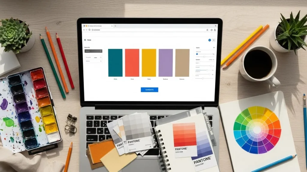
You are staring at a blank artboard. The client wants something “fresh,” “trustworthy,” yet “disruptive.”
You have dragged the colour picker around the wheel for forty-five minutes, and everything either looks like a muddy mess or a rip-off of a fast-food chain.
This is the point where amateurs guess, and professionals reach for their toolkit.
Colour is not merely about aesthetics; it is about function, psychology, and technical reproducibility.
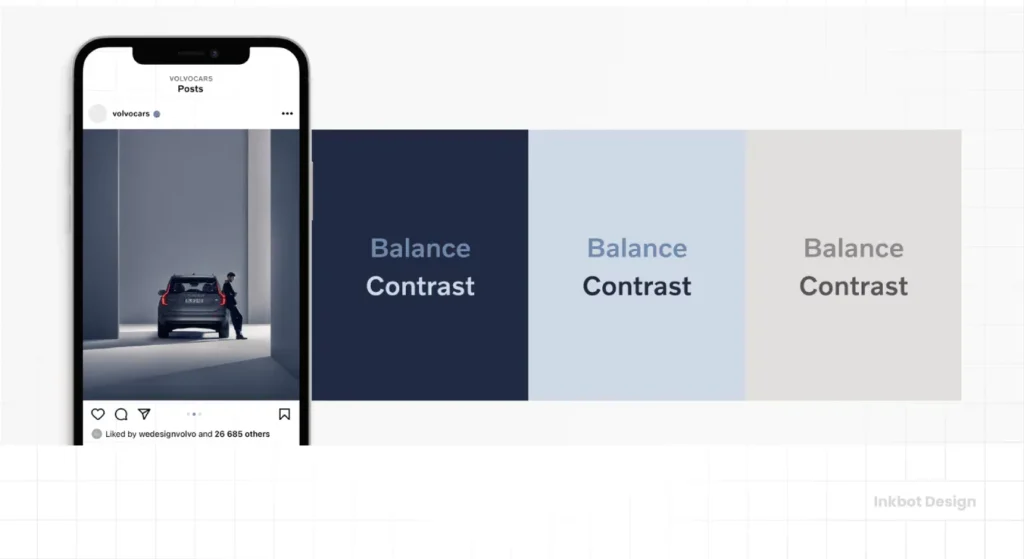
A hex code that looks electric on your Retina display might look like dried mud when printed on a matte business card. A subtle grey text on a white background might look elegant to you, but it renders your website legally non-compliant for visually impaired users.
We are not here to discuss which colours look “pretty.” We are here to dismantle the tools that generate them.
In this guide, we will examine the seven best colour palette generators available today.
We will strip away the marketing fluff to determine which tools actually integrate into a professional workflow and which are merely toys.
- Colour tools must output technical data: Hex, RGB, and ideally CMYK or Pantone for accurate cross-media reproduction.
- Use accessibility checks and contrast ratio validation to meet WCAG standards and avoid legal and usability issues.
- Choose tools by workflow: Coolors for speed, Adobe Color for CC integration and accuracy, Material for UI systems.
- Validate screen palettes for print using Pantone Connect or CMYK proofs to prevent unexpected printed results.
- Use AI generators for ideation but refine palettes with professional tools and human judgement for context and psychology.
What is a Colour Palette Generator?
A colour palette generator is a software tool, typically web-based or AI-driven, that automates the process of creating cohesive colour schemes based on colour theory algorithms.
At its core, a professional generator must provide three technical outputs:
- Harmony Rules: It must apply mathematical relationships (complementary, split-complementary, triadic) to ensure the colours do not clash visually.
- Technical Data: It must provide Hex codes for web, RGB values for screens, and preferably CMYK or Pantone approximations for print.
- Exportability: It needs to extract the data from the browser and import it into your design software (Adobe, Figma, Sketch) via ASE files, CSS, or SCSS.
If a tool only gives you a hex code and a “good vibe,” it is useless for professional branding.
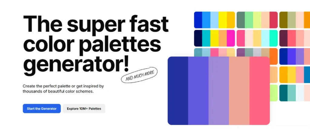
1. Coolors.co: The Speed Demon for Rapid Iteration
If you need to generate fifty options in five minutes to show a client the breadth of possibilities, Coolors is the industry standard for speed and efficiency. It has evolved from a simple spacebar-mashing toy into a fairly robust platform.
How It Works
The interface is immediate. You press the spacebar, and it generates a five-colour scheme. You lock the colours you like, press space again, and the remaining slots cycle through options that harmonise with your locked choices.
The Professional’s View
What makes Coolors valuable is not the random generation—that is arguably its weakest feature for serious work. The value lies in the Image Picker and the Contrast Checker. You can upload a client’s mood board image, and Coolors will extract the dominant pixel averages to form a palette.
More importantly, it has recently integrated accessibility checks directly into the generation flow. You can toggle a “Colour Blindness” mode to see how your palette appears to users with Protanopia or Deuteranopia.
Key Features
- Export Options: PDF, PNG, SCSS, SVG, and—crucially for Adobe users—ASE (Adobe Swatch Exchange).
- iOS App: One of the few generators with a usable mobile app for on-the-go inspiration.
- Luminance Adjustment: You can tweak the HSB (Hue, Saturation, Brightness) directly on the strip without leaving the generator.
The Downside
It is easy to get trapped in the “Slot Machine Effect.” You keep hitting spacebar, hoping for magic rather than making a deliberate design decision. It requires discipline to stop and refine one’s thoughts.
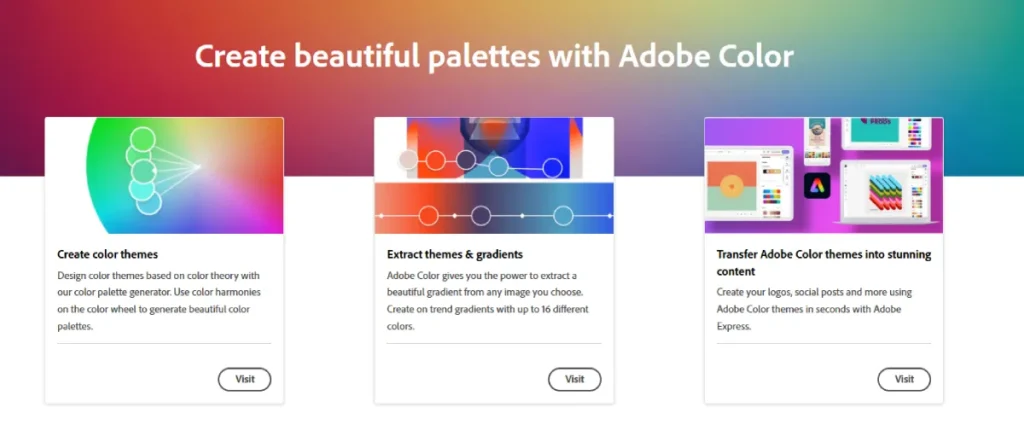
2. Adobe Color: The Ecosystem Standard
For anyone paying the “Adobe Tax” (Creative Cloud subscription), Adobe Color (formerly Kuler) is the heavyweight champion of integration. It is not just a website; it is a panel inside Photoshop, Illustrator, and InDesign.
How It Works
Adobe Color offers a sophisticated wheel where you drag pucks to adjust colours based on strict harmony rules (Analogous, Monochromatic, Triadic, etc.). Because it is built by Adobe, the colour science behind the rendering is incredibly accurate to what you will see in their software.
The Professional’s View
The killer feature here is the “Explore” tab, which enables you to search for palettes based on keywords such as “Corporate,” “Cyberpunk,” or “Medical.” But the real reason we use it at Inkbot Design is the “CC Libraries” sync.
When you save a palette in the browser, it appears instantly in your InDesign Swatches panel. This eliminates the tedious process of copying and pasting hex codes or manually entering CMYK values. It streamlines the workflow between the brand strategist and the production designer.
Key Features
- Accessibility Tools: Adobe has added a robust “Contrast Checker” that flags combinations failing WCAG AA or AAA standards.
- Extract Gradient: Beyond flat colour, it can extract smooth gradients from uploaded images, which is vital for modern UI design.
- Trend Analysis: It aggregates data from Behance to show you what colour trends are currently spiking in specific industries.
The Downside
The UI can feel clinical and heavy. It lacks the “fun” and speed of Coolors. It is a tool for engineers of colour, not necessarily for quick brainstorming.
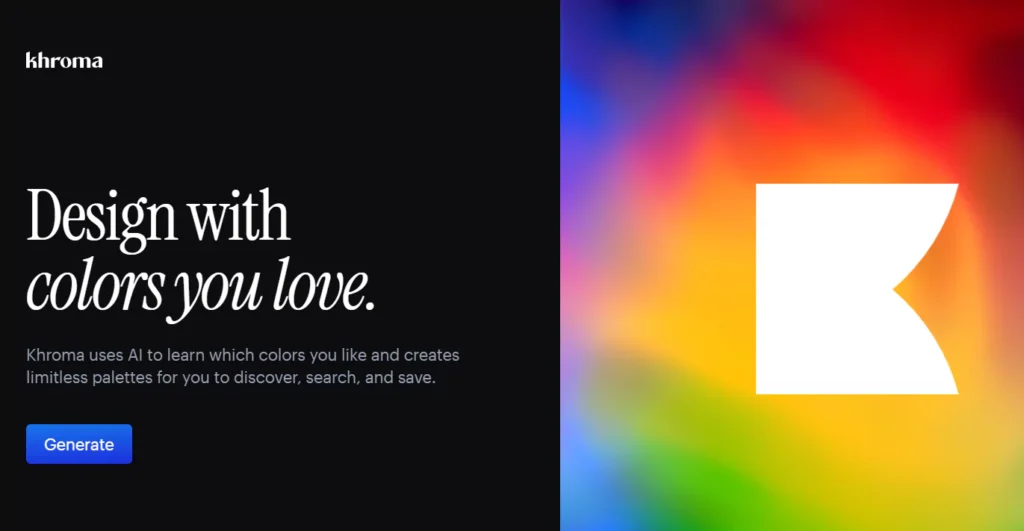
3. Khroma: The AI Personal Assistant
Khroma is different. It uses machine learning to understand your personal colour preferences and then generates limitless combinations based on that training data.
How It Works
When you first load Khroma, you have to perform a “training” exercise. You select 50 colours that you like from a massive grid. This takes about 5 minutes. The neural network then analyses these choices to understand your bias—do you prefer desaturated earth tones? Neon cyans? Deep blacks?
Once trained, it presents palettes in practical formats: as typography on a coloured background, as a gradient, or as a two-colour poster layout.
The Professional’s View
Khroma is excellent for breaking out of a rut while staying within your general aesthetic safety zone. Seeing the colours applied to text immediately is a huge time-saver for UI designers. It answers the question, “Is this legible?” before you even export the code.
Key Features
- Contextual Visualisation: It displays colours as Poster, Type, Gradient, or Image, helping you visualise usage.
- Infinite Scroll: There is no “generate” button; it just keeps loading options that match your neural profile.
- Search by Bias: You can filter the AI’s output by Hue, Tint, Value, or Colour (e.g., “Show me things I like, but make them Purple”).
The Downside
The training phase is a barrier to entry. Additionally, if you are designing for a client whose brand personality differs from your own personal taste, Khroma’s bias towards your preferences becomes a liability. You need to retrain it or ignore your instincts.
4. Huemint: The Context-Aware Generator
Most generators show you vertical stripes of colour. Huemint uses machine learning to map those colours onto realistic mockups of websites, logos, and packaging illustrations instantly.
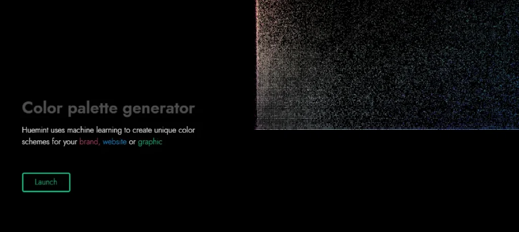
How It Works
You select a generation model (e.g., “Transformer” or “Diffusion”), and Huemint generates a palette. Simultaneously, it applies that palette to a preset vector illustration or a website hero section. It decides which colour should be the background, which should be the accent, and which should be the text.
The Professional’s View
This is arguably the most useful tool for presenting concepts to clients. Clients often struggle to visualise how a five-colour strip translates to a brand identity. Showing them a generated mockup where the primary colour is the background and the secondary colour is the CTA button helps them “get it” immediately.
Key Features
- Bootstrap Integration: It can generate colour schemes specifically mapped to Bootstrap utility classes (success, danger, info).
- Smart Mapping: The AI understands hierarchy. It rarely makes the mistake of putting a light yellow text on a white background because it has “learned” contrast.
The Downside
The export options are limited compared to Adobe or Coolors. It is a visualisation tool, not a production tool.
5. Material Design (The Colour Tool): The UI/UX Specialist
If you are building an app or a website that adheres to Google’s Material Design guidelines, this is not optional—it is mandatory.
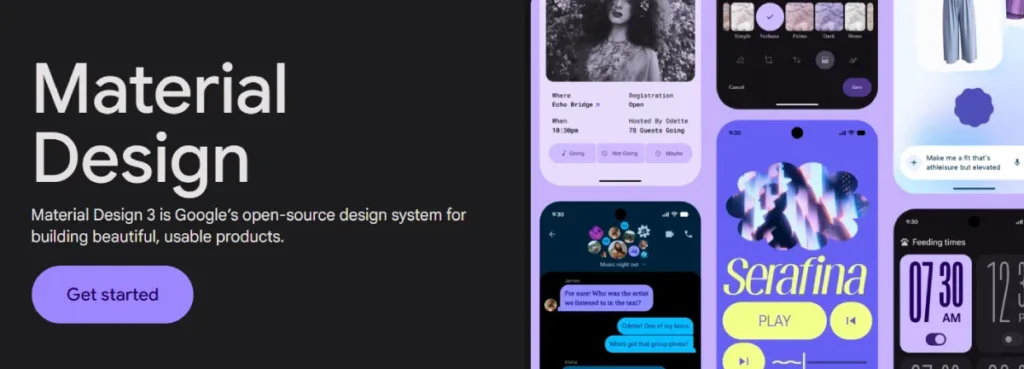
How It Works
This tool is rigid. It forces you to select a Primary and a Secondary colour. It then automatically generates the tonal variants (P-50 to P-900) required for a complete UI system. It shows you exactly how your Floating Action Button (FAB) will look against the background.
The Professional’s View
For product designers, this saves hours of math. Calculating the correct shade of “hover state” blue or “pressed state” blue is tedious. Material Design automates the creation of your accessibility-compliant text colours (On-Primary, On-Secondary).
Key Features
- Accessibility Pass/Fail: It instantly flags if your text colour is illegible on top of your primary colour.
- UI Preview: Real-time preview on standard Android UI components.
The Downside
It creates “Google-looking” apps. If you want a brand that feels distinct from the Android ecosystem, you will find this tool restrictive.
6. Pantone Connect: The Physical Reality Check
We must address the elephant in the room: Print.
Web-based generators (RGB) lie to you. They show you neon greens and electric blues that are physically impossible to reproduce with CMYK ink. If you send an RGB hex code to a printer, the result will be dull and disappointing.
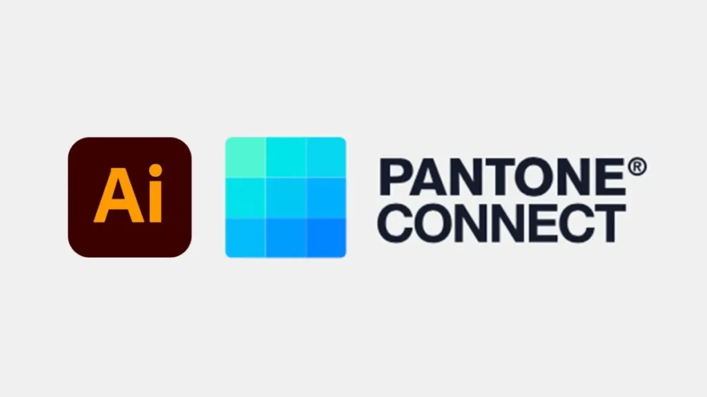
How It Works
Pantone Connect (formerly a standalone app, now a plugin/web tool) allows you to browse the Pantone Matching System (PMS). It is the only way to guarantee that the colour you see is the colour you get on a physical box or t-shirt.
The Professional’s View
You use this tool to “sanitise” your web palette. Once you have generated a scheme in Coolors or Khroma, you take those hex codes into Pantone Connect to find the closest matching spot colour.
Warning: You will often find that your favourite digital colour has no direct Pantone equivalent. This is a critical conversation to have with a client before they sign off on the brand guidelines.
Key Features
- Cross-Reference: Find the closest PMS match for a Hex or RGB value.
- Mood Boards: Build palettes based on physical ink standards.
The Downside
It is expensive. Pantone has transitioned to a subscription model, which many designers find frustrating. However, for professional packaging design, it is a non-negotiable cost of doing business.
7. Data Viz Palette: The Analyst’s Choice
Brand colours are one thing; data visualisation is another. If your client requires charts, graphs, and dashboards, your standard brand palette will likely fall short of meeting their needs. You need colours that are equidistant in hue to be distinguishable in a pie chart.
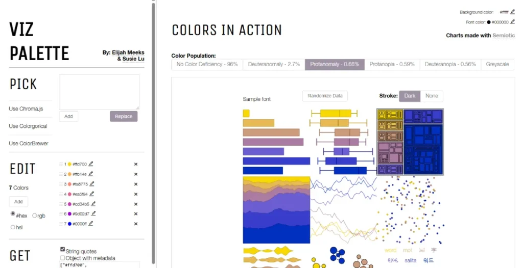
How It Works
You input your primary brand colours, and Data Viz Palette generates a series of additional colours specifically designed for charts. It simulates how lines and bars look when overlapping.
The Professional’s View
We use this specifically for B2B tech clients and Fintech companies where dashboards are the product. Standard palettes often lack enough contrast between “Series 1” and “Series 2” data. This tool fixes that logic.
The Science of Selection: How to Choose Not Just “Good” Colours, But “Right” Colours
Anyone can pick colours that look nice. A strategist picks colours that work. When evaluating the output from these generators, you must apply the principles of colour psychology.
1. The RGB vs CMYK Trap
The most common failure mode for new businesses is falling in love with a colour on a screen that cannot exist in print.
- RGB (Red, Green, Blue): This is light. It is additive. Screens can project incredibly bright, saturated light.
- CMYK (Cyan, Magenta, Yellow, Key/Black): This is ink. It is subtractive. Paper absorbs light.
The Fix: Always test your palette in CMYK mode in Illustrator before presenting it. If the vibrancy dies, you need to adjust the expectation or the colour.
2. The 60-30-10 Rule
A generator gives you five equal stripes of colour. Never use them equally. Apply the 60-30-10 rule:
- 60% is your primary colour (usually a neutral or brand anchor).
- 30% is your secondary colour.
- 10% is your accent colour (for CTAs and highlights).
3. Accessibility is Law, Not a Feature
In 2026, web accessibility is a legal requirement in many jurisdictions (ADA in the US, EAA in Europe).
If your “Submit” button text does not have a contrast ratio of at least 4.5:1 against the button background, you are failing WCAG AA standards. This creates friction for users and exposes the company to liability. Tools like Adobe Color and the Contrast Checker by WebAIM are essential for validating the output of other generators.
Consultant’s Note: I once audited a fintech client who used a light grey text on a white background because it looked “clean” and “Apple-esque.” Their user testing revealed a 20% drop-off in form completion among users aged 50 and above. We darkened the grey, ruined the “aesthetic,” and recovered the revenue. Contrast converts.
The State of Colour Tools in 2026: The Generative Shift
The landscape has undergone significant shifts in the last 18 months. We are moving away from algorithmic generation (math-based) to semantic generation (language-based).
Tools like ChatGPT and Midjourney can now generate colour palettes via text prompts. You can ask an LLM: “Give me a hex code palette for a luxury coffee brand in London that feels rainy but warm.”
However, these LLMs often exhibit technical issues. They might give you a hex code that they claim is “Pastel Blue,” but when rendered, it is actually a muddy grey.
The Strategy: Utilise Generative AI for generating ideas and vibes, but utilise the tools listed above (Coolors, Adobe) to execute the data.
Technical Comparison: The Wrong Way vs. The Right Way
| Feature | The Amateur Approach | The Professional Approach |
| Selection Method | “I just pick what looks cool.” | Uses psychology and competitor analysis. |
| Validation | Looks good on my iPhone. | Validated for WCAG AA/AAA contrast compliance. |
| Print Proofing | Ignores print; shocked when cards look dull. | Checks CMYK gamuts and selects Pantone matches. |
| Handoff | Sends a screenshot of the colours. | Exports .ASE files and SCSS variables. |
| System | Uses 5 colours randomly. | Defines Primary, Secondary, Utility, and Semantic roles. |
The Verdict
The best colour palette generator is not the one with the flashiest interface; it is the one that fits your workflow.
- For pure speed and brainstorming: Use Coolors.
- For professional integration and print safety: Use Adobe Color.
- For UI/UX Systems: Use Material Design.
- For Client Visualisation: Use Huemint.
Do not let the tool dictate the design. These generators are starting points, not finish lines. The machine provides the data; you provide the context.
If you are struggling to build a cohesive brand identity that works across print and digital, or if you are worried your current palette is costing you customers, it might be time to bring in the experts.
Frequently Asked Questions (FAQ)
What is the most accurate colour palette generator?
Adobe Color is widely considered the most technically accurate for professional designers. Because it integrates directly with the Adobe Creative Cloud, the conversion between RGB, CMYK, and LAB colour spaces is consistent with industry-standard software, such as Photoshop and Illustrator.
Can I use these generators for print design?
Yes, but with caution. Most generators operate in RGB (screen) mode. You must convert these colours to CMYK (print) values to see how they will actually look on paper. We recommend using Pantone Connect to find physical ink matches for the digital colours you generate.
How many colours should be in a brand palette?
While generators often give you five colours, a robust brand system typically needs more. You need a Primary Brand Colour, a Secondary Colour, a set of Neutrals (greys, blacks, whites) for UI, and Semantic Colours (red for error, green for success) for functional elements.
What is the 60-30-10 rule in colour theory?
The 60-30-10 rule is a timeless principle in decor and design. It suggests that 60% of the design should be the dominant colour (usually a neutral), 30% should be the secondary colour, and 10% should be an accent colour. This ensures balance and prevents the design from becoming overwhelming.
Why do my colours look different on my phone vs. my laptop?
Every screen has a different “Colour Gamut” and calibration. An iPhone screen is OLED and highly saturated, whereas a cheap office monitor is typically LCD and often appears washed out. Professional designers use calibrated monitors and trust the Hexadecimal codes/data rather than relying solely on their eyes.
Is Coolors.co free to use?
Yes, Coolors.co offers a robust free version that allows you to generate an unlimited number of palettes. However, they offer a Pro version (paid) that unlocks features like removing ads, saving more palettes, and advanced export options like SVG and ASE.
How do I know if my colour palette is accessible?
You must check the “Contrast Ratio” between your text colour and your background colour. Tools like Adobe Color and WebAIM have built-in checkers. For standard text, you generally need a ratio of at least 4.5:1 to meet WCAG AA standards.
What is an ASE file?
ASE stands for Adobe Swatch Exchange. It is a file format that allows you to share colour palettes between different Adobe programs (e.g., from Photoshop to InDesign) or between different designers. It ensures everyone is using the exact same colour values.
Can AI generate a brand colour palette?
Yes, tools like Khroma and Huemint use AI to learn your preferences and generate palettes. However, AI lacks the cultural context and psychological nuance that a human designer brings. AI is a great starting point, but human refinement is usually necessary.
Why should I avoid neon colours for my logo?
Neon colours are “out of gamut” for standard CMYK printing. If you design a logo with neon green, it will print as a dull forest green on standard business cards or letterheads. To print true neon, you have to pay for expensive fluorescent Pantone inks.

