Top 10 Brown Logos: A Deep Dive into Earthy Brand Identity
Brown.
The earth is brown; coffee is brown; chocolate is brown. Steady, safe, down-to-earth.
It’s also the colour of choice for some of the biggest brands in the world.
Why?
Because brown isn’t flashy, it doesn’t scream for attention. Instead, it murmurs dependability and genuineness — a promise kept.
What they’ve done is tap into something primal. They’ve recognised that sometimes, the quietest can be the most powerful statement in a world of neon signs and digital billboards,
So, what can we learn from these brown-logo pioneers? What do their earth-toned emblems hide?
Let’s see.
Ten stories. Ten logos. Ten lessons on subtle branding power.
Do you want to look at marketing from another angle?
- Brown logos suggest reliability and authenticity, making them effective in branding for food and natural products.
- Brands like UPS and M&M's show how consistent use of brown can create powerful associations with trust and nostalgia.
- Brown can convey warmth and luxury when designed thoughtfully, enhancing a brand's image across various industries.
1 – UPS: The Brown That Delivers
Starting in 1916, they took a modest hue that camouflaged dirt and turned it into an internationally recognised symbol of dependability. It is not just about choosing a colour but a commitment spanning one hundred years.
Decorative? Definitely not! The shield on their logo represents something more than that. It’s like shaking hands with someone you can trust – visualised. And while we may say nothing in favour of security, this sign speaks volumes: “safe.”
So, no, the company did not simply settle for any old shade of brown when choosing its identity system. It built an empire around what people commonly call earth tones today (or browns). To such an extent, have they integrated this colour into everything about them that even questions are subject to copyright law: “What Can Brown Do For You?”
It’s not about looking pretty; it’s about standing out by fitting in – turning everyday things into extraordinary ones.
UPS teaches us that branding isn’t done through flashy designs or trendy colours; instead, it is done through being consistent with your message over time and showing commitment towards choice until people cannot separate industry knowledge from thoughts surrounding yourself.
2 – M&M’s: A Chocolatey Delight
M&M’s didn’t invent brown. They didn’t even invent chocolate.
But for over 80 years, they’ve owned a particular shade of brown in our collective psyche. It’s not just any brown—it’s M&M’s brown.
This brown whispers comfort. It shouts indulgence. It’s the brown of childhood memories and adult guilty pleasures.
While the world changed, this brown stood firm. Logos came and went, but brown remained.
Today’s tilted ‘M’? It’s brown with attitude. It’s not static; it’s in motion, racing towards your taste buds.
Here’s the magic: M&M’s paired this steadfast brown with a rainbow of candy shells. Serious meets playful. Indulgence meets fun.
They didn’t just make chocolate. They created an experience.
The question isn’t whether you like M&M’s. The question is: What’s your brown? What’s the core truth in your brand that remains constant, even as you evolve?
Find your brown. Own it. Then, like M&M’s, watch your audience melt in your hand, not your mouth.
3 – Hershey’s: America’s Chocolate Sweetheart
Hershey’s didn’t choose brown by accident. They decided on it because it’s the colour of their product, sure. But more importantly, it’s the colour of consistency.
Since 1894, that brown logo has promised sweetness, comfort, and a moment’s respite from the day’s chaos.
It’s not just any brown. It’s Hershey’s brown—a colour that whispers “tradition” and shouts “America” all at once.
The script? It’s not corporate. It’s personal. Like a note from a friend. A friend who’s been there for generations.
They could have changed it and modernised it. They made it sleek and shiny. But they didn’t because some things don’t need fixing.
In a world of constant change, Hershey’s brown is an anchor. A reminder that some pleasures are timeless.
What’s your brown? What’s the colour of your promise?
4 – Nespresso: Brewing Up Sophistication
Nespresso didn’t just sell coffee. They sold belonging.
You’re not thinking about caffeine when you see that rich, deep brown logo. You’re thinking about who you are. Or who you want to be.
Minimalism isn’t about less. It’s about more. More meaning. More impact. More connection.
Nespresso’s brown doesn’t shout. It whispers. And in a world of noise, whispers get noticed.
Luxury isn’t about price. It’s about the story. Nespresso’s story is written in brown ink on metallic paper. It’s a story of sophistication, of taste, of discernment.
They didn’t create a product. They made a tribe. A tribe of people who believe that their coffee says something about who they are.
And that’s the real magic. Not the coffee. Not the colour. But the idea is that you’re choosing to be part of something bigger by choosing Nespresso.
Something brown. Something beautiful. Something that matters.
5 – A&W: Root Beer Realness
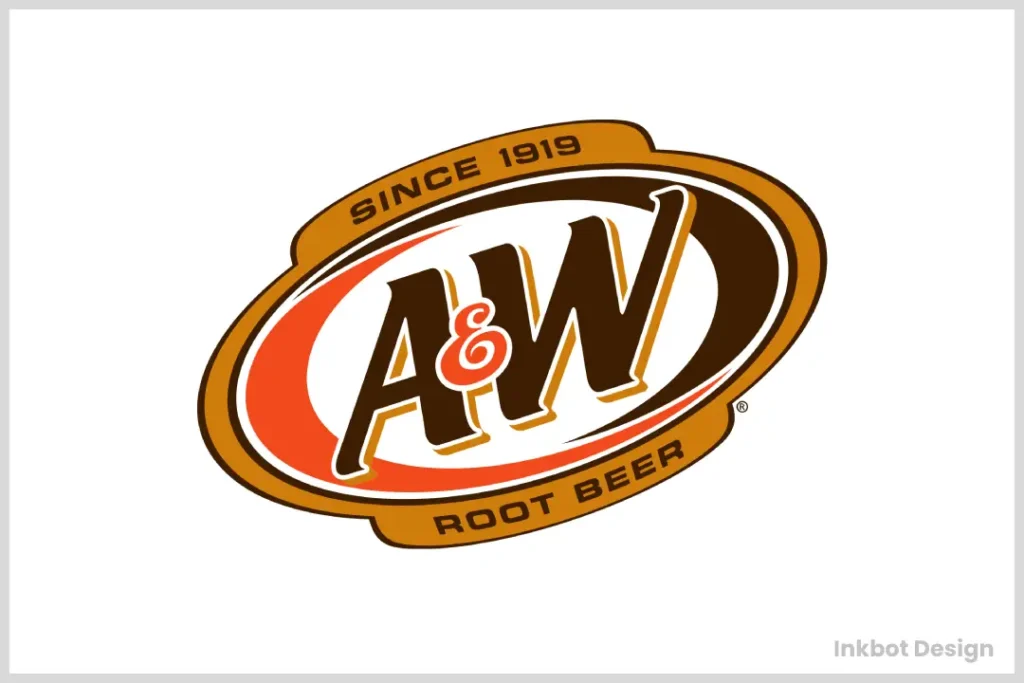
Their brown logo has been more than a design choice since the 1920s.
Brown isn’t showy. It doesn’t scream for attention. But it does tell the truth. It’s natural. The colour of tree bark, soil, and roots gives root beer its name.
A&W chose to go with brown when everything else was neon signs and fake flavours. They didn’t follow everyone else; they led by staying true to themselves.
This is not simply nostalgia; it’s about faithfulness. You know what you’re getting when you see that brown logo: nothing hidden, no tricks involved, only real taste served with a bit of American history.
A&W did not have to rebrand every ten years. They knew that sometimes, being radical means being consistent.
Ultimately, A&W’s use of a brown logo is more than just an emblem — it serves as a signifier that genuineness never goes out of fashion, which is very important in this age where people crave authenticity.
6 – Godiva: Chocolate Luxury
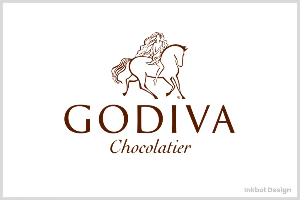
When you see Godiva brown, you don’t think “dirt.” You think “luxury.” You think, “I deserve this.”
It’s not just brown. It’s brown with purpose—Brown with a golden edge. Brown whispers “royalty” and “indulgence” in the same breath.
And there she is – Lady Godiva herself. Not just a logo but a legend. A story you can taste.
Godiva isn’t selling chocolate. They’re selling an experience. An expectation. A moment of “yes, this is what chocolate should be.”
Are you making promises with your choices? Or just picking safe colours?
7 – Dreyer’s Ice Cream: Scooping Up Success
Dreyer’s did more than just make ice cream. They made a statement.
Brown for ice cream? Yes, really.
While other companies use the typical blue and white scheme, Dreyer’s is going with brown. And it’s not just a colour— it’s something to discuss.
Because brown isn’t only chocolate, it’s warmth. It’s the kitchen counter where your grandma used to serve you a scoop. It’s what brings you back home.
In this world of bright neon frozen yoghurt shops and trendy gelato bars on every corner, Dreyer’s decided to be the soft, cosy hug nobody saw coming.
They’re not selling ice cream. They’re selling moments. Memories. Feelings.
Cold says blue, clean says white — but brown? Brown says, “Stay a while…” Brown says, “Have another scoop.” Brown says, “You’re home.”
Dreyer’s didn’t follow the ice cream playbook. They wrote their own.
8 – Ferrero Rocher: Elegance & Sophistication
Look closely. It’s not just text. It’s a promise wrapped in gold.
“Ferrero” – all curves and grace. It doesn’t shout. It seduces. It’s the script of luxury, of moments, savored.
“Rocher” – modern, clean. The future embraces tradition—a perfect dance of old and new.
And that oval they use in Branding? It’s not just a shape. It’s a stage. A golden spotlight for a chocolate star. It says, “This isn’t just candy. This is an event.”
Gold. Brown. The colours of earth and sun. Of cocoa transformed into bliss. They’re not selling chocolate. They’re alchemy of sale.
This logo doesn’t compete. It doesn’t need to. It stands apart, whispers rather than shouts.
In a world of loudness, Ferrero Rocher chose quiet elegance. They needed to follow the rulebook. They wrote a new one.
What’s your gold oval? What’s the subtle touch that elevates your brand from product to experience?
9 – Cracker Barrel: Home-Style Comfort
Brown is not just a colour here. It is a time machine.
Cracker Barrel went for earth and wood when everything else was neon. They didn’t choose trendy; they decided forever.
That older man in the rocking chair? He’s not clip art. He’s a storyteller. A silent greeter said, “Slow down. Stay a while.”
This isn’t fast food. It’s slow food. Food that remembers.
The brown doesn’t say, “Eat here!” It says, “Remember when?” It’s not selling meals. It’s selling memories.
Cracker Barrel decided to be country as hell in a sleek and modern world. They chose authentic over trendy. Comfortable over cool.
They’re not competing with other restaurants but with your grandma’s kitchen.
What’s your rocking chair? What’s the symbol that tells your story without saying a word?
Are you chasing trends, or are you brave enough to stand still and let the world come to you?
Cracker Barrel proves there’s power in old things in an oversaturated market of new. Things we know by heart. Things like brown
10 – Tootsie Roll: Chewy Chocolate Goodness
Since 1896, they’ve been brown. Proudly, defiantly, deliciously brown.
Tootsie Roll stands firm in a candy aisle exploding with rainbow hues and neon wrappers. Brown. Bold. Unapologetic.
That font? It’s not just letters. It’s a time capsule—a portal to simpler days when a penny bought a moment of joy.
They’re not selling candy. They’re consistency of sale. In a constantly changing world, Tootsie Roll says, “We remember. We’re still here.”
Brown isn’t boring. It’s brave. It’s the colour of chocolate, earth, and things that last.
Tootsie Roll doesn’t chase trends. They set them. They’ve been setting them for over a century.
Are you constantly reinventing to stay relevant? Or are you building something so genuine and authentic that relevance chases you?
In a market obsessed with the new, Tootsie Roll proves there’s power in the old. In the familiar. In the brown.
They’re not competing with other candies. They’re competing with memories. And they’re winning.
The Psychology of Brown in Branding
After exploring the top ten brown logos, Let’s explore why brown is such an effective colour in branding.
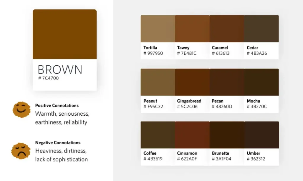
Earthy and Natural
For most people, brown symbolises earth, wood and nature. Hence, it is common for brands that desire to appear natural or organic to use this colour.
Reliable and Stable
Some people see brown as a reliable, stable colour, not flashy or trendy but solid and trustworthy, making it perfect for brands that want to communicate trustworthiness.
Warm and Comforting
Brown is comforting because it reminds us of warmth. It can make us think about home or heart.
Luxurious and Rich
In certain situations (such as Godiva or Nespresso), brown can suggest wealthy sophistication when placed in its appropriate context.
Designing with Brown: Tips and Tricks
If you are thinking about using brown in your branding, here are some things to consider:
- Think about what you do. Brown is great for food or natural products – like chocolate, coffee, or honey – but it may not work well for tech companies or banks.
- Shades matter. Lighter browns can be cosy and inviting, while darker ones feel more expensive and exclusive.
- Pair it up. Creams, beiges, oranges and reds work well with brown. Teal or light blue can give it a modern edge.
- Don’t drown everything in brown. It’s a heavy colour and can make things seem flat or dull if overused. Use lots of different shades or pair with lighter colours instead.
- Remember where your logo will be seen. Different backgrounds or materials might change how the colour appears.
The Pros and Cons of Brown Logos
Like any design choice, opting for a brown logo has upsides and downsides. Let’s weigh them up:
Pros:
- Stands out in a sea of blue and red logos
- Conveys reliability and stability
- Perfect for brands with an earthy or natural focus
- It can be both luxurious and approachable
- Works well with various design styles
Cons:
- It can be seen as boring if not executed well
- It might not pop as much as brighter colours
- It could be associated with dirt or dullness if not careful
- It may not work for all industries (tech companies, for instance)
- Requires clever design to avoid looking muddy
Brown Logos in Different Industries
Brown logos don’t have to be limited to chocolate companies and delivery services. Here are some other industries that embrace the earthy hue:
Food and beverage
There have been countless examples in this category — think crackers or chocolates. It works well because it often represents the product (coffee, chocolate, whole grains).
Fashion and retail
Brands like Cotton On prove brown can be fashionable, usually conveying a laid-back, earthy vibe in fashion branding.
Eco-friendly and organic products
This one is a no-brainer for brands wanting to highlight their natural/organic credentials. It instantly communicates earthy, wholesome values.
Luxury goods
Like with Godiva chocolates or leather goods – brown can give an extremely luxurious look when paired with the correct design elements.
Home/furniture
Being associated with wood, it’s frequently used by furniture or home goods brands trying to convey quality/craftsmanship.
Conclusion
From delivering parcels to delivering chocolatey treats, these brown logos demonstrate the versatility and strength of this underappreciated colour in branding. Brown has shown that it can signal trustworthiness, indulgence or down-to-earth authenticity – whatever a particular logo design requires.
As we have seen, the psychology of brown logos is deep and varied. It can mean anything from comfort and reliability to wealth and elegance. The trick lies in how you use it: the tone, the other colours used alongside it within the design, and even overall brand messaging.
So, next time you come across a brown logo, take a moment to think about what it might be saying. Is it tapping into nostalgia? Promising dependability? Or inviting you to indulge yourself with some luxury? Whatever message they send out, one thing’s certain – brown logos aren’t going anywhere soon but will continue to leave their colourful mark on worldwide brandings.
FAQs
Why do many food brands have brown logos?
Brown is generally connected with chocolate, coffee, and other comfort foods. It can create a sense of warmth and luxury; this makes it a popular choice for food companies.
Can a brown logo work for a modern, tech-focused brand?
Although less common in tech branding, brown can still be used. A tech company may use a brown logo to differentiate itself from competitors or indicate reliability and eco-friendliness.
How can I make a brown logo look more exciting?
To add dynamism to a brown logo, you could try using vibrant accent colours alongside it or even exciting typography. Alternatively, incorporating unique design elements will help make such logos appear more dynamic.
Are there any industries where brown logos are particularly effective?
Brown logos are most successful when employed by businesses operating within the food industry, especially those that deal with chocolates or coffees, since they give off an earthy feel, which can also be suitable for any company looking forward to projecting itself as natural.
How has the use of brown in logos evolved?
Over the years, though still present as one of the most essential colours in corporate identity systems, design language around browns has become more sophisticated than ever, with a broad range of contemporary applications characterised by modern styles usually accompanied by other trendy shades.
Can changing a logo to brown impact a brand’s perception?
Yes, depending on how you do it. Introducing a new hue into your symbol may instantly change what people think about your organisation, primarily if such colour is related to nature or traditional values, thus leading them into believing that you’re reliable, organic, natural, etc., but only when done well!
How does the psychology of brown differ from other colours in branding?
Unlike powerful pigments like red or blue, this one creates feelings of stability, comfort, and earthiness, which are perceived as softer and grounded compared to their counterparts.
Are there any potential drawbacks to using a brown logo?
If not executed properly, then yes. As with all design choices, if mishandled, brown could appear dull and outdated; therefore, you must consider your brand’s character and target market before settling on brown.
How can digital brands effectively use brown in their logos?
Digital organisations should choose warm, rich tones that will be visible on screens but still modern when paired with various typographical options or elements such as gradients, etc.
Is it true that UPS has trademarked their specific shade of brown?
The company has protected its unique hue, Pantone 462C, under copyright law for application within transportation sectors, indicating a strong association between this colour and its brand identity.
How do cultural differences affect the perception of brown logos?
Brown is often associated with earth and nature; however, these associations may vary depending on cultural background: some people see it as mourning poverty while others view it positively; thus, designers should always consider a global audience when using colours like this.
Can a brown logo help a brand appear more eco-friendly?
Yes, because of organic eco-friendly connotations behind shades related to forests, fields, rivers, etc. – using any such colour in your emblem would automatically make customers think you’re environment conscious. However, remember not to use them unless backed up by actual, sustainable practices to avoid charges labelled ‘greenwashing’.


