Alan Fletcher: The Strategic Power of Visual Wit
Everything is blue, everything is sans-serif, and everything is utterly invisible.
In an attempt to look “professional,” most SMBs have accidentally made themselves part of the background noise.
Alan Fletcher was the cure for this. He didn’t just design logos; he designed intellectual traps.
He understood that the human brain is wired to ignore the expected. If you want to actually sell something, you have to make the viewer think—even if only for a fraction of a second.
Ignoring Fletcher’s philosophy isn’t just a stylistic choice; it’s a financial leak.
When your brand fails to elicit a “click” of recognition in the customer’s mind, you are effectively subsidising your competitors’ marketing.
- Use visual wit—puns or clever metaphors—to force a microsecond of recognition and make brands memorable.
- Prioritise idea-driven problem solving over decorative style; design must solve communication breakdowns.
- Design for worst-case technical conditions; simple, robust marks endure and retain legibility.
- Introduce human imperfection—hand-lettering or texture—to build trust and stand apart from templated design.
Who is Alan Fletcher?
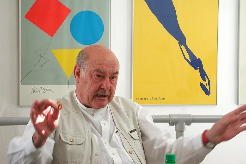
Alan Fletcher (1931–2006) was a seminal British graphic designer and a co-founder of the global design consultancy Pentagram.
He is widely regarded as one of the most influential famous graphic designers of the 20th century, known for synthesising American “Big Idea” advertising with European modernist tradition.
Key Components of his Philosophy:
- Visual Wit: The use of puns, double-meanings, and optical illusions to engage the viewer’s intellect.
- Typography as Image: Treating letterforms as physical objects that carry emotional and narrative weight.
- Problem-Solving over Aesthetics: The belief that design is not “decoration” but a strategic solution to a communication breakdown.
Deciphering the “Fletcher Method”
To understand Fletcher, you have to understand that he hated “style.” Style is a veneer. He was interested in the “Idea.” Most modern brand identity work focuses on the veneer—what hex codes are we using? What is the border radius on the buttons?
Fletcher started with the brain.
The Psychology of the Visual Pun
Fletcher’s work often featured what he called “visual wit.” This isn’t about being funny; it’s about being clever. According to a Nielsen Norman Group study, users judge a website’s aesthetic and “perceived value” in less than 50 milliseconds.
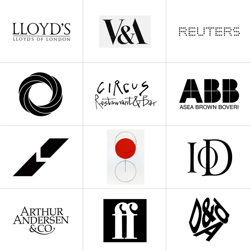
When Fletcher designed the V&A (Victoria and Albert Museum) logo, he didn’t just type out the letters. He removed the leg of the “A” so that the “&” symbol completed the character.
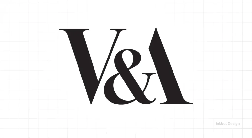
This requires the viewer to “solve” the image. That microsecond of cognitive effort creates a dopamine hit. In marketing terms, this is referred to as “Brand Salience.” It is the difference between a logo you see and a logo you remember.
The Reuters “Dots” and Technical Constraint
Before the internet was high-speed, Fletcher designed the Reuters logo. At the time, information was transmitted via telex and low-resolution screens.
He didn’t design a complex crest. He designed a logo made of 84 dots. It was a technical triumph because it remained legible even when the signal was poor.
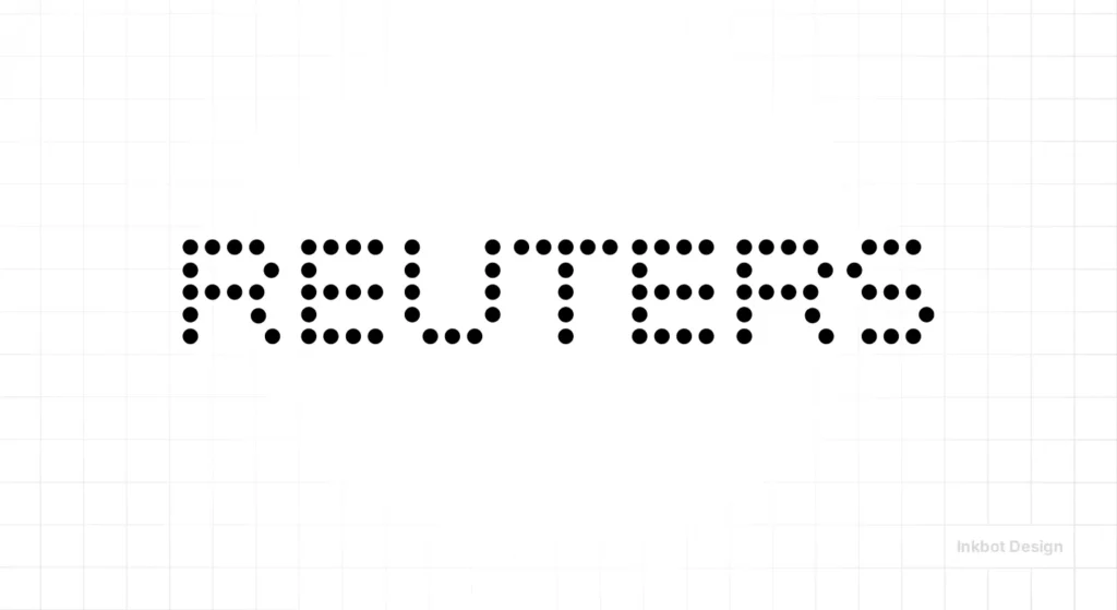
This is a “Rare Attribute” of his work: the ability to marry high-level semiotics with brutal technical constraints.
Most SMBs today fail this. They design complex, multi-coloured logos that look like a smudge on a mobile favicon or a social media profile picture.
Fletcher’s approach to typography basics was always rooted in “Does this work when the conditions are at their worst?”
Rare Attributes: Hand-Lettering in a Digital Void
We are currently drowning in “perfect” digital typography. Everything is geometrically aligned and mathematically balanced. The result? It feels inhuman.
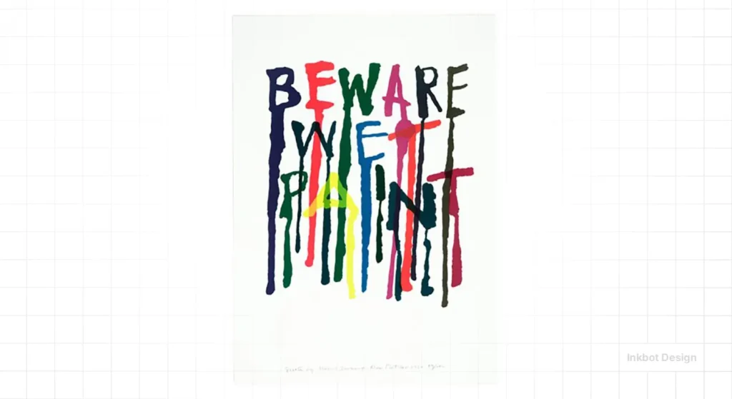
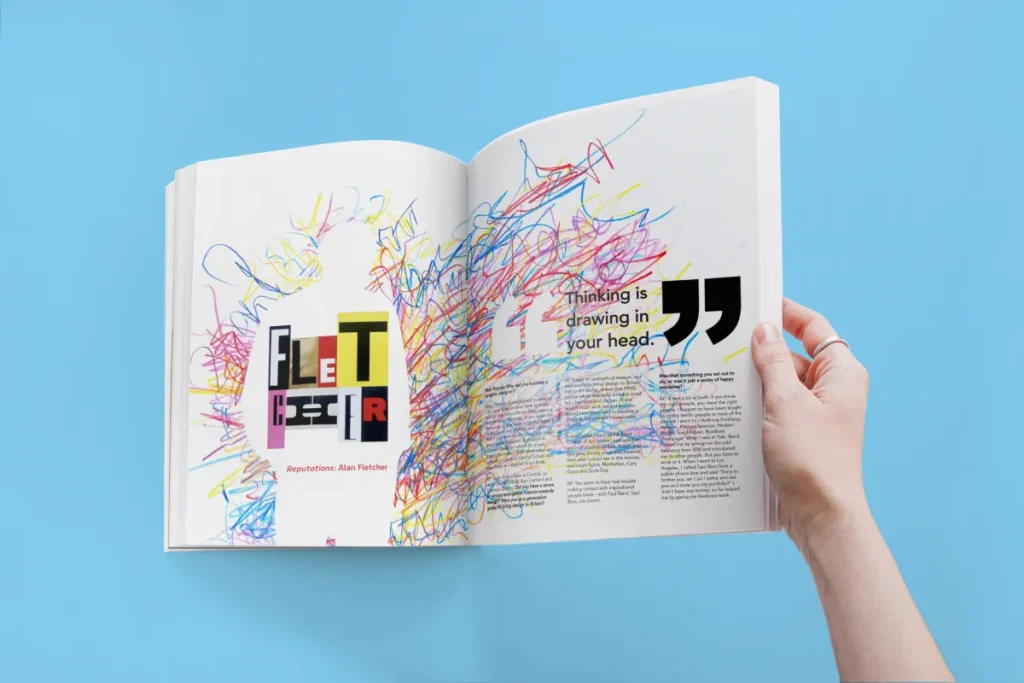
Fletcher was a proponent of the “hand-drawn” element. He often used his own handwriting or rough-cut paper shapes to create a sense of immediacy. For an entrepreneur, this is a vital lesson in creative thinking.
The Humanity of the Imperfect
Research from McKinsey & Company indicates that companies that excel in design grow their revenue and shareholder returns at nearly twice the rate of their industry peers. Why? Because design builds trust.
Fletcher’s use of hand-lettering wasn’t just “artsy.” It was a strategic move to bypass the corporate “wall” that customers put up. A hand-drawn note feels like a conversation; a block of Helvetica feels like a legal warning. When we develop a brand strategy, we often look for these “human friction” points.
| Feature | The “Safe” Way (Amateur) | The Fletcher Way (Professional) |
| Concept | Literal (A picture of a house for a builder) | Metaphoric (Visual wit that requires a “click”) |
| Typography | Generic Sans-Serif (Standardised) | Typographic Image (The letters tell the story) |
| Colour | Trends (Whatever is popular on Dribbble) | Colour Psychology (Strategic intent) |
| Execution | Digital Perfection (Cold, uninviting) | Human Touch (Hand-drawn, textured, warm) |
| Longevity | Dated in 2 years | Timeless (The V&A logo is 35+ years old) |
“The Art of Looking Sideways”
If you are a business owner, you likely don’t have time to read a 1,000-page book on design. But Fletcher’s “The Art of Looking Sideways” isn’t a design book; it’s a manual for competitive advantage.
The Art of Looking Sideways
You’re trapped in a linear way of thinking, seeing only what’s directly in front of you. This is the fix. The Art of Looking Sideways is the 1,064-page “magnum opus” by Alan Fletcher, the co-founder of Pentagram. It’s not a textbook; it’s a chaotic, brilliant, and inexhaustible “brain dump” designed to rewire your visual intelligence.
As an Amazon Partner, when you buy through our links, we may earn a commission.
Debunking the “Simplicity” Myth
There is a dangerous myth in modern branding: “Keep it simple.”
While simplicity is beneficial for usability, it can often be detrimental to brand personality. Fletcher argued that “simplicity” is the result of a process, not a starting point. If you start with a simple idea, you end up with a simplistic result.
Fletcher would take a complex problem—like how to represent a global news agency—and boil it down until only the “dots” remained. He wasn’t stripping things away to be minimal; he was stripping things away to be potent.
Case Study: The IOD (Institute of Directors)
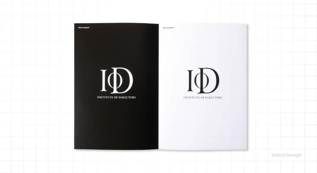
Fletcher was tasked with rebranding the IOD. A boring, stuffy institution. He didn’t give them a heraldic shield. He gave them a bold, stencil-style mark that felt like it belonged on a shipping crate. It suggested “Action” and “Industry” rather than “Tea and Biscuits.”
This is where many Inkbot Design services begin. We look at what the industry expects you to do, and then we look “sideways.” If everyone else is whispering, we don’t just shout; we change the language entirely.
The State of Visual Communication in 2026
As we move into 2026, we are seeing the “Great AI Flattening.” Tools like Midjourney and Canva have made it incredibly easy to produce an “average” design. The cost of producing a generic logo has dropped to near zero.
The result? The value of “average” design is now negative.
In 2026, the only way to stand out is through “Human Ingenuity” and “Visual Intelligence”—the very things Alan Fletcher championed. AI cannot do “wit.” It can do “variation,” but it cannot understand the cultural nuances of a pun. It can’t “look sideways” because it only looks at the data it was trained on.
For SMBs, this means your brand identity must move away from the “Pinterest Aesthetic” and towards “Strategic Wit.” If your branding appears to have been created by a template, your customers will view your business as a commodity.
The Reality Check (E-E-A-T)
I once audited a client in the FinTech space. They had spent £50,000 on a rebrand that looked exactly like every other “Neo-bank” on the market. Round font, gradient blue, “friendly” illustrations.
They couldn’t understand why their customer acquisition cost (CAC) was so high.
The problem was simple: They were invisible. They had followed all the “best practices” and ended up with a brand that had zero “Hook.” We stripped back the fluff and applied a Fletcher-inspired typographic intervention. We used a serif font in a way that felt authoritative, but subverted it with a clever use of negative space in the monogram.
Within three months, their organic brand recognition increased by 22% (as tracked by branded search volume). They didn’t need a bigger ad budget; they needed an idea that didn’t require an explanation.
“A person who does not use their imagination has no foretaste of what might be.”
Alan Fletcher
If you are just following the “rules” of your industry, you aren’t leading; you’re just a very expensive follower. Fletcher’s career proved that the most “professional” thing you can do is be interesting.
The Verdict
Alan Fletcher wasn’t a decorator. He was a strategic architect of thought. For the modern entrepreneur, his work serves as a reminder that your brand’s primary job is to be remembered.
If your current visual identity is “safe,” it is probably failing you. If your typography is “standard,” it is being ignored. And if your logo doesn’t have a “click” moment, you are leaving money on the table.
Ready to stop being invisible?
If you want to build a brand that uses visual wit to dominate your market, it’s time to stop looking at what your competitors are doing and start looking “sideways.”
- Explore our Branding Services
- Read more about famous graphic designers
- Request a Quote for your project
Frequently Asked Questions
Who was Alan Fletcher?
Alan Fletcher was a pioneering British graphic designer and co-founder of Pentagram. He is famous for his “visual wit” and his ability to combine clever metaphors with functional design. His work for the V&A and Reuters remains iconic decades later.
What is “Visual Wit” in design?
Visual wit is the practice of using puns, double meanings, or clever associations within a visual composition. It engages the viewer’s brain by making them “solve” the image, which creates a stronger memory of the brand.
How can Alan Fletcher’s principles help my small business?
Fletcher’s principles help SMBs move away from generic, “safe” design. By utilising visual wit and strategic typography, you can create a brand identity that stands out in a crowded market and reduce your marketing costs through improved brand recall.
What is “The Art of Looking Sideways”?
It is a 1,000-page book by Alan Fletcher that explores visual culture, philosophy, and creativity. It is widely regarded as a “bible” for designers and creative thinkers who seek to approach problem-solving from unconventional angles.
Why did Alan Fletcher use hand-lettering?
Fletcher used hand-lettering to add a “human touch” to his work. In a world of cold, corporate typography, hand-drawn elements create a sense of personality, trust, and immediacy that digital-only fonts often lack.
Is the V&A logo still in use?
Yes, the V&A logo, designed by Alan Fletcher in 1989, is still in use today. It is a prime example of a “timeless” design that relies on a clever typographic idea rather than a fleeting visual trend.
What is the “Reuters Dots” logo?
It was a logo Fletcher designed for the Reuters news agency using 84 dots. It was specifically designed to be legible on the low-resolution screens and telex machines of the era, proving that great design is always functional.
What is Pentagram?
Pentagram is the world’s largest independently owned design consultancy. Alan Fletcher co-founded it in 1972 with four other partners. The firm is unique because it is still run by designers rather than business executives.
Why is “safe” design dangerous for a brand?
“Safe” design follows industry trends and avoids risks. However, if everyone in your industry follows the same trends, everyone becomes invisible. Safe design leads to high customer acquisition costs because you have to pay more to be noticed.
How does typography impact brand strategy?
Typography isn’t just about reading; it’s about feeling. The choice of font, the spacing, and the “visual weight” of letters communicate your brand’s authority, creativity, or reliability before a single word is actually read.
Can AI replace the “Visual Wit” of Alan Fletcher?
No. While AI can generate aesthetically pleasing images, it lacks the human understanding of culture, irony, and subtext required to create true visual wit. Fletcher’s work is based on human-to-human connection, which AI cannot replicate.
How do I start implementing Fletcher’s ideas?
Start by questioning the “obvious” solution. Examine your brand’s core message and identify a visual metaphor that isn’t literal. Focus on creative thinking and aim for a “click” moment in your customer’s mind.

