
Inclusive Branding: The Case for Accessible Design
Most entrepreneurs view inclusive branding as a box-ticking exercise.
They slap a rainbow flag on their logo in June, hire a diverse cast for a single photoshoot, and pat themselves on the back.
This is not inclusivity; it is marketing theatre. And consumers—especially the younger demographic—can smell the inauthenticity from a mile away.
Real Inclusive Branding is not about politics or signalling virtue. It is about simple mathematics.
If your website is unusable for the visually impaired, you are blocking a revenue stream. If your imagery only reflects one demographic, you are ignoring the rest of the market. If your language is laden with jargon, you are alienating neurodiverse users.
In my years as a Creative Director, I have seen brilliant businesses cap their own growth because they designed their brand for themselves, rather than the world.
They confuse “target audience” with “people who look like the founder.”
This guide strips away the fluff to reveal the mechanical, strategic, and financial reality of building a brand that actually works for everyone.
- Inclusive branding is functional not performative: design for usability, not token gestures or seasonal symbols.
- Accessibility equals market opportunity: meeting WCAG and inclusive practices unlocks significant revenue (e.g., the UK "Purple Pound").
- Inclusive visual identity requires tested contrast, legible typography, and multimodal cues — not mere aesthetic choices.
- Authenticity demands systems: audits, diverse inputs, codified guidelines and continuous feedback to avoid tokenism and legal risk.
What is Inclusive Branding?
Inclusive branding is the strategic process of designing visual identities, messaging, and customer experiences that accommodate the widest possible range of human diversity. It moves beyond “representation” (who is in the photo) to “functionality” (who can use the product).
The Core Components:
- Visual Accessibility: Ensuring logos, typography, and colour palettes meet WCAG (Web Content Accessibility Guidelines) standards for legibility.
- Cultural Intelligence: Understanding cultural nuances to avoid offensive blunders or alienation in global markets.
- Cognitive Inclusion: Structuring information and language to be clear for users with different cognitive processing styles (e.g., dyslexia, autism).
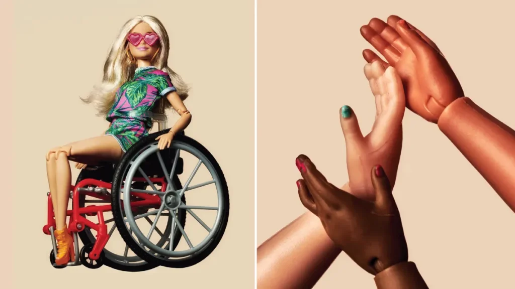
- Representative Imagery: Authentic depiction of diverse races, ages, bodies, and abilities without resorting to stereotypes or tokenism.
The Economics of Exclusion: Why This Isn't Charity
Let’s get the “feel-good” factor out of the way. You should care about inclusive branding because exclusion is expensive. When you design for the “average” user, you design for no one, because the “average” user does not exist.
The “Purple Pound” and Market Share
In the UK alone, the spending power of disabled households—often referred to as the “Purple Pound”—is estimated to be worth £274 billion per year. Globally, this figure enters the trillions. When a brand ignores accessibility, it is not just being “mean”; it is actively rejecting money.
McKinsey & Company’s “Diversity Wins” report confirms the correlation between inclusivity and financial performance. Companies in the top quartile for gender diversity on executive teams were 25% more likely to have above-average profitability than companies in the fourth quartile. For ethnic and cultural diversity, that figure rises to 36%.
This is not a coincidence. Diverse teams build diverse products. They spot gaps that homogenous teams miss.
The Brand Risk of “Cancel Culture”
The cost of getting it wrong is immediate and severe. In the age of social media, a tone-deaf campaign not only flops, but it also destroys brand equity.
Real-World Example: The Pepsi Fiasco
In 2017, Pepsi released an ad featuring Kendall Jenner joining a protest and handing a police officer a can of soda, seemingly “solving” civil unrest. The backlash was instantaneous. It trivialised the Black Lives Matter movement and positioned Pepsi as deeply out of touch. The ad was pulled within 24 hours. The damage to Pepsi’s reputation among Gen Z and Millennials was palpable. This was a classic case of a boardroom lacking the cultural intelligence to say, “This is a terrible idea.”

Visual Identity: The Technicalities of Accessible Design
As a design agency, this is where we see the most frequent—and avoidable—mistakes. A visual identity is useless if people cannot see it or read it.
Colour Contrast and Legibility
Many brands choose their colour palette based on “vibes” or “mood boards” without consulting the Web Content Accessibility Guidelines (WCAG).
WCAG 2.1 requires a contrast ratio of at least 4.5:1 for normal text and 3:1 for large text (AA Standard). If your brand uses light grey text on a white background because it looks “minimalist” and “chic,” you are making your content invisible to users with low vision, cataracts, or those simply looking at their phone in bright sunlight.
Note: “Accessible” does not mean “ugly.” High contrast can be striking, bold, and modern. Think of the stark black and yellow of construction warnings—maximum visibility, immediate impact.
Typography and Neurodiversity
Font choice is more than aesthetic; it is structural. Serif fonts with high stroke contrast (thick and thin lines) can be difficult for people with dyslexia to read, as the letters can appear to merge or float.
Best Practices for Inclusive Typography:
- Sans-Serif is Safer: Fonts like Arial, Verdana, or custom geometric sans-serifs are generally more legible.
- Avoid All-Caps: Reading all-caps text reduces reading speed by 10-15% because we rely on the shape of words (ascenders and descenders) to recognise them. All-caps make every word a rectangle.
- Line Height and Spacing: Tightly packed text is a nightmare for cognitive processing. Generous leading (line height) improves comprehension for everyone.
The Visual Identity Audit
| Feature | The Amateur Mistake | The Professional Approach (Inclusive) |
| Colour Palette | Pastels on white; low contrast for “subtlety.” | Tested combinations passing WCAG AA/AAA standards. |
| Typography | Thin, wispy scripts or heavy decorative fonts. | Humanist Sans-Serif with distinct letterforms (e.g., ‘I' vs ‘l'). |
| Icons | Abstract, ambiguous shapes require guesswork. | Universal symbols accompanied by text labels. |
| Data Viz | Using only colour to differentiate (Red vs Green). | Using colour, patterns, and labels (for colour blindness). |
| Motion | Auto-playing videos with rapid flashing. | User-controlled playback; reduced motion settings respected. |
Language and Tone: Who Are You Talking To?
Inclusive branding extends to the words you use and your verbal identity. This is not about policing speech; it is about precision. Exclusionary language is often a result of lazy writing.

The Gender-Neutral Shift
Unless you are selling a product biologically restricted to a specific sex, there is rarely a need to gender your audience. Phrases like “Hey guys” or “For the businessman” are outdated.
- Instead of: “The modern businessman needs a reliable laptop.”
- Use: “The modern professional needs a reliable laptop.”
This simple switch doubles your potential audience without losing any meaning.
Plain English and Cognitive Load
The average reading age in the UK is approximately 9 years old. If your brand voice is full of academic polysyllabic words, you are not sounding “premium”; you are creating friction.
According to the Nielsen Norman Group, users scan web pages rather than read them. Complex language increases cognitive load. Inclusive branding respects the user's time and mental energy by being clear, direct, and simple.
Avoiding the “Tokenism” Trap
The most significant pitfall in inclusive branding is tokenism: the practice of making only a perfunctory or symbolic effort to achieve a particular goal, often by recruiting a small number of people from underrepresented groups to create the appearance of diversity or equality.
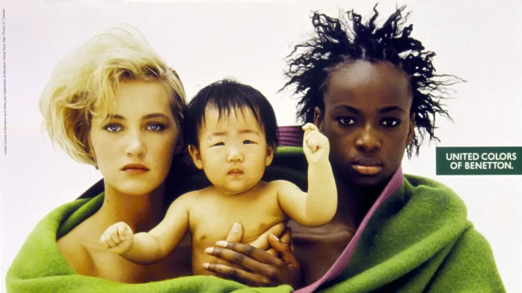
The “Benetton” Effect vs. Authentic Strategy
In the 1990s, United Colours of Benetton was famous for its shock advertising, featuring diverse groups. While it raised awareness, for many brands today, simply arranging a diverse cast in a line is no longer enough.
How to spot Tokenism:
- The “One of Each” Rule: Does your imagery look like a checklist? (One Asian person, one Black person, one wheelchair user, all smiling unnaturally).
- The “Hero” Complex: Are the diverse characters in your branding always the sidekicks, while the “hero” character remains the traditional archetype?
- Seasonal Support: Do you only care about LGBTQ+ rights in June (Pride Month) or Black history in October (UK)? If your logo turns a rainbow in June but your corporate policies don't support LGBTQ+ staff, that is “Rainbow-washing.”
Real-World Success: Fenty Beauty
When Rihanna launched Fenty Beauty, she didn't just put diverse models in the ads. She launched with 40 shades of foundation. Inclusivity was built into the product inventory, not just the marketing. This was operational inclusivity. The “Fenty Effect” compelled legacy brands like Estée Lauder and L'Oréal to scramble and expand their own product ranges. Fenty proved that inclusivity is a massive, untapped market demand.

The “Reality Check”
I once audited a client in the financial technology (FinTech) sector. They were incredibly proud of their “disruptive” app interface. It was sleek, with a dark mode by default, and featured a very thin, neon-blue font. They came to us because their user acquisition cost was high, but their churn rate was even higher.
They thought the problem was their pricing.
I looked at the analytics.
The drop-off rate was highest among users aged 50 and above. Why? Because as we age, our eyes require more light and higher contrast to read. Their “sleek” dark mode with low-contrast neon text was physically painful for older demographics to read.
They were effectively putting a “Keep Out” sign on their door for anyone with presbyopia, which is practically everyone over 45. This demographic also happened to hold the majority of the investable assets they were targeting.
We redesigned the interface with a high-contrast “Light Mode” and increased the font weight. We didn't change the product; we changed the accessibility. Conversion rates for the 50+ demographic increased by 40% over a three-month period.
That is the reality of inclusive branding. It is not about being “woke.” It is about fixing the leaks in your bucket.
Inclusive Branding in 2026: AI and Algorithmic Bias
As we move through 2026, the frontier of inclusive branding has shifted from human decisions to machine learning. Companies are increasingly using AI to generate content, segment audiences, and serve ads.
However, AI models are trained on historical data, and historical data is biased.
- Generative Imagery: If you ask an AI image generator for a “CEO,” it will overwhelmingly produce images of white men in suits. Brands using AI for stock imagery must actively prompt for diversity, or they will inadvertently regress their visual identity by decades.
- Targeting Algorithms: Platforms like Meta and Google have faced scrutiny for allowing advertisers to exclude audiences based on “ethnic affinity” or age. An inclusive brand audit now involves checking your ad sets to ensure your targeting isn't discriminatory.
The Fresh Shift:
In the last 12 months, we have seen the rise of “Accessible by Default” regulations in the EU (European Accessibility Act). By mid-2025, digital products sold in the EU had to meet strict accessibility standards. This legal pressure means that inclusive branding is no longer optional for any business trading internationally. It is a compliance issue.
Strategic Implementation: A Roadmap
If you are ready to move beyond lip service, here is your implementation plan.
1. Audit Your Assets
Look at your website, brochures, and social media.
- Run a Lighthouse audit in Chrome Developer Tools to check for accessibility scores.
- Review your last 50 social media posts. Who is represented? Who is missing?
2. Expand Your Inputs
You cannot output inclusive work if your inputs are homogeneous. If your design team is entirely comprised of 25-year-old men from London, you will produce work that appeals to 25-year-old men from London.
- Action: Consult with diverse user groups. Use testing platforms that allow you to filter testers by disability or demographic.
3. Codify It in Brand Guidelines
Don't leave it to chance. Update your Brand Identity Services guidelines to include:
- Mandatory contrast ratios.
- Banned terms and preferred inclusive language.
- Image selection protocols (e.g., “Images must reflect the diversity of our actual customer base, not stock photo stereotypes”).
4. Continuous Feedback Loops
Inclusivity is not a “set and forget” project. Language evolves. Standards change. Create a channel where customers can report accessibility issues or offensive content without having to go through multiple steps.
The Verdict
Inclusive branding is the ultimate stress test for a business. It forces you to ask: “Does this actually work?” and “Does this work for everyone?”
The brands that survive the next decade will not be the ones with the loudest virtue signalling. They will be the ones that are effortlessly usable by the blind, culturally resonant with the global majority, and welcoming to the neurodiverse.
You can view this as a burden or as a competitive advantage. While your competitors are fighting over the same narrow slice of the “average” demographic, you can open your doors to the rest of the world.
If you are tired of a brand identity that looks good in a pitch deck but fails in the real world, we should talk.
Frequently Asked Questions (FAQ)
What is the difference between diversity and inclusive branding?
Diversity is about the presence of differences (e.g., having people of different races in your ads). Inclusive branding is about the practice of ensuring those people—and others—can effectively access, understand, and engage with your brand. Diversity is the “who”; inclusion is the “how.”
Is inclusive branding expensive to implement?
Retrofitting a non-inclusive brand can be costly, but building inclusivity from the start is often cost-neutral. For example, choosing accessible colours costs the same as choosing inaccessible ones. The return on investment (ROI) comes from the expanded market reach and reduced legal risk.
Does accessibility only apply to websites?
No. While digital accessibility (WCAG) is critical, inclusive branding also applies to physical packaging (such as easy-open designs for individuals with arthritis), retail environments (including wheelchair ramps and sensory-friendly hours), and customer service scripts. It is a holistic brand experience.
How does inclusive branding impact SEO?
There is a massive overlap between SEO and accessibility. Features such as alt text for images, clear heading structures (H1, H2), and video transcripts help screen readers and search engine crawlers understand your content. An accessible site is almost always an SEO-friendly site.
What is the “Curb-Cut Effect” in branding?
The “Curb-Cut Effect” refers to the phenomenon where features designed for people with disabilities ultimately benefit everyone. Just as dropped kerbs (curb cuts) help wheelchair users and parents with prams or travellers with suitcases, video captions help the deaf and people watching videos with the sound off.
Can a small business afford inclusive design?
Yes. Small businesses are often more agile and can implement changes faster than corporate giants. Simple steps, such as ensuring high contrast in marketing materials, using plain English, and adding image descriptions on social media, cost nothing but time and awareness.
Is using a rainbow logo enough for Pride Month?
No. If your support is limited to a logo change for 30 days, it is considered “performative allyship” or “rainbow-washing.” Consumers expect year-round commitment to LGBTQ+ causes, internal hiring policies, and genuine support before they trust the rainbow logo.
What are the legal risks of non-inclusive branding?
In many jurisdictions, including the UK (Equality Act 2010) and the US (ADA), digital accessibility is a legal requirement. Brands can be—and are—sued for having websites that are unusable by people with disabilities.
How do I choose inclusive typography?
Prioritise legibility over style. Look for “Humanist Sans-Serif” fonts, which have open shapes and distinct letterforms. Avoid fonts where the uppercase ‘I', lowercase ‘l', and number ‘1' appear identical, as this can cause confusion for many readers.
What is the first step to fixing my brand's inclusivity?
Start with an audit. Review your visuals for contrast and representation, and review your copy for exclusionary language. A professional brand audit can highlight the blind spots you might be missing.

