Ford Logo Design History: Why Consistency Beats Modernism
Most entrepreneurs treat their logo like a seasonal wardrobe. They get bored, they hire a cheap agency, and they “freshen up” their brand identity because they think novelty equals relevance.
They are wrong.
To understand the financial value of stubborn consistency, consider the Ford logo design. While other automotive giants have frantically flattened, bevelled, and abstracted their identities to chase digital trends, Ford has held onto a Victorian-era script and a simple blue oval for nearly a century.
They almost didn’t. In 1966, Henry Ford II hired Paul Rand—the designer of the IBM and UPS logos—to overhaul the company’s image.
Rand presented a modernist masterpiece. Ford looked at it and said, “No.” He understood something that most modern marketing managers forget: you cannot buy heritage; you can only accumulate it.
This is not just a timeline of badges. This is a forensic analysis of how the Ford logo design survived wars, depressions, and the digital revolution without losing its soul.
- Consistency over chasing trends: Ford preserved heritage by resisting frequent redesigns, building long-term visual equity.
- The Spencerian script: A custom, hand-drawn signature by Childe Harold Wills remains the logo’s personal, human touch.
- Blue Oval origin: Introduced in 1927 to fit radiator placement and convey dependability, unity, and endurance.
- Paul Rand rejection (1966): Henry Ford II chose heritage over modernist polish to retain the brand’s historical weight.
- Practical refinements: 2003’s bevel then 2017’s flat update prioritised reproduction, scalability, and physical tooling constraints.
What is the Ford Logo Design?
At its core, the Ford logo design is one of the longest-standing corporate identities in commercial history, defined by the “Blue Oval” and a distinct script typeface.
The Core Components:
- The Spencerian Script: A flowing, calligraphic typeface that mimics the handwriting of the early 20th century, specifically based on the hand of Childe Harold Wills.
- The Blue Oval: Introduced in 1927 (Model A), it acts as a container that signifies reliability, economy, and accessibility.
- The Colour Palette: Typically Pantone 294C (or similar variations of deep blue), chosen to represent strength, excellence, and grace.
Unlike different types of logos that rely on abstract icons (like Audi’s rings) or mascots (like Ferrari’s horse), Ford relies on a Wordmark enclosed in a shape. It is a literal signature of the founder, stamped on every product.
The Early Chaos: Before the Oval (1903–1927)
We tend to think of legacy brands as having arrived fully formed. The reality is often a messy mix of experimentation. Before the Blue Oval became an icon, Ford’s branding was inconsistent, cluttered, and confusing.
1903: The “Art Nouveau” Border
The very first logo from 1903 did not say “Ford.” It said “Ford Motor Co. Detroit, Mich.” wrapped in a circular, scrolling border that looked more like a coaster for a pint of ale than a badge for a revolutionary machine.
This was typical for the era. It was fussy. It had poor legibility at a distance. If you shrunk this down to the size of a key fob or a favicon, it would turn into a black smudge. It lacked a hierarchy of information. The word “Detroit” was given almost as much weight as “Ford.”
The Lesson: Early-stage companies often over-explain in their logos. They attempt to condense location, legal status (Co.), and ornamentation into a single mark. It never works.
1909: The “Childe Harold Wills” Script
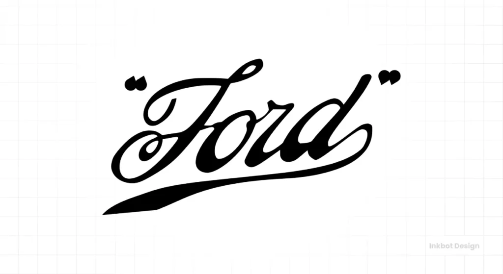
This is the pivot point. Henry Ford was not an artist, but rather an engineer. He needed a distinct trademark. He turned to Childe Harold Wills, a chief engineer and one of the first employees.
Wills had a printing set at home that he used to make calling cards. The font style was Spencerian Script, a standard form of handwriting taught in American business schools in the late 19th century. It was the “Times New Roman” of 1890s correspondence—formal, elegant, but legible.
Wills drafted the word “Ford” in this script. It was not designed by a branding agency; it was designed by the individual responsible for developing the metallurgy for the vanadium steel parts. This utilitarian origin story is crucial. The logo wasn’t trying to sell a “lifestyle”; it was simply signing the work.
1912: The Failed “Winged Pyramid”
Here is a rare aspect of Ford’s history that is often overlooked. In 1912, the marketing department (or its equivalent) got restless. They felt the script was too plain. They introduced a new design: a pyramid shape with wings (symbolising speed and grace) containing the script, often in orange or dark blue. The text read “The Universal Car.”
It was a disaster. Henry Ford reportedly hated it. He had a disdain for ornamentation that served no functional purpose. The pyramid didn’t make the car go faster. The wings didn’t improve the suspension. It was fluff.
The design was scrapped quickly. This failure is significant because it cemented the company’s direction: cut the clutter.
The Birth of the Blue Oval (1927)
The Model T was the car that put the world on wheels, but the Model A (1927) was the car that gave Ford its badge.
This was the first time the script was encased in the horizontal oval. Why an oval?
- Radiator Integration: The shape fits naturally on the radiator grille of the Model A.
- Visual Containment: The script is long and flowing. Without a container, it feels floating and unanchored. The oval provides a “stamp” effect, turning the text into a badge.
- The Psychology of Shapes: Ovals and Circles Convey a Sense of Community, Unity, and Endurance. Squares suggest structure; triangles suggest conflict or motion. Ford wanted to project stability.
The deep blue background was added to create high contrast with the silver/white text. In colour psychology, blue is associated with dependability. It is the colour of the police, the navy, and the bank. For a machine that people were trusting with their lives, blue was the only logical choice.
Consultant’s Note: I often tell clients that constraint breeds creativity. Ford didn’t choose the oval because of a focus group. They chose it because it fit the radiator. Don’t overthink the shape; instead, consider where the logo needs to reside.
The 1966 Paul Rand Proposal: The Road Not Taken
This is the most fascinating chapter in the history of Ford logo design.
By the 1960s, the Spencerian script had become outdated. It was Victorian. It reminded people of their grandfathers. The world was moving toward Modernism—characterised by clean lines, Helvetica, and Swiss Grid systems.
Henry Ford II hired Paul Rand. Rand is the godfather of corporate identity. He designed the IBM stripes, the ABC logo, and the Westinghouse mark. He was expensive, arrogant, and brilliant.
The Rand Concept:
Rand proposed modernising the script. He cleaned up the letters, thinned the lines, and encased them in a sleeker, more geometric pill shape. It was beautiful. It was an objectively “better” design from a technical standpoint. It scaled better. It was sharper.
The Rejection:
Henry Ford II looked at the presentation and rejected it. His reasoning? It was too much of a departure. The quirky, slightly unbalanced, old-fashioned script carried the weight of history. The Rand logo resembled a corporation; the original logo resembled a person.
The Lesson for SMBs:
Sometimes, “bad” design can be an effective branding strategy. If your logo has quirks—a weird kerning issue, a strange ligature—that have been there for 20 years, think twice before “fixing” them. Those quirks are your visual equity.
The Centennial and The Flat Era (2003–Present)
2003: The “Centennial” Gradient
To celebrate 100 years, Ford released the “Centennial Blue Oval.” This version introduced shading, highlights, and a 3D bevel effect. It was designed to look like a physical chrome badge.
The Problem:
In the print era, this approach was effective. In the digital era, it was a nightmare.
- Scalability: When you shrank the 3D oval down to a mobile screen, the highlights turned into white noise.
- Reproduction: Embroidering a gradient on a mechanic’s shirt is expensive and looks messy.
- Trend Chasing: It looked like a button from Windows Vista.
2017: The Return to Flat Design
Recognising the digital constraints, Ford quietly rolled out a flatter version. They removed the heavy chrome bevels. They unified the blue. They cleaned up the script slightly (though barely noticeably to the untrained eye).
This is the current state of the Ford logo design. It is a flat, vector-friendly mark that works as well on an iPhone app icon as it does on the grille of an F-150.
Technical Analysis: Why The Script Works
Let’s look at the typography. The Ford script is not a standard font. It is custom lettering.
- The High “F”: The capital F is aggressive. It towers over the rest of the name. It signals authority.
- The Connected “ord”: The “o”, “r”, and “d” are connected in a continuous flow. This mimics the assembly line—a continuous process.
- The “D” Loop: There is a subtle quirk in the “d” where the loop swings back. It balances the visual weight of the “F” on the left. Without that loop, the logo would feel heavy on the left side.
Comparative Analysis: Ford vs. Competitors
The automotive industry is notorious for rebranding. Let’s compare Ford’s stability to its rivals.
| Feature | Ford | General Motors (GM) | Volkswagen (VW) |
| Core Symbol | Blue Oval (Script) | Initials (GM) | VW Monogram |
| Major Redesigns | 0 (Evolutionary only) | 5+ (Recent total overhaul to lowercase gradient) | 8+ (Constant thinning/thickening of the ring) |
| Identity Era | Victorian / Heritage | Modern / Tech-focused | Bauhaus / Industrial |
| Perceived Stability | High | Low (Identity crisis) | Moderate |
| Primary Colour | Pantone 294C | Gradient Blue -> Flat Blue | Blue -> White/Black -> Blue |
The Data: According to studies on brand asset distinctiveness, consumers can draw the Ford logo from memory with 70% greater accuracy than the GM logo. Why? Because the GM logo changes every time the board of directors panics about EV market share. Ford stays the same.
The Consultant’s Reality Check
I once audited a client in the manufacturing sector—a family-owned business that had been operating for 40 years. They had a “dated” logo. It was clunky, the font was ugly, and the colours were muddy. Their marketing director wanted to scrap it for a clean, sans-serif icon, like those used by tech startups.
I stopped them. I told them, “That ‘ugly’ logo is stamped on machines in 50 countries. It represents 40 years of parts not breaking. If you change it to look like a tech startup, you lose your primary advantage: longevity.”
This is the Ford strategy. Ford sells trucks to people who work with their hands. These customers value toughness and history. They don’t care about minimalist Swiss design. If Ford changed its logo to a sleek, abstract symbol, it would alienate its core F-150 buyer.
Don’t fix what is profitable. If your logo is “ugly” but recognisable, it is a good logo.
For businesses looking to understand how to build this kind of asset, you don’t start by drawing. You start by defining the strategy. You can explore our logo design services if you want to create something that lasts 50 years, not just 5 months.
Application: The “Engineering” of the Badge
One rare attribute often missed is the physical production of the logo.
The Ford logo design is primarily a physical object. It is a badge.
- Die-Casting: The logo must be die-cast in metal or plastic. The lines of the script cannot be too thin, or the mould will break.
- Embroidery: It must be stitched onto the seats of a Mustang and the polo shirts of the sales staff.
- Grille Placement: It must sit on the front of a car, taking 100mph winds, rain, and road grit.
When the logo was refined in 2003 and 2017, the designers weren’t just looking at pixels; they were also considering the overall visual impacts. They were looking at tooling. They widened certain gaps in the script (like the loop in the ‘o’) to ensure that when the logo is cast in plastic at 2 inches wide, the blue paint doesn’t bleed into the chrome text.
Pro Tip: If you are designing a logo for a physical product, print it out at 2cm width. If the ink bleeds together, your logo fails.
The Verdict
The Ford logo design is a masterclass in stubbornness.
Henry Ford and his successors understood that a trademark is a vessel for trust. Every time you change the vessel, you spill a little bit of that trust. By keeping the script (almost) exactly as Childe Harold Wills drew it in 1909, Ford has built a visual asset that is virtually impossible for competitors to replicate.
Competitors can buy better robots. They can hire better engineers. They can buy more ad space. But they cannot buy 120 years of a single, unbroken visual signature.
Your Next Step:
Are you about to rebrand because you’re bored? Stop. Audit your current brand equity first. If you need an honest assessment of whether your identity needs an update or just a polish, request a quote and we will provide you with a direct answer, not a sales pitch.
Frequently Asked Questions (FAQ)
What font is used in the Ford logo design?
The Ford logo does not use a commercial font. It uses a custom “Spencerian Script” originally drawn by Childe Harold Wills in 1909. While fonts like “FordScript” exist online, they are fan-made imitations and not the official proprietary lettering used by the Ford Motor Company.
Why did Ford reject the Paul Rand logo design?
Henry Ford II rejected the 1966 Paul Rand proposal because he felt it was too modern and lacked a connection to the company’s heritage. He believed the original whimsical script carried the history of the brand, whereas Rand’s modernist design, while beautiful, felt too corporate and cold.
When did Ford introduce the Blue Oval?
The “Blue Oval” was officially introduced in 1927 with the launch of the Model A. It was designed to act as a badge for the radiator grille, providing a background container to hold the script and signify reliability and economy.
What is the meaning behind the Ford logo colours?
The Ford logo uses a specific shade of blue (close to Pantone 294C) to symbolise strength, excellence, and trustworthiness. The white text represents purity and elegance. This high-contrast combination was chosen for its legibility and its psychological association with dependability.
Has the Ford logo ever changed?
Yes, but rarely significantly. The logo originated as an intricate border in 1903, briefly evolved into a “Winged Pyramid” in 1912, and adopted its current oval shape in 1927. Since then, changes have been minor refinements to the shape and shading (like the 2003 gradient) rather than total redesigns.
Who designed the original Ford logo?
The famous script was designed by Childe Harold Wills, a close associate of Henry Ford and the company’s first chief engineer. He used his grandfather’s printing set to style the letters, basing them on the Spencerian handwriting style common in business correspondence of that era.
Why is the Ford logo an oval?
The oval shape was likely chosen for practical and psychological reasons. Practically, it fit well on the radiator shells of the 1920s. Psychologically, the oval represents continuity, safety, and inclusivity, which align with Ford’s mission to build “The Universal Car.”
What was the “Winged Pyramid” Ford logo?
In 1912, Ford briefly used a logo featuring a pyramid with wings and the text “The Universal Car.” Henry Ford disliked the design because he felt it was ornamental and not functional. It was quickly discontinued in favour of the simpler script, making it a rare collector’s item today.
Is the current Ford logo 2D or 3D?
The current Ford logo (since roughly 2017) uses a “flat design” aesthetic. While previous versions (specifically the 2003 Centennial logo) used heavy gradients and bevels to simulate 3D chrome, the modern version is flattened for better legibility on digital screens and mobile devices.
What can small businesses learn from the Ford logo?
The biggest lesson is consistency. Ford has maintained the same core visual identity for over 100 years, building immense brand recognition. Small businesses should avoid frequent rebranding and instead focus on building equity in a single, distinct mark over time.

