
David Carson: King of Chaos & Why Legibility is Overrated
Most entrepreneurs are terrified of “messy” design.
They want everything aligned, centred, and—above all—legible.
They believe that if a font is hard to read, the marketing has failed.
This is a common misconception among primary school students about how the human brain processes information.
I’ve spent years auditing brand identities that are technically “perfect” but commercially invisible. They follow every rule in the book and, as a result, they blend into the background noise of a saturated market.
David Carson, a man with no formal design training, understood something that these “safe” brands often overlook: Communication is not the same as legibility.
To be understood, be clear and concise. But if you want to be remembered, you might need to be a little chaotic.
Ignoring the influence of Carson in the modern pantheon of famous graphic designers is a recipe for creative stagnation. It costs you money because “safe” is the most expensive thing a brand can be.
- Carson proves legibility is a tool, not a rule; memorable brands use friction to be noticed.
- Grunge typography and non linear layouts prioritise emotion over clean, grid-based perfection.
- Controlled chaos creates engagement; forcing viewers to decipher content builds exclusivity and memory.
- Major brands used Carson’s grit to feel human, authentic, and culturally relevant.
- Apply chaos professionally: balance 80% clarity with 20% expressive, tactile, textured design.
What is David Carson?
David Carson is an American graphic designer, art director, and surfer, best known for his innovative magazine design and use of experimental typography.
He is the central figure of the “grunge typography” movement, which prioritised expressive, emotive layouts over traditional grid-based structures and legibility.
Key Components of the Carson Philosophy:
- Typographic Expressionism: Using fonts as images rather than just carriers of text.
- Non-Linear Layouts: Abandoning the traditional grid system to create visual tension.
- Vernacular Imagery: Incorporating “low-fi” or “found” textures and photography to create authenticity.
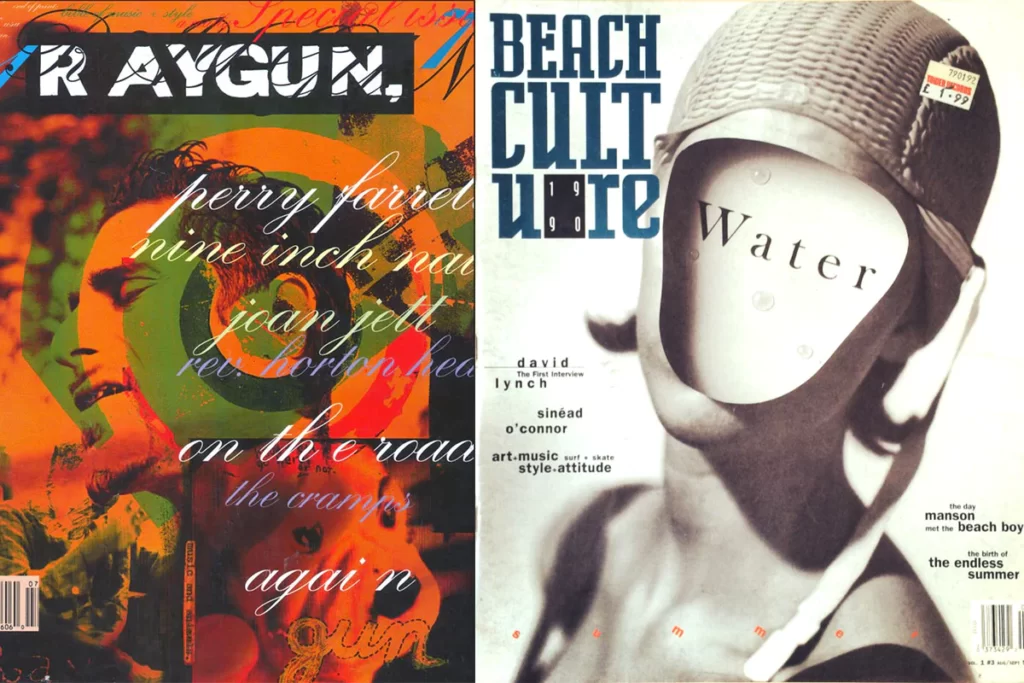
The Ray Gun Revolution: When Chaos Became Commercial
In the early 1990s, the design world was dominated by the Swiss Style, characterised by clean, logical, and sterile aesthetics.
Then came Ray Gun magazine. Carson, as the founding art director, treated every page as a laboratory.
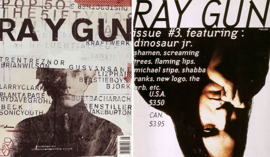
He famously set an entire interview with Bryan Ferry in the font Zapf Dingbats—a collection of symbols and icons—simply because he found the interview boring.
To a “rational” business owner, this looks like professional suicide. Why would you make your content unreadable?
Just because something's legible doesn't means it communicates. More importantly, it doesn't mean it communicates the right thing. So, what is the message sent before somebody actually gets into the material? And I think that's sometimes an overlooked area.
The answer lies in Information Gain. By forcing the reader to struggle, Carson created a level of engagement that clean design can never achieve.
The reader had to “decipher” the brand. This created a sense of “in-the-know” exclusivity for the alternative rock audience. It wasn't about the words; it was about the feeling of the music scene.
Real-World Example: The Quiksilver Shift
When Carson worked with Quiksilver, he didn't just put a logo on a poster. He used print design techniques that mimicked the grit of the beach and the movement of the waves. The result?
Quiksilver didn't look like a clothing company; it looked like a lifestyle.
Data from the era shows that this “authentic” chaos helped the brand dominate the youth demographic, contributing to a multi-million-pound global expansion.
The Science of Emotion vs. Legibility (The Myth Debunking)
There is a persistent myth in the SMB world: The easier it is to read, the better the design.
Research from the Nielsen Norman Group suggests that users typically only read about 20% of the text on a page. If your design is “perfectly legible” but lacks emotional impact, that 20% is forgotten the moment the user scrolls.
The Counter-Intuitive Truth:
According to Don Norman, author of Emotional Design, “attractive things work better.”
When a user has a positive visceral reaction to a design—even if it's “messy”—their brain releases dopamine, which makes them more tolerant of minor difficulties (like reading a complex font). This is known as the Aesthetic-Usability Effect.
Professional Chaos vs. Amateur Mess
| Feature | The Carson Way (Pro) | The Amateur Way (Mess) |
| Hierarchy | Emotional hierarchy (what you feel first) | No hierarchy (everything is the same size) |
| Typography | Purposeful overlap and typography basics manipulation | Random fonts that clash for no reason |
| White Space | “Active” negative space that guides the eye | “Dead” space that feels empty |
| Legibility | Sacrificed for “Readability” (the desire to read) | Sacrificed because of poor technical skill |
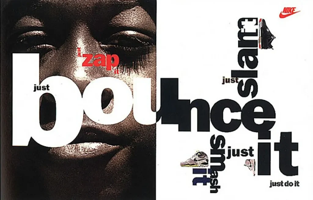
Carson in the Corporate World: Nike, Pepsi, and Big Business
If you think Carson's style is only for “edgy” magazines, you haven't been paying attention to corporate history.
Nike hired Carson for their “Play” campaign. At the time, Nike was transitioning from a purely athletic brand to a global cultural icon. They needed to move away from the rigid, “corporate” look. Carson’s use of blurred imagery and distorted type resonated with the “Just Do It” ethos of pushing boundaries.
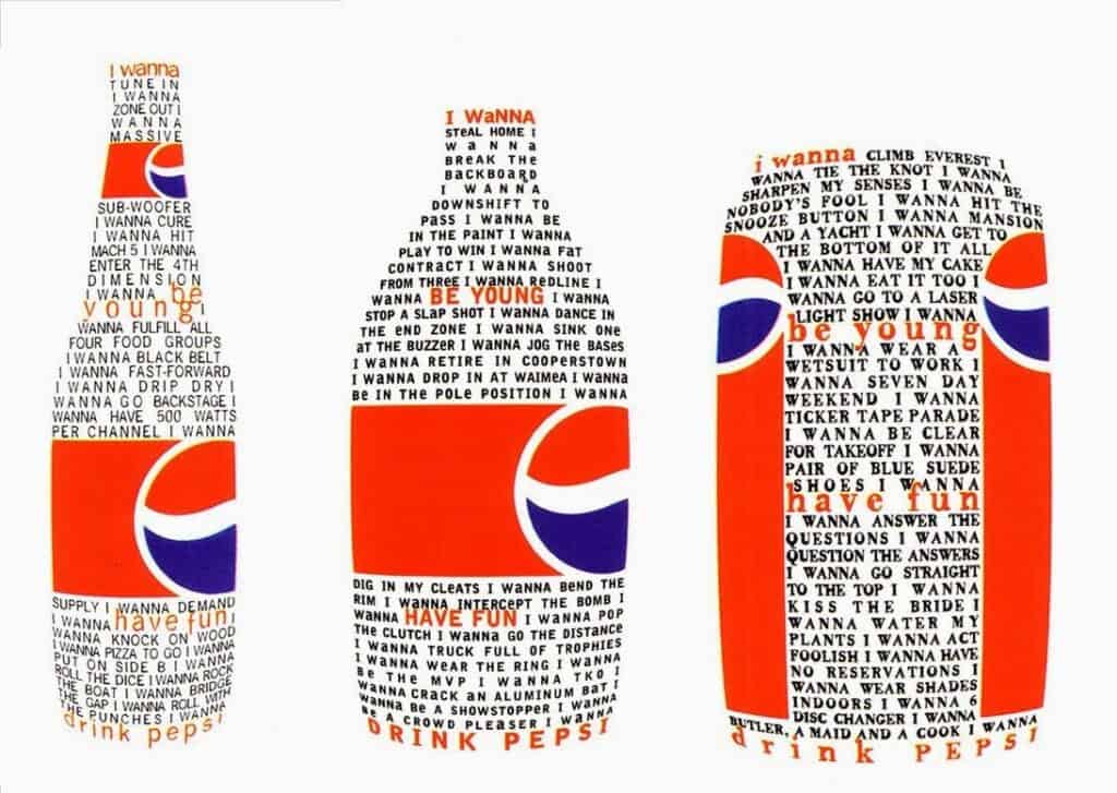
Pepsi also utilised his “chaos” for their “Generation Next” rebranding. Why? Because a billion-dollar company understood that “perfect” design felt fake to teenagers. They needed the “Carson touch” to feel human, flawed, and therefore, real.
When you look at our packaging design guide, you'll see that the principles of texture and visual weight—elements Carson pioneered—are still vital for standing out on a physical or digital shelf.
The State of “Carsonism” in 2026
We are currently witnessing a massive resurgence of Carson-inspired aesthetics. Why? Because of the “AI Fatigue” of 2024 and 2025.
Generative AI tools are exceptionally good at producing “perfect” designs. They create symmetrical, clean, and mathematically balanced layouts. As a result, the internet is becoming a sea of sameness. In 2026, Human Imperfection is the new luxury.
Brands are now moving back to “Anti-Design” and “Brutalist” aesthetics to prove they have a human soul. If your website appears to have been created by a machine, your customers will subconsciously trust you less. They want the grit.
They want the “David Carson” friction that proves a human hand was involved. This is why web design is important in a post-AI world; it’s about soul, not just software.
The Consultant's Reality Check
I once audited a client—a high-end watchmaker—who was complaining that their marketing felt “cold.” Their colour psychology was correct (deep blues and golds), their fonts were premium, and their photography was tack-sharp.
The problem? It was too perfect. It felt like a stock photo.
I told them to “Carson it up.” We broke the grid. We overlapped the serif typography with the product shots. We introduced “grain” into the digital layouts. They were terrified. They thought it looked “broken.”
Within three months, their social media engagement tripled. People weren't just “liking” the posts; they were taking the time to look at them. They were trying to “read” the image. That friction created a memory.
If you are an entrepreneur, you need to ask yourself: Are you being “clean” because it’s effective, or because you’re afraid of what your peers will think of a little mess?
The Technical Mechanics of Controlled Chaos
To implement David Carson's style without it becoming a disaster, you must understand three technical concepts:
1. Optical Kerning vs. Mathematical Kerning
Standard software uses mathematical spacing. Carson uses optical spacing—how the letters look next to each other. Sometimes, letters should touch. Sometimes, they should be miles apart. It's about the rhythm of the line, not the rules of the software.
2. The Narrative of the “Accident”
Carson often talked about the “happy accident.” A printer jam, a torn piece of paper, or a blurred photo. In a commercial context, this is about Texture. High-resolution, clean vectors often lack the “tactile” feel that drives consumer trust.
3. Deconstructed Hierarchy
In traditional design, you have H1, H2, and H3. In Carson’s world, the most important information might be the smallest thing on the page, forcing the viewer to hunt for it. This “gamification” of the reading experience is a powerful tool for Inkbot Design’s services when we want to create deep brand immersion.
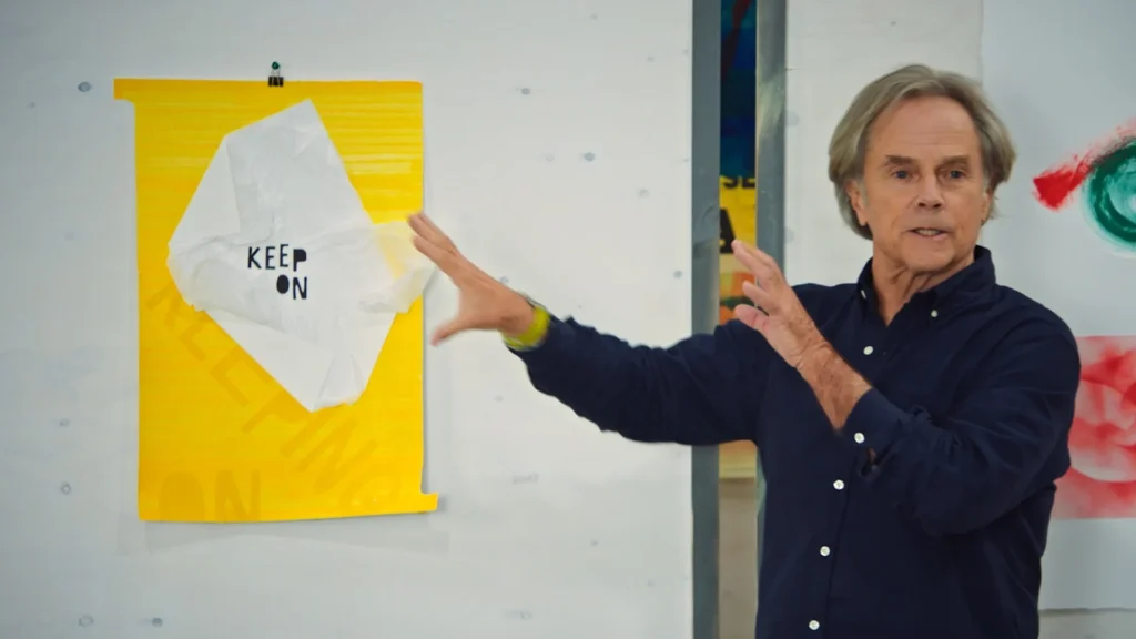
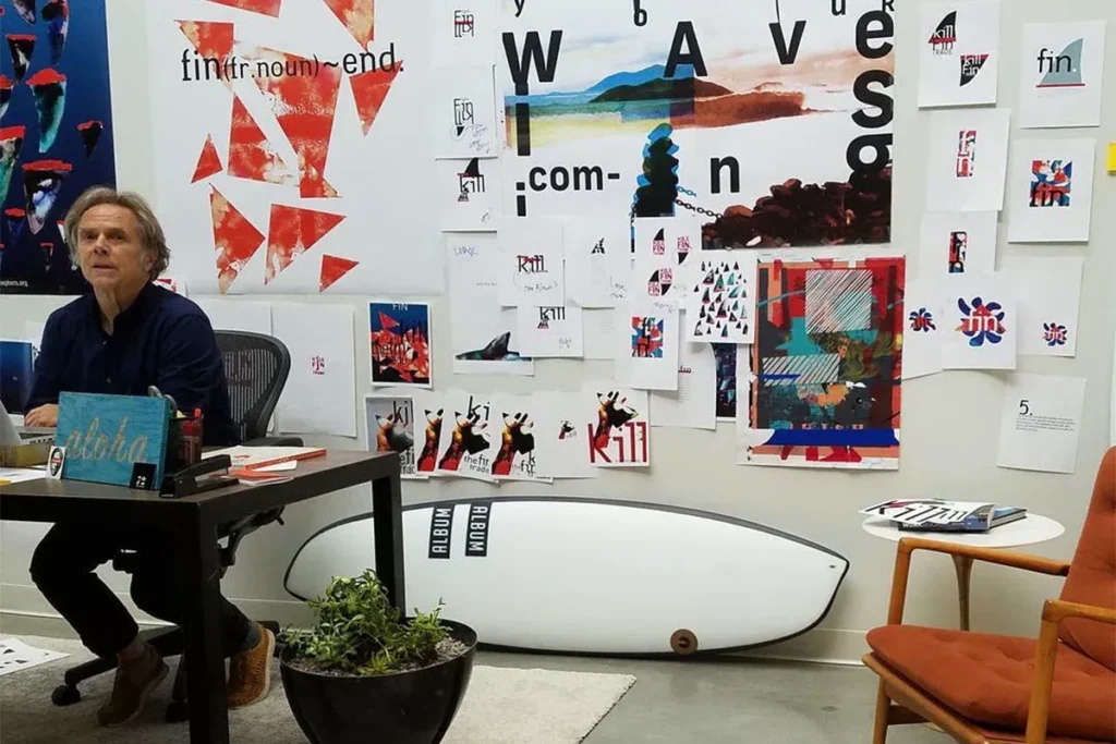
I never learned all the things you're not supposed to do; I just do what makes the most sense.
The Verdict
David Carson is not just a “grunge designer.” He is a master of human attention. He understands that in a world of infinite noise, the loudest thing you can be is different. For entrepreneurs and SMB owners, the lesson is clear: Legibility is a tool, not a rule.
If your brand is currently perceived as “safe,” it is also likely to be invisible. You don't need to set your entire website in Zapf Dingbats, but you do need to introduce enough visual friction to make your audience stop and think.
Chaos, when managed by a professional, is the ultimate competitive advantage.
Would you like me to audit your current brand identity to see where a little “controlled chaos” could improve your engagement? Request a quote here or explore our main site for more insights.
Frequently Asked Questions (FAQ)
Is David Carson’s style still relevant for modern websites?
Absolutely. While we use more “functional” layouts for navigation, the “Hero” sections and brand storytelling benefit immensely from Carson-inspired textures and typography. It breaks the “Bootstrap” template look that plagues modern web design.
How does David Carson influence logo design?
He taught us that a logo doesn't have to be a static, perfect vector. It can have movement, “grit,” and personality. His influence is evident in brands that incorporate “distressed” or “hand-drawn” elements to convey a more authentic feel.
Can “messy” design actually hurt my sales?
Yes, if it’s done by an amateur. Professional “chaos” still follows principles of balance, contrast, and weight. If you ignore these, you just get a mess. If you follow them, you get an iconic brand.
What is “Grunge Typography”?
It is a style of design that emerged in the 90s, characterised by distressed textures, irregular spacing, and a rejection of traditional typographic rules. David Carson is the primary pioneer of this movement.
Why did David Carson use Zapf Dingbats for an interview?
He found the content of the interview with Bryan Ferry uninspired. By setting it in symbols, he transformed a boring piece of text into a legendary piece of “art” that people are still discussing 30 years later.
How can I apply Carson’s principles to my social media?
Stop using perfectly aligned templates. Try overlapping your text, using high-contrast textures, and experimenting with “blurred” motion in your graphics to stand out in a fast-scrolling feed.
What is the “End of Print” philosophy?
It was the title of Carson's first book. It didn't mean magazines would die, but rather that the traditional, rigid way of designing for print was no longer viable. Design was becoming more fluid and experimental.
Does David Carson use a grid system?
Rarely. He typically designs by “eye,” placing elements where they feel right rather than where a mathematical grid dictates. This requires a very high level of innate design skill.
What brands has David Carson worked with?
He has worked with some of the world's largest brands, including Nike, Pepsi, Quiksilver, Audi, and Microsoft. His “rebellious” style is highly valued by massive corporations looking to stay “cool.”
How do I balance legibility and creativity?
Use the “80/20 Rule.” Keep 80% of your functional information (pricing, contact details) clear and legible. Use the other 20% (headlines, hero images) to be as creative and “chaotic” as your brand allows.
What is David Carson’s background?
Surprisingly, he was a professional surfer (ranked 9th in the world) and a sociology teacher before becoming a designer. This non-traditional background is likely why he was so comfortable breaking design rules.
Where can I learn more about famous designers?
You can read our comprehensive guide on famous graphic designers to see how Carson compares to other legends like Paul Rand or Saul Bass.

