25 Political Logos: Good, Bad & Branding Lessons
Forget widgets, software, or coffee. Political logos are the highest-stakes branding on Earth.
They aren’t just designed to look nice on a website. They’re weapons. They are designed to move millions of people, raise billions in funding, and, quite literally, change the world. They have to work on a tiny lapel pin, a massive stadium banner, a shaky smartphone screen, and a protest placard.
As a designer who’s seen businesses fumble their branding over far smaller stakes, the world of political logos is a fascinating, brutal, and incredibly insightful classroom. But frankly, much of it is dreadful.
So, what can your small business—whether you’re a plumber, a programmer, or a pie shop owner—learn from this multi-billion-dollar branding battlefield? More than you think. This goes far beyond simple logo design basics; this is about high-stakes persuasion.
Let’s dissect 25 of the most iconic examples.
- Clarity over clutter: design a simple, bold mark that reads at a glance and scales across sizes and media.
- Tell one story: distil your brand to a single, memorable promise or emotion rather than conflicting messages.
- Context and versatility: ensure the logo works in its real environments—pins, banners, social icons, merchandise.
- Evolve thoughtfully: update designs to stay relevant but respect legacy equity to avoid unintended negative meanings.
1. The ‘Big Idea’ Logos: Selling a Feeling, Not a Person
These logos transcended the candidate or party and sold a single, powerful concept: Hope, Stability, or Change.
1. Barack Obama ‘O’ (2008)
This is the gold standard. The “O” is for his name, yes, but it’s also a rising sun over the American plains (represented by the flag’s red and white stripes). It’s a symbol of a new day, of hope. It’s not just a logo; it’s a complete brand identity in one mark.
- SME Takeaway: Your logo doesn’t just need to say who you are (your name). It needs to sell your promise (what you do for the customer).
2. Reagan-Bush ’84
After a tough few years, America was told it was “Morning in America.” This logo is the visual equivalent. It’s simple, bold, stable, and incredibly confident. The clean, strong typography conveys an optimistic and professional feel. It’s not fancy, and that’s the point. It’s reliable.
- SME Takeaway: Don’t underestimate the power of clean, confident typography. Sometimes, the best logo is just your name, presented with absolute authority.
3. The Labour Rose (UK)
In the 1980s, the Labour Party was perceived as a hard-left party, closely tied to unions and associated with the “Red Flag.” To become electable (“New Labour”), they needed a complete image shift. They swapped the angry red flag for a soft, approachable red rose—a national symbol of England. It visually repositioned the entire party from “revolution” to “social democracy.”
- SME Takeaway: Is your branding stuck in the past? A rebrand can be a powerful signal to customers that your service, values, or approach has fundamentally evolved.
4. Trump “MAGA” (The Hat)
This one’s controversial, but from a design perspective, it’s genius. The official “Trump-Pence” logo was forgettable. The real logo was the red “Make America Great Again” hat. It’s a slogan, a logo, and a piece of merchandise all in one. It’s wearable, tribal, and instantly identifiable.
- SME Takeaway: Your brand isn’t just your logo; it’s the entire experience. What’s your “red hat”? What’s the one thing your customers can see, wear, or use that makes them part of your tribe?
2. The Power of a Single Symbol: No Words Needed
These logos are so simple and so potent that they require zero text. They are activist and party logos that have become global shorthand.
5. CND (Peace Symbol)
Designed in 1958 for the British Campaign for Nuclear Disarmament, this is perhaps the most successful activist logo in history. It’s an abstract combination of the semaphore signals for ‘N’ and ‘D’. It’s simple, meaningless to the uninitiated (making it feel like a secret), yet incredibly easy to draw, paint, or stitch.
- SME Takeaway: The best symbols are unique and ownable. Can you create a simple mark that is 100% yours and, over time, becomes synonymous with your service?
6. Extinction Rebellion (XR)
This is a modern masterclass in protest branding. An encircled hourglass. The message is brutally simple: time is running out. It’s stark, urgent, and (critically for a protest group) incredibly easy to spray-paint, chalk, or make a stencil of.
- SME Takeaway: Your logo must be versatile and fit its primary application. A protest logo needs to be simple and reproducible. A luxury brand’s logo needs to look good embossed in gold foil. Know your context.
7. The Black Power Fist
Visceral, powerful, and uncompromising. This isn’t a passive symbol; it’s an action. It perfectly captures the spirit of the movement: power, resistance, and solidarity. It’s a human, emotional, and political gesture turned into a 2D icon.
- SME Takeaway: Powerful logos evoke emotion. What do you want your customers to feel when they see your brand? Strength? Comfort? Excitement? Design for that feeling.
8. The US Party Animals (Donkey & Elephant)
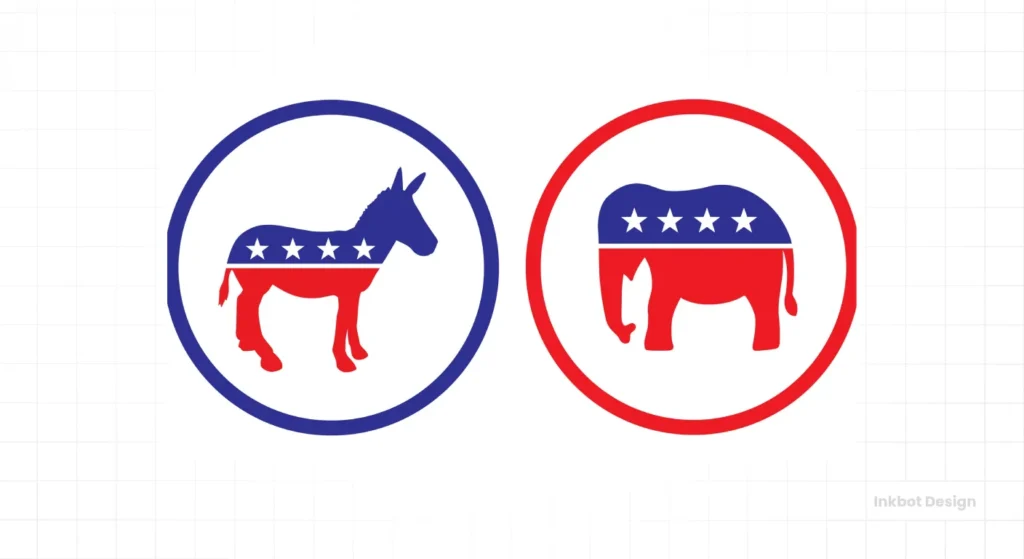
These weren’t created by a design agency. They started as 19th-century political cartoons by Thomas Nast, intended to be insulting. The Democrats (the “jackass”) and Republicans (the “timid” elephant) eventually embraced them. They’ve endured for over a century because they’re memorable, adaptable, and now steeped in history.
- SME Takeaway: Longevity builds trust. A well-chosen symbol or mascot can serve you for decades, accumulating meaning and brand equity every year. Don’t change your logo just because you’re bored with it.
9. Lib Dem “Bird of Liberty” (UK)
For a third party squeezed between the two giants (Labour’s Rose, Conservatives’ Tree), the Lib Dems needed something different. The “Bird of Liberty” is a clear, simple symbol of its core value: freedom. It’s clean, optimistic, and visually distinct.
- SME Takeaway: What is your one core value? Can you distil it into a single, simple image? Clarity beats cleverness every time.
3. The Dark Side & The Revolutionaries: Power and Warning
These logos demonstrate the terrifying power of branding to unite, divide, and command. We study them not to emulate their ideology, but to respect the raw power of visual communication.
10. The Swastika (Nazi Party)
Let’s be blunt: this is the most successful—and horrific—example of political branding in modern history. Before the Nazis co-opted it, the swastika was an ancient, positive symbol. By tilting it 45 degrees and placing it in a stark white circle on a blood-red field, they created something dynamic, aggressive, and unmissable. The colour theory alone—red (danger, blood), white (purity, nationalism), black (the symbol itself)—was deliberately chosen for maximum psychological impact.
- SME Takeaway: Colour and form have immense power. This is a chilling reminder that a brand is a tool, and its impact (for good or ill) depends on the wielder. Use these tools deliberately and responsibly.
11. The Hammer & Sickle
Another powerful symbol. It’s a genius piece of conceptual design, created to represent a specific political idea: the union of the industrial working class (represented by the hammer) and the agricultural peasantry (represented by the sickle). It’s simple, industrial, and instantly synonymous with Communism.
- SME Takeaway: Symbolism matters. Do your visual elements clearly and literally represent what you do? A wrench for a plumber, a coffee bean for a cafe. This “functional” symbolism can be very effective.
12. Solidarnosc (Solidarity)
This logo is the movement. Designed by Jerzy Janiszewski for the Polish trade union, the letters are arranged in a huddled formation, reminiscent of a crowd of people marching, carrying a flag. It’s raw, energetic, and looks like it was painted with a wide brush on a shipyard wall… because that’s its origin. It’s the visual definition of “solidarity.”
- SME Takeaway: Authenticity is magnetic. This logo feels real. Your brand should be true to its origins and values. Don’t try to be a slick corporation if you’re a passionate local artisan.
4. The ‘Initial’ Approach: When a Name (or Letter) is the Brand
This is a common tactic in a candidate-driven race. It’s an attempt to build a brand around a single person, often with mixed results.
13. Hillary ‘H’ (2016)
This logo was endlessly critiqued by designers. It’s a simple ‘H’ with an arrow pointing… to the right (a cardinal sin for a Democrat candidate, said many). It felt cold, corporate, and static. However, it was also designed to be a blank canvas. It was filled with photos of supporters, used in endless variations, and was instantly recognisable. It was a vessel, not a statement.
- SME Takeaway: A simple monogram can work (see: Chanel, Louis Vuitton), but it can also feel sterile. If you adopt this approach, the execution must be flawless, and the brand’s personality must be reflected in the logo (including photography, tone of voice, etc.).
14. Jeb! (2016)
The infamous exclamation mark. This is a classic case of faking the vibe. The campaign aimed to inject energy and excitement into a candidate perceived as lacking energy and enthusiasm. The logo just came across as desperate. It was shouting, “Please be excited!”
- SME Takeaway: Your logo cannot fake your brand’s personality. If you’re a quiet, reliable, meticulous accountant, a logo with a lightning bolt is a lie, and your customers will feel the mismatch.
15. AOC (2018)
Compare this to Jeb!. This typography is bold, tilted, uncompromising, and loud. It’s stacked like a poster, breaking rules. It appears to be a grassroots challenge to the status quo. It perfectly matched the energy and message of the candidate. It’s not “pretty,” but it’s powerful.
- SME Takeaway: Match your visual aggression to your market position. If you’re a new “challenger brand” trying to disrupt an old industry, you need a challenger’s logo. Don’t be afraid to be bold and break a few rules.
16. Bernie Sanders (2016/2020)
This logo is almost un-designed. It’s a simple, slightly friendly font. His name. A little wave. That’s it. And it worked perfectly for him. It felt authentic, honest, and unslick—just like the man himself. It was the antithesis of the corporate Hillary ‘H’.
- SME Takeaway: Sometimes, the most powerful design choice is to look “un-designed.” It signals authenticity, a lack of pretension, and a focus on substance over style.
5. The ‘Guard’ & The ‘Nations’: Institutional & Identity Logos
These logos represent established parties, nations, and institutions. Their job is to convey stability, history, and a clear sense of “who we are.”
17. The Conservative Tree (UK)
Like Labour’s Rose, this was a major rebrand. The Tories swapped their “Torch of Liberty” (which felt a bit aggressive) for a scribbled Oak tree. The oak is a symbol of England, representing strength and deep roots. The “hand-drawn” style was intended to soften their image, portraying them as the “caring Conservatives.”
- SME Takeaway: A rebrand can soften your image. A new logo can help you reach a new audience that might have found your old brand too harsh, corporate, or old-fashioned.
18. SNP (Scottish National Party)
This logo combines two symbols: the thistle (a national emblem of Scotland) and a ribbon shaped like the Saltire (the Scottish flag). It’s a simple, elegant piece of identity design. Its one and only job is to say “Scotland.”
- SME Takeaway: Using well-understood cultural or regional symbols can be a powerful shortcut… if it’s authentic to your brand. A local bakery using a town landmark, for example.
19. United Nations (UN)
The ultimate “global” logo. It’s a map of the world (from top to bottom, so no country is “on top”) encircled by olive branches, the classical symbol of peace. It’s a literal, visual representation of its entire mission: “Global Peace.”
- SME Takeaway: Can your logo explain your entire mission at a glance? This level of clarity is something to strive for.
20. European Union (EU)
The 12 stars on a blue field. The circle represents unity and harmony, and the number 12 (unrelated to the number of member states) is a traditional symbol of perfection and completeness. It’s simple, geometric, and stable.
- SME Takeaway: Geometric simplicity often leads to a timeless design. Shapes and simple patterns can create a feeling of stability and trust.
21. Green Party (Global)
Most Green parties around the world use one of two symbols: a sunflower or a green-coloured globe. It’s not subtle, but it doesn’t need to be. The message is “environment,” and it’s communicated instantly.
- SME Takeaway: Obvious symbolism isn’t always bad. If you are an eco-friendly cleaning company, a simple green leaf works. Don’t be obscure for the sake of being “clever.”
22. Pirate Party (Global)
A ‘P’ stylised as a pirate sail. It’s clever, playful, and perfectly on-brand for a movement focused on internet freedom and copyright reform (i.e., “piracy”). It takes a negative term and owns it.
- SME Takeaway: Don’t be afraid to have a personality! A clever visual pun or a playful mark can make your brand far more memorable than a “safe” corporate logo.
23. Sinn Féin (Map)
For decades, Sinn Féin’s logo has often featured a map of a united Ireland. This is the ultimate “mission” logo. It’s a clear, visual, and political statement of their primary goal. It’s not just a logo; it’s a map of their desired future.
- SME Takeaway: If your business has one single, clear, defining goal or unique selling proposition (USP), don’t be afraid to make it the centrepiece of your brand.
24. Joe Biden (2020)
After four years of the chaotic “MAGA” brand, the Biden logo was a deliberate return to “normal.” Bold, stable, traditional sans-serif font. The ‘E’ is styled as the stripes of the flag. It’s solid, reassuring, and professional. It was designed to be the opposite of chaos.
- SME Takeaway: Sometimes, the most powerful brand statement is “normality” and “reliability.” In a chaotic market, a simple, strong, no-nonsense logo can be incredibly reassuring to customers.
25. The Modern GOP Elephant
The Republican Party has tried to “modernise” its elephant. The new versions are sleeker, often just a silhouette. One version, with stars on its back, was heavily criticised for making the elephant look “caged” or “trapped.”
- SME Takeaway: Modernising a legacy logo is a dangerous move. You risk losing decades of brand equity, or worse, accidentally creating a new, negative interpretation. If you must update, evolve, don’t replace.
A Designer’s Scorecard: What Really Works?
Let’s put a few of these on the table and score them like a design brief. This is how I’d break them down for a client.
| Logo | Simplicity (1-5) | Memorability (1-5) | Versatility (1-5) | Core Message | SME Lesson |
| Obama ‘O’ (2008) | 4 | 5 | 5 | “Hope,” “New Day,” “Future” | A great logo tells a story. |
| CND (Peace) | 5 | 5 | 5 | “Nuclear Disarmament,” “Peace” | Simple, abstract marks are timeless and easy to reproduce. |
| MAGA Hat | 5 | 5 | 3 | “Tribalism,” “Patriotism,” “Change” | Your brand is bigger than your logo. It’s a system. |
| Hillary ‘H’ (2016) | 5 | 2 | 4 | “Hillary.” (and…) | A simple logo can be a blank, boring canvas. |
| Conservative Tree (UK) | 3 | 3 | 4 | “Stability,” “Nature,” “Caring” | A rebrand can successfully shift perceptions (e.g., “softer”). |
Getting this right isn’t just a matter of taste. It’s a complex process of strategy, psychology, and pure design skill. It’s why serious political campaigns and serious businesses invest heavily in professional logo design.
What Your Business MUST Learn from This
You don’t have a billion-dollar marketing budget, but you can steal their thinking. If you boil all this down, here are the non-negotiable rules for your own business logo:
- Clarity Over Clutter. A simple, bold logo will always beat a complex, detailed one. If it’s not clear from five metres away, it’s failing.
- Tell ONE Story. Your logo can’t be “premium, and budget-friendly, and fast, and traditional.” The Obama ‘O’ was about “Hope.” The XR logo is “Time’s running out.” What’s your one thing?
- Be Versatile. Your logo will appear on your website, Instagram profile picture, van, invoices, and possibly your shopfront. It must work in all those places, in one colour, and at all sizes.
- Don’t Be Afraid to Evolve. The Labour Rose and Conservative Tree prove that brands can—and should—evolve. If your logo looks like it was made in 1995 (and not in a cool, retro way), it’s telling customers your business is, too.
Your logo is your flag. It’s the first thing your customer sees and the last thing they remember. Don’t send it into battle without a strategy.
Your Next Move
I see so many entrepreneurs and small business owners treat their logo as an afterthought—something to get “done” on the cheap so they can get to the “real” work.
As this list proves, the logo is the real work. It’s your entire strategy, distilled into a single mark.
If you’re looking at your own logo and realising it’s not working for you, maybe we should talk. Explore the professional logo design services we offer at Inkbot Design. If you’re just starting to think about a change, you can request a free quote, and we’ll have an honest conversation.
Political Logos FAQs
What makes a political logo “iconic”?
An iconic logo is one that transcends its original context and remains recognisable across various settings. It becomes a shorthand for an idea, a movement, or a moment in time. The CND Peace Symbol is iconic because it no longer just represents one organisation; it represents a global idea.
What can I learn from the Obama ‘O’ logo?
The main lesson is to “sell the promise, not the product.” The ‘O’ wasn’t just his initial; it was a symbol of “Hope,” “A New Day,” and “Unity.” Your logo should try to capture the feeling or benefit you provide, not just your name.
Why was the Hillary Clinton ‘H’ logo so controversial?
Designers and political pundits found it cold, corporate, and static. The arrow pointing to the right was seen as a bad political metaphor for a left-leaning candidate. It shows that in a high-stakes environment, every design choice will be over-analysed.
How important is colour in political logos?
Extremely. Colours are packed with emotional and cultural meaning. In the US and UK, red, white, and blue are obvious patriotic choices. The Nazi’s use of red/white/black was a deliberate psychological tool. The Green Party’s use of green is a simple, powerful signifier.
What’s the difference between a logo and a brand (using MAGA)?
The “Trump-Pence” sign was their logo. The “brand” was the entire experience: the red hat, the “Make America Great Again” slogan, the rallies, and the candidate’s tone. The hat became the most powerful symbol of that brand. Your logo is just one part of your overall brand.
Can a bad logo actually lose an election?
Probably not on its own. However, a bad logo (like Jeb’s!) can reinforce a negative perception (of low energy) and suggest a campaign that is out of touch or trying to fake its personality. It’s a symptom of a weak brand, not the cause.
Why do so many political logos use flags or national symbols?
It’s the fastest, simplest, and laziest way to communicate “patriotism” and “national identity.” It’s a visual shortcut. A good design (like the Obama ‘O’) will integrate these elements subtly, rather than just sticking a flag on it.
What’s the story behind the Republican elephant and Democratic donkey?
They were popularised by cartoonist Thomas Nast in the 1870s. He depicted the “Republican Vote” as a powerful but timid elephant and the Democrats as a stubborn “jackass” (donkey). Both parties, initially insulted, eventually adopted the mascots as their own.
How did the UK Labour Party’s rose logo change its image?
It was a deliberate rebrand in the 1980s to move away from the “hard-left” image associated with the red flag (a symbol of socialism and revolution). The red rose (a national symbol of England) felt softer, more moderate, and more patriotic, helping to create “New Labour.”
What is the most important lesson for a small business from these logos?
Clarity. The best logos on this list convey a single, instantly recognisable idea. Obama = Hope. XR = Urgency. CND = Peace. Don’t try to make your logo say five different things. Pick your one most important message and design around that.


