1930s Fonts & Typography: Art Deco & Beyond
The best 1930s fonts are defined by the sleek, geometric modernism of the Art Deco movement, a style that celebrated the machine age with streamlined forms and monoline strokes.
While geometric sans-serifs, such as Paul Renner’s Futura, continued to dominate, this era also produced elegant, high-contrast typefaces that were perfect for the glamorous posters and advertising of the time.
This decade’s typography strikes a balance between functional clarity and decorative sophistication, capturing a unique blend of industrial progress and artistic expression.
- The 1930s saw a shift towards Modernism in typography, focusing on functionality and simplicity over ornate styles.
- Bauhaus's influence emphasised that form follows function, promoting clean lines and geometric shapes in design.
- Sans-serif fonts became highly popular, especially grotesque styles, marking a significant trend in typography during the decade.
- Technology advancements, like Linotype and emerging photo-typesetting, revolutionised typesetting and typeface designs for efficient printing.
- The enduring legacy of 1930s typography is seen in modern design, influencing logo creation, web typography, and advertising.
The Roaring Twenties Hangover
First, take a little look at what came before it.
The Roaring Twenties were all about excess, weren’t they?
Jazz and flappers and typography screaming, ‘Look at me!’ However, the world was still recovering from a hangover when the calendar flipped to 1930.
The Great Depression had hit, and suddenly, all that extravagance seemed a bit, well, excessive.
This shift in mood and economics would profoundly impact how designers approached typography in the 1930s.
The Birth of Modernism in Typography
With the dawn of the 1930s, designers were ready for something new. The ornate decorative styles of the Art Nouveau and Art Deco movements were beginning to feel old. Enter Modernism, stage left.
Modernist typography was the ultimate stripping down to the essence of things—no frills or fuss, but pure and functional design.
It’s as if Marie Kondo came early and told people to keep only typefaces that spark joy and are legible. Bauhaus Influence
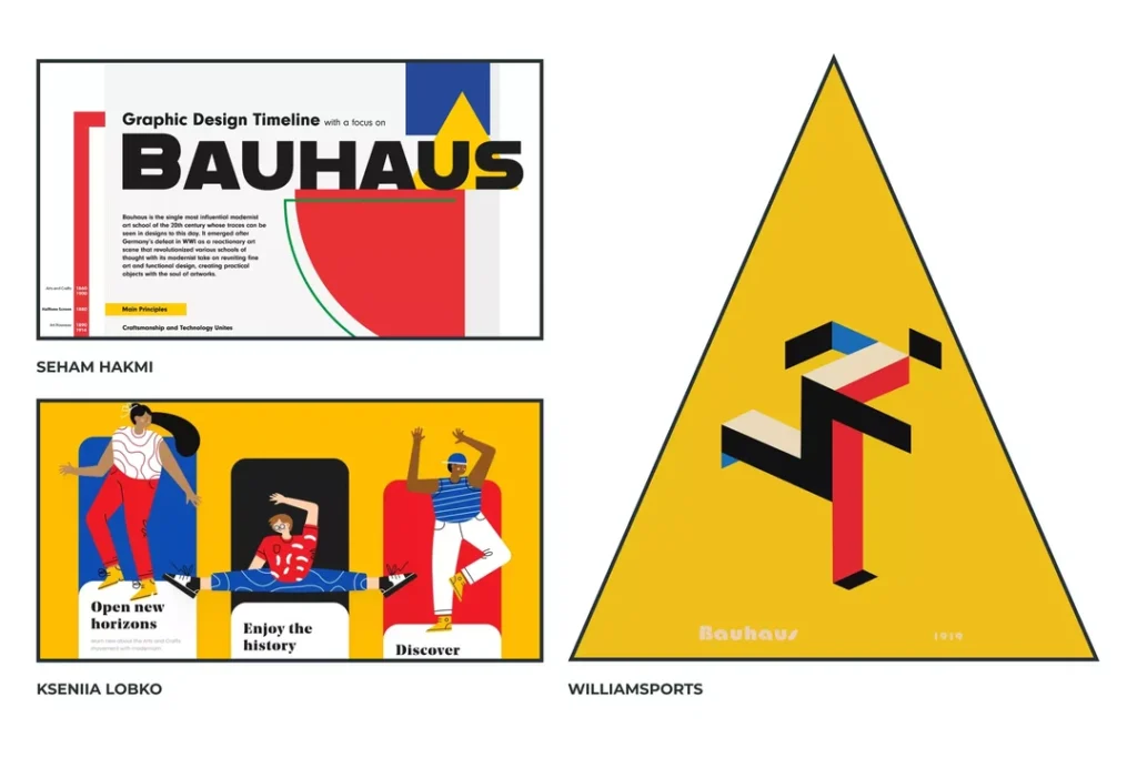
You can’t discuss 1930s fonts and typography without mentioning Bauhaus.
This German art school was founded in 1919, but by the early 1930s, it was already hitting its stride. Their philosophy?
Form follows function.
What does that mean for typography? It means clean lines and geometric shapes, with a focus on readability.
Some essential Bauhaus-inspired typefaces of the 1930s:
- Futura, by Paul Renner, 1927; widely adopted during the ’30s
- Kabel-Rudolf Koch, 1927
- Nobel by Sjoerd Henrik de Roos, 1929. This was typography’s little black dress: plain, unnamed, always correct.
Sans-Serif Takes Centre Stage
Sans-serif fonts were the hipsters of the 1930s, if you will. Designers, in particular, had a thing for grotesque sans serifs.
These fonts have been used since the 19th century, but have reached new heights.
Some popular grotesque fonts from the 1930s:
- Monotype Grotesque (released in various weights throughout the 1920s and 1930s)
- Stephenson Blake Grotesque (various cuts released in the 1930s)
- Gill Sans (Eric Gill, 1928-1930)
Gill Sans, in particular, became the archetypal British typeface: the typographic stiff upper, lip-clean, proper, yet with just that hint of character.
Geometric Sans-Serifs: The New Kid On The Block
While grotesques were having their heyday, another sans-serif style began to emerge: the geometric sans. In such fonts, the underlying structure comprises basic geometric shapes, most of all the circle.
Major geometric sans-serifs of the 1930s:
- Futura [as above]
- Erbar-JJakob Erbar, 1922-1930
- Kabel – as above
These fonts captured the essence of Art Deco into letterform—sleek, modern, and oh-so-stylish.
1930s Geometric vs. Grotesque Sans-Serif Comparison
In 2026, choosing between these styles depends on your digital rendering requirements. Geometric fonts offer high-impact symmetry, while Grotesque fonts provide superior legibility in dense text blocks.
| Feature | Geometric (e.g., Futura) | Grotesque (e.g., Gill Sans) |
| Core Shape | Circles, Squares, Triangles | Irregular, “Hand-touched” curves |
| Terminals | Sharp, pointed (modern) | Often angled or blunt |
| Best Use Case | Headlines, Hero Banners, Minimalist Branding | Body copy, UI Navigation, Wayfinding |
| 2026 Popularity | High (in Tech/Fashion) | Moderate (in Editorial/Heritage) |
Serif Fonts: Not Dead Yet
While sans-serif fonts were the belle of the ball, serif fonts weren’t about to go quietly into the night. With their organic, calligraphic feel, old-style serifs evolved to fit the modernist ethos.
Some notable old-style serifs from the 1930s:
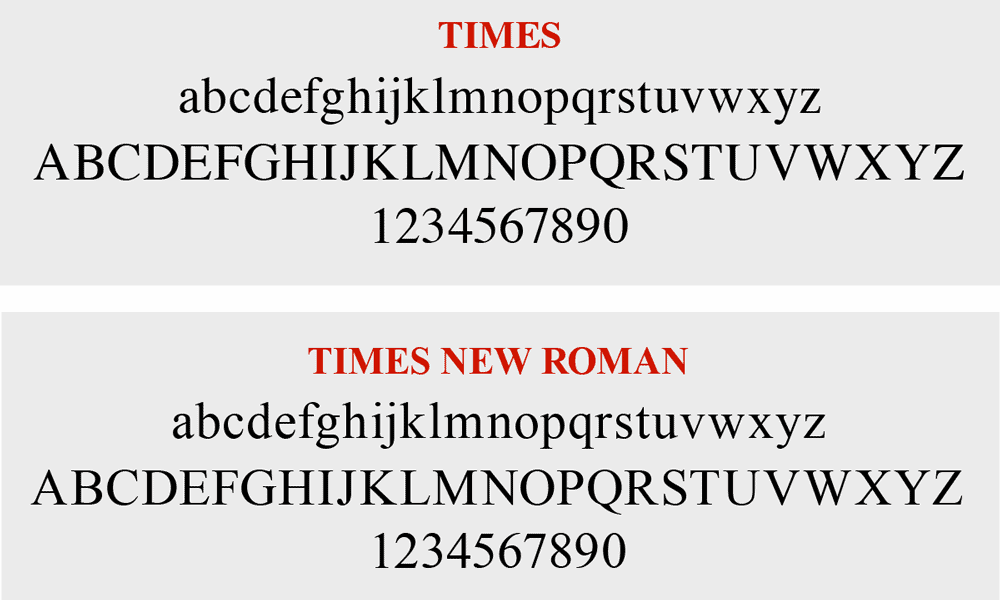
- Times New Roman· Stanley Morison · 1931
- Perpetua · Eric Gill · 1928-1932
- Bembo· revival by Monotype· 1929
Times New Roman was, for the newspaper in London, designed to appeal to the typographic equivalent of a well-tailored suit: classic, versatile, and correct under almost any circumstance.
Slab Serifs: The Bold and the Beautiful
Slab serifs—with their thick, squared-off serifs—discovered their uses within advertising and displayed typography throughout the 1930s. They were like typographic equivalents of a bold statement necklace: attention-grabbing and unapologetic.
But look, not everything was about hard edges and machine-like precision.
While the modernists were stripping everything back, some designers recognised that brands needed a human touch to sell their products.
This is where casual script fonts started to find their feet.
They were the perfect antidote to all that cold, geometric rationalism.
Think of typefaces like Signal by Walter Käch from 1931, or Howard Allen Trafton’s Cartoon from 1936.
They felt personal, with a bit of class, almost like a signature on a letter.
They brought a sense of intimacy and charm that a blocky sans-serif just couldn’t manage.
It was a quiet rebellion, a reminder that even in the age of industry, people still preferred to buy from individuals.
Some of the new slab serifs that made waves in the thirties:
- Memphis (Rudolf Wolf, 1929-1938)
- Rockwell (Monotype, 1934)
- Beton (Heinrich Jost, 1931-1936)
The French Touch: Poetic Modernism
Meanwhile, across the Channel, the French were doing their own thing.
Of course they were.
They took one look at the rigid functionalism of the Bauhaus and thought, ‘Right, this is good, but where’s the soul?
Where’s the artistry?’
What emerged was a kind of poetic modernism, and its undisputed king was the designer A. M. Cassandre.
The bloke was a different class.
His posters for clients like the Dubonnet aperitif or the L’Atlantique ocean liner weren’t just advertisements; they were towering works of art.
The typography wasn’t just some text slapped on at the end.
It was an integral part of the image’s architecture.
Letters became structural supports, waves, or beams of light.
He even designed his own typeface, Peignot, in 1937.
It was brilliantly weird, a sans-serif typeface that dispensed with a traditional lowercase in favour of mixing standard capitals with smaller, lowercase-style caps.
It shouldn’t have worked, but it did.
It was pure French style: decorative, daring, and utterly confident.
The Impact of Technology on 1930s Typography

The Linotype, invented in the late 19th century, truly came into its own in the 1930s. This hot metal typesetting system enabled faster and more efficient printing, which in turn influenced typeface design.
Fonts for Linotype needed to be robust and legible, even on low-quality paper, in order to achieve high printing speeds. This prompted some exciting design actions: increased x-height for better readability and sturdier serifs to endure printing.
Typography was going to the gym—typefaces were becoming more vital in resisting the high demands of mass production.
Photo-Typesetting: A Sneak Peek
Although photo-typesetting applications didn’t become common until after World War II, photography-based typesetting technology emerged during the 1930s. This process utilised photography to set type, thus eliminating the need for metal type in a design context.
Still, in its infancy, phototyping was a herald of the digital revolution. It was as if one had seen the first mobile phone: clumsy and limited, full of potential.
Typography in Advertising: Selling the American Dream

The 1930s saw an increase in advertising, despite or perhaps because of the economic downturn. Typography played a significant role in capturing the consumer’s attention and selling products.
Advertisers preferred bold, striking typefaces:
- Cooper Black Oswald Bruce Cooper, 1922, but widely used in the ’30s
- Peignot A.M. Cassandre, 1937
- Bank Gothic Morris Fuller Benton, 1930-1933
These fonts were the carnival barkers of typography—loud, distinctive, and impossible to ignore.
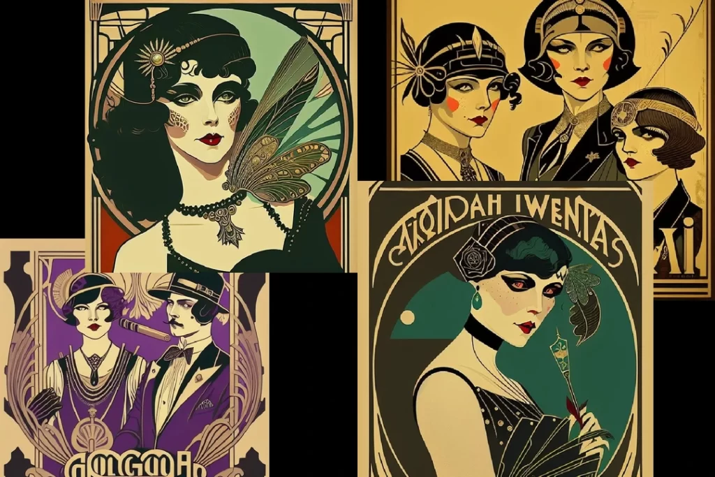
Art Deco’s Last Hurrah
While Modernism was rising, Art Deco had stayed in the building. The Art Deco-inspired typography continued to shine in the 1930s, especially in advertising and poster design.
Characteristics of Art Deco typography:
- Geometric shapes
- Stylised, elongated letterforms
- Decorative elements that reference machinery and speed
It was the typographic equivalent of a flapper dress: glamorous, a bit too much, yet impossible not to stare at.
Typography as Public Service: The WPA Posters
Back in the States, typography was being put to work for a completely different reason.
The Great Depression was biting hard, and as part of President Roosevelt’s New Deal, the government’s Works Progress Administration (WPA) had a rather brilliant idea.
They established the Federal Art Project, which provided employment to thousands of unemployed artists, commissioning them to create posters for the public good.
These weren’t selling fancy drinks or new cars.
They were encouraging Americans to visit their national parks with the iconic “See America” series, promoting public health initiatives, and announcing community theatre productions.
This was typography for the people.
The style was direct and honest, with no messing about.
It often featured bold, legible sans serifs, frequently hand-drawn with a charming imperfection.
The use of screen printing led to big, flat blocks of colour that made the posters incredibly striking.
It was a massive undertaking that brought a clean, modernist aesthetic to the masses.
Moreover, it demonstrated that great design was more than just a commercial tool.
It could be used to inform, unite, and help rebuild a nation’s spirit.
Political typography: Propaganda and protest

The 1930s were a politically tumultuous time, and of course, with politics comes messaging. Typography played a significant role in the political climate. In Germany, the Nazi party favoured blackletter faces as being traditionally German.
Ironically, they later abandoned the black letter, declaring it “Jewish” in 1941. It just goes to show that even typography can fall victim to the whims of dictators.
Protest and Revolution: The Typography of Dissent
Left-wing movements were on the opposite side of the political spectrum, also disseminating their messages through typography. Avant-garde constructivist-inspired designs in the Soviet Union found their way into protest posters and pamphlets worldwide.
Characteristics of protest typography in the 1930s:
- Bold, sans-serif typefaces
- High contrast layouts
- Integration of photography and illustration
Typography had joined a union—strong, united, ready to fight for its ideology.
Magazine and Newspaper Design: The New Typography in Action

The 1930s saw a revolution in magazine and newspaper design, with strong influences from the principles of New Typography. The likes of Jan Tschichold championed asymmetric composition, sans-serif type, and the use of photography.
Publications such as Vogue and Harper’s Bazaar adopted these new design principles and developed an aesthetic that remains relevant today. Magazines had shrugged off the corset, thrown it away, and replaced it with Coco Chanel—nothing was less than effortlessly chic.
The Grid System: Order from Chaos
The 1930s also fostered the creation of grid systems within layout design. To be even more defined later in the 1950s and ’60s, the concept helped organise page layouts.
- Benefits of the Grid System
- Improved readability
- Consistency between multiple pages
- Easier integration of text and image
It was like giving typography a map—suddenly, every element knew precisely where it went.
Book Design: From Tradition to Innovation

While magazines moved into modernism, book design in the 1930s refocused on classic typography. Designers drew inspiration from the Renaissance in creating layouts where harmony and proportion prevailed.
Characteristics of the 1930s book design:
- Classic serif typefaces
- Generous margins
- Typographic details such as leading and kerning
It was as if the books decided to do their Sunday best: elegant, refined, timeless.
Paperbacks: Typography for the masses
The 1930s also saw the advent of the mass-market paperback. Publishers such as Penguin revolutionised the book’s look through standardised forms and an innovative exploitation of typography.
The now-iconic Penguin design, created by Edward Young in 1935, consisted of:
- A plain three-panel cover
- Strong use of colour
- Legible sans-serif typography
Typography had found fast fashion, suddenly an excellent design for the masses.
Typeface Designers of the 1930s: The Unsung Heroes

Eric Gill: The Controversial Genius
Eric Gill, designer of Gill Sans and Perpetua, was one of the most potent type designers of the 1930s. His work combined modernist principles with a profound understanding of classical proportion.
Fun fact: Gill was also a sculptor, and his sense of form in three dimensions informed his type design. It was as if his letters were carved rather than drawn.
Paul Renner: The Mind Behind Futura
Now, we have to talk properly about the man behind Futura, Paul Renner.
He is mentioned a lot, but there’s a real story behind it.
Renner wasn’t officially a member of the Bauhaus, but he was absolutely on the same page.
His whole philosophy was that a typeface had to be a creature of its time.
For the modern age, that meant ditching the historical baggage and building letters from pure, geometric forms.
The ‘o’ is a perfect circle, and the capitals have the proportions of classical Roman inscriptions.
It was clean, logical, and radical.
But here’s the thing.
Renner was staunchly anti-Nazi.
He despised their ideology and their backwards-looking embrace of blackletter fonts.
He even published a bold pamphlet called ‘Kulturbolschewismus?’ (‘Cultural Bolshevism?’), where he took a direct aim at their cultural policies.
You can guess how well that went down.
The Nazis sacked him from his teaching post in Munich in 1933.
The irony is, while they were trying to silence him at home, his typeface was exploding in popularity across the globe, becoming an international symbol of forward-thinking modernism.
A quiet, typographic two-fingers-up to the regime, really.
Stanley Morison: The Typographic Consultant
Stanley Morison, who designed Times New Roman, was not a type designer himself but a typographic consultant for Monotype. And his influence extended far beyond those few faces that he created.
Morison’s philosophy:
- The type should be invisible.
- Good typography draws attention to the content, not itself.
- Tradition and innovation should be balanced.
It was as if Morison was the typographic equivalent of a good butler—always there, always helpful, but never drawing attention to himself.
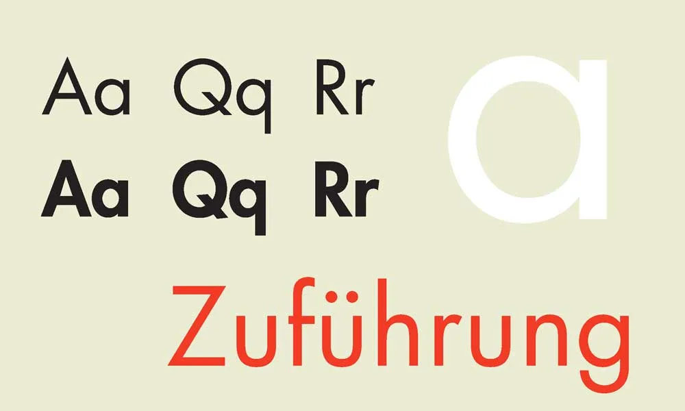
Rudolf Koch: The Calligrapher-Turned Type Designer
Rudolf Koch brought a calligrapher’s sensibility to type design. His typefaces, like Kabel, combined geometric modernism with a hint of handcrafted charm.
Koch’s approach was to:
- Emphasise spiritual features of letterforms.
- Combine traditional calligraphy with modern design principles.
- He designed typefaces that sounded modern yet timeless.
It was as if Koch had discovered how to instruct machines in the appearance of a human hand’s soul.
The Legacy of 1930s Typography
The typography of the 1930s set the stage for the mid-century modern movement of the 1950s and ’60s. In this era, clean lines, geometric forms, and a respect for functionality carried over into the post-war era.
Reinterpretation and Digital Revival
This digital age has revived countless examples of typefaces from the 1930s. Fonts such as Futura and Gill Sans will undoubtedly be virtually ubiquitous among modern designers for many more years to come.
Digital recreations of fonts from the 1930s often include the following: extended character sets, weight, style, and optimisations for screen display, among others. In many ways, this breathes new life into these fonts—the same classic style now enriched with everything modern technology can bring to bear.
Timeless Appeal of 1930s Style
There is just something about the typography from the 1930s that continues to charm designers and readers alike. It could be due to an ideal balance of form and function or the tint of past times.
Whatever the reason may be, it seems the influence of 1930s typography is everywhere to be seen, from:
- Logo design
- Web typography
- Print advertising
- Film and television title sequences
It’s almost as if the 1930s left a time capsule, and we are still unpacking its treasures today.
Designing with 1930s Fonts in 2026: The Digital Revival
While the Linotype machine is a relic of the past, 1930s typography is experiencing a significant resurgence with the advent of Variable Font technology. Modern designers aren’t just using static versions of Futura; they are utilising axes for weight and slant to optimise for OLED displays.
- Futura Now: The Monotype revival offers a variable version that allows for precise weight adjustments, perfect for responsive web design.
- Gill Sans Nova: Updated for the digital era with improved x-heights for better legibility on mobile devices.
- Accessibility Note: When using high-contrast Art Deco fonts like Peignot, ensure a minimum contrast ratio of 4.5:1 to meet WCAG 3.0 standards, as the thin strokes can “break” on low-resolution screens.
Conclusion: The Decade That Shaped Modern Typography
The 1930s were a decade of contrasts: economic hardship versus technological advance, political turbulence pitted against the birth of artistic innovation. That tension—working out between tradition and modernism, decoration and functionality—also played itself out in typography.
These typefaces and design tenets formulated in this crucible continue to shape our visual world today—from the cleanliness of sans-serif fonts to the grid systems at the heart of modern layouts, we see the influence of 1930s typography around us.
Reflecting on this pivotal decade, we’re reminded that great design can come from any circumstance. Designers of the 1930s, working within the confines of economic constraint and technological change, rose to the challenge while leaving behind a typographic legacy that stood the test of time.
The next time you’re reading some sleek sans-serif font or a perfectly balanced page layout, just doff your hat to those pioneering typographers from the 1930s—they may not have known it then. Still, they were fixing the face of the future of visual communication, one letterform at a time.
1930s Typography: Expert FAQs
What was the most used font in the 1930s?
Among the most famous fonts that dominated the 1930s are Futura, Gill Sans, Times New Roman, and Cooper Black. They represented different styles—from modernist sans serifs to traditional serifs and bold display typefaces.
What are the best 1930s fonts for modern logo design?
Futura remains the gold standard for minimalist logos, while Bank Gothic is preferred for architectural and masculine branding. For a more decorative Art Deco look, Peignot or modern revivals, such as Metropolis, offer a high-fashion aesthetic.
Is Times New Roman still considered a “modern” font?
While designed in 1931, Times New Roman is now viewed as a “Transitional Serif.” In 2026, it is frequently used to evoke institutional authority or “Dark Academia” aesthetics in digital publishing.
Was serif or sans-serif more popular during the 1930s?
In the 1930s, serif and sans-serif typefaces were used; however, there was a distinct preference for sans-serif fonts in displays and advertising. Regarding body text, serif fonts remained very popular with books and newspapers.
How did this technology influence typography in the 1930s?
The development of printing technology, particularly the widely used linotype printers, significantly impacted the development of typefaces. Fonts needed to be robust and legible when printed at high speeds on low-grade paper. Additionally, photo-typesetting gradually freed designers from the constraints of metal types.
What was ‘New Typography’, and how did it influence 1930s design?
‘New Typography’ promoted simplicity, clarity, and functionality in typographic design. The promotion was for asymmetrical layouts, sans-serif typefaces, and the integration of typography with photography. It had a preeminent influence on magazine and advertising design in the 1930s.
How did the political movements use typography in the 1930s?
Throughout the 1930s, political movements utilised typography as a tool of aggression in propaganda and protest. The fascist regimes favoured bold and aggressive typefaces, while the constructivist designs influenced the left-wing movements. Depending on the message, typography conveyed strength, authority, or a revolutionary spirit.
Which 1930s fonts are available on Google Fonts?
Excellent free alternatives include Jost (inspired by Futura), Tenor Sans (Art Deco style), and Crimson Text (for a Bembo-like feel).

