Top 10 Typography Design Tips to Make Your Designs Pop
The secret to world-class design isn’t a complex layout or a flashy colour palette; it’s typography.
If you get the type wrong, the entire brand identity collapses.
Typography is the visual component of the written word, and in my experience at Inkbot Design, it’s the quickest way to tell a premium brand apart from an amateur one.
Most people think choosing a font is a quick aesthetic choice. It isn’t. It’s a strategic decision that affects readability, user experience (UX), and brand trust. I’ve seen brilliant concepts ruined by poor kerning or a typeface that clashes with the brand’s personality.
If you want to move past “bland” and start producing “brilliant,” you need a solid foundation. Here are my top 10 typography design tips to elevate your work immediately:
- Choose fonts that reflect your brand: match typeface personality to brand values for coherent, professional identity across touchpoints.
- Prioritise legibility: ensure readable sizes, proper leading, and WCAG contrast ratios for accessible, user-friendly text.
- Master hierarchy and spacing: use clear size/weight hierarchy, thoughtful kerning and tracking to guide attention and clarity.
- Optimise for modern screens: use variable fonts, WOFF2, clamp() and generous negative space for performance and fluid typography.
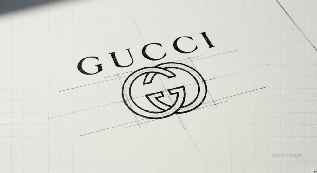
1. Choose Fonts That Reflect Your Brand
The fonts you use in your designs say a lot about your brand. Are you going for a modern, minimalist vibe? Or something more classic and elegant?
Whatever the case, your font choices must align with your brand’s personality and aesthetic. After all, you wouldn’t want to use a fun, playful font for a law firm’s website, would you?
When selecting fonts, consider the overall “feel” you’re going for. Is it professional? Sophisticated? Edgy? Whimsical? Browse font libraries like Google Fonts or Adobe Fonts, and pay close attention to the personality and characteristics of each option.
Also, stick to a consistent font pairing throughout your design work. This helps create a cohesive, polished look. A good rule of thumb is to pair a serif font (like Georgia or Baskerville) with a sans-serif font (like Helvetica or Open Sans).
The Psychology Behind Your Typeface: Emotional Resonance in 2026
Typography is the “body language” of your text. Long before a reader parses the meaning of your words, they have already subconsciously categorised your brand based on the visual weight and geometry of your letters.
In a digital landscape saturated with content, understanding the psychological triggers of different typefaces is essential for creating trust.
- Serif Fonts (e.g., Times New Roman, Playfair Display): These carry the weight of tradition, authority, and reliability. They are the “suit and tie” of typography. Use these when you need to establish a legacy feel or high-end sophistication.
- Sans-Serif Fonts (e.g., Inter, Montserrat): These represent modernity, efficiency, and transparency. Because they lack decorative “feet,” they feel approachable and clean.
- Slab Serifs (e.g., Rockwell, Arvo): These are bold, confident, and masculine. They work exceptionally well for tech companies that want to feel “sturdy” and established without feeling “old.”
Scenario: Imagine a digital banking app. If it uses a whimsical, thin script, users may subconsciously feel their money is “unsafe” due to the perceived lack of stability.
By switching to a geometric Sans-Serif with a generous x-height, the brand projects security and modern efficiency.
2. Prioritise Legibility
No matter how visually stunning your design is, you will lose your audience if the text is hard to read. That’s why legibility should be one of your top typography priorities.
When choosing fonts, opt for clean, clear, and easy on the eyes. Avoid overly decorative or script-like fonts, as they can be challenging to read, especially in smaller sizes.
It’s also important to pay attention to font size and line spacing (also known as leading). As a general rule, aim for a body text font size of at least 16px, and ensure there’s enough line spacing to prevent the text from feeling cramped.
And remember contrast! Ensure sufficient contrast between your font and background colour for maximum readability. A good rule of thumb is to use dark or light text on a dark background.
Typographic Accessibility: Beyond Simple Readability
True legibility means your design is usable by everyone, including those with visual impairments or neurodivergent conditions like dyslexia. Following WCAG (Web Content Accessibility Guidelines) is no longer optional; it is a fundamental pillar of professional design.
- Contrast Ratios: Ensure your text-to-background contrast ratio is at least 4.5:1 for normal text and 3:1 for large text. Tools like Adobe Colour or Stark can help you verify this.
- Avoid “Pure Black” on “Pure White”: This can cause “halation” (a blurring effect) for readers with astigmatism. Instead, use a very dark grey (#1A1A1A) on a slightly off-white background.
- Dyslexia-Friendly Choices: Avoid mirrored letters (like ‘b’ and ‘d’ being exact reflections). Typefaces like FS Me or even common fonts like Arial are often preferred over complex serifs for long-form reading.
3. Structural Integrity: Anatomy and Advanced Hierarchy
To master hierarchy, you must first understand the Anatomy of Type. When we talk about making a design “pop,” we are often referring to the relationship between the Ascenders (the parts of letters that go up, like in ‘h’) and the Descenders (the parts that go down, like in ‘p’).
The 2026 Framework for Hierarchy:
| Element | Purpose | Recommended Treatment |
| H1: Hero Headline | Immediate Hook | Max weight, unique display face, tight tracking. |
| H2: Section Leads | Navigation | High contrast to body text, 1.5x – 2x size. |
| Body Copy | Information | High legibility, 1.5 – 1.6 Leading, neutral weight. |
| Captions/Labels | Context | All-caps (short) or italics, 10-12px, increased tracking. |
The “Squint Test”: Blur your eyes and look at your design. If you cannot tell which piece of information is the most important based solely on the “blobs” of light and dark, your Typographic Hierarchy needs work.
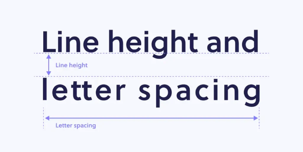
4. Kern and Space Thoughtfully
Kerning and letter spacing are two of the more subtle yet impactful elements of excellent typography. Kerning refers to adjusting the space between individual letter pairs, while letter-spacing (tracking) deals with the overall spacing between all the letters in a word or line of text.
Getting these elements right can significantly affect your typography’s overall look and feel. Too much kerning or tracking can make your text look cramped and unnatural, while too little can make it feel spaced out and disjointed.
The key is to find the perfect balance. Experiment with different kerning and tracking adjustments until your text feels cohesive and easily read. Pay close attention to letter pairs that need more or less spacing, like “To” or “Wa”.
Advanced Font Pairing: Finding the Perfect Match
Pairing fonts is like pairing wine with a meal—it’s about finding harmony or “deliberate tension.” In 2026, we have moved beyond the simple “Serif + Sans Serif” rule.
1. The “Same Family” Strategy: The easiest way to ensure success is to use a “Super-family.” Typefaces like Roboto (which has Serif, Sans, Slab, and Mono versions) let you change the style while maintaining the design’s underlying DNA.
2. Contrast in Geometry: Pair a very geometric Sans-Serif (like Futura) with a humanist Serif (like Caslon). The rigid geometry of the headline contrasts beautifully with the organic, calligraphic feel of the body text.
3. The Personality Check: If your headline font is “loud” and full of character (a Display Font), your body font should be “quiet” and invisible. Never let two “loud” fonts fight for attention.
5. Mobile Optimisation and the Rise of Variable Fonts

In 2026, mobile optimisation has evolved beyond simply “making things bigger.” The industry standard has shifted toward Variable Fonts (OpenType Font Variations).
Unlike traditional font files, where you need a separate file for “Bold,” “Italic,” and “Light,” a single Variable Font file contains the entire spectrum of weights and widths.
Why Variable Fonts Matter for Your Design:
- Performance: Loading one file instead of six reduces HTTP requests, drastically improving your site’s Core Web Vitals.
- Fluid Typography: You can use CSS
clamp()to smoothly transition font sizes and weights based on the user’s viewport, ensuring perfect legibility from a Smartwatch to a 32-inch monitor. - Animation: You can subtly animate font weight on hover or scroll, creating a dynamic, premium feel that static fonts cannot match.
Technical Tip: When implementing web fonts, always use the WOFF2 format. It offers significantly better compression than older formats, ensuring your typography doesn’t slow down the user experience.
6. Embrace Negative Space
Negative space, or the empty areas surrounding your text, is just as important as the text itself. When used strategically, negative space can enhance the overall impact of your typography.
By incorporating generous amounts of white space around your text, you create a sense of airiness and sophistication. It also helps direct the reader’s eye to the most critical information.
Don’t be afraid to let your text “breathe” a bit. Experiment with wider margins, increased line spacing, and intentional text placement on the page. This minimalist approach can work wonders for making your typography feel polished and refined.
7. Avoid Common Mistakes
A few typography faux pas are all too familiar, even among seasoned designers. Steer clear of these, and you’ll instantly elevate the quality of your work.
For starters, never use more than two or three font families in a single design. Stick to a cohesive pairing, as mentioned earlier. Also, be wary of using too many font styles (bold, italic, etc.) – this can make your design feel cluttered and unfocused.
Another big no-no is using ALL CAPS for long stretches of body text. Not only does it come across as SHOUTING, but it’s also much more complicated for readers to parse. Use all caps sparingly, like in headlines or calls to action.
And finally, make sure you’re not inadvertently creating “rivers” of white space running through your text. This happens when large gaps between words create distracting vertical channels. Adjust your kerning and tracking to fix this.
8. Explore Typographic Effects
Once you’ve mastered the fundamentals, get creative with your typography. There are all kinds of cool effects and techniques you can experiment with to make your text stand out.
For example, try overlaying text on top of an image for a striking, attention-grabbing look. Or play around with drop shadows, glows, or other layer styles to add depth and dimension. You could integrate hand-drawn elements or stylised lettering for a more artisanal vibe.
Just remember to keep these effects subtle and in service of your overall design goals. You don’t want your typography to feel gimmicky or overpowering. The key is to use these techniques judiciously to enhance, not distract from, your message.
9. Pay Attention to the Little Details
Great typography isn’t just about choosing the right fonts and arranging them nicely on the page. It’s also about sweating the small stuff – the little details that most people won’t even notice but that collectively elevate your work to the next level.
Consistent punctuation, proper use of ellipses and em dashes, and careful letter spacing all contribute to a polished, professional aesthetic. Take the time to fine-tune these elements and ensure they’re applied consistently across your design.
You should also be mindful of typographic conventions, such as using smart quotes instead of straight quotes, correctly formatting numbers and currency, and ensuring your text is aligned correctly.
These may seem minor points, but paying attention to them can significantly affect how your typography is perceived.
10. Keep Learning and Practising
The world of typography is vast and ever-evolving. No matter how skilled you become, there’s always more to learn. That’s why it’s so important to approach typography as an ongoing process of growth and discovery.
Stay curious and keep exploring new fonts, techniques, and design trends. Read articles, watch tutorials, and immerse yourself in the work of designers you admire. The more you expose yourself to great typography, your skills will improve.
And, of course, the absolute best way to level up is through consistent practice. Challenge yourself to integrate new typographic elements into your designs, experiment with different font pairings, and get feedback from others. The more reps you put in, the more intuitive and second nature it will become.
Remember, typography isn’t something you ever truly “master” – it’s a lifelong pursuit. So embrace the journey, stay hungry to learn, and don’t be afraid to take risks. Your typography will only continue to get better and better.
Designing for a Global Audience: Multilingual Type
In a globalised economy, your Typography Design must often work across multiple languages. A font that looks beautiful in English might not even support the characters needed for German (umlauts) or French (accents), or for entirely different scripts like Arabic or Hanja.
- Unicode Support: Ensure your chosen font family has a robust Unicode library.
- Vertical Expansion: Languages like Thai or Hindi require more vertical space (increased Leading) because of their complex vowel markers above and below the base characters.
- The Noto Project: If you are building a truly global brand, Google’s Noto Sans is a lifesaver; it is designed to support every script in the world with a consistent visual aesthetic.
2026 Typography Tools Comparison Table
| Tool Category | Top Recommendation | Best For… | Key Feature |
| Design / Prototyping | Figma | Interface Design | Variable font support & collaborative editing. |
| Font Management | Typeface 3 | Organising libraries | Minimalist UI with excellent tagging and previewing. |
| Type Design | Glyphs 3 | Creating custom fonts | Industry standard for professional font engineering. |
| Discovery | Fontshare | Free high-quality fonts | Operated by the Indian Type Foundry; highly curated. |
| Identification | WhatTheFont | Reverse engineering | AI-driven font recognition from screenshots. |
Wrapping Up
There you have it – my top 10 typography design tips to help you create captivating, attention-grabbing designs. From choosing the right fonts to sweating the little details, these principles will set you up for typographic success.
Of course, the best way to put these tips into practice is to start designing. And if you ever need a helping hand, the team at Inkbot Design is always here to lend our expertise.
We’d love to work with you on crafting a brand identity and marketing materials that truly wow your audience through the power of impeccable typography.
So what are you waiting for? Go forth and make some beautiful, type-centric designs! I can’t wait to see what you create.
FAQs
What is the best font size for body text in 2026?
For desktop, the standard has moved toward 18px to 20px to accommodate higher-resolution displays. For mobile, 16px remains the minimum, but you should adjust Line Height to at least 1.6 for better touch-target legibility.
How do I choose between a Serif and a Sans-Serif font for a logo?
Consider your brand’s core value. If you represent “Stability and Heritage,” a Serif is usually superior. If you represent “Innovation and Speed,” a Sans-Serif is the modern choice.
What are ‘Rivers of White’ and how do I fix them?
Rivers are distracting gaps that align vertically through multiple lines of text, often caused by “Justified” alignment. Fix them by using “Flush Left” (Ragged Right) alignment or adjusting your Tracking.
Should I use ‘All Caps’ for my headlines?
All caps are excellent for short, punchy headlines (3-5 words) as they create a strong rectangular block. However, they significantly reduce reading speed for longer sentences because the “shape” of the words is lost.
What is the difference between a Typeface and a Font?
A Typeface is the creative design (e.g., Helvetica), while a Font is the specific file or format you use (e.g., Helvetica Bold 12pt WOFF2). Think of a typeface as the “album” and a font as the “MP3 file.”
Are free Google Fonts professional enough for luxury brands?
Absolutely. Many Google Fonts, such as Montserrat or Playfair Display, are designed by top-tier foundries. The key is in how you apply Kerning and Negative Space, not just the price tag of the file.
How do I make my typography look good in Dark Mode?
Text can appear “thicker” on dark backgrounds. Consider reducing the font weight by one step (e.g., move from Medium to Regular) when switching to Dark Mode to maintain the same visual clarity.
What is fluid typography?
Fluid typography uses CSS functions, like clamp(), to scale font sizes dynamically between a defined minimum and maximum, rather than rigid “breakpoints.” This ensures the type looks perfect on every screen size.
How many fonts are too many for one website?
A general rule is to stick to two font families. Using three or more often leads to visual clutter and increased page load times, which can negatively impact user experience.
Does typography affect SEO?
While the “style” of a font isn’t a direct ranking factor, typography impacts User Engagement Metrics like dwell time and bounce rate. A clear, accessible typeface keeps users on the page longer, which signals quality to search engines.