Keeping it Simple: The Art of Minimalistic Websites
Something is refreshing about a minimalistic website's clean look and feel. As more sites compete for our attention with crowded layouts and flashy graphics, minimalism almost seems rebellious in its restraint.
However, less can often be more when it comes to web design.
From world-famous companies like Apple to humble personal blogs, minimalistic websites help websites connect with users in simple yet powerful ways.
- Minimalistic websites enhance user engagement by reducing cognitive load and focusing on core content.
- Key characteristics include limited colour palettes, clean layouts, and a focus on usability across devices.
- Effective minimalist design combines aesthetics with functionality, fostering memorable user experiences.
What Defines Minimalistic Websites?
When we talk about minimalistic websites, what exactly do we mean? For starters, some key elements that characterise the minimalist approach:
- Limited colour palette – Typically three colours or less, often more neutral like black, white and grey
- Clean layout – Heavy use of negative space, no clutter, clear visual hierarchy
- Primary navigation – Sparse menus and links, just the essentials
- Focus on content – Text and images take centre stage over gratuitous graphics/animations
- Sans-serif typography – Open, neutral font styles like Arial or Helvetica
- Mobile-friendly – Adapts seamlessly to smaller screens
Of course, variations exist, but sites with those sparse, functional qualities tend to fit the minimalist mould. They convey content directly through pared-down aesthetics.
The Philosophy Behind Minimalist Design

Minimalism extends far beyond the web-based world, influencing visual arts, music, literature, architecture and more. But when it comes to websites, why is this idea of “minimalism” so appealing to designers and users alike?
“Perfection is achieved not when there is nothing more to add, but when nothing is left to take away.”
~ Antoine de Saint-Exupéry
That quote eloquently sums up the “less is more” philosophy behind minimalism. Rather than overload sites with elements aiming to catch the user’s eye, minimalism favours a Spartan approach that eliminates any distractions from core content and functionality.
Applied to web design, the fundamental principles of minimalism include:
- Directness
- Clarity
- Focus
- Purposefulness
- Elegance
Sites built on those principles aim to create seamless user experiences. Viewers can quickly comprehend layouts, navigate sites intuitively, and digest information quickly.
Enhancing User Engagement through Minimalist Web Design
Minimalist web design significantly enhances user engagement by reducing cognitive load. Users report feeling less overwhelmed and more focused on content due to the streamlined visuals.
Sites with simple designs tend to increase time spent on pages and decrease bounce rates, reinforcing their effectiveness. By focusing on core content, minimalism encourages users to interact meaningfully, resulting in higher engagement levels.
Research reveals that users appreciate the ease of navigation, which guides them intuitively through the site. Minimalist designs support interactive elements that foster better user experiences without overwhelming them.
Features such as hover effects and subtle animations add a fresh yet unobtrusive element to pages.
These design choices help guide users naturally through content, improving engagement and satisfaction.
The Practical Benefits of Minimalist Websites
Beyond the philosophical appeal, minimalist web design also brings some practical upsides:
Speed
- Minimalist sites require less memory and render faster with simpler code and fewer images/animations. Important in our impatient digital age!
Responsiveness
- The pared-down designs quickly adapt for optimal mobile experiences across devices.
Accessibility
- The clean layouts and basic typography aid viewers with disabilities in accessing content.
Scannability
- Allows readers to scan and extract essential information quickly.
Personalisation
- Minimalist templates let content take the spotlight rather than flashy graphics competing for attention. Brands can better highlight their distinct voice.
Cost Savings
- Developing sites with simple interfaces and limited visual assets is cheaper and less labour-intensive.
In many respects, minimalism seems ideal for crafting sites in the modern web landscape. But how did this trend towards sparse, uncluttered interfaces evolve in web design?
Accessibility and Inclusivity in Minimalist Design
Minimalism aligns with accessibility by creating clean layouts that aid users with disabilities. High contrast text and simple navigation structures improve readability and ease of access. Sites can be navigated via keyboard inputs, supporting users with mobility challenges.
Screen reader compatibility is enhanced through simplified designs. Ensuring inclusivity extends the reach of sites, as accessible features cater to a broader audience with varied needs.
A Brief History of Minimalism in Web Design
“Everything should be made as simple as possible, but not simpler.”
~ Albert Einstein
While that famous Einstein quote may as well apply directly to minimalism, the aesthetic has roots extending back centuries in areas like Japanese traditional design, modernist architecture, and Scandinavian furniture. How and when did this influence finally permeate the web?
Mid ‘90s Emergence
- As internet adoption spread to the mainstream public in the 1990s, early sites focused chiefly on function over form with simple layouts and blocks of text. Limited bandwidth and developments in CSS positioned minimalist styling to thrive online.
Apple Leads the Way
- With their trademark minimalist visual identity, Apple created sites like the 1998 apple.com to redefine best practices in clean, sophisticated web design. Their influence still shapes many sites today.
The Impact of Minimalism on E-commerce Websites
Minimalist design has positively impacted e-commerce by simplifying the purchasing process. Sites like Amazon and Zara employ clean, intuitive interfaces that guide customers from product discovery to checkout with ease.
These designs reduce distractions, focusing solely on products and purchasing actions. A minimalist approach allows faster loading times and easier navigation, which is essential for retaining customer interest.
The straightforward design ensures that users can locate products and make purchases without unnecessary hurdles.
Post-Web 2.0 Resurgence
- After sites progressed past the Web 1.0 basics, Web 2.0 brought back clutter with widgets, ads, video, animation, pop-ups and more vying for attention. Minimalism made a resurgence as an antidote to increasingly noisy sites.
The Mobile Imperative
- Adapting web experiences for smaller mobile screens compelled designers to refine layouts to the most essential for their audience. The principles of minimalism proved perfect for the task.
Maturing of Best Practices
- With two decades of experiments behind them, developers better understand how to implement minimalism following its core principles rather than just making sites plain and empty.
So, minimalism is vital in modern web design frameworks while evolving in new directions. When strategically applied rather than just removing elements arbitrarily, the minimalist treatment helps brands creatively differentiate themselves while better resonating with users through the noise.
Creating Hierarchy Through Minimalist Design

Beyond having fewer site elements overall, minimalism employs visual hierarchy to focus attention efficiently. But how specifically can designers establish effective orders while limiting components? Some essential methods include:
Strategic Use of Colour
- Sparingly applying bright colours, like highlighting CTAS, makes them stand out.
- Otherwise, neutral palettes direct eyes to those flourishes
Typographic Contrast
- Varying fonts, scales, and weights keep specific text in themes more prominent.
- For body content, uniformity aids scannability
Negative Space
- Whitespace helps carve out specific regions on the page for distinction
- Padding strengthens the grouping of related content
Visual Weight
- Bolder shapes and more prominent elements signal the importance
- More delicate icons/graphics fade appropriately into the background
With a few concise visual cues, viewers intuitively learn where the page would guide their attention in alignment with site goals.
Role of Typography in Minimalism
Typography plays an integral role in minimalist design by guiding user focus. Choosing the right typeface, size, and weight helps establish hierarchy and readability. Fonts like Helvetica or Arial, with clean lines, are favoured for their simplicity and clarity.
The strategic use of typographic contrast draws attention to key messages and distinctions. Consistency in typography contributes to the overall aesthetic, enhancing visual appeal without adding clutter.
Additionally, typography serves as an important tool for expressing brand identity within minimalist frameworks. By carefully selecting and pairing fonts, designers can evoke specific emotions and values, resonating with the target audience.
The subtle use of typography ensures that the site's style remains consistent, further reinforcing the brand's message.
Case Study 1: The Apple Website

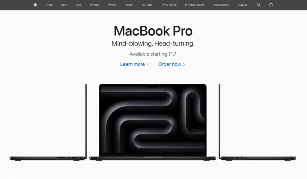
As one of the most influential pioneers of minimalism in digital interfaces, Apple offers a prime case study for the techniques in action. We’ll analyse critical elements that make their site so effective:
Strictly Limited Colour Palette
- Mainly black and white with just a splash of colour for branding and CTAS
- Reflects their sleek product aesthetic extended online
Content-Focused
- Products are foregrounded while global navigation recedes in the background.
- Typography and imagery shine
Mobile-First Philosophy
- Design philosophies optimised for mobile products translate directly to the site.
- Streamlined effectively across device sizes
Video Integration
- Short videos replace many static images for elegant site accents
- Captures the lifestyle context of products
The result is a site where the style and substance stay true to the Apple brand. It effectively balances aesthetics and utility while exemplifying digital minimalism executed skillfully.
Case Study 2: Smashing Magazine

Smashing Magazine serves the web design community with articles, eBooks, events, and print. As developers themselves, their site design sets standards for balancing visual appeal and quick performance.
Typography Driven
- Font choice, scale and colour define a hierarchy
- Only accented by subtle icons
Animation Flourishes
- Animations add flair without distraction
- Enhance interactions like menu transitions
Colourway Variations
- Change primary colour schemes across sections
- Creates distinction without complicating
Progressive Enhancements
- Core content downloads fast without JavaScript frills
- Then, it enhances dynamically after the page load
Smashing Magazine demonstrates how minimalism leaves room to brand content sections uniquely while not undermining the continuity site-wide. The multi-pronged approach makes the experience enjoyable while allowing customisation opportunities.
When Minimalism Falls Short
For all its conceptual appeal, minimalist web design fails badly without proper strategy and planning. Unfortunately, many sites seem to adopt it as the latest trend rather than for clear objectives. What drawbacks commonly plague subpar minimalist implementations?
- Bland visuals – Just being plain without aesthetic sensibilities
- Choppy workflows – Forcing users through too many pages
- Insufficient detail – Key site content feels incomplete
- Unclear navigation – Over-simplified menus don’t provide enough path guidance
- Inaccessible functionality – Hidden interfaces confuse more than help
- Slow performance trade-offs – Light sites still need optimisation for speed
Style takes priority over properly serving the site's audience and goals. So, what distinguishes bad minimalism from exemplary implementations?
Common Mistakes in Minimalist Web Design
Some common mistakes in minimalist web design include oversimplifying navigation, which may confuse users.
Mobile optimisation is often overlooked, despite the widespread use of mobile devices. Inadequate contrast between text and background can lead to poor readability, adversely affecting user experience.
Designers often misjudge the balance between aesthetic simplicity and functionality. The lack of feedback for user interactions can lead to frustration, undercutting the site's purpose.
Key Takeaways for Creating Effective Minimalist Sites

The many excellent practitioners of minimalism prove less can mean more in website design. However, avoiding common downfalls depends on focusing on purpose and vision. Here are the core guiding principles to inform minimalist website builds:
- Know your audience intimately first
- Align site goals to user goals and brand vision
- Determine exactly what site elements are essential or excessive
- Use visual reduction to eliminate distractions from essentials
- Treat minimalism as a cohesive design language across properties
- Test usability continuously and solicit user feedback
- Remember, website design is always iterative; the build evolves over time
With the perfect balance of aesthetic appeal and utility matched directly to audience needs, minimalist sites employ simplicity powerfully. This clarity of vision ultimately drives meaningful engagement well beyond the technology.
The Future of Minimalist Web Design
Looking ahead, how might minimalism expand its influence on digital experiences? Consider these intriguing frontiers:
- More online brands are unifying mobile and web presences through minimalist principles
- Sophisticated combinations with other cutting-edge site capabilities like animation, VR and voice
- A broader minimalist palette encompassing more diversity of layouts, colourways and typographies
- Gradual emergence is a typical pattern across apps and even wearable interfaces
- Mainstream appreciation for accessibility and performance is built into minimalism
Given the user's appetite for streamlined, purposeful online interactions, minimalism’s star shines bright on the horizon.
With sound strategy more critical than ever, brands are incentivised to perfect minimalist techniques while putting their vision front and centre. Audiences worldwide eagerly await the next wave of innovations in simplistic yet satisfying web experiences.
Conclusion
In closing, the proof resides in millions of pixels—minimalism executed skillfully, has tremendous power across the modern web.
Stripping away superfluous elements so core content shines through often creates the most memorable and meaningful user experiences.
Of course, aesthetics alone cannot sustain sites long-term; their usefulness and accessibility matter more than ever.
But the sites that strike that delicate balance of form and function lasting into the future will likely take many cues from minimalist values, for digital simplicity is elegant when purpose stands at the centre.
Frequently Asked Questions
What are some other examples of effective minimalist websites?
Some other excellent minimalist sites include Medium, GitHub, Basecamp, Dropbox, and Stripe. They utilise limited colour schemes, ample negative space, mobile-adaptive layouts, strategic typographic contrast, and balanced simplicity with functionality.
How can I make my current website more minimalist?
Some easy ways to make an existing website more minimalist include eliminating visual clutter like excessive text, graphics, ads or icons, reducing your colour scheme to 3 colours or less, simplifying navigation elements to only essential pages, and optimising your content layouts to be single-column for white space.
What typical industries embrace minimalism most in web design?
Digital product companies most commonly adopt minimalist website aesthetics, given Apple’s strong influence on the sector. However, versatile minimalist principles also effectively support apps and sites for fashion, online publishing, architecture, interior design, lifestyle brands, photography, and modern art galleries.
What should I focus on if minimalism is new to me?
If minimalist design feels unfamiliar, concentrate most on understanding your target users and their critical tasks on your site first. Then, determine what content and functionality prove essential to support those goals. Build your simplified aesthetic and navigation emerging directly from what users need, not just arbitrarily removing elements. Test and refine based on feedback.
Is minimalism just a trend or here to stay in web design?
While certain flavours of minimalist sites will fall in and out of vogue, its core principles have already profoundly impacted web design standards over the past 20+ years. With roots extending back through many artistic and architectural movements, minimalism may be labelled a trend but shows no signs of vanishing as audiences continue expecting focus over excessive stimulation online. The most adaptable and purpose-driven minimalist sites will likely enjoy remarkable longevity.


