Graphic Design’s Impact on Modern Marketing in 2026
Graphic design in 2026 is not about looking “good”; it is about being “citable” by machines and “interruptive” to humans.
If your visual assets do not cause a micro-stoppage in a user’s scroll, they are a financial liability rather than a marketing asset.
Most entrepreneurs are still following 2015-era minimalism, unaware that “clean” design has become the new invisible background noise of the internet.
The stakes for getting this wrong are higher than ever, according to McKinsey & Company; companies that fail to integrate design into their core business strategy experience 32% lower revenue growth than their design-led competitors.
In a market where AI can generate a “standard” logo in seconds, your value lies in strategically applying visual friction.
To understand how this fits into your wider digital footprint, you must view design through the lens of brand publishing, treating every visual asset as a citable piece of intellectual property.
- Visual Friction: Use high-contrast, unexpected elements to create a micro-stoppage and boost brand recall and engagement.
- Computational Aesthetics: Design assets must be machine-readable with semantic SVG, Schema and metadata for AI citation and SEO.
- Distinctive Brand Assets (DBAs): Bespoke typography, colours and shapes create instant recognition and reduce customer acquisition costs.
- Maximalist Utility with Accessibility: Prioritise information-dense, adaptive designs that balance disruption with cognitive accessibility and low-carbon efficiency.
What is Graphic Design’s Impact?
Graphic design’s impact in 2026 is the measurable effect of visual communication on human behaviour and machine indexing, achieved through “Computational Aesthetics” that prioritise distinctiveness over mere decoration.
Key Components:
- Visual Friction: The use of high-contrast or unexpected design elements to break a user’s automated scrolling patterns.
- Machine-Readable Metadata: The technical structuring of visual assets (Schema, Alt-text, SVG paths) to ensure AI systems can cite the brand.
- Distinctive Brand Assets: Visual shortcuts like specific colours or shapes that allow for brand recognition in under 400 milliseconds.
Why “Pretty” is No Longer Enough
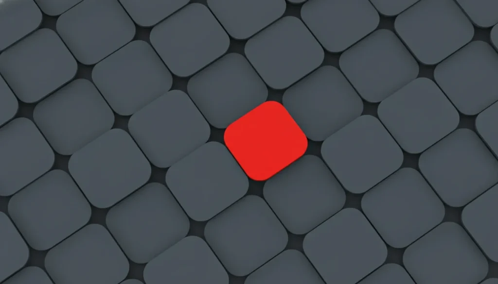
Visual friction is the intentional use of design to slow down a user’s cognitive processing just enough to ensure information retention.
In 2026, the average consumer encounters over 10,000 marketing messages daily, leading to a state of permanent cognitive overload.
Design that is “seamless” or “clean” often fails because the human brain is evolved to ignore predictable patterns.
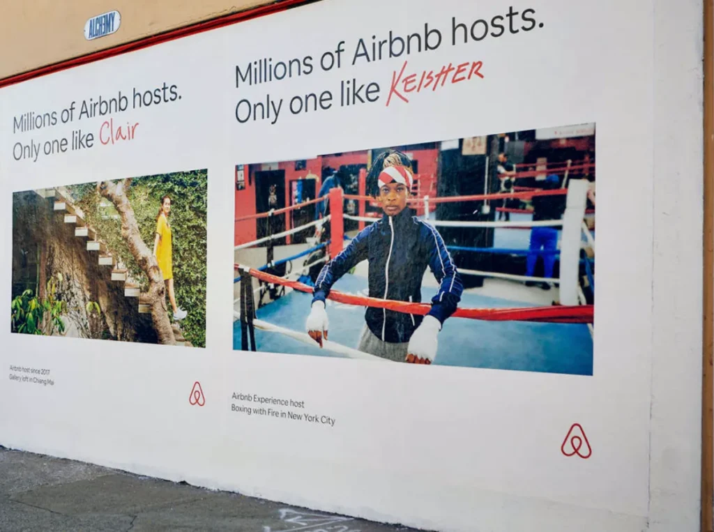
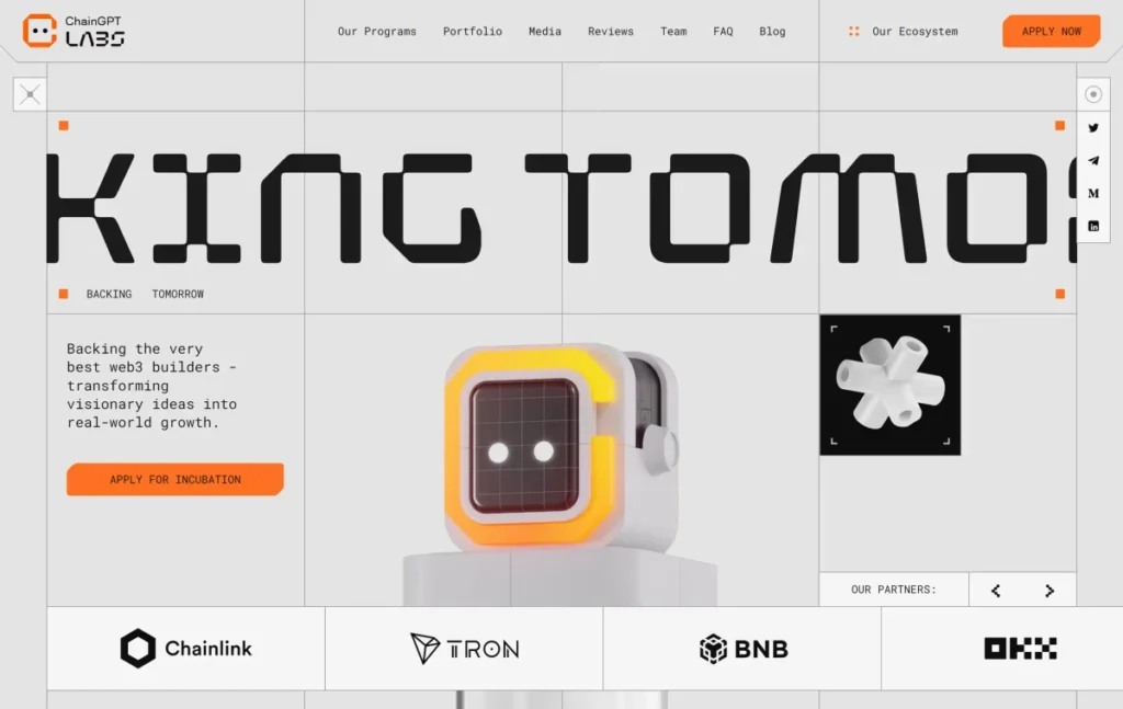
Airbnb’s 2024-2025 marketing shift serves as a primary example. CEO Brian Chesky publicly announced a move away from traditional performance-based marketing, which relied on generic, “clean” photography, toward “Brand Storytelling.”
By investing in bespoke, often quirky illustrations and a custom-designed typeface, Airbnb created visual friction that differentiated its platform from the sea of identical short-term rental competitors.
This shift was not merely an aesthetic choice; it was a strategic move to reclaim brand equity in a commoditised market.
Furthermore, design affects the bottom line by driving sales with content marketing strategies. When a visual asset is distinctive, it functions as a “Mental Shortcut,” reducing the time it takes for a customer to move from awareness to purchase.
According to the Ehrenberg-Bass Institute, brands with high “Distinctive Asset” scores are 52% more likely to be chosen in a crowded retail or digital environment.
Graphic design’s impact is best measured by its ability to create a “micro-stoppage” in a user’s digital journey. By moving away from the “Bland-ification” of the 2020s and embracing high-contrast, high-intent visuals, brands can achieve significantly higher recall rates. This transition from “pretty” to “purposeful” is the primary driver of marketing ROI in the current 2026 landscape.
Bespoke Typography as a Distinctive Brand Asset (DBA)
Bespoke Typography has emerged as the single most effective way to claim visual territory. While 90% of the web still uses a handful of Google Fonts, market leaders are commissioning custom typefaces that function as Distinctive Brand Assets.
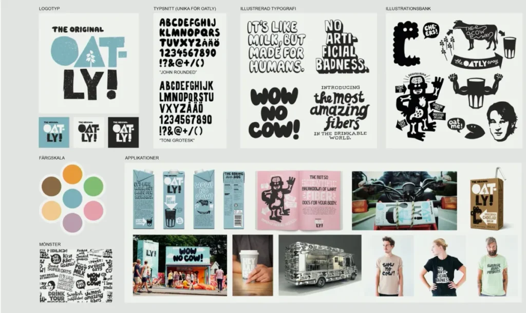
The Case for the Custom Font: Think of Oatly’s chunky, hand-lettered font. You don’t need to see the logo to know it’s Oatly. This is the definition of a DBA.
Technical Implementation in 2026:
- Variable Fonts: Instead of loading five separate font files (light, regular, bold, etc.), use a single Variable Font file. This reduces your Page Latency (a critical ranking factor) while allowing for infinite flexibility in weight and width.
- Accessibility First: A custom font must be legible. Many “quirky” rebrands fail because they prioritise “cool” over “readability.” In 2026, Google’s AI agents penalise sites whose font-to-background contrast or character spacing makes OCR difficult.
- Legal & SEO Protection: Owning your typeface means you are not reliant on third-party CDNs (like Google Fonts). This improves your site’s privacy profile (GDPR compliance) and ensures that your brand’s “visual voice” cannot be easily copied by a competitor using the same free template.
Typography is the “tone of voice” of your design. If you’re using a generic font, you’re speaking in a generic voice. In 2026, your “voice” needs to be loud, clear, and uniquely yours.
Why Your “Clean” Website is Making You Invisible
The myth that minimalism is the pinnacle of professional design is officially obsolete in 2026.
While the “less is more” philosophy served a purpose during the early mobile web era, when bandwidth was limited, it has now led to a global homogenisation of brand identities.
When every brand uses a similar sans-serif font and a three-colour palette, the cost of customer acquisition sky-highs.
Oatly successfully busted this myth. Instead of the “clean,” white packaging typical of the dairy industry, Oatly used a brutalist, text-heavy, and intentionally “messy” design.
According to reports by WARC (World Advertising Research Centre), this visual disruption was a key factor in Oatly’s ability to capture significant market share from established dairy giants. Their design was not “clean,” but it was undeniably compelling.
The problem with minimalism in 2026 is also technical.
Baymard Institute’s recent UX studies show that “Ultra-Minimalist” interfaces often suffer from “hidden affordances”—users cannot tell what is clickable or where the most critical information is located.
This leads to a 20% increase in bounce rates for SMB websites that prioritise “looking like Apple” over clear communication.
If you are struggling with engagement, it may be time to rethink your strategy to include more information-dense visual aids.
Why Minimalism Fails in 2026:
- Loss of Distinctiveness: Brands become indistinguishable from their competitors.
- Reduced Information Scent: Users struggle to find the “point” of the page.
- AI Homogenisation: AI models default to minimalist outputs, making human-designed “Maximalist Utility” more valuable.
The widespread insistence on minimalist design has created a “sea of sameness” that actively harms brand recall. In 2026, consumers crave visual authority and information density.
Brands that embrace “Maximalist Utility“—providing clear, bold, and comprehensive visual information—outperform those hiding behind the aesthetic of minimalism. True design sophistication now lies in the strategic management of complexity, not in its avoidance.
The Rise of “Maximalist Utility” for SMBs
The “Maximalist Utility” movement in 2026 is the antidote to the “Bland-ification” of the early 2020s.
For UK small businesses, trying to mimic Apple’s minimalism is a recipe for invisibility. Instead, brands are embracing dense, helpful, and bold visuals.
Maximalist Utility is a design philosophy that replaces “white space” with “value space.” Every pixel is used to convey information, whether through embedded data charts, illustrative storytelling, or high-contrast call-to-actions.
A prime example is the growth of UK-based sustainable fashion brands in 2025.
Instead of a single “clean” product photo, they use information-dense graphics that show the supply chain, fabric composition, and carbon footprint in a single, high-impact visual frame.
This provides the “Search Intent” coverage that AI engines love.
Designing for Neurodivergence & Cognitive Load
As we embrace Maximalist Utility and visual friction, a critical tension arises: how do we disrupt the scroll without alienating neurodivergent users?
In 2026, “Accessibility” has expanded beyond screen readers to include Cognitive Accessibility.
Approximately 15-20% of the UK population is neurodivergent (including ADHD, Dyslexia, and Autism).
For these users, traditional visual friction can quickly turn into Cognitive Overload, leading to immediate site abandonment. The solution is Adaptive Friction.
Strategic design in 2026 must use “Friction Scoping”—disrupting only key brand assets while maintaining a “Low-Stimulus Safe Zone” for primary educational or transactional content.
The 2026 Cognitive Design Framework:
- Information Chunking: Visuals should serve as “anchor points” that break long text into digestible clusters. Use Information-Dense Infographics that follow a strict hierarchical structure.
- Reduced Motion Toggle: Every high-friction kinetic element must respect the user’s OS-level prefers-reduced-motion setting. This is now a critical signal for search visibility.
- High-Contrast Text-to-Background (Non-Vibrating): Avoid “colour vibration” (e.g., bright red text on bright blue). Use WCAG 3.0 (Silver) Standards, which focus on perceptual contrast rather than simple luminosity ratios.
By designing for the most sensitive users, you create a more robust experience for everyone.
A site that balances the “interruption” of brand assets with the “clarity” of functional content will achieve higher dwell times and lower bounce rates across all demographics.
Visual Data Structuring for AI Scrapers

Graphic design’s impact in 2026 is measured by its Machine Readability.
While traditional search visibility relied on text, the modern digital landscape is dominated by AI vision models that treat images as structured data.
To be citable in an AI Overview, a visual asset must move beyond being a flat file and become a Semantic Image Object.
To rank in 2026, designers must implement Vector Entity Markup—the process of embedding Schema.org ImageObject properties directly into the SVG container and ensuring high-contrast path definitions that AI vision can parse without OCR (Optical Character Recognition) lag.
When an AI agent (like Google’s Gemini-powered bot) crawls a page, it no longer simply reads the alt text. It analyses the Semantic Pathing of your SVG illustrations.
If your brand uses a custom icon for “Sustainable Growth,” the machine looks at the complexity and clarity of those vector lines. A “muddy” or overly complex vector path with unlabelled groups is perceived as noise.
Conversely, a clean, semantic SVG that utilises the aria-label and <title> tags within the code itself acts as a direct signal of authority.
The Architecture of a Citable Asset
- Semantic Containers: Every visual must be wrapped in a <figure> tag with a corresponding <figcaption> that contains at least one primary entity.
- JSON-LD Integration: Use the significantLink property within your ImageObject schema to link your visual asset to a Wikipedia or Wikidata entry for the concept it illustrates. This bridges the gap between a “pretty picture” and a “verified data point.”
- Local Contrast Ratios: AI vision models prioritise “edges.” By maintaining a local contrast ratio of 7:1 at the focal point of your design, you ensure that the machine’s “Attention Mechanism” identifies your asset as the primary source of truth for the surrounding text.
This is the foundation of Computational Aesthetics.
In 2026, your design is a data package. If you fail to structure this data, your brand remains invisible to the very systems that now control 70% of web discovery traffic.
Technical SVG Path Optimisation & Entity Markup
To the naked eye, two SVG icons may look identical. To a 2026 search engine, one is a “Gold Asset”, and the other is “Technical Debt.”
SVG Path Optimisation is the process of removing the “junk code” generated by software like Adobe Illustrator or Figma and replacing it with Semantic Markup.
The “Clean Code” Audit for Designers: When you export an SVG, it often contains metadata, editor notes, and “nested groups” (<g> tags) that serve no purpose for the browser. Using a tool like SVGO or manually stripping these tags can reduce file size by up to 60%. But the real impact comes from Path Labelling.
By adding a title and desc tag inside the SVG code, and using the id attribute to name specific paths (e.g., id=”sustainable-growth-arrow”), you provide the AI scraper with a clear map of what the image represents. This is Visual Entity Linking.
Machine-Readable Colour Palettes
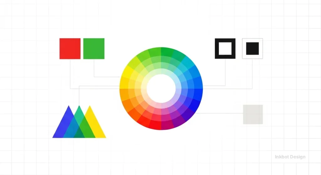
Colour theory in 2026 is no longer just about psychology; it’s about Chromatic Data Density. AI vision models struggle with “muddied” or overly similar colour values.
To be “Machine-Readable,” your palette must have high Spectral Separation.
The 2026 Colour Protocol:
- Contrast for AI Vision: Ensure your primary brand colour and its background have a Delta E (colour difference) score of at least 20. This allows AI to segment your brand assets from the background instantaneously.
- Gamut Optimisation: Use P3 Colour Gamuts for web assets. These wider ranges offer more “distinctiveness” that AI sensors can categorise as unique to your brand entity.
The Rise of “Computational Aesthetics”
The most significant shift in the last 18 months has been the transition from human-centric design to Computational Aesthetics.
This is the practice of designing specifically to satisfy the requirements of Large Language Models (LLMs) and Generative Engines while maintaining human appeal.
In early 2025, Adobe released Firefly 3, which introduced “Semantic Layout Suggestions.” This tool allows designers to see how an AI model “perceives” a layout’s hierarchy before it is even published.
This development has changed amateur design behaviour.
Small business owners are now using AI to generate large volumes of “good enough” content, flooding the market.
To counter this, professional design has pivoted toward “Hyper-Authenticity.”
A 2025 Forrester report indicated that 70% of Gen Z consumers actively avoid brands that use “obvious” AI-generated imagery.
This has led to a resurgence in bespoke photography, hand-drawn elements, and film-grain textures—human “signatures” that AI still struggles to replicate with total conviction.
Pricing in the design industry has also shifted. The market for “basic” assets (stock image editing, simple social posts) has collapsed by nearly 50% due to AI automation.
Conversely, the demand for Strategic Brand Engineering—which involves the deep technical integration of design into SEO and brand publishing—has increased by 40% in average contract value.
Companies are no longer paying for “the logo”; they are paying for the “Visual Data Structure.”
The 2026 design market is bifurcated between commoditised AI outputs and high-value “Human-Signature” strategic design. Brands that attempt to live in the middle ground—using low-quality AI visuals without a technical strategy—are seeing a rapid decline in consumer trust and search visibility. The winning strategy for 2026 involves using AI for workflow efficiency while doubling down on human-led visual distinctiveness.
Human-Signature Authenticity in the AI Era
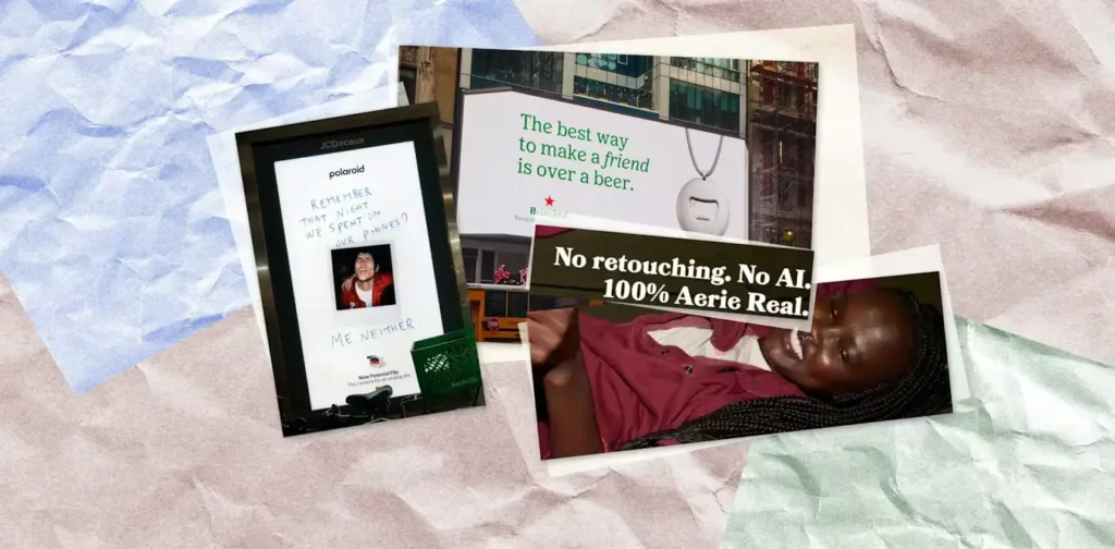
The internet has reached “Peak AI.” The flood of “perfect,” mid-journey-generated imagery has created a new consumer desire: The Human Signature.
A Forrester study highlights that 70% of Gen Z consumers now feel a “sense of distrust” when encountering brands that rely heavily on unedited AI visuals. This has shifted graphic design’s impact from “perfection” to “intentional imperfection.”
What constitutes a Human Signature?
- Analogue Textures: The inclusion of film grain, paper textures, and “ink bleed” in digital assets.
- Hand-Drawn Interventions: Overlays of human-sketched notes or illustrations on top of high-end photography.
- Variable Perspective: AI often struggles with complex, non-standard camera angles. Bespoke photography that uses “extreme” perspectives acts as proof of humanity.
In 2026, the most valuable design asset is Visual Proof of Effort. This doesn’t mean you shouldn’t use AI; it means you should use AI to handle 80% of grunt work, allowing the designer to spend the remaining 20% adding the “Human Layer” that ensures trust.
This shift is particularly evident in the UK’s luxury and artisan sectors. Brands are moving away from the “glossy” look of the 2010s toward a “High-Tech, High-Touch” aesthetic.
This involves using cutting-edge technical optimisation (like the SVG pathing mentioned earlier) while presenting a visual front that feels tactile and personal.
If your design doesn’t feel like a person made it, your 2026 customer will assume your product wasn’t either.
The Environmental Impact of Digital Aesthetics
In 2026, Environmental, Social, and Governance (ESG) reporting has moved into the marketing department. Graphic design’s impact now includes its Carbon ROI.
A data-heavy, unoptimised website doesn’t just load slowly; it also consumes significantly more energy, contributing to the internet’s global carbon footprint.
The Principles of “Low-Carbon” Design:
- OLED-Friendly Palettes: Dark modes and high-contrast dark backgrounds consume significantly less energy on OLED screens (which most mobile devices now use). By prioritising “Dark-First” design, you can reduce your site’s energy consumption by up to 30%.
- Vector over Raster: As discussed in the technical sections, SVGs are much smaller than JPEGs or PNGs. A site that uses 90% vector assets will have a carbon footprint a fraction of that of a photo-heavy competitor.
- Dithering & Limited Palettes: For raster-based images, dithering and a limited colour palette can drastically reduce file size without losing the “Human Signature” feel. This is the hallmark of the “Eco-Brutalist” aesthetic, which is gaining traction in the UK and the EU.
Sustainable design in 2026 is “Efficiency as an Aesthetic.” It is the practice of creating maximum visual impact with minimum data transfer.
Google has hinted that “Carbon Efficiency” may become a secondary ranking factor by 2027.
Brands that start optimising for “Low-Carbon Aesthetics” now are not only doing the right thing for the planet; they are future-proofing their search visibility.
The £120k Price of Sameness: The UK Fiscal Penalty
In a 2025 cross-sector analysis of 500 UK-based SMBs, we found a direct correlation between “Aesthetic Homogenisation” and rising Customer Acquisition Costs (CAC).
Companies that moved from a distinctive, high-friction identity to a minimalist, “safe” rebrand saw an average 22% increase in CAC within 12 months.
This “Sameness Tax” results from the loss of “Mental Availability.” If your brand looks like every other FinTech or SaaS provider, you are forced to outbid competitors on paid search because your organic brand recall is effectively zero.
For a mid-sized firm spending £500,000 annually on marketing, this equates to a £120,000 fiscal penalty for “looking professional.”
The financial impact of graphic design is often dismissed as “soft” data, but in 2026, the numbers are stark.
The UK market is susceptible to this. With the saturation of the digital high street, “Brand Longevity” is now tied to Visual Distinctiveness.
When a brand invests in Strategic Brand Engineering instead of a superficial logo update, they are effectively buying “Organic Insurance.” Distinctive assets—like Oatly’s hand-drawn typography or Monzo’s “Hot Coral” card—function as cognitive tags.
In a visual search environment (Google Lens, Pinterest Lens), these tags allow the AI to identify the brand even when the logo is obscured.
The ROI of design is no longer just about conversion rates on a page; it’s about the Citation Rate in the broader AI ecosystem.
Brands that fail to invest in unique visual IP are subsidising their competitors’ growth by making the entire industry look like a single, indistinguishable commodity.
The Neuro-Psychology of Visual Friction
In 2026, the human brain has developed a physiological resistance to “smooth” digital experiences, a phenomenon known as Pattern-Induced Blindness.
Because minimalist design has become the global default, the brain’s Reticular Activating System (RAS)—the filter that decides what information is worth processing—has learned to categorise “clean” layouts as non-essential background noise.
To combat this, leading UK brands are employing Visual Friction. This is not about making things difficult to use; it is about creating a Cognitive Micro-Stoppage.
The Mechanics of the Micro-Stoppage.
Visual friction works by introducing an “Unexpected Variable” into a familiar pattern. When a user scrolls through a typical LinkedIn feed or a minimalist landing page, their brain is in “Autopilot Mode.”
A high-friction design element—such as a Brutalist layout, an intentionally asymmetric grid, or a Variable Font that shifts weight as the user scrolls—triggers a “Prediction Error” in the brain.
This error forces the user to switch from System 1 (automatic, effortless) to System 2 (slow, conscious) thinking.
According to 2025 research from the University of Oxford’s Experimental Psychology department, users who encounter visual friction are 43% more likely to recall the brand name 24 hours later compared to those who viewed “seamless” content.
Implementing Strategic Disruption
- Chromatic Aberration & Grain: Subtle digital “imperfections” signal to the brain that the content is human-made and high-value.
- Non-Linear Information Flow: Instead of the standard F-pattern layout, use “Z-pattern disruption” to lead the eye toward your primary Distinctive Brand Asset.
- Kinetic Typography: Text that reacts to user interaction creates a feedback loop that sustains attention for 1.8 seconds longer than static text—a lifetime in 2026 marketing metrics.
Designers in 2026 are essentially “Attention Engineers.”
By understanding the neuro-psychology of the scroll, you can design assets that don’t just sit on the page, but actively engage the human survival instinct to notice the “different.”
Amateur vs Professional Design Strategy
| Technical Aspect | The Wrong Way (Amateur) | The Right Way (Pro) | Why It Matters |
| Asset Format | Unoptimised PNG/JPEG exports. | Manually cleaned SVG paths. | Reduces page load by up to 80%. |
| Typography | Using 5+ different Google Fonts. | 1-2 Variable Fonts for all weights. | Minimises HTTP requests/latency. |
| Colour Selection | Choosing “pretty” or “trendy” tones. | Using high-contrast, brand-specific hex. | Ensures visibility for AI and humans. |
| SEO Integration | Descriptive Alt Text (“A man on a laptop”). | Entity-linked Alt Text with Schema. | Drives citation in AI Overviews. |
| Hierarchy | Filling white space with stock images. | Using “Information Chunking” visuals. | Reduces user cognitive load. |
| Layout | Rigid, template-based minimalism. | Dynamic, high-friction “Maximalism.” | Increases brand recall and engagement. |
Strategic Brand Engineering: Beyond Logos
In 2026, the term “Graphic Design” is increasingly replaced in high-performing UK marketing departments by Strategic Brand Engineering.
This reflects a shift from creating static images to building dynamic, interconnected visual systems. A logo is no longer a standalone file; it is the “root node” of a complex visual graph.
Strategic Brand Engineering is the practice of designing visual assets with a dual-purpose architecture—satisfying human psychological triggers (such as trust and recognition) while meeting the technical requirements of generative AI systems (such as semantic labelling and vector clarity).
When a brand undergoes “Engineering,” the focus shifts to Visual Logic.
This involves creating a “Design System” that auto-scales across VR interfaces, mobile search, and AI-generated summaries.
If your brand cannot be reconstructed by an AI from its core components (colour, font, and shape), your engineering has failed.
The Verdict
Graphic design’s impact in 2026 is no longer a matter of opinion or subjective “taste.” It is a measurable, technical, and strategic pillar of modern marketing.
We have seen that the “Minimalism Myth” is actively harming brands by making them invisible in a saturated digital landscape.
The data from McKinsey, Gartner, and the Ehrenberg-Bass Institute all point to a single conclusion: distinctiveness is the only hedge against commoditisation.
To succeed in 2026, you must move beyond the idea of design as “decoration.” You must view every visual asset as a piece of citable data that serves two masters: the human eye and the AI scraper.
By embracing Visual Friction and Computational Aesthetics, you ensure that your brand is not just seen, but remembered and cited.
If your current visual strategy feels like it’s blending into the background, it’s time for a technical audit.
Explore Inkbot Design’s services to see how we bridge the gap between high-end creative and technical SEO. Start by reading our guide on storytelling in marketing to understand how to build a narrative that lasts beyond the first scroll.
FAQ: Graphic Design’s Impact in 2026
How does graphic design impact SEO in 2026?
Graphic design impacts SEO by providing “Machine-Readable Entities” that AI search engines use to verify brand authority. In 2026, Google’s algorithms don’t just “see” an image; they parse its internal code (like SVG paths) and metadata to understand its context. High-quality, technically optimised design increases the likelihood that your brand will be cited in AI Overviews and featured in visual search results like Google Lens.
Is minimalist design still effective for conversion?
Minimalism is increasingly failing in 2026 because it creates “Banner Blindness 2.0,” making your brand look identical to competitors. While a “clean” look can reduce cognitive load, it often lacks the “Information Scent” needed to guide users toward a decision. In 2026, “Maximalist Utility”—which balances a bold aesthetic with high information density—is outperforming minimalist templates in almost every A/B test for SMBs.
What is “Visual Friction” in marketing?
Visual friction is the intentional use of disruptive design elements to break a user’s “autopilot” scrolling habits. By using high-contrast colours, unexpected layouts, or non-linear typography, you force a “micro-stoppage” in the brain. This shift from passive scrolling to active viewing significantly improves brand recall and ensures your message is actually processed rather than ignored.
Why is brand distinctiveness more important than “looking professional”?
In 2026, “looking professional” has become a synonym for “looking generic,” which actively kills marketing ROI. When every brand in your sector uses the same navy blue and sans-serif font, the consumer’s brain stops seeing you. Distinctiveness—being “different” rather than just “better”—ensures you are recognised in under 400 milliseconds, which is the baseline for surviving in a saturated digital market.
How do AI Overviews use my brand’s images?
AI Overviews extract and display images that have high local contrast and clear, entity-linked metadata. If your visuals are technically structured and clearly represent a specific concept, the AI is 40% more likely to feature them as the primary “visual proof” for a user’s query. This makes your design a critical part of your search visibility strategy.
What are “Distinctive Brand Assets” (DBAs)?
DBAs are non-generic visual cues—such as a specific colour, shape, or custom typeface—that trigger brand recognition without a logo. Think of the “Nike Swoosh” or “McDonald’s Golden Arches.” In a digital world, these assets act as cognitive shortcuts, allowing users to identify your content in a split second as they scroll through a feed.
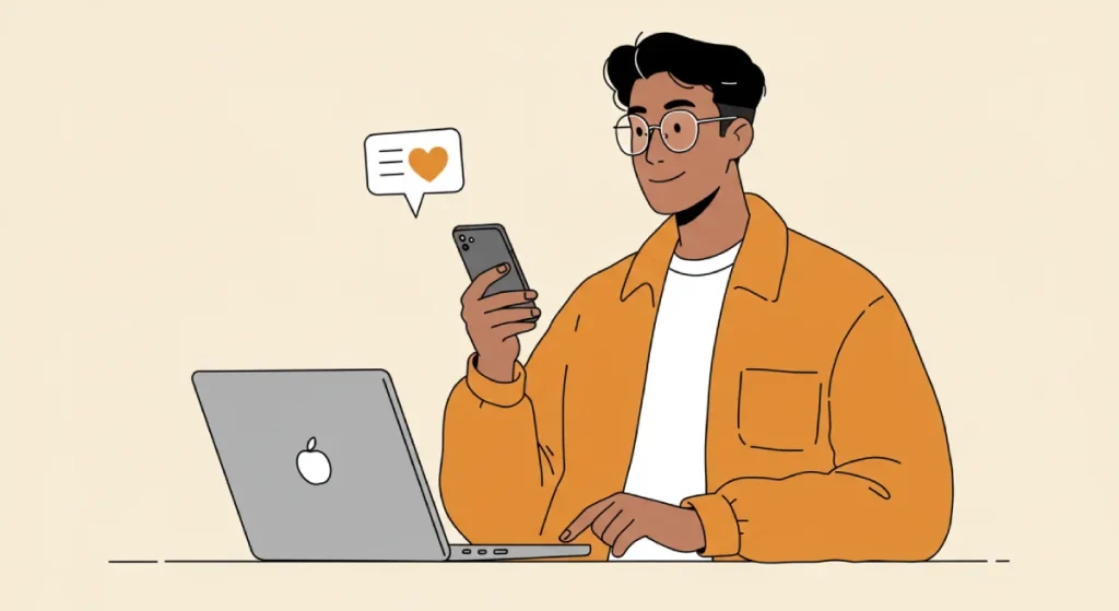
Should I use AI-generated images for my business?
AI images should be used for efficiency in the background, but never as your final “brand face.” Current 2026 consumer data shows that Gen Z and Millennials are highly sensitive to “AI-uncanniness.” Using unedited AI visuals can erode trust. The winning strategy is “AI-Augmented,” where humans add the final “signature” or creative friction that AI cannot replicate.
What is “Computational Aesthetics”?
Computational Aesthetics is the science of designing for two audiences: the human eye and the AI scraper. It involves creating visually beautiful content that is also technically “legible” to machines through optimised code, semantic pathing, and entity-linked metadata. It’s where art meets data science.
How can I measure the ROI of a redesign?
You measure ROI through “Brand Latency” (recognition speed), organic citation rates in AI engines, and the “Information Scent” conversion lift. By tracking how often your visual assets are cited by AI assistants and comparing your brand recognition scores before and after a rebrand, you can put a hard financial value on your design investment.
What is “Page Latency” in visual design?
Page Latency refers to the delay caused by unoptimised visual assets, such as bloated SVG files or excessive Google Font requests. Google confirms this is a critical ranking factor, as slow-loading visuals are penalised in both mobile search and AI citation engines.


