Typographic Hierarchy: Guiding the User’s Eye
If your website text looks like a monotonous grey wall, you are losing money. It is that simple.
Users do not read; they scan. They hunt for keywords, anchors, and exit signs. If your layout requires them to perform mental gymnastics just to determine what a headline is and what a caption is, they will leave.
You have approximately 10 seconds to convince a visitor they are in the right place. Poor typographic hierarchy wastes eight of them.
I have sat in presentations where a CEO argues that the logo needs to be “bigger” while ignoring the fact that their value proposition is buried in a paragraph of 12px light grey text. That is not a branding problem; it is a hierarchy failure.
Typographic hierarchy is the invisible hand that guides a user through your content.
It tells them what matters, what to read first, and where to click next. Without it, you do not have a design; you have a document.
- Users scan pages; typographic hierarchy must immediately show what matters within about 10 seconds.
- Contrast—size, weight, colour, and position—is essential; without it nothing stands out.
- Use a modular scale and spacing to create harmonious, intentional sizes and group related content.
- Adjust hierarchy for mobile: tighten ratios, rely on weight and spacing, and ensure reachable CTAs.
What is Typographic Hierarchy?
Typographic Hierarchy is the system of organising type that establishes an order of importance within the data, allowing the reader to easily navigate the content.
It uses visual cues—primarily size, weight, colour, and position—to create a clear distinction between levels of information. It is the difference between a dictionary (highly structured, easy to scan) and a novel (linear, requires sustained attention).
The Three Levels of Hierarchy
- Level One (The Hook): Usually the headline (H1). This is the most prominent typography on the page. It must answer the user’s primary question immediately.
- Level Two (The Signposts): Subheadings (H2, H3). These break content into digestible chunks, helping users scan for relevant sections.
- Level Three (The Meat): Body text, metadata, and captions. This is the dense information where the actual message lives.
Note: Effective hierarchy is not about making Level One massive. It is about the ratio and contrast between Level One and Level Three.
The Mechanics of Hierarchy (How to Control the Eye)
You do not need to be an artist to master this. You just need to understand the physics of visual perception. Hierarchy relies on contrast. If everything is bold, nothing is bold. If everything is big, nothing is big.
Size and The Modular Scale
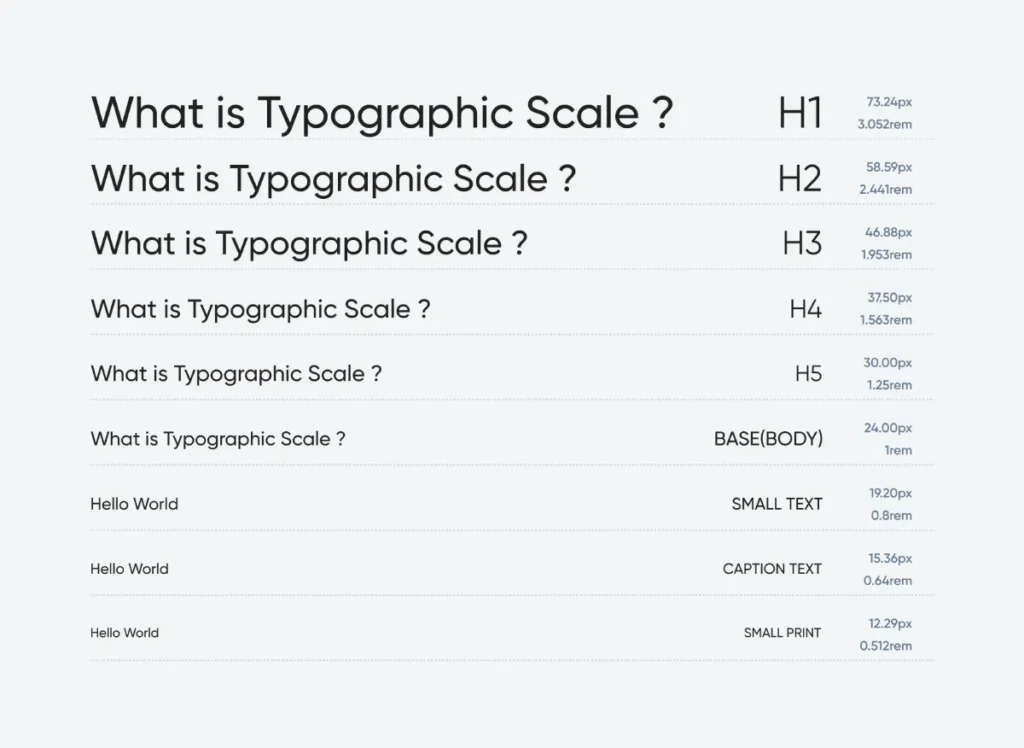
The most obvious tool is size. However, choosing random font sizes (e.g., 32px for headers, 18px for body text) often results in a disjointed mess. Professional designers use a Modular Scale—a mathematical ratio used to generate a harmonious range of font sizes.
A common ratio is the Golden Ratio (1:1.618) or the Major Third (1:1.250).
If your base body text is 16px, a Major Third scale looks like this:
- Body: 16px
- H4: 20px
- H3: 25px
- H2: 31.25px
- H1: 39.06px
Using a mathematical scale ensures that your hierarchy feels intentional, not accidental. It removes the guesswork.
Modern Typographic Scale Generator
Establish a perfect visual hierarchy. Choose your base size and ratio to generate a harmonious font scale, complete with modern CSS variables.
Live Preview
CSS Output
/* CSS will appear here */
Weight and Texture
Size is a blunt instrument. Weight (boldness) is the scalpel. You can often maintain a consistent font size but achieve hierarchy purely through weight.
Consider a blog post listing. You might have the title in Bold (700), the date in Regular (400), and the excerpt in Light (300). All elements might be 16px in size, yet the hierarchy remains clear.
The “Real Link” Rule:
In our work on typography basics, we often find that amateur designers rely too heavily on size. They make headlines huge but leave the weight too light, causing the text to recede when it should pop. A smaller, bolder header often commands more attention than a large, thin one.
Colour and Contrast
Colour indicates function and priority.
- Black/Dark Grey: Primary content (high contrast).
- Light Grey: Secondary content (metadata, timestamps).
- Brand Colour: Interaction points (links, buttons).
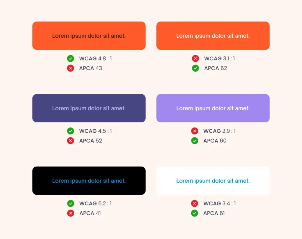
The WCAG 2.1 Guidelines dictate that text must have sufficient contrast to be legible. However, strictly adhering to high contrast for everything creates visual fatigue. You must lower the contrast of secondary elements (like footer text) to push the primary content forward.
Case and Capitalisation
- Uppercase: Screams for attention. Use sparingly for short labels, buttons, or sub-headers (H4/H5). Never use for body text.
- Sentence Case: The standard for readability. It feels conversational and natural.
- Title Case: Formal and structured. Best for main headlines.
Spacing (The Secret Weapon)
White space (also known as negative space) is arguably the most powerful tool for creating hierarchy. It groups related information.
The Law of Proximity: Objects that are close together are perceived as a group.
If your H2 is equidistant between the paragraph above it and the paragraph below it, the user halts. They do not know which section the header belongs to. The H2 must always be closer to the content it introduces than the content that preceded it.
| The Wrong Way (Amateur) | The Right Way (Pro) |
| Headline Size: 72px (Too big, breaks mobile) | Headline Size: Scale-based (e.g., 2.5em or 48px) |
| Spacing: Even spacing above and below headers. | Spacing: Top margin is 2x the bottom margin. |
| Differentiation: Uses 4 different fonts to “add variety.” | Differentiation: Uses 1-2 fonts; relies on weight/size. |
| Body Text: Pure Black (#000000) on White. | Body Text: Dark Grey (#333333) for softer reading. |
| Emphasis: Bold entire sentences. | Emphasis: Bold key phrases or keywords only. |
Hierarchy and Reading Patterns: The F-Pattern
Users do not read your beautifully crafted intro. They scan it.
The Nielsen Norman Group (NN/g) famously identified the F-Shaped Pattern for reading web content. Eye-tracking studies confirm that users scan the top line (the header), drop down a bit, scan across again (sub-header), and then stick to the left margin, vertically scanning for keywords.

How Hierarchy Supports the F-Pattern:
- Top Bar: Your H1 and primary navigation must carry the heaviest visual weight.
- Left Alignment: Centred text is harder to scan because the eye has to find the start of each new line. Left-aligned text provides a consistent “anchor” for the eye to return to.
- Bullet Points: These break the vertical flow, acting as speed bumps that force the user to pay attention.
If you centre-align a large block of text, you disrupt the F-Pattern. The user’s eye wanders, gets tired, and they bounce.
The “10-Second Rule” and Cognitive Load
Every design decision adds or removes Cognitive Load—the amount of mental processing power required to use your site.
When hierarchy is weak, the brain has to work harder to parse the page structure. “Is this a title? Is this a button?” This micro-confusion accumulates. If the cognitive load exceeds the perceived value of the content, the user leaves.
We call this the 10-Second Rule. You have roughly 10 seconds to communicate:
- Who you are.
- What you do.
- Why they should care.
If your hierarchy fails to highlight the Value Proposition (usually the H1 or a sub-header) within those 10 seconds, you have failed.
Real World Failure: The “Wall of Text”
I once audited a B2B legal consultancy firm. Their expertise was undeniable, but their bounce rate was 85%. Why? Their articles were 2,000-word blocks of 14px Times New Roman. No subheads. No bolding. No pull quotes.
It looked like a terms of service agreement.
The Fix: We did not change a single word of the copy. We simply:
- Increased body font to 18px.
- Added H2s every 300 words.
- Used bold text for key legal precedents.
- Added blockquotes for case outcomes.
Result: Time on page increased by 140% in two weeks. The content didn’t get better; the hierarchy did.
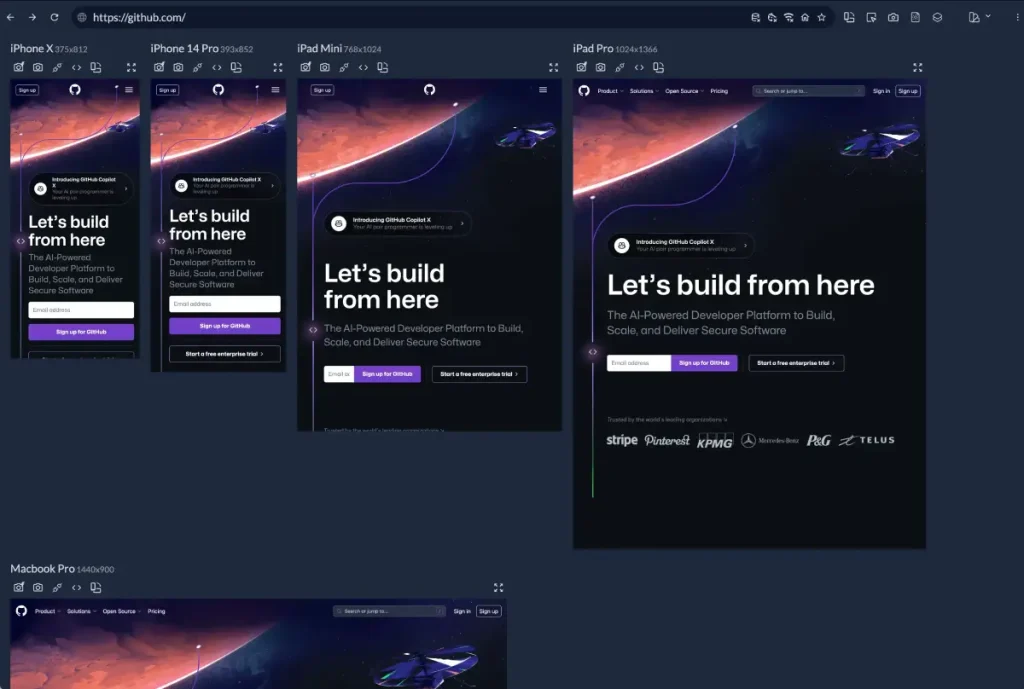
Responsive Hierarchy: Mobile Challenges
A hierarchy that works well on a 27-inch iMac often collapses on an iPhone 15.
On mobile, you do not have the luxury of horizontal space. You cannot use position (left vs right columns) to indicate hierarchy. You are forced into a single vertical column.
The Mobile Scale Problem
A 60px H1 looks great on desktop. On mobile, it takes up the entire viewport, forcing the user to scroll before they even know what the page is about.
You must use Fluid Typography or CSS breakpoints to adjust the scale.
- Desktop: H1 = 48px, Body = 18px (Ratio 2.6)
- Mobile: H1 = 32px, Body = 16px (Ratio 2.0)
The ratio tightens on mobile. The contrast in size decreases, so you must rely more on weight and spacing to maintain hierarchy.
Also, consider “thumb zones.” Primary calls to action (which should be high in the visual hierarchy) must be easily reachable. If your “Buy Now” button is tiny and buried in the top left corner, it fails the functional hierarchy test, regardless of how bold it is.
For more information on building robust brand systems that scale, refer to our guide on brand identity services.
7. The State of Typographic Hierarchy in 2026
As of late 2025 and moving into 2026, we are seeing a shift away from the ultra-minimalist, low-contrast “tech” aesthetic that dominated the early 2020s.
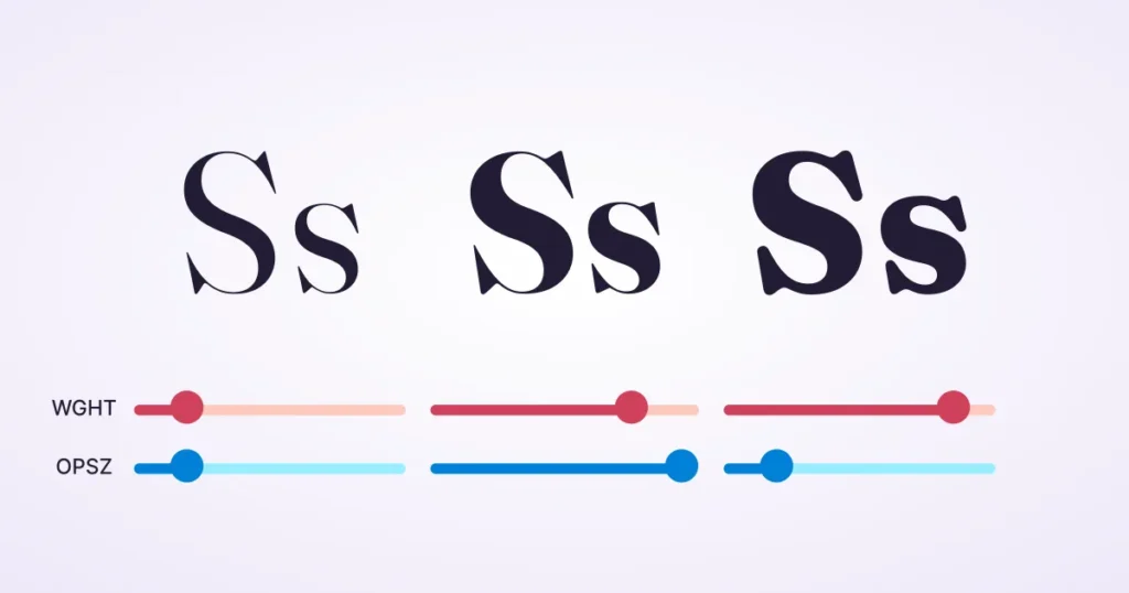
Variable Fonts are Standard
Variable fonts enable designers to use a single font file to generate an infinite range of weights and widths. This is a game-changer for hierarchy. Instead of being stuck with “Bold” (700) and “Regular” (400), we can program the H1 to have a weight of 850 and the H2 to have a weight of 620. This allows for microscopic control over hierarchy without bloating site load times.
Read more about variable fonts and why they matter for performance.
Accessibility as a Ranking Factor
Google and legal bodies are cracking down on contrast ratios. The “grey text on white background” trend is dead. A high-contrast hierarchy is not just an aesthetic choice; it is also a requirement for SEO and compliance. If your hierarchy relies on subtle shades of grey that fail WCAG AA standards, you are actively penalising your site’s visibility.
Consultant’s Reality Check
I frequently observe this with SMB owners. They buy a premium WordPress theme, then they break it.
They paste text from Microsoft Word, bringing along inline styles that override the theme’s CSS. They bold entire paragraphs because “it’s all important.”
Here is the truth: If you highlight everything, you highlight nothing.
I recently reviewed a pitch deck for a fintech startup. They used five different font sizes on one slide. The investor didn’t know where to look, so they looked at their phone. We simplified it to two sizes: A massive number (The Data) and a small caption (The Context). They got the funding.
Typography is control. Do not relinquish it.
If you are struggling to combine typefaces effectively, check our guide on font pairing.
The Verdict
Typographic hierarchy is not about making things look “pretty.” It is an engineering problem. It is about data visualisation.
You are building a structure that helps a human brain process information with minimal caloric expenditure. When you get it right, the user reads your message, understands your offer, and clicks your button. When you get it wrong, they bounce.
Stop treating text as a commodity. Treat it as your primary user interface.
Next Step: Open your website’s “About” page. Squint your eyes until the text blurs. Can you still identify the most important element on the page? If not, you have a hierarchy problem. Request a quote if you would like us to repair it for you.
Frequently Asked Questions (FAQ)
What is the most important element in typographic hierarchy?
Contrast is the most critical element. Whether achieved through size, weight, or colour, there must be a visible difference between levels of information. Without contrast, the reader cannot distinguish between a headline and body text.
How many font sizes should I use on a website?
Stick to a modular scale with 3-5 distinct sizes. Typically, you need a size for the Main Header (H1), Subheaders (H2/H3), Body Text, and a smaller size for captions and metadata. Using more than five often creates visual clutter.
Does font weight affect hierarchy more than size?
It can. A small, heavy, bold font often attracts the eye faster than a large, thin font. Weight adds “density” to the text, making it stand out against the whitespace. Using weight allows you to maintain a compact layout while still guiding the eye.
What is the difference between readability and legibility?
Legibility refers to how easily a distinct character can be recognised (the design of the typeface itself). Readability refers to how easily blocks of text can be processed (controlled by hierarchy, line height, and spacing). Good hierarchy improves readability.
Why is centre-aligned text bad for hierarchy?
Centre-aligned text is harder to read for long passages because the starting point of each line changes. This forces the eye to work harder to find the next line, causing fatigue. It is acceptable for short headlines, but should be avoided for body copy.
How does mobile design change typographic hierarchy?
Mobile screens reduce available horizontal space, meaning you cannot use layout (such as columns) to signal importance. You must rely on tighter size ratios and vertical spacing. Giant headlines on desktops must be scaled down to prevent them from pushing content below the fold.
What is a modular scale in typography?
A modular scale is a sequence of numbers used to determine font sizes that relate to one another in a harmonious way. Common scales include the Golden Ratio (1:1.618) or the Perfect Fourth (1:1.333). This ensures the size difference between an H1 and an H2 feels natural.
How does colour impact text hierarchy?
Colour assigns function. Dark, high-contrast colours indicate primary content. Lighter, lower-contrast colours push elements like dates or tags into the background. Bright accent colours are typically reserved for interactive elements, such as links and buttons.
Can I use all-caps for headings?
Yes, but sparingly. All-caps text is harder to read because the shapes of the letters are block-like and uniform. It works well for short labels or subheaders (H4), but creates a “shouting” effect if used for main headlines or long sentences.
How does white space create hierarchy?
White space (negative space) isolates elements. By surrounding a headline with ample space, you signal that it is important and separate from the text around it. Lack of space creates a cluttered “wall of text” that is difficult to scan.
What is the F-Pattern in web design?
The F-Pattern describes how users scan content on a screen: across the top, down a bit, across again, and then down the left side. A typographic hierarchy should support this by placing key keywords and headers along the left axis to catch the reader’s eye.
Why should I avoid using too many typefaces?
Using too many typefaces (more than 2 or 3) dilutes your brand identity and confuses the hierarchy. If a user sees a serif font for a header, a sans-serif font for a subhead, and a script font for a quote, they don’t know which visual cue signals importance. Consistency builds trust.