A Practical Guide to the Psychology of Colours in Web Design
Most conversations about colours in web design start from the wrong place. They begin with “What’s your favourite colour?” or “What does the colour blue mean?”.
This is amateur hour.
Your website’s colour palette isn’t a reflection of your personal taste. It’s a strategic business tool engineered to evoke specific feelings and drive specific actions from your target customer. Get it right, and you build trust and guide users to a sale without them noticing.
Get it wrong, and you might as well be invisible.
- Website colour palettes should be strategic, not based on personal preference, to evoke feelings and drive user actions.
- Colour meanings vary by culture, industry, and brand positioning—context is crucial for effective colour usage.
- Utilise the 60-30-10 rule for a balanced colour palette: 60% dominant, 30% secondary, and 10% accent colours.
- Accessibility must be prioritised; colour contrast should meet WCAG standards to avoid alienating users with visual impairments.
- Use contrasting colours for call-to-action buttons to enhance visibility and engagement based on the isolation effect.
Most Colour “Advice” is Rubbish
You’ve seen them. The brightly coloured infographics that get shared all over social media. They confidently declare that Red means Passion, Green means Nature, and Purple means Royalty.
That’s lazy thinking. And for a business owner, it’s dangerous.
Telling you “blue builds trust” is as helpful as telling you “use words to write copy.” It’s technically accurate, but utterly devoid of the context that makes it valuable. Does it build trust with a 19-year-old gamer in Tokyo or a 65-year-old financial planner in Chicago? The answer is wildly different.
The real power of colour doesn’t come from a universal meaning. It comes from context.
The Three Layers of Colour Context You Can’t Ignore
Before considering a specific shade, you must filter your choices through three critical layers. Miss one, and the whole thing falls apart.
Layer 1: Cultural Context
Colour is not a universal language. In Western cultures, white is associated with weddings, purity, and minimalism. In many Eastern cultures, it’s the colour of mourning.
Using a heavy amount of black for a financial services site might feel sleek and modern in North America, but it could signify debt or misfortune in other parts of the world. You have to know who you’re talking to.
Layer 2: Industry Context
Every industry has its own colour shorthand. It’s a set of expectations baked into the customer’s brain.
Tech and finance are awash with blue for a reason—it projects stability and professionalism. Health and wellness brands lean heavily on green to signal nature, health, and vitality. Fast food loves red and yellow because they grab attention and suggest speed.
You can intentionally break these conventions to stand out, but it must be a deliberate strategic choice, not an accident. You need to know the rules before you can effectively break them.
Layer 3: Brand Positioning Context
How do you want your business to feel? Are you the budget-friendly, accessible option or the premium, luxury choice?
A discount airline will use bright, optimistic oranges and yellows to feel friendly and affordable. A high-end watchmaker will use black, silver, and deep, muted tones to convey sophistication and exclusivity. Their colour choices directly reflect their price point and brand promise.
A Pragmatic Guide to Core Colours in Business (The No-Nonsense Edition)
Forget the abstract meanings. Let’s talk about how these colours actually perform in a business context.
Blue: The Corporate Default for Trust
There’s a reason Facebook, LinkedIn, X (formerly Twitter), and countless banks use blue. It’s the internet’s beige. It’s calm, secure, and non-threatening.
- Common Associations: Trust, stability, competence, professionalism.
- Use It For: Corporate sites, financial institutions, tech SaaS, healthcare, and any business where building trust is the primary goal.
- Watch Out For: It can feel cold, impersonal, and overly conservative. It’s so common that it can be challenging to stand out.
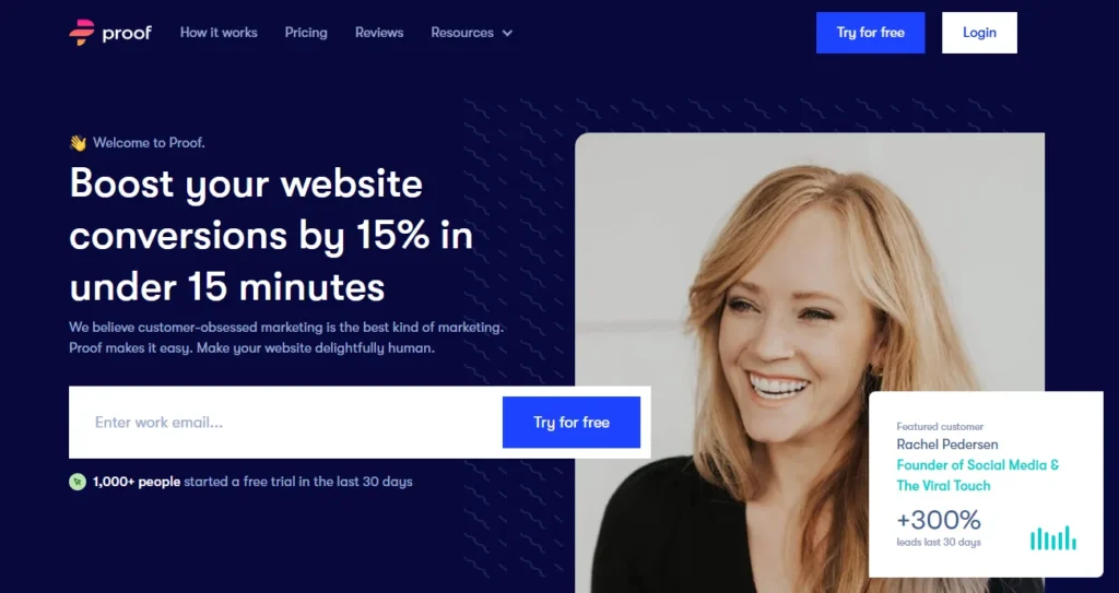
Red: The Double-Edged Sword of Urgency
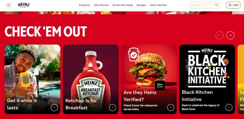
Red is a pure stimulus. It grabs attention, increases heart rate, and creates a sense of urgency. It’s a biological shortcut to “LOOK AT THIS.”
- Common Associations: Energy, excitement, passion, urgency, danger.
- Use It For: Call-to-action buttons (“Buy Now,” “Order Today”), clearance sales, breaking news, and brands that want to feel energetic and youthful, like Coca-Cola or Netflix.
- Watch Out For: Overuse creates anxiety and can look aggressive. In finance, it signifies a loss. Never use it as a primary background colour.
Green: The Go-To for Growth and Wellness
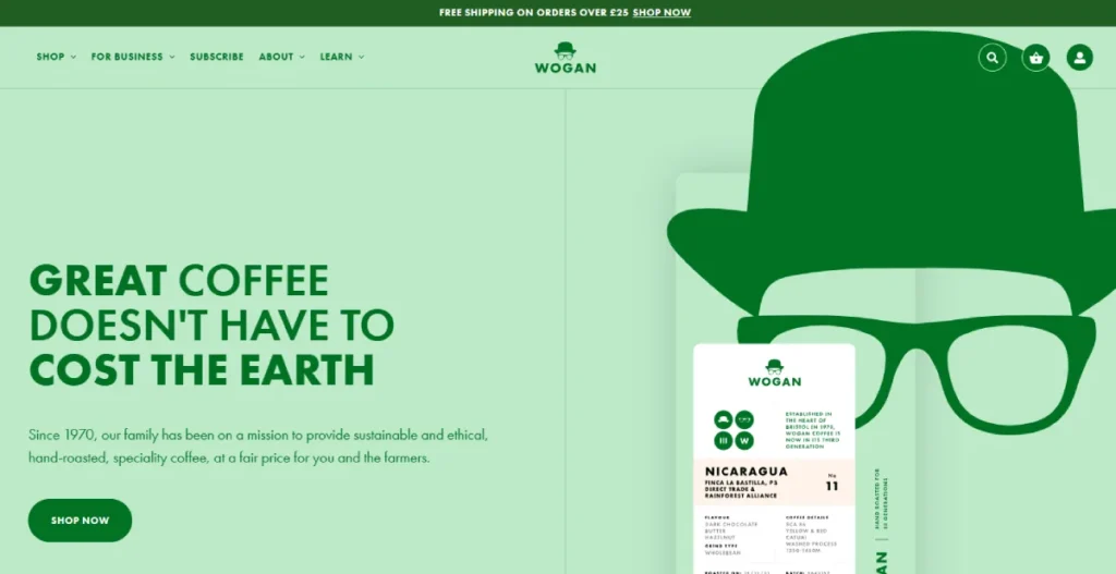
Green is the easiest colour for the human eye to process. It feels restful and balanced. Its connection to nature is deeply ingrained.
- Common Associations: Health, nature, growth, wealth, harmony, sustainability.
- Use It For: Natural products, environmental causes, health and wellness brands (like Whole Foods), and financial services focused on growth (like a wealth management firm). Spotify uses it to feel fresh and alive.
- Watch Out For: Can feel bland if the shade isn’t chosen carefully. Some muted greens can feel stagnant.
Orange & Yellow: The Optimists of the Palette

These are the colours of optimism, action, and affordability. They are friendly, cheerful, and demand attention without the aggression of red.
- Common Associations: Confidence, cheerfulness, creativity, friendliness, urgency.
- Use It For: Brands that want to feel accessible and fun. Think Amazon’s “Add to Cart” button or Fanta’s playful identity. It’s excellent for CTAs that aren’t as critical as “Buy Now.”
- Watch Out For: Yellow can cause eye strain in large amounts. Bright orange can feel cheap or unsophisticated if not appropriately balanced.
Purple: The Maverick of Luxury and Creativity

Purple has long been associated with royalty and wealth because the dye was historically rare and expensive. Today, it carves out a niche for brands that are either luxurious or highly creative.
- Common Associations: Luxury, wisdom, creativity, imagination, quality.
- Use It For: Premium products, creative agencies, educational tools, and brands that want to feel different, like Cadbury or Twitch.
- Watch Out For: It can be polarising; people tend to either love it or hate it. It can appear frivolous if used in the wrong industry (e.g., a serious medical practice).
Black, White & Greyscale: The Foundation of Sophistication

Used correctly, a greyscale palette communicates elegance, modernity, and focus. The absence of colour puts all the emphasis on your products, photography, and messaging.
- Common Associations: Sophistication, luxury, power, simplicity, minimalism.
- Use It For: High-end fashion (Chanel), luxury goods, tech products (Apple), and portfolio websites where the work needs to be the hero.
- Watch Out For: A purely black-and-white site can lack personality and emotion if not executed with sharp typography and powerful imagery.
Beyond Single Colours: Building a Palette That Actually Works
A website isn’t a single colour. It’s a system. Businesses’ most common mistake is throwing too many colours at the page, creating visual chaos.
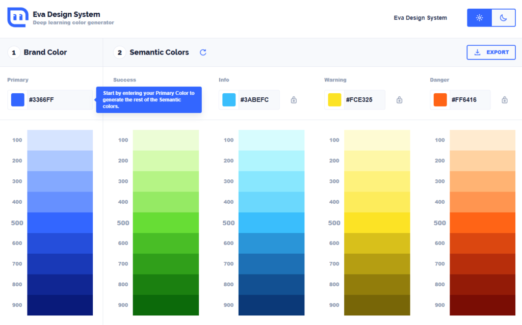
A simple, robust framework is the 60-30-10 Rule.
- 60% is your dominant colour. This is the primary hue of your brand, often used for backgrounds and broad visual areas. It sets the overall mood.
- 30% is your secondary colour. This should contrast with your dominant colour. It creates visual interest for things like subheadings or secondary content blocks.
- 10% is your accent colour. This is your “action” colour. It should be a bold, contrasting colour for the essential elements you want users to notice, like CTAs, links, or key icons.
This isn’t a rigid law but a brilliant starting point to ensure your design feels balanced and professional. A complete web design service goes much deeper, but this rule alone will put you ahead of 90% of your competitors.
The Topic Everyone Ignores: Colour, Contrast, and Accessibility

Let’s be blunt: a beautiful website that a portion of your audience can’t use is a failed website.
Approximately 1 in 12 men and 1 in 200 women have some form of colour vision deficiency. You lose customers if your light grey text is on a white background. It’s that simple.
The Web Content Accessibility Guidelines (WCAG) provide clear standards for colour contrast. Your text and interactive elements must have enough contrast against their background to be readable by people with visual impairments.
This isn’t just about being inclusive. It’s good business. You can’t sell to people who can’t read your offer.
Your Secret Weapon: Using Colour for Conversion
No single “best” colour for a Call-to-Action (CTA) button exists. Anyone who tells you otherwise is selling something.
The Von Restorff or isolation effect dictate the most effective CTA colour. It states that an item that stands out from its peers is more likely to be remembered and noticed.
In web design, this means the best colour for your “Buy Now” button is the one that contrasts most dramatically with the rest of your page. An orange or red CTA will perform brilliantly if your site is predominantly blue and white. If your site is orange, a blue CTA will work better.
The goal isn’t to pick a “persuasive” colour; it’s to create a can’t-miss visual target.

So, How Do You Choose Your Colours?
Stop thinking about what you like. Start thinking like a strategist.
- Define Your Brand: Write down 3-5 adjectives that describe your brand’s personality (e.g., “reliable,” “innovative,” “friendly”).
- Analyse Your Audience & Industry: Who are you selling to? What do your competitors’ websites look like? You can either align with industry norms or deliberately break them.
- Choose a Dominant Colour: Based on the above, select a primary colour that reflects your core brand personality.
- Build Your Palette: Use the 60-30-10 rule to select a secondary and a punchy accent colour that complements your dominant choice.
- Test for Accessibility: Run your chosen palette through a contrast checker. No exceptions.
This process transforms colour selection from a random guess into a calculated business decision.
Getting colour right is a foundational piece of a professional online presence. It’s the silent partner in building trust and driving action.
If you’re ready to move past guesswork and build a website that works as hard as you do, perhaps it’s time for a proper conversation. The team at Inkbot Design focuses on creating brands and websites that don’t just look good—they perform.
FAQs
What is the most trustworthy colour for a website?
Blue is overwhelmingly perceived as the most reliable and professional colour, so financial institutions, tech companies, and healthcare providers heavily use it.
What is the 60-30-10 rule in web design?
The 60-30-10 rule is a guideline for creating a balanced colour palette. 60% of your design should be a dominant colour, 30% a secondary colour, and 10% a contrasting accent colour, typically reserved for calls-to-action.
What is the best colour for a “Buy Now” button?
There is no single best colour. The most effective colour contrasts highly with the rest of the page elements, making it stand out visually (the isolation effect).
How does colour affect conversion rates?
Colour affects conversion rates by guiding the user’s eye, creating visual hierarchy, and evoking emotions. A high-contrast, well-placed call-to-action button can significantly increase clicks by being more noticeable.
Why is colour accessibility (WCAG) important?
Colour accessibility is crucial because it ensures that people with visual impairments, including colour blindness, can read and interact with your website. An inaccessible site alienates potential customers and can have legal implications.
Should I use trendy colours on my website?
Using fashionable colours can make your site feel modern, but it’s risky. Trends fade, and a website based on a “colour of the year” can look dated quickly. Choosing a timeless palette that aligns with your brand strategy is generally better.
How do cultural differences impact colour choices?
Colours have different meanings across cultures. For example, white signifies purity in the West but is associated with mourning in some Eastern cultures. If you have a global audience, it’s vital to research these associations.
Can a black and white website be effective?
Absolutely. Black and white (or greyscale) palettes can convey sophistication, luxury, and minimalism. They are highly effective for brands like high fashion, tech, and creative portfolios, where the focus needs to be on the product or content.
How many colours should a website have?
Sticking to a limited palette of 2-3 primary colours is best, following the 60-30-10 rule. Using too many colours creates visual clutter and confuses the user, weakening your brand message.
Is red a bad colour for a website?
Red is not inherently bad, but it must be used strategically. It’s excellent for creating urgency and drawing attention to CTAs. However, using it in large amounts can create a sense of anxiety or aggression.
What colours make a website look cheap?
Overly bright, saturated, and clashing colours can make a website look cheap and unprofessional. Poorly executed gradients and a lack of a cohesive palette are also common culprits.
How do I test my website’s colour contrast?
You can use free online tools known as “contrast checkers.” These tools allow you to input the hex codes for your background and foreground colours to see if they meet WCAG accessibility standards.
Your website’s colour scheme isn’t just decoration—it’s a critical business asset. If you’re tired of trends and ready for a strategic design that delivers results, explore our Web Design Services or request a no-obligation quote to see how we can help.


