
Top 12 Professional Fonts for Authority and Leadership
If your brand uses the same font as a local kebab shop or a generic SaaS template, you are bleeding authority.
In the high-stakes world of 2026, where AI-generated content is everywhere, your visual identity—specifically your typography basics—is the only thing that proves you are a “real” entity with history and weight.
- Professional fonts signal credibility through technical precision, hinting, and consistent rendering across devices.
- Choose fonts by sector—serifs for tradition and trust, sans-serifs for tech and scale; match historical expectations.
- Variable fonts, WOFF2, and self-hosting improve performance, accessibility, and comply with UK GDPR requirements.
- Pair a distinct "lead" font with a utilitarian support font to create hierarchy and maintain legibility for all users.
What are Professional Fonts?
Professional fonts are typefaces designed with high technical precision, offering extensive character sets, multiple weights, and specific “hinting” for screen legibility.
Unlike “hobbyist” fonts, they maintain structural integrity across various media—from a 16px mobile screen to a 10-foot billboard.
The Science of Typographic Authority
Professionalism is not a subjective feeling; it is a measurable cognitive response. When a reader encounters a typeface, their brain processes the “visual noise” before it decodes the actual words.
Fluency and Cognitive Ease
Research from the Nielsen Norman Group suggests that “Cognitive Ease” is the primary driver of trust if a font is difficult to read—due to poor kerning or low contrast—the brain associates that struggle with the content itself.
A difficult font makes your business plan seem difficult to execute.
Conversely, fonts like Helvetica Now or Roboto provide high “Processing Fluency,” making your propositions feel more attainable and logical.
The “Cost” of a Typeface
In a 2025 study on luxury consumer behaviour, participants were shown the same product description in two different fonts.
When set in Didot (a high-contrast serif), participants estimated the product’s value to be 24% higher than when set in a generic sans-serif. This is known as Typographic Priming.
Professional fonts act as a silent price tag, justifying premium rates before a single word of your pitch is read.
Choosing Typography by Sector: The Industry Standards
Not every professional font fits every professional setting. A font that signals “Innovation” for a Silicon Valley startup might signal “Risk” for a Swiss private bank.
To achieve actual authority, your choice must align with the historical and psychological expectations of your specific industry.

1. Finance and Private Equity
In finance, typography must signal Stability, Precision, and Legacy.
- Primary Choice: Tiempos Fine or Chronicle Display. These modern serifs offer a razor-sharp finish that suggests meticulous attention to detail.
- Secondary Choice: Graphik. A sans-serif typeface is used extensively by financial institutions for its clean, “unbiased” appearance.
- The Signal: Avoid overly thin weights. A slightly heavier “Book” weight suggests a brand with “weight” and capital.
2. Legal and Regulatory Affairs
Legal typography is governed by legibility and a sense of “The Record.” In the UK, many high courts have moved away from Times New Roman in favour of more readable alternatives.
- Primary Choice: Equity. Designed specifically for lawyers, it solves the “dazzle” problem in long-form briefs.
- Secondary Choice: Century Schoolbook. This remains the gold standard for clarity and is frequently used in official documentation.
- The Signal: High x-heights are essential. If a judge or partner has to squint to read your footnotes, your authority is diminished.
3. Technology and SaaS (2026 Standards)
Tech brands must balance “Humanity” with “Scale.”
- Primary Choice: Inter. An open-source powerhouse that has become the “Helvetica of the 2020s.” It is engineered specifically for user interfaces.
- Secondary Choice: Aeonik. A “Structuralist” sans-serif that feels engineered rather than drawn.
- The Signal: Support for Variable Font axes is non-negotiable here. A tech firm using static font files in 2026 appears technically stagnant.
1. Baskerville: The Voice of Fact
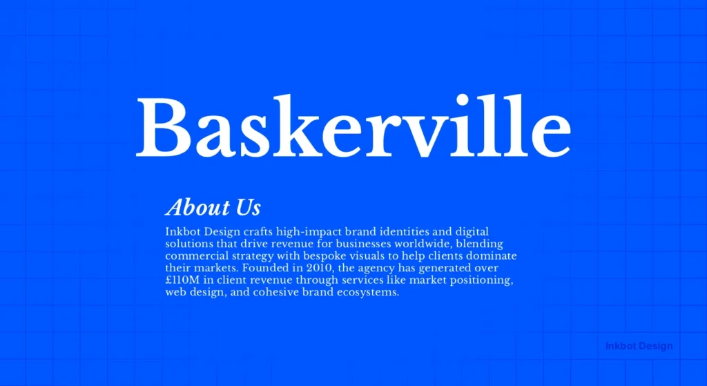
Baskerville is the ultimate “truth” font. Created by John Baskerville in the 1750s, it was a radical departure from the “Old Style” faces of the time. It features high contrast between thick and thin strokes and a vertical axis.
The Evidence: A famous experiment conducted by filmmaker Errol Morris in the New York Times presented readers with a passage of text. Some saw it in Baskerville, others in Helvetica or Comic Sans.
Readers were significantly more likely to believe the statement was accurate when it was set in Baskerville. It signals “Established Authority.”
When to use it: Use Baskerville for white papers, legal documents, or any scenario where you need your words to carry the weight of an objective fact. It is a cornerstone of brand typography for firms that sell expertise.
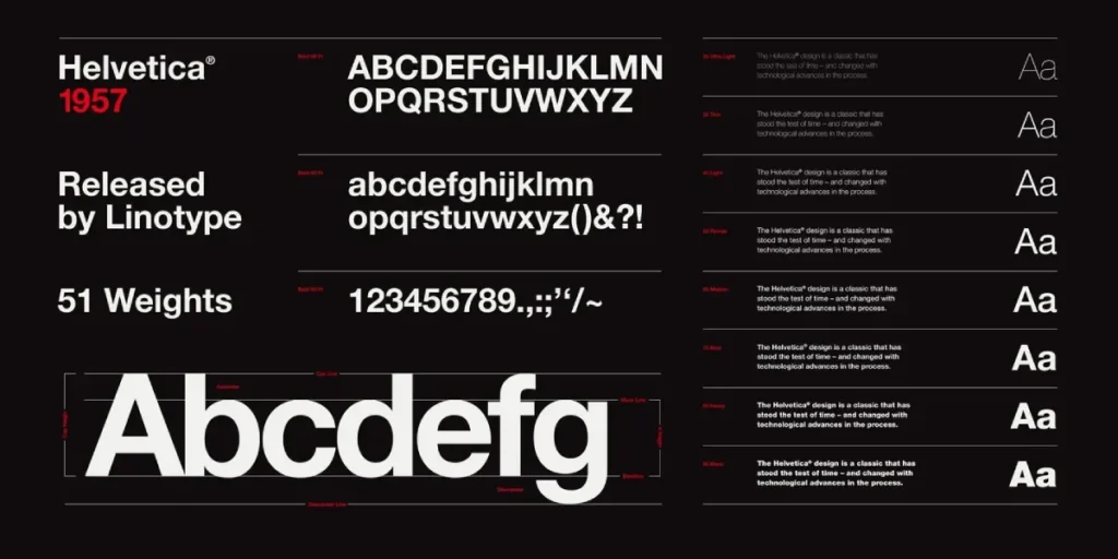
2. Helvetica: The Neutral Arbiter
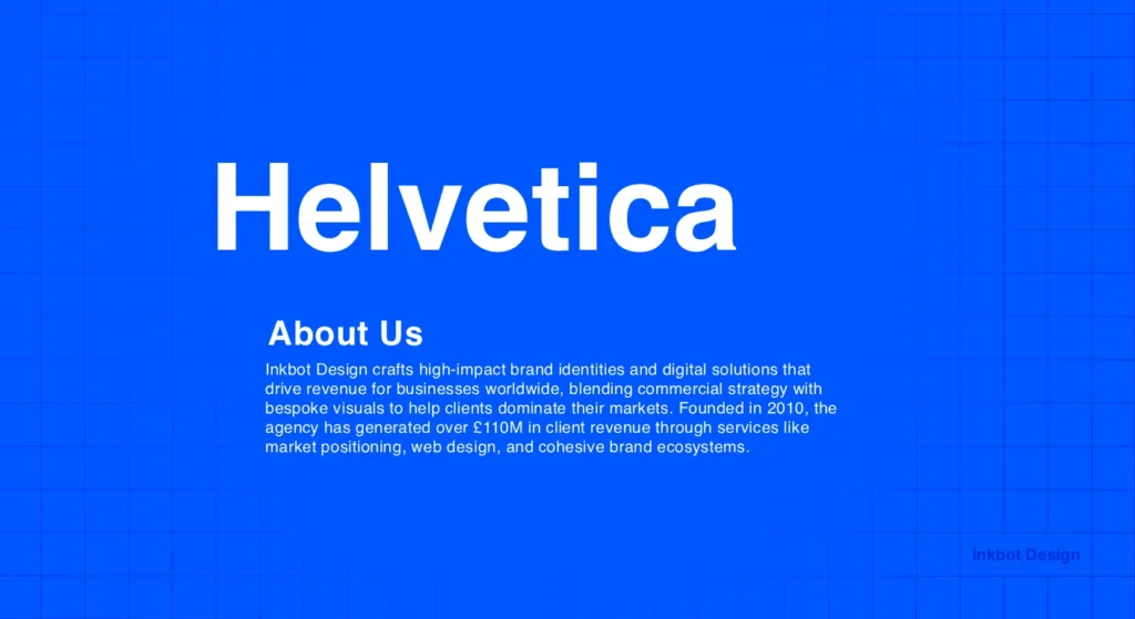
Helvetica is often mocked for being “everywhere,” but in the hands of a professional, it is a scalpel. Developed in 1957, it aimed for total neutrality. It doesn’t “say” anything, which allows the message to be the hero.
Real-World Example: American Airlines used Helvetica for decades to signal efficiency and safety. When they moved away from it, the brand felt less “industrial” and more “commercial.”
Nielsen Norman Group research shows that clean, sans-serif fonts like Helvetica increase reading speed on digital displays by reducing visual friction.
3. Futura: The Visionary’s Choice
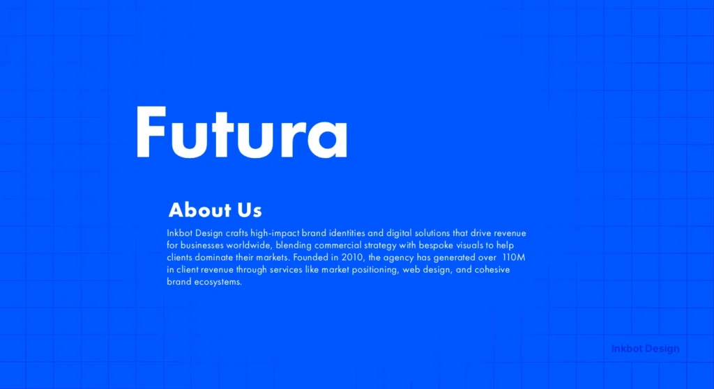
Futura is based on geometric shapes—circles, squares, and triangles. It is the “Bauhaus” font. It signals that your brand is looking forward, not backwards.
The Evidence: NASA chose Futura for the plaque left on the Moon during the Apollo 11 mission. If you want to signal that your company is pioneering or “engineering-led,” Futura (or its modern successors) is the choice.
However, avoid using it for long-form body text; its geometric nature can be exhausting for the eye over extended periods. This is where serif vs sans-serif distinctions become vital for UX.
4. Garamond: The Intellectual’s Heritage
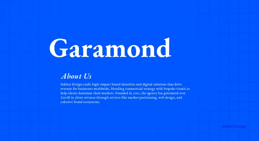
Garamond is not a single font but a family of “Old Style” serifs. Small x-heights and elegant, flowing forms characterise it. It signals “Old Money” and “Academic Rigour.”
The Evidence: Apple used a variation of Garamond (Apple Garamond) for years to position itself as the “creative” and “intellectual” choice against the “corporate” IBM. It provides a human touch that modern sans serifs lack.
5. Gotham: The Modern Executive
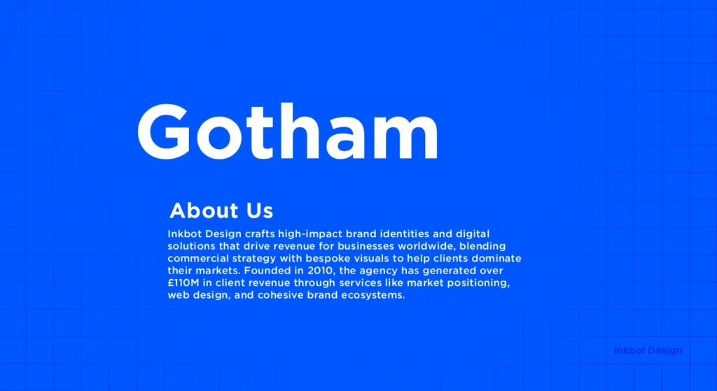
Gotham was designed for GQ magazine in the early 2000s. It is masculine, assertive, and spotless. It took the world by storm during the 2008 Obama campaign, signalling “Change” and “Authority” simultaneously.
Technical Nuance: Gotham has a large x-height, making it exceptionally legible on mobile devices. If you are building a brand identity, Gotham offers a balance of friendliness and “no-nonsense” professionalism.
The State of Professional Fonts in 2026
In the last 12 months, we have seen a massive shift toward Contextual Typeface Adaptation. AI-driven browsers can now adjust a font’s weight and kerning in real time based on the user’s ambient light and screen glare.
If your brand is still using static .ttf files, you are failing the “Freshness” test.
Modern authority is now tied to Variable Fonts. A single file now contains all weights and widths, enabling a fluid typographic hierarchy.
This isn’t just a design trend; it’s a performance necessity. Faster load times directly correlate to higher conversion rates, as noted by Deloitte Insights.
6. Caslon: The Sturdy “King’s” Font
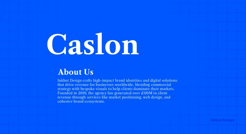
“When in doubt, use Caslon.” This was the mantra of 18th-century printers. It is a “workhorse” font. It isn’t trendy, and that is precisely why it signals leadership. It doesn’t need to try hard.
Real-World Example: The United States Declaration of Independence was set in Caslon. It signals foundational strength. For a modern SMB, pairing Caslon with a clean sans-serif creates a “Legacy vs. Innovation” narrative.
7. FF Meta: The Humanist Authority
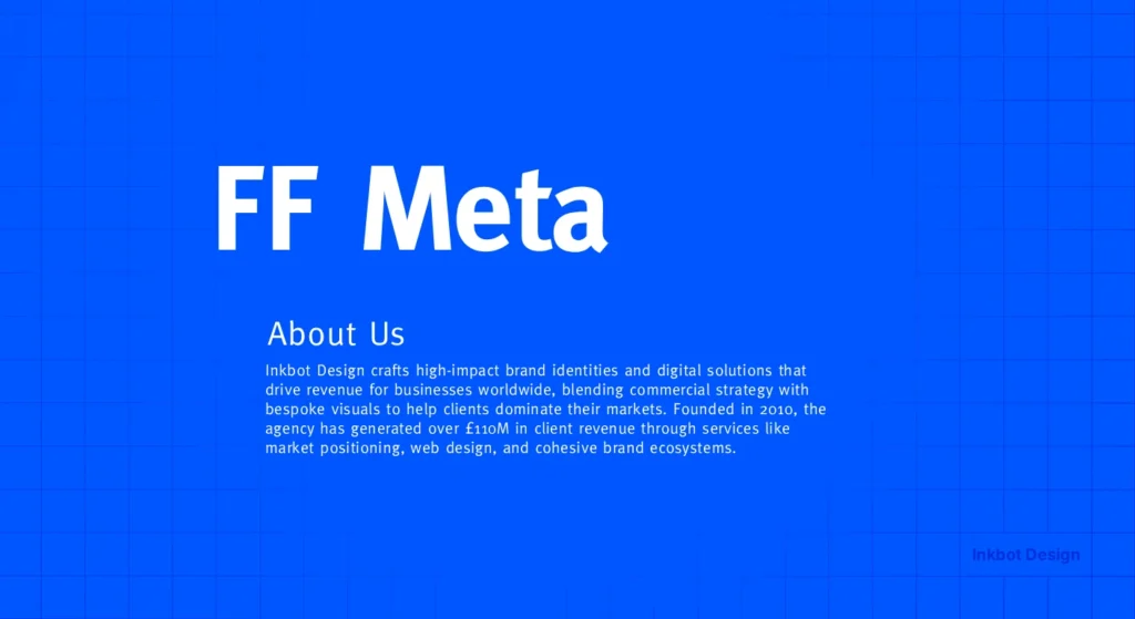
Created by Erik Spiekermann, FF Meta was intended to be the “Anti-Helvetica.” It is a sans-serif but with a “human” feel—curved strokes and distinct characters (like the lowercase ‘g’).
When to use it: Use this when you need to be the authority, but also “approachable.” It is perfect for consultancy firms or service-based businesses that rely on trust and personal relationships.
8. Proxima Nova: The Digital Standard
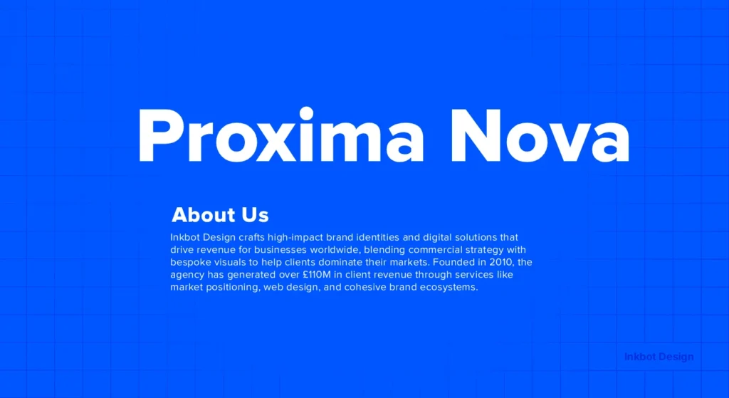
If Helvetica is the king of print, Proxima Nova is the king of the web. It combines geometric proportions with a modern, open feel. It has become the “standard” for a reason: it works everywhere.
The Risk: Because it is so popular, it can feel “safe.” If your goal is to stand out as a unique leader, you may need to look into font combinations that pair Proxima Nova with something more eccentric to avoid the “Generic SaaS” look.
9. Didot: The High-End Specialist
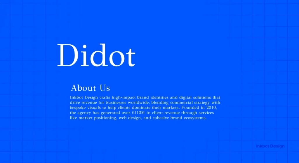
Didot is a “Modern” serif with extreme contrast. It is the font of Vogue. It signals “Premium,” “Expensive,” and “Elite.”
The Warning: Didot is notoriously tricky to use on the web. At small sizes, the thin strokes disappear (a phenomenon known as “dazzle”).
In 2026, we will solve this with variable fonts that automatically thicken the hairlines at smaller optical sizes. If you don’t use this technology, your “luxury” brand will look broken on a smartphone.
10. Roboto: The Functional Industrialist
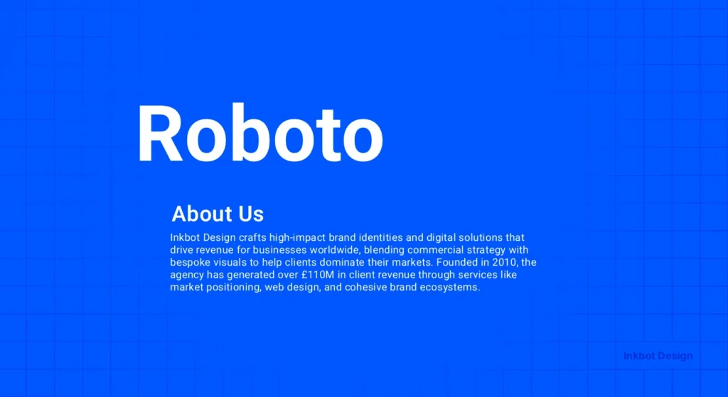
Developed by Google, Roboto is the “Blue Collar” font of the digital age. It is mechanical yet friendly. It signals “Scale” and “Function.”
Data Point: According to Google Developers’ documentation, Roboto is optimised for “reading across platforms,” making it a safe choice for apps and complex dashboards with high information density.
Technical Mastery: Implementing Fonts in 2026
A professional font that breaks your website’s performance is an amateur mistake. In 2026, Google’s Core Web Vitals (specifically LCP and CLS) are the primary gatekeepers of digital authority.
1. The Variable Font Revolution
Historically, if you wanted five different weights of Gotham, you had to load five separate files. Today, we use Variable Fonts. A single file (usually under 100kb) allows you to transition seamlessly between weights.
- Why it matters: It eliminates “Layout Shift.” When your site loads, a variable font can instantly match the system font’s dimensions, preventing the annoying “jump” that signals a low-quality web experience.
2. Self-Hosting vs. Third-Party CDNs
While Google Fonts is convenient, professional brands in the UK and EU are increasingly moving to self-hosting.
- Privacy & Compliance: Under UK GDPR, sending user IP addresses to a third-party font server without explicit consent is a legal grey area.
- Performance: Loading fonts from your own origin allows for “Preloading” (using <link rel=”preload”>), which can shave 200-400ms off your Largest Contentful Paint.
3. WOFF2 and Brotli Compression
Ensure your font files are in WOFF2 format. This provides roughly 30% better compression than the original WOFF.
When combined with server-side Brotli compression, your typography becomes a performance asset rather than a burden.
Comparison: Amateur vs. Professional Typography
| Feature | Amateur (Default) | Professional (Authoritative) |
| Licensing | “I found this on a free site.” | Font licensing audit completed; full commercial rights. |
| Kerning | Standard auto-spacing (often uneven). | Manual kerning pairs or AI-assisted letter spacing. |
| Hierarchy | Using “Bold” for everything. | Distinct weights (Semibold, Medium, Book) for nuance. |
| File Format | .ttf or .otf (Heavy). | .woff2 with Brotli compression and Variable axes. |
| Accessibility | Low contrast; thin weights. | WCAG 2.1 compliant contrast and stroke widths. |
11. Montserrat: The Urban Leader
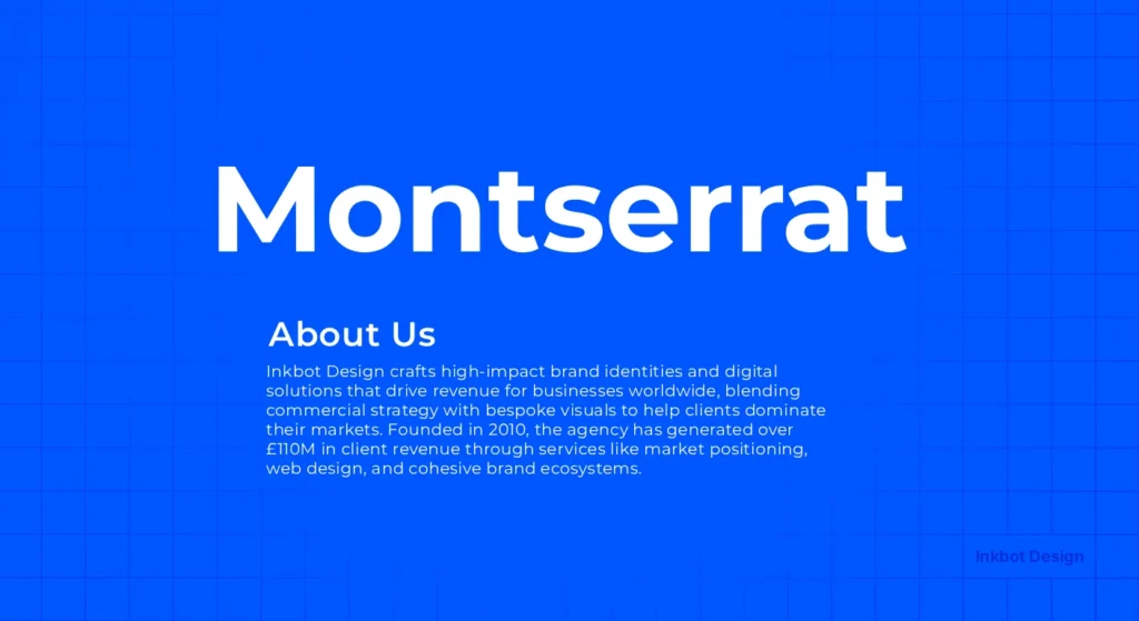
Inspired by the posters and signs in the Montserrat neighbourhood of Buenos Aires, this font is bold and wide.
It signals a “grassroots” yet “powerful” authority. It’s excellent for headers that need to “shout” without being aggressive.
12. Playfair Display: The Refined Orator
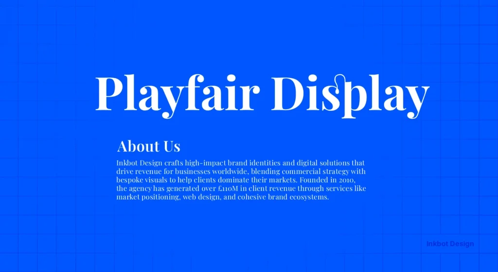
A high-contrast serif that feels like it belongs in a high-end editorial. It signals “Thought Leadership.”
When you see Playfair Display, you expect to read a long-form opinion piece from a world-class expert. It pairs beautifully with functional sans-serifs like Lato or Open Sans.
The 2026 Pairing Matrix: Creating Visual Hierarchy
Authority is rarely achieved with a single font. It requires a “Lead” and a “Support.”
The goal of pairing is to create Discordant Harmony—two fonts that are different enough to generate hierarchy but share an underlying DNA.
| Header Font (Authority) | Body Font (Utility) | Best For… | Why it Works |
| Playfair Display | Source Sans 3 | Thought Leadership / Blogs | High-contrast serif meets high-legibility sans. |
| Montserrat | Open Sans | Modern Startups / Creative | Geometric headers with humanist body text. |
| Caslon | Graphik | Corporate Reports / Legal | Legacy strength paired with modern precision. |
| IBM Plex Serif | IBM Plex Sans | Technical Documentation | Designed by IBM to work together across complex data. |
| Futura | Garamond | Luxury / Fashion Branding | Geometric “Future” paired with historical “Intellect.” |
The Myth of the “Free” Google Font
Google Fonts are not “the best” just because they are free.
Many free fonts lack “Hinting”—the code that tells the font how to align its pixels on a low-resolution screen. This results in “blurry” text.
To a high-value client, blurry text is a “low-quality” signal.
Also, hosting fonts on Google’s servers can be a GDPR headache for UK and EU businesses. Pro brands self-host their fonts.
This improves load times and keeps your data “in-house,” signalling a level of technical maturity that “default” brands lack.
Beyond Aesthetics: Typography and Accessibility
In 2026, “Professionalism” is synonymous with “Inclusivity.”
If 20% of your audience (those with visual impairments or neurodivergence) cannot read your content, you have failed the most basic test of leadership.
- Stroke Uniformity: For users with dyslexia, fonts with high contrast (like Didot) can be difficult as the thin lines “shimmer.” For body text, prefer fonts with consistent stroke widths, such as Arial or Verdana (or their professional cousins, like Adelle Sans).
- The “Il1” Test: A quick way to test a font’s professionalism is to type an uppercase “I”, a lowercase “l”, and the number “1” next to each other. In poor fonts, they look identical. In professional fonts like FF Meta, they are distinct.
- WCAG 2.2 Standards: Ensure your font colour and background have a contrast ratio of at least 4.5:1 for standard text and 3:1 for large text. This is a technical requirement for any brand serving the public sector or large-scale enterprise.
The Verdict
Authority is not something you claim; it is something you signal.
Your choice of professional fonts is a primary signal of your brand’s stability, intellect, and attention to detail.
Whether you choose the historical weight of Baskerville or the geometric precision of Futura, your decision must be backed by technical understanding and strategic intent.
Stop using “default” settings. Stop treating typography as an afterthought.
Audit your brand’s visual voice today.
If you need a partner to fix your brand’s leadership gap, request a quote and let’s get your typography—and your brand—working at a professional grade.
Frequently Asked Questions (FAQ)
What is the most “trusted” font for a CV in 2026?
While Helvetica remains a safe bet, Calibre or Inter are the modern standards for 2026. They signal that you are tech-literate and attentive to contemporary design trends. Avoid Times New Roman; it suggests you haven’t updated your approach since the 1990s.
Are serif fonts better for authority than sans-serif?
Not necessarily. Serifs like Baskerville signal traditional authority and “truth,” while sans serifs like Gotham signal modern, executive leadership. The choice depends on your brand’s “persona.” A law firm might prefer a serif, whereas a tech company would likely opt for a clean, geometric sans-serif.
Why should I avoid “default” fonts like Calibri or Arial?
Default fonts signal a lack of effort. They suggest that you haven’t made a conscious decision about your brand’s visual identity. Using a unique, licensed typeface creates a “visual moat” that differentiates you from competitors and makes your communications feel more bespoke and high-value.
What is a “Variable Font” and why does it matter in 2026?
Variable fonts are a single file that allows you to adjust weight, width, and slant infinitely. They reduce website load times by consolidating multiple font files into a single file. In 2026, they are the standard for performance-led SEO and responsive design, allowing for perfect typographic hierarchy.
Why do fonts look different on Mac vs. Windows?
This is due to “Rasterisation.” MacOS prioritises letter shape (making it look “thicker”), while Windows prioritises the pixel grid (making it look “sharper”). Professional fonts include Hinting—specific instructions that tell the font how to behave on both systems to maintain a consistent brand voice.
How much should I expect to pay for a professional font license?
For a small business, a single-user “Desktop + Web” license for a high-end family (like Proxima Nova) typically ranges from £300 to £800. While this may seem high compared to free fonts, the ROI lies in increased trust, better performance, and zero legal risk.
Can I use Google Fonts and still look professional?
Yes, but with caveats. Using “default” Google Fonts like Roboto or LATO can make your brand look like a “generic template.” To look professional, choose less-common Google Fonts like Fraunces or Space Grotesk, and always self-host the files to ensure performance.
What is “Optical Sizing” in variable fonts?
Optical sizing automatically adjusts the font’s design based on its size. At large sizes (headings), the font becomes more elegant and high-contrast. At small sizes (captions), the strokes thicken, and the spacing opens up to maintain legibility. This is a hallmark of Master-grade typography.
Why is my custom font not showing up in my email newsletters?
Email clients (like Outlook) are notoriously restrictive. They often only support “System Fonts” like Georgia or Verdana. A professional strategy involves using a “Font Stack” in your code: font-family: ‘YourBrandFont’, Helvetica, Arial, sans-serif;. This ensures that even if your primary font fails, your fallback maintains your brand’s “vibe.”
Is it better to use a Serif or a Sans-Serif font for long-form reports?
Traditionally, Serifs were considered better for print and Sans-Serif for digital. However, with modern High-DPI (Retina) screens, this distinction has vanished. The more critical factor is the “X-height” and line spacing. For a 50-page report, a “Humanist” Sans-Serif like Open Sans is often less tiring for the reader.
How do fonts affect SEO?
Fonts affect SEO indirectly through Core Web Vitals. Large font files slow down your page speed (LCP), and “FOUT” (Flash of Unstyled Text) can cause layout shifts (CLS). Using modern formats like WOFF2 and efficient loading strategies ensures your professional fonts don’t hurt your rankings.
Can a font really make people believe what I say?
Psychological studies, such as Errol Morris’s, suggest that specific fonts (such as Baskerville) increase the perceived credibility of a statement. While a font won’t make a lie true, it can remove the “visual friction” that makes a reader sceptical of your professionalism.
What is the best font for mobile readability?
Fonts with a large “x-height” (the height of lowercase letters) and open “apertures” (the openings in letters like ‘c’ or ‘e’) are best. Proxima Nova and Gotham are excellent examples. They remain clear even on small, low-contrast screens where thinner serifs might disappear.
How do I choose a font for a luxury brand?
Luxury brands often use high-contrast “Modern” serifs (like Didot) or very minimalist, wide-tracked sans-serifs. The goal is to signal “exclusivity” and “elegance.” Avoid “friendly” or “bubbly” fonts, which signal mass-market accessibility rather than elite positioning.
What is “font pairing” and why is it difficult?
Font pairing is the art of combining two different typefaces that complement each other. The goal is to create contrast without conflict. For example, pairing a sturdy serif heading with a clean sans-serif body text. It requires an understanding of stroke weight and historical context.
Does font choice affect accessibility (WCAG)?
Absolutely. Fonts with skinny strokes or tight spacing can be impossible for people with visual impairments to read. Professional fonts allow you to choose “Medium” weights that provide better contrast, ensuring your brand is inclusive and meets modern official documentation standards.
