Peter Saville: The Graphic Design Masterclass
Peter Saville made a career out of being misunderstood, and in doing so, he became one of the most influential graphic designers of the last fifty years.
He didn’t care if you could read the band’s name on the cover.
He cared about how the object made you feel.
If you’re running a business in 2026, you can’t afford to ignore the psychological leverage of high-concept design.
- Saville treated design as cultural commentary, blending high-art appropriation with industrial minimalism to create status-driven identities.
- Calculated obfuscation: hiding names and titles creates exclusivity, engagement, and brand "vibe" over literal legibility.
- Typographic rigour: curated serif and sans choices and strict hierarchy signal heritage or modernity without explicit text.
- Perceived value scales with craft: complex production (Blue Monday) can boost prestige despite short-term financial cost.
- Modern lesson: human-curated weirdness and historical references beat generically clean AI logos for brand distinction.
Who is Peter Saville?
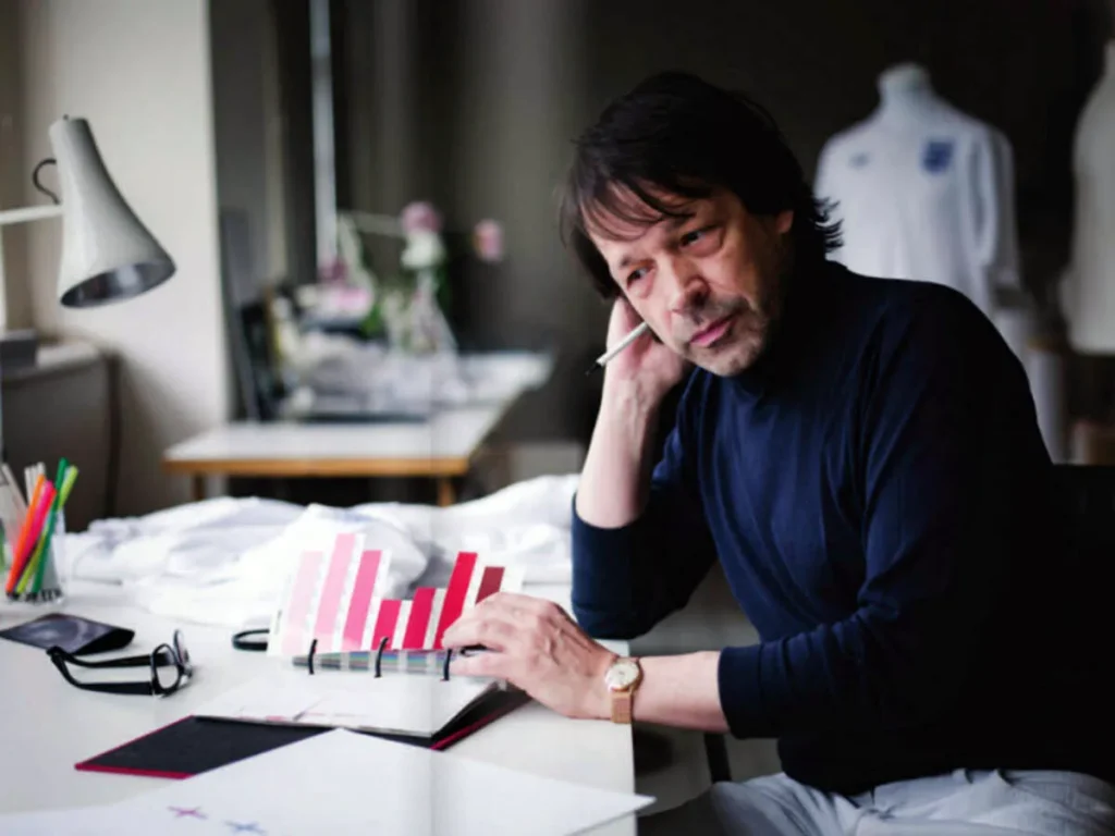
Peter Saville is a British graphic designer and art director best known for his career-defining work with Factory Records. His approach treats graphic design as a form of cultural commentary, blending high-art appropriation with industrial minimalism to create identities that function as status symbols rather than mere advertisements.
The three core elements of the Saville methodology are:
- Cultural Appropriation: Recontextualising classical art and historical movements (like Futurism or Neoclassicism) for modern commercial use.
- Calculated Obfuscation: The deliberate removal of traditional marketing “clutter” (band names, titles) to create an aura of exclusivity.
- Typographic Rigour: A forensic focus on serif and sans-serif fonts to communicate heritage or modernity without saying a word.
The Factory Records Era: Designing the Mystery
In the late 1970s, Saville became a founding partner of Factory Records. This wasn’t just a record label; it was a laboratory for visual communication.
While other famous graphic designers were trying to make punk look “messy,” Saville made it look like a government-issued document from a dystopian future.
The “Unknown Pleasures” Anomaly
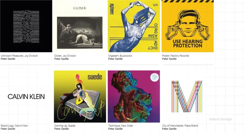
The cover for Joy Division’s Unknown Pleasures (1979) is perhaps the most over-utilised image in modern history. You see it on T-shirts in H&M and coffee mugs in Shoreditch.
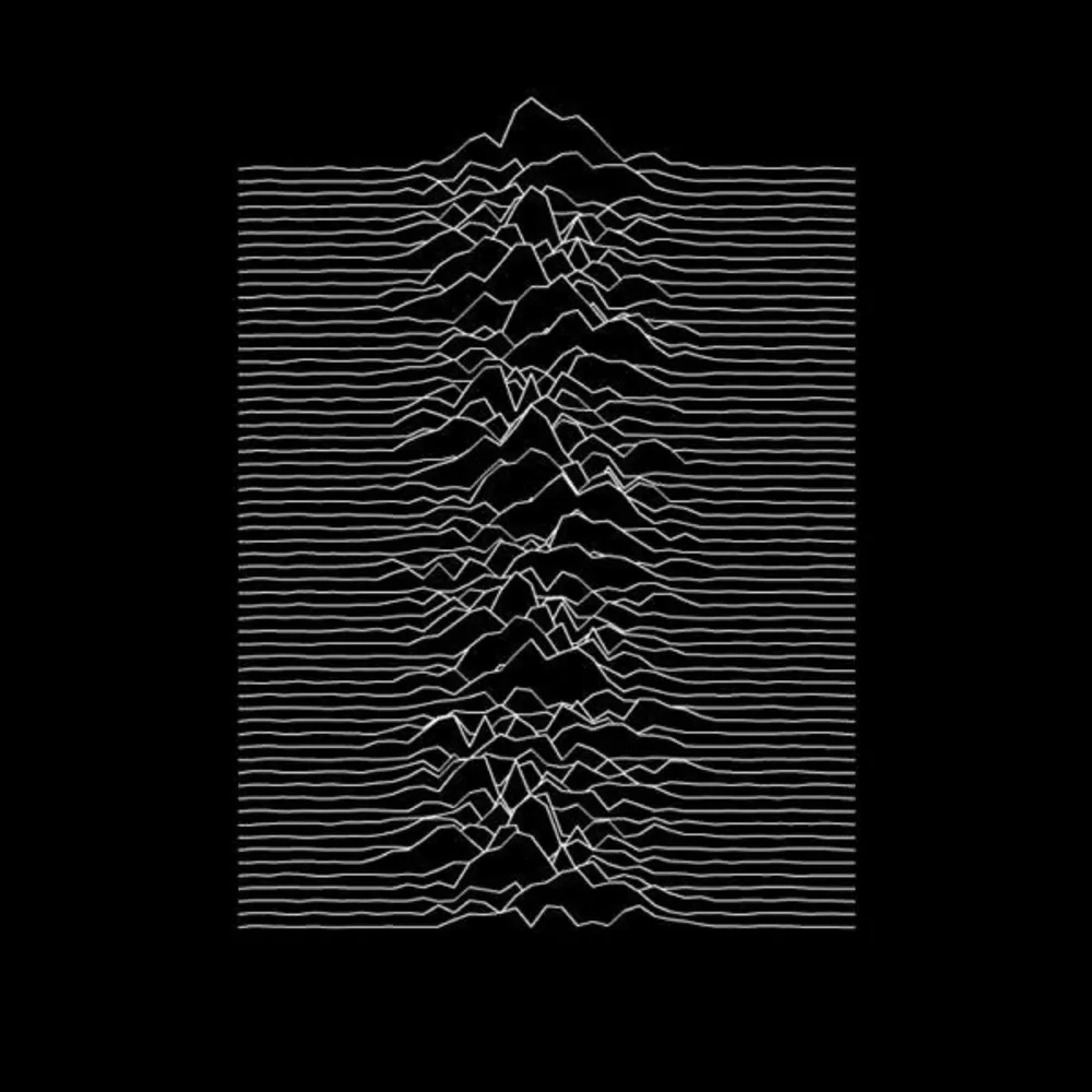
But from a brand perspective, it was a radical act of defiance. There was no band name. No title. Just a data visualisation of a dying star (CP1919) taken from the Cambridge Encyclopaedia of Astronomy.
The Lesson for Business Owners: Saville proved that a brand’s “vibe” is often more valuable than its literal name. If your brand identity relies entirely on your logo being legible at 10 paces, you haven’t built a brand; you’ve built a signpost.
The Blue Monday Financial Disaster
If you think design doesn’t impact the bottom line, look at New Order’s Blue Monday. Saville designed the 12-inch sleeve to look like a 5.25-inch floppy disk. It involved expensive die-cutting and silver ink.

According to industry legend and confirmed by Factory co-founder Tony Wilson, the sleeve was so expensive to produce that the label lost roughly 5p on every copy sold.
It became the best-selling 12-inch single of all time.
“We didn’t realise we were losing money because we didn’t have an accountant. We just thought it looked brilliant.” — Tony Wilson
While I don’t suggest you bankrupt your company for a “brilliant” die-cut business card, there is a technical truth here: Perceived value often scales with production complexity. When you invest in your brand strategy, you are signalling to your market that you are playing a different game than the discounters.
The Technical Anatomy of Saville’s Typography
Saville didn’t just “pick fonts.” He curated them. He understood that typography basics are the foundation of all authority.
His work often oscillates between two extremes: the cold, Swiss-inspired utility of Helvetica and the romantic, classical authority of Bembo or Garamond.
The Power of Typographic Hierarchy
In his work for New Order, Saville often used a “code” system. On the album Power, Corruption & Lies, he replaced the text with a colour-coded wheel. To read the band name or title, you had to use a decoder printed on the back.
This is the peak of typographic hierarchy. By making the user “work” for the information, Saville created a deep sense of engagement.
| Element | The Amateur Way | The Saville (Pro) Way |
| Information | Put everything on the front page. | Hide the details to create intrigue. |
| Font Choice | Whatever looks “modern” on Canva. | Use fonts with historical gravitas (e.g., Bembo). |
| Spacing | Crammed to save space. | Excessive “white space” to signal luxury. |
| Colour | Use “bright” colours to get attention. | Use colour psychology to evoke mood. |
Debunking the “Clear Communication” Myth
There is a piece of “Best Practice” advice that every marketing “guru” on LinkedIn vomits daily: “Your design must be immediately understandable to a five-year-old.”
This is a myth. In fact, it’s a trap for businesses that want to command a premium.
Data from a 2024 Nielsen Norman Group study suggests that while “low visual complexity” is good for utility (like checking out on an e-commerce site), it is detrimental to brand recall and “prestige” perception.
Saville’s work is often intentionally complex or obscure. By not giving the viewer everything immediately, he creates an “In-Group” and an “Out-Group.”
If you “get” the design, you belong. If you don’t, you’re not the target audience. For high-end services, being for everyone is a death sentence.
The Shift to Luxury: Burberry and the “Blandification” Era
In 2018, Saville worked with Riccardo Tisci to rebrand Burberry. He replaced the traditional equestrian knight and “Burberry” serif with a bold, sans-serif wordmark and a “TB” (Thomas Burberry) interlocking monogram.
This move was controversial. Critics called it “Blandification”—the trend of every luxury house (Balenciaga, Saint Laurent, Céline) moving toward the same bold sans-serif font.
However, from a forensic branding perspective, Saville was doing something else. He was making the brand “digital-first.”
The monogram was a masterclass in creative thinking. It turned a 160-year-old heritage brand into a pattern that could be applied to everything from puffer jackets to Instagram filters.
The State of Graphic Design in 2026
As we move through 2026, the “Blandification” trend is finally breaking. We are seeing a return to “New Ornamentation.”
Brands are realising that when AI can generate a “clean” logo in seconds, the only way to stand out is through human-curated weirdness.
Peter Saville’s early work—his use of 19th-century paintings and obscure data—is becoming the blueprint for the post-AI aesthetic.
The Consultant’s Reality Check: Why You’re Failing
During our fieldwork at Inkbot Design, we frequently encounter small business owners who aspire to “something like Apple.”
Here is the uncomfortable truth: You aren’t Apple.
Apple spent forty years and billions of dollars earning the right to be minimal. If you are a £2M-a-year consultancy or a boutique law firm, being “minimal” just makes you look unfinished.
Saville’s “minimalism” was never about doing less. It was about rejection. He rejected the need to please everyone. He rejected the need to follow the grid. If you want to fix your branding, you need to decide what you are willing to reject.
- Are you willing to reject “safe” colours?
- Are you willing to reject a logo that “looks like a logo”?
- Are you willing to invest in creative thinking that might confuse your least profitable customers?
If the answer is no, then you’ll continue to struggle with high customer acquisition costs because you have no “brand gravity.”
The Verdict
Peter Saville didn’t just make things look “cool.” He understood that design is a power dynamic. By controlling the visual narrative—often through appropriation and refusal—he compelled the audience to engage with the brand on his terms.
Whether you are a solo entrepreneur or a growing SMB, the lesson is clear: your visual identity is not a service to the customer. It is a declaration of who you are. Stop asking for “feedback” from people who aren’t your target market and start building a brand that has the conviction to be itself.
If you are tired of generic, fluff-filled design advice and want a visual strategy that actually commands attention, you need to talk to someone who understands the difference between a “logo” and a “legacy.”
Would you like me to request a quote for your next rebrand, or would you prefer to see how we apply these principles to our services?
FAQ: Everything You Need to Know About Peter Saville
What is Peter Saville most famous for?
He is most famous for his work as the art director for Factory Records, where he designed iconic album covers for Joy Division and New Order. His work defined the visual aesthetic of the post-punk era and transitioned into high-fashion branding for names like Burberry and Jil Sander.
Why did the Blue Monday cover lose money?
The Blue Monday sleeve was designed to mimic a 5.25-inch floppy disk, necessitating intricate die-cutting and the use of expensive silver inks. The production cost exceeded the wholesale price of the record. While it was a financial blunder for the label, it became a legendary piece of design history.
What font does Peter Saville use?
Did Peter Saville design the Burberry logo?
Yes, in 2018, Saville collaborated with Riccardo Tisci to create a new Burberry logo and a monogram based on the initials of the founder, Thomas Burberry. This was part of a broader “blandification” trend in luxury, though Saville added a unique interlocking pattern.
What is “The Peter Saville Associates”?
This was his design studio, founded in the mid-80s. It marked his transition from record sleeves to more “corporate” and fashion-focused work, allowing him to apply his avant-garde sensibilities to mainstream brands like Yohji Yamamoto and Martine Sitbon.
Why is the Joy Division ‘Unknown Pleasures’ cover so popular?
Its popularity stems from its minimalism and scientific mystery. It’s an “encoded” image—a data plot of a pulsar—that feels both organic and technological. Its lack of text makes it a “universal” symbol that has been adopted by various subcultures over the decades.
How can I apply Saville’s style to my business?
Focus on “Brand Gravity.” Use high-quality typography and don’t be afraid of white space. Instead of following trends, look at historical or artistic references that reflect your brand’s core values and “appropriate” them into a modern context.
Is Peter Saville still active?
Yes, Peter Saville continues to work as a consultant and art director. He often collaborates on high-level branding projects, public art installations, and “cultural identity” projects for cities like Manchester.
What is the “calculated arrogance” of Peter Saville?
It refers to his willingness to ignore traditional marketing rules—like making the product name large and legible. By being “arrogant” enough to hide the information, he created a sense of exclusivity and “cool” that standard advertising cannot replicate.
What did Saville do for the city of Manchester?
Saville was appointed as a creative consultant for the city of Manchester. He helped define the visual language for the “Original Modern” branding, aiming to position the city as a hub of creativity and industrial heritage.
What is the difference between Saville and other graphic designers?
While many designers focus purely on “solving a problem,” Saville focuses on “creating an aura.” His work is more about the psychological and cultural impact of the visual rather than just the utility of the information.
Why is appropriation important in his work?
Appropriation allows a brand to “borrow” the authority of history. By using a 19th-century painting on a 21st-century product, Saville gives that product an immediate sense of depth and prestige that a “newly created” logo might lack.

