Paula Scher: The Typography & Branding Masterclass
I once sat across from a client who complained that a logo concept “only took five minutes” to explain.
I told him he wasn’t paying for the five minutes; he was paying for the fifteen years it took to make those five minutes possible. This is the fundamental tension in the design industry: the confusion between effort and value.
Paula Scher, a partner at Pentagram and arguably the most influential graphic designer alive, famously epitomised this when she sketched the Citibank logo on a napkin during their first meeting.
The client was stunned. How could something so “simple” be the solution to a multi-billion-pound merger?
The answer lies in the difference between being a decorator and being a strategist. Most famous graphic designers attempt to conceal their work behind complexity. Scher does the opposite.
She uses typography as a blunt-force instrument to solve complex organisational problems. If you are an entrepreneur playing it safe with your brand, you are likely losing money to competitors who aren’t afraid to be loud.
- Design is strategy not decoration; clients pay for decades of experience that make brief moments of insight possible.
- Use typography as image: bold, maximalist letterforms create emotional resonance and unmistakable brand distinctiveness.
- Serious Play: embrace intuition and "solvable" mistakes to discover original visual solutions over safe, sterile designs.
- Apply brand to the real world: environmental graphics and scale turn architecture and spaces into immersive, memorable identity.
Who is Paula Scher?
Paula Scher is an American graphic designer, painter, and educator who became the first female principal at the design consultancy Pentagram. Her work is defined by the “maximalist” use of typography, where text becomes the primary visual element rather than a secondary caption.
The three core elements of her design philosophy are:
- Typography as Image: Treating letterforms as the central illustrative component.
- Serious Play: A methodology that embraces intuition and “solvable” mistakes over rigid, data-driven grids.
- Environmental Integration: Scaling 2D design into 3D architectural spaces to create immersive brand experiences.
The CBS Years: Where the Rules Were Broken
Before she was a titan of corporate identity, Scher was the art director at CBS Records. In the 1970s and 80s, she was responsible for up to 150 album covers a year. This wasn’t a “creative retreat”; it was a factory.
However, it was in this high-pressure environment that she developed a distaste for the clean, sterile lines of Swiss Modernism, which dominated the era.
While her peers were obsessed with the “International Typographic Style” (think Helvetica, lots of white space, and rigid grids), Scher was raiding the archives of Art Deco and Russian Constructivism.
Real-World Example: Boston’s Debut Album
In 1976, Scher designed the cover for Boston’s self-titled debut.

Instead of a standard band photo, she opted for a sci-fi conceptual piece featuring guitar-shaped spaceships. It wasn’t just “cool”; it was a strategic move to differentiate the band in a crowded rock market.
Data from WARC suggests that distinctive brand assets (DBAs) are the primary drivers of long-term growth, and Scher was building these assets decades before the term was coined.
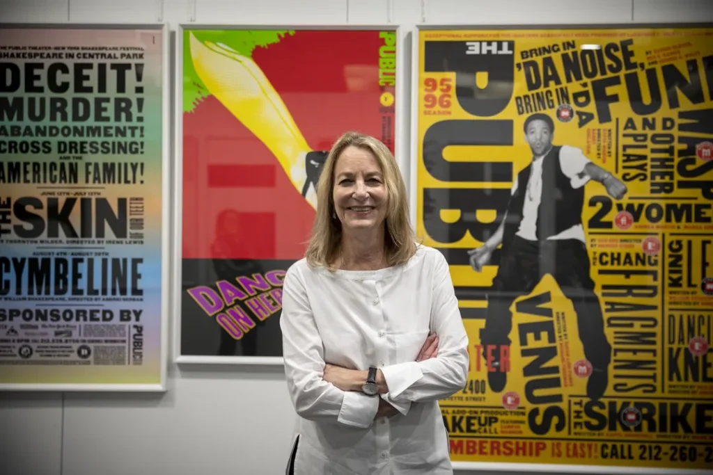
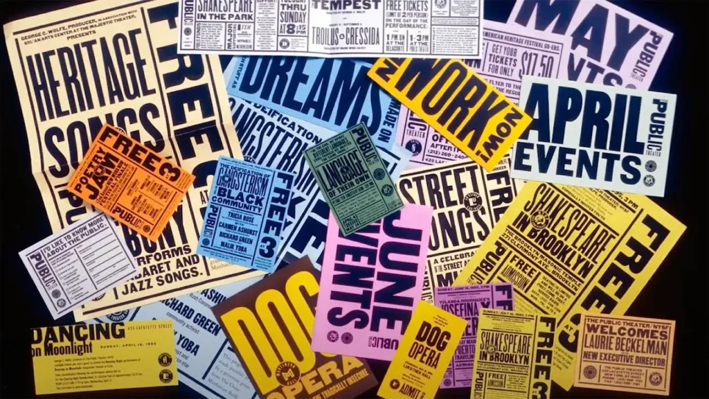
The Public Theater: A Masterclass in Visual Identity
If you want to understand why your current brand strategy is failing, look at The Public Theater in New York. Before 1994, cultural institutions all looked the same: polite, quiet, and elitist.
Scher changed that. She didn’t just give them a logo; she gave them a voice. By using wood-type fonts of varying weights and sizes, she created a visual language that felt like the streets of New York—loud, diverse, and urgent.
The Impact of Typographic Hierarchy
Scher’s work for The Public Theater demonstrated that typographic hierarchy isn’t just about making things readable; it’s about creating an emotional resonance. She used “Knockout” typefaces to scream at the audience.
| Feature | The Amateur Way | The Paula Scher Way |
| Font Choice | Safe, “modern” sans serifs (Helvetica). | Bold, eclectic, historical revivals. |
| Layout | Centred, symmetrical, and “neat.” | Active, diagonal, and overlapping. |
| Colour | Muted, corporate palettes. | High-contrast, vibrant, and jarring. |
| Scale | Type fits inside the box. | Type is the box; it bleeds off the edges. |
Research by the Nielsen Norman Group on visual scanning patterns shows that users prioritise bold, high-contrast elements. Scher’s “maximalist” approach forces the eye to engage, whereas most SMB branding allows the eye to slide right past.
The Citibank Logo: The Napkin Myth and the Reality of Value
In 1998, Citicorp and Travelers Group merged to form Citigroup. It was the largest corporate merger in history at the time. The challenge was to create a brand identity that combined the heritage of both entities.
Scher sat in the initial briefing and, within seconds, drew a lowercase ‘c’ with an arch over it. The arch was a nod to the Travelers red umbrella.
Why This Isn’t “Easy”
Clients often mistake speed for lack of effort. However, according to a McKinsey & Company report on the business value of design, companies that excel at design grow their revenues and shareholder returns at nearly twice the rate of their industry peers.
Scher’s “napkin” moment was the result of thirty years of internalising visual cues. She didn’t “draw a logo”; she solved a multi-billion-dollar architectural problem in ten seconds. If you are looking for design services, you aren’t paying for hours—you are paying for the elimination of risk.
Environmental Graphic Design: Beyond the Screen
One of the most overlooked aspects of Scher’s career is her work in Environmental Graphic Design (EGD). She realised that a brand doesn’t live in a brand guidelines PDF; it lives in the physical world.
At the New Jersey Performing Arts Centre (NJPAC), she didn’t just put signs on the walls. She painted the typography on the building itself. The architecture became the brand.

The Psychology of Space
Using colour psychology and massive scale, Scher transformed a functional space into an experiential one.
This is a lesson for SMB owners: your brand exists everywhere your customer touches your business. If your office, your packaging, or your typography doesn’t align with your digital presence, you are creating cognitive dissonance.
“Consistency is King”
In the world of branding, we are often told that consistency is the most important metric. This is a half-truth that leads to boring, invisible brands.
The Counter-Argument
Paula Scher’s work for the New York City Ballet (NYCB) proved that variability is more powerful than consistency.
She created a system where the fonts and colours could shift and change for every season, yet the “soul” of the brand remained recognisable.
The Ehrenberg-Bass Institute argues that “distinctiveness” is more important than “differentiation.” You don’t need to be different; you need to be unmistakable. Scher achieves this by creating “containers” for creativity rather than rigid sets of rules.
“If you’re not failing, you’re not practising.”
Paula Scher
Serious Play: The Methodology of Intuition
Scher’s concept of “Serious Play” is her most valuable contribution to creative thinking. She differentiates between “Serious” work (the polished, finished product) and “Solemn” work (the boring, safe, corporate stuff).
- The State of Innocence: Approaching a problem without knowing the “correct” way to do it.
- The Breakthrough: Using a mistake or a “wrong” idea to find a new visual path.
- The Execution: Applying professional rigour to the intuitive discovery.
Why SMBs Struggle with Play
Most entrepreneurs are too terrified of looking “unprofessional” to engage in serious play. They end up with “solemn” brands that look like every other B2B SaaS company on LinkedIn. Scher’s success proves that the biggest risk is actually being boring.
I Once Audited a Client…
I remember auditing a mid-sized law firm that wanted a “modern” rebrand. They had spent £20,000 on a logo that resembled one from a template library. It was perfectly aligned, perfectly symmetrical, and utterly forgettable.
When I showed them Paula Scher’s work for the High Line or the Museum of Modern Art (MoMA), the partners were horrified. “It’s too messy,” they said. “The letters are too close together.”

I told them: “That ‘mess’ is why people remember it. Your ‘neat’ logo is why your clients forget your name five minutes after the meeting.”
Scher understands that font pairing and font combinations aren’t just technical exercises. They are psychological triggers. If your brand doesn’t have a “hook”—something slightly off-kilter or remarkably bold—it isn’t a brand. It’s just a name.
The State of Graphic Design in 2026
As we move into 2026, the industry is being flooded by generative AI. Tools can now produce “clean” logos in seconds. This makes Paula Scher’s philosophy more relevant than ever.
AI is excellent at being “solemn.” It can follow rules, maintain grids, and produce perfect symmetry. But AI cannot engage in “Serious Play.”
It cannot understand the cultural nuance of a wood-type font in a digital age or the “humanity” of a hand-painted map.
The Return to the Tangible
We are seeing a massive shift back towards “imperfect” design. Pricing for high-level branding is no longer about the asset (the logo file); it’s about the narrative authority.
In 2026, a brand’s value is tied to its ability to feel human in a sea of synthetic content. Scher’s hand-drawn maps and tactile typography are the antidote to the “dead pixel” aesthetic of the 2020s.
Technical Breakdown: The Scher Toolkit
To replicate even a fraction of Scher’s impact, you need to master the technical nuances of typography.
1. Kerning as a Weapon
Scher often uses “tight” kerning—bringing letters so close they almost touch. This creates a sense of tension and urgency. Most amateurs leave too much “breathing room,” which results in a lack of visual impact.
2. The Power of the Supergraphic
Scaling a small element (like a period or a single letter) until it becomes a massive graphic shape. This is a core technique in her environmental work.
3. Historical Recontextualisation
Scher doesn’t use “new” fonts. She uses old fonts in new ways. By looking at the typography basics of the 19th century, she creates designs that feel timeless rather than trendy.
The Verdict
Paula Scher is the final word on why design is a business investment, not an expense. She doesn’t follow trends; she creates the weather. For the entrepreneur, the takeaway is clear: stop trying to be “neat” and start trying to be distinct.
Whether it’s a napkin sketch or a 40-story building wrap, Scher proves that the most powerful tool in your arsenal is a bold, unapologetic point of view. If you are ready to stop being invisible and start being a landmark, it’s time to rethink your brand identity.
Would you like to see how we can apply these “Serious Play” principles to your own brand? Request a quote today or explore our branding services to see our work in action.
Frequently Asked Questions (FAQ)
Who is Paula Scher?
Paula Scher is a world-renowned graphic designer and the first female principal at Pentagram. She is renowned for her maximalist typography and iconic branding for clients such as Citibank, The Public Theater, and Tiffany & Co. Her work often seamlessly blends high art with commercial grit.
What is the “napkin sketch” story?
During a meeting with Citibank, Scher sketched their new logo on a napkin in seconds. She famously argued that the client wasn’t paying for the seconds it took to draw, but for the decades of experience that allowed her to find the solution so quickly.
What is “Serious Play” in design?
“Serious Play” is Scher’s philosophy of embracing intuition and mistakes. She believes that the best work comes from a state of “innocence” where the designer isn’t afraid to fail, leading to breakthroughs that “solemn” or rigid processes cannot achieve.
Why is her work for The Public Theater significant?
It redefined cultural branding. Instead of the quiet, elitist look typical of the arts, Scher used bold, street-style typography inspired by New York City. This created a visual language that was inclusive, loud, and instantly recognisable, changing how institutions communicate.
How does Paula Scher use typography?
She treats typography as an image rather than just text. By varying weights, sizes, and orientations, she makes the letterforms the primary visual hero of the design. This “maximalist” approach forces engagement and creates a strong brand voice.
What is Environmental Graphic Design (EGD)?
EGD involves applying graphic design to the physical environment, such as buildings and interiors. Scher is a pioneer in this field, often painting massive typography directly onto architectural surfaces to create immersive brand experiences that go beyond a screen.
Is Paula Scher still at Pentagram?
Yes, Paula Scher has been a partner at Pentagram’s New York office since 1991. She continues to lead major branding projects and remains one of the most influential figures in the global design community.
What are some of Paula Scher’s most famous projects?
Her portfolio includes the Citibank logo, The Public Theater’s identity, the redesign of the Microsoft Windows 8 logo, as well as the wayfinding systems for the New York City Ballet, MoMA, and the High Line. She is also known for her intricate, hand-painted maps.
Why should entrepreneurs care about her work?
Scher proves that a brand’s value lies in its distinctiveness and authority. Her work shows that playing it safe is often the riskiest move a business can make. Learning from her “direct” approach can help SMBs build more memorable brands.
What fonts does Paula Scher use?
Scher frequently uses bold, sans-serif typefaces, such as Akzidenz-Grotesk, Franklin Gothic, and Knockout. She is known for “reviving” historical fonts and using them in contemporary, high-impact ways that defy modern trends.
How did she influence the Microsoft logo?
For Windows 8, Scher famously asked, “Your name is Windows. Why are you a flag?” She pushed for a more literal, perspective-based “window” logo, moving the brand away from its previous multi-coloured, wavy flag design towards a cleaner, more meaningful identity.
What can I learn from Paula Scher about brand strategy?
The biggest lesson is that strategy should lead to a clear, bold visual conclusion. A brand isn’t just a logo; it’s a visual language that must be flexible enough to evolve but distinct enough to be remembered.


