Website Design Process: 2026 Guide to AI-Driven Results
In 2026, your website isn’t just a digital brochure; it’s a data node.
If your website design process is still following the “pretty picture” philosophy of the last decade, you are wasting capital.
The stakes have changed. Since McKinsey reported that GenAI could add trillions to the global economy, the market has been flooded with “AI-designed” junk.
True performance in 2026 comes from a forensic blend of human strategy and AI efficiency.
If you ignore the importance of web design as a technical foundation, you are essentially building a skyscraper on a swamp.
- Prioritise discovery and semantic mapping to define entity authority and user intent before visual design.
- Design information architecture for AI agents using hub and spoke topology and agentic metadata for MX optimisation.
- Combine AI-assisted prototyping with human-led authenticity to avoid generic, soulless AI designs.
- Ensure technical excellence: edge-side rendering, audited AI code, accessibility and continuous semantic refreshing.
What is a Website Design Process?
A website design process is a structured, multi-phase methodology used by professional agencies to plan, create, and launch a digital asset.
In 2026, this process integrates semantic SEO, technical performance, and AI-assisted workflows to ensure the site meets the needs of both human users and AI search agents.
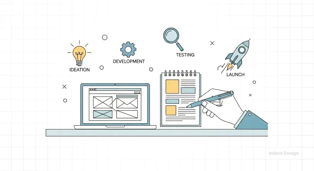
The three core elements of a modern process include:
- Strategic Discovery: Identifying user intent and entity relationships before a single pixel is moved.
- Architectural Logic: Building a logical information architecture that allows for instant data retrieval.
- Conversion Optimisation: Using data-backed design to guide the user toward a specific financial outcome.
The primary commercial benefit of an AI-integrated process is the reduction of Marginal Design Costs.
By using AI as a System Curator, we move from “pixel-pushing” to “system orchestration.”
This creates a Design-to-Ticket workflow where AI agents automatically generate responsive components based on design system tokens and simultaneously create the associated Jira or GitHub tickets for the development team.
This compresses the traditional agency timeline by 40%, enabling your capital to be allocated to high-level strategy rather than repetitive production overhead.
Phase 1: Discovery and Semantic Mapping
The biggest mistake I see? Starting with “What do you want the site to look like?”
Wrong. We start with “What entities are we claiming authority over?”
In the 2026 Inkbot Design workflow, Discovery involves auditing your existing brand equity and mapping it against the current semantic environment. We don’t just look at keywords; we look at the “Knowledge Graph.”
The Death of the Generic Brief
“We want it to be modern and clean”, tells me nothing.
We utilise AI-driven sentiment analysis to extract your competitors’ reviews, pinpointing precisely where they fall short.
If your competitors are annoying customers with slow load times or confusing navigation, that becomes our primary point of entry.
Real-World Example:
When auditing a mid-sized B2B firm in late 2025, we found that while their design was “modern,” their UX vs UI design balance was skewed. They had focused on aesthetic UI, but the UX was so convoluted that AI agents (like Google’s Gemini) couldn’t find their pricing page.
We remapped their discovery phase to focus on “Answer Engine Optimisation” (AEO), and their organic leads tripled in a couple of months.
Phase 2: Information Architecture (The AI Backbone)
In 2026, your information architecture is more important than your logo.
Why? Because LLMs (Large Language Models) are now the primary “gatekeepers” of traffic.
If an AI agent can’t crawl your site map and understand the relationship between your “Services” and your “Case Studies,” you won’t appear in “Search Generative Experiences.”
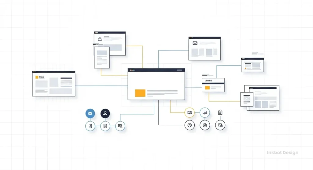
Building for the “Agent-First” World
We use a “Hub and Spoke” model. Your primary service pages act as the hub, with supporting technical articles (like this one) acting as the spokes. This builds “Topical Authority.”
| Element | Amateur Approach | Pro (Inkbot) Approach (2026) |
| Site Map | Linear and shallow. | Semantic clusters with clear entity linking. |
| Navigation | Based on “what looks cool.” | Based on “User Intent Flow” and AI parseability. |
| Internal Linking | Random and “keyword-heavy.” | Contextual, using natural language anchors. |
| Metadata | Static and generic. | Dynamic, optimised for LLM “Summary” snippets. |
Beyond the human interface, 2026 requires Machine Experience (MX) Optimisation.
We are no longer just designing for eyes; we are designing for AI Delegates that navigate the web to perform tasks.
This involves creating Agentic Metadata—a layer of structured data that instructs AI agents on how to effectively “consume” your site.
If your process doesn’t include Semantic HTML5 and explicit problem-to-solution labelling, you are invisible to the autonomous agents that now handle an estimated 30% of B2B research.
We often see sites where the mobile-first design is an afterthought. In 2026, mobile-first is the baseline, but “Agent-First” is the competitive edge.
Phase 2.5: The Bento Grid Architecture
In 2026, Bento Grids have become the modular standard for Information Architecture. Inspired by Japanese lunch boxes, this layout organises diverse content—Features, Testimonials, and Data Viz—into asymmetric, card-like blocks.
From an SEO/GEO perspective, Bento Grids are superior because they create clear Semantic Boundaries.
Each card acts as a self-contained Entity Node, allowing Gemini to scrape and cite specific sections (like your “Core Services”) without the cognitive load of a long-form scrolling page.
At Inkbot Design, we utilise CSS Grid to ensure these blocks remain accessible and responsive, maintaining a perfect Mobile-First Index score.
Phase 3: Wireframing and AI-Assisted Prototyping
Wireframing is the skeletal structure of your site. It’s where we decide where the eyes should go. In 2026, we’ve moved past static tools.
We use wireframing in web design as a collaborative phase where AI generates 50 variations of a layout based on conversion data, and our designers pick the three that don’t feel “robotic.”
In 2026, we are witnessing the Human Touch Counter-Trend.
As AI-generated layouts become the statistical “mean,” authenticity has emerged as the ultimate premium differentiator.
Forensic design now incorporates a Humanity Surcharge—a deliberate investment in “High-Friction” elements like hand-drawn typography, candid non-stock photography, and intentional “asymmetry.”
This signals to the user’s subconscious that the brand is operated by humans with a pulse, not just a prompt, effectively bridging the “Trust Gap” created by the synthetic web.

The “Uncanny Valley” of AI Design
There is a massive risk in 2026: sites that look too AI-generated.
You’ve seen them—the perfectly symmetrical layouts, the generic “diverse office people” images, the soulless copy. These sites have high “bounce rates.”
I once audited a client who used a “fully automated” AI web builder. It cost them £500.
Within three months, their conversion rate dropped to 0.2%.
Why? Because the AI had followed “best practices” so rigidly that the site had no personality. It looked like a scam.
We had to go in, rip out the generic components, and inject human friction—real photos, edgy copy, and responsive web design that actually worked on an iPhone.
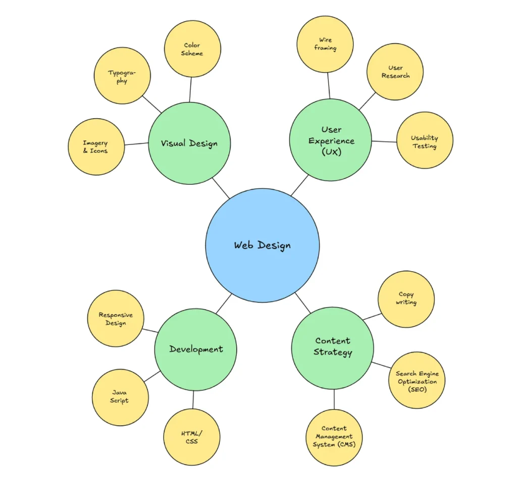
Phase 4: Visual Design and Brand Integration
Visual design in 2026 isn’t about being “pretty.” It’s about Cognitive Load Management.
Accessibility is Not Optional
If your site isn’t following web accessibility guidelines, you are excluding up to 20% of your potential market. Furthermore, Google’s 2026 algorithm now uses “Accessibility Score” as a direct ranking signal.

We focus on:
- Dynamic Contrast: Adjusting based on user device settings.
- Variable Typography: Ensuring legibility across all screen sizes.
- Non-Visual Elements: ARIA labels that actually describe the content for screen readers and AI agents.
Referencing current web design trends for businesses, we observe a shift away from “Minimalism for the sake of it” toward “Functional Maximalism”—where the site provides all the necessary data on one page without requiring the user to click multiple times.
The New Accessibility: APCA and Variable Fonts
As we transition toward WCAG 3.0, the binary 4.5:1 contrast ratio is being replaced by the APCA (Advanced Perceptual Contrast Algorithm). This 2026 standard accounts for font-weight and ambient light.
We utilise Variable Fonts (Woff2) to dynamically adjust weight and width based on the user’s environment.
| Standard | Logic | 2026 SEO Impact |
|---|---|---|
| WCAG 2.1 | Static Ratios (4.5:1) | Baseline Requirement |
| APCA (WCAG 3.0) | Perceptual Weighting | High (Ranking Signal) |
| Variable Fonts | Single File Interpolation | Blazing LCP (0.8s) |
Phase 5: Technical Development and Performance Engineering
This is the “Black Box” phase. Most clients don’t want to know how the engine works; they just want the car to go fast. But in 2026, speed is a legal requirement for ranking.
The Myth: “AI Code is Perfect”
Many developers are now using AI to write their CSS and JavaScript. This is a disaster if not audited.
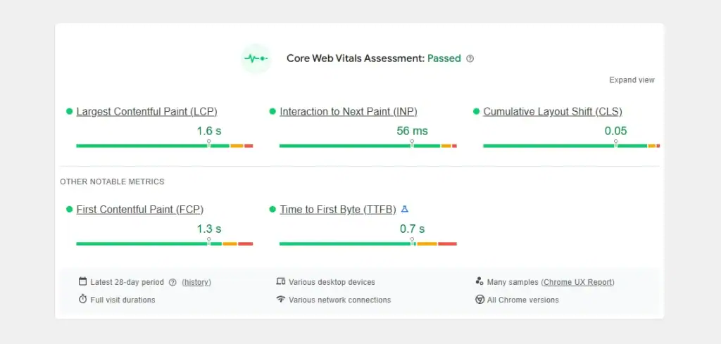
AI-generated code is often bloated, containing “hallucinated” libraries or redundant functions that slow down your Largest Contentful Paint (LCP).
According to Nielsen Norman Group, even a 100ms delay in response time can break the user’s flow. At Inkbot, we hand-code the critical path to ensure your site loads in under 0.8 seconds.
The State of Web Tech in 2026
We have moved toward Edge-Side Rendering (ESR). Instead of your site sitting on a server in London, it’s distributed across a global network.
This means a user in Tokyo sees your site as fast as a user in Manchester. If your agency isn’t talking about ESR, they are living in 2020.
A frequent “pain point” in website launches is the delay of real-world A/B testing. The solution in 2026 is the Predictive Usability Optimiser.
Before a single user visits the site, we run Synthetic User Simulations—feeding the prototype into an AI trained on billions of real-world interaction patterns.
This predicts task completion rates and Cognitive Friction points with 85% accuracy. By fixing these flaws pre-launch, we eliminate the “Rework Tax” and ensure your site is conversion-ready from the first 50 milliseconds.
Phase 6: Testing, QA, and AI Agent Validation
Before we go live, we put the site through a “Forensic Stress Test.”
- Human Testing: Real people trying to find your landing page design and complete a purchase.
- Bot Testing: We run the site through LLM simulators to see how Gemini, GPT-5, and Claude “summarise” the page. If the summary is incorrect, the structure is likely to be incorrect as well.
- Security Audit: Checking for prompt injection vulnerabilities in your contact forms.

Phase 7: Launch and The “Growth Loop”
Launch is not the end. This marks the beginning of the data collection phase.
In 2026, we will use a website maintenance checklist that includes “Semantic Refreshing.” Since language evolves and AI search patterns change, we update your site’s schema and entity links every quarter to ensure you stay at the top of the pile.
Debunking the “Set It and Forget It” Myth
There’s a common belief that once a site is “SEO-optimised,” it stays that way. This is a lie. Data from Search Engine Journal and Google’s own documentation suggest that “content decay” occurs more rapidly in an AI-driven world.
If you aren’t adding “Information Gain”—new, unique data that doesn’t exist elsewhere—your rankings will naturally slide as AI-generated competitors copy your old content.
The Verdict
The website design process in 2026 is a high-stakes technical discipline. You can’t just “design” your way to success anymore. You have to engineer it.
At Inkbot Design, we don’t do “fluff.” We build forensic, data-driven digital assets that are designed to survive the AI revolution. We focus on the web design services that actually move the needle for your bottom line.
If you are tired of generic advice and want a site that actually works, you know what to do. Stop guessing and start measuring.
Request a Quote today, and let’s fix your digital presence.
Frequently Asked Questions
What is an “AI-Driven” website design process?
It is a hybrid methodology where AI handles the high-volume data tasks (analytics, wireframe iterations, and code generation) while human strategists focus on brand “soul,” emotional resonance, and ethical governance.
How long should a professional website redesign take in 2026?
A forensic, strategy-led build typically takes 8 to 12 weeks. While AI can generate a layout in minutes, the human-led phases of discovery, semantic mapping, and “Humanity” testing cannot be rushed without risking brand dilution.
What is Machine Experience (MX) Optimisation?
MX is the process of making your site “readable” for AI agents and LLMs. It involves using Semantic HTML, JSON-LD Schema, and structured summaries that enable AI search engines to accurately extract and cite your content.
How does AI improve website conversion rates?
Through Predictive Usability. AI can simulate thousands of user journeys before the site goes live, identifying friction points in your navigation and CTA placement that would normally take months of real-world A/B testing to find.
Why is “Human Friction” a trend in 2026 design?
As the web becomes increasingly saturated with “perfect” AI-generated layouts, users are craving authenticity. Introducing “human friction”—deliberate imperfections and a unique brand “voice”—signals credibility and distinguishes you from the sea of automated sameness.
What are the legal requirements for AI in web design?
Under 2026 UK and EU guidelines, you must maintain Data Provenance. This means ensuring that any AI tools used (such as Adobe Firefly) are trained on ethical datasets and that you retain full copyright over the “Significant Human Authorship” of your brand assets.
Does AI-generated code affect my SEO?
It can. If not audited, AI-generated CSS and JavaScript can become bloated, resulting in poor Core Web Vitals. A forensic process requires a human developer to prune and “minify” AI-assisted code to maintain sub-second load times.
What is a “Dark Launch” in the design process?
A Dark Launch is a soft release to a controlled segment of your audience. It allows you to monitor how AI Agents and humans interact with the live site, making iterative adjustments to the UX before the official “Big Bang” reveal.
How do I choose between a “Custom” build and an AI website builder?
AI builders (like Wix AI) are excellent for small, low-stakes projects. However, for a business requiring Topical Authority and complex third-party integrations, a custom build on a framework like GeneratePress offers the technical “moat” you need to rank.
What is “Edge-Side Rendering” (ESR)?
ESR is a performance standard where your site is rendered at the “edge” of the network (closest to the user). In 2026, this ensures that your site is fast for every user globally, which is a confirmed ranking factor for Google’s mobile-first index.
Why is “Accessibility” a ranking signal in 2026?
Search engines equate accessibility with high-quality code. Following WCAG 2.2 ensures that your content is navigable by screen readers and AI scrapers, increasing your “Crawl Efficiency” and semantic clarity.
How much should I invest in a 2026 website redesign?
For a professional, strategy-led UK site, investment typically ranges from £5,000 to £ 25,000 or more. Anything cheaper is often a “template-tweak” that lacks the forensic SEO and AI-readiness required to win in 2026.
What is “Content Decay” and how do I prevent it?
Content decay refers to the gradual loss of ranking power over time. A professional process includes a Semantic Refresh schedule—quarterly updates to your structured data and content to ensure it remains a “Primary Source” for AI search engines.
Can AI replace my web designer?
AI replaces the “Pixel-Pusher” (repetitive production), but it cannot replace the System Curator (the strategist). In 2026, the value of a designer is in their ability to orchestrate AI tools to achieve a specific commercial outcome.
What is the “Design-to-Ticket” workflow?
It is an automated pipeline that instantly translates design components into developer-ready code and project management tickets. This eliminates the “Handoff Gap” and ensures that the final site aligns perfectly with the strategist’s original vision.
What is the difference between AEO and GEO?
AEO (Answer Engine Optimisation) focuses on being the direct answer for specific questions (Siri/Alexa/Snippets). GEO (Generative Engine Optimisation) focuses on ensuring your brand is cited as a primary source when AI models (Gemini/GPT-5) synthesise a response.