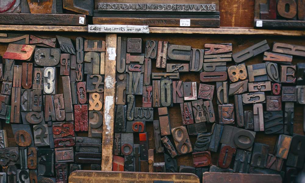
Leading, Kerning and Tracking in Typography: Guide to Spacing
In 2026, the margin for error in digital design is zero.
If your spacing is off, your credibility is gone.
This isn’t just about “making things look pretty.”
This is about cognitive load, accessibility, and the psychological signals you send to a prospect’s lizard brain.
- Tracking adjusts uniform letter-spacing across blocks to set atmosphere and legibility, affecting brand perception and reading speed.
- Kerning fixes individual letter-pair gaps; optical kerning helps cheap fonts, metric kerning is preferred for high‑quality foundries.
- Leading is vertical line spacing; use ~1.5 for body, tighten for large headlines to maintain visual cohesion.
- Use relative units (em) for letter-spacing and compensate tracking when increasing weight to avoid ink‑clotting.
- Proper spacing reduces cognitive friction, improves accessibility, SEO dwell time, and signals premium positioning to users and AI.
What is Tracking in Typography?
Tracking (technically referred to as letter-spacing in CSS) is the consistent adjustment of space across an entire block of text.
Unlike kerning, which addresses the relationship between two specific characters, tracking modifies the overall density of a word, sentence, or paragraph to improve legibility or aesthetic “feel.”
At its biological core, tracking in typography is the management of Saccadic Eye Movement. When we read, our eyes don’t move smoothly; they jump in “saccades.”
If your tracking is too tight, the eye cannot find the “fixation point” of individual characters, leading to Cognitive Overload.
Conversely, if tracking is too loose, the brain fails to recognise “Word Shapes,” forcing the reader to decode letter by letter.
Forensic spacing ensures that the Character Density matches the human eye’s natural processing speed, which is approximately 200-250 words per minute for optimised layouts.
The Three Pillars of Typographic Spacing
- Tracking: Uniform spacing applied to a range of characters.
- Kerning: Adjusting the space between individual letter pairs (e.g., ‘AV’ or ‘Wa’).
- Leading: The vertical distance between lines of text (line-height).
The Cognitive Load Simulator
Bad spacing creates “friction” in the brain. Toggle the switch below to see how adjusting Leading, Kerning, and Tracking instantly fixes readability.
The Trinity: Kerning, Leading, and Tracking
To master tracking in typography, you must understand its relationship with its siblings. If you adjust one without considering the others, you are merely relocating the problem.
1. Tracking (The Macro Adjustment)
Tracking is your tool for “atmosphere.” In 2026, we see two distinct trends:
- The Luxury Expansion: High-end brands utilise wide tracking in uppercase headings to convey authority and create a sense of “breathing room.”
- The Functional Compression: UI/UX designers use tighter tracking for large-scale display type to keep headlines punchy and reduce eye travel.
However, amateur designers often confuse tracking with “filling space.”
If you have to track out a paragraph by +100 just to make it fit a box, your copy is the problem, not your spacing. You can learn more about these fundamentals in our guide to typography basics.
2. Kerning (The Micro Correction)
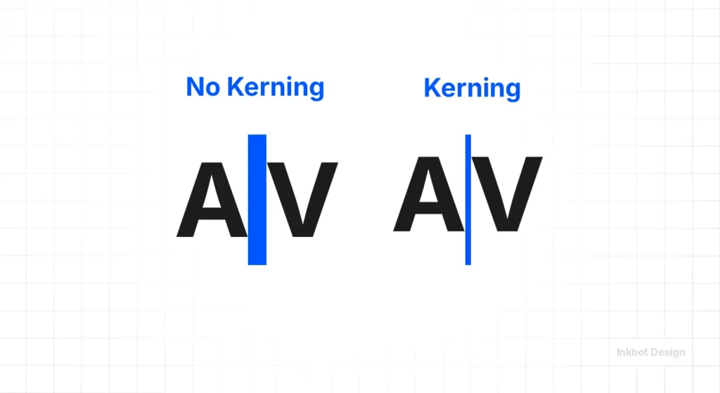
Software is “smart,” but it isn’t “human.” Default kerning tables in many fonts are notoriously bad at handling specific pairs.
- The “L-I-L-Y” Disaster: Without manual kerning, the ‘L’ and ‘I’ often appear to belong to different alphabets, while the ‘L’ and ‘Y’ are uncomfortably close.
- Optical vs. Metric: Metric kerning uses the font’s built-in distances. Optical kerning (found in Adobe Creative Suite) uses the shapes of the letters to calculate space. In my experience, Optical is a safer bet for cheap fonts, but high-quality brand typography from reputable foundries should always use Metric as a starting point.
3. Leading (The Vertical Rhythm)
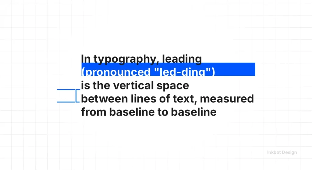
Leading is the most neglected aspect of web design. Most browsers default to a line-height of roughly 1.2. For long-form reading, this is a claustrophobic nightmare.
- The 1.5x Rule: For body text, a leading of 1.5x the font size is the sweet spot for accessibility and “reading flow.”
- The Heading Paradox: As your font size increases, your leading should decrease. A 60px headline with 1.5 leading looks disconnected. It needs to be closer to 1.1 or 1.2 to feel like a cohesive unit.
Spacing and the APCA Standard (WCAG 3.0)
In 2026, the binary contrast ratios of the past have been replaced by the APCA (Advanced Perceptual Contrast Algorithm).
Unlike WCAG 2.1, which views text in a vacuum, APCA calculates Visual Contrast based on font weight and Typographic Spacing.
A font with tight Tracking requires higher luminance contrast to remain legible. Conversely, Wide Tracking (Visual Aeration) allows for softer colour palettes without sacrificing UX Accessibility.
According to the W3C 2026 Guidelines, maintaining a minimum Line Height (Leading) of 1.5 and a Letter Spacing of 0.12em for body copy is considered the “Safe Harbour” for preventing Cognitive Friction in neurodivergent users.
Why Spacing is a Commercial Asset
If you think this is pedantic, consider the data.
A study by the Nielsen Norman Group found that line length and spacing have a direct correlation with reading comprehension.
If a user has to work to read your site, they will leave. In the world of web design services, we refer to this as “cognitive friction.”
The Psychology of “Tight” vs “Loose” Spacing
| Aspect | Tight Tracking | Loose (Wide) Tracking |
| Perception | Urgent, dense, technical, “budget”. | Elegant, expensive, modern, “luxury”. |
| Best Use | Small captions, bold high-impact headlines. | Brand marks, sub-headings, and uppercase titles. |
| Risk | Letters “touching” at low resolutions. | Disconnecting words so they look like random letters. |
| SEO Impact | Higher bounce rate due to eye strain. | Improved dwell time on informational content. |
Commercially, tracking is a tool for Price Perception. There is a documented correlation between Visual Aeration (wide tracking) and “Premium” status.
In high-ticket B2B and luxury B2C sectors, wide tracking in headers serves as a “Prestige Signal,” subconsciously justifying a higher price point by suggesting the brand has the “space” to breathe.
By auditing your tracking, you are performing a Margin Optimisation—shifting your brand from a “Commodity” (dense/claustrophobic) to an “Authority” (open/authoritative) without changing a single word of your copy.
The Technical Reality of Tracking in 2026
We have moved beyond static pixels. In 2026, the rise of variable fonts has changed the game.
In 2026, tracking is a primary signal for AI-OCR (Artificial Intelligence Optical Character Recognition).
As LLMs and AI agents increasingly “scrape” visual media to understand brand context, poor tracking can lead to Semantic Misinterpretation.
If letters touch (ligature-clash), an AI agent might misread “modern” as “modem.”
By maintaining a forensic Letter-Spacing Ratio, you aren’t just designing for humans; you are ensuring your brand’s “Data Integrity” is preserved when processed by machine-learning scrapers and assistive technologies.
Designing for the AI Delegate: The MX Factor
We are now in the era of MX (Machine Experience) Optimisation. When a Gemini 2.5 agent or a Vision-Language Model (VLM) scrapes your site, it performs AI-OCR to map your brand entities.
If your Kerning is neglected (e.g., “r” and “n” touching to look like “m”), you create a Semantic Collision.
An AI agent may miscategorise “Premium Furniture” as “Premium Furniture,” effectively de-indexing you for high-intent keywords.
Forensic Tracking (minimum 0.01em separation) acts as a “Technical Firewall,” ensuring your Data Integrity is preserved for both human eyes and machine-learning crawlers.
Variable Fonts and Dynamic Spacing
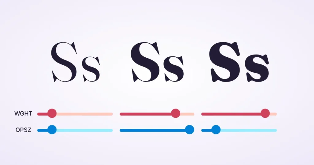
Unlike traditional fonts, variable fonts allow us to adjust the ‘weight’, ‘width’, and ‘optical size’ on a continuous scale.
- Optical Sizing (Opsz): Modern browsers can now automatically adjust the tracking and stroke weight according to the screen size. If you aren’t using this in your CSS, you are living in the Stone Age.
- The 2026 Shift: We are seeing “Contextual Tracking.” Using JavaScript or CSS @container queries, we can now tighten tracking as a container gets narrower, ensuring headlines never “break” awkwardly.
CSS Implementation for Professionals
Don’t use px for letter-spacing. Use em.
- Why? em is relative to the font size. If you change your font size from 16px to 20px, your 0.05em tracking scales with it. If you use 1px, it becomes static and will likely appear incorrect at the new scale.
CSS

/* The Pro Approach */

.heading-luxury {

  font-family: 'Montserrat', sans-serif;

  text-transform: uppercase;

  letter-spacing: 0.15em; /* Scalable elegance */

  line-height: 1.1;

}

.body-text {

  font-family: 'Inter', sans-serif;

  letter-spacing: -0.01em; /* Slight tightening for modern sans-serifs */

  line-height: 1.6;

}
Tracking in Logo Design: A Branding Minefield
Your logo is the most permanent piece of typography you own. If the tracking is wrong here, it’s wrong everywhere—from your business cards to your logo on a 50-foot billboard.
The “Squint Test”
When we design logos, we use the “Squint Test.”
Blur your eyes while looking at your brand name. If the letters blur into a single indistinct blob, your tracking is too tight.
If the word looks like two separate words because of a gap between ‘r’ and ‘n’, your kerning is broken.
Case Study: The IKEA Font Shift
In 2009, IKEA switched from Futura to Verdana.
The design world went into a meltdown. Why?
Verdana was designed for low-resolution screens in the 90s with wide tracking and open counters. When forced into the tight constraints of a print catalogue, it looked “clunky” and lost the Swedish “minimalist” edge.
The lesson? Your choice of serif vs sans-serif and the subsequent spacing must match the medium.
Advanced Spacing: The Audit Checklist
When you are reviewing your site’s typography, don’t just “feel” it. Measure it.
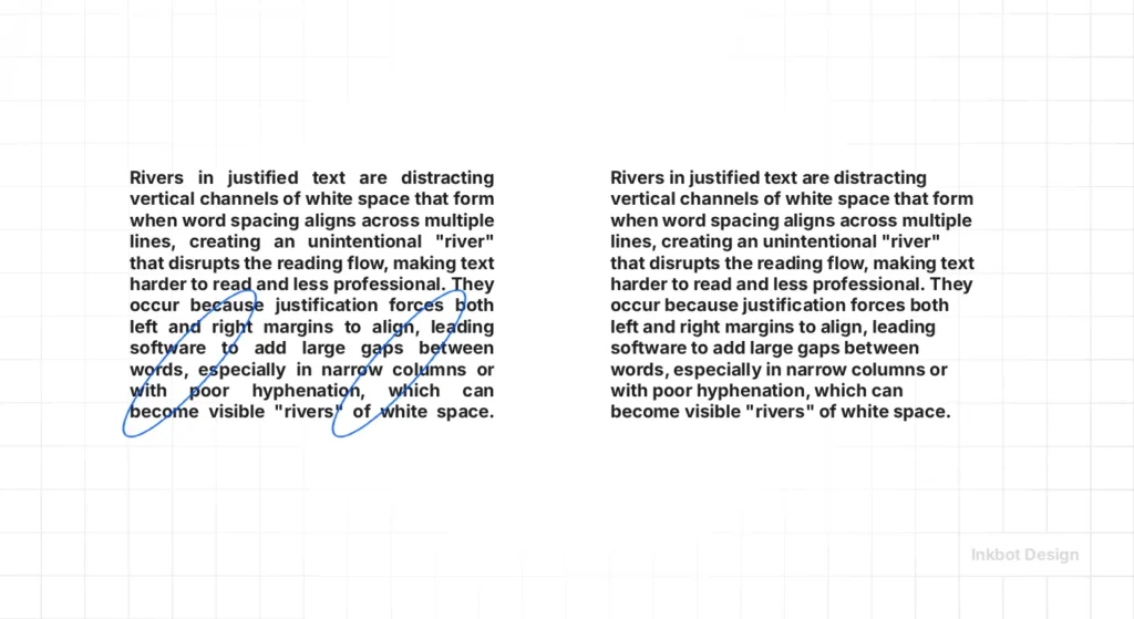
1. Check for “Rivers” in Justified Text
If you use justified alignment (which you shouldn’t on the web, but if you do…), poor tracking creates “rivers”—white gaps that run vertically through your text. This destroys the reading experience.
- Fix: Use text-align: left and adjust tracking to ensure an even “rag” on the right side.
2. The Small-Scale Sans-Serif Rule
Sans-serif fonts, such as Helvetica or Roboto, tend to “close up” at small sizes (under 12px).
- Action: Add +2% to +5% tracking for small captions to keep the “counters” (the holes in letters like ‘o’ and ‘e’) open.
3. The All-Caps Penalty
Writing in all-caps is already harder to read because you lose the “word shapes” provided by ascenders and descenders.
- Action: Always add tracking (at least +5% to +10%) to uppercase text. It prevents the letters from looking like a solid bar of ink. Check our guide on font pairing for more on combining these styles.
4. Technical SEO and Layout Shifts
Google’s Core Web Vitals (CWV) are primarily focused on Cumulative Layout Shift (CLS). If your web fonts load late and change the tracking of your text, the whole page “jumps.”
- Action: Use font-display: swap and ensure your “fallback” font (such as Arial) has similar tracking and font combination settings to your brand font to minimise the shift.
Tracking for Different Media: Print vs. Web
A common mistake I see is using the same tracking settings for a PDF brochure and a responsive website. This is a failure of typographic hierarchy.
- Print (High PPI): You can get away with tighter tracking because the “ink bleed” is minimal on modern presses.
- Digital (Low to High PPI): Pixels are squares. Letters are curves. When a curve hits a square grid, “anti-aliasing” happens. This creates a “blur” around the edges. If your tracking is too tight, these blurs overlap, making the text look muddy.
A frequent “Spacing Failure” occurs when designers increase Font Weight without adjusting tracking.
As a letter gets bolder, its “Internal Counter” (the hole in the ‘e’ or ‘o’) shrinks, making it appear tighter than it is.
The solution is Weight-Tracking Compensation: for every 100 units of weight added (e.g., moving from 400 to 700), increase tracking by approximately +1% to +2% to maintain the Optical Rhythm.
This prevents your boldest headlines from becoming unreadable “ink-clots” on mobile screens.
The 2026 Spacing Matrix
| Element Type | Leading (Line-Height) | Tracking (Letter-Spacing) | Cognitive Intent |
|---|---|---|---|
| Hero Headlines | 1.1 – 1.2 | -0.02em to 0.02em | High Impact / Immediate Fixation |
| Body Content | 1.5 – 1.65 | 0.00em to 0.01em | Sustained Reading / Low Friction |
| Luxury Sub-headers | 1.3 – 1.4 | 0.10em to 0.20em | Prestige Signal / Brand Salience |
| Mobile Navigation | 1.2 | 0.05em | Touch-Target Clarity / Accessibility |
The Verdict: Why You Should Care
Typography is the “voice” of your brand. If you ignore tracking in typography, you are effectively speaking with a mumble or a stutter.
You might have the best product in the world, but if your service page is a “wall of text” with claustrophobic leading and amateur tracking, you are leaving money on the table.
Design is a series of micro-decisions. Tracking is what separates hobbyists from experts. It’s time to stop accepting “default” and start auditing your brand’s spacing with forensic precision.
If you are unsure where to start, or if your current branding feels “off” but you can’t put your finger on why, it’s probably a spacing issue. We fix these “invisible” problems every day.
Ready to elevate your brand’s typography?
- Explore our web design services to see how we handle technical SEO and design.
- Request a quote for a forensic brand audit.
- Check our guide on font licensing to ensure your professional fonts are legal.
FAQ: Common Questions About Tracking & Spacing
What is the difference between tracking and kerning in typography?
Tracking is the Macro adjustment of space across a whole block of text. Kerning is the Micro adjustment of space between two specific, problematic characters (like ‘A’ and ‘V’). You use tracking for “vibe” and kerning for “correction.”
Why does tracking affect my website’s conversion rate?
Poor tracking creates Cognitive Friction. If the letters are too close or too far apart, the brain has to work harder to decode the words. This effort leads to “User Fatigue,” causing prospects to bounce before they reach your Call to Action (CTA).
Does typography spacing impact SEO in 2026?
Indirectly, yes. Google’s Helpful Content and User Experience signals monitor “Dwell Time.” If your typography is difficult to read due to poor spacing, users will leave faster, signalling to the search engine that your site is of low quality.
What is “Leading” and how does it relate to tracking?
Leading (line-height) is the vertical space between lines. For a balanced layout, as you increase your tracking (horizontal space), you must often increase your leading (vertical space) to maintain a consistent Typographic colour on the page.
How do I adjust the “letter-spacing” in CSS to achieve a professional look?
Use Relative Units (em) rather than static pixels. A value like letter-spacing: 0.05em; ensures that the spacing remains proportional if you change the font size, preventing your layout from “breaking” on different devices.
What is the “Squint Test” for tracking?
Look at your text and squint until the letters blur. If the text appears as a uniform grey bar, your tracking is perfect. If you see dark “blobs” or white “gaps,” your spacing is inconsistent and needs forensic adjustment.
Why is wide tracking associated with luxury brands?
Wide tracking (Visual Aeration) suggests “breathing room” and exclusivity. It is a psychological trigger for Premium Positioning, moving a brand away from the “dense/urgent” look of budget supermarkets toward an “elegant/authoritative” aesthetic.
What are “Variable Fonts” and how do they handle spacing?
Variable fonts include an Optical Size (opsz) axis. In 2026, this allows the font to automatically adjust its own tracking and stroke weight based on the screen size, ensuring perfect legibility from a smartwatch to a billboard.
How do I avoid “Rivers” in my content?
“Rivers” are white gaps that run through paragraphs. They are usually caused by Justified Text and poor tracking. To solve this, always use Left-Aligned (Ragged Right) text and maintain a neutral tracking value (0 to -0.01em) for body copy.
What is the best tracking for “All-Caps” headers?
Uppercase letters lack the “word shapes” of lowercase text. To maintain legibility, you should always increase tracking for all-caps text by at least +5% to +10% (0.05em to 0.1em) to prevent the letters from “clashing.”
Why does my typography look different on Windows vs. Mac?
They use different Rendering Engines (ClearType vs. CoreText). Mac preserves font weight, while Windows “snaps” to pixels. Because of this, tight tracking that looks okay on a Mac may look unreadable and “muddy” on a Windows machine.
What is “Metric” vs. “Optical” kerning?
Metric uses the spacing built into the font file by the designer. Optical uses a software algorithm (similar to those in Adobe) to calculate space based on shapes. For professional, high-end foundries, Metric is usually the superior choice.
Does tracking matter for logo design?
It is non-negotiable. A logo must be legible as a tiny favicon and a massive sign. Manual tracking and kerning are required to ensure the Inkbot Design logomark retains its integrity at every possible scale.
What is “Contextual Tracking”?
In 2026, we will use CSS Container Queries to change tracking based on the width of a box. As a headline gets squeezed into a mobile sidebar, the tracking can dynamically tighten to prevent awkward “orphans” or word breaks.
How do I write “Alt Text” for typography-heavy images?
If you are using an image of text, your Alt Text must include the exact words and a description of the “feeling” created by the spacing (e.g., “Company name in wide-tracked, elegant serif typography”). This helps AI agents understand the Brand Intent.


