Herbert Bayer: Architect of the Modern Visual Language
I’ve spent two decades auditing brand identities that look like a car crash of conflicting ideas. If you want to understand why your marketing feels “off,” you need to look at Herbert Bayer.
Bayer was the last living link to the Bauhaus, and he spent his life rectifying the mess that the Victorian-era clutter had left behind.
He understood that every millimetre of white space has a job to do.
If you ignore his principles, you aren’t “being creative”—you’re just being loud and ineffective.
In a world where 81% of consumers need to trust a brand before making a purchase, Bayer’s “Total Design” approach isn’t a history lesson; it’s a survival guide for your business.
- Bayer codified Bauhaus "Total Design," unifying typography, architecture, and commerce into a functional visual system.
- He championed functional minimalism: remove nonessential elements to prioritise legibility and information transmission.
- He designed the Universal typeface and promoted single-case, geometric sans-serif typography for clarity and economy.
- At CCA he proved brand strategy sells ideals, using surreal imagery and typographic hierarchy instead of product photos.
- He pioneered data visualisation and grid systems, prefiguring modern UI/UX, infographics, and mobile-first branding constraints.
Who is Herbert Bayer?
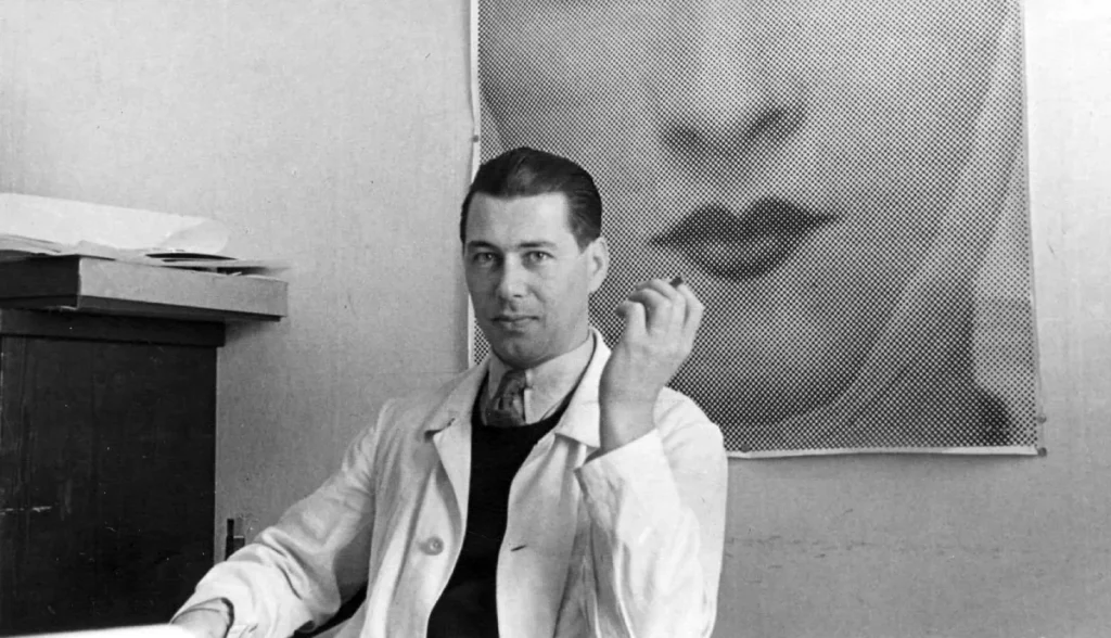
Herbert Bayer (1900–1985) was an Austrian-American graphic designer, painter, architect, and photographer who served as the first master of the Printing and Advertising workshop at the Bauhaus. He is widely recognised for codifying the Bauhaus aesthetic into a functionalist system of “Total Design” that integrated art, architecture, and commerce.
Key Components of Bayer’s Philosophy:
- Functional Minimalism: Removing any visual element that does not serve the transmission of information.
- The “Universal” Typeface: A geometric, sans-serif approach that rejected traditional German “Fraktur” and capital letters.
- Psychological Advertising: Using Surrealist-inspired imagery and colour psychology to trigger subconscious consumer responses.
The Bauhaus Years: Killing the Capital Letter
When Bayer arrived at the Bauhaus in 1921, European typography was a congested nightmare. German “Blackletter” was the standard—ornate, difficult to read, and tied to a nationalist past.
Bayer didn’t just want to change the font; he wanted to change the way the human brain processed text.
In 1925, Walter Gropius appointed Bayer as a “Junior Master.” His first task? Revolutionise the printing shop. This is where he developed the Universal typeface.
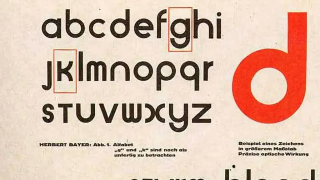
His logic was brutally direct: we don’t speak in capital letters, so why do we write in them? By eliminating uppercase, he argued that we could save time, space, and money for the printing industry.
While the “all-lowercase” experiment didn’t catch on with the general public, it laid the foundation for typography basics that we still use in digital interfaces today. When you look at a sleek, minimalist app UI, you are looking at Bayer’s ghost.
The Real-World Impact of Universalism
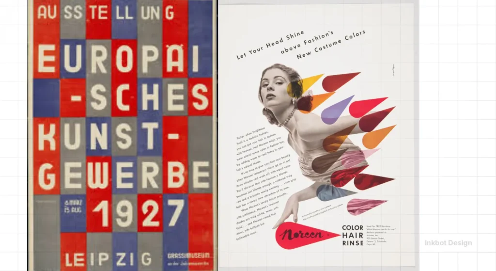
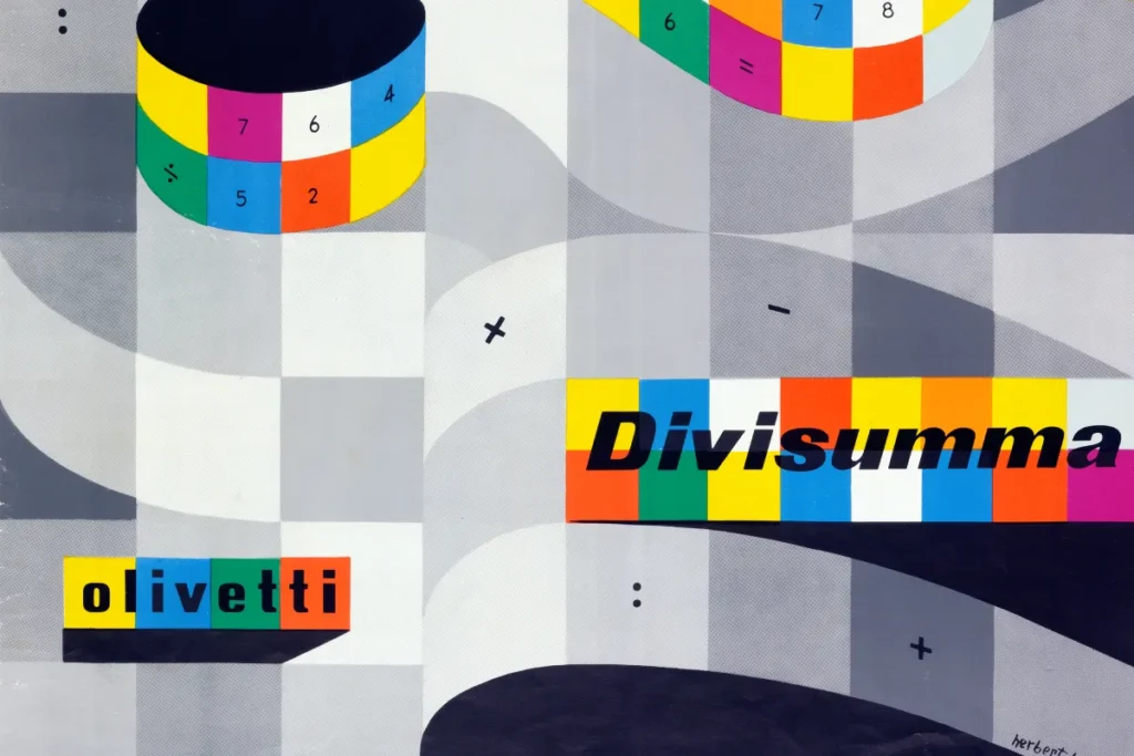
Bayer’s work for the Bauhaus exhibition catalogues proved that typographic hierarchy could lead a reader’s eye through a page like a GPS. He used thick bars, primary colours, and unconventional angles to create a “visual path.”
For a modern SMB, the lesson is clear: if your website forces a user to “search” for the buy button, you’ve failed. Bayer’s work reminds us that legibility is non-negotiable.
The American Transition: Commercialising the Avant-Garde
By 1938, the political climate in Germany made it impossible for Bayer to stay. He moved to New York with nothing but his portfolio and a recommendation from Alfred Barr, the director of the Museum of Modern Art (MoMA).
Unlike other artists who turned their noses up at commerce, Bayer embraced it. He saw the American corporation as the new “patron of the arts.” He worked for J. Walter Thompson and eventually became the design consultant for the Container Corporation of America (CCA).
The CCA and the “Great Ideas of Western Man”
This is where Bayer proved his worth as a famous graphic designer. He didn’t just design ads for cardboard boxes; he shaped the company’s culture. Under his direction, the “Great Ideas” campaign featured no product photos. Instead, it used surrealist art to illustrate philosophical quotes.
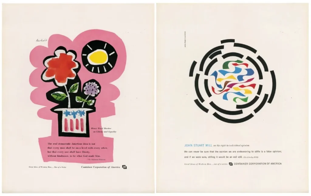
The result? CCA became synonymous with intelligence and stability. It was one of the first true examples of a brand strategy that sold an “ideal” rather than a commodity.
“Design is not a self-expression. It is a service to the client.”
Herbert Bayer
Data Visualisation Before Computers
In 1953, Bayer completed what many consider his magnum opus: the World Geographic Atlas for the CCA. This wasn’t a book of maps; it was a 368-page visual encyclopedia of the human environment.

Bayer pioneered the use of infographics. He used overlays, symbols, and diagrams to explain complex weather patterns and resource distributions. Long before Edward Tufte or modern data dashboards, Bayer understood that data is useless unless it is “readable.”
The “Wrong Way” vs. “The Bayer Way”
| Feature | The Amateur Way (Pre-Bayer) | The Pro Way (Bayer Method) |
| Typeface | Ornate, Serif, inconsistent sizes. | Geometric, Sans-serif, strict hierarchy. |
| Grid System | Random placement, “filling the space.” | Modular, mathematical alignment. |
| Photography | Literal, product-focused. | Symbolic, surrealist, narrative-driven. |
| Colour | Decorative, chosen by “feel.” | Functional, used to categorise info. |
The State of Information Design in 2026
As we move into 2026, the principles Bayer championed—clarity, systems-thinking, and the removal of the unnecessary—are more vital than ever.
With the rise of AI-generated content, the internet is becoming a landfill of “visual noise.”
Recent shifts in Generative Engine Optimisation (GEO) suggest that search engines are prioritising “Information Density.” Just as Bayer stripped away the “fluff” of the 1920s, modern brands must strip away the “AI-fluff” of the 2020s.
We are seeing a return to a “Bayer-esque” brutalist style in branding.
Companies are ditching complex gradients for flat, high-contrast brand identities that render perfectly on everything from a smartwatch to a billboard.
Bayer’s “Universal” dream might finally be coming true through the constraints of mobile-first design.
The Verdict
Herbert Bayer was the man who dragged graphic design out of the Victorian attic and into the industrial age.
He proved that a designer’s job isn’t to decorate a page, but to engineer a solution. If your current branding feels like it’s screaming into a void, you’re likely ignoring the “Total Design” framework.
You don’t need more “stuff” on your website. You need more clarity. You need a system that works when you aren’t in the room to explain it.
Ready to stop guessing?
Explore our professional design services or get a quote for your project today. Let’s build something that actually works.
Herbert Bayer, Graphic Designer
You’re treating graphic design as a minor aesthetic choice, but it’s actually a tool for structural change. This is the fix. Herbert Bayer: Graphic Designer is the definitive account of the Bauhaus master who treated every medium—from posters and typography to architecture—as a single, unified discipline.
Patrick Rössler’s deep-dive biography follows Bayer’s journey from the radical workshops of the Bauhaus through the dark complexities of Nazi Germany, and finally to his massive influence on the American design scene.
As an Amazon Partner, when you buy through our links, we may earn a commission.
Frequently Asked Questions (FAQ)
Who was Herbert Bayer?
Herbert Bayer was a pioneering graphic designer and the first Master of the Printing and Advertising workshop at the Bauhaus. He is famous for developing the Universal typeface and for his “Total Design” approach, which integrated various artistic disciplines into commercial and architectural projects.
What is the “Universal” typeface?
Designed by Bayer in 1925, the Universal typeface is a geometric sans-serif font that famously omitted capital letters. Bayer believed that uppercase letters were redundant and that a single-case alphabet would be more efficient for modern printing and communication.
Why did Herbert Bayer move to America?
Bayer left Germany in 1938 due to the rise of the Nazi regime, which suppressed the Bauhaus and labelled modern art as “degenerate.” He moved to New York and later Aspen, Colorado, where he influenced American corporate design and architecture.
What was Bayer’s role at the Container Corporation of America (CCA)?
Bayer served as the Chairman of the Department of Design at CCA. He was instrumental in creating the “Great Ideas of Western Man” advertising campaign, which focused on intellectual and philosophical concepts rather than direct product sales.
What is “Total Design”?
“Total Design” (or Gesamtkunstwerk) is the idea that all aspects of a project—from the typography on a brochure to the architecture of the building it’s housed in—should be part of a unified, cohesive visual system.
How did Bayer influence modern typography?
Bayer pioneered the use of sans-serif fonts, mathematical grid systems, and functional hierarchy. These elements are the foundation of modern digital UI/UX design and corporate branding.
Did Herbert Bayer design the Aspen Institute?
Yes, Bayer was heavily involved in the development of the Aspen Institute for Humanistic Studies. He designed the campus, the posters, and even the “Earth Mound” sculptures, treating the entire town as a “Total Design” project.
What is the World Geographic Atlas?
Published in 1953, the World Geographic Atlas was a landmark in data visualisation. Bayer utilised innovative graphic techniques to present complex geographical and statistical data in a clear and easy-to-understand format.
Is the Universal typeface still used today?
While the original 1925 version is rarely used for body text, its principles influenced dozens of modern fonts, including ITC Bauhaus and various geometric sans-serifs used in contemporary branding.
Why did Bayer dislike capital letters?
Bayer argued that using two different alphabets (upper and lower case) for the same sounds was illogical and increased the cost and complexity of typewriting and printing. He advocated for a “single-case” alphabet to simplify communication.
How does Herbert Bayer’s work relate to branding?
Bayer was one of the first designers to treat a company’s visual output as a systematic “identity.” He understood that consistency across all touchpoints—advertising, packaging, and architecture—builds long-term brand equity.
What can SMBs learn from Herbert Bayer?
The biggest lesson is that “less is more” only works when the “less” is mathematically and psychologically intentional. Clarity, hierarchy, and consistency are the most powerful tools in a small business’s marketing arsenal.

