DFB Rebrand: Why Germany Dumped the National Colours
The DFB has officially ditched the black, red, and gold in its primary mark. This isn’t just a colour swap; it is a total pivot toward a digital-first, monochrome ecosystem that prioritises screen legibility over tradition.
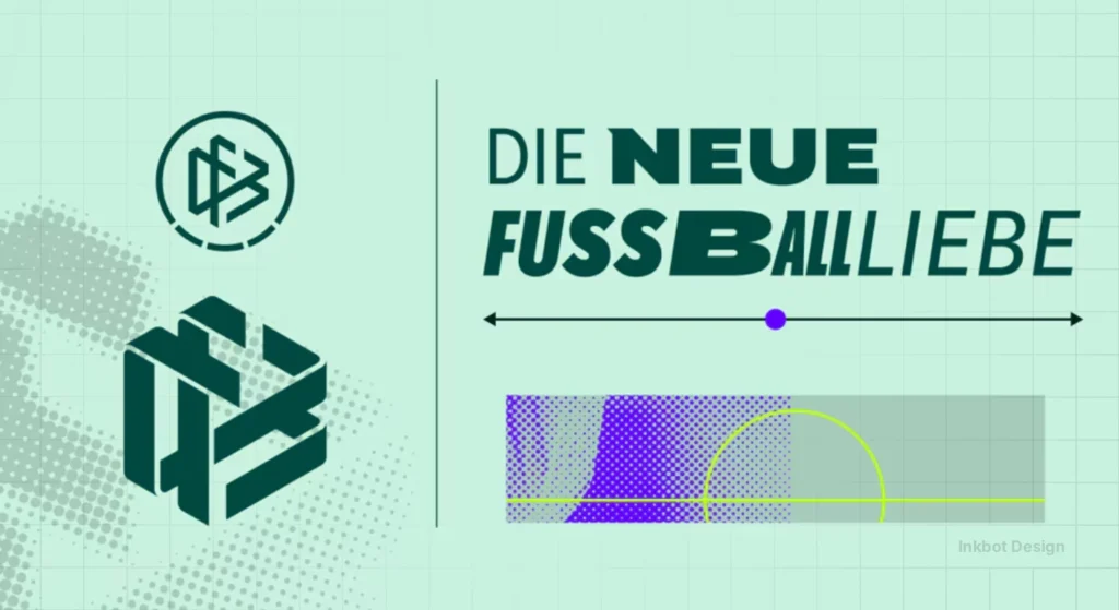
- Monochrome green replaces black, red, gold as DFB’s primary mark to prioritise digital legibility across screens and apps.
- Strichpunkt led the redesign, softening the eagle emblem for a tech‑forward, flexible visual system.
- DFB‑Sans expanded from six to 56 styles, enabling variable typography for everything from scoreboards to TikTok overlays.
- Critics say the softened, clinical look sacrifices football’s grit, feeling more like a global entertainment brand than a national body.
- Practical strategy: keep traditional crest for the team, use green for corporate/digital touchpoints to balance provenance and modernity.
A Bold Shift to Monochrome Green
The German Football Association (DFB) has rolled out a refreshed brand identity that abandons the tricolour in favour of a flexible green palette.
In its anniversary year, the association not only looks back on a rich history but also consciously looks to the future. The new brand identity stands for clarity, innovation and modernity. It reflects the diversity of German football – from the grassroots to the elite, from the national teams to the amateur level.’’
DFB general secretary Holger Blask
By flattening the angles and opting for shades like ‘lime’ and ‘dark green’, the association is preparing for a post-Adidas world where the physical kit is just one part of the story.
This move anchors the federation’s 125th-anniversary celebrations in a visual language that feels more like a tech startup than a heritage sports body.
It’s a direct response to the need for a ‘variable’ identity—one that can survive the rigours of 4K broadcasts and microscopic app icons at the same time.
The 56-Style Typographic Overhaul
Is a variable font the future of sports branding?
We used to worry about whether a font would work in a print brochure. Now, the DFB and Supertype have expanded the DFB-Sans typeface from six to 56 styles.
Variable fonts are a bloody nightmare to manage if you don’t have a tight brand portal, but they offer unparalleled control over layout hierarchy. (I remember a client in 2018 who wanted ‘bespoke’ kerning for a billboard in Belfast; we spent three hours on a single word only for the printer to stretch the vinyl.)
The DFB-Sans now spans from ‘Compressed’ to ‘Super Extended’. This allows the brand to ‘breathe’ depending on the platform, whether it’s a scoreboard or a TikTok overlay.
This typographic flexibility is essential as the federation navigates the massive Nike Germany 2027 transition. It creates a stable visual anchor while the hardware—the kits themselves—undergo a seismic shift in manufacturing and design philosophy.
Actually, as I write this, I’m changing my mind about the quantity. Fifty-six styles might be overkill. It smells of ‘designing because we can’, rather than ‘designing because we should’.
The Creative Verdict: Too Soft for Football?
The new DFB logo is a clinical, highly efficient piece of communication design, but it lacks the ‘grit’ of the game.
‘Softening’ the angles is a classic corporate move to appear more ‘inclusive’ and ‘modern’.
In reality, it often just makes things look like a high-end health insurance app. Football is about friction, sweat, and hard edges—elements that are being polished away in the name of UX-friendly vectors.
At Inkbot Design, we often see brands lose their provenance when they chase the ‘monochrome’ trend. The DFB claims green has been part of their DNA since 1926, which is a nice bit of historical shielding.
But let’s be honest: they want to look like a global entertainment brand, not just a football association.
It’s a bit of a contradiction. They’ve kept the eagle for the national team because they know the fans would revolt. The ‘corporate’ side gets the green wash, while the ‘passion’ side keeps the tricolour. It’s a safe, calculated bet.
One real-world pitfall to watch for is ‘logo-bleeding’ in dark mode. The violet-blue accent is designed to prevent this, but on lower-end OLED screens, that lime green is going to vibrate like a neon sign in a rainy alley.
Strategic Takeaways on the DFB Rebrand
Graphic Designers: Master variable fonts now. If you aren’t building brand systems that can scale from a favicon to a stadium wrap using a single font file, you’re already obsolete.
Business Owners: Provenance matters. If you’re changing your colours, find a historical hook—even an obscure one from 1926—to justify the shift to your core audience.
FAQs
Why did they get rid of the red and gold?
They didn’t ‘get rid’ of them so much as put them in a drawer for ‘special occasions’. The new green focus is about digital clarity and standing out in a sea of red and blue sports logos.
Does the national team have to wear green logos now?
No. The ‘Mannschaft’ keeps the eagle crest. The green stuff is for the suits and the apps.
Is Strichpunkt a good agency?
They are top-tier. Their work on the 2026 World Cup Kit Overview context shows they understand how to bridge the gap between legacy and the future.
Will this look good on the Nike kits in 2027?
It’s designed to be ‘brand agnostic’. It’ll look just as clean on a Nike swoosh as it did on the Adidas stripes, which is exactly the point.
What’s a variable font anyway?
Think of it as one font file that acts like a slider. You can change the weight and width on the fly without loading 20 different files.
Is the ‘Supersign’ actually useful?
It’s a bit of ‘brand fluff’ for the annual report. Most fans won’t even notice it’s there.
Does the new logo feel ‘German’?
It feels ‘Global’. Whether that’s a good thing for a national association is a question for a long night at the pub.


