How to Create a Logo Portfolio That Gets You Hired
Nobody cares about your logo as much as you do.
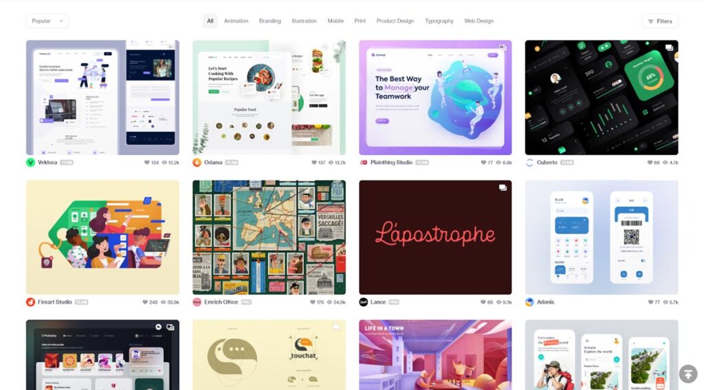
I review hundreds of portfolios a year. Most of them are what I call “digital scrapbooks”—endless grids of pretty, context-less symbols floating in white space.
They look nice. They probably got a few likes on Dribbble. But they do not tell me anything about whether you can solve a business problem.
If you are trying to get hired by a serious agency or secure a five-figure contract with an SMB, a gallery of aesthetic marks is insufficient. It is actually a liability. It suggests you focus on decoration rather than function.
A professional logo portfolio is not an art gallery; it is a forensic evidence file. It must demonstrate that your design decisions generated value, solved a specific problem, or effectively positioned a client in their market.
If you are tired of being ghosted by creative directors or haggled down by clients who “just want a simple icon,” this guide is for you. We are going to dismantle the standard portfolio approach and rebuild it into a sales engine.
- Curate ruthlessly: show 3–6 deep case studies, not dozens of context-less logo thumbnails.
- Context is king: explain the brief, strategy, process and measurable results for each project.
- Demonstrate process and tech: include sketches, grids, motion, and optimised files (SVG/WebP) for real-world use.
What is a Logo Portfolio? (The Definition You Need)
A logo portfolio is a curated collection of case studies designed to demonstrate a designer’s strategic thinking, technical execution, and commercial impact.
It is distinct from a “work archive.” An archive contains everything you have ever done. A portfolio contains only the work that sells your future services.

Key Components of a High-Converting Portfolio:
- Curation: The deliberate exclusion of weak or irrelevant work.
- Context: Explaining the “Who, Why, and How” behind the mark.
- Application: Demonstrating the logo in real-world environments (mockups/photos).
- Process: Evidence of the thinking (sketches, grids, rejected concepts).
- Results: Metrics or qualitative data proving the design worked.
The “Dribbblisation” of Design: Why Pretty Pictures Fail
There is a disease in our industry. We call it “Dribbblisation.” This refers to the trend of designing logos specifically to look good as a 400×300 pixel thumbnail, rather than to function in the real world.
When you present a logo in isolation—just a black mark on a white background—you are forcing the viewer to guess the context.
- Is this for a funeral home or a nightclub?
- Is the target audience Gen Z or retirees?
- Did the client request minimalism, or did you impose it on them?
Without context, I cannot judge the effectiveness of the work. I can only judge its aesthetics. And aesthetics are subjective. If a Creative Director (CD) dislikes the colour orange and your thumbnail features it, you are out.
However, if you frame that orange logo within a case study explaining that “Competitor A uses Blue, Competitor B uses Green, so we chose Orange to disrupt the shelf presence,” suddenly the CD’s personal preference is irrelevant. You have shown strategic competence.
Consultant’s Note: I once audited a designer who had a stunning portfolio of abstract marks. He couldn’t get hired. Why? Because every project looked the same. He wasn’t solving client problems; he was applying his personal style to every brief. Agencies don’t hire stylists; they hire problem solvers.
The Anatomy of a Perfect Case Study
This is where 90% of designers fail. They upload a JPEG of the logo and call it a project.
A single image is not a project. It is a snippet. To get hired, you need Case Studies. A case study takes the viewer on a journey from the problem to the solution.
Here is the exact structure we look for at Inkbot Design when vetting freelancers or new hires.
1. The Hook (The Headline & Hero Image)
Do not just title your project “Bakery Logo.” That is boring. Use a title that hints at the challenge or the solution.
- Bad: “Joe’s Coffee Shop Branding”
- Good: “Rebranding Joe’s Coffee to Target the Premium Market”
The Hero Image should not just be the flat logo. It should be the logo in situ. Display the signage, coffee cup, or app icon on a screen. The immediate context is King.
2. The Brief (The Problem)
You must define the constraints. Design without constraints is art. Design with constraints is engineering.
Keep this short (50-100 words). Answer these three questions:
- Who is the client?
- What was their problem? (e.g., outdated image, merging with another company, low visibility).
- What was the goal? (e.g., attract younger customers, look more expensive).
3. The Strategy (The “Why”)
This is the section that gets you paid more. Explain your research. Did you analyse the competitors? Did you look at the history of the industry?
- “We noticed all competitors used serif fonts and dark reds. To signal innovation, we pivoted to a geometric sans-serif and a vibrant electric blue.”
This sentence alone proves you are thinking about market positioning, not just drawing shapes.
4. The Process (The “How”)
Show your work. I want to see the ugly sketches. I want to see the grid construction.
Why? Because I need to know you didn’t just trace a stock vector. Showing your grid lines (even if they are retrospective) demonstrates attention to detail and technical proficiency. It proves the geometry is intentional.
Include:
- Pencil sketches (scanned).
- Black and white vector construction.
- The grid overlay.
- Typography exploration.
5. The Solution (The Reveal)
This is the high-fidelity presentation of the final logo. Show the lockups:
- Primary logo.
- Secondary mark (badge/icon).
- Wordmark.
- Minimum size test (does it work at 16px?).
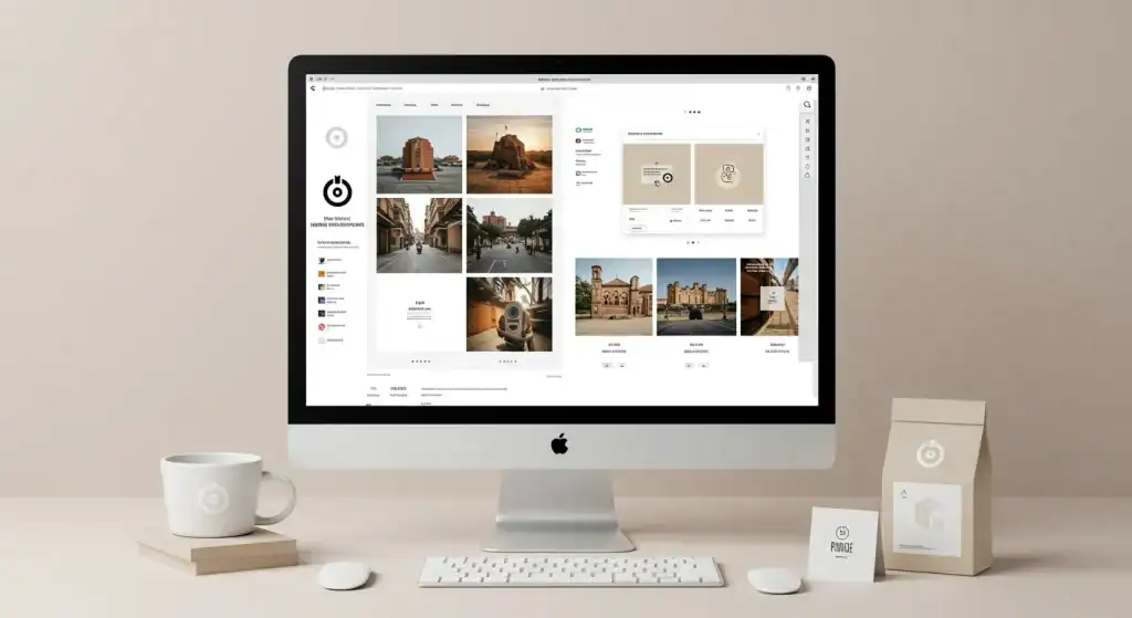
6. The Application (The Mockups)
This is where you bring the brand to life. But be careful—bad mockups are worse than no mockups.
If you are designing for a B2B tech firm, do not put their logo on a coffee sack. It makes no sense. Display it on a lanyard, in an annual report, on a website header, or on office signage.
The Golden Rule of Mockups: The mockup must match the client’s industry.
7. The Result (The Evidence)
If possible, include data.
- “Since the rebrand, sales increased by 20%.”
- “The client secured £2M in Series A funding.”
- “User retention on the app improved by 15%.”
If you don’t have numbers, consider using a client testimonial. A quote from the CEO saying, “This new identity completely transformed how our team feels,” is powerful social proof.
Technical Execution: Formatting and File Types
It is 2026. If your design portfolio takes 10 seconds to load because you’ve uploaded 10MB uncompressed PNGs, I will close the tab. Efficiency is part of the job.
Optimisation and Speed
A creative director is likely viewing your portfolio on a mobile device between meetings, or on a laptop with twenty other tabs open.
- Image Format: Use WebP for complex images. It offers superior compression to JPEG/PNG without quality loss. Use SVG for flat logos and icons to ensure infinite scalability and crispness on Retina displays.
- Lazy Loading: Ensure your site lazy-loads images. The viewer should not have to wait for the footer images to download before they can see the header.
The Platform Debate: Custom vs. Network
Where should your portfolio live?
| Platform | Pros | Cons | Verdict |
| Custom Site (WordPress/Webflow) | Total control, SEO benefits, and a professional appearance. No competitor distractions. | Requires maintenance, hosting costs, learning curve. | Essential for Seniors/Agencies. |
| Behance | High traffic, built-in community, free. Easy for recruiters to find. | Your work is displayed next to thousands of competitors. Hard to customise the layout. | Good for Juniors/Discovery. |
| Dribbble | High visibility, quick validation. | Encourages “eye candy” over substance. Limited context space. | Supplement only. Not a main portfolio. |
| Private, tailored to specific applications. | Not searchable (SEO), hard to update, file size issues in email. | Use for specific client pitches only. |
My Recommendation: Build a custom site. It is your digital real estate. Use a simple WordPress theme or a Webflow template. If you cannot design a website, how can I trust you to design my brand?
For more on building a robust freelance business structure, read our freelance survival guide.
Curation: The Art of Killing Your Darlings
The most common mistake I see is volume over quality.
I do not need to see 50 logos. I need to see 5 great ones.
If you include mediocre work to “pad out” the portfolio, you are dragging down your average score. A portfolio with three stunning projects is infinitely better than one with three stunning projects and seven average ones.
The “Weakest Link” Theory:
You are judged by your worst piece of work. If you have a brilliant tech rebrand next to a poorly executed logo you did for your aunt’s bakery 5 years ago, the client will worry that they might get the “aunt’s bakery” version of you.
Delete any project that:
- Is more than 3-4 years old (unless it is iconic).
- You are not proud of.
- Does not represent the type of work you want to do next.
- Required no strategic thinking.
If you want to do high-end corporate identity, remove the Twitch streamer logos. If you want to do packaging, remove the SaaS app icons. Dress for the job you want.
Writing for Designers: Text Matters

Designers are visual people. We hate writing. But in a portfolio, your writing is the voice-over. It guides the viewer through the work.
You do not need to write a novel. Use bullet points. Use headers.
Typography in Portfolios:
Ensure your body text is legible. I see so many portfolios using light grey text on white backgrounds (low contrast) or tiny 12px fonts.
- Size: Minimum 16px (ideally 18px-20px) for body copy.
- Measure: Keep line lengths between 50-75 characters.
- Hierarchy: Your H2s and H3s should clearly scan.
According to the Nielsen Norman Group, users scan text in an F-shaped pattern. They read the first two paragraphs horizontally, then scan down the left side. Put your most important information (the client name, the result) at the start of your sentences and paragraphs.
The “Fake” Project Strategy
“But Stuart,” I hear you ask, “I am just starting out. I don’t have clients like Nike or Apple. How can I build a case study without a client?”
You build a Concept Project. But you must do it correctly.
Do not redesign Apple. It is arrogant and usually looks worse than the original. Do not redesign Coca-Cola.
Instead, find a local business with terrible branding. A local charity, a struggling bookshop, a historic theatre.
- Do the work for real. Treat it like a paid gig. Research their history.
- State clearly that it is a Concept. Label it “Unsolicited Rebrand Concept.”
- Solve a real problem. “The local theatre is losing ticket sales to the cinema chain. I rebranded them to highlight their heritage and exclusive experience.”
This shows initiative. It demonstrates that you can identify business problems and resolve them. That is more impressive than a made-up “crypto startup” logo that serves no purpose.
Check out our thoughts on self-taught vs formal education to see why your portfolio matters more than your degree.
The “About Me” Page: Building Trust
Your work gets you the interview. Your “About” page helps you achieve a cultural fit.
This page should not just be “I like coffee and kerning.” It needs to humanise you while maintaining professionalism.
What to include:
- Your Philosophy: How do you approach design? Do you believe in minimalism? Data-driven design?
- Your Experience: Who have you worked with? (Logos of past clients establishes authority).
- Your Face: People buy from people. A professional headshot builds trust.
- Your Services: Be specific. Do you just do logos? Or do you do Brand Identity Systems? (See our services page for how to structure this.)
- Contact Info: Make it impossible to miss. A “Hire Me” button should be included in both the navigation bar and the footer.
If you work from home, ensure your environment supports you in producing professional-quality work. Read our guide on how to build a productive workplace at home.
The State of Logo Portfolios in 2026
The landscape has shifted. Two major factors have changed how portfolios are viewed in the last 18 months: AI and Motion.
1. The AI Filter
With tools like Midjourney and DALL-E 3, which can generate infinite logo variations in seconds, the “visual” part of your job has been devalued. A client can get a “nice-looking” image for free.
Therefore, your portfolio must emphasise the human strategy that AI cannot replicate. Show the reasoning. Show the market analysis. Show the sketches that prove you didn’t just prompt a generator. Your value is no longer in making the mark, but in knowing which mark is right.
2. Motion is Mandatory
Static logos are dead. In a digital-first world, logos live on screens. They animate, they load, they transition.
If your portfolio only shows static JPEGs, you are behind. You don’t need to be a motion graphics expert, but it’s essential to learn the basics of After Effects or Lottie. Show how the logo builds on screen. Show how the icon bounces or fades.
According to a 2024 report by WARC (World Advertising Research Center), brand assets that include motion or sonic branding increase brand recall by over 18% compared to static assets.
The Consultant’s Reality Check
I remember reviewing a portfolio for a Senior Designer role. The work was immaculate. Technical perfection. But every single project description was: “I was asked to design a logo for X. I chose blue because it is calm. I used a circle because it implies unity.”
I rejected the candidate.
Why? Because that is “Design School 101” justification. It is fluffy.
The candidate we hired had a portfolio that said: “The client was losing market share to a cheaper competitor. We needed a brand identity that justified a 20% price premium. We used a serif typography system to borrow authority from heritage brands, signalling luxury.”
See the difference? One talks about shapes and feelings. The other talks about money and markets.
If you want to be treated like a partner, speak the language of business. If you want to be treated like a pixel pusher, speak the language of art.
The Verdict
Building a logo portfolio that gets you hired is not about showing the most work; it is about showing the right work in the right way.
- Curate ruthlessly: 3-6 deep case studies.
- Context is King: Explain the problem, strategy, and result.
- Show the Process: Validate Your Skills with Sketches and Grids.
- Optimise for Tech: Fast loading, mobile-responsive, motion-ready.
- Speak Business: Frame design as an investment, not a decoration.
Your portfolio is the most important project you will ever design. Treat it with the same respect you would a paying client.
Ready to elevate your brand’s visual identity? If you are a business owner looking for a team that understands the strategic value of design, request a quote today. We don’t just draw logos; we build businesses.
Frequently Asked Questions (FAQ)
How many projects should be in a logo portfolio?
Quality trumps quantity. Aim for 3 to 6 detailed case studies rather than 20 isolated images. This allows you to explain the strategy and context behind each project, which is more persuasive to creative directors than a large volume of context-less visuals.
Should I include my sketches in my portfolio?
Yes. Showing sketches and the “messy” conceptualisation phase demonstrates that you have a unique process and didn’t just copy a trend. It validates your problem-solving skills and proves the final result was intentional, not accidental.
What if I don’t have any real client work yet?
Create “concept projects” or “unsolicited redesigns.” Choose a local business with poor branding and rebrand it as if it were a client. Clearly label it as a concept. Treat it seriously—conduct thorough research, define a concise brief, and execute a comprehensive strategy.
Is Behance better than a personal website?
A personal website is better for established designers, as it offers total control over branding and SEO, without distractions from competitors. Behance is excellent for discovery and junior designers, but it should ideally funnel traffic to your main website.
How do I write about my design work?
Use the STAR method: Situation (the problem), Task (the goal), Action (what you designed and why), and Result (the outcome). Focus on business goals and strategic decisions rather than just describing the visual aesthetics.
Do I need to show motion graphics in a logo portfolio?
In 2026, yes. Digital platforms are the primary point of contact for most brands. Demonstrating how a logo animates, loads, or behaves in a UI environment shows that you understand modern digital requirements, giving you an edge over designers who only work with static elements.
What is the best file format for portfolio images?
Use WebP for photographs and complex mockups to ensure high quality at low file sizes. Use SVG for logos, icons, and vector graphics to ensure they remain crisp on high-resolution Retina screens and load instantly.
Should I include the logo price in the case study?
Generally, no. Pricing is subjective and confidential. However, you can mention the scale of the project (e.g., “A rebranding package for a Series A startup”) to hint at the budget level without revealing specific contracts.
How do I make my portfolio stand out to agencies?
Agencies look for thinking, not just styling. Stand out by including a “Strategy” section in your case studies. Explain the market analysis, competitor audit, and why the design positions the client for success.
Why is my portfolio not getting me hired?
It is likely lacking context or curation. If you have too many disparate styles, no explanations, or weak mockups, clients cannot visualise how you can help them. Audit your portfolio: remove the weakest 50% of work and rewrite the case studies for the top 50%.

