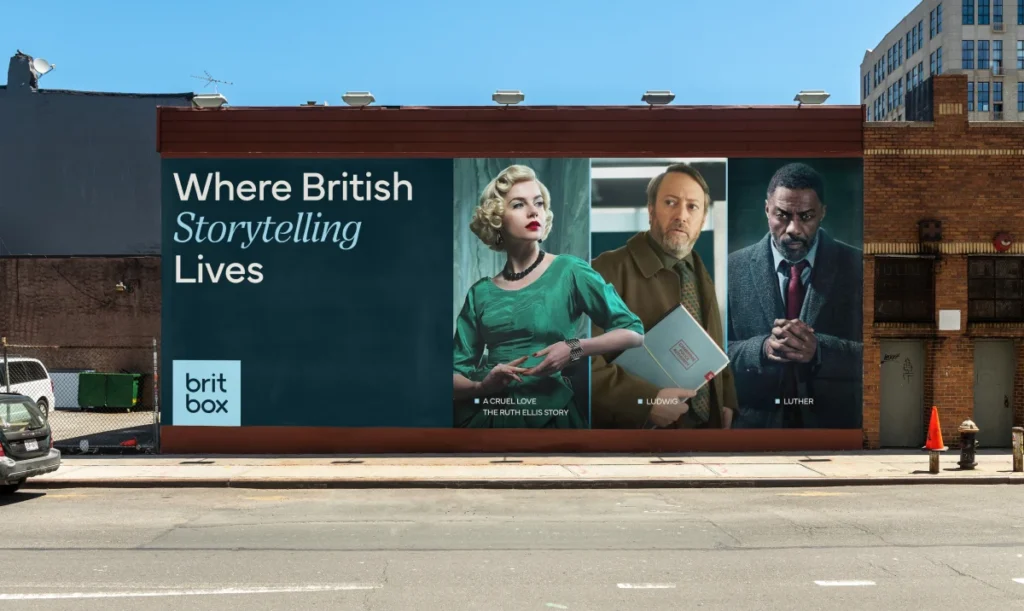
Britbox Rebrand: Moving Beyond the Union Jack Flag
Sibling Rivalry ditches the red and blue for a sophisticated ‘British perspective’. Here is why the streaming giant is boxing up its identity in 2026.
Turns out, being ‘British’ is a bit of a moving target these days.
In January 2026, BritBox finally admitted that shouting about the Union Jack isn’t a personality—it’s just a geography lesson.
Their new identity, crafted by the New York-based Sibling Rivalry, moves away from the expected red, white, and blue of the 2017 launch and leans into something much more subtle.

This shift matters because it signals the end of ‘flag-waving’ design for digital-first exports. If you’re competing with the likes of Apple TV+ or Mubi, you can’t look like a souvenir shop in Piccadilly Circus. You need a perspective, not just a postcode.
- BritBox drops the Union Jack motif for a subtler, more sophisticated British perspective.
- New identity by Sibling Rivalry pivots from touristy colours to a refined, monochromatic palette.
- The retained canted square on the i preserves brand heritage while signalling evolution.
- Typography is bolder, giving BritBox presence alongside broadcasters like BBC and ITV.
- Rebrand positions BritBox as a premium, editorial streaming service rather than a souvenir-style exporter.
The Death of the Souvenir Shop Aesthetic
The 2019 Mailchimp rebrand taught us that eccentricity wins, but for BritBox, the problem was clutter. The old logo tried to do too much with its two-tone lettering and patriotic baggage.
Sibling Rivalry has built this new look on the 2025 campaign statement, ‘See it differently’. It’s a clever pivot. They aren’t just selling ‘shows from Britain’ anymore; they’re selling a British way of looking at the world.
Why ditch the red and blue?
Most agencies won’t admit this, but the Union Jack is a bloody nightmare to work with in a modern UI. Red and blue fight for dominance, and they often look cheap on high-density OLED screens.
The new palette is monochromatic, anchored by a light ‘sky blue’ and a dark ‘peacock’ blue-green. It’s sophisticated. It’s moody. It feels more like a rainy afternoon and less like a tourist tea towel.
Actually, as I write this, I’m looking at the way the canted square on the ‘i’ has been retained. It’s a nice bit of heritage. It keeps the ‘box’ in BritBox without needing a literal container to hold the type.

Is the framing device a gimmick?
Sibling Rivalry introduced a square framing device as a core identity kit tool. This is where Figma’s latest layout features (we’re all on the 2026 iterative updates now) really shine.
The box can isolate a specific actor’s face or hold a stacked version of the wordmark. It’s a classic graphic design move—think of the National Geographic border—but applied with digital flexibility.

The typography has been ‘beefed up’ too. The previous weight felt a bit thin, a bit apologetic. The new wordmark has the presence to stand next to the BBC or ITV logos without looking like the smaller, weaker cousin.
The Creative Verdict
The BritBox rebrand proves that fear is usually misplaced.
At Inkbot Design, we always tell clients that provenance isn’t about where you are—it’s about the value you bring from that place. Sibling Rivalry has stripped away the obvious and left the essential.
The problem with most streaming rebrands is that they’re becoming a soulless soup of sans-serif fonts. While this is certainly a ‘clean’ update, the peacock green keeps it from feeling like another generic AI-generated interface. It has a bit of grit.
If I were sitting across from a junior designer today, I’d tell them to look at the ‘i’. That tiny tilt is doing all the heavy lifting. It’s proof that you don’t need a massive illustration to tell a story; you just need one confident gesture.
Strategic Takeaways
- Graphic Designers: Don’t be afraid to kill the ‘obvious’ colour palette if it’s strangling the brand’s growth.
- Business Owners: Your heritage is a perspective, not just a logo. Focus on the way you work, not just your location.
FAQs on the BritBox Rebrand
Is the new BritBox logo too boring without the red and blue?
No. It’s grown up. The old one looked like it belonged on a box of shortbread; this one looks like it belongs on a premium streaming platform.
Why keep the square on the ‘i’ if you’re changing everything else?
Because you need a thread of continuity. Complete ‘scorched earth’ rebrands usually alienate the existing audience. That little square is a nod to the ‘box’ and keeps the brand’s DNA intact while the rest of it evolves.
What is a ‘peacock blue-green’ anyway?
It’s a fancy way of saying a dark, sophisticated teal. It’s a colour that works exceptionally well with white and light blue in a digital environment. It gives the brand a depth that standard navy just can’t manage.
Should every brand move toward monochromatic looks?
Not necessarily. But for streaming, where the content (the movie posters and trailers) provides the colour, the brand itself needs to be a quiet, confident container.
How does this help them compete with Netflix?
It positions them as a ‘prestige’ choice. Netflix is the supermarket; BritBox is now positioning itself as the high-end boutique. The design matches the price point and the editorial tone.
Did Sibling Rivalry do a good job?
Yes. They’ve managed to make ‘Britishness’ feel like a premium vibe rather than a political statement. In 2026, that’s no small feat.

