The 4-Week Branding Sprint: How We Ship Quality Branding Fast
Startups rarely have the luxury of long branding projects. You have funding to secure, more people to hire, and, on top of that, your website needs to look credible.
What about the brand, though? It’s actually the most important thing!
You need clean, consistent visuals that can carry you across everything you have now and will have in the future..
My team at Merge Rocks does a complete branding in 3–4 weeks and saves startups thousands of dollars without cutting corners on quality. How?
Below, I’ll show you our team’s exact process for startups across SaaS, Fintech, Healthtech, and Web3. You’ll see how we keep decisions tight and still deliver a brand you can grow with.
First, we design UX and build websites, too, so the system you get works in Figma, on a landing page, and inside your product.
- Run a time-boxed 4-week sprint (Logo, Identity, or Concept packages) to deliver usable branding without lengthy agency timelines.
- Front-load decisions via a sharp brief, workshop and moodboard to prevent late-stage churn and irreversible direction early.
- Work Figma-first with a single source of truth, constrained routes, and real-use mockups to ensure designs hold under content.
- Handover a tidy system: named Figma components, exports, palette, type scale, brand graphics and a concise Brand Book.
First principle – decide scope before style
Speed comes from narrowing the playing field on day one.
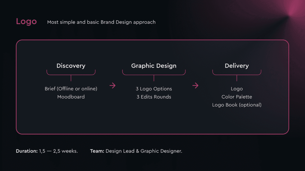
Logo Sprint (1.5–2.5 weeks). This is for MVPs that need a credible logo, colour palette, and optional mini logobook. Just keep it lean and get moving.
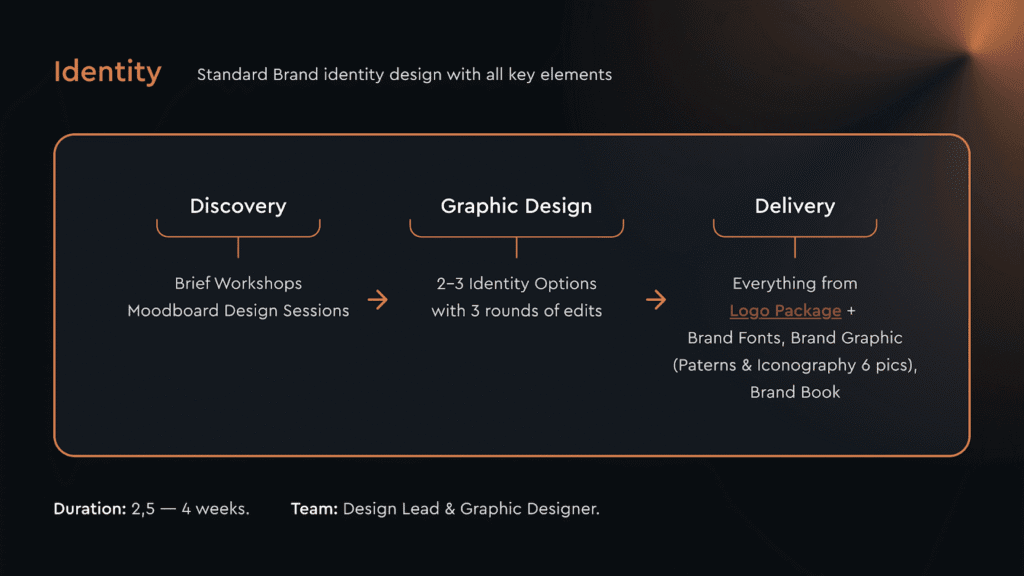
Identity Package (3-4 weeks). A working visual system: logo set, colour and typography, up to six brand graphics, optional illustration, social kit, and a short Brand Book.
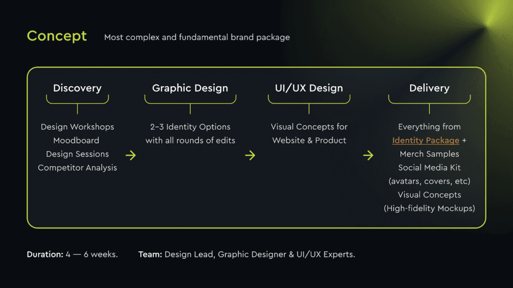
Concept Package (4-6 weeks). This package includes everything above, plus more visuals for launch: merch samples, a social kit of your choice, and high-fidelity app or website concepts.
Pick one path and resist drastically expanding your scope afterwards. You’ll save time and cash long before design starts.
Why this process is actually fast
- Decisions are front-loaded
A tight briefing workshop and a decisive moodboard session prevent the late-stage churn that burns weeks.
- One source of truth
We run everything in Figma – files, comments, components – so there’s no re-drawing in another tool later.
- Constraints by design
Two or three routes only, with up to three feedback rounds. Less choice increases momentum and lead to clearer work.
- Proof by application
Every route is shown on real use cases – a homepage hero, a dashboard card – to test whether the system holds under content.
Week-by-week Branding Sprint plan you can copy
N.B. We usually run one focused cross-functional team – a Design Lead and a Graphic Designer, with a UI/UX designer joining when product visuals are required.
Week 1 – Discovery
The aim is a sharp brief and a shared taste map.
Workshops and brief. We guide you through a short identity brief, then a 60–90 minute workshop. We leave with clear direction, not vague adjectives. Sample questions we use:
- What must the brand help the business achieve in the next 6–12 months?
Why: timeline forces prioritisation. A company chasing enterprise pilots needs different signals from one chasing consumer sign-ups.
- Who buys, who uses, and who influences the decision?
Why: buyers, users, and influencers often differ. Visuals for a CFO differ from visuals for a product lead.
- Which competitor would you tolerate being compared to – and which comparison would hurt?
Why: This draws a line between safe proximity and damaging similarity. It’s clearer than asking for “differentiation”.
- What do you do better than others that a customer would notice in week one?
Why: ties visual direction to proof. We can signal clarity and low friction if the setup speed is real.
- List 3–5 emotions you want a first-time visitor to feel.
Why: emotions translate into typography and contrast choices. “Calm” and “assured” rarely sit with ultra-high saturation.
- Where will the brand live most in the next quarter – website, deck, dashboard, social, events?
Why: the primary touchpoint dictates trade-offs. If dashboards dominate, legibility and token naming outrank poster-style graphics.
- Any meaning behind the name that should guide forms or motifs?
Why: Hidden stories can yield strong logo geometry or pattern logic without adding time.
- What colours, symbols, or clichés should we avoid at all costs?
Why: bans are faster than likes. A clear “no” list prevents dead-end concepts.
- Which two brands outside your category do you rate, and why?
Why: external references lift taste beyond local norms and reduce category echo.
- What must be ready on handover day to call this a success?
Why: forces a concrete delivery checklist (files, Brand Book, social headers, deck cover), and prevents last-minute additions.
Competitor review
We map logotypes, key elements, brand graphics, iconography and social tiles for the closest competitors. The goal is to spot crowded colours and overused motifs early.
Moodboard – abstraction first, examples second
This is where speed starts to pay off. We compose a large moodboard with abstractions and applied examples:
- Form and concept cues – geometric vs organic shapes, motion, structure, negative space ideas.
- Colour tiles are 10–15 palette examples of contrast, saturation, and accessibility.
- Typography – families that match your product’s voice, with real UI and headline examples.
- Brand graphics – pattern logics, icon styles, illustration treatments, and image guidelines.
- Use cases – quick mockups across a site hero, dashboard block, pitch slide, and social.
You pick a lane by choosing what to keep and what to ban. We document strong yes and no decisions and lock the direction within 24 hours.
Sprint by Jake Knapp
You’re wasting months in endless debates and meetings, talking big ideas to death. This book gives you the five-day “Sprint” framework to stop talking and start doing. It’s the proven system, born at Google, to solve huge problems and test a real solution in a single week.
As an Amazon Partner, when you buy through our links, we may earn a commission.
Week 2 – Concept
We present two or three identity directions. Each includes:
- Logo concepts and construction
- Colour and type hierarchy
- Initial brand graphics with two patterns or icon ideas
- A simple site or product visual to prove the system under content
Why this mix works: there’s no guessing from posters. You’re seeing how a headline wraps, how a button reads, how a chart label sits. This way, your feedback becomes concrete and much faster to implement.
Week 3 – Development
With a route selected, we now expand:
- Finalise the logo set – colour, mono, small-size variants
- Build the whole palette and typographic scale with accessibility in mind
- Produce up to six brand graphics – patterns and iconography – built from a single logic
- Optional illustration style with two sample scenes
- Social kit or merch previews so the team can picture launch assets
- UI/UX visuals, usually a homepage and a key product screen, to test the system where it will live
We also test colour contrast, spacing, and token names so the development team can implement all this without rework.
Week 4 – Handover ( in a way that prevents support tickets)
Fast projects stall when files are messy. Here’s what we package and hand over:
- Neatly organised folders and a downloadable archive
- Figma components and styles are named for reuse
- Vector and raster exports for print and digital
- A Brand Book that covers spacing, colour usage, dos and don’ts, examples, and file locations
You finish with a system, not a pretty PDF.
Building a moodboard that your team can actually choose from

A quick method you can copy:
Start abstract.
Place shape studies, spacing rhythms, and negative space ideas before logos. People choose faster when not anchored on a single mark.
Force contrasts.
Show one high-contrast palette, one mid-tone set, and one muted option. Middle-of-the-road boards drag decisions.
Mix sizes.
Pair billboard-style examples with tiny UI tokens so legibility stays part of the conversation.
Write the why.
Add small labels – “organic curve for warmth” or “rigid grid for precision” – so the team aligns on intent, not just taste.
Where the real savings come from
We make early decisions irreversible. Moodboards, competitor tiles, and a fast workshop remove indecision by day three. That slashes unplanned rounds later.
One tight team. The same designers who set direction build the assets and the product visuals. There is less translation overhead, fewer meetings, and fewer hours.
Figma first. Your logo, graphics, and components live where your product team works. You comment once. Developers get tokens and exports that match the design exactly.
Time-boxed feedback. We book three key sessions (Kick-off, Moodboard, Concepts), and keep your involvement light between them. Decisions happen while the context is fresh.
Compared to a 10–12 week agency process with multiple hand-offs, our four-week path trims weeks of studio time. At typical design rates, that easily removes five-figure costs, and you start selling sooner.
Pitfalls that add weeks to your branding and how to avoid them
- Endless routes.
Cap options at two or three. More choice slows decisions and produces blended outcomes.
- Poster-only concepts.
Always include a real page or screen. If it breaks under content, it will break in production.
- Vague feedback.
Ask reviewers to tag comments as keep, change or ban. Discussion time drops, and intent is clear.
- File sprawl.
Lock one file as the source of truth. Export from there only.
What to hand over
Even in a short sprint, aim to deliver:
- Logo set in colour and mono
- Palette with contrast guidance
- Type scale with examples for headings, body, UI
- Up to six graphics – patterns or icons – from one visual logic
- A social header set and a deck cover
- A succinct Brand Book in Figma with a downloadable archive
A note on logo-only sprints
If the runway is tight, a logo plus colour palette can be done in 1.5–2.5 weeks with up to three rounds of feedback. Keep the naming consistent, export sizes clear, and write a one-page usage note. When funding lands, you’ll be ready to extend into the complete Identity Package.
Why trust our team’s expertise and not someone else’s
- 100+ startups have trusted our team to improve design and ship faster.
- We specialise in SaaS, Fintech, Healthtech, and Web3, so our references and UI patterns are relevant to your space.
- When you’re ready, we can continue into Webflow development or a dedicated product design team.
This process is built for you if you need a brand prepared in a month and robust enough for your next release.
Wrap-up
If you’re a founder or design lead working against deadlines, this approach keeps quality high by making better decisions sooner. Use the workshop questions, build a moodboard that forces choices, test routes on real screens, and package files so the next team can keep going without you.


