Trump’s Board of Peace Logo is a Graphic Train Wreck
The new ‘Board of Peace’ logo is a masterclass in how to alienate half the planet with a single vector file.
- 'Board of Peace' logo centres on a gilded shield, signalling exclusion and American-centric protectionism, not global cooperation.
- AI-made cartography produced glaring errors: distorted Ontario, misplaced Caribbean islands, and inconsistent kerning betraying unvetted automation.
- The board's structure is transactional: a $1 billion permanent seat creates a pay-to-play, two-tier global hierarchy excluding the Global South.
- Visually and symbolically it replaces UN inclusivity with a Trump-branded, ego-driven emblem that omits regions the board claims to help.
Visual Identity is Policy by Other Means
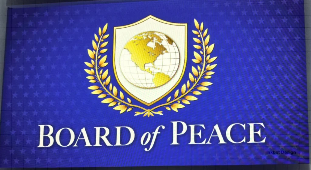
The ‘Board of Peace’ emblem, unveiled by Donald Trump on 22 January 2026, is an aggressive pivot away from globalism toward a brand of gilded isolationism.

By ditching the egalitarian circle of the UN for a rigid, American-centric shield, the administration has visualised a new world order in which the ‘peace’ extends only as far as the gold foil reaches.
Design isn’t just about looking pretty; it’s about what you choose to leave on the cutting room floor.
In this case, the ‘cutting room floor’ includes Gaza—the very territory the board is meant to oversee—and half of our NATO allies.
It’s a bit of a contradiction to claim you’re rebuilding the Middle East while literally cropping it out of your official letterhead.
A Gilded Shield for a Fragmented World
Is it a logo or a property developer’s coat of arms?
When I first saw the ‘Board of Peace’ mark on my feed this morning, I had a bit of a kerning panic before I even realised the geography was botched.
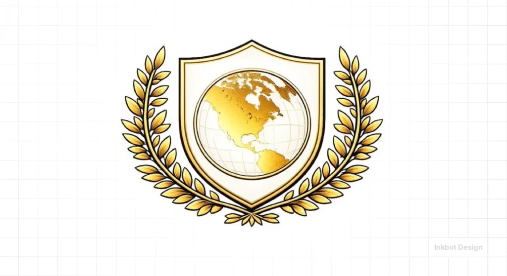
It’s housed in a shield—a classic heraldic trope that screams ‘protection’ or ‘exclusion,’ depending on which side of the wall you’re standing on.
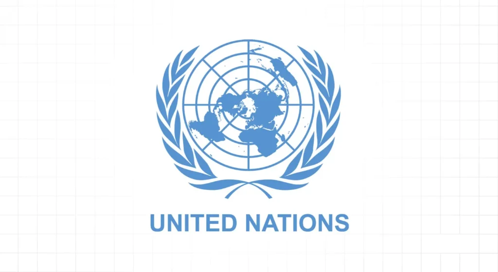
It’s a far cry from the 1945 UN emblem designed by Oliver Lincoln Lundquist, which used a North Pole projection specifically to avoid showing any single nation as ‘on top.’

Why did they ignore the North Pole?
By centring the map on the US sphere of influence, the design team (or the AI prompt-engineer, let’s be honest) has created a ‘Map of Us’ rather than a ‘Map of Peace.’
The original UN Blue was chosen because it was the ‘opposite of red, the war colour.’ Here, we have Trump Gold.
It’s the visual equivalent of a loud tie in a quiet room. It doesn’t invite cooperation; it demands a membership fee.
Cartography by Algorithm: The Ontario Incident and AI Hallucinations
The graphic errors in the Board of Peace emblem aren’t just sloppy; they are symptomatic of the “offshoring” of state identity to unvetted AI systems.
When the logo was first shared on X (formerly Twitter), eagle-eyed observers like Séamus Malekafzali and cartoonist Mattie Lubchansky pointed out several “hallucinations” that a human cartographer would never commit:
- The Ontario Glitch: The border between the US and Canada—the only border explicitly rendered—appeared to “swallow” parts of the Great Lakes, turning Ontario into a digital smudge of a landmass.
- The Caribbean Expansion: The Bahamas were rendered nearly attached to Florida, while new, non-existent islands appeared in the Caribbean Sea.
- Variable Kerning: The lettering in the initial White House release was non-uniform, a classic sign of AI-generated text within images.
This reliance on AI for a “Board of Peace” meant to define global boundaries is a profound irony.
If the administration’s tools cannot accurately define the Rio Grande or the 49th Parallel, the geopolitical strategy they represent is equally suspect.
It suggests a “post-truth” cartography in which the map does not represent the world but rather the Chairman’s immediate, unrefined whim.
Governance by Subscription: The $1 Billion Permanent Seat
While the aesthetic critique focuses on the logo’s “cut-rate” appearance, the Board of Peace’s structural reality is far more transactional.
According to the board’s founding charter, signed in Davos, permanent membership is not granted by democratic consensus but by a $1 billion cash contribution.
This fee, described by the administration as a “demonstration of deep commitment,” creates a two-tier hierarchy of global influence.
Countries that cannot or will not pay the fee are relegated to three-year terms, subject to the Chairman’s renewal. This model essentially turns international diplomacy into a high-stakes “Governance as a Service” (GaaS) platform.
Critics, including Anna Betts and various European diplomats, have noted that this financial barrier effectively excludes most of the Global South, creating a “pay-to-play” world order that bypasses traditional United Nations funding models.
| Membership Type | Duration | Cost | Key Benefit |
| Permanent Member | Lifetime (Charter entry) | $1,000,000,000 (USD) | Veto-resistant status, permanent board seat. |
| Associate Member | 3-Year Term | $0 (Subject to invite) | Temporary participation, renewal at Chairman’s discretion. |
The Creative Verdict: Ego Over Equity

I’ve been around the block long enough to know when a client has ‘helped’ too much with a brief.
This logo reeks of a boardroom where the most powerful person kept saying, ‘Make it shinier’ and ‘Put us in the middle.’
Actually, as I write this, I’m changing my mind—it’s not even a logo. It’s a badge for a club that most people aren’t invited to join.
Design should build bridges, but this shield acts as a barrier.
The ‘Board of Peace’ logo fails the primary test of international branding: it fails to see the ‘other.’ In Belfast, we understand the weight of symbols; they can heal or provoke.
Choosing to exclude the very region you are ‘saving’—Gaza—from your visual identity isn’t just a mistake; it’s a profound lack of empathy.
If you’re going to charge countries $1 billion to be in the club, the least you can do is make sure they’re on the map.
Strategic Takeaways
Graphic Designers: Always check your map projections before hitting ‘Export.’ If you’re designing for a global audience, centring on one country is a political statement, not just a layout choice.
Business Owners: Your brand should reflect your reach, not just your ego. If your visual identity excludes your primary stakeholders, don’t be surprised when they don’t buy into your vision.
Symbolism of the New Order: UN vs. Board of Peace
The visual shift from the UN’s egalitarian circle to Trump’s gilded shield represents a fundamental pivot in international relations theory.
| Feature | United Nations Emblem (1945) | Board of Peace Logo (2026) |
| Shape | Circle (Infinite, Inclusive) | Shield (Defensive, Exclusive) |
| Projection | North Pole (No nation “on top”) | Western Hemisphere (Americentric) |
| Primary Colour | UN Blue (Neutral, Anti-War) | Trump Gold (Wealth, Power) |
| Key Symbol | Olive Branches (Peace) | Gilded Olive Branches (Transactional Peace) |
| Governance | Multilateral / 193 Members | Unilateral / Chairman for Life |
The Founding Nineteen: A New Axis of Diplomacy
The Board of Peace is not a global body in the sense of the United Nations General Assembly. It is a coalition of the willing—and the paying.
While Donald Trump sent out over 50 invitations, only 19 countries signed the founding charter in Davos.
Confirmed Founding Members (Jan 2026):
- Américas: Argentina (Javier Milei), El Salvador.
- Middle East: Saudi Arabia, Egypt, Israel (Benjamin Netanyahu), UAE, Qatar, Bahrain, Morocco.
- Europe/Eurasia: Hungary (Viktor Orbán), Belarus (Aleksandr Lukashenko), Azerbaijan, Kazakhstan, Uzbekistan.
- Asia: Vietnam, Pakistan, Thailand (invited/pending).
Notable Absentees: Traditional US allies such as France, Germany, Canada, and the United Kingdom have pointedly refused to join. Mark Carney, who initially considered the role, withdrew after the $1 billion fee was made mandatory for permanent influence. This creates a stark divide: a “Gold Bloc” of nations aligned with a transactional, US-centric model, versus the traditional “Blue Bloc” of the UN and NATO.
FAQs
Why is the Board of Peace logo considered “AI-generated”?
Graphic designers noted several “hallucinations” in the map, including a distorted US-Canada border and misplaced Caribbean islands. These errors, combined with non-uniform text rendering in the original Davos slides, are hallmarks of unedited generative AI output.
Why is it gold instead of ‘Peace Blue’?
Because the brand isn’t ‘Peace’—it’s ‘Trump.’ In 2026, we’re seeing a total merger of state identity and personal celebrity branding.
Is a shield better than a circle for a peace organisation?
No. A circle is inclusive and infinite. A shield is defensive and has sharp edges. It’s a terrible metaphor for diplomacy.
Does the map on the logo show the whole world?
No. Unlike the UN logo, which uses a polar projection to show all inhabited continents, the Board of Peace emblem focuses exclusively on the Western Hemisphere, primarily North America. Regions like Gaza, the Middle East, and Western Europe are entirely omitted from the central map.
Is the Board of Peace a part of the United Nations?
No. While it was authorised by UN Resolution 2803 to oversee Gaza, the Board’s charter establishes it as an independent, private international organisation. Chairman Donald Trump has stated it will work “in conjunction” with the UN, but has not ruled out eventually replacing “failed” international bodies.
Why are NATO allies missing?
The logo mirrors the membership. If you aren’t paying the $1 billion ‘subscription fee’ mentioned in Davos, you don’t get your landmass on the shiny gold shield.
Is this the worst political logo of the decade?
It’s up there. It makes the 2012 London Olympics logo look like a masterpiece of clarity and grace.


