Top 10 Best 1920s Fonts for a Timeless Look
The best 1920s fonts capture the exuberant spirit of the Jazz Age, blending the geometric precision of the Art Deco movement with bold, expressive forms.
Look, the thing is, this typographic explosion didn’t just happen in a vacuum.
After the Great War, the economy began to roar back to life, and for the first time, mass advertising became a significant phenomenon. Suddenly, everyone had something to sell. Companies were scrambling to get their products noticed in slick new magazines and on colourful posters plastered everywhere.
They needed fonts that would do more than just spell out a name; they needed fonts that would grab you by the collar and shout. That’s what really sparked all this creativity, right? A desperate, brilliant need to sell stuff to a brand new consumer world.
This era produced iconic typefaces ranging from the clean, geometric sans-serif Futura to the flamboyant, decorative display font Broadway and the famously rounded Cooper Black.
These fonts are ideal for projects that seek vintage luxury and historical authenticity, lending a Gatsby-esque flair to modern branding and poster design.
- Explore the top 10 1920s fonts that blend vintage charm with modern design for stunning results.
- Each font offers unique characteristics, enhancing your design's sophistication and readability.
- 1920s typography reflects innovation, elegance, and rebellion, allowing for creative play in projects.
- Mix and match these fonts thoughtfully for a touch of nostalgia without sacrificing modern aesthetics.
1 – Futura: The Font of the Future (Ironically)
Ah, Futura. The geometric sans-serif that took the 1920s by storm and never really left. Created by Paul Renner in 1927, this font was so ahead of its time that it might as well have arrived in a DeLorean.
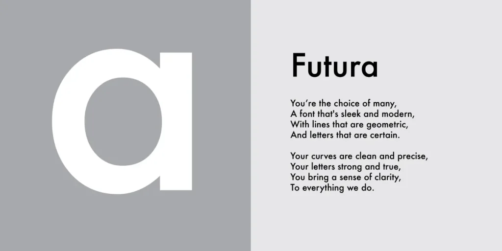
Why Futura Still Slaps
- Clean lines: Perfect for modern, minimalist designs
- Versatility: Works in headlines and body text
- Timeless appeal: Used by brands like FedEx and Volkswagen
Remember when I tried to use Comic Sans for a luxury watch brand? Yeah, that didn’t go down well. But Futura? It’s like the Swiss Army knife of fonts – it just works.
Pro Tip: Pair Futura with a serif font for a classic 1920s contrast that’ll make your designs pop as champagne corks on New Year’s Eve.
2 – Rockwell: The Slab Serif Sensation
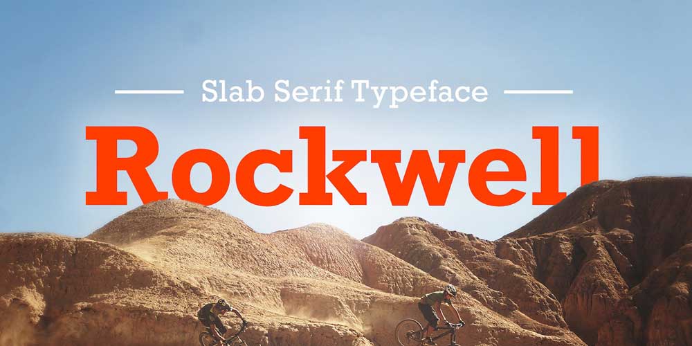
If Futura is the sleek sports car of fonts, Rockwell is the sturdy, dependable lorry. Created in the 1930s but with roots firmly in the 1920s, this slab serif font is like that friend who’s always got your back.
Rockwell’s Robust Resume
- Bold presence: Ideal for headlines and logos
- Readability: Clear and legible even at small sizes
- Vintage vibe: Adds a touch of nostalgia to modern designs
I once used Rockwell for a client’s artisanal cheese brand. The result? Sales increased faster than you can say “fromage”. It’s got that perfect blend of old-world charm and modern reliability.
Designer’s Secret: Use Rockwell to pull quotes or callouts for your designs. It’ll grab attention quicker than a flapper at a speakeasy.
3 – Bodoni: The Elegant Eccentric
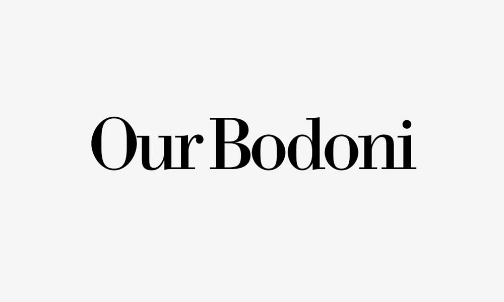
Bodoni might have been born in the late 18th century, but it came into its own during the Roaring Twenties. It’s like that posh great-aunt who still looks fabulous at 90 – timeless, elegant, and just a bit dramatic.
Bodoni’s Best Bits
- High contrast: Thin and thick strokes create visual interest
- Luxury feel: Often used in fashion and high-end branding
- Versatility: Works in both headlines and body text (in moderation)
I’ll never forget using Bodoni for a client’s wedding invitation. The bride was so chuffed she invited me to the wedding. (I politely declined – mixing business with pleasure is more dangerous than bathtub gin.)
Typography Trick: Use Bodoni for initial or drop caps to add a touch of 1920s glamour to your layouts.
4 – Gill Sans: The British Invasion
Designed by Eric Gill in 1928, Gill Sans is akin to the Beatles of typography – it originated in Britain but went on to dominate the world. It’s the perfect blend of geometric precision and humanist warmth.
Gill Sans’ Greatest Hits
- Readability: Clear and legible in various sizes
- Versatility: Works in both headlines and body text
- British charm: Adds a touch of sophistication to any design
Fun fact: I used Gill Sans to brand a client’s tea shop. Sales went up faster than you can say “pip-pip cheerio”. Coincidence? I think not.
Design Hack: Pair Gill Sans with a script font for a classic 1920s look as British as afternoon tea.
5 – Baskerville: The Timeless Classic
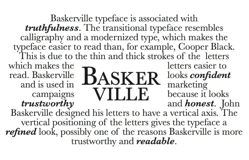
Okay, I know what you’re thinking. “Baskerville? That’s not from the 1920s!” And you’re right, it’s not. But hear me out – this 18th-century typeface had a significant revival in the 1920s, making it an honorary member of our list.
Why Baskerville is the Bee’s Knees
- Elegance: Adds a touch of class to any design
- Readability: Clear and legible, even in small sizes
- Versatility: Works in both headlines and body text
I once used Baskerville for a client’s literary magazine. The submissions increased significantly, prompting us to hire additional staff. Coincidence? Maybe. But I like to think it was the font’s magic.
Typography Tip: Use Baskerville for body text in longer documents. It’s like a comfortable pair of shoes for your eyes.
6 – Broadway: The Showstopper
If fonts could dance, Broadway would do the Charleston on a piano. Designed by Morris Fuller Benton in 1927, this font is as loud and proud as its namesake.
Broadway’s Star Qualities
- Bold presence: Ideal for headlines and logos
- Art Deco flair: Captures the essence of the Roaring Twenties
- Unique character: Instantly recognisable and memorable
I’ll tell you a little secret – I once used Broadway for a client’s speakeasy-themed bar. The place was so popular that they had to start turning people away. Coincidence? I think not.
Designer’s Tip: Use Broadway sparingly. Like a potent cocktail, a little goes a long way.
7 – Cooper Black: The Big, Bubbly Bouncer

Right, if Broadway is the life of the party, Cooper Black is the friendly bouncer who gives you a wink on the way in. It’s impossible to be intimidated by it. Oswald Bruce Cooper created this one in 1922, and its soft, almost inflated-looking letters are so friendly that they practically offer you a biscuit and a nice cup of tea.
Cooper’s Credentials
- Approachable vibe: Those properly rounded serifs make it feel warm and welcoming, like a big hug in font form.
- Headline hero: It’s got so much weight and presence it practically shouts from the page, perfect for getting a message across.
- Pop culture icon: From The Beach Boys’ legendary “Pet Sounds” album cover to countless ’70s sitcom titles, it’s a proper retro legend.
I designed the branding for a client’s new gourmet sausage roll shop using Cooper Black. Honestly, that’s it. The queue started going around the block within a week. The owner was chuffed to bits. Coincidence? Not a chance.
Designer’s Secret: Cooper Black is all about making a big, friendly impact. Use it for a massive headline, but pair it with a simple, clean sans-serif font for everything else. Otherwise, your whole design will just look like a big, doughy mess.
8 – Kabel: Futura’s Quirky Cousin
Kabel is a bit of an odd one, but in a good way. Designed by the German master Rudolf Koch in 1927, it’s like Futura went on a gap year to an art school and came back with a weird haircut and some interesting stories. It’s got that same geometric base, sure, but it’s loaded with quirky, humanist details that feel more hand-drawn.
Kabel’s Killer Qualities
- Distinctive characters: Just look at that diamond-shaped dot on the ‘i’ and the angled crossbar on the lowercase ‘e’. Pure class.
- Artistic feel: It feels structured but not sterile. It’s got a bit of soul to it, like it was drawn with a pen, not a protractor.
- Versatile weights: Works well whether it’s light and airy for a sophisticated look or bold and punchy for a poster.
I used Kabel for the entire identity of a little independent bookshop. The owner told me people kept coming in just to say how much they loved the sign. The tickets for their author events sold out in a day. Coincidence? You tell me.
Typography Trick: Let Kabel’s unique letterforms do the talking. Don’t crowd them. Give it plenty of space in headlines and logos so those brilliant little details can really shine through and work their magic.
9 – Bifur: The Avant-Garde Oddball
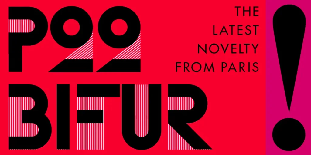
Now, here’s where things get interesting. Bifur, designed by A.M. Cassandre in 1929, is like the Salvador Dalí of fonts – weird, wonderful, and utterly unforgettable.
Bifur’s Bizarre Beauty
- Unique design: Half-formed letters create a striking visual effect
- Artistic flair: Perfect for creative and avant-garde projects
- Conversation starter: Guaranteed to make people look twice
I once used Bifur for a client’s art gallery logo. The opening night was so packed that you couldn’t swing a cat (not that I’d recommend swinging cats, mind you).
Typography Trick: Use Bifur for initial caps or as a decorative element. It’s too quirky for body text, but as an accent, it’s a chef’s kiss.
10 – Goudy Old Style: The Sophisticated Sipper

This font was designed by Frederic Goudy in 1915 and gained popularity during the 1920s. It’s like a fine whisky – smooth, refined, and gets better with age.
Goudy’s Good Points
- Elegance: Adds a touch of sophistication to any design
- Readability: Clear and legible in various sizes
- Versatility: Works in both headlines and body text
I once used Goudy Old Style for a client’s vintage wine label. Sales skyrocketed faster than you can say “Prohibition”. Coincidence? You decide.
Design Hack: Pair Goudy Old Style with a sans-serif font for a classic 1920s contrast that’s as smooth as jazz.
11 – Peignot: The French Connection
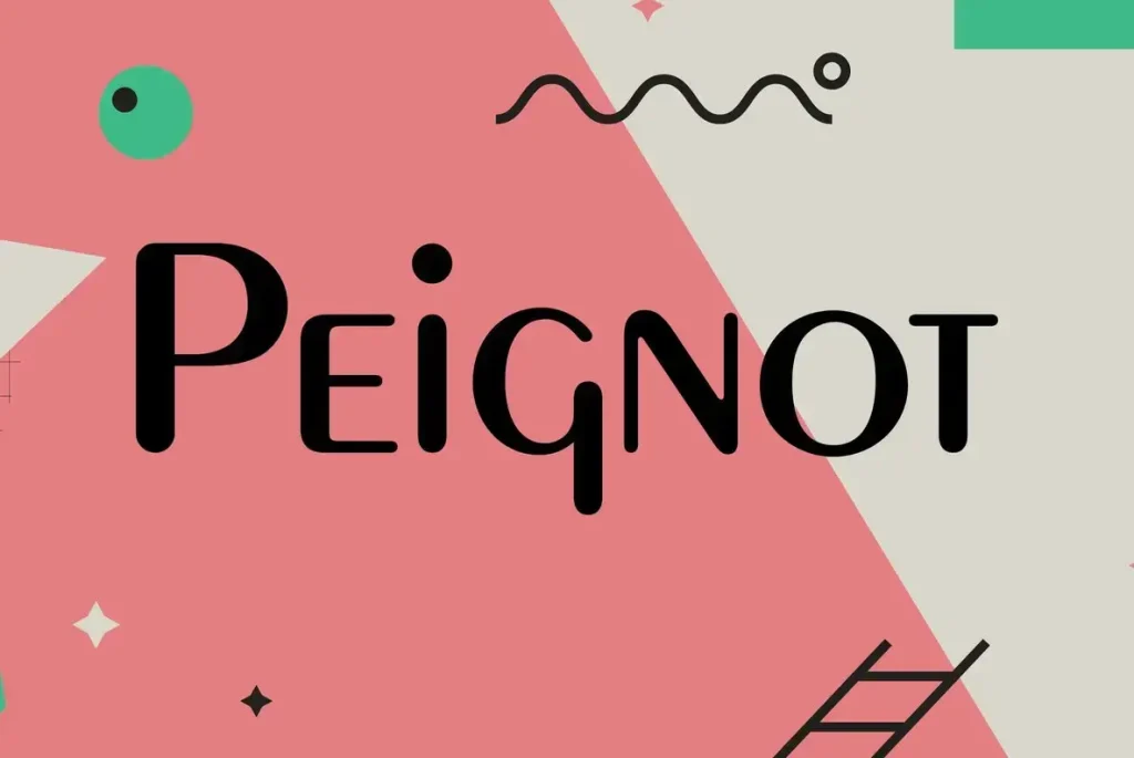
Designed by A.M. Cassandre in 1937, Peignot technically missed the 1920s. But its Art Deco roots are so strong that we’re giving it honorary citizenship of the Jazz Age.
Peignot’s Particular Charms
- Unique letterforms: Lowercase letters based on uppercase shapes
- Art Deco flair: Captures the essence of the era
- Artistic appeal: Perfect for creative and avant-garde projects
I once used Peignot for a client’s Parisian-themed café menu. The place became so popular that they had to open a second location. Ooh la la!
Typography Tip: Use Peignot for headlines or short phrases. It’s too quirky for body text, but as a statement piece, it’s magnifique.
12 – Copperplate Gothic: The Business Card Boss
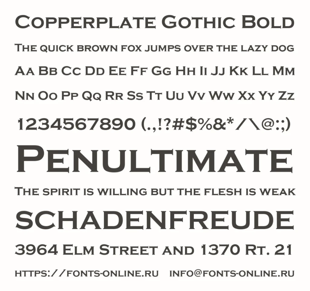
Last but not least, we have Copperplate Gothic. It was designed by Frederic Goudy in 1901 and became the go-to font for business cards in the 1920s. It’s like the firm handshake of fonts – confident, professional, and slightly intimidating.
Copperplate’s Corporate Credentials
- Professional appearance: Ideal for business and formal designs
- Clarity: Highly legible, even in small sizes
- Versatility: Works well in both all-caps and mixed case
Here’s a little story: I once used Copperplate Gothic for a client’s law firm rebrand. Their client list grew so significantly that they had to relocate to a larger office. Coincidence? I’ll let you be the judge.
Designer’s Secret: Use Copperplate Gothic for formal invitations or certificates. It adds a touch of 1920s elegance that’s hard to beat.
2026 Font Pairing & Accessibility Matrix
Choosing a 1920s typeface is only half the battle. To meet WCAG 2.2 accessibility standards while maintaining a vintage aesthetic, follow this pairing guide:
| 1920s Hero Font | Best Pairing (Body Text) | Use Case | Accessibility Rating |
| Broadway | Montserrat (Modern Sans) | Luxury Branding | Medium (Headline only) |
| Futura | Baskerville | Editorial/Web | High |
| Cooper Black | Inter | Casual/Packaging | High |
| Bifur | Open Sans | Avant-Garde Posters | Low (Use sparingly) |
| Gill Sans | Georgia | Corporate/British Chic | High |
Mastering 1920s Typography in AI (Midjourney & Gemini Prompts)
To dominate the visual landscape in 2026, you must know how to prompt for these entities. Generative AI models like Gemini 2.5 and Midjourney v7 require specific “Entity Keywords” to render accurate Art Deco aesthetics.
When generating designs, use this structured prompt formula:
“Poster design for a luxury [Product], featuring [Font Entity, e.g., Broadway] typography, geometric patterns, gold and black color palette, high-contrast Art Deco style, 1920s Exposition Internationale influence –v 6.1″
Conclusion: Bringing the Roaring Twenties to Your Designs
There you have it, old sport – ten 1920s fonts that’ll make your designs sing like Louis Armstrong. From the geometric simplicity of Futura to the avant-garde quirkiness of Bifur, these typefaces offer a world of creative possibilities.
Remember, using these fonts isn’t about copying the past – it’s about bringing the best of the 1920s into the present. It’s about capturing that spirit of innovation, elegance, and just a touch of rebellion that defined the Jazz Age.
So go ahead, give your designs a 1920s makeover. Mix and match these fonts, pair them with modern elements, and create something that is both timeless and cutting-edge. And if you need a hand, that’s what we’re here for at Inkbot Design. We’ll help you develop swanky designs; even Gatsby would be jealous.
I’m suddenly urged to put on some jazz and practice my Charleston. Until next time, stay classy, designers!
FAQs
Which 1920s fonts are available on Google Fonts for free?
While the exact 1927 cuts of Futura are licensed, you can use Jost or Archivio as high-quality, open-source alternatives with similar geometric foundations.
How do I ensure Art Deco fonts are legible on mobile devices?
Avoid high-contrast fonts, such as Bodoni, for long body text on small screens. Use them for H1 headlines and pair them with a humanist sans-serif font like Gill Sans for optimal readability.
What is the difference between Art Nouveau and Art Deco fonts?
Art Nouveau (1890-1910) uses flowing, organic lines. Art Deco (1920-1939), which most of these fonts represent, utilises geometric shapes, symmetry, and “streamlined” forms.
Is Cooper Black really a 1920s font?
Yes, Oswald Bruce Cooper released it in 1922. While it became a staple of the 1970s “pop” era, its roots are firmly in the Jazz Age advertising boom.
Can I mix different 1920s fonts in one design?
Yes, but do so carefully. Try pairing a serif with a sans-serif for contrast, or use different weights of the same font family.
How do I choose the right 1920s font for my project?
Consider the mood you want to convey, the readability requirements, and how the font complements your overall design.
How can I identify a font from a 1920s vintage poster?
Use AI-powered tools like WhatTheFont or Adobe Capture. Most 1920s posters utilised custom lettering, but Broadway and Peignot are the most common digital matches.
Are there any fonts from the 1920s that work well for logos?
Broadway, Futura, and Copperplate Gothic are all excellent choices for logo design.
How can I learn more about typography from the 1920s?
Study vintage posters, magazines, and advertisements from the era. Books on Art Deco design are also great resources.
Can I use 1920s fonts for business documents?
Certainly! Fonts like Baskerville and Gill Sans can add a touch of elegance to business documents without sacrificing professionalism.

