April Greiman: The Technical Legacy of a Design Pioneer
In my years as a Creative Director, I’ve seen countless entrepreneurs sink thousands into branding that is technically proficient but functionally invisible. It lacks soul because it adheres too closely to the rules.
If you want to understand why your marketing feels flat, you should examine the work of April Greiman.
She didn’t just use computers; she interrogated them.
While the rest of the industry was busy clutching their T-squares and lamenting the “death of craftsmanship” at the hands of digital pixels, Greiman was busy inventing the future.
She proved that you can be technically radical while remaining commercially viable.
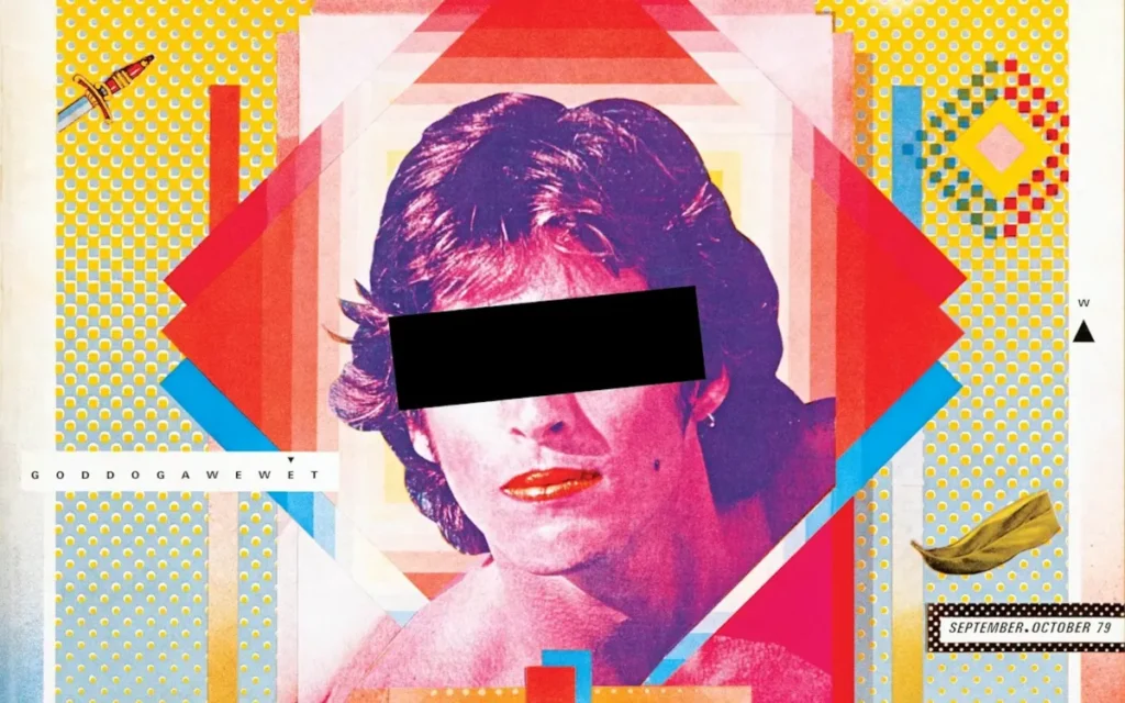
- Greiman embraced computers as a new medium, using pixelation and glitches as deliberate aesthetic elements.
- She fused Swiss typographic discipline with chaotic digital layering to create New Wave, postmodern visual language.
- Hybrid Imagery: blending photography, video and digital graphics into layered compositions that demand engagement.
- She treated space as three dimensional, using depth, overlap and kinetic layouts to guide the viewer's eye.
- Her approach teaches brands to use technological authenticity and visual friction to stand out in a sterile market.
Who is April Greiman?
April Greiman is a transmedia artist and designer recognised as one of the first practitioners to embrace computer technology as a primary design tool.
Her work pioneered the New Wave (or Postmodern) aesthetic, characterised by a rejection of the rigid International Typographic Style.

The core elements of her approach include:
- Hybrid Imagery: The integration of video, photography, and digital graphics into a single, layered composition.
- Space as a Tool: Treating the page (or screen) as a three-dimensional environment rather than a flat surface.
- Technological Authenticity: Refusing to hide the “glitches” or bitmapped textures of digital tools, turning technical limitations into aesthetic choices.
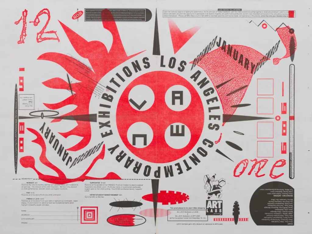
The Basel Foundation: Mastering the Rules to Break Them
Before you can ignore the rules, you have to master them. Greiman studied at the Allgemeine Gewerbeschule Basel under the guidance of legends such as Armin Hofmann and Wolfgang Weingart.
This is where she learned the “Swiss Style”—the ultra-clean, grid-based logic that governs 90% of the corporate logos you see today.
But Greiman saw the grid as a cage. She took the precision of Swiss typography basics and infused it with the chaotic energy of the emerging digital age. This wasn’t rebellion for its own sake; it was a recognition that the world was becoming increasingly complex, and design needed to reflect that.
Debunking the Myth: “Simple Design is Always Better”
There is a persistent and irritating myth in the SMB world that “clean and simple” is the only way to appear professional. I hear it every week. “Give us something clean!”
The data suggests otherwise. According to the research, while users prefer “low complexity” for initial processing, they also tend to overlook brands that lack “visual interest” or “prototypicality” because they fail to form a distinct memory.
The “clean” design you’re chasing is often just a “boring” design. Greiman’s work was complex, layered, and often difficult to parse at a single glance.
It forced the viewer to engage.
In a 2026 market saturated with AI-generated “clean” templates, Greiman’s layered, human-plus-machine approach is the only way to stand out.
1984: When the Macintosh Met a Visionary
In 1984, the design world was terrified of the Apple Macintosh. They thought its 512×342 pixel resolution was a toy. They thought the “jaggies” (aliased edges) were an insult to the history of print design.
Greiman didn’t see a toy; she saw a new dimension. She was among the first famous graphic designers to realise that the computer wasn’t just a faster way to do what we were already doing. It was a completely different medium.
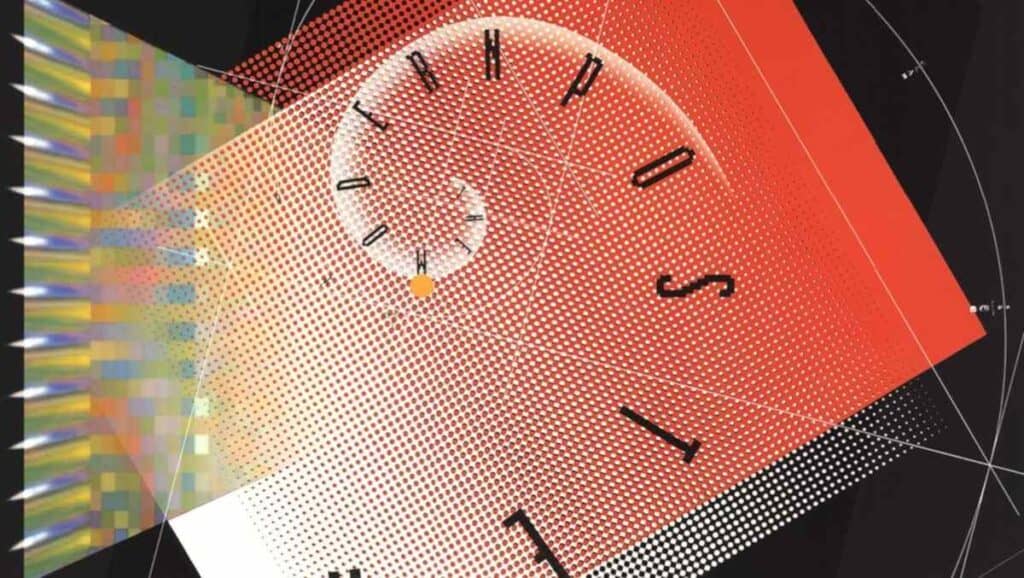
The 12-Foot Poster That Broke Design
In 1986, she produced Design Quarterly #133, titled “Does It Make Sense?” It was a 12-foot-long fold-out poster featuring a life-sized, digitally rendered nude of Greiman herself, overlaid with layers of astronomical data, symbols, and bitmap typography.
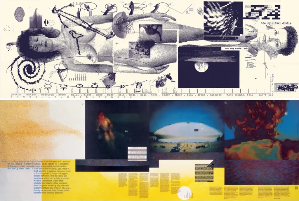
This wasn’t just art. It was a technical manifesto. She used the Mac’s limitations—the low-resolution textures and the limited font sets—as a feature, not a bug.
She proved that a designer’s value isn’t in their ability to draw a straight line with a pen, but in their ability to direct a technical process.
Business Lesson: If you are waiting for technology to become “perfect” before you adopt it, you are already behind. Your competitors are currently using the “imperfect” tools of today to define the aesthetic of tomorrow.
| The Wrong Way (Amateur) | The Right Way (Pro – The Greiman Method) |
| Hiding the digital nature of a brand to look “traditional.” | Embracing the medium (digital, print, or motion) and its unique traits. |
| Using a rigid grid that makes every page look identical. | Using “Kinetic” layouts that guide the eye through depth and layering. |
| Viewing “whitespace” as an empty area to be left alone. | Viewing space as a 3D volume where elements can float or recede. |
| Prioritising legibility over engagement. | Balancing legibility with “visual friction” to ensure the message sticks. |
Hybrid Imagery: The Technical Edge
Greiman’s most significant contribution to modern branding is arguably the concept of Hybrid Imagery. This is the blending of disparate media types.
In the 80s, this meant combining video stills with traditional offset printing. Today, it translates to the intersection of why web design is important and physical brand touchpoints.
Real-World Example: The US Postal Service
In 1995, Greiman was commissioned to design a stamp for the US Postal Service celebrating the 19th Amendment.
She didn’t just put a portrait on a rectangle. She used layered textures and overlapping planes to represent the passage of time and the complexity of the movement.
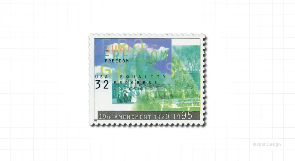
The result was a stamp that looked like nothing else in the mail. It had “depth.” For an SMB, this means your packaging design guide shouldn’t just be about a logo on a box. It should be about how the digital textures of your website translate to the physical textures of your product.
The State of April Greiman’s Philosophy in 2026
We are currently seeing a massive resurgence of the “New Wave” aesthetic. After a decade of “Corporate Memphis” and overly sterile UI design, the market is craving texture.
In 2026, we see this manifest as:
- Glitched Reality: Brands purposely using “low-fi” digital artefacts to signal authenticity in an age of AI-polished perfection.
- Maximalist Layouts: Moving away from the “one hero image + one headline” template toward dense, layered information environments.
- Transmedia Consistency: Ensuring a brand feels the same in a VR environment as it does on a business card.
Greiman predicted this. She once said,
“The computer is just another tool, like a pencil, but it’s a pencil that can also be a plane or a telescope.”
A Consultant’s Reality Check
I once audited a client—a mid-sized tech firm in London—who had spent £40,000 on a rebrand that looked like every other “SaaS” company on the planet.
Deep blue gradients, sans-serif fonts, and “clean” icons. It was technically perfect and commercially dead.
When I asked them why they chose that direction, they said, “We wanted to look safe.”
“Safe” is another word for “forgotten.” I showed them Greiman’s work from 1986. I showed them how she used colour psychology to create tension rather than just “pleasantness.”
We scrapped their “safe” palette and introduced visual friction—layers of technical data and “imperfect” textures. Their engagement metrics didn’t just improve; their sales team reported that prospects actually remembered who they were after the first meeting.
If your design doesn’t have a point of view, it isn’t design. It’s just noise.
“Design is the bridge between the technical and the human. If you remove the human ‘mess’, you remove the bridge.”
The Verdict
April Greiman didn’t just change the look of design; she changed the logic of it.
She taught us that the computer is a partner, not just a tool. For any entrepreneur or SMB owner, the lesson is clear: stop trying to look “standard.”
Whether you are looking for bespoke design services or just trying to understand why your current visuals aren’t converting, you must embrace the “Hybrid” reality.
Greiman’s legacy proves that when you stop being afraid of the “jaggies” and start embracing the complexity of your own brand story, you create something that actually makes sense.
If you’re ready to stop playing it safe and start building a brand that people actually remember, it’s time to move beyond the template.
Would you like me to audit your current brand assets to see where “safe” design is costing you money? Request a quote here.
Frequently Asked Questions
What is April Greiman most famous for?
April Greiman is most famous for her pioneering work in “New Wave” graphic design and being one of the first major designers to embrace the Apple Macintosh. Her 1986 poster for Design Quarterly #133, “Does It Make Sense?”, is considered a landmark in the history of digital design.
How did April Greiman influence the New Wave design movement?
She moved away from the rigid, objective “Swiss Style” and introduced subjectivity, layering, and three-dimensional depth. By integrating video technology and bitmapped computer graphics, she broke the traditional grid-based layout systems that had dominated the industry for decades.
What is “Hybrid Imagery” in Greiman’s work?
Hybrid imagery refers to the technical process of blending different types of media—such as photography, video stills, and digital graphics—into a single composition. This approach enables a richer, more nuanced visual narrative that reflects the complexity of the digital age.
Why is Greiman’s work relevant to modern business branding?
In a market full of generic, AI-generated designs, Greiman’s philosophy of “visual friction” and technological authenticity helps brands stand out. Her work teaches businesses to embrace their unique technical traits rather than hiding behind sterile templates.
Did April Greiman study under famous designers?
Yes, she studied at the Kansas City Art Institute and later at the Allgemeine Gewerbeschule in Basel, Switzerland. Her mentors included Armin Hofmann and Wolfgang Weingart, from whom she learned the discipline of Swiss typography before evolving her own style.
What was “Does It Make Sense?”
It was a 12-foot-long fold-out poster created for Design Quarterly magazine in 1986. It featured a life-sized digitised image of Greiman and served as a technical and philosophical argument for the use of computers in high-level graphic design.
How does Greiman’s use of “space” differ from traditional design?
Traditional design often treats the page as a 2D surface. Greiman treated the page as a 3D environment, using overlapping elements, shadows, and varying scales to create a sense of depth and motion, thereby drawing the viewer’s eye through the composition.
What role did the 1984 Macintosh play in her career?
The Macintosh was the catalyst for her digital exploration. While others saw it as a tool for “low-quality” work, Greiman saw it as a new medium. She embraced bitmapped fonts and pixelated textures to create a new aesthetic that defined the late 1980s and 1990s.
What is the “New Wave” aesthetic?
New Wave (or Postmodern) design is characterised by a playful, often chaotic rejection of minimalism. It features bold colours, layered textures, non-linear layouts, and a mix of historical and futuristic elements, often with a focus on human expression over corporate objectivity.
Is April Greiman still active in the design world?
Yes, she continues to work through her studio, Made in Space, based in Los Angeles. Her current work focuses on the intersection of architecture, environmental design, and digital media, continuing her legacy of transmedia exploration.
How does colour psychology play into Greiman’s work?
Greiman used colour not just for aesthetics but to create emotional and spatial tension. She often used neon or clashing palettes to draw attention to specific layers of information, ensuring the viewer engaged with the complexity of the message rather than just “consuming” it.
Why should SMBs care about “visual friction”?
Visual friction is the opposite of a “seamless” user experience. While ease of use is important, a brand that is too smooth is often forgotten. Controlled friction—utilising Greiman’s layering techniques—forces the user to pause and process the brand, resulting in higher recall and better brand differentiation.


