The Psychology Behind Animal Symbolism in Logo Design
Let’s be honest. Humans are just animals with better marketing.
We’ve relied on a primal, instantaneous understanding of other creatures for millennia.
A lion meant danger. A dog meant companionship. A bird meant freedom.
This stuff is baked into our DNA. It’s a cognitive shortcut our brains use to make snap judgments.
And that’s precisely why businesses are so drawn to animal logos. It feels like a cheat code for building a brand personality.
But here’s the problem. Most businesses use this shortcut lazily. They slap an eagle on their logo to look “authoritative” or a lion to seem “strong,” and in doing so, they create a profoundly generic and instantly forgettable brand.
This isn’t a dictionary of what animals mean. You can find that anywhere. This is a framework for deciding if an animal logo is a strategic weapon or a self-inflicted wound for your brand.
It’s about choosing a symbol that amplifies—not fabricates—your company’s truth.
- Animal logos resonate instinctively, leveraging deep-seated associations for effective brand messaging.
- Choosing an animal that aligns with your brand's essence is crucial for authenticity and memorability.
- Be wary of clichéd animals; they can make your brand blend in rather than stand out.
- Consider cultural meanings and potential negative connotations before finalising your animal logo choice.
We’re Hardwired to Notice Animal Symbolism in Logo Design
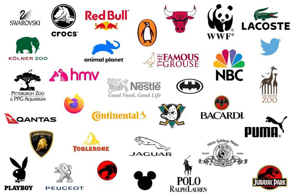
Your brain is a remarkably efficient, pattern-recognising machine. When you see an animal, even a simplified drawing of one, it triggers a cascade of deep-seated associations without you even thinking about it. Survival, danger, community, nurture—it’s all there.
This is the power you’re tapping into. An animal logo doesn’t create personality; it magnifies what’s already there.
The Puma logo works beautifully if your brand is genuinely fast, agile, and predatory in its market.
If your brand is slow, bureaucratic, and clumsy, putting a leaping cat on your letterhead highlights the ridiculous gap between who you are and claim to be.
The World Wildlife Fund’s panda is a masterclass in conservation. It isn’t just a cute bear. The choice of a panda instantly communicates rarity, vulnerability, and a gentle strength. It perfectly encapsulates their entire mission in a single, emotionally resonant mark. The symbol amplifies the truth of their work.
The Cardinal Sin: Choosing an Animal for Aspiration, Not Reality
This is where most brands fall flat. They don’t pick an animal that reflects their behaviour, service, or company culture. They choose one that reflects their ego.
#1: The “Majestic Animal” Cliche
Every new financial firm, every “alpha” consultant, every ambitious tech startup defaults to the same tired pool of predators. The lion. The wolf. The eagle.
They think it makes them look dominant, influential, and trustworthy. It makes them look identical to the 1,000 other uninspired businesses with the same idea.
Your wealth management firm is not a lion. It is most likely a small team of people who are very skilled with spreadsheets and client relationships. The disconnect between a lion’s primal ferocity and your service’s reality is jarring. It feels inauthentic because it is.
This only works when the brand’s core function embodies the animal’s primary trait. Lamborghini’s raging bull is perfect because the cars are ferocious, untamed, and powerful. The symbol is an honest reflection of the product.
#2: Willfully Ignoring the Dark Side
When you choose an animal, you don’t get to cherry-pick its symbolism. You inherit the entire, complex web of cultural associations, both positive and negative.
A snake might represent healing and transformation (the Rod of Asclepius in medicine), but it also carries a heavy baggage of deceit, danger, and temptation. A fox is clever, yes, but also sly and untrustworthy. A spider might be a patient, creative builder, but it’s a source of primal fear for many.
Ignoring the negative side is naive. The smart move is to choose an animal with minimal negative connotations, lean into the ambiguity, and incorporate it into your story.
A cybersecurity firm using a stylised spider to represent “weaving a protective web” is a clever subversion. Bacardi’s use of the bat is brilliant. Instead of running from its spooky connotations, they rooted it in a family story of bats living in their distillery rafters, symbolising good fortune. They owned the narrative.
#3: The Cringeworthy Cartoon
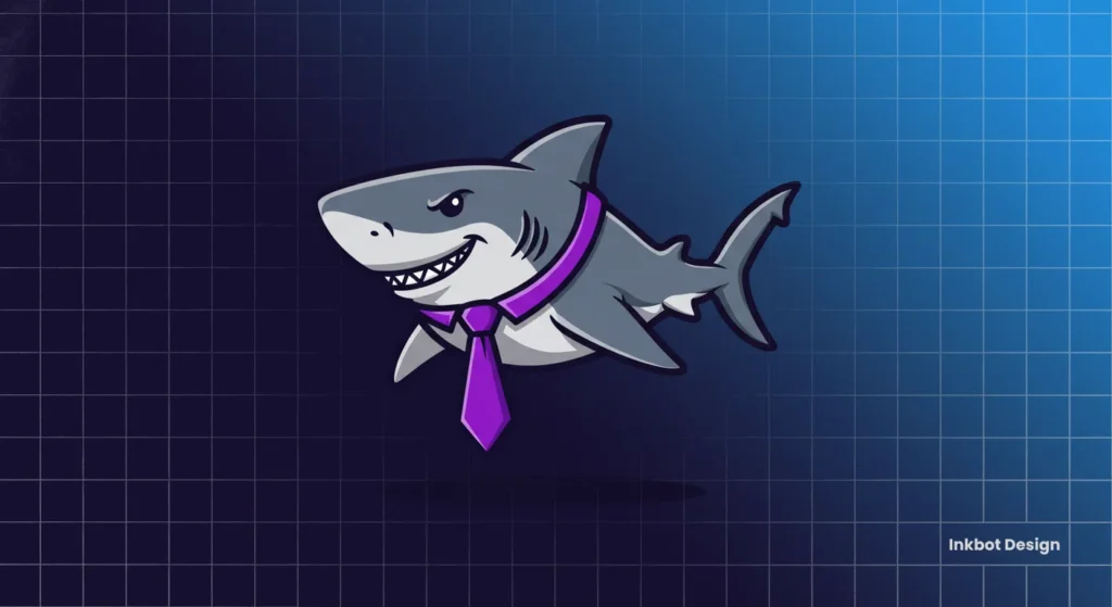
This is a special kind of brand identity disaster. It happens when a serious, professional service—a law firm, an investment bank, a B2B software company—tries to appear “friendly” and “approachable” by turning a powerful animal into a goofy, smiling cartoon.
Imagine a tax attorney whose logo is a grinning, cartoon shark wearing a tie.
It doesn’t make them seem approachable. It makes them seem clownish. It utterly demolishes any sense of authority, trust, or professionalism they had hoped to establish. Playfulness is a strategic choice. If your service isn’t inherently playful, a cartoon mascot creates a cognitive dissonance that repels serious customers.
A Practical Framework: How to Choose the Right Animal for Your Brand
If you’re still convinced an animal logo is for you, stop thinking about what you want to look like. Instead, use this process to find a symbol that reflects your actions.
Step 1: Define Your Core Brand Attributes (Just 3 Verbs)
Forget empty adjectives like “innovative” or “trustworthy.” They mean nothing. Focus on verbs. Verbs are about action. What does your business actively do for its customers at its absolute core?
Do you protect their assets? Do you connect disparate systems? Do you simplify complex processes? Do you build communities? Do you accelerate growth?
Pick three. No more. These are your pillars.
Step 2: Brainstorm Animals That Embody Those Verbs
Now, take your three verbs and brainstorm animals that live and breathe those actions. And please, think beyond the first idea that comes to mind.
- Protect: A bear or a lion is obvious. But what about a turtle with its shell? A porcupine? A goose, which is fiercely territorial? An aardvark, which builds impenetrable burrows?
- Connect: An ant or a bee is a good start, representing teamwork and collaboration. But what about a dolphin, known for complex social communication? Or a mycelial network (fungus), the ultimate natural connector?
- Simplify: This is harder. A beaver, which engineers complex dams from simple materials? Or an animal known for its efficiency of movement, like a hummingbird?
This exercise forces you out of the cliché box and into a more strategic territory.
Step 3: The Culture and Context Test
You have a shortlist of animals. Now, vet them against reality.
- Cultural Meaning: What does this animal mean in your primary market? An owl represents wisdom in the West, but can be a bad omen in other cultures.
- Competitive Landscape: Does a major competitor in your industry already “own” this animal? If you’re a sports apparel brand, choosing a big cat is walking directly into Puma’s shadow.
- Negative Baggage: Go back to Pet Peeve #2. What is the absolute worst interpretation of this animal? Be honest with yourself. Can you defend against it or subvert it?
Step 4: The Execution Test: How Will It Be Drawn?
The animal itself is only half the story. The artistic style of the logo determines its final personality. The same wolf can be rendered in a dozen ways, each with a different feel.
A geometric wolf conveys and sense of technical precision. An illustrative, woodcut-style wolf conveys a rustic, traditional, and authentic feel. A minimalist, single-line wolf feels elegant, premium, and sophisticated.
The execution style must match your brand’s personality and the expectations of your audience.
A Field Guide to Animal Symbolism (With Real-World Examples)
This is not a comprehensive list. It serves as a starting point to illustrate how different categories of animals carry varying symbolic weight.
The Predators: Power, Leadership, and Risk
- Animals: Lion, Tiger, Wolf, Bear, Eagle, Shark
- Symbolism: Strength, dominance, protection, aggression, vision, ferocity.
- Real-World Examples: MGM’s roaring lion is pure entertainment authority. The Porsche crest features a black horse, but its subsidiary, Porsche Design, has used a stylised tiger.
- Warning: This is the most overused and cliché-ridden category. Using a predator requires immense brand confidence and a product to match. If you’re not the undisputed king of your jungle, you’ll look like a pretender.
The Prey & Herbivores: Community, Agility, and Trust
- Animals: Deer, Horse, Elephant, Rabbit, Gazelle
- Symbolism: Grace, speed, community, endurance, peace, wisdom, family.
- Real-World Examples: The prancing horse of Ferrari is pure, unbridled power and prestige. John Deere’s leaping deer signifies a connection to the land and agility. Evernote’s elephant is a brilliant choice for a memory app, playing on the adage “an elephant never forgets.”
The Birds: Freedom, Communication, and Vision
- Animals: Dove, Owl, Peacock, Hummingbird, Swan
- Symbolism: Freedom, peace, wisdom, beauty, speed, communication, ambition.
- Real-World Examples: The evolution of the Twitter (now X) logo from a detailed bird to an ultra-simplified icon focuses on streamlined communication. Duolingo’s friendly owl, Duo, perfectly represents their mission of making learning (wisdom) accessible and fun. NBC’s peacock was a clever way to advertise colour television, with its feathers representing the network’s divisions.
The Insects & Arachnids: Hard Work, Transformation, and Connection
- Animals: Bee, Ant, Butterfly, Spider
- Symbolism: Community, diligence, cooperation, metamorphosis, patience, creativity.
- Real-World Examples: The bee is often used for brands that want to convey a sense of community and hard work (e.g., Manchester’s worker bee symbol). The butterfly is a classic choice for brands focused on transformation and beauty.
- Warning: Many people have phobias related to insects and spiders. The design must be carefully stylised to avoid visceral adverse reactions.
The Aquatic Life: Adaptability, Flow, and the Unknown
- Animals: Fish, Dolphin, Octopus, Turtle
- Symbolism: Fluidity, intelligence, complexity, adaptability, longevity, protection.
- Real-World Example: The Lacoste crocodile is one of the most famous animal logos. It’s not just a reptile; it’s a story. Tennis player René Lacoste was nicknamed “The Alligator” for his tenacity and ferocity. The logo represents that personal story of performance and grit, transformed into a symbol of status.
The Mythical Creatures: Aspiration, Imagination, and Exclusivity
- Animals: Dragon, Phoenix, Unicorn, Griffin
- Symbolism: Ultimate power, rebirth, purity, courage, magic.
- Real-World Example: Starbucks’ Siren (often mistaken for a mermaid) is a rare mainstream success. She represents the allure and mystery of the sea, from where the first coffee traders hailed.
- Warning: This is a dangerous category. A mythical creature can make your brand feel fictional, untethered from reality, or juvenile. It works best for entertainment, gaming, or niche luxury brands that sell an element of fantasy.
Beyond the Animal: How Style Shapes the Message
Never forget that the how is as important as the what. A business owner might say, “I want a fox logo,” but a designer hears a dozen possibilities.
Minimalist & Abstract
- Effect: Modern, sleek, confident, and sophisticated. It strips the animal to its essential form or a single core concept.
- Use Case: Ideal for premium brands, tech companies, and consultancies seeking to convey intelligence and focus. The simpler the mark, the more confidence it conveys.
Geometric
- Effect: Conveys logic, precision, stability, and a scientific or technical approach. It’s constructed from shapes like triangles, squares, and circles.
- Use Case: An excellent choice for engineering firms, data analytics companies, and tech startups. A geometric lion feels less about raw power and more about controlled, strategic strength.
Illustrative & Hand-Drawn
- Effect: Creates a sense of authenticity, tradition, approachability, and craft. It feels human and personal.
- Use Case: Ideal for consumer brands, food and beverage companies, and businesses seeking to establish a strong, friendly brand personality. Mailchimp’s “Freddie” mascot is a perfect example of an illustrative mark that gives the brand a warm, quirky character.
Is an Animal Logo Right for Your Business?
After all this, you might realise an animal logo isn’t the right move. That’s a perfectly valid strategic conclusion.
It’s a powerful tool, but it is not a universal solution. Before you commit, ask yourself one final, brutally honest question:
Does this animal represent my business’s core function and personality, or am I just reaching for a symbol because I think it looks cool or makes us seem like something we’re not?
Sometimes, the strongest, most honest, and most effective identity is a beautifully crafted wordmark or a unique abstract symbol. Not every brand needs a beast to carry its message. Often, clarity is better than a cliché.
An animal in your logo isn’t a mask to hide behind. It’s a megaphone. It will take the quiet truth of your brand and broadcast it to the world, for better or worse.
Choose wisely.
If you’re wrestling with this decision, it’s often a sign of a deeper brand strategy issue that a simple logo can’t fix. The work we do in our logo design services is built on establishing a strategic foundation first. If you’re not at that stage, you can find more of our unfiltered thoughts on branding right here on the Inkbot Design blog.
Frequently Asked Questions (FAQs)
What is the most overused animal in logo design?
Lions, eagles, and wolves are arguably the most overused, especially in finance, legal, and consulting sectors. They are often chosen as a generic symbol for “strength” or “leadership” and have lost much of their impact due to saturation.
Can an animal logo hurt my brand?
Yes. A poorly chosen animal logo can disconnect your brand promise and customer perception. A cliché choice can make you look unoriginal, while an animal with strong negative connotations (like a snake or rat) can repel customers if not handled strategically.
How does colour affect animal symbolism in a logo?
Colour dramatically influences the animal’s symbolic meaning. A red bull feels aggressive and assertive (Lamborghini), while a blue one might feel more reliable or corporate. A green fox could suggest clever environmental solutions, whereas an orange one feels more playful and creative.
Should I use a real animal or a mythical creature for my logo?
Real animals connect to known traits and feel more grounded. They are suitable for most businesses. Mythical creatures (dragons, unicorns) work best for brands in entertainment, gaming, or niche luxury industries that sell an element of fantasy and aspiration. Using one for a conventional business can feel untethered from reality.
What is the difference between an animal mascot and an animal logo?
An animal logo is a simplified, symbolic representation of an animal integrated into a brand’s identity (e.g., the Puma cat). An animal mascot is a fully-rendered character with a distinct personality that acts as a brand ambassador (e.g., Mailchimp’s Freddie, Duolingo’s Duo). Mascots are generally more illustrative and friendly.
Are insect logos a good idea?
They can be, but they require careful execution. Insects like bees and ants are excellent symbols for community and hard work. Butterflies are great for transformation. However, due to common phobias, the design must be stylised, abstract, or friendly to avoid adverse reactions.
How do I choose an animal that a competitor doesn’t already use?
Start by researching your direct and indirect competitors. If an animal is heavily used in your industry, avoid it. Use the verb-based framework in this article to brainstorm less obvious choices that align with your brand’s core actions.
Can I change my animal logo later?
You can, but it should be done with extreme care. A logo change is a significant part of a rebrand. Twitter’s shift from its iconic bird to the “X” logo demonstrates that it’s possible, but comes with the cost of losing years of brand equity built into the original symbol.
Is it better to have an abstract or a realistic animal logo?
It depends on your brand. An abstract or minimalist logo often feels more modern, sophisticated, and corporate. A realistic or illustrative logo can convey a sense of tradition, authenticity, or personality. The choice should align with your brand’s overall personality and target audience.
What if my business doesn’t have any obvious animal traits?
Then an animal logo is likely the wrong choice for you. A strong wordmark, a lettermark, or an abstract symbol can be much more effective. The root cause of most bad animal logos is forcing an animal connection where none exists.
